Grid GK5 Joomla module
The new Grid GK5 module for Joomla 2.5/3.x is composed of a set of modules and their spatial relationship with each other. With the Grid GK5 module, you can implement space-saving grid-based layout on websites and incorporate a variety of content types via different modules. It works by placing elements in optimal position based on your settings, sort of like a mason fitting stones in a wall.
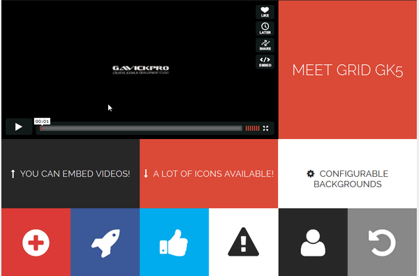
You’ve probably seen it in use all over the Internet. It provides a fluid solution and makes moving elements a joy! With built-in support for module embedding, the possibilities for implementing this release are unlimited! Grid layout can be used to intelligently reflow elements within a webpage. Module offers horizontal & vertical grid layouts. Just few clicks to create attractive portfolio, news wall or gallery with photos & movies with social links etc.

Like tables, the Grid GK5 enables to align elements into columns and rows, but unlike tables, the Grid doesn’t have content structure, and thus enables a wide variety of layouts not possible with tables. Modules can utilize that organization through various properties. By separating the layout structure from the content it will be easier to modify layouts for multiple (desktop, tablet and mobile) devices. The grid is fluid and flexible, because the module is fully responsive (RWD) – especially if all included into the Grid modules will be also responsive.
The way that Grid displays blocks has been changed from v1.2 in order to reduce the risk of a 1-pixel space appearing between the blocks. We have used the minimum scaling of blocks combined with an increase in the values of the z-index.
Module configuration
The Grid is a module, this means that you have more scope than if it was a component. Thanks to the amazing grid management system we’ve integrated into the module, it remains easy, intuitive and quick to configure. Nevertheless, we wanted to bring its use by writing this documentation.
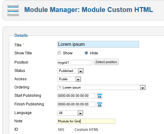
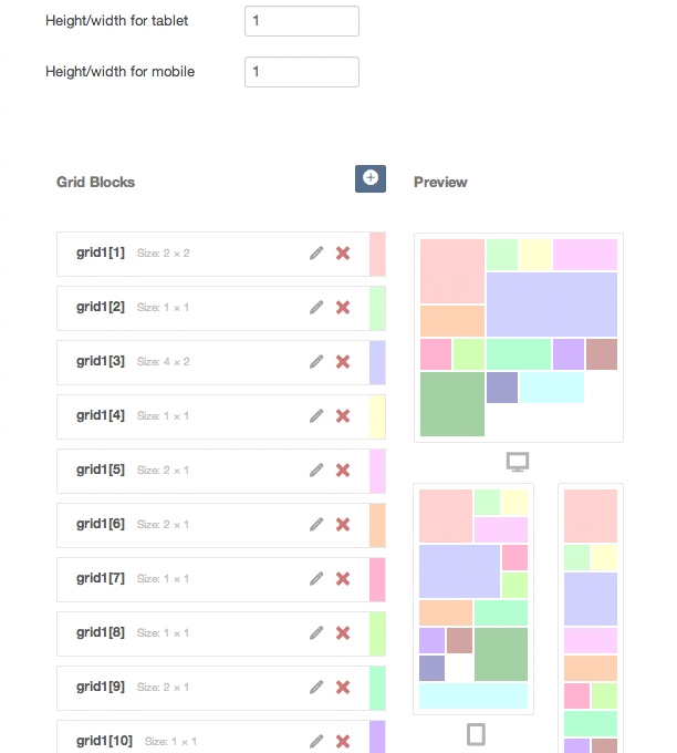
Basic Settings – “BASIC” tab
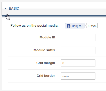
Basic settings
The “Module ID” option allows you to specify your own static module ID. If this option will be blank then the automatic module ID will be created.
The “Module Suffix” is used to set a suffix representing a custom style.
The “Grid margin” option allows you to specify a margin for wrapper with the grid items. Useful if you need to hide edge borders with negative margins.
The “Grid border” are the horizontal and vertical dividing lines of the grid. And this option allows you to specify a border around the grid items. Default value is zero (no borders). To get gray thin border use this short CSS style:
1px solid #ccc
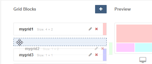
GRID SETUP tab
Here you will find simple Grid creator which allows you to add modules. The most important change in module since 1.2 version heralds the end of restrictions to the proportions of Grid blocks. With these new options, you may easily specify the proportions of blocks between the height and width units – ‘1’ means that one height unit is equal to one width unit. This value is rounded up to 2 decimal places — independently for different types of devices. This way the blocks may have different proportions on tablets, smartphones and on other desktop browsers.
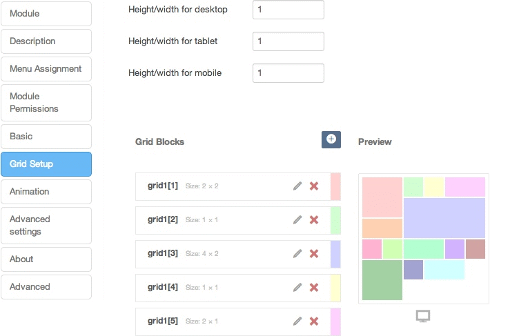
You can specify the proportions for desktop, mobile and tablet view
This new feature for the Grid GK5 module significantly increases its usage possibilities and make it a viable option in even more situations.
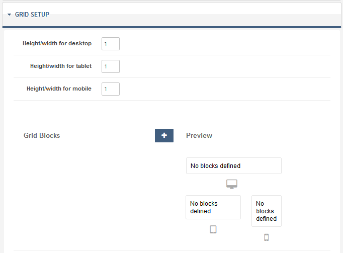
Grid setup – no defined blocks
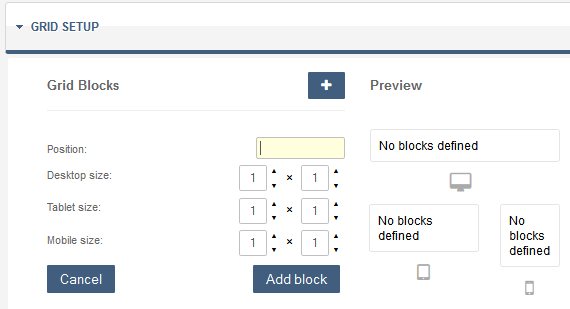
Grid – adding new module
Each block is defined by the following parameters:
- Name of module positions
- Size desktop
- Size tablet
- Size mobile
Sizes are given in blocks and width can be no greater than 6 on the desktop, 4 for tablet view and 2 on mobile view.
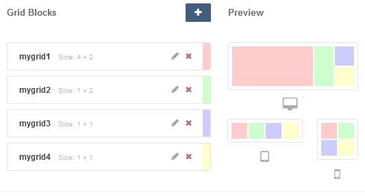
Four modules on the Grid layout – an arrangement suitable for landscape orientation
The position of the module can be given simply as: mygrid, myposition or even user1.
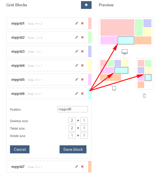
Seven modules in Grid layout
Grid GK5 – configuration II
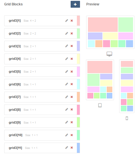
Grid GK5 – configuration II – setup
Then system will load the first module from this module position list. But you can also use the following syntax: myposition [3]. Then Grid system will use a third module only from this position modules list. With this mechanism, you can use only a few module positions with a number of modules inside. But we suggest to use custom module position names not used by template framework, this allows you to keep order in Module Manager. Because you will know which ones you use in the Grid and which one are published like standard modules.
Custom module position for Grid GK5 purposes
The most important facts:
- The smallest grid element is 1×1 square, where “1” means 16.666666% in the desktop layout, 25% in the tablet layout and 50% in the mobile layout.
- The width will be fluid, because the biggest width for the desktop layout is in example 1200px and the smallest is 840px, so one unit is in range “140-200px”.
Of course elements (modules) in the list can be sorted using drag and drop feature. It means when you “grab” an object you can drag it to a different location (up or down).
ANIMATION tab
Settings on this tab are used to determine the module’s animation style.
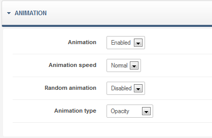
The “Animation” option allows you to enable or disable animation of the grid.
The “Random animation” option allows you to enable or disable random animation of the grid blocks.
The “Animation speed” is used to choose animation speed (fast = 250ms, normal = 500ms, slow = 750ms).
The “Animation interval” option allows you to specify animation interval in miliseconds.”
The”Animation type” option is used to select the animation type from popular effects: opacity, scale, rotate and slide.
ADVANCED SETTINGS tab
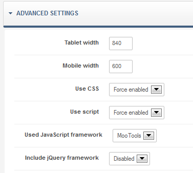
In this section you can change Tablet and Mobile width for the grid – used in the media-queries. Also enable/disable JavaScript libraries or default CSS for this module.
Honestly, not many big Joomla! developers have gone truly Grid system module like we did. But of course, if you have any thoughts or questions please do not hesitate to write your opinion/ideas on our support forum.
Messages
Since version 1.2, we’ve also added a new important element as well – from now on after each change in the grid settings, a prompt reminding you of the need to save the module settings appears. It has been created to prevent situations where someone modifies the module and forgets to save the changes.
Errors and warnings
If one day you will see this message “Error: Specified module position doesn’t exist or is blank!” – it means that you probably made a small mistake. For example you forgot to assign module to this same menu position as The Grid or you made a spelling mistake in the name of the module position.
This article was first published