
H,
Is it possible to show a shorter menu with less items when watching the site on a mobile phone?
Kind regards,
GertJan
Shorter menu when watching site on mobile
Rate this topic: 
- teitbite
- Sun Mar 10, 2013 1:47 pm
- Reply with quote
- Report this post
Hi
Yes You can select a different menu for mobile in template configuration.
Yes You can select a different menu for mobile in template configuration.
-

- Moderator
- GK User
- Sun Mar 10, 2013 7:57 pm
- Reply with quote
- Report this post
teitbite wrote:Hi
Yes You can select a different menu for mobile in template configuration.
Can you tell me exactly where?
I can't seem to find it.... there's a menu-tab but there I can only select one menu (main menu) but I see no option to select something different for mobile devices.
-
- Gold Boarder
- teitbite
- Mon Mar 11, 2013 4:34 pm
- Reply with quote
- Report this post
Hi
Yes You're right. Such option was available with non-responsive templates. I've just looked in wrong template while writing an answer. In this case You can still disable some links with using GK Menu Extra plugin and it's functinality to add class suffixes for menu elements. Than simply add a suffix called "nomobile" to the elements You would like to hide.
Yes You're right. Such option was available with non-responsive templates. I've just looked in wrong template while writing an answer. In this case You can still disable some links with using GK Menu Extra plugin and it's functinality to add class suffixes for menu elements. Than simply add a suffix called "nomobile" to the elements You would like to hide.
-
- Moderator
- GK User
- Tue Mar 12, 2013 9:40 am
- Reply with quote
- Report this post
teitbite wrote:Hi
Yes You're right. Such option was available with non-responsive templates. I've just looked in wrong template while writing an answer. In this case You can still disable some links with using GK Menu Extra plugin and it's functinality to add class suffixes for menu elements. Than simply add a suffix called "nomobile" to the elements You would like to hide.
Hi,
Thanks for the reply. I will try this and let you know if this is the solution for me but I think it will be
Kind regards, GertJan
-
- Gold Boarder
- GK User
- Tue Mar 12, 2013 9:50 am
- Reply with quote
- Report this post
I tried it directly but it does not work.
If I put nomobile in the menu item the item also dissapears from my normal website.
Did I enter it correctly? See screenshot below.
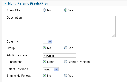
If I put nomobile in the menu item the item also dissapears from my normal website.
Did I enter it correctly? See screenshot below.
-
- Gold Boarder
- teitbite
- Tue Mar 12, 2013 12:52 pm
- Reply with quote
- Report this post
Hi
Yes it's correct. Please show me Your site now so I'll see what is wrong.
Also please add this code to override.css and remember to allow using this file in template settings:
Yes it's correct. Please show me Your site now so I'll see what is wrong.
Also please add this code to override.css and remember to allow using this file in template settings:
- Code: Select all
/* tablet/mobile suffixes */
.notablet {
    display: block;
}
.nomobile {
    display: block;
}
.onlytablet {
    display: block;
}
.onlymobile {
    display: block;
}

@media only screen and (min-width:720px) and (max-width: 985px) {
.onlytablet {
    display: block;
}

.notablet {
    display: none;
}
}

@media only screen and (max-width:719px) {
.nomobile {
    display: none;
}

.onlymobile {
    display: block;
}
}
-
- Moderator
- GK User
- Tue Mar 12, 2013 7:08 pm
- Reply with quote
- Report this post
Added the code to override.css
But still no change > http://178.18.89.213/~madonna/
If you go to Madonna, Biografie..
On the site you see 2012 as the first item.
I have added ' nomobile' to this item but I still see it on my iphone.
But still no change > http://178.18.89.213/~madonna/
If you go to Madonna, Biografie..
On the site you see 2012 as the first item.
I have added ' nomobile' to this item but I still see it on my iphone.
-
- Gold Boarder
- teitbite
- Wed Mar 13, 2013 3:21 pm
- Reply with quote
- Report this post
Hi
Acctualy this element is removed, but in a different menu system In one which got disabled and replaced with a dropdown which is not supporting suffixes.
There is a long shot to check but maybe it will work:
please try it. If this will not work than I can modifie the menu to accept class suffixes in this view.
Acctualy this element is removed, but in a different menu system
In one which got disabled and replaced with a dropdown which is not supporting suffixes.There is a long shot to check but maybe it will work:
- Code: Select all
otpion[value="/~madonna/index.php/madonna/biografie/2012/"] {
display: none;
}
please try it. If this will not work than I can modifie the menu to accept class suffixes in this view.
-
- Moderator
- GK User
- Fri Mar 15, 2013 2:26 pm
- Reply with quote
- Report this post
Hi again!
Where do I put the last piece of code?
Where do I put the last piece of code?
-
- Gold Boarder
- teitbite
- Sat Mar 16, 2013 1:42 pm
- Reply with quote
- Report this post
Hi
This still should go into the override.css but I've made a typo, should be "option" instead of "otpion". Sorry.
This still should go into the override.css but I've made a typo, should be "option" instead of "otpion". Sorry.
-
- Moderator
- GK User
- Mon Mar 18, 2013 9:57 am
- Reply with quote
- Report this post
teitbite wrote:Hi
This still should go into the override.css but I've made a typo, should be "option" instead of "otpion". Sorry.
 it's still not working....
-
- Gold Boarder
- teitbite
- Mon Mar 18, 2013 5:04 pm
- Reply with quote
- Report this post
Hi
It was just a guess anyway. Got another idea. Try this code:
It was just a guess anyway. Got another idea. Try this code:
- Code: Select all
#gkMobileMenu select option:nth-child(10) {
display: none;
}
-
- Moderator
- GK User
- Tue Mar 19, 2013 1:59 pm
- Reply with quote
- Report this post
teitbite wrote:Hi
It was just a guess anyway. Got another idea. Try this code:
- Code: Select all
#gkMobileMenu select option:nth-child(10) {
display: none;
}
Hi!
Thanks for the efforts... this code is also not working.
-
- Gold Boarder
- teitbite
- Tue Mar 19, 2013 3:49 pm
- Reply with quote
- Report this post
Hi
Are You sure it's not working ? Biography option is not there anymore
Are You sure it's not working ? Biography option is not there anymore
-
- Moderator
15 posts
• Page 1 of 1