Events - Customization Manual
Usage Guide
Events Customization
Since the Events theme moves many of the options that were historically in our widgets or theme settings to the Theme Customizer and pages, there are many changes to be aware of to ensure that you are able to customize the theme to your liking. In this guide, we will be looking at the new features added into the Theme Customizer, how the page-based areas of the theme work, such as the frontpage, event, speakers and sponsor pages, as well as answering some basic customization questions to help you amend the theme to match your requirements.
Theme Options
The Theme Customizer includes a huge set of options for making your site unique with just a few clicks. Each option is discussed at length below.
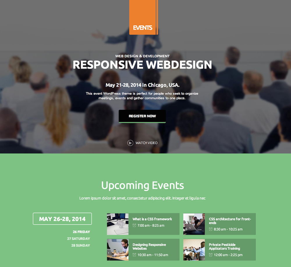
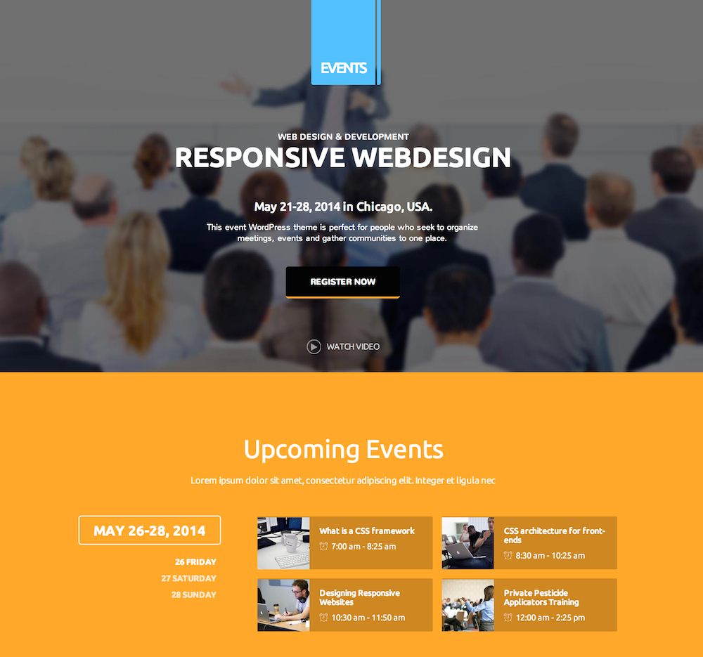
Colors
The colors section allows you to set the color of various theme elements as you wish from the many available in the customizer. There are a total of four sections that may be modified:
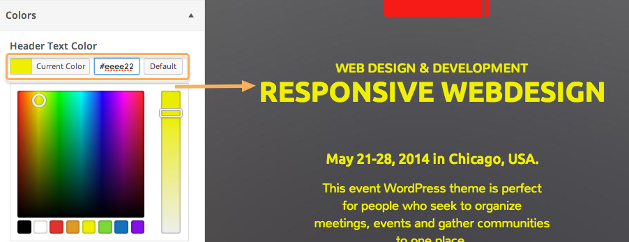
Header Text Color - This option defines the color of the text in the header of the frontpage only.
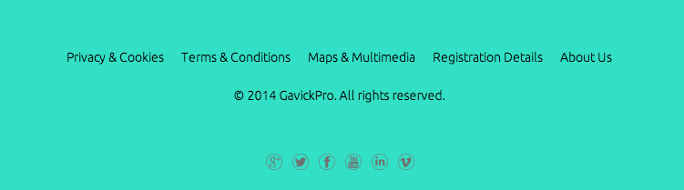
Background Color - This option sets the color of the background, which is visible in the footer of the theme on all pages.
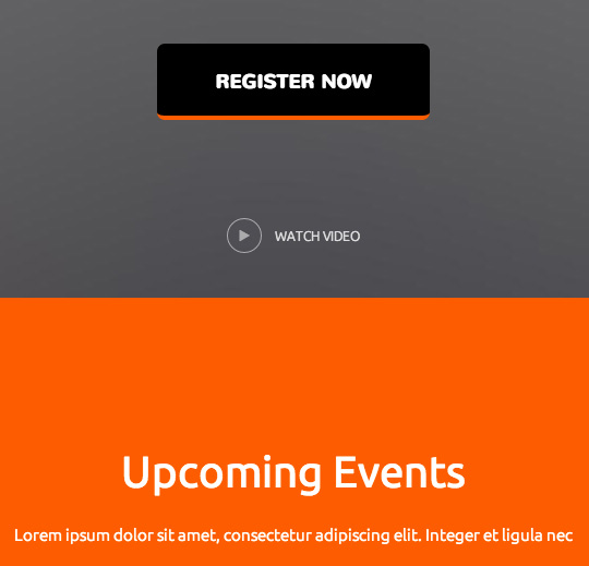
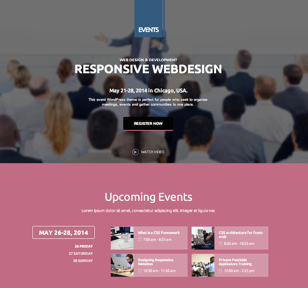
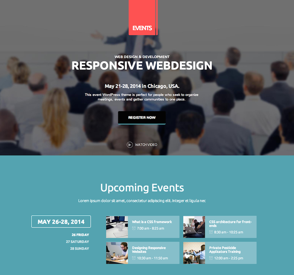
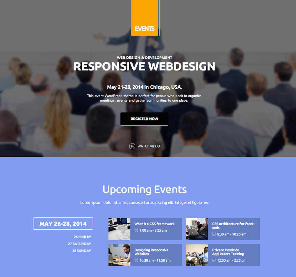
Primary Color - The primary color defines primary page elements such as the background color of the Upcoming Events section on the homepage, and the color of buttons and other typography elements.
Secondary Color - The secondary color defines other page elements such as the logo background color and the menu on-hover color.
There is one further option in this section; Upcoming events items background color. This option controls whether the blocks that display the event name and timing in the Upcoming Events section are highlighted using a color that is lighter than the primary color, or darker. For example, if you set your primary color to a dark blue and select "Lighter than background" in the drop-down list, then the block will be a lighter shade of blue to help them stand out:
We have also prepared six recommended color variations to help you achieve a solid color style that compliments the content well; why not give them a try if you aren't comfortable setting your own colors?
Suggested Color Schemes
Primary color: #00bcf2
Secondary color: #f21b23
Upcoming events items background color: Lighter than background
Primary color: #7fc085
Secondary color: #eb8038
Upcoming events items background color: Darker than background
Primary color: #ffa73b
Secondary color: #59c2ff
Upcoming events items background color: Darker than background
Primary color: #c06c84
Secondary color: #355c7d
Upcoming events items background color: Lighter than background
Primary color: #56a3b0
Secondary color: #fa5456
Upcoming events items background color: Lighter than background
Primary color: #809eed
Secondary color: #fca51d
Upcoming events items background color: Darker than background
Header Image
The Header Image section lets you set the image to be used as the background in the header. To add your own image, simply click on the Add new image button to open the Choose Image screen. You may then upload your header image, or click on the Media Library tab to select an image that you have already uploaded.
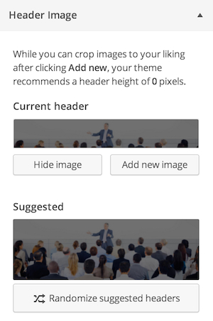
Once an image has been uploaded and selected, click on the Select and Crop button in the bottom right of the screen.
There should be no need to crop your image, so click on the Skip Cropping button on the bottom right.
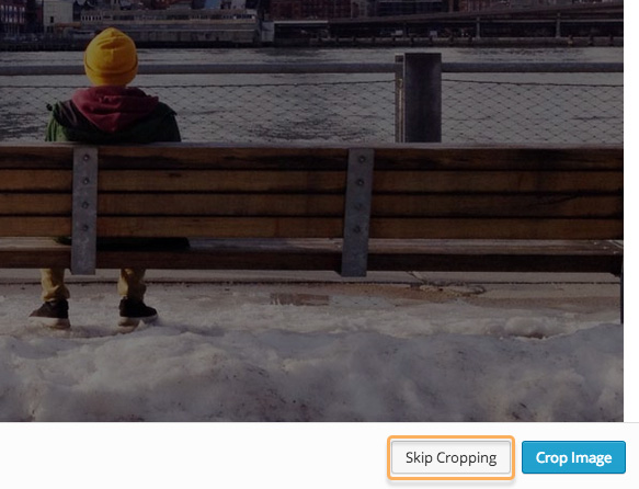
Your header background image is now set.
Background Image
If a background image is set then it is used in the footer of the theme, where the copyright information and social icons are.
Navigation
This section allows you to assign menus to the menu positions in the theme; you may modify the assigned menus in the Appearance → Menus section of your WordPress backend.
Static Front Page
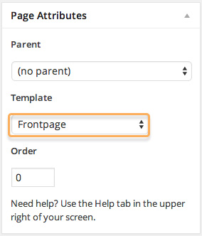
In this section you can specify the page that should be used as the frontpage of your site. This needs to stay set to a page with the Frontpage template assigned to it; more information regarding this may be found later in this guide.
Font options
Here you may set the fonts used in the theme; either a standard font or a Google font. There are two font areas to be chosen; one for the headers and titles of the theme, and another for the body, or content.
Using a Google Font
Using a Google font in Events is easy; just follow these steps:
- Navigate to to Google Fonts website.
- From the list of fonts, select the one you wish to use and click the Quick Use icon.
- Select the styles and character sets you wish to use for the font by clicking the tickboxes next to each.
- In the Add this code to your website section, copy only the font URL from the link element.
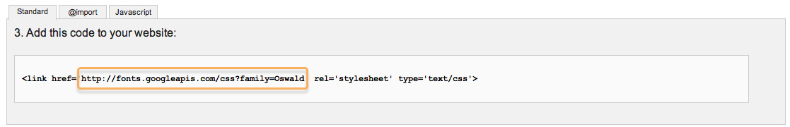
- In the Appearance → Customize → Font options section of your WordPress backend, select Google Font in the drop-down list for the section you wish to use (either Header Font or Body Font).
- Paste the copied URL into the Google Font URL for Header/Body field; after a moment the live preview will update to show you how your site looks with the new font.
- Click the Save & Publish button to save changes.
The font has now been set as needed, and you will see the changes in the live preview window.
Using a Standard Font
The standard fonts available may be seen and selected in the Header Font or Body Font drop-down list; under the initial Google Font option are a list of standard fonts, so if you wish to use one of these fonts you may simply select it from the list, and the live preview will updated accordingly.
Default font configuration
Body font
Google Font
//fonts.googleapis.com/css?family=Ubuntu:300,400,500,700
Selectors:
body,
input,
button,
select,
textarea,
.btn-video
Header font
Google Font
//fonts.googleapis.com/css?family=Nunito:400,700,300
Selectors:
#gk-header-mod p,
#gk-header-mod .big-btn
Layout
The layout options allow you to control the theme width across all display sizes. Each width setting for responsive displays, which includes the Theme Width, Tablet Width, Small Tablet Width and Mobile Width options, all define their sizes in pixels (px). The theme has our recommended widths already set, but you are free to modify these should you have a preferred width in mind for your site.
Sidebar options
Note: The sidebar area uses no widgets in our demo content except on one specific demo page ("Widget Styles") which is not part of the main content. As such, the sidebar does not appear on any page; you will need to add widgets to the sidebar to see the effects of these options.
The Sidebar Width option works slightly differently to the other options in this section. Rather than being expressed as a number of pixels, it is instead expressed as a percentage.
For example; if you set the Theme Width to 1000 pixels, and then set the Sidebar Width to 25%, then the sidebar will be 250 pixels wide, as 250 is 25% of 1000. The standard width setting is 26, but feel free to make this larger or small depending on your site's aesthetics. It is of course recommended that you keep the width far under 50%; your main site content should always be the star!
The other sidebar option, Sidebar Position, allows you to decide whether the sidebar's widgets appear on the left or right of the main page content. This option should be set entirely according to your preference. Remember that the sidebar widget area needs to have widgets to display before the sidebar will appear.
Features
The features section includes options that do not fit into the other sections, including social, logo and copyright options. The options available, and their functions, are as follows:
- Upload a logo - This option allows you to upload an image to be used as a logo, replacing the red block with "Events" written across it that makes up the default CSS logo. Images uploaded will be automatically resized to fit the space provided, but if the logo is much wider than it is tall then some CSS changes may be required for best results. If no image is selected or uploaded, then the default logo defined in the CSS code is used. More information about customizing the logo may be found later in this guide.
- Use Scroll Reveal - scrollReveal.js is a Javascript library created by Julian Lloyd that is used to create reveal animations; as you scroll down the page, each element animates into place. If you do not wish to use these animations, or are defining your own animations, then untick this option to disable the scrollReveal.js script.
- Display Related Posts - Each post's page in the Events theme includes an area above the comments where posts related to the post currently being read are displayed as thumbnails with titles.
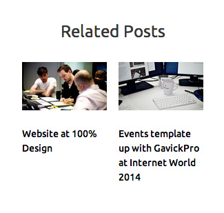
If you do not want this area to appear on your site, untick this option.
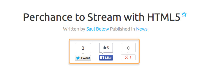
- Post Social Icons - Sets whether Facebook, Twitter and Google+ Share and Like buttons appear at the top of each post's page under the title.
- Page Social Icons - Similar to the above, this option decides if the share buttons appear on pages, rather than posts.
- Speaker Page Social Icons - Events includes a special Speaker page template, that is different from the standard pages. This option decides if the social icons should appear on these custom pages too.
- Sponsor Page Social Icons - The Sponsor page, like the Speaker page, displays information about a specific event sponsor. This option sets whether social icons appear on this custom page.
- Event Page Social Icons - The Event page is another custom page template that displays information about a specific conference or event within your schedule. If you would like users to be able to share or like these specific pages, then leave this option ticked.
- Date Format - This option sets whether dates are displayed in the theme-specific way, or in the standard WordPress way. In Events, the theme date format reads "Mon 14 Jul, 2014", whereas the standard WordPress version would use "July 14, 2014" without the day or shortened month name.
- Copyright Text - Decides what copyright text should appear at the bottom of all pages. You can replace the existing text with your own, or remove it entirely by leaving the field blank.
Features Based on Pages
There are 4 areas that are based entirely on the page/subpage structure in the Events theme; the frontpage, events, speakers, and sponsors. Each of these sections uses a similar layout; a base page is created for the particular section with a special page template selected that defines the page as frontpage, event, speaker or sponsor, and then subpages are added to create new items of that type (a new speaker, a new conference or speech at your event etc...).
For the frontpage, shortcodes are used in the subpages to display these areas. For example, the event-specific shortcode will display an agenda of your event, with tabs to allow users to scroll between different event days. Other areas of the frontpage are created using custom HTML in the subpages.
Over the course of this section, we'll look at the structure for each area of the Events theme, and cover the creation of the base page and subpages. If you are looking for information on the shortcodes used on the frontpage to display the information from these pages, then you should check the Frontpage section of this guide, which explains the shortcodes used in each section of the frontpage.
Events Pages
If you wish to use a shortcode to display your event information on the frontpage, it is important that you are aware of how an event is managed in this theme, using pages. An example of the demo content's Event page structure is below:
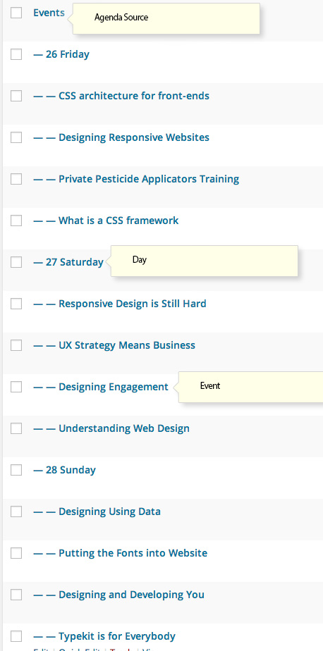
First, a page is created using either the Events List or Events List with Pictures page template; in the demo content the page is called "Events".
This page acts as the base for the event and will list the individual seminar or conference details that are added via subpages. A first-level subpage will act as a divider for your individual seminars; for example, in the demo content the "Events" page has three subpages that use the different dates of the event, so that the three days of the event appear as three different tabs on the frontpage.
Finally, second-level subpages are added to the date subpages; these second-level pages define the particular seminars, conferences or other meetings occurring on that date, with the start time, venue and speaker information.
Creating the Events Base Page
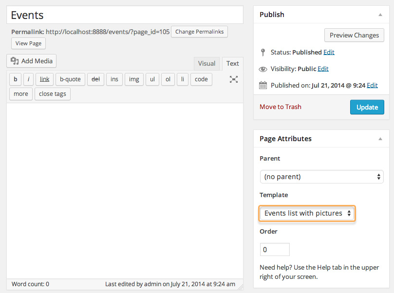
The base page that is used for Events is a normal page, but with a special page template selected. To create an Events page; in your WordPress backend click on Pages → Add New to be taken to the Add New Page screen.
In the title field, give your page a name. This name will not be displayed on the frontend; it is purely for your benefit so make sure to name it something that is easy for you to identify!
Leave the mainbody of the page blank. In the right sidebar you will see a box labelled Page Attributes. In the drop-down list for the Template option, select either Events List or Events List with Pictures. Both of these pages will display the content from the subpages, but the Events List with Pictures will also display the featured images for the individual event pages.
Now click on Publish to publish the page to the frontend.
Creating the Date pages
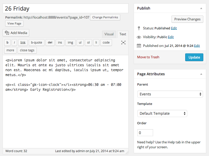
Now you have the event page created, you need to decide how the event will be split up. In the demo content the event is split up into days, with each day hosting different events.
To create these subpages, click on Pages → Add New in your WordPress backend as before. Now, enter a title that you would like to appear as a divider for your event. For example, if you wanted to split your event list by date, then enter the first date of your event as the title.
Now you need to assign the Events page as the parent of your date page. This option is in the Page Attributes section in the right sidebar. In the drop-down list for the Parent option, select your Events page.
You may add content to this page, and it will be displayed in full in the Events List page. It is a good idea to keep the content to a minimum, such as the day's overall start and end times, or mention where attendees should go to at the start of the day.
Creating the Individual Event Pages
With the base event page and the date pages created, you can create the individual seminar or conference pages that detail the particulars of each stage of your event. For example, you may have a morning session and an afternoon session on each day, or hour-long seminars throughout each day. For each session or seminar, you can create a separate page to provide event details and registration links.
To create the event subpage, click on Pages → Add New in your WP backend. As with the Date pages, we need to assign this new page a parent; this should be the day that the event is occurring on. For example, if you've separated your event into dates, then the parent of this page should match the date the event is taking place on. The parent may be set in the Parent drop-down list in the right sidebar, as before.
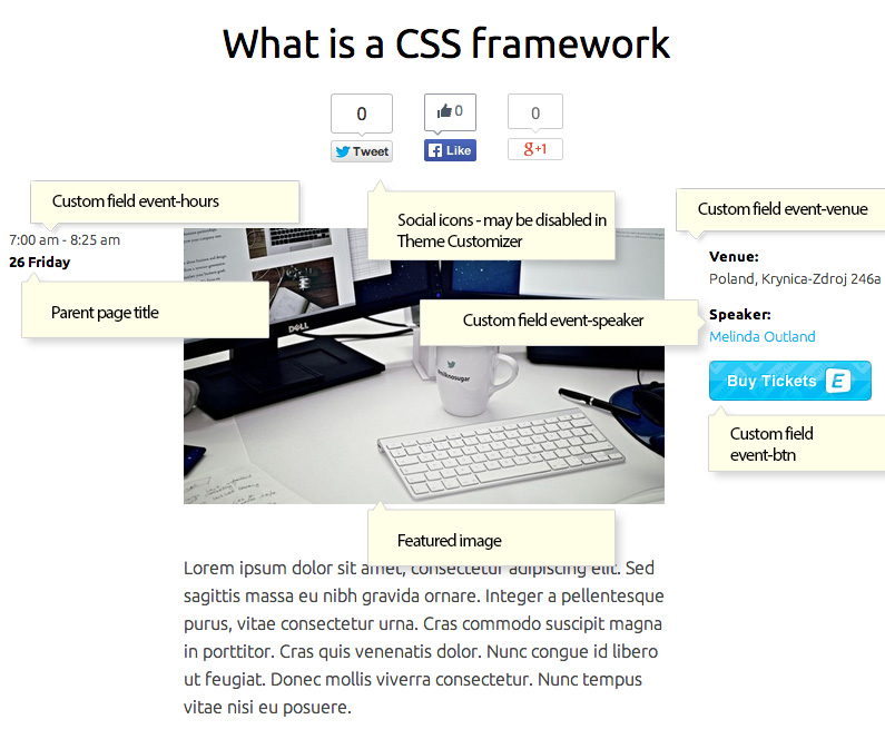
In the title field, type the name of your individual event or seminar. In the body of the page you can provide more in-depth details. The individual event pages also include some custom fields to display additional information about your event, such as the speaker, timing, venue and more.
Enabling Custom Fields
The custom fields available in the event pages are not essential, but they can provide more information about your event and may be displayed on the frontpage. For example, a page with a custom field to provide the timing of the event will have its timing displayed on the frontpage in the Upcoming Events section, whereas an event without this timing will be blank in that area. It is entirely down to personal preference whether each field is utilized or not though.
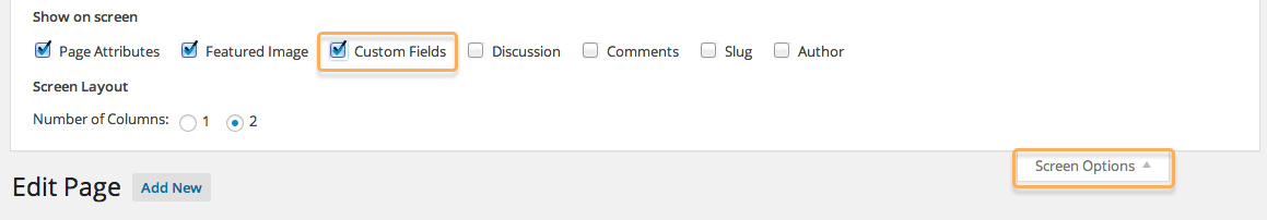
To add a custom field you will first need to enable them in the screen options. When on the Edit Page or Add New Page section of your WordPress backend, click on the Screen Options button at the top of the screen to open a list of tickboxes, and add a tick next to Custom Fields.
The custom field area will now appear underneath the mainbody of the edit screen, ready for you to make changes to.
Custom Fields Used in the Events Pages
There are four custom fields that are displayed on the event page, as follows:
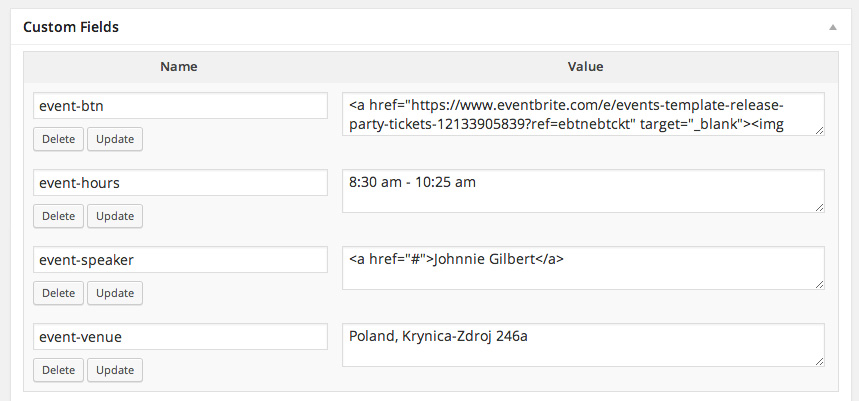
- event-hours - Use this to set the timing of the event; this appears on the left on the event screen, and also in the event list and upcoming events area on the frontpage.
- event-venue - This sets the venue of the event, which will be displayed on the right of the event page and on the event list.
- event-speaker - This sets the name of the speaker at the event, which will be displayed on the right of the event page and in the event list.
- event-btn - This area is used for displaying the Eventbrite "Buy Tickets" button that appears on the right of the event page.
Adding Your Own Custom Fields
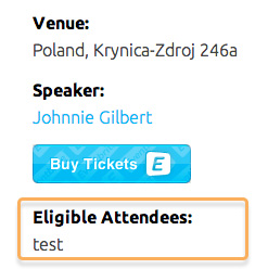
If you have additional information that you wish to add about the event; perhaps only certain attendees have access, or there are separate groups for each event, then you can add your own custom fields to the event pages so that the additional information is clearly labelled and displayed on the right side of the event page.
When creating the custom field, you should use the following syntax:
event-customFieldLabel
Where customFieldLabel is the name you want displayed next to the custom field. The hypens in the custom field name will be converted to spaces, and each new word after a hyphen will be capitalized. However, the event- prefix will not be displayed at all.
For example, a custom field named:
event-eligible-attendees
Will appear on the page as:
Eligible Attendees:
To create a new custom field:
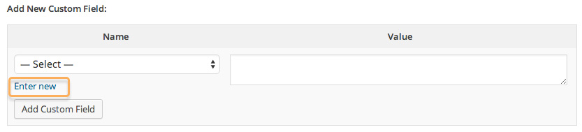
- Ensure that Custom Fields are enabled in the Screen Options by clicking on the Screen Options button at the top of the screen.
- In the Custom Fields section of the Edit Page screen, look for the Add New Custom Field section and click on Enter new.

- Enter the Name of your custom field as per the guidelines above, then add your content to the Value column.
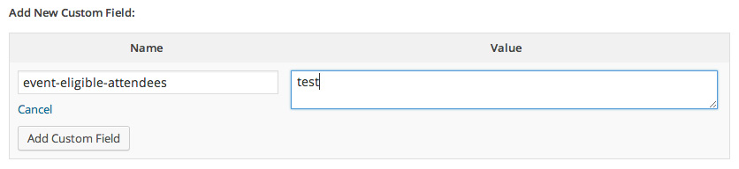
- Click on the Add Custom Field button to finish.
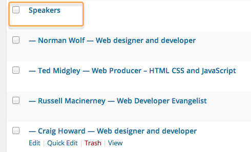
Speaker Page Structure
Like the Event pages, a base page is created for your speakers that will generate a list from its subpages, and subpages are added to the base page with further details. However, unlike the Event pages, there is only one level of subpages. An example of the structure can be seen in this image:
A base page is created with a special Speakers List template selected, and speaker pages with custom fields especially for speaker details are added as subpages to this base page to create the structure for the shortcode to display.
Creating the Base Speaker Page
To create the base speaker page, we need to create a new page and assign the correct template.
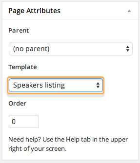
First, click on Pages → Add New in your WP backend to open the Add New Page screen. Then, in the Page Attributes section in the right sidebar, change the drop-down menu setting to Speakers list.
You may also add some content, such as a brief introduction to the speakers area or mentioning the range of experience that they cover etc... there is no limit to the amount of content you may add, but remember that when the user visits the Speaker List page they will see all of the page content along with the content from the Speaker pages, so be careful not to overstuff the page with content.
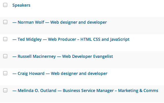
This page will now act as the base for your speakers, and if visited, it will list the speaker details from its subpages:
Creating Individual Speaker Subpages
Now that you have a base speaker page, you need to add a new subpage to this base page for each speaker in your event. In your WP backend, click on Pages → Add New in the left menu to open the Add New Page screen.
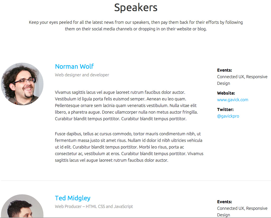
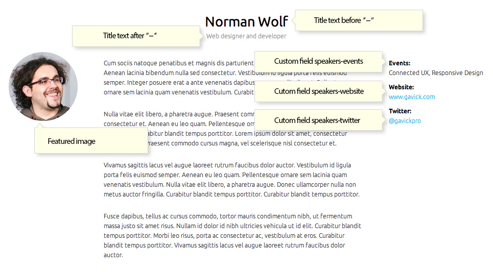
The Title field is used to create both the title, which should be the name of your speaker, and subtitle, which should be your speaker's profession, on the speaker page. The name is written first, then a double-hyphen separator, then the job title. For example, a speaker named Helen Jones, who is a Web Developer, would have the following title:
Helen Jones -- Web Developer
You should also set a Featured Image, which will be displayed as the speaker's headshot on the frontpage and speaker subpage.
Now, you need to set the Parent page and the Page Template. These options are found in the right sidebar under the Page Attributes section. In the drop-down list for the Parent option, select your base Speaker page. In the drop-down list for the Page Template option, choose Speaker.
You can now add content to the mainbody. If you add a readmore to the page, then all the text up to the readmore will appear on the Speaker list page, rather than the whole text; this can be useful if your speaker pages are content-heavy.
Custom Fields in the Individual Speaker Subpages
There are three custom fields available in the Speaker pages; you will need to enable Custom Fields in your Screen Options by clicking on the Screen Options button at the top-right of the screen and adding a tick in the tickbox next to Custom Fields.
The available custom fields are:
- speaker-events - This custom field will be used to display the events the speaker will be appearing at or contributing to.
- speaker-twitter - This custom field contains a link tag with a URL to the speaker's twitter account.
- speaker-website - This custom field contains an link tag with a URL to the speaker's website.
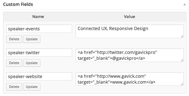
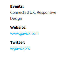
You may see how the custom fields are placed on the speaker page in the below image:
Adding Your Own Custom Fields
Just like the event pages, you can add your own custom fields that will be displayed on the speaker pages on the right-hand side.
When creating the custom field, you should use the following syntax:
speaker-customFieldLabel
Where customFieldLabel is the name you want displayed next to the custom field. The hypens in the custom field name will be converted to spaces, and each new word after a hyphen will be capitalized. However, the speaker- prefix will not be displayed at all.
For example, a custom field named:
speaker-speaker-specialization
Will appear on the page as:
Speaker Specialization:
To create a new custom field:
- Ensure that Custom Fields are enabled in the Screen Options by clicking on the Screen Options button at the top of the screen.
- In the Custom Fields section of the Edit Page screen, look for the Add New Custom Field section and click on Enter new.
- Enter the Name of your custom field as per the guidelines above, then add your content to the Value column.
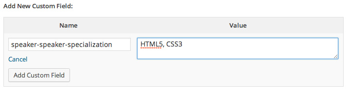
- Click on the Add Custom Field button to finish.
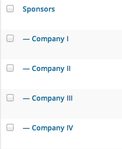
Sponsor Page Structure
As with the Speaker pages, a base page is use with a special Sponsors Listing template selected to list the content of subpages. Then, subpages are added with the Sponsor information and logo, so that it may be displayed on the frontpage.
Creating the Base Sponsor Page
As with the other base pages, we need to create a new page, and assign the correct Page Template to it.
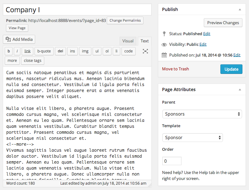
Click on Pages → Add New Page in your WordPress backend to be taken to the Add New Page screen. Set the title to whatever you wish to name the section, as the title will appear on the frontend. In the Page Attributes section in the right sidebar, set the Page Template drop-down list option to Sponsors Listing.
You may add some content to the mainbody of the page if desired; this will be displayed at the top of the listings when a user navigates to the page.
Creating the Individual Sponsor Subpages
With the base sponsors page created, you may now add subpages to this page to create the individual sponsor subpages. In the WP backend, click on Pages → Add New in the left menu to open the Add New Page screen. Add your title to the title field; this should be the company name as it is what will be displayed in the sponsor listings.
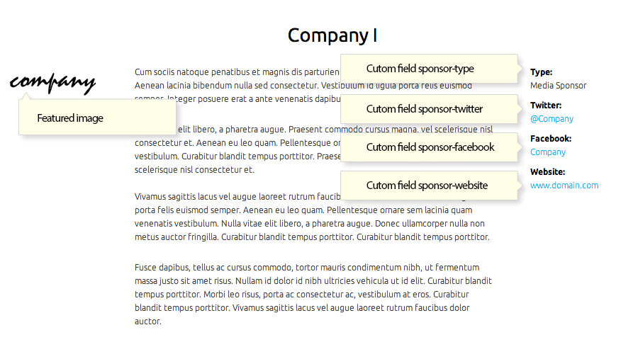
As with the Speaker pages, you may add content to the page as you see fit, providing details of the sponsor. By adding a readmore, you can limit how much of the subpage is displayed in the listing should you have content-rich sponsor pages and don't wish to display the whole subpage content in the listings. Make sure to set a Featured Image in the right sidebar; this should be the sponsor logo as it will be displayed on the frontpage.
In the Page Attributes section in the right sidebar, set the Parent option to your Base Sponsor Page, and set the Template option to Sponsor; this ensures that the custom fields are displayed properly like in the demo content.
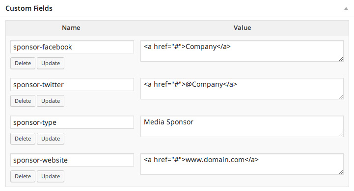
Custom Fields in the Individual Sponsor Pages
There are a total of four Custom Fields available in the Sponsor pages; remember to make sure that Custom Fields is enabled in the Screen Options, available by clicking the button at the top-right of the screen.
- sponsor-facebook - This custom field contains a link tag with a URL to the company Facebook page.
- sponsor-twitter - This custom field contains a link tag with a URL to the company Twitter page.
- sponsor-type - This custom field lets you define the sponsor type, if needed.
- sponsor-website - This custom field contains a link tag with a URL to the company website.
Adding Your Own Custom Fields
If you have additional information that you wish to add about the event; perhaps only certain attendees have access, or there are separate groups for each event, then you can add your own custom fields to the event pages so that the additional information is clearly labelled and displayed on the right side of the event page.
When creating the custom field, you should use the following syntax:
sponsor-customFieldLabel
Where customFieldLabel is the name you want displayed next to the custom field. The hypens in the custom field name will be converted to spaces, and each new word after a hyphen will be capitalized. However, the sponsor- prefix will not be displayed at all.
For example, a custom field named:
sponsor-sponsor-level
Will appear on the page as:
Sponsor Level:
To create a new custom field:
- Ensure that Custom Fields are enabled in the Screen Options by clicking on the Screen Options button at the top of the screen.
- In the Custom Fields section of the Edit Page screen, look for the Add New Custom Field section and click on Enter new.
- Enter the Name of your custom field as per the guidelines above, then add your content to the Value column.
- Click on the Add Custom Field button to finish.
Frontpage
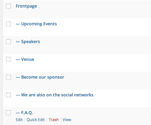
Like our Storefront theme, the frontpage is created using a page as a base, with subpages providing the additional content.
In the demo content, the Frontpage page is used as a base, and contains the HTML content used in the header (the image is set in the theme settings).
Any page you create may be used as the frontpage; all that is required is that the page uses the Frontpage template (this is set in the Template option in the right sidebar of the Edit Page screen), and that the set frontpage has subpages to use for creating the other frontpage content.
Any subpages that are added to the Frontpage will be used to create the content under the header, with each new subpage adding another section to the page. For example, if you do not add any subpages to the frontpage, then your homepage will consist of only the header. However, if you add a subpage that uses the FAQ section to the frontpage, then your homepage will include the header and FAQ section. The next subpage you add will have its content displayed under the FAQ section, and so on.
So, to create your frontpage, you need to create a frontpage that uses the Frontpage template, then add subpages with the content you want displayed to the frontpage. Each section in the demo content uses HTML code to display information, or uses shortcodes to pull event, schedule, speakers or sponsor information from their respective pages and subpages.
The following sections will provide details on how each section works individually, and how you may customize each area to your liking.
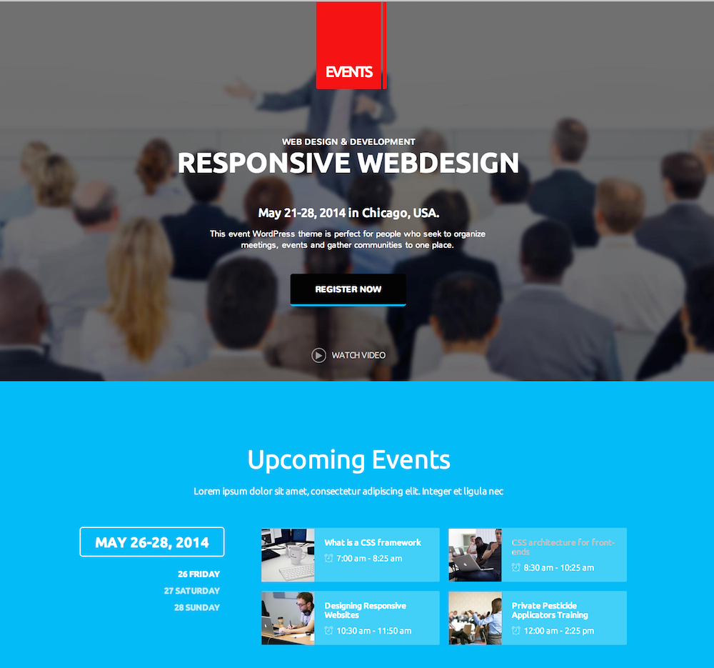
The Header Section
The header section displays an image with text and buttons overlaid. The background image is set in the theme options; check the Theme Options section for more information.
Header Structure
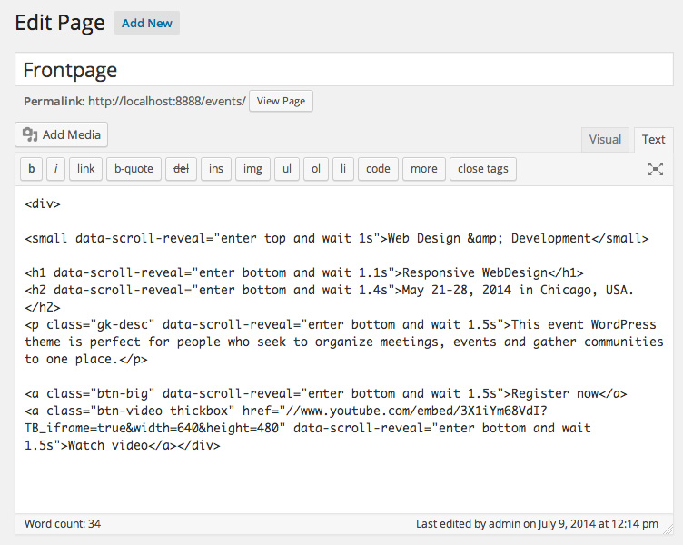
The header image is set in the theme options, but the text and buttons is created using HTML code in the body of the Frontpage of the theme, so if you wish to modify it you will need to click on Pages → All Pages in your WordPress backend to be taken to the list of pages, then click on the page that you have defined as the Frontpage (in the demo content it is simply named "Frontpage"); you will see that it has HTML code as the content.
The text itself is made up of a number of HTML tags with some special classes to provide buttons or overlay pop-ups for videos.
The basic structure of the page in the demo content is as follows:
<div>
<small data-scroll-reveal="enter top and wait 1s">Web Design & Development</small>
<h1 data-scroll-reveal="enter bottom and wait 1.1s">Responsive WebDesign</h1>
<h2 data-scroll-reveal="enter bottom and wait 1.4s">May 21-28, 2014 in Chicago, USA.</h2>
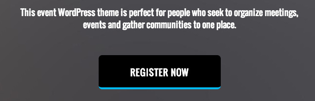
<p class="gk-desc" data-scroll-reveal="enter bottom and wait 1.5s">This event WordPress theme is perfect for people who seek to organize meetings, events and gather communities to one place.</p>
<a class="btn-big" data-scroll-reveal="enter bottom and wait 1.5s">Register now</a>
<a class="btn-video thickbox" href="//www.youtube.com/embed/3X1iYm68VdI?TB_iframe=true&width=640&height=480" data-scroll-reveal="enter bottom and wait 1.5s">Watch video</a>
</div>
Changing the Text Above the Register Now Button
The text elements of the header are created with a mixture of <small>, <h1>, <h2> and <p> tags. Each of these elements has special CSS code just for the header to add extra stylization and spacing to the text.
If you wish to use the exiting layout but with your own text, then you need only change the text between the <small> tags to your subtitle, the <h1> text to your title, the <h2> text to your event date and location, and the <p> text to your short information about the event:
<div>

<small data-scroll-reveal="enter top and wait 1s">Event subtitle here</small>

<h1 data-scroll-reveal="enter bottom and wait 1.1s">Event title here</h1>
<h2 data-scroll-reveal="enter bottom and wait 1.4s">Event date and location here</h2>
<p class="gk-desc" data-scroll-reveal="enter bottom and wait 1.5s">Description of the event here</p>

<a class="btn-big" data-scroll-reveal="enter bottom and wait 1.5s">Register now</a>
<a class="btn-video thickbox" href="//www.youtube.com/embed/3X1iYm68VdI?TB_iframe=true&width=640&height=480" data-scroll-reveal="enter bottom and wait 1.5s">Watch video</a>

</div>
If you'd like to rearrange the text in this area entirely, then you will need to be aware of the effect of each tag.
The <small> tag creates a small title that uses capital letters only; any lower-case letters between these tags are changed to upper-case. The <h1> tags creates a large title. As with the <small> tags, content in this tag will be upper-case only.
The <h2> tag's text is slightly larger than the <small> tag's content, but it displays both upper-case and lower-case lettering.
The <p> tag works as you would expect; creating basic text with both upper-case and lower-case letters shown as normal. A special class is added to differentiate this <p> from others in the CSS code; gk-desc. This class uses a slightly larger font-size in order for it to fit more comfortably with the other header content.
By combining these tags in different layouts, you can arrange the text above the register button to your liking. There is no requirement with regards to which tags are used where, so feel free to use 3 <small> tags if that is the kind of content you want!
You may be wondering about the data-scroll-reveal attribute that appears in most of the tags; this defines the reveal animation for that element. This animation can be disabled in the theme settings, or more information may be found in the Reveal Animations section of this guide.
Adding or Changing the Register Now Button
The button that contains the "Register Now" text is created with an <a> tag with a special class to create the button with CSS; btn-big. To change the text of the button you only need to change the text between the tags, without changing the class or data-scroll-reveal attributes:
<a class="btn-big" data-scroll-reveal="enter bottom and wait 1.5s">Your button text here</a>
Adding a New Button
To add a new button, you should copy the existing <a> tag's content; by matching the class you create the button, and by matching the data-scroll-reveal attribute you preserve the reveal animations.
<a class="btn-big" data-scroll-reveal="enter bottom and wait 1.5s">Your first button text here</a>
<a class="btn-big" data-scroll-reveal="enter bottom and wait 1.5s">Your second button text here</a>
You may use multiple buttons in your header content, but bear in mind that they are quite large with a lot of padding, so they should be kept to a minimum if possible to preserve the header's aesthetics.
Removing a Button
To remove the button, you need only delete the entire opening and closing <a> tag and all the content between them.
Adding a Link
By default no URL is provided in the demo content for the button to link to; clicking on the button does nothing. However, we can easily have the button link to another page on our site or an external site by adding an href attribute. This attribute defines a URL for the button to link to, and should be added in the opening <a> tag.
<a class="btn-big" href="Your link here" data-scroll-reveal="enter bottom and wait 1.5s">Your first button text here</a>
Changing the Watch Video Text and Link
The Watch Video text, icon and link are defined in a single <a> tag with a special class that enables the linked video to appear in an overlay pop-up:
Changing the Text
The change the text that appears after the icon you should change the text between the opening and closing <a> tag:
<a class="btn-video thickbox" href="//www.youtube.com/embed/3X1iYm68VdI?TB_iframe=true&width=640&height=480" data-scroll-reveal="enter bottom and wait 1.5s">Your text here</a>
Changing the Link
To change the video that is linked to in this area, you will need to change the href attribute to point to your video; to do that, you will need the embed code for the video.
Popular video sites such as Youtube and Dailymotion include embed URLs for their videos. To get the embed code:
Youtube - Open your browser to the video you wish to embed, then click on the Share button underneath the video, then click on Embed in the tabs under the Thumbs Up and Thumbs Down buttons. A box will open with the full embed code, but we only need the URL from the src parameter.

Copy this URL and paste it into the href parameter in the HTML code on your Frontpage.
Dailymotion - Open the video's page that you want to embed, and click on the Export button under the video. Two options will appear; Permalink and Get embed code.
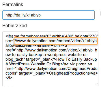
Copy the URL from the src parameter and paste it into your page's href parameter on your Frontpage.
Now that you have the embed code, we must add some additional text to the end of the code to make it open correctly in the overlay. Copy and paste this code:
?TB_iframe=true&width=640&height=480
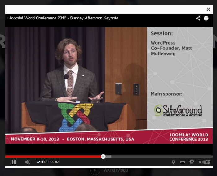
On to the end of your embed URL in the href parameter. For example, if I wanted to embed the Joomla World Conference 2013 keynote, I would copy the video embed URL, which is:
//www.youtube.com/embed/V3_WLFvoIxc
And paste it into the <a> tag's href parameter:
<a class="btn-video thickbox" href="//www.youtube.com/embed/V3_WLFvoIxc" data-scroll-reveal="enter bottom and wait 1.5s">Watch Video</a>
Then add the additional piece of code to the end of the URL:
<a class="btn-video thickbox" href="//www.youtube.com/embed/V3_WLFvoIxc?TB_iframe=true&width=640&height=480" data-scroll-reveal="enter bottom and wait 1.5s">Watch Video</a>
The video will now open within the overlay when the Watch Video icon or text is clicked.
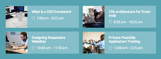
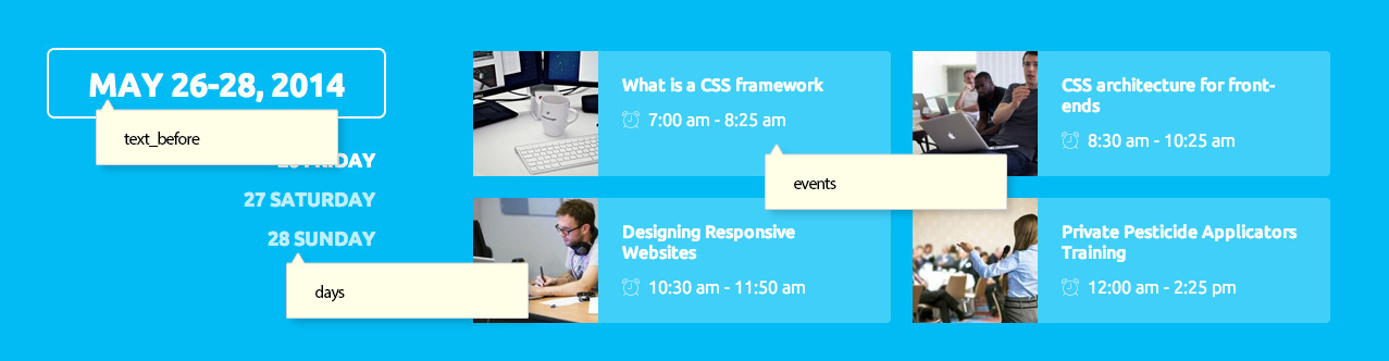
The Upcoming Events Section
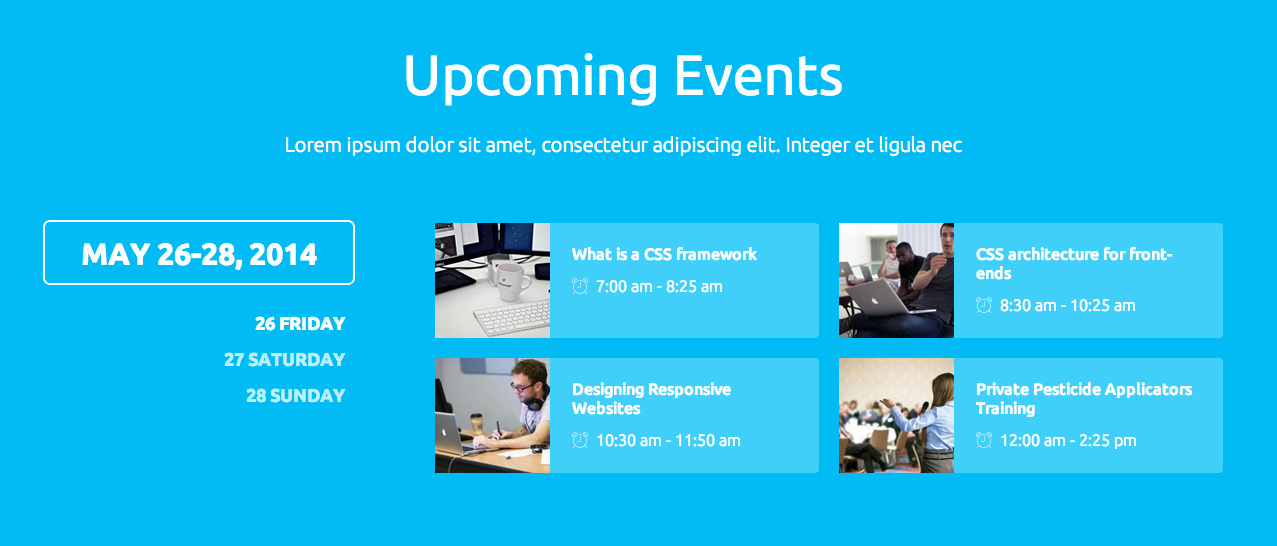
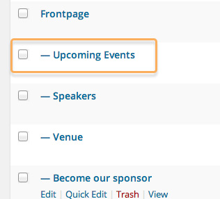
The upcoming event section is created via a subpage of the Frontpage; to amend it you should open the Pages → All Pages section of your WP backend and click on the first subpage of the frontpage; in the demo content this is called Upcoming Events.
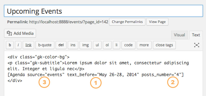
This page uses some simple HTML with <div> tags to create the color background, with <p> tags providing the subtitle text. A shortcode is added at the end of the content to pull details from the event pages and display it as an agenda, with tabs to allow users to select different dates and see the events running on that day.
The basic structure of the page code looks like this:
<div class="gk-color-bg">
<p class="gk-subtitle">Lorem ipsum dolor sit amet, consectetur adipiscing elit. Integer et ligula nec</p>
[Agenda source="events" text_before="May 26-28, 2014" posts_number="4"]
</div>
Changing the Title and Subtitle
The majority of the content in the Upcoming Events section is created by the shortcode, however there are two elements that appear in the HTML code that can be modified; the title and the subtitle of the section.

Changing the Title
The title that is displayed at the top of the section is taken from the page title. To change it, click on Pages → All Pages in your WP backend and find your Upcoming Events page; in the demo content this is called Upcoming Events and is the first subpage of the frontpage.
Click on the page name to be taken to the Edit Page screen. Here, you can simply change the text in the Title field, and this will change the title of the section on your frontpage.

Changing the Subtitle
The subtitle that appears underneath the title of the section is created in the HTML content of the Upcoming Events page in the <p> tags.
<p class="gk-subtitle">Lorem ipsum dolor sit amet, consectetur adipiscing elit. Integer et ligula nec</p>
It uses a special class, gk-subtitle, for its CSS rules. To change the subtitle text, modify the content between the tags:
<p class="gk-subtitle">Your subtitle here</p>
It is not necessary to include a subtitle, so you may delete this HTML code should you wish to just use the title and shortcode:
<div class="gk-color-bg">
[Agenda source="events" text_before="May 26-28, 2014" posts_number="4"]
</div>
How the Agenda Shortcode Works
The Agenda shortcode used in the Upcoming Events section creates its content using two sources; data added as a parameter in the shortcode, and information from the specified Event pages. For more information on the event page structure, refer to the Features Based on Pages section earlier in this guide. This shortcode uses three parameters:
- Text from the text_before parameter is used to create the title on the left of the agenda ("May 26-28, 2014" in the demo content). This can be whatever you wish, though do remember that there is limited space available for text.
The posts_number defines the number of event preview blocks to be displayed on each day; the setting in the demo content is 4, but if you have more events on each day then you may set this to a higher number; more blocks will be created accordingly.
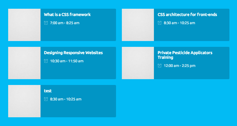
The source parameter is the most important; this tells the shortcode which page to use as the base to get the rest of its information; it must be a page with day names, dates or other dividers assigned as subpages. It first loads the day subpage names as tabs, then in each tab, it loads the scheduled events of each day,
The Speakers Section
As with the Upcoming Events section, the Speakers section uses a shortcode to display the majority of its content, with a title and subtitle. The speaker page code with the shortcode added will look like this:
<p class="gk-subtitle">Lorem ipsum dolor sit amet, consectetur adipiscing elit.</p>

[Speakers source="speakers"]
Changing the Title and Subtitle
As before, the Speakers section of the frontpage takes its title from the Title field of the base speakers page, and the subtitle from the HTML content.
Changing the Title
To change the title, you will need to modify the base page title directly. In your WP backend, click on Pages → All Pages in the left menu to be taken to the list of pages, then click on the page you have set as the base for your Speaker list; in the demo content this is simply called Speakers.
You will be taken to the Edit Page screen. Change the text in the Title field and click Update to save changes; this will amend the title of the section on your frontpage:
Changing the Subtitle
To change the subtitle you will need to modify the text between the <p> tags in the page content.
<p class="gk-subtitle">Lorem ipsum dolor sit amet, consectetur adipiscing elit.</p>
Leave the class attribute as it is, as this is used to provide the CSS code for the subtitle. Just change the text between the tags to your preferred subtitle:
<p class="gk-subtitle">Your subtitle here</p>
If you prefer, you may delete these tags entirely if you do not with to use a subtitle, leaving just the shortcode:
[Speakers source="speakers"]
How the Speakers Shortcode Works
The Speakers shortcode is simple, and takes its data from the Speaker pages of your content. For more information on how the Speaker pages are structured, check the Features Based on Pages section earlier in this guide.
There is only one parameters to be filled here; the source parameter should contain the page slug of the Speaker List page, as the shortcode will check if there are any subpages to this Speaker List page. If there are, it will display the featured image from the post, along with the title and subtitle from the individual speaker page.
The featured image does not need to be circular; the featured image will automatically be cropped on the frontpage and individual speaker pages.
The shortcode will display as many speakers as there are subpages, automatically adjusting if more speaker subpages are added.
Finding the Page Slug
To find the page slug of your Speakers page so that it can be added to the source attribute:
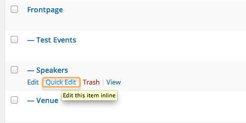
- In your WordPress backend, click on Pages → All Pages; this will take you to a list of your pages.
- Find your base Speaker List page in this list; in the demo content this is simply called Speakers.
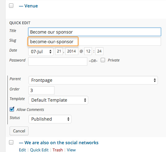
- Hover your mouse over the page name to reveal four options; Edit, Quick Edit, Trash and View.
- Click on the Quick Edit option; this will reveal a set of fields for amending the page settings. One of these fields will be Slug, that contains the page slug; just copy and paste this into the source parameter.
Changing the Number of Speaker Columns
In the demo content the default number of columns is four, so the frontpage displays four speakers per row. If you have a different number of speakers, such as six, then it may be better to display three speakers per row to ensure symmetry.
To change the number of columns, you will need to add a cols parameter to the shortcode, with the number of columns needed. For example, to have three columns, the shortcode should be amended to:
[Speakers source="speakers" cols="3"]
The Venue Section
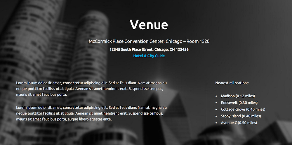
The Venue section of the frontpage uses custom HTML to list details about where the event is taking place, with a image in the background with a parallax effect.
Venue Section Structure
This section's content is split into three separate blocks of HTML code; a mixture of <p> and <a> tags create the top section of the content, with the address and link to the the Hotel and City Guide. The left column content, that contains a description, is created with a <div> tag with a special class that contains <p> tags with the content. Finally, the right column is created with <dl>, <dt> and <dd> description list content for information on local rail stations. The background image is taken from the page's featured image, and the title from the title of the page. The code for this section in the demo content looks like this:
<div class="gk-venue">
<p data-scroll-reveal="enter top">McCormick Place Convention Center, Chicago - Room 1520</p>
<address data-scroll-reveal="enter top and wait 0.2s">
12345 South Place Street, Chicago, CH 123456
<a href="#">Hotel & City Guide</a>
</address>
<div data-scroll-reveal="enter left and wait 0.4s">
<p>Lorem ipsum dolor sit amet, consectetur adipiscing elit. Sed at felis diam. Nam at magna eu neque porttitor facilisis ut at ligula. Aenean sit amet hendrerit erat. Suspendisse tempus, mauris sit amet faucibus porta.</p>
<p>Lorem ipsum dolor sit amet, consectetur adipiscing elit. Sed at felis diam. Nam at magna eu neque porttitor facilisis ut at ligula. Aenean sit amet hendrerit erat. Suspendisse tempus, mauris sit amet faucibus porta, augue libero egestas ante.</p>
</div>
<dl data-scroll-reveal="enter right and wait 0.4s">
<dt>Nearest rail stations:</dt>
<dd data-scroll-reveal="enter right and wait 0.5s">Madison (0.12 miles)</dd>
<dd data-scroll-reveal="enter right and wait 0.6s">Roosevelt (0.30 miles)</dd>
<dd data-scroll-reveal="enter right and wait 0.7s">Cottage Grove (0.40 miles)</dd>
<dd data-scroll-reveal="enter right and wait 0.8s">Stony Island (0.48 miles)</dd>
<dd data-scroll-reveal="enter right and wait 0.9s">Avenue C (0.50 miles)</dd>
</dl>
</div>
Changing the Address Information
The address information is contained in two tags; a <p> tag for the Hotel name and conference room, an <address> tag for the street address information, and an <a> for the link to the Hotel Guide.
To change the address, you will need to amend the content between the <p> and <address> tags.
<p data-scroll-reveal="enter top">Your venue name here</p>
<address data-scroll-reveal="enter top and wait 0.2s">
Your street address here
<a href="#">Hotel & City Guide</a>
</address>
Changing the Hotel Guide Link
The hotel guide link can direct users to a useful website for finding their way around the city, or link to the hotel website so that visitors can book rooms. To change this link and the link text, you will need to modify the content of the <a> tag, replacing the # in the href attribute with your link URL:
<p data-scroll-reveal="enter top">Your venue name here</p>
<address data-scroll-reveal="enter top and wait 0.2s">
Your street address here
<a href="Your link URL here">Your link text here</a>
</address>
Changing the Description Text
The left column of the Venue section contains plain text, that can be used to describe the venue or provide other information to potential attendees. To change this text, you need only modify the content between the two sets of <p> tags:
<div data-scroll-reveal="enter left and wait 0.4s">
<p>Your first paragraph here</p>
<p>Your second paragraph here</p>
</div>
You do not necessarily need to have two paragraphs; we used two as this is more aesthetically-pleasing, but you may add or remove paragraphs as you see fit. Make sure to leave the <div> tags untouched as they are required for the styling in this section.
Changing the Nearest Rail Stations List Text
The right column of the Venue section contains a description list, with plain text. The list is created with an opening <dl> tag; the text heading for the list is contained in the <dt> tags, and the list content itself is within individual <dd> tags.
<dl data-scroll-reveal="enter right and wait 0.4s">
<dt>Nearest rail stations:</dt>
<dd data-scroll-reveal="enter right and wait 0.5s">Madison (0.12 miles)</dd>
<dd data-scroll-reveal="enter right and wait 0.6s">Roosevelt (0.30 miles)</dd>
<dd data-scroll-reveal="enter right and wait 0.7s">Cottage Grove (0.40 miles)</dd>
<dd data-scroll-reveal="enter right and wait 0.8s">Stony Island (0.48 miles)</dd>
<dd data-scroll-reveal="enter right and wait 0.9s">Avenue C (0.50 miles)</dd>
</dl>
To change the title of the column, you should amend the content between the <dt> tags. For each list item, modify the text between the <dd> tags.
<dl data-scroll-reveal="enter right and wait 0.4s">
<dt>Your title text here</dt>
<dd data-scroll-reveal="enter right and wait 0.5s">First list item here</dd>
<dd data-scroll-reveal="enter right and wait 0.6s">Second list item here</dd>
<dd data-scroll-reveal="enter right and wait 0.7s">Third list item here</dd>
<dd data-scroll-reveal="enter right and wait 0.8s">Fourth list item here</dd>
<dd data-scroll-reveal="enter right and wait 0.9s">Fifth list item here</dd>
</dl>
Adding or Removing List Items
Each list item is contained in a single set of <dd> tags, and you may add or remove list items as you see fit. To remove an item, you should delete the <dd> tag that relates to the item you are removing, including the tag itself. For example, in the demo content the list has five items:
<dd data-scroll-reveal="enter right and wait 0.5s">First list item here</dd>
<dd data-scroll-reveal="enter right and wait 0.6s">Second list item here</dd>
<dd data-scroll-reveal="enter right and wait 0.7s">Third list item here</dd>
<dd data-scroll-reveal="enter right and wait 0.8s">Fourth list item here</dd>
<dd data-scroll-reveal="enter right and wait 0.9s">Fifth list item here</dd>
If we want only three items, then we can remove the last two <dd> tags:
<dd data-scroll-reveal="enter right and wait 0.5s">First list item here</dd>
<dd data-scroll-reveal="enter right and wait 0.6s">Second list item here</dd>
<dd data-scroll-reveal="enter right and wait 0.7s">Third list item here</dd>
To add a list item, you should recreate the <dd> tag, along with the data-scroll-reveal attribute as this controls the reveal animation. So if I have five items:
<dd data-scroll-reveal="enter right and wait 0.5s">First list item here</dd>
<dd data-scroll-reveal="enter right and wait 0.6s">Second list item here</dd>
<dd data-scroll-reveal="enter right and wait 0.7s">Third list item here</dd>
<dd data-scroll-reveal="enter right and wait 0.8s">Fourth list item here</dd>
<dd data-scroll-reveal="enter right and wait 0.9s">Fifth list item here</dd>
I can copy and paste the <dd> tag from the list, but just change the content:
<dd data-scroll-reveal="enter right and wait 0.5s">First list item here</dd>
<dd data-scroll-reveal="enter right and wait 0.6s">Second list item here</dd>
<dd data-scroll-reveal="enter right and wait 0.7s">Third list item here</dd>
<dd data-scroll-reveal="enter right and wait 0.8s">Fourth list item here</dd>
<dd data-scroll-reveal="enter right and wait 0.9s">Fifth list item here</dd>
<dd data-scroll-reveal="enter right and wait 0.9s">Sixth list item here</dd>
The Become Our Sponsor Section
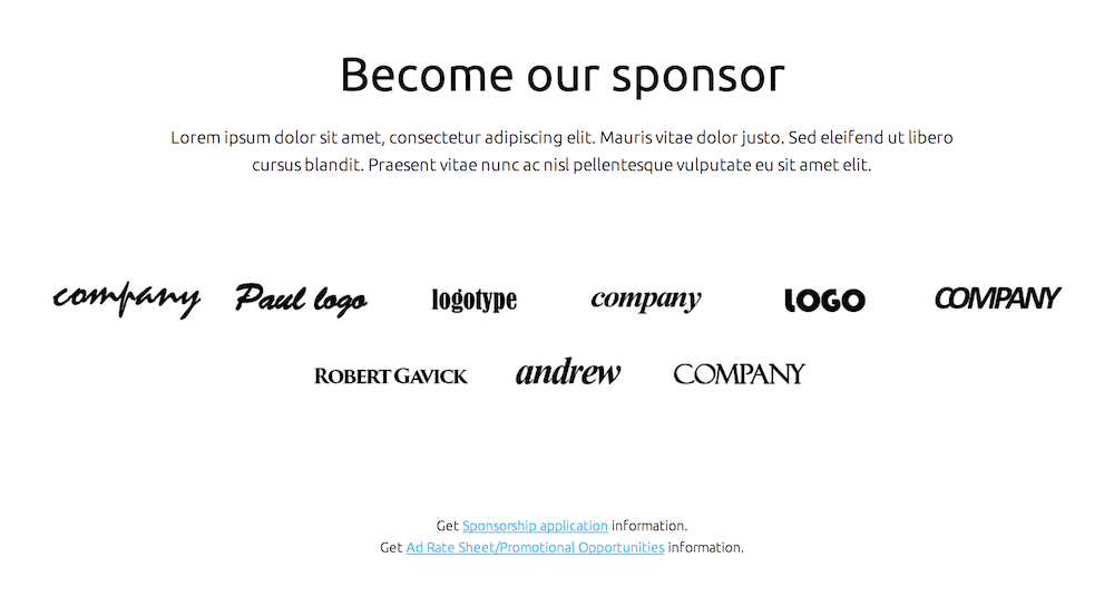
The Sponsors section is, like the Upcoming Events and Speakers sections before it, created using a shortcode that pulls information from a set of pages to display your sponsors' logos, along with links to sponsorship and advertising information.
Become Our Sponsor Section Structure
The Sponsors section uses the title of the Sponsor frontpage subpage to create the section title, with <p>, <small> and <a> tags creating the text and link content. The sponsor logos are created with a shortcode that, like the other areas based on pages, pulls its information from the specific Sponsor List subpage.
The basic code to this section looks like this:
<div class="gk-sponsors">
<p>Lorem ipsum dolor sit amet, consectetur adipiscing elit. Mauris vitae dolor justo. Sed eleifend ut libero<br>
cursus blandit. Praesent vitae nunc ac nisl pellentesque vulputate eu sit amet elit.</p>

[Sponsors source="sponsors"]

<small>Get <a href="#">Sponsorship application</a> information.</small><small>Get <a href="#">Ad Rate Sheet/Promotional Opportunities</a> information.</small>
</div>
Changing the Title and Subtitle
To change the title and subtitle of this section, you will need to amend the page content directly. In your WordPress backend, click on Pages → All Pages to see the list of pages. Find the subpage used to create the frontpage sponsor section and click on it; in the demo content it is called Become our sponsor.
Once on the Edit Page screen, you can change the title of the section by just changing the text in the Title field.
For the subtitle, you will need to change the content within the <p> tags at the start of the page content:
<div class="gk-sponsors">
<p>Your subtitle text here</p>
How the Sponsors Shortcode Works
The Sponsors shortcode appears after the first <p> tag in the page content:
[Sponsors source="sponsors"]
This shortcode will take the featured images from the subpages of the specified page. It contains just one parameter, source, which defines the page slug of your sponsors base page so that the shortcode can pull the correct sponsor logos.
The shortcode will search the subpages of the provided source page, and will display the featured images from these subpages. More information on the structure of the Sponsor pages may be found in the earlier Features Based on Pages section.
Retrieving the Page Slug
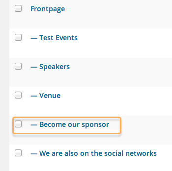
For the shortcode to work properly, it needs to have the page slug of your base sponsor page in the source parameter. In the demo content the page slug is already set as sponsors, but if you are creating your own content then the slug may be different.
To find or change the page slug:
- In your WordPress backend, click on Pages → All Pages to be taken to the page list.
- Hover your mouse pointer over your sponsor page; a set of options will appear.
- Click on the Quick Edit option; this will expand a set of fields.
The page slug may now be seen in the Slug field.
Changing the Links and Link Text
In the demo content the links in the text underneath the sponsor logos do not point anywhere as they are just placeholders, but we can easily add our own links if needed.
To change the text, you will need to modify the content between the <small> tags after the Sponsors shortcode. For the link text, you will need to modify the text between the <a> tags that appear in the <small> tags:
<small>Unlinked text here <a href="#">First link text here</a>More unlinked text here</small>

<small>Second unlinked text here<a href="#">Second link text here</a>More unlinked text here</small>
To make the clickable text link somewhere, you will need to add your link URL to the href attribute:
<small>Unlinked text here <a href="Your first link here">First link text here</a>More unlinked text here</small>

<small>Second unlinked text here<a href="Your second link here">Second link text here</a>More unlinked text here</small>
You can make your link text as long as you wish, but do try to exercise restraint! Of course, you may also delete these tags should you not wish to include this information on your site.
The Social Network Section
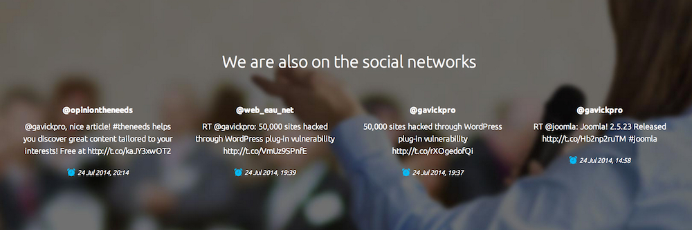
The We are also on the social networks section is created with a shortcode that is slightly more complex than our other shortcodes. The basic syntax looks like this:
[Tweets query="" cols="4" rpp="4" result_type="recent" cache_time="10" consumer_key="XXX" consumer_secret="YYY" user_token="XXX" user_secret="YYY"]
Shortcode Parameters
To get the most from this shortcode you need to be aware of what each parameter does.
- query - This parameter should contain the term you want to search for; this can be your username if you want to keep the displayed tweets directly related to you, or another term.
- cols - This parameter sets the number of columns to be displayed, or to put it another way; how may tweets should appear in a row. By default this is set to four, but you may specify a lower or higher number if preferred.
- rpp - This defines the number of tweets to be displayed; this should match the number of columns for best results.
- result_type - This parameter lets you control what type of tweet is displayed from the search term used; mixed, recent or popular. These options are discussed in detail below.
- cache_time - This parameter sets the length of time that information is stored in the database; this should be left at 10-15 minutes as lower values can cause longer page load-times.
You may have noticed that even if you've imported the demo content or installed via the quickstart you still aren't able to see any tweets on your site; this is because the shortcode needs to query Twitter, which requires a consumer key and secret along with a user token and secret.
These elements are covered in the last four parameters of the shortcode; consumer_key, consumer_secret, user_token, user_secret. To get this information you will need to register on the Twitter development site; a guide to this may be found here.
result_type Options
The result_type parameter in the [Tweets] shortcode lets you set the type of tweets to be displayed. There are three options:
- mixed - Includes both popular and real-time results for the search term.
- recent - Returns only the most recent results for the search term.
- popular - Returns only the most popular results for the search term.
The FAQ Section
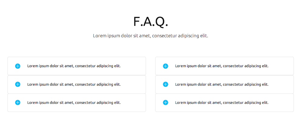
The FAQ section provides answers to common questions, with answers that expand when the question is clicked; a very convenient feature that saves space.
FAQ Section Structure
The FAQ section is created purely with custom HTML in the page content, with CSS classes providing the additional styling and on-click functions. A description list <dl> with a special class is created, with <dt>, <dd> and <p> tags forming the question and answer content. The basic structure used in the demo looks like this:
<p class="gk-subtitle">Lorem ipsum dolor sit amet, consectetur adipiscing elit.</p>
<div class="gk-cols" data-cols="2">
<div>
<dl class="gk-faq">
<dt data-scroll-reveal="enter left and wait 0s">Lorem ipsum dolor sit amet, consectetur adipiscing elit.</dt>
<dd><p>Duis mollis, est non commodo luctus, nisi erat porttitor ligula, eget lacinia odio sem nec elit. Curabitur blandit tempus porttitor. Integer posuere erat a ante venenatis dapibus posuere velit aliquet. Aenean lacinia bibendum nulla sed consectetur. Vivamus sagittis lacus vel augue laoreet rutrum faucibus dolor auctor.</p></dd>
<dt data-scroll-reveal="enter left and wait 0.2s">Lorem ipsum dolor sit amet, consectetur adipiscing elit.</dt>
<dd><p>Duis mollis, est non commodo luctus, nisi erat porttitor ligula, eget lacinia odio sem nec elit. Curabitur blandit tempus porttitor. Integer posuere erat a ante venenatis dapibus posuere velit aliquet. Aenean lacinia bibendum nulla sed consectetur. Vivamus sagittis lacus vel augue laoreet rutrum faucibus dolor auctor.</p></dd>
<dt data-scroll-reveal="enter left and wait 0.4s">Lorem ipsum dolor sit amet, consectetur adipiscing elit.</dt>
<dd><p>Duis mollis, est non commodo luctus, nisi erat porttitor ligula, eget lacinia odio sem nec elit. Curabitur blandit tempus porttitor. Integer posuere erat a ante venenatis dapibus posuere velit aliquet. Aenean lacinia bibendum nulla sed consectetur. Vivamus sagittis lacus vel augue laoreet rutrum faucibus dolor auctor.</p></dd>
</dl>
</div>
<div>
<dl class="gk-faq"><dt data-scroll-reveal="enter right and wait 0s">Lorem ipsum dolor sit amet, consectetur adipiscing elit.</dt>
<dd><p>Duis mollis, est non commodo luctus, nisi erat porttitor ligula, eget lacinia odio sem nec elit. Curabitur blandit tempus porttitor. Integer posuere erat a ante venenatis dapibus posuere velit aliquet. Aenean lacinia bibendum nulla sed consectetur. Vivamus sagittis lacus vel augue laoreet rutrum faucibus dolor auctor.</p></dd>
<dt data-scroll-reveal="enter right and wait 0.2s">Lorem ipsum dolor sit amet, consectetur adipiscing elit.</dt>
<dd><p>Duis mollis, est non commodo luctus, nisi erat porttitor ligula, eget lacinia odio sem nec elit. Curabitur blandit tempus porttitor. Integer posuere erat a ante venenatis dapibus posuere velit aliquet. Aenean lacinia bibendum nulla sed consectetur. Vivamus sagittis lacus vel augue laoreet rutrum faucibus dolor auctor.</p></dd>
<dt data-scroll-reveal="enter right and wait 0.4s">Lorem ipsum dolor sit amet, consectetur adipiscing elit.</dt>
<dd><p>Duis mollis, est non commodo luctus, nisi erat porttitor ligula, eget lacinia odio sem nec elit. Curabitur blandit tempus porttitor. Integer posuere erat a ante venenatis dapibus posuere velit aliquet. Aenean lacinia bibendum nulla sed consectetur. Vivamus sagittis lacus vel augue laoreet rutrum faucibus dolor auctor.</p></dd>
</dl>
</div>
</div>
This code may look extensive and complex, but if we break it down to its component parts you will see that it is very simple in structure.
First, a subtitle is created in a paragraph tag:
<p class="gk-subtitle">Subtitle here</p>
Then, a <div> block is created, with a special class that separates the FAQ blocks into columns; the data-cols parameter defines the number of columns:
<div class="gk-cols" data-cols="2">
Next, a <div> is created to contain the first column of questions:
<div>
And a new description list is created with a gk-faq class to provide the styling:
<dl class="gk-faq">
Now, the questions and answers are created. Each question is contained in a <dt> tag, and answer to the question in <dd> and <p> tags.
<dt data-scroll-reveal="enter left and wait 0s">First Question</dt>
<dd><p>First answer</p></dd>
More questions and answers are added to complete the column. Once all the questions and answers for the first column are defined, the <dt> and <div> for the column are closed:
</dl>
</div>
Then, the process is repeated for a second column, with an opening <div> and <dl> tag, followed by <dt>, <dd> and <p> tags for the questions.
Let's look at the complete code with descriptive content, rather than demo filler content; this should be more understandable:
<p class="gk-subtitle">Subtitle</p>
<div class="gk-cols" data-cols="2">

<div>
<dl class="gk-faq">
<dt data-scroll-reveal="enter left and wait 0s">First Column Question 1</dt>
<dd><p>First Column Answer 1</p></dd>
<dt data-scroll-reveal="enter left and wait 0.2s">First Column Question 2</dt>
<dd><p>First Column Answer 2</p></dd>
<dt data-scroll-reveal="enter left and wait 0.4s">First Column Question 3</dt>
<dd><p>First Column Answer 3</p></dd>
</dl>
</div>

<div>
<dl class="gk-faq">
<dt data-scroll-reveal="enter right and wait 0s">Second Column Question 1</dt>
<dd><p>Second Column Answer 1</p></dd>
<dt data-scroll-reveal="enter right and wait 0.2s">Second Column Question 2</dt>
<dd><p>Second Column Answer 2</p></dd>
<dt data-scroll-reveal="enter right and wait 0.4s">Second Column Question 3</dt>
<dd><p>Second Column Answer 3</p></dd>
</dl>
</div>
</div>
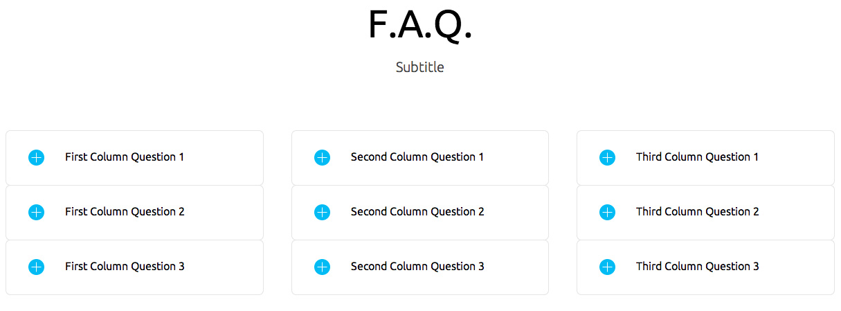
Changing the Title and Subtitle
To change the title of this section, you will need to amend the Title field for the page itself. In the demo content the page is named F.A.Q., but you may name it what you wish.
For the subtitle, you would need to change the <p> tag that appears at the start of the body of the page content:
<p class="gk-subtitle">Your subtitle text here</p>
Adding or Removing Questions and Answers
In the demo content there are two columns, each one containing three questions. However, you may find that you require more or less questions to be answered in your site. Thankfully, adding and removing questions is easy.
Each question in a column is contained in <dt> tags, with the answer to the question in <dd> and <p> tags. One question with answer will look like this:
<dt data-scroll-reveal="enter left and wait 0s">First Column Question 1</dt>
<dd><p>First Column Answer 1</p></dd>
Removing a Question
To remove a question, we would need to remove the content from the opening <dt> tag to the closing <dd> tag. For example, if we have three questions and answers:
<dt data-scroll-reveal="enter left and wait 0s">First Column Question 1</dt>
<dd><p>First Column Answer 1</p></dd>
<dt data-scroll-reveal="enter left and wait 0.2s">First Column Question 2</dt>
<dd><p>First Column Answer 2</p></dd>
<dt data-scroll-reveal="enter left and wait 0.4s">First Column Question 3</dt>
<dd><p>First Column Answer 3</p></dd>
And we want to remove the second questions, we would delete the tags accordingly:
<dt data-scroll-reveal="enter left and wait 0s">First Column Question 1</dt>
<dd><p>First Column Answer 1</p></dd>
<dt data-scroll-reveal="enter left and wait 0.2s">First Column Question 3</dt>
<dd><p>First Column Answer 3</p></dd>
Adding a Question
To add a question, you will need to create (or copy and paste!) the structure of the question and answer, and add it to the content within the column <div>, after an existing question and answer. For example, if we have three questions:
<dt data-scroll-reveal="enter left and wait 0s">First Column Question 1</dt>
<dd><p>First Column Answer 1</p></dd>
<dt data-scroll-reveal="enter left and wait 0.2s">First Column Question 2</dt>
<dd><p>First Column Answer 2</p></dd>
<dt data-scroll-reveal="enter left and wait 0.4s">First Column Question 3</dt>
<dd><p>First Column Answer 3</p></dd>
And we want to add a fourth, we would copy and paste the question and answer structure and add it to the end:
<dt data-scroll-reveal="enter left and wait 0s">First Column Question 1</dt>
<dd><p>First Column Answer 1</p></dd>
<dt data-scroll-reveal="enter left and wait 0.2s">First Column Question 2</dt>
<dd><p>First Column Answer 2</p></dd>
<dt data-scroll-reveal="enter left and wait 0.4s">First Column Question 3</dt>
<dd><p>First Column Answer 3</p></dd>
<dt data-scroll-reveal="enter left and wait 0.4s">First Column Question 4</dt>
<dd><p>First Column Answer 4</p></dd>
Adding Columns
By default the demo content splits the FAQ into 2 columns, but it is possible to create additional columns should you have many questions that need to be visible on the frontpage. To do so, you need to do two things; change the data-cols parameter, and create the column content.
Changing the data-cols Parameter
The data-cols parameter is located in the opening <div> tag after the subtitle text:
<div class="gk-cols" data-cols="2">
Simply change the parameter to the number of columns you need:
<div class="gk-cols" data-cols="3">
Creating a New Column
Now that you have set the number of columns, you will need to create the content for the column. To do this, you will need to create another <div> containing the column content. For example, in our demo content there are two columns:
<p class="gk-subtitle">Subtitle</p>
<div class="gk-cols" data-cols="2">

<div>
<dl class="gk-faq">
<dt data-scroll-reveal="enter left and wait 0s">First Column Question 1</dt>
<dd><p>First Column Answer 1</p></dd>
<dt data-scroll-reveal="enter left and wait 0.2s">First Column Question 2</dt>
<dd><p>First Column Answer 2</p></dd>
<dt data-scroll-reveal="enter left and wait 0.4s">First Column Question 3</dt>
<dd><p>First Column Answer 3</p></dd>
</dl>
</div>

<div>
<dl class="gk-faq">
<dt data-scroll-reveal="enter right and wait 0s">Second Column Question 1</dt>
<dd><p>Second Column Answer 1</p></dd>
<dt data-scroll-reveal="enter right and wait 0.2s">Second Column Question 2</dt>
<dd><p>Second Column Answer 2</p></dd>
<dt data-scroll-reveal="enter right and wait 0.4s">Second Column Question 3</dt>
<dd><p>Second Column Answer 3</p></dd>
</dl>
</div>

</div>
So let's add a third column of content by creating a new <div> containing questions and answers, and changing the data-cols attribute accordingly.
<p class="gk-subtitle">Subtitle</p>
<div class="gk-cols" data-cols="3">

<div>
<dl class="gk-faq">
<dt data-scroll-reveal="enter left and wait 0s">First Column Question 1</dt>
<dd><p>First Column Answer 1</p></dd>
<dt data-scroll-reveal="enter left and wait 0.2s">First Column Question 2</dt>
<dd><p>First Column Answer 2</p></dd>
<dt data-scroll-reveal="enter left and wait 0.4s">First Column Question 3</dt>
<dd><p>First Column Answer 3</p></dd>
</dl>
</div>

<div>
<dl class="gk-faq">
<dt data-scroll-reveal="enter right and wait 0s">Second Column Question 1</dt>
<dd><p>Second Column Answer 1</p></dd>
<dt data-scroll-reveal="enter right and wait 0.2s">Second Column Question 2</dt>
<dd><p>Second Column Answer 2</p></dd>
<dt data-scroll-reveal="enter right and wait 0.4s">Second Column Question 3</dt>
<dd><p>Second Column Answer 3</p></dd>
</dl>
</div>

<div>
<dl class="gk-faq">
<dt data-scroll-reveal="enter right and wait 0s">Third Column Question 1</dt>
<dd><p>Third Column Answer 1</p></dd>
<dt data-scroll-reveal="enter right and wait 0.2s">Third Column Question 2</dt>
<dd><p>Third Column Answer 2</p></dd>
<dt data-scroll-reveal="enter right and wait 0.4s">Third Column Question 3</dt>
<dd><p>Third Column Answer 3</p></dd>
</dl>
</div>

</div>
Now the third block's content will be displayed in a third column.
Icons in the menu
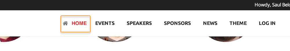
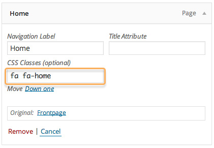
In the Events theme it’s possible to add icons to the left of selected menu items. Adding an icon is simple, you just need to specify the icon in the CSS Classes option of the selected menu item:
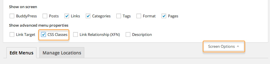
If the CSS Classes field is not visible, you’ll need to click on Screen Options at the top of the screen and enable the Show CSS Classes option.
The icon that you may use come from the extensive Font Awesome collection. To use an icon, you need to write fa in the CSS Classes field, followed by the class name of the icon you want to use. For example, if you wanted to use Font Awesome’s WordPress icon, you would write:
fa fa-wordpressEvery Font Awesome icon class uses the same format; fa-iconname, so you will need to type fa twice in the CSS Classes field; once to set the class to Font Awesome, and again to set the icon class i.e. “fa fa-iconname”.
The full list of available icons is available here
Popup login
In Events you may also show a popup overlay for users to log-in with, rather than redirecting them to a separate log-in page.
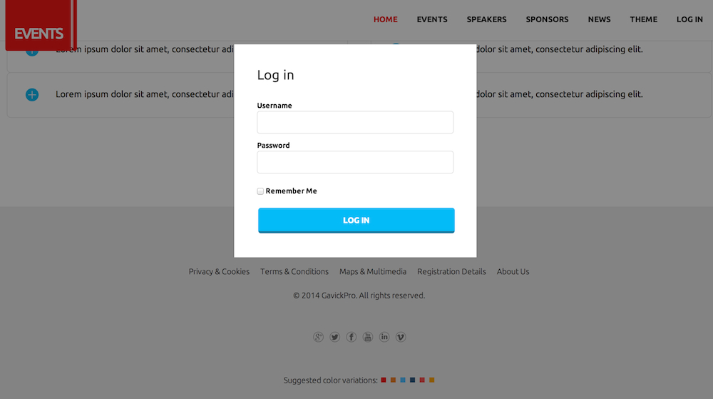
The popup overlay needs to be assigned to a menu item that you wish to use as a log-in link so that it will appear when the menu item is clicked. To do this, you will need to add a special CSS class, gk-login, to the selected menu item in the Menu Manager:
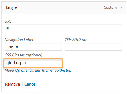
If the CSS Classes field is not visible, you’ll need to click on Screen Options at the top of the screen and enable the Show CSS Classes option.