The Gavern Joomla template framework and its Responsive Layout
GavickPro has begun to release what we term ‘responsive layout’ templates. This document explains the features of these templates.
The new “Layout” section manages template settings associated with page design. This is related to our new approach to template design whereby pages will now have the capability to scale up or down in order to match the screen sizes of various devices: from full desktop-wide screens to tablets to the small touchscreens found on smartphones.
The following changes were necessary for us to implement support for Responsive Web design:
- new layout for module positions
- new suffixes for the altered module positions
- new suffixes specific to display on mobile devices
- mobile section removed from template settings
New layout for module positions
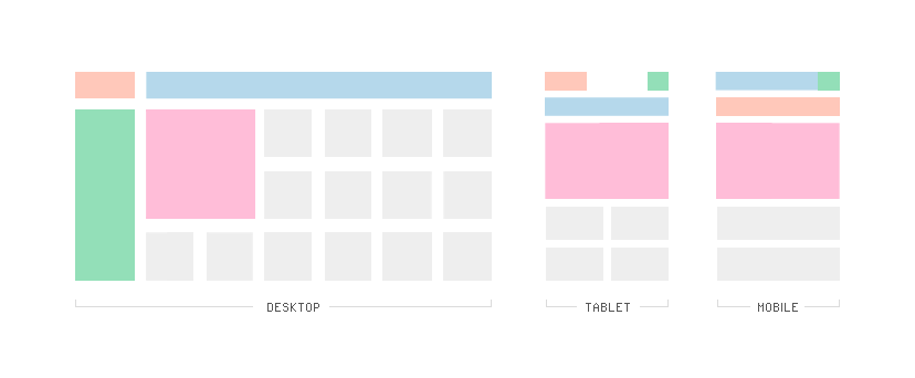
Every responsive layout template ships with three layout variations. These layout variations are:
- desktop – a layout designed to support standard wide screens, featuring the normal menu and multiple-column format;
- tablet – a layout for display on tablet-sized devices, with certain elements moved to new positions and use of a two-column format; and,
- mobile – a layout in support of the smallest screens currently available, with which a site visitor is presented with a single-column layout.
Let us compare these layouts in more detail.
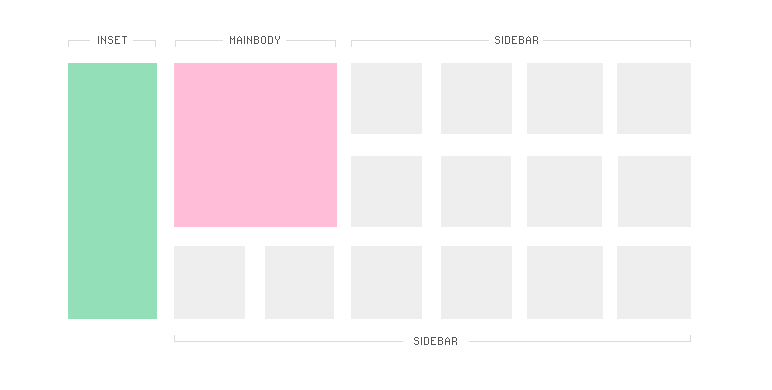
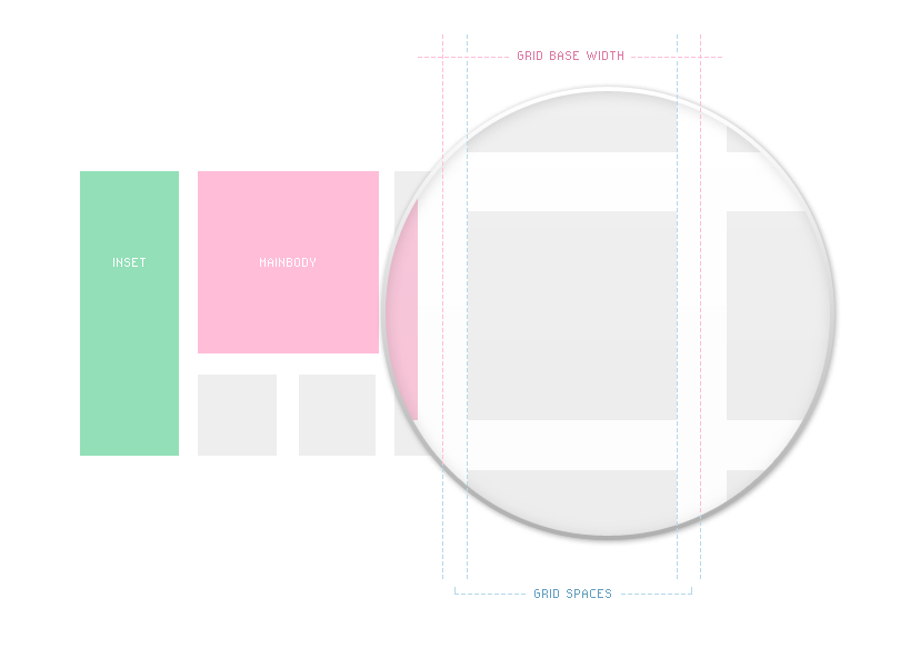
The image below demonstrates that the main section of the template consists of three columns, namely:
- inset
- mainbody
- sidebar
The mainbody column is partially combined with the sidebar because modules from the sidebar on smaller screens should be placed below mainbody. So, in this instance, the mainbody block is treated as a single moveable block of sidebar modules. The sidebar module uses MooMasonry to fill out the available space; we will discuss this mechanism a little later in this article.
Four basic elements have been changed on the tablet variation of the standard layout:
- the menu is positioned underneath the logo
- the inset column has been moved to the top-right corner as a button
- modules from the sidebar module position create two columns under the mainbody block
- the footer is now displayed at the end of the page and not in the inset column
The layout for mobile devices has received similar treatment:
- the menu now creates the top placed bar
- the inset column button goes to the menu bar
- the modules form sidebar module position now create one column layout under the mainbody block
- the footer is smaller and fits the mobile device width
How Does This All Work?
We have embedded a few media queries into each template:
- at the end of the css/menu/menu.css file, we’ve placed some code we refer to as ‘media queries’ which, based upon the type of display type detected for the current device, will select and display the appropriate menu design
- rules for the smaller screens are located in the css/tablet.css file
- CSS rules responsible for the page design on the smallest screens are located in the css/mobile.css file
Media queries for the tablet.css file are calculated automatically depending upon settings of the layout section.
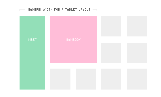
In general, the tablet layout is enabled when the screen size is smaller than the sum of the inset and mainbody column widths.
The mobile.css file content is enabled for smartphones with a screen size smaller than 640 pixels (of course, with a pixel ration of 2.0).
For higher resolutions, the default layout will normally be an automatic fit using the template grid.
How Is the Template Layout Grid Configured?
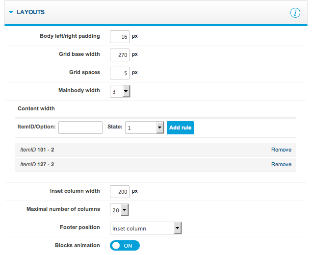
Let’s take a closer look at the new Layout section in the template’s back-end:
A few important options are found here.
- Body left/right padding – this option is used to set the left/right spaces on the page layout. It is necessary to set this to the proper value to avoid problems involving the blocks being placed on the edge of the screen.
- Grid base width – the most important setting, this is used to specify the layout grid column width. It describes how wide each column will be and it is tightly linked to the next few options.
- Grid spaces – also a very important option, this specifies the spaces between blocks on the layout:
- mainbody width – this option is related to the ‘grid base width’. Here, you can specify the width of the mainbody column using the base columns width (e.g., if the column width was set to 200 pixels and mainbody width was set to 2, then the mainbody width would equate to 200 * 2 = 400 pixels. The real space in the mainbody column will be smaller because all blocks use CSS property box-sizing set to the border-box value, so the final space will be the smaller of the grid space values multiplied by 2.
- content width – this option operates like other options used to override certain values on specific options or ItemIDs. Here, the width of the mainbody for specific pages may be overridden; for example, if you need a wider mainbody column for the K2 component.
- Inset column width – specifies the width of the inset column in pixels.
- Maximal amount of columns – specifies the maximum width of the page. This is is useful with very large screens, e.g., for column widths set to 200 pixels for the maximum 10 columns, the page layout will stop expanding on screens larger than 2000 pixels.
The last two options are of lesser importance for the layout:
- footer position – used to define where the footer will appear. The footer normally appears on the inset column; on tablet and mobile views it goes to the bottom of the page, but you can also display a duplicated footer (in inset and at the bottom) or show only the footer on the bottom.
- Blocks animation – this option enables / disables the animation used when MooMasonry arranges the blocks.
MooMasonry is an amazing and very important part of our responsive templates. We have improved the original script with our own adjustments.
How is MooMasonry Used in the Templates?
MooMasonry is used in three module positions in each GavickPro responsive design template for Joomla:
- sidebar
- top
- bottom
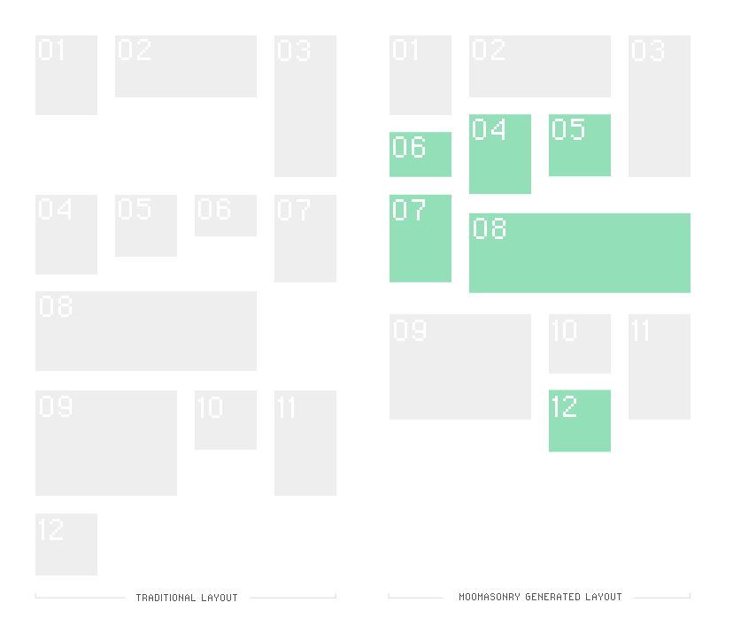
In general, MooMasonry fixes the block positions to avoid problems due to blank spaces resulting from floating elements.
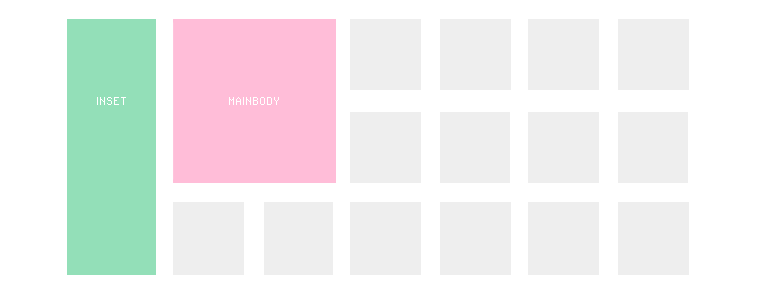
The following image compares the traditional layout with float with the layout generated by MooMasonry:
On wider screens, MooMasonry uses the column base width to generate the modules layout. On smaller screens (tablet / mobile phones), it uses a percentage width for the dual or single columns of the modules.
New Suffixes for Modified Module Positions
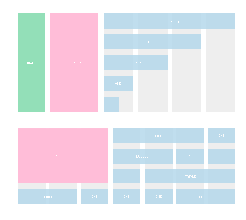
On wide screens, the following special module suffixes may be applied:
- half
- one
- double
- triple
- fourfold
Important Note!
The module cannot be wider than the mainbody column. So, if you set the mainbody width to 3 then the suffix fourfold will have the same width as the suffix triple. With the mainbody width set to 2, the suffix double will be equal to the maximum and the suffixes fourfold and triple will be equal to the double suffix module width. This limit was necessary for situations where modules land under the mainbody column, but the tablet.css is still not loaded. Please remember that we recommend using the full suffix, which generates 100% module width, only for modules which are last in any particular module position. Applying full in other situations will lead to problems with positioning of other blocks.
In general, you can use the special module suffixes to control layout of modules. We have also updated a few other important items – the most important being the fact that the script now controls the block height; if it changes, then the layout will be rearranged with a small delay to adjust for the new dimensions.
New Suffixes for Mobile Devices
When preparing a Web page for display on a wide spectrum of device types, you must consider that certain information may only be absolutely required on specific devices. This is why we have produced four special suffixes:
- onlytablet – the block will only be visible when tablet.css is loaded
- onlymobile – the block will only be visible when mobile.css is loaded
- notablet – the block will not be visible when table.css is loaded
- nomobile – the block will not be visible when mobile.css is loaded
To suppress a module from displaying on both the tablet and mobile devices, apply both suffixes simultaneously, such as: “ notablet nomobile” (and remember to place a space at the beginning of each suffix!).
Mobile Section Removed from Template Settings
This change was obviously needed as a result of new dynamic nature of template layout based upon device screen size. Additional changes were necessary to prepare the page for touch devices. This is why we’ve prepared a special script which changes the way main menu works on tablets: using a click to open a submenu and a double-click to open the link.
Summary
We have implemented the responsive Web design layout in preparation for our new templates in a post-PC era. We will continue to improve the template settings and add new options, creating additional possibilities.
Please remember that when using a responsive template for a Web project, only modules developed to work with the responsive layout should be selected. For example, our Tabs GK5 module fully supports the responsive design in the horizontal mode. We have also added new options for the News Show Pro GK4 to make it more responsive, and we will soon release responsive styles fro the Image Show GK4 module.
This article was first published
