Make your Joomla site tablet & mobile friendly with custom module rules
One of the biggest obstacles to overcome when designing a responsive layout site is that not all content (inside modules) were designed to work with responsive templates. That means that sometimes you need the ability to hide a specific element on only selected mobile devices. We’ve made that all possible and very easy to do for you with hiding special classes/suffixes!
Hide Specific Joomla Modules via the Hide Suffixes
A hide classes is a class that can be applied to any modules on the page and hides that particular element at certain mobile device. You can use one or two suffixes from four special suffixes for Joomla! 2.5/3.x template(s) :
- onlytablet – the block will only be visible when tablet.css is loaded (screen size 1030px / 820px and less)
- onlymobile – the block will only be visible when mobile.css is loaded (screen size 580px and less)
- notablet – the block will not be visible when table.css is loaded
- nomobile – the block will not be visible when mobile.css is loaded
To suppress a module from displaying on both the tablet and mobile devices, apply both suffixes simultaneously, such as: “ notablet nomobile” (and remember to place a space at the beginning of each suffix!). Please note that these additional classes are only enabled when the responsive layout is enabled.
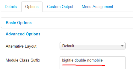
Use them in Module Class Suffix field, like others suffixes (before or after them).
How to Hide Additional Joomla Menu
For additional menu, for example, top menu or bottom menu you have two solutions to hide them efficiently:
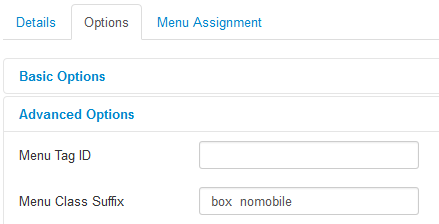
- Use ” box nomobile” (without quotes!) in Menu Class Suffix in module configuration
This solution is effective, however, it can sometimes (depending on the template) slightly change the top menu appearance.

after adding ” box” suffx

before adding ” box” suffix
- Second solution requires file (mobile.css or tablet.css) editing.
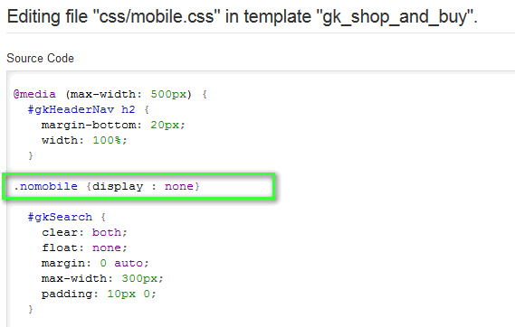
Now add ” nomobile” (without quotes!) in Menu Class Suffix, after that (top/bottom) menu will still look the same, but disappears when will be displayed on smartphone.
To Hide Specific Content (inside article) use @media screen property via custom css.
This article was first published