GavernWP WordPress Theme Framework: The Layout settings
Five main options are associated with the theme layout settings:
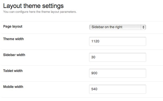
The Page layout option makes it possible to specify a column position in the page’s layout. This is found on the left or right-hand side, or you can completely disable showing a column (in this situation, you can achieve the layout via an additional subpage style – fullwidth).
The Theme width option specifies a page’s maximum width; no matter the width of a browser window, a page’s width will not exceed this value.
Column width is specified as a percentage through the Sidebar width option. Tablet width and Mobile width options are used to specify the width of a browser window in pixels when the css/tablet.css and css/mobile.css files are loaded.
In the case of the tablet.css file, modules which normally create a four-column layout (max) appear in a two-column layout. After loading a mobile.css file, this will switch to a one-column layout. Additionally, after loading a tablet.css file, a column moves under the main content of a given page.
Note: All options of the Layout section are available through a site live-preview editor which allows option values to be easily adjusted.
This article was first published