Learn how to disable our Joomla templates responsive layout for mobile or tablet screens.
In 2012, we began to creating a Responsive Joomla Templates. We used existing tools (media queries, fluid grids, and scalable images) to create a template that displayed beautifully at multiple resolutions. By default when your Joomla web site is viewed on a mobile device such as a tablet or smartphone then a “responsive” version of your site will be used instead.
How to disable Responsive Layout in Gavick Templates
RWD basically allows a website to respond or adapt to a different viewport size, smaller or larger, without your having to set a specific domain (.mobi) for people using mobile devices. But in not all cases Joomla administrators wants to use this feature, which is enabled by default – that’s why we prepared this simple guide.
Go to Template Manager -> click on the selected GK Template Name -> then choose the Layouts tab. There you will find Responsive Layout option.
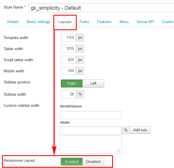
If your GK template have RWD support – it means that it can be disabled. The responsive layout is completely optional, don’t use it if you don’t want it! If you wish to use the responsive layout simply turn on the switch again and the Gavern framework will take care of the rest!
Using Tablet width and Mobile width options you can decide with which device resolution Responsive Layout will be activated to adapt to this changed viewport size.
How to hide modules on Tablet and Mobile Devices
One of the biggest obstacles to overcome when designing a responsive layout site is that not all content like modules were designed to work with responsive layouts. That means that sometimes you need the ability to hide a specific extension on only certain sized screens, so that something doesn’t break the site’s layout and everything looks proportionate. We’ve made that all possible and very easy to do for you with hiding classes (suffixes) ! There are four main ways to manage content on different size screens, and they are documented >><<.
How to disable Mobile layouts
Older templates don’t support Responsive design even for Joomla 3.2 – but they have mobile layouts, separate versions for phones and smartphones. Which can be also disabled from template configuration options. By default those mobile versions are enabled.
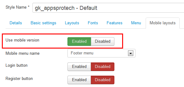
Disabling Mobile version in Joomla 3.x
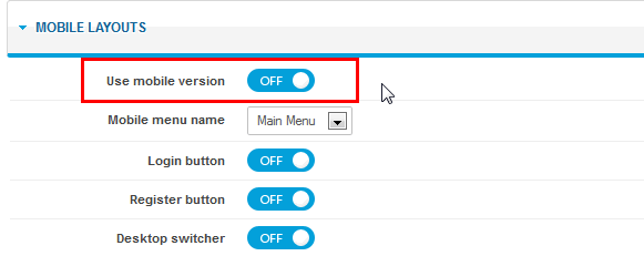
Disabling Mobile version in Joomla 2.5
If you want to edit mobile templates you have to modify those four files:
- gk_TemplateName/layouts/handheld.php
- gk_TemplateName/css/mobile/handheld.css
- gk_TemplateName/layouts/smartphone.php
- gk_TemplateName/css/mobile/smartphone.css
Because those mobile versions have two different styles dark and light – if you chose one of them you have to modify CSS file with its style name on filename.
This article was first published