Removing module zoom and lightbox hover effects in our Joomla templates
In some of our Joomla templates (for example in GK RockWall or GK Music State) you might have seen, especially on the homepage, a zoom and dark-background layer effect on mouse hover with our modules.

Unfortunately, there’s no single switch that turns it off/on, so you’ll need to use the following CSS code that will allow you to override the template settings.
How to disable zoom and rotate effect in CSS
Using the CSS override method (more), use the following CSS code:
 .nspArt .nspImageWrapper:hover img,
.gkNspPM-TitleOverlay:hover .gkImgOverlay,
.gkNspPM-TitleOverlay > figure:hover > img
 {
   transform: none !important;
   -moz-transform: none !important;
   -ms-transform: none !important;
   -o-transform: none !important;
   -webkit-transform: none !important;
}
As you can see we’ve used CSS3 and not JQuery to both achieve this effect and to disable it. The ‘None’ value defines that there should be no transformation.
The transform property applies a 2D or 3D transformation to an element. This property allows you to rotate, scale, move, and skew elements like images.
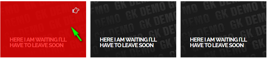
How to disable dark curtain (layer) on mouse over in the NSP module
To change the opacity property level for an element you should change the value in the CSS3 opacity property from 0 to 1. So to remove the dark layer use 0.
.gkNspPM-TitleOverlay:hover .gkImgOverlay {opacity:0;}
Default value is/was 0.75.
If you want to change the background color of the layer from black to red you can use this code:
.gkNspPM-TitleOverlay .gkImgOverlay {background: red;}
Of course you can use your own color using color names or hex values (#fff = white).
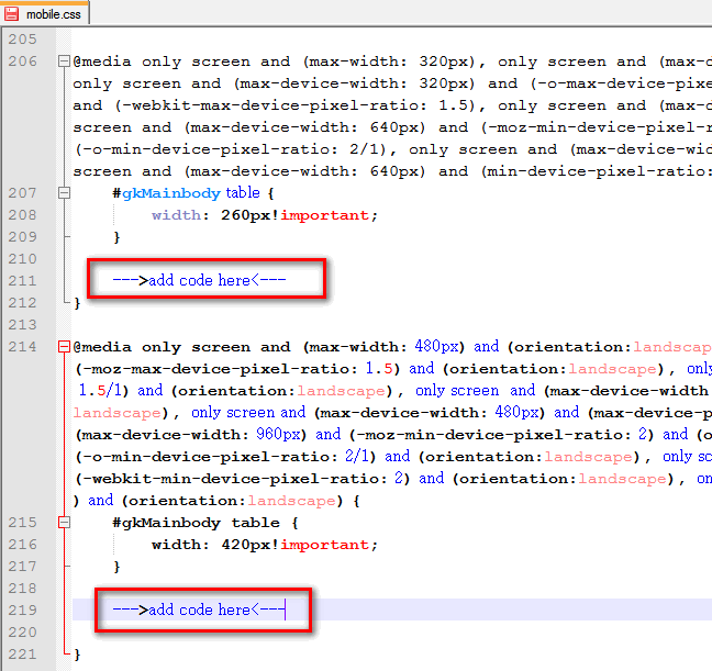
How to disable effects only in Mobile view
Using above code inside override.css will not help, because this is global override system and Joomla! will use this code on all mobile, tablet and desktop views. If you want to disable “special” effects only for selected small screen size you have to customize mobile.css file, which is locked inside template folder (gk_TemplateName\css\mobile.css).
There find two lines: ~209 and ~215 inside where you should find @media only screen… { …} block and put above code inside. By the way, the @media queries rule allows different style rules for different media and/or depending on browser window size in the same style sheet.
Read more about Css3 Media Queries here – this knowledge will help you in this and next, future projects.
This article was first published