GK Grid – WordPress widget guide
With our (M)Social theme we released a new free WordPress Gavick widget – GK Grid. It is composed of a set of widgets and their spatial relationship with each other; you can implement space-saving grid-based layouts on websites and incorporate a variety of content types through the use of different widgets. It works by placing elements in the optimal position based on your settings on the grid which can be define by you. Only a few steps (clicks) divide you from attractive portfolio, news wall or gallery with photos & movies with social links etc. constructed using GK Grid.

GK Grid – widget for WordPress used in (M)Social theme
In summary, GK Grid is a widget which can be used to display several widgets (from a defined widget area, e.g. Bottom I or GK Grid II) in visually-appealing configured blocks.
GK Grid Joomla module and responsive WordPress layout
The grid is fluid & flexible and fully responsive (RWD) – especially if all the widgets that are added by the user to GK Grid are also responsive. Widget uses FontAwesome (v3.2.1) – which are in fact vectors fonts.
GK Grid Download
This widget is included in our (M)Social and MusicState Quickstart packages, or the newest versions may always be downloaded from our Github repository.
GK Grid Configuration
First step should be prepare a content for a grid, collect images (photos, icons) and text. Let’s start with following effect:
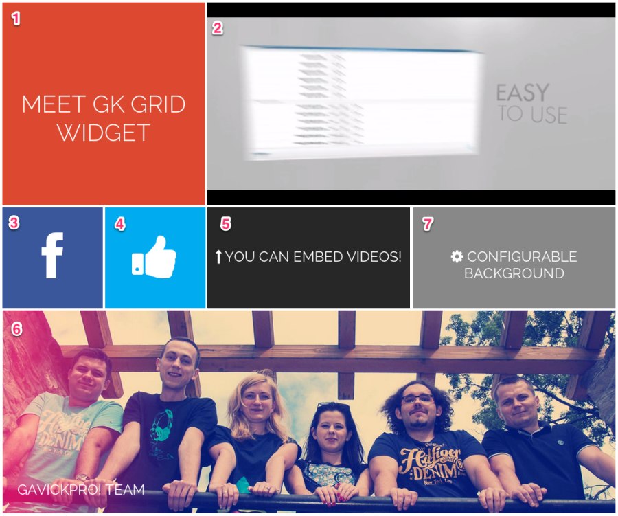
GK Grid – example result effect
I numbered the blocks in this image to make it easier to understand which configuration is being used where. A good option is to start not with configuring the GK Grid widget directly, but with the source widgets you intend to use. To this end, we will use the GK Grid III position as a source for our Grid. In these positions we have 7 text widgets.
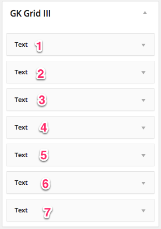
Let’s check these widgets:
Widget number 1:
<div>
	<h1><a href="">Meet GK Grid Widget</a></h1>
</div>
It’s really simple text widget, you should change only “Meet GK Grid Widget” text with your own
Widget number 2:
<div><iframe src="//player.vimeo.com/video/22126094?title=0&byline=0&portrait=0&color=db4a37" width="720" height="306" frameborder="0" webkitallowfullscreen mozallowfullscreen allowfullscreen></iframe></div>
In the second text widget, you should change iframe src source to your own video’s URL, if you want to use youtube instead of vimeo, use the following code:
<div"><iframe type="text/html" width="640" height="385" src="https://www.youtube.com/embed/k0wTHj1zAOY" allowfullscreen frameborder="0"></iframe></div>
Widget number 3
The third text widget is with an icon; available icons are described here: (Icons – Font Awesome section)
<a href="#"><i></i></a>
4th widget is similar to the 3rd widget.
Widget number 5:
<div><h3><i></i> You can embed videos!</h3> </div>
you can change the text and background colors (gk-color1 – gk-color4) if you want to add more colors you should edit the CSS sources, and you can also change the icon if desired.
Widget number 6:
<div><a href="/res/[pageurl]/URL" style="background-image: url('/res/[pageurl]/wp-content/themes/Msocial/images/gavickpro-team.jpg');"></a>
<h3><a href="/res/[pageurl]/activity">GavickPro! Team</a></h3></div>
this widget is used to load photos/images; the content should be inside the div tag with the gk-photo class. Then you can specify the URL and image file path. Additionally you can add a header (h3 tag)
The last widget is very similar to the 5th widget’s source.
So, now we have our source. At this time these widgets are not visible anywhere, so we have to configure our GK Grid widget to allow for their display.
We start by putting the GK Grid widget into the Header position (or whatever position you wish to see your blocks in)
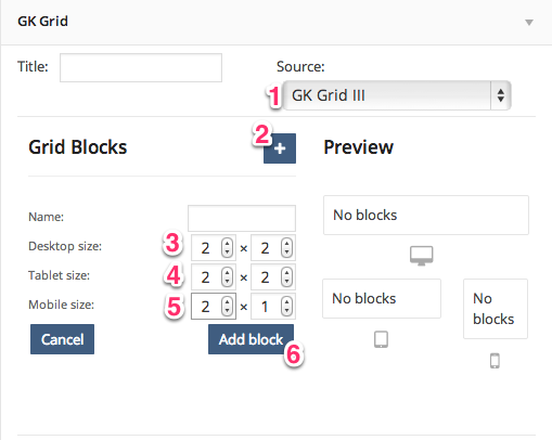
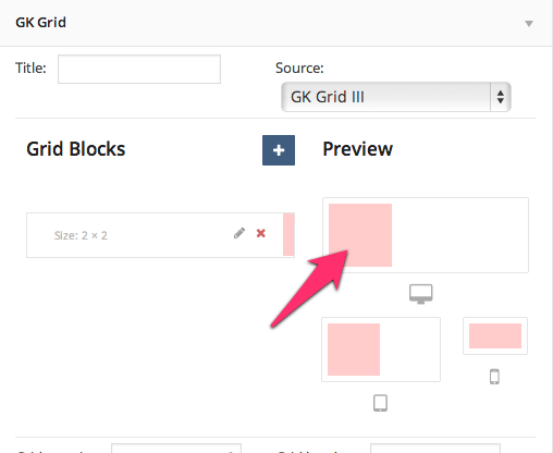
First of all we have to specify the source for our Grid; in this example we will choose the GK Grid III position. (1). Then we can add our first block (2), and specify it’s size (3,4,5). When you click the Add Block button (6) we’ll see our first block on the right side:
Then we have to configure all 7 blocks; you should decide which size your blocks should be on desktop, tablet and mobile. In this example I will I set the blocks the following way:
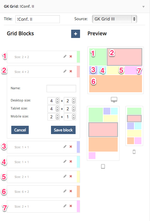
Remember that this order of blocks is connected with the order of the text widgets from the GK Grid III position, so the first block here will display the first text widget from the GK Grid III widget area.
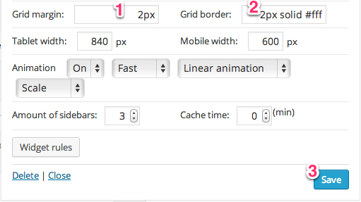
Then we have to specify our Grid margin (1) and border (2); when we click the Save button (3) we should see our blocks. Of course you can use additional options (specify tablet and mobile width – when your GK Grid changes layout to suit tablets/mobiles), use different kind of animations, and set cache time if needed.
The amount of sidebars option is necessary if you have more GK Grids widgets on your website and you need more GK Grid positions. Then you can use widget rules to specify on which pages the grid should be displayed, and I think that’s all!
This article was first published