- Details
- Written by Robert Gavick
- Category: Hotel
- Hits: 7821
Introduction
Villa Bellucci is a powerful travel & tourism theme for WordPress, with an emphasis on providing reservation and room showcase features for hotels or other accommodation providers, as well as gallery pages and slideshows that are perfect for museums or art galleries to promote their exhibitions.
In this guide we'll be looking at how each section of this theme's frontpage is built, as well as the extra pages, features and plugins, along with some basic customization information to help you get started adding your own touch to the theme.

Guide Structure
The Villa Bellucci customization guide is split into three sections:
- Theme Options - Covers the customization options built into the theme and accessible via the WordPress Customizer.
- Frontpage Elements - Examines the core frontpage elements and how they're created, and how you can modify their content for your own purposes.
- Theme Features - Explores the extras included with Villa Bellucci, such as plugins, typography, Scroll Reveal and other useful features.
Theme Options
To provide a comfortable customization experience the core settings for Villa Bellucci are included in the WordPress Customizer, where you can see a real-time preview of every option as you change it, making basic customization extremely simple and intuitive, even for beginners. You can reach the customizer screen by clicking on Appearance → Customize in the WordPress dashboard. The customizer is made up multiple option areas, each of which can be expanded by clicking on the section-name. In this section, we'll look at each section's options, and cover what they do.
Site Identity
This section is dedicated to setting the core naming and branding of the theme, covering the site's name, logo etc...Once this section is expanded the following options are available:
- Site Title - The site title is created when you first install WordPress; it sets what name visitors will see in the browser tab when browsing your site and will be used as the logo content when the Logo Type option is set to Text.
- Tagline - The tagline appears next the title in the browser's tab, to the right of the divider symbol (|).
- Site Icon - This options lets you set a favicon for your site, which is displayed in browser tabs & shortcuts or as app icons on mobile phones.
- Show Tagline - When the Logo Type option is set to Text, the tagline will be displayed underneath the logo of the site.
- Logo Type - Selects the type of logo that will be displayed at the top of the site; the example logo is created via CSS which you can of course modify, or you can define a simple text or image logo, or have no logo at all.
- Select Image - This option appears if you have set the Logo Type to Image, allowing you to upload a new logo to use on your site.
Colors
This section lets you customize the core color scheme of Villa Belluci using a helpful color picker rather than modifying the CSS directly. There is only one option in this section:
- Primary Color - The majority of the Villa Belluci layout is based on images, but this setting controls the color of additional elements such as buttons, links, and highlights.
Menus
This tab contains options for creating and setting menus, with the same functionality as the menu page. There are two main options in this section:
- Menu Locations - This option lets you assign available menus to the available locations in the theme.
- Add a Menu - Lets you create new menus and assign items to them.
Any menus you have created will also appear in this section where you can modify there available links and options.
Widgets
This section allows you to add, remove or edit widgets in the widget positions available in the Villa Belluci theme, similar to the functionality you would find in the Appearance → Widgets section of the dashboard, but with the benefit of the preview window to see the effects of the widget as they are created (with some exceptions; some third-party widget's can be updated in this section, but won't live preview due to the way that they work behind the scenes).
Static Front Page
This section deals with how your frontpage content is laid out, with options for displaying static pages or latest posts. The available options are:
- Front page displays - Choose whether you want your frontpage to display a list of your latest posts, or a styled static page. Villa Belluci uses a static front page to create its homepage content, so it's advisable to leave this setting as A Static Page.
- Front Page - Sets the static front page; in Villa Belluci if you've used the quickstart or manual install guide then you should already have a page with the Frontpage template set as your frontpage, and this should not be changed as it is relied upon to create the frontpage layout.
- Posts Page - Sets a separate page where you will display your posts if you are using a static frontpage. This option should not be needed, as a blog section is already included with Villa Belluci which will display your latest posts.
Font Options
Villa Belluci has support for multiple fonts, from standard web fonts to more complex offerings from Google Fonts, and you can target each individual element of the page to use a particular font, though the standard installation already has all relevant elements targeted if you're not interested in getting that deep into customizing the fonts! The available options are:
-
Define Size of the Fonts - This option sets the base size of the font, from which all other text sizes are taken. Essentially, the base size is the size standard text will use, with CSS-styled text being larger or smaller relative to this base size.
-
Body Font - Sets the font used in the Body elements of the theme (such as blog post text etc...). This can be a standard web font such as Verdana or Arial, or a Google Font.
- Google Font URL for the Body - This option only appears when the Body Font option is set to Google Font. Here, you can add the URL for the Google Font you wish to use (more information is available in the Using a Google Font section of this guide that follows this one).
-
Selectors for the Body font - This field contains all the CSS classes or elements that should be changed to the selected Body Font. These elements are already preset in the theme, but you may add/remove your own elements if desired.
-
Header Font - Sets the font used in the Header elements of the theme (e.g. headings, logos etc...); choose from standard web font or Google Font.
- Google Font URL for the Header - Appears if the Header Font option is set to Google Font. The Google Font's URL can be added here.
-
Selectors for the Header font - Defines the CSS elements that should use the selected Header Font. Can be customized if desired.
-
Other Elements Font - Defines the font used in the Other Elements of the theme (such as the author info section, comments etc...); choose from standard web font or Google Font.
- Google Font URL for the other elements - Appears if the Other Elements Font option is set to Google Font. The URL for the chosen Google Font should be added here.
- Selectors for the Other Elements font - Defines the CSS classes that should use the Other Elements font. Users may add/remove their own classes as needed.
In each of the Font options there is a choice between using a standard web font or a Google Font; follow these steps to apply a new font to each section as needed:
Using a Google Font
Setting up a Google Font in the theme requires some very simple steps:
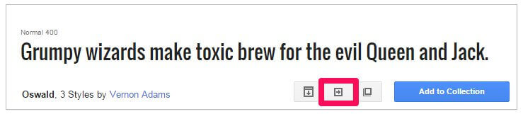
- Navigate to to Google Fonts website.
-
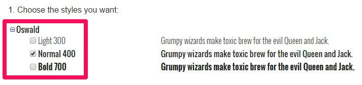
From the list of fonts, select the one you wish to use and click the Quick Use icon.
-
Select the styles and character sets you wish to use for the font by clicking the tickboxes next to each.
-
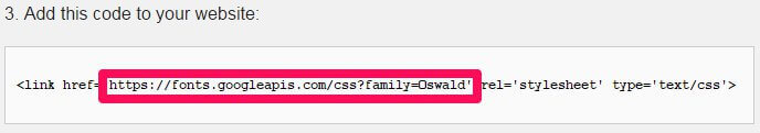
In the Add this code to your website section, copy only the font URL from the link element.
-
In the Appearance>Customize>Font options section of your WordPress backend, select Google Font in the drop-down list for the section you wish to use.
-
Paste the copied URL into the Google Font URL for Header/Body/Other Elements field; after a moment the live preview will update to show you how your site looks with the new font.
- Click the Save & Publish button to save changes.
The font has now been set as needed, and you will see the changes in the live preview window.
Using a Standard Font
The standard fonts available may be seen and selected in the Header Font, Body Font or Other Elements Font drop-down list; under the initial Google Font option are a list of standard fonts, so if you wish to use one of these fonts you may simply select it from the list, and the live preview will updated accordingly.
Layout
This section is concerned with the width of the theme, specifically in regards to the sidebar and the responsive width on each screen size, such as for tablets and mobile phones (which dictates which media elements are loaded etc...). The available options are as follows:
- Theme Width - Sets the max width (in pixels) of the theme; this is the largest that it will stretch to given a screen with a high-enough resolution; the default is 1240px.
- Tablet Width - Sets the max width for the tablet layout; screens larger than this set width will use the desktop site-layout. The default setting for this options is 1040px.
- Small Tablet Width - Sets the max width for the small tablet layout. Default setting is 840px.
- Mobile Width - Sets the max width for the mobile layout; default is 640px.
- Sidebar Width - Sets the total width of the sidebar; the width is set as a percentage of the total available width to ensure that the sidebar remains uniform across all screen sizes. For example, if your theme width is set at 1000px and the sidebar widget is set at 30%, then the sidebar will be 300px wide. You can experiment with this setting by going to a page that uses the sidebar such as the room preview pages; the live preview will update the sidebar as you change the options.
- Sidebar Position - Sets whether the sidebar should appear on the left or right of the theme on the pages that have a sidebar.
Features
This section covers any special features that do not fit into the other categories, as well as toggles for included JavaScript libraries. The available options are:
- Enable Classic Menu - When enabled, the main menu of the theme will appear at the top of the screen in the usual position. When this option is disabled, the classic menu is replaced with menu button and icon that opens an Aside menu when clicked.
- Enable Fixed Classic Menu - When both this option and the Enable Classic Menu option are enabled, the main menu is accessible at any point on the page when the user scrolls up. If this option is disabled or if the aside menu is selected then the user must scroll to the top of the page to access the menu.
- Display Details on Pages - When enabled pages will display the author, creation date and other pertinent information, similarly to what is displayed on the blog posts.
- Enable Word-break - This option may be useful when using elements with a dynamic width or a non-romanized language such as Japanese or Korean that may not word-wrap correctly otherwise.
- Use Scroll-Reveal - When enabled, animations created using the Scroll Reveal library, which produces reveal animations for HTML elements, will be displayed. More information on Scroll Reveal may be found in the Theme Features section of this guide.
- Use Photo Swipe - Sets whether to use the Photo Swipe functionality, which adds touch functionality to the gallery page layout included in this theme.
- Display Related Posts - When enabled, a related-posts section is added at the bottom of each post, with images and links to other posts.
- Read More Button on Categories - This option toggles whether a "More" text link should appear on post category listing pages under each listed post.
- Use Page Preloader - When the page preloader is enabled, each page load is accompanied with a animated loading screen so users only see the page once the major elements have been loaded.
- Enable Popup Login - When disabled, clicking on a login link will take the user to a separate login page. When this option is enabled, clicking the login link will open a login overlay without navigating away from the current page.
- Date Format - Defines the formatting for the dates in post previews and at the top of posts.
- Copyright Text - Here you can add HTML that will be displayed in the footer of the theme.
Note: As in Villa Belluci the footer elements are created via a **Text** widget in the **Bottom V** position HTML added to this field will be used only when this widget is disabled or non-existent.
Social API
The Social API area provides options related to the addition of share buttons and social network icons in the theme.
- Post Social Icons - Toggles whether post pages will include Facebook, Twitter, Google+ etc...Like & Share buttons at the bottom of each post page.
- Page Social Icons - Provides the same functionality as the above option, but this time toggles whether the icons appear on pages rather than posts.
-
Enable Popup for Social Icons - When enabled, the social icon links are all contained in a separate button, that provides a list of social networks to share to.
If disabled, the icons will all appear separately at the bottom of the post's page.
Note: If this option is disabled only the buttons for Facebook, Google+ and Twitter will be available.
- Enable FB Icon - Set whether a Facebook share button is included in the list of sites to share to.
- Enable Twitter Icon - Toggles whether a Twitter share button is added to the social icons area.
- Enable Google Icon - Adds a Google+ share button to the social area.
- Enable Pinterest Icon (Only available when Icon Popup is enabled) - Adds a Pinterest link to the list of available social networks for sharing.
- Enable LinkIn Icon (Only available when Icon Popup is enabled) - Adds a LinkedIn link to the list of available social networks for sharing.
- Enable VK Icon (Only available when Icon Popup is enabled - Adds a VK link to the list of available social networks for sharing.
Cookie Law
This Customizer panel is dedicated to configuring a cookie banner in accordance with EU law.
- Use Cookie Consent Plugin - Enables or Disables the Cookie Law plugin.
- Consent Mode - Defines the type of cookie consent your site uses; choose from Explicit, where no cookies are set until the visitor consents, and Implied, which sets cookies but offers users the option to opt-out.
- Use SSL - Sets whether the Cookie Banner uses Secure Socket Layer (SSL) to protect any data it receives.
- Banner Placement - Choose where the Cookie Banner appears on your site.
- Tag Placement - Selects where the Privacy Settings tag appears on your page, that opens the Cookie Consent overlay when clicked.
- Refresh after gaining consent - Toggles whether the page should refresh after cookie consent is given.
There are some advanced configuration options available with this plugin; more information may be found on our blog in this features article.
Header Slider
Options in this section control the look and extra elements of the slideshow.
- Image Height - Sets the max height for the slideshow image.
- Image Width - Sets the max width for the slideshow image.
- Tablet Image Height - Sets the max height for the slideshow as it appears on tablet-sized screens.
- Tablet Image Width - Sets the max width for the slideshow on tablet-sized screens.
- Mobile Image Height - Sets the slideshow max height for mobile screens.
- Mobile Image Width - Sets the slideshow max width for mobile screens.
- Show Title Block - Toggles whether the frontpage slideshow should display each slide's title & subtitle as a text overlay.
- Show Prev/Next Buttons - When enabled pagination arrows to switch between slides on the left and right of the slide area.
- Show Pagination - When enabled additional pagination buttons are added to the bottom of the slideshow so users can instantly click to any slide.
- Enable Autoanimation of Slider - Toggles whether the slideshow rotates through slides automatically or not.
- Slider Animation Interval - Sets the length of time between the autoanimation moving between slides in milliseconds.
- Image Background Color - Sets the color of the background behind the image; this is displayed when no featured image is set in the slide or if the images fail to load.
Slider
The options in this section provide similar functionality to the Header Slider section, but this time focused on the bottom slider. The available options are:
- Image Height - Sets the max height for the slideshow image.
- Image Width - Sets the max width for the slideshow image.
- Tablet Image Height - Sets the max height for the slideshow as it appears on tablet-sized screens.
- Tablet Image Width - Sets the max width for the slideshow on tablet-sized screens.
- Mobile Image Height - Sets the slideshow max height for mobile screens.
- Mobile Image Width - Sets the slideshow max width for mobile screens.
- Show Title Block - Toggles whether the frontpage slideshow should display each slide's title & subtitle as a text overlay.
- Show Prev/Next Buttons - When enabled pagination arrows to switch between slides on the left and right of the slide area.
- Show Pagination - When enabled additional pagination buttons are added to the bottom of the slideshow so users can instantly click to any slide.
- Enable Autoanimation of Slider - Toggles whether the slideshow rotates through slides automatically or not.
- Slider Animation Interval - Sets the length of time between the autoanimation moving between slides in milliseconds.
- Image Background Color - Sets the color of the background behind the image; this is displayed when no featured image is set in the slide or if the images fail to load.
Newsletter
This section controls the newsletter popup's options.
- Newsletter Display - Sets the trigger for the newsletter popup appearing; it can be set to Display Directly, so it appears immediately when the page loads, Display After Time, so it appears after a time delay, and Display After Scrolling, so it appears when the user scrolls.
- Time Delay (Seconds) - When the Newsletter Display option is set to Display After Time, this option sets the delay between the page loading and the popup appearing.
- Scroll Delay (px) - When the Newsletter Display option is set to Display After Scrolling, this option sets the number of pixels the user must scroll down the page before the newsletter popup appears.
Contact Page
This section is only available when the Customizer preview viewport is on the contact page i.e. when the frontpage preview loads in the demo layout, clicking on the Contact link in the main menu will take you to the contact page, and this section will appear. This section includes options specific to the contact page.
- Enable reCaptcha - When enabled users must complete a reCaptcha before they can send an email via the contact form.
- Email Source - Sets the email address that messages sent via the contact form should be sent to. If left empty the WordPress administrator email address will be used as default.
- Display Google Map - Toggles whether the Google map view is displayed on the contact page or not.
- Latitude Value/Longtitude Value - These values set where the Google map will be focused on on the contact page when it loads.
- Enable User Interface on the Map - When enabled the zoom, streetview and direction controls are visible on the map so users can scroll and zoom.
- Level of Map Zoom - Sets the zoom level of the map on load.
Frontpage Elements
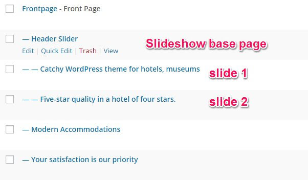
Villa Bellucci uses a page-based system to create its homepage content. This works by creating a page that has a special template, called Frontpage, assigned to it. Subpages are then added to this base page, with each subpage creating a new section of the homepage. For example, in the demo layout for Villa Bellucci, the base frontpage page contains the reservation form that appears in the header, and the first subpage of the frontpage creates the slideshow (with subpages of the slideshow page creating the slides). Then, the third subpage creates the text and photo block underneath the header.
Of course, it can all sound rather confusing when written out like that, so let's visualize this layout system with a list:
- Frontpage (header reservation form)
- First Subpage (header slideshow)
- First header slideshow slide
- Second header slideshow slide
- Second Subpage ("Modern Accommodations" and hotel information text and image grid)
- Third Subpage ("Your satisfaction is our priority" text section)
- Fourth Subpage (bottom slideshow)
- First bottom slideshow slide
- Second bottom slideshow slide
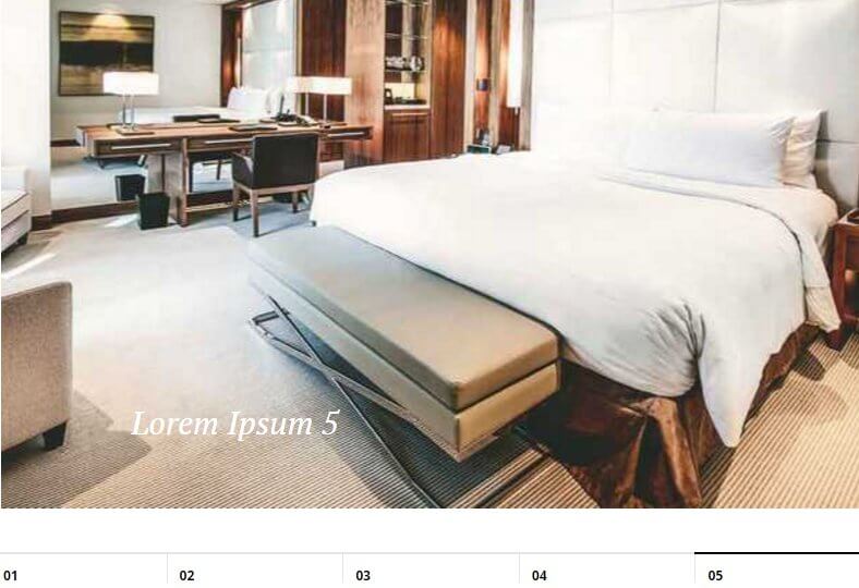
- Fifth Subpage (room showcase)
- Sixth Subpage (Testimonials)
- Seventh Subpage (Blog highlights)
- First Subpage (header slideshow)
As you can see, the frontpage is the starting point, with first-level subpages creating each section of the page, and second-level subpages creating slides for the two slideshows. At the start of each frontpage customization section we'll highlight where in this hierarchy we currently are to help you keep track of things.
Each subpage can contain multiple elements, including HTML code to create the text and image blocks, shortcodes for creating the room and blog post highlights, and images that are used as slides or as backgrounds. In each section, we'll cover which of these elements are used, how they work, and finally, how to modify the elements to add your own content.
Much of the HTML tags you will see in these sections will include **data-sr** attributes; these attributes refer directly to the ScrollReveal JavaScript library, which is included in Villa Belluci and makes creating scroll reveal animations easy. More information on how these attributes may be modified is covered in the **Features** section of this guide, but when first making changes these attributes should be left untouched to preserve the aesthetic in the theme.
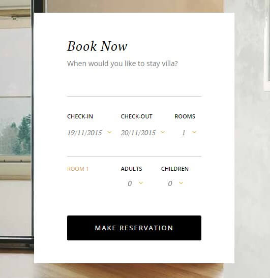
The Header Reservation Form
The header reservation form appears in the right-hand side of the header, providing an easy way for guests to send booking requests to your hotel.
This section's details are taken from the base frontpage:
- Frontpage (header reservation form)
- First Subpage (header slideshow)
- Second Subpage ("Modern Accommodations" and hotel information text and image grid)
- Third Subpage ("Your satisfaction is our priority" text section)
- Fourth Subpage (bottom slideshow)
- Fifth Subpage (room showcase)
- Sixth Subpage (Testimonials)
- Seventh Subpage (Blog highlights)
This section is created using a shortcode in the mainbody of the page that creates an instance of the gkhotelreservation plugin, which displays the reservation form. The shortcode as used in the demo looks like this:
[GK_Hotel_Reservation title="Book Now" fields="name,email,phone" rooms_max="5" adult_max="3" children_max="2" subtitle="When would you like to stay villa?"]
Shortcode Breakdown
The shortcode is extremely simple; like other shortcodes in WordPress, the Hotel Reservation plugin starts with a basic shortcode:
[GK_Hotel_Reservation]
This will load the basic version of the reservation form with the default settings, which will match the demo layout. From this base shortcode, additional attributes are added after the shortcode text but before the closing square bracket to modify the core settings. The available attributes are:
- title - This attribute can be used to set the bold text that appears at the top of the form.
- subtitle - This attribute defines the smaller subtitle text that appears under the title.
- rooms_max - Sets the maximum number of rooms that can be selected in the
- adults_max - Sets the maximum number of adults that can be booked per room.
- children_max - sets the maximum number of children that can be booked per room.
- fields - Defines which text fields appear on the booking form that appears when the Make Reservation button is clicked; there are three fields available: name, email, and phone.
As you can see in the demo content, the title is set as "Book Now, the subtitle is set as "When would you like to stay villa?", adult_max and child_max are both set to 2, rooms_max is set to 5 and the fields attribute is set to use all three fields, name,email,phone. These match the default settings so it was not necessary to include all the attributes, but this was done so that vigilant users could figure out how to change the settings if necessary.
Changing the Title
To change the title, modify the text between the quotes in the title attribute of the shortcode:
[GK_Hotel_Reservation title="Your Title Here"]
Changing the Subtitle
To change the subtitle, modify the text between the quotes of the subtitle attribute:
[GK_Hotel_Reservation subtitle="Your Subtitle Here"]
Changing the Booking Form Fields
The booking form by default consists of three fields; a name, email and phone number field. However, you can limit the number of fields if necessary; for example, you may only require a name and contact email address. To limit which fields appear, modify the text between the quotes of the fields attribute:
[GK_Hotel_Reservation fields="Required Fields Here"]
So if we wanted to use only email and name fields, we'd add these two fields separated by commas in the quotes:
[GK_Hotel_Reservation fields="name,email"]
Changing the Max Bookable Rooms
To limit the number of rooms that can be requested in any single reservation, change the number between the quotes of the rooms_max attribute:
[GK_Hotel_Reservation rooms_max="max number of rooms here"]
Changing the Max Adults & Children
To change the max number of adults and children that may be booked per room (that is, changing the maximum number selectable in the Adults and Children drop-down list), modify the numbers between the quotation marks of the adults_max and children_max attributes:
[GK_Hotel_Reservation adults_max="Max Adults Number Here" children_max="Max Children Number Here"]
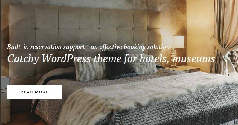
The Header Slideshow
The header slideshow provides a stylish introduction to your site, as well as a nice background for the reservation form:
This section is created in the First Subpage of the Frontpage:
- Frontpage (header reservation form)
- First Subpage (header slideshow)
- Second Subpage ("Modern Accommodations" and hotel information text and image grid)
- Third Subpage ("Your satisfaction is our priority" text section)
- Fourth Subpage (bottom slideshow)
- Fifth Subpage (room showcase)
- Sixth Subpage (Testimonials)
- Seventh Subpage (Blog highlights)
No actual information is contained in this page; the slides are provided via subpages added to this page.
How it Works
Unlike the other frontpage areas which rely on shortcodes or HTML to create their content, the slideshows work in a similar way to the frontpage as a whole. That is, the subpage itself creates the slideshow automatically, and then any subpages added after that count as slides.
Let's visualize this hierarchy:
- First Subpage (header slideshow)
- First header slideshow slide
- Second header slideshow slide
So we have the header slideshow page, which is a subpage of the Frontpage. Then, further subpages are added to the slideshow page, with each subpage creating a slide.
The header slideshow base page contains no information save a title, but this is used just to help backend users distinguish the page from the rest. The actual meat of the slideshow, that is, the slides plus the overlay text and link, are all provided in the individual slide subpages.
So the First Subpage that creates the header is just a placeholder, and its subpages provide the slides. Let's look at how the slide subpage works.
In each slide subpage there are four elements that are defined; a Featured Image, which defines the slide image, a Title, which creates the large overlay text, and an <a> tag in the mainbody of the page that contains the link URL for the slide, and the smaller subtitle text that appears above the title in the slide's text overlay.
The tag is just a standard tag, with no additional classes or other elements:
<a href="Slide Link URL Here">Subtitle Text Here</a>
So adding more slides is as simple as creating a new subpage of your header slideshow base page, and adding a title, featured image and <a> tag with link and text.
Changing a Slide's Image
Each slide in the header is created via a subpage of the Header Slideshow page, with the Featured Image providing the slide. To change an existing slide's image, in your WordPress backend click on Pages → All Pages to see a list of your pages, and click on one of the subpages of your header slideshow page (this will be the first subpage of your Frontpage).
Once on the Edit Page screen, you will see the current slide image in the Featured Image section in the right sidebar. To remove the existing slide, click on the Remove Featured Image text under the image.
Once the image is removed, you can specify your new slide image. To do so, click on the Set Featured Image text in the Featured Image section. Your media library will open, and you may upload your slide or select an existing image from your library to use. Once done, click on the Save button at the top of the screen to save changes, and your new slide is ready!
When selecting an image, bear in mind your current image width and height settings (these may be set in the WordPress Customizer). If the image does not match the slideshow's set dimensions it will be cropped & zoomed to fit, which may affect the aesthetics of the slide if there are major discrepancies between the slider's settings and the image ratio.
Changing a Slide's Overlay Text and Link
Each slide has two pieces of overlaid text; a large-font title, and a smaller-font subtitle that appears above the title, and the slide can be set to link to another area of your site when clicked.
To change the title of a slide, open the Edit Page screen for the slide you want to modify, then change the text in the Title field and click the Update button in the top-right to save changes. The new title text will automatically be added in the overlay text.
For the subtitle, you will need to modify the text between the <a> tag in the mainbody of the page.
<a href="Slide Link URL Here">Subtitle Text Here</a>
For the slide link, add your own link URL into the href attribute in the opening <a> tag.
Adding a New Slide
Adding new slides to the header slideshow is as simple as adding a new page to your site. First click on Pages → Add New in your WordPress dashboard. Once on the edit screen for your new page, look for the Page Attributes section in the right sidebar. Here, you will see there is a Parent option with a drop-down list of your pages; select your header slideshow base page as your new page's parent; the theme will automatically use this new subpage as a slide.
Now we need to add the slide elements. First, set the slide image by clicking on the Set Featured Image button in the Featured Image section of the right sidebar, and uploading a slide image or selecting one from your Media Library.
Next, add a title to the Title field; this will be used as the large text overlay on the slide. Finally, add an <a> tag containing the slide link URL and subtitle text for the overlay:
<a href="Slide Link URL Here">Subtitle Text Here</a>
Now click on the Publish button to make the page public; the slide will be automatically displayed in the header slideshow.
Note: The order of the slides in the slideshow is defined by their date of creation, so if you wish to change the order you will need to delete the older slides and recreate them in a new slide page to move them to the end.
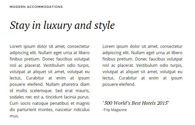
The Hotel Info Section
This section serves as the introduction to your hotel, with two columns of text, an image grid made up of three bottom images and two sidebar images, and a sidebar hotel information section for showing off your rooms, amenities or other hotel features:
This section is created using HTML taken from the First Subpage of the Frontpage page:
- Frontpage (header reservation form)
- First Subpage (header slideshow)
- Second Subpage ("Modern Accommodations" and hotel information text and image grid)
- Third Subpage ("Your satisfaction is our priority" text section)
- Fourth Subpage (bottom slideshow)
- Fifth Subpage (room showcase)
- Sixth Subpage (Testimonials)
- Seventh Subpage (Blog highlights)
In this section, all elements are added via custom HTML, unlike the header section that also uses the WordPress Customizer to control some options. The HTML used in the demo looks like this:
<div class="frontpage-content-wrapper">
<h3 class="widget-title"><span>Modern Accommodations</span></h3>
<h2>Stay in luxury and style</h2>
<div class="gk-cols" data-cols="2">
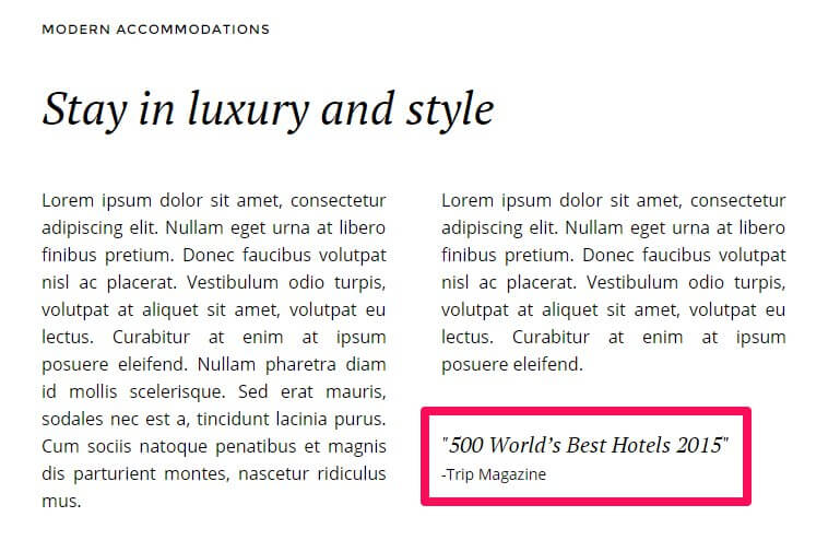
<div class="gk-text-justified"><p>Lorem ipsum dolor sit amet, consectetur adipiscing elit. Nullam eget urna at libero finibus pretium. Donec faucibus volutpat nisl ac placerat. Vestibulum odio turpis, volutpat at aliquet sit amet, volutpat eu lectus. Curabitur at enim at ipsum posuere eleifend. Nullam pharetra diam id mollis scelerisque. Sed erat mauris, sodales nec est a, tincidunt lacinia purus. Cum sociis natoque penatibus et magnis dis parturient montes, nascetur ridiculus mus.</p></div>
<div class="gk-text-justified"><p>Lorem ipsum dolor sit amet, consectetur adipiscing elit. Nullam eget urna at libero finibus pretium. Donec faucibus volutpat nisl ac placerat. Vestibulum odio turpis, volutpat at aliquet sit amet, volutpat eu lectus. Curabitur at enim at ipsum posuere eleifend.<cite>"500 World’s Best Hotels 2015"<small>-Trip Magazine</small></cite></p></div>
</div>
<div class="gk-photo-grid offset-left">
<div class="figure gk-grid-1" data-sr="scale up 10%">
[caption id="attachment_65" align="alignnone" width="840"]<img src="http://localhost/WordPress/Quickstarts/Hotel/wp-content/uploads/2015/07/hotel3.jpg" alt="Luxury Rooms" width="840" height="434" class="size-full wp-image-65" /> Luxury Rooms[/caption]
</div>
<div class="figure gk-grid-2" data-sr="scale up 10% and wait .15s">
[caption id="attachment_70" align="alignnone" width="394"]<img src="http://localhost/WordPress/Quickstarts/Hotel/wp-content/uploads/2015/07/hotel5.jpg" alt="Bathrooms" width="394" height="434" class="size-full wp-image-70" /> Bathrooms[/caption]
</div>
<div class="figure gk-grid-2" data-sr="scale up 10% and wait .3s">
[caption id="attachment_69" align="alignnone" width="394"]<img src="http://localhost/WordPress/Quickstarts/Hotel/wp-content/uploads/2015/07/hotel4.jpg" alt="Jacuzzi" width="394" height="434" class="size-full wp-image-69" /> Jacuzzi[/caption]
</div>
</div>
</div>
<aside id="frontpage-sidebar">
<div class="gk-photo-grid no-margin widget">
<div class="figure gk-grid-1" style="visibility: visible; ">
<img src="http://localhost/WordPress/Quickstarts/Hotel/wp-content/uploads/2015/07/hotel1.jpg" alt="hotel1" width="400" height="234" class="alignnone size-full wp-image-76" />
</div>
<div class="figure gk-grid-1" style="visibility: visible; ">
<img src="http://localhost/WordPress/Quickstarts/Hotel/wp-content/uploads/2015/07/hotel2.jpg" alt="hotel2" width="399" height="235" class="alignnone size-full wp-image-77" />
</div>
</div>
<div class="border-title widget">
<h3 class="widget-title"><span>Hotel information</span></h3>
<div class="content">
<ul class="gk-info">
<li class="gk-info-col-2">
<dl>
<dt>Check-in:</dt>
<dd><strong>2:00 pm</strong></dd>
</dl>
</li>
<li>
<dl class="gk-info-col-2">
<dt>Check-out:</dt>
<dd><strong>12:00 am</strong></dd>
</dl>
</li>
<li>
<dl>
<dt>Smoking:</dt>
<dd>Non-Smoking</dd>
</dl>
</li>
<li>
<dl>
<dt>Parking:</dt>
<dd>Self parking: €30.00</dd>
<dd>Valet: €50.00</dd>
</dl>
</li>
<li>
<dl>
<dt>Pets:</dt>
<dd>Service animals allowed: Yes</dd>
<dd>Maximum Weight: 50 lbs</dd>
</dl>
</li>
</ul>
</div>
</div>
</aside>
HTML Breakdown
This section contains an awful lot of HTML code, but if we break it down into blocks then things become a lot easier to follow. First off, let's remove the example text from the HTML code and replace it with placeholder text; this will make it a bit clearer which elements go where:
			    <div class="frontpage-content-wrapper">

			    <h3 class="widget-title"><span>Title</span></h3>
			    <h2>Subtitle</h2>

			    <div class="gk-cols" data-cols="2">
			    <div class="gk-text-justified"><p>First Column Text</p></div>
			    <div class="gk-text-justified"><p>Second Column Text<cite>"Quotation Text"<small>-Citation</small></cite></p></div>
			    </div>

			    <div class="gk-photo-grid offset-left">
			    <div class="figure gk-grid-1" data-sr="scale up 10%">
			    [caption id="attachment_65" align="alignnone" width="840"]<img src="First Image URL" alt="Alt Title" width="840" height="434" class="size-full wp-image-65" /> Caption Text[/caption]
			    </div>

			    <div class="figure gk-grid-2" data-sr="scale up 10% and wait .15s">
			    [caption id="attachment_70" align="alignnone" width="394"]<img src="Second Image URL" alt="Alt Title" width="394" height="434" class="size-full wp-image-70" /> Caption Text[/caption]
			    </div>

			    <div class="figure gk-grid-2" data-sr="scale up 10% and wait .3s">
			    [caption id="attachment_69" align="alignnone" width="394"]<img src="Third Image URL" alt="Alt Title" width="394" height="434" class="size-full wp-image-69" /> Caption[/caption]
			    </div>
			    </div>

			    </div>
			    <aside id="frontpage-sidebar">
			    <div class="gk-photo-grid no-margin widget">
			    <div class="figure gk-grid-1" style="visibility: visible; ">
			    <img src="First Sidebar Image URL" alt="hotel1" width="400" height="234" class="alignnone size-full wp-image-76" />
			    </div>
			    <div class="figure gk-grid-1" style="visibility: visible; ">
			    <img src="Second Sidebar Image URL" alt="hotel2" width="399" height="235" class="alignnone size-full wp-image-77" />
			    </div>
			    </div>

			    <div class="border-title widget">
			    <h3 class="widget-title"><span>Sidebar Text Title</span></h3>
			    <div class="content">
			    <ul class="gk-info">
			    <li class="gk-info-col-2">
			    <dl>
			    <dt>First Large Information Title</dt>
			    <dd><strong>First Large Information Text</strong></dd>
			    </dl>
			    </li>
			    <li>
			    <dl class="gk-info-col-2">
			    <dt>Second Large Information Title</dt>
			    <dd><strong>Second Large Information Text</strong></dd>
			    </dl>
			    </li>
			    <li>
			    <dl>
			    <dt>First Small Title</dt>
			    <dd>First Small Text</dd>
			    </dl>
			    </li>
			    <li>
			    <dl>
			    <dt>Second Small Title</dt>
			    <dd>Second Small Text</dd>
			    <dd>Second Small Text</dd>
			    </dl>
			    </li>
			    <li>
			    <dl>
			    <dt>Third Small Title</dt>
			    <dd>Third Small Text</dd>
			    <dd>Third Small Text</dd>
			    </dl>
			    </li>
			    </ul>
			    </div>
			    </div>
			    </aside>
Now let's establish how the HTML is layered. We may split the entire HTML code into two smaller sections; one for the centre column containing the two columns of text and image grid, whose HTML is contained within the opening <div> element that contains the frontpage-content-wrapper class:
			    <div class="frontpage-content-wrapper">

			    <h3 class="widget-title"><span>Title</span></h3>
			    <h2>Subtitle</h2>

			    <div class="gk-cols" data-cols="2">
			    <div class="gk-text-justified"><p>First Column Text</p></div>
			    <div class="gk-text-justified"><p>Second Column Text<cite>"Quotation Text"<small>-Citation</small></cite></p></div>
			    </div>

			    <div class="gk-photo-grid offset-left">
			    <div class="figure gk-grid-1" data-sr="scale up 10%">
			    [caption id="attachment_65" align="alignnone" width="840"]<img src="First Image URL" alt="Alt Title" width="840" height="434" class="size-full wp-image-65" /> Caption Text[/caption]
			    </div>

			    <div class="figure gk-grid-2" data-sr="scale up 10% and wait .15s">
			    [caption id="attachment_70" align="alignnone" width="394"]<img src="Second Image URL" alt="Alt Title" width="394" height="434" class="size-full wp-image-70" /> Caption Text[/caption]
			    </div>

			    <div class="figure gk-grid-2" data-sr="scale up 10% and wait .3s">
			    [caption id="attachment_69" align="alignnone" width="394"]<img src="Third Image URL" alt="Alt Title" width="394" height="434" class="size-full wp-image-69" /> Caption[/caption]
			    </div>
			    </div>
And the sidebar, which consists of two images plus a hotel information section, which is contained within an <aside> HTML element using the frontpage-sidebar class, rather than a <div>:
			    <aside id="frontpage-sidebar">
			    <div class="gk-photo-grid no-margin widget">
			    <div class="figure gk-grid-1" style="visibility: visible; ">
			    <img src="First Sidebar Image URL" alt="hotel1" width="400" height="234" class="alignnone size-full wp-image-76" />
			    </div>
			    <div class="figure gk-grid-1" style="visibility: visible; ">
			    <img src="Second Sidebar Image URL" alt="hotel2" width="399" height="235" class="alignnone size-full wp-image-77" />
			    </div>
			    </div>

			    <div class="border-title widget">
			    <h3 class="widget-title"><span>Sidebar Text Title</span></h3>
			    <div class="content">
			    <ul class="gk-info">
			    <li class="gk-info-col-2">
			    <dl>
			    <dt>First Large Information Title</dt>
			    <dd><strong>First Large Information Text</strong></dd>
			    </dl>
			    </li>
			    <li>
			    <dl class="gk-info-col-2">
			    <dt>Second Large Information Title</dt>
			    <dd><strong>Second Large Information Text</strong></dd>
			    </dl>
			    </li>
			    <li>
			    <dl>
			    <dt>First Small Title</dt>
			    <dd>First Small Text</dd>
			    </dl>
			    </li>
			    <li>
			    <dl>
			    <dt>Second Small Title</dt>
			    <dd>Second Small Text</dd>
			    <dd>Second Small Text</dd>
			    </dl>
			    </li>
			    <li>
			    <dl>
			    <dt>Third Small Title</dt>
			    <dd>Third Small Text</dd>
			    <dd>Third Small Text</dd>
			    </dl>
			    </li>
			    </ul>
			    </div>
			    </div>
			    </aside>
Now let's look at these two sections more closely to see how they work. The frontpage center column's HTML code after the opening <div> begins with the small title for the section, which is contained in a set of <span> tags wrapped in an <h3> tag that uses the widget-title class to set the font size slightly lower than standard:
<h3 class="widget-title"><span>Modern Accommodations</span></h3>
And that's immediately followed by the larger main title, which is in a simple <h2> tag:
<h2>Stay in luxury and style</h2>
Now comes the start of the text; a <div> tag wraps the text section and uses the gk-cols class to split it into two equally-sized columns as defined in the data-cols attribute:
<div class="gk-cols" data-cols="2">
Next is the <div> that creates the first column of text; this also uses the gk-text-justified class, which applies some CSS rules to keep the text centered within its column, like a newspaper article. Then comes the text itself, which is contained in plain <p> tags, and the closing </div> tag:
<div class="gk-text-justified"><p>Lorem ipsum dolor sit amet, consectetur adipiscing elit. Nullam eget urna at libero finibus pretium. Donec faucibus volutpat nisl ac placerat. Vestibulum odio turpis, volutpat at aliquet sit amet, volutpat eu lectus. Curabitur at enim at ipsum posuere eleifend. Nullam pharetra diam id mollis scelerisque. Sed erat mauris, sodales nec est a, tincidunt lacinia purus. Cum sociis natoque penatibus et magnis dis parturient montes, nascetur ridiculus mus.</p></div>
The second column of text is created similarly to the first section; opening <div> with gk-text-justified class, <p> tags for the text, however, there are two additional tags used within the <p> tags to create a quote and citation:
A set of <cite> tags wraps the quotation & citation, and within these tags is a set of <small> tags that wrap the citation text so that it can be styled differently from the quote text. Finally, the text and the second column are ended with the closing <p> and </div> tags:
<div class="gk-text-justified"><p>Lorem ipsum dolor sit amet, consectetur adipiscing elit. Nullam eget urna at libero finibus pretium. Donec faucibus volutpat nisl ac placerat. Vestibulum odio turpis, volutpat at aliquet sit amet, volutpat eu lectus. Curabitur at enim at ipsum posuere eleifend.<cite>"500 World’s Best Hotels 2015"<small>-Trip Magazine</small></cite></p></div>
Now that both columns of text have been created, the column section ends with another closing </div> tag:
</div>
With the text section finished, the block where the images will be placed is next. A new <div> is added with a gk-photo-grid class that applies the styling to the image layout, and an offset-left class that adds spacing to ensure the images are placed appropriately at all screen sizes:
<div class="gk-photo-grid offset-left">
Now each of the images will be added. Each image will consist of two main components; a <div> element with a special CSS class that wraps the entire image, and a "[Caption]" shortcode that containing the <img> tag, that creates the image and sets the width & height, and the caption text that appears overlaid on the image. Let's look at how the first, larger image in the grid is created. First, a <div> is created with two classes attached; figure and gk-grid-1, which are used to place and align the images across a responsive layout:
<div class="figure gk-grid-1" data-sr="scale up 10%">
Next comes the caption shortcode; inside the opening brackets is an id attribute for CSS targeting, and a width setting that defines the max width of the container:
[caption id="attachment_65" align="alignnone" width="840"]
Then comes the <img> tag, that functions as normal; the src attribute defines the image used, and width and height attributes set the maximum size of the image to keep it balanced with the other images in the grid. There are also two classes set; size-full and wp-image-65
<img src="http://localhost/WordPress/Quickstarts/Hotel/wp-content/uploads/2015/07/hotel3.jpg" alt="Luxury Rooms" width="840" height="434" class="size-full wp-image-65" />
Finally, before the closing shortcode is the text for the caption, and then the first image block of the grid is closed with a closing </div> tag:
			    Luxury Rooms[/caption]
    			</div>
Now comes the smaller images of the grid; the HTML code will be very similar to the larger image, with some differences in the classes applied in order to target the CSS appropriately. First off
			    <div class="figure gk-grid-2" data-sr="scale up 10% and wait .15s">
    			[caption id="attachment_70" align="alignnone" width="394"]<img src="http://localhost/WordPress/Quickstarts/Hotel/wp-content/uploads/2015/07/hotel5.jpg" alt="Bathrooms" width="394" height="434" class="size-full wp-image-70" /> Bathrooms[/caption]
    			</div>

    			<div class="figure gk-grid-2" data-sr="scale up 10% and wait .3s">
			    [caption id="attachment_69" align="alignnone" width="394"]<img src="http://localhost/WordPress/Quickstarts/Hotel/wp-content/uploads/2015/07/hotel4.jpg" alt="Jacuzzi" width="394" height="434" class="size-full wp-image-69" /> Jacuzzi[/caption]
			    </div>
			    </div>

			    </div>
Notice that both the images added here utilize the gk-grid-2 class, which is used to align the smaller images. Otherwise, the other tags here are the same, with a caption shortcode, width and height attributes and caption text. After this, the main column is closed with a set of closing </div> tags:
			    </div>
    			</div>

			    </div>
With the main section finished, we can move on to the sidebar content. This is much simpler in terms of HTML than the main section, but there are some extra elements that make it a bit more complex than our earlier themes. The first thing you'll see for this part of the HTML code is an <aside> tag that uses the frontpage-sidebar class; this wraps all of the sidebar content and is used to separate the sidebar content from the main content:
<aside id="frontpage-sidebar">
After this is the image grid, which this time consists of two images. The image grid is wrapped by <div> element with the gk-photo-grid, no-margin and widget classes:
<div class="gk-photo-grid no-margin widget">
Then comes the image content itself; like with the main section's image grid each image is added by using a <div> element with the gk-grid-1 and figure classes:
<div class="figure gk-grid-1">
Followed by an <img> tag containing the link to the image, plus the width, height and classes assigned by WordPress when an image is inserted into the content:
<img src="https://project.gavick.com/dziudek/wordpress/hotel_clean/wp-content/uploads/2015/07/hotel1.jpg" alt="hotel1" width="400" height="234" class="alignnone size-full wp-image-76" />
And then the image's block is closed with the closing </div>:
</div>
This format is repeated to insert the second image in the grid, with an additional closing </div> tag at the end to close out the grid section:
				<div class="figure gk-grid-1" style="visibility: visible; ">
				<img src="https://project.gavick.com/dziudek/wordpress/hotel_clean/wp-content/uploads/2015/07/hotel2.jpg" alt="hotel2" width="399" height="235" class="alignnone size-full wp-image-77" />
				</div>
				</div>
Now comes the text portion of the sidebar; this is a fairly basic piece of HTML code, but with a few different classes applied due to the differences in text style used throughout this section. First up is a new <div> with the border-title and widget classes attached, which will wrap the entire text section:
<div class="border-title widget">
After this is the section title, which is made up of text with a dividing line after the text. The title is created using an <h3> tag with the widget-title class attached, and a plain <span> tag within it that contains the title text:
<h3 class="widget-title"><span>Hotel information</span></h3>
Next is the check-in and checkout times; since this information is important the text is quite differently styled from the rest of the section, with large timings that are easy for users to spot. Before creating this text though, the HTML code first creates a new <div> with the content class attached, followed by a <ul> unordered list tag with a gk-info, which creates a list that will be used to separate the rest of the content:
				<div class="content">
				<ul class="gk-info">
Next, the check-in time is created. A new list item <li> tag is added that uses the gk-info-col-2 class, which is used to sort the content into columns within the previously-created gk-info block:
<li class="gk-info-col-2">
Then, a description list <dl> tag is opened, and a description term <dt> added that defines the text above the time (in this case, "Check-in:"):
				<dl>
				<dt>Check-in:</dt>
Then a <dd> definition tag containing a set of <strong> tags is used to add the time; the <strong> tags are used to style the text to be larger than the other <dd> items we'll see further down the code:
<dd><strong>2:00 pm</strong></dd>
Then the item is closed with closing </dl> and </li> tags:
				</dl>
				</li>
This layout is then repeated to add the checkout time in the second column:
				<li>

				<dl class="gk-info-col-2">
				<dt>Check-out:</dt>
				<dd><strong>12:00 am</strong></dd>
				</dl>
				</li>
With these main items taken care of, the rest of the code is used to add any other important hotel information and policies, such as whether pets are allowed, smoking and non-smoking room allocation and parking costs. Each item consists of a similar layout as in the check-in/checkout times, but without the additional classes to sort the items into columns and without <strong> tags, since the text needs to be smaller. So, each item will be a list item <li> containing a description list <dl>, with the <dt> definition tag used for the title of the policy to be defined, and a <dd> tag for each clause of the policy:
				<li>
				<dl>
				<dt>Smoking:</dt>
				<dd>Non-Smoking</dd>
				</dl>
				</li>
Here, the policy is only non-smoking, so there is one <dd> tag. The next policy, Parking, includes two options; Self-parking and Valet parking, so two <dd> tags are used:
				<li>
				<dl>
				<dt>Parking:</dt>
				<dd>Self parking: €30.00</dd>
				<dd>Valet: €50.00</dd>
				</dl>
				</li>
The format is repeated once more for the pets policy:
				<li>
				<dl>
				<dt>Pets:</dt>
				<dd>Service animals allowed: Yes</dd>
				<dd>Maximum Weight: 50 lbs</dd>
				</dl>
				</li>
With all items added, the tags that are still open are closed, including the unordered list, the <div> elements, and finally, the <aside> tag that contained the sidebar:
				</ul>
				</div>
				</div>
				</aside>
Changing the Section Title and Subtitle
The title and subtitle are contained at the start of the HTML code for the page, in the <h3> and <h2> tags:
				<h3 class="widget-title"><span>Modern Accommodations</span></h3>
				<h2>Stay in luxury and style</h2>
Simply replace the text between these tags with your own content; remember that the text in the <h3> tags creates the smaller text on top, and the text in the <h2> tags creates the larger text underneath:
				<h3 class="widget-title"><span>Small Title Here</span></h3>
				<h2>Large Subtitle Here</h2>
Changing the Intro Text and Citation
The two-column intro text and citation are are created using a <div> element that uses the gk-cols class, which splits the next two <div> tags' content into two columns. Then, the text for each column is added using a combination of a <div> and a plain <p> tag, with the citation added at the end of the second column's <div> using a <cite> tag for the quote, and <small> tag for the person or organization being quoted:
				<div class="gk-cols" data-cols="2">
				<div class="gk-text-justified"><p>Lorem ipsum dolor sit amet, consectetur adipiscing elit. Nullam eget urna at libero finibus pretium. Donec faucibus volutpat nisl ac placerat. Vestibulum odio turpis, volutpat at aliquet sit amet, volutpat eu lectus. Curabitur at enim at ipsum posuere eleifend. Nullam pharetra diam id mollis scelerisque. Sed erat mauris, sodales nec est a, tincidunt lacinia purus. Cum sociis natoque penatibus et magnis dis parturient montes, nascetur ridiculus mus.</p></div>
				<div class="gk-text-justified"><p>Lorem ipsum dolor sit amet, consectetur adipiscing elit. Nullam eget urna at libero finibus pretium. Donec faucibus volutpat nisl ac placerat. Vestibulum odio turpis, volutpat at aliquet sit amet, volutpat eu lectus. Curabitur at enim at ipsum posuere eleifend.<cite>"500 World’s Best Hotels 2015"<small>-Trip Magazine</small></cite></p></div>
				</div>
Change the content in the <p> tags for each column as needed. If you wish to keep the quote/citation layout, then add the quote text after the opening <cite> tag, and the name of the person being quoted in the <small> tags:
				<div class="gk-cols" data-cols="2">
				<div class="gk-text-justified"><p>First Column Text</p></div>
				<div class="gk-text-justified"><p>Second Column Text<cite>"Quote Text"<small>-Citation Name</small></cite></p></div>
				</div>
If you do not wish to use the quote text in this section, simply remove the <cite> tag from the end of the code and all the text inside:
				<div class="gk-cols" data-cols="2">
				<div class="gk-text-justified"><p>First Column Text</p></div>
				<div class="gk-text-justified"><p>Second Column Text</p></div>
				</div>
Changing the Photo Grid Images
Under the two-column intro text is a set of three images; one large with two smaller ones underneath. Because of the layout the HTML includes some more complex elements than just plain <img> tags; instead the whole image grid section is wrapped in a <div> element, with each image wrapped in another <div>, all of which are used for styling and layout purposes:
				<div class="gk-photo-grid offset-left">
				<div class="figure gk-grid-1" data-sr="scale up 10%">
				[caption id="attachment_273" align="alignnone" width="832"]<a href="http://localhost/WordPress/Quickstarts/Hotel/wp-content/uploads/2015/07/Contact.png"><img src="http://localhost/WordPress/Quickstarts/Hotel/wp-content/uploads/2015/07/Contact-832x1024.png" alt="Caption Images" width="832" height="1024" class="size-large wp-image-273" /></a> Caption Images[/caption]
				</div>

				<div class="figure gk-grid-2" data-sr="scale up 10% and wait .15s">
				[caption id="attachment_70" align="alignnone" width="394"]<img src="http://localhost/WordPress/Quickstarts/Hotel/wp-content/uploads/2015/07/hotel5.jpg" alt="Bathrooms" width="394" height="434" class="size-full wp-image-70" /> Bathrooms[/caption]
				</div>

				<div class="figure gk-grid-2" data-sr="scale up 10% and wait .3s">
				[caption id="attachment_69" align="alignnone" width="394"]<img src="http://localhost/WordPress/Quickstarts/Hotel/wp-content/uploads/2015/07/hotel4.jpg" alt="Jacuzzi" width="394" height="434" class="size-full wp-image-69" /> Jacuzzi[/caption]
				</div>
				</div>
To replace the images with your own, rather than inserting your own image link into the src attribute of each <img> tag as would normally be the case, we can instead take advantage of the standard WordPress Add Media function. To do so, first we'll need to remove the existing image; this means the "caption" shortcode and everything in between e.g. if we wanted to replace the second image in the code:
				<div class="figure gk-grid-2" data-sr="scale up 10% and wait .15s">
				[caption id="attachment_70" align="alignnone" width="394"]<img src="http://localhost/WordPress/Quickstarts/Hotel/wp-content/uploads/2015/07/hotel5.jpg" alt="Bathrooms" width="394" height="434" class="size-full wp-image-70" /> Bathrooms[/caption]
				</div>
We would need to delete the caption shortcode starting at the "[caption" part of the code and finishing at the closing "[/caption]" part:
				<div class="figure gk-grid-2" data-sr="scale up 10% and wait .15s">

				</div>
Once done we'll need to insert our new image. Make sure the cursor is placed in the space where the deleted image was before, then click on the Add Media button above the editor to open your Media Library. here you can click on the image you wish to use in the grid; a list of options will appear in the sidebar where you can add a caption if desired, and set the size of the image (full-size, medium etc...). Once done, click on the Insert Into Page button in the bottom-right of the page to insert the image; WordPress will automatically add the relevant code to do so.
Bear in mind when doing this that the size of the image matters; the section has a maximum width of approx. 800px, so images larger than this width will be automatically resized. However, the height is not affected; if you use an image that has a very high vertical size it will increase the overall size of the image grid, which won't look so good when aligned with the sidebar and other page content. As a general rule you should aim to match the existing sizes as used in the demo layout for best results.
Changing the Sidebar Images
The images in the sidebar use a much simpler HTML layout, with the images defined in standard <img> tags:
				<div class="gk-photo-grid no-margin widget">
				<div class="figure gk-grid-1">
				<img src="https://wordpress/hotel_clean/wp-content/uploads/2015/07/hotel1.jpg" alt="hotel1" width="400" height="234" class="alignnone size-full wp-image-76" />
				</div>
				<div class="figure gk-grid-1" style="visibility: visible; ">
				<img src="https://wordpress/hotel_clean/wp-content/uploads/2015/07/hotel2.jpg" alt="hotel2" width="399" height="235" class="alignnone size-full wp-image-77" />
				</div>
				</div>
Simply replace the URL for the src attribute in the <img> tags with your own image URL; you may find the URL for any image in your media library by clicking on Media in your WordPress backend to open the library, then clicking on the image you wish to use; in the details screen that opens you'll see the URL for the image in the URL field in the top-right of the screen, which you can copy and paste into your content.
Changing the Hotel Information Title
The Hotel Information title in the sidebar is generated in the first set of <h3> and <span> tags after the sidebar images, just after a <div> element with the border-title and widget classes:
				<div class="border-title widget">
				<h3 class="widget-title"><span>Hotel information</span></h3>
Swap the text between the <h3> tags to modify the title text accordingly:
				<div class="border-title widget">
				<h3 class="widget-title"><span>Section Title Here</span></h3>
Changing the Hotel Information Entries
The entries for the hotel information section uses a unordered list to wrap the entire group of entries, with each entry consisting of a list item <li> tag that contains a description list <dl>; inside this list is a <dt> tag that contains the name of the item such as "Smoking", and a <dd> tag that contains the policy text, such as "Non-Smoking":
				<li>
				<dl>
				<dt>Smoking:</dt>
				<dd>Non-Smoking</dd>
				</dl>
				</li>
				<li>
To modify a particular policy, simply change the text between the <dt> and <dd> tags accordingly. To add a new policy to this section, this format should be copied and pasted into the end of the section's HTML code, before the closing </ul> tag:
				<li>
				<dl>
				<dt>New Title:</dt>
				<dd>New Policy Text</dd>
				</dl>
				</li>
				<li>
				</ul>
				</div>
				</div>
				</aside>
To remove an existing policy completely, simply delete the entire entry from the opening <li> to the closing </li> tag.
At the top of this section is a check-in/checkout section which uses a more complex two-column layout; this is created in the same way as the other policies but with two major changes; the check-in and checkout text are separated into their own <li> tags, both of which have the gk-cols-2 class attached, which halves the width of the section so that the list item only takes up 50% of the available sidebar width; this separates the two elements into two columns. Then, the policy text in the <dd> tag is wrapped in <strong> tags, which styles the text to be larger and appear underneath the <dt> text:
				<li class="gk-info-col-2">
				<dl>
				<dt>Check-in:</dt>
				<dd><strong>2:00 pm</strong></dd>
				</dl>
				</li>
				<li>
				<dl class="gk-info-col-2">
				<dt>Check-out:</dt>
				<dd><strong>12:00 am</strong></dd>
				</dl>
				</li>
You may modify the text in these items the same as with the others, but care must be taken to ensure the structure and classes are not modified to avoid damaging the layout:
				<li class="gk-info-col-2">
				<dl>
				<dt>First Column Title Text:</dt>
				<dd><strong>First Column Large Text (under title)</strong></dd>
				</dl>
				</li>
				<li>
				<dl class="gk-info-col-2">
				<dt>Second Column Title Text</dt>
				<dd><strong>Second Column Large Text (under title)</strong></dd>
				</dl>
				</li>
You may also duplicate this text the same way as you do the other elements; so if you wanted to add another two-column policy that defines the rack rate for your standard and superior rooms, for example, you could add this code to the hotel information section:
				<li class="gk-info-col-2">
				<dl>
				<dt>Standard Room Rack Rate:</dt>
				<dd><strong>€250 per night</strong></dd>
				</dl>
				</li>
				<li>
				<dl class="gk-info-col-2">
				<dt>Superior Room Rack Rate:</dt>
				<dd><strong>€300 per night</strong></dd>
				</dl>
				</li>
Don't forget to include the code for both columns when using this layout, otherwise it will create some blank space that doesn't fit with the rest of the section. There is also no technical limit to the number of policies you add to this section, but bear in mind that the more you add the larger the section becomes, which may make the sidebar larger than the main content and create some unattractive white-space.
The "Your Satisfaction is our Priority" Section
This section adds two columns of text with a large, long-form title that can introduce some core facts about your location:
This section is created using HTML code from the Third Subpage of the Frontpage:
- Frontpage (header reservation form)
- First Subpage (header slideshow)
- Second Subpage ("Modern Accommodations" and hotel information text and image grid)
- Third Subpage ("Your satisfaction is our priority" text section)
- Fourth Subpage (bottom slideshow)
- Fifth Subpage (room showcase)
- Sixth Subpage (Testimonials)
- Seventh Subpage (Blog highlights)
The basic HTML code for this section is as follows:
<div class="narrow title-centered">
<h3 class="widget-title"><span>Your satisfaction is our priority</span></h3>
<div class="content">
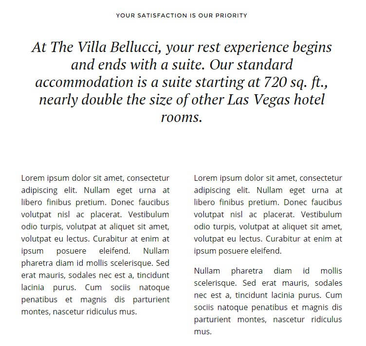
<h3>At The Villa Bellucci, your rest experience begins and ends with a suite. Our standard accommodation is a suite starting at 720 sq. ft., nearly double the size of other Las Vegas hotel rooms.</h3>
<div class="gk-cols" data-cols="2">
<div class="gk-text-justified"><p>Lorem ipsum dolor sit amet, consectetur adipiscing elit. Nullam eget urna at libero finibus pretium. Donec faucibus volutpat nisl ac placerat. Vestibulum odio turpis, volutpat at aliquet sit amet, volutpat eu lectus. Curabitur at enim at ipsum posuere eleifend. Nullam pharetra diam id mollis scelerisque. Sed erat mauris, sodales nec est a, tincidunt lacinia purus. Cum sociis natoque penatibus et magnis dis parturient montes, nascetur ridiculus mus.</p></div>
<div class="gk-text-justified"><p>Lorem ipsum dolor sit amet, consectetur adipiscing elit. Nullam eget urna at libero finibus pretium. Donec faucibus volutpat nisl ac placerat. Vestibulum odio turpis, volutpat at aliquet sit amet, volutpat eu lectus. Curabitur at enim at ipsum posuere eleifend.</p><p>Nullam pharetra diam id mollis scelerisque. Sed erat mauris, sodales nec est a, tincidunt lacinia purus. Cum sociis natoque penatibus et magnis dis parturient montes, nascetur ridiculus mus. </p>
</div>
</div>
</div>
</div>
HTML Breakdown
Since this section is created entirely with text, the HTML layout is much simpler than the previous section, though the code is still slightly more complex than plain text due to the additional styling in the long title and two-column text. First off, let's look at the code with the content replaced with placeholder text to see what goes where:
			    <div class="narrow title-centered">
			    <h3 class="widget-title"><span>Small Top Title</span></h3>
			    <div class="content">
			    <h3>Long-form Title</h3>

			    <div class="gk-cols" data-cols="2">
			    <div class="gk-text-justified">
			    <p>First Column Text</p></div>
			    <div class="gk-text-justified">
			    <p>Second Column First Paragraph Text</p>
			    <p>Second Column Second Paragraph Text</p>
			    </div>
			    </div>
			    </div>
			    </div>
The code opens with a <div> element that wraps the entirety of the section, with two classes attached; title-centered, that centers the title elements of the section, and narrow, which is used to limit the title and column width to emulate the newspaper-style text layout:
<div class="narrow title-centered">
Next is the small title text that appears at the top of the section; this is created with an <h3> tag with the widget-title class attached to modify the font size, as with the previous section. Inside this tag is a plain <span> tag, which in turn contains the small title text:
<h3 class="widget-title"><span>Your satisfaction is our priority</span></h3>
After this is another <div> element with a content class attached that styles the long-form title:
<div class="content">
Next is the long-form title itself, which is created with plain <h3> tags:
<h3>At The Villa Bellucci, your rest experience begins and ends with a suite. Our standard accommodation is a suite starting at 720 sq. ft., nearly double the size of other Las Vegas hotel rooms.</h3>
Now comes the two columns of content. This is created in the same manner as the two columns of text in the Modern Accommodations section; a <div> is added with the gk-cols class attached, which splits the next two <div> elements into columns. There is also a data-cols attribute, that sets the number of columns (in this case, two):
<div class="gk-cols" data-cols="2">
Then the two columns of text are created. Each column consists of a <div> tag with the gk-text-justified class attached to control the layout, followed by standard <p> tags that contain the column text. Once all the text for the column is added it's closed with the closing </div>:
<div class="gk-text-justified"><p>Lorem ipsum dolor sit amet, consectetur adipiscing elit. Nullam eget urna at libero finibus pretium. Donec faucibus volutpat nisl ac placerat. Vestibulum odio turpis, volutpat at aliquet sit amet, volutpat eu lectus. Curabitur at enim at ipsum posuere eleifend. Nullam pharetra diam id mollis scelerisque. Sed erat mauris, sodales nec est a, tincidunt lacinia purus. Cum sociis natoque penatibus et magnis dis parturient montes, nascetur ridiculus mus.</p></div>
Then the second column of text is added, following the same structure, though this time there are two paragraphs rather than one:
			    <div class="gk-text-justified"><p>Lorem ipsum dolor sit amet, consectetur adipiscing elit. Nullam eget urna at libero finibus pretium. Donec faucibus volutpat nisl ac placerat. Vestibulum odio turpis, volutpat at aliquet sit amet, volutpat eu lectus. Curabitur at enim at ipsum posuere eleifend.</p><p>Nullam pharetra diam id mollis scelerisque. Sed erat mauris, sodales nec est a, tincidunt lacinia purus. Cum sociis natoque penatibus et magnis dis parturient montes, nascetur ridiculus mus. </p>
    			</div>
Finally, all the outstanding <div> elements are closed; that is, the columns <div>, then the content <div>, then the frontpage <div>:
			    </div>
			    </div>
			    </div>
Bringing the section to a close.
Changing the Small Title
The small text title that appears at the very top of the section is defined in the combination <h3> and <span> tags in the second line of the code:
			    <div class="narrow title-centered">
    			<h3 class="widget-title"><span>Your satisfaction is our priority</span></h3>
Replace the text between the <span> tags with your own small title:
			    <div class="narrow title-centered">
    			<h3 class="widget-title"><span>Small Top Title</span></h3>
Changing the Long-Form Title
The long title text is created in the second <h3> element of the code, immediately after the <div> containing the content class:
			    <div class="content">
    			<h3>At The Villa Bellucci, your rest experience begins and ends with a suite. Our standard accommodation is a suite starting at 720 sq. ft., nearly double the size of other Las Vegas hotel rooms.</h3>
Replace the text here with your own:
			    <div class="content">
    			<h3>Long-form Title</h3>
Changing the Two Text Columns
The text columns are in self-contained <div> elements following a <div> tag with a gk-cols class attached; this is what separates the text into two columns. It's easy to spot the text columns in the demo code due to their being the only instances of plain <p> tags in the section, and the large amount of placeholder text used:
			    <div class="gk-cols" data-cols="2">
    			<div class="gk-text-justified"><p>Lorem ipsum dolor sit amet, consectetur adipiscing elit. Nullam eget urna at libero finibus pretium. Donec faucibus volutpat nisl ac placerat. Vestibulum odio turpis, volutpat at aliquet sit amet, volutpat eu lectus. Curabitur at enim at ipsum posuere eleifend. Nullam pharetra diam id mollis scelerisque. Sed erat mauris, sodales nec est a, tincidunt lacinia purus. Cum sociis natoque penatibus et magnis dis parturient montes, nascetur ridiculus mus.</p></div>

			    <div class="gk-text-justified"><p>Lorem ipsum dolor sit amet, consectetur adipiscing elit. Nullam eget urna at libero finibus pretium. Donec faucibus volutpat nisl ac placerat. Vestibulum odio turpis, volutpat at aliquet sit amet, volutpat eu lectus. Curabitur at enim at ipsum posuere eleifend.</p><p>Nullam pharetra diam id mollis scelerisque. Sed erat mauris, sodales nec est a, tincidunt lacinia purus. Cum sociis natoque penatibus et magnis dis parturient montes, nascetur ridiculus mus. </p>
			    </div>
Notice that there are two <div> elements in the above code; this each one represents a column. So if you want to add text to left column, you would modify the text in the first <div> and <p> tags, and modify the text in the second tags for the right column:
			    <div class="gk-cols" data-cols="2">
			    <div class="gk-text-justified">
			    <p>First Column Text</p></div>
			    <div class="gk-text-justified">
			    <p>Second Column First Paragraph Text</p>
			    <p>Second Column Second Paragraph Text</p>
			    </div>
There is no limit to the number of paragraphs or their length that you may add to either column; to add more, just create another set of <p> tags and add your content. Just bear in mind that going too crazy with text will make your site look a bit too much like a newspaper!
The Bottom Slideshow
The second slideshow provides another area for displaying your images, allowing your site to highlight facilities, room layouts, local attractions and more:
This section is created using the Fourth Subpage of the Frontpage.
- Frontpage (header reservation form)
- First Subpage (header slideshow)
- Second Subpage ("Modern Accommodations" and hotel information text and image grid)
- Third Subpage ("Your satisfaction is our priority" text section)
- Fourth Subpage (bottom slideshow)
- Fifth Subpage (room showcase)
- Sixth Subpage (Testimonials)
- Seventh Subpage (Blog highlights)
As with the header slideshow, this subpage does not contain any information itself; instead, it acts as a base for subpages containing the slides.
How It Works
The bottom slideshow works in exactly the same way as the header slideshow, in that the fourth subpage acts as a blank base, and then subpages are added to the subpage, with each one creating a new slide and its content:
- Fourth Subpage (bottom slideshow)
- First bottom slideshow slide
- Second bottom slideshow slide
- Third bottom slideshow slide
- Fourth bottom slideshow slide
- Fifth bottom slideshow slide
So the fourth subpage that acts as the base for the slideshow doesn't have anything in it, save a title so that it can be distinguished from the other pages in the backend. The actual meat of the slides is taken from the subpages added to this base.
Each slide consists of two elements; a slide image, and a text overlay. These elements are generated from the slide subpages, with the Featured Image of the slide page providing the slide image, and the title of the slide page providing the overlaid text.
So there's a blank base subpage, which is the fourth subpage of the frontpage. To this subpage, more subpages (so technically sub-subpages!) are added, with each one including a featured image and a title, which are automatically added to the slideshow.
Changing a Slide's Image
Each slide in the bottom slideshow is created from subpages of the Bottom Slideshow page, just like in the header. To change an existing slide's image, in your WordPress backend click on Pages → All Pages to see a list of your pages, and click on the slide page you want to change; the slide title is the same as the overlaid text on the slide if you're having trouble finding the one you want to amend.
Once on the Edit Page screen, you will see the current slide image in the Featured Image section in the right sidebar. To remove the existing slide, click on the Remove Featured Image text under the image.
Once the image is removed, you can specify your new slide image. To do so, click on the Set Featured Image text in the Featured Image section. Your media library will open, and you may upload your slide or select an existing image from your library to use. Once done, click on the Save button at the top of the screen to save changes, and your new slide is ready!
When selecting an image, bear in mind your current image width and height settings (these may be set in the WordPress Customizer). If the image does not match the slideshow's set dimensions it will be cropped & zoomed to fit, which may affect the aesthetics of the slide if there are major discrepancies between the slider's settings and the image ratio.
Changing a Slide's Overlay Text
The overlaid text of a slide is taken from the title of the slide page; to change it, open the Edit Page screen for the slide you want to modify, then change the text in the Title field and click the Update button in the top-right to save changes. The new title text will automatically be added in the overlay text.
Adding a New Slide
To add new slides to the bottom slideshow you'll just add new subpages to the fourth subpage, including the title and featured image for the slide. First click on Pages → Add New in your WordPress dashboard. Once on the edit screen for your new page, look for the Page Attributes section in the right sidebar. Here, you will see there is a Parent option with a drop-down list of your pages; select your bottom slideshow base page as your new page's parent; the theme will automatically use this new subpage as a slide.
Now we need to add the slide elements. First, set the slide image by clicking on the Set Featured Image button in the Featured Image section of the right sidebar, and uploading a slide image or selecting one from your Media Library.
Next, add a title to the Title field; this will be used as the large text overlay on the slide.
Now click on the Publish button to make the page public; the slide will be automatically displayed in the header slideshow.
Note: The order of the slides in the slideshow is defined by their date of creation, so if you wish to change the order you will need to delete the older slides and recreate them in a new slide page to move them to the end.
The Room Showcase Section
The rooms showcase provides a highlight for the room types available, with an image, price and description plus a link to make a booking:

This section is created using HTML code from the Fifth Subpage of the Frontpage:
- Frontpage (header reservation form)
- First Subpage (header slideshow)
- Second Subpage ("Modern Accommodations" and hotel information text and image grid)
- Third Subpage ("Your satisfaction is our priority" text section)
- Fourth Subpage (bottom slideshow)
- Fifth Subpage (room showcase)
- Sixth Subpage (Testimonials)
- Seventh Subpage (Blog highlights)
And the basic code used in the demo layout is as follows:
		    <h3 class="widget-title regular-space"><span>Modern Accommodations</span></h3>
		    <h3>Villa Bellucci has 264 elegantly furnished and air conditioned classic rooms, <br>ideal for business and leisure travellers.</h3>

		    [gknsp use_css="off" cache_time="0" article_format="rooms.format" widget_css_suffix="offers" article_cols="3" article_rows="1" article_block_padding="60px 5px 20px 5px" article_image_w="400" article_image_h="240" data_source_type="wp-custom" post_types_list="gk_rooms" orderby="date" order="ASC" article_text_len="24"]
HTML Breakdown
The HTML code for this section can actually be split into two distinct parts, only the first part of which is HTML. First off, let's change the HTML code to use placeholder text instead of the demo text so it's easier to see where everything goes:
			    <h3 class="widget-title regular-space"><span>Small Title</span></h3>
	    		<h3>Introductory Text</h3>

			    [gknsp Shortcode Attributes Here]
The first part is very simple and provides the introductory title and text:
			    <h3 class="widget-title regular-space"><span>Modern Accommodations</span></h3>
	    		<h3>Villa Bellucci has 264 elegantly furnished and air conditioned classic rooms, <br>ideal for business and leisure travellers.</h3>
Whilst the second part isn't HTML; instead, it's a shortcode that creates an instance of our News Show Pro widget, which provides previews of your posts:
[gknsp use_css="off" cache_time="0" article_format="rooms.format" widget_css_suffix="offers" article_cols="3" article_rows="1" article_block_padding="60px 5px 20px 5px" article_image_w="400" article_image_h="240" data_source_type="wp-custom" post_types_list="gk_rooms" orderby="date" order="ASC" article_text_len="24"]
In this case, it has been specifically set-up to display previews of your room pages, which are created using the Rooms plugin (more information on this plugin may be found in the Theme Features section of this guide). Let's examine the opening HTML code first. It opens with an <h3> tag that has two classes attached; widget-title, which sets the font size to be smaller than the standard, and regular-space, which controls the padding and spacing around the title. Within this tag is a plain <span> tag that surrounds the title text itself:
<h3 class="widget-title regular-space"><span>Modern Accommodations</span></h3>
Next comes the larger intro text; this is just a plain <h3> tag containing the text, with a <br> tag used to move the text to a new line where needed:
<h3>Villa Bellucci has 264 elegantly furnished and air conditioned classic rooms, <br>ideal for business and leisure travellers.</h3>
After this is the News Show Pro shortcode:
[gknsp use_css="off" cache_time="0" article_format="rooms.format" widget_css_suffix="offers" article_cols="3" article_rows="1" article_block_padding="60px 5px 20px 5px" article_image_w="400" article_image_h="240" data_source_type="wp-custom" post_types_list="gk_rooms" orderby="date" order="ASC" article_text_len="24"]
It probably looks rather complex, but once you understand how the shortcode works it becomes much clearer. Let's break it down; we start with the basic shortcode:
[gknsp]
What this shortcode does is creates an instance of the News Show Pro widget in your page content, or in this case, in your frontpage content. However, this basic shortcode will create the widget with all the default settings, which won't match the theme at all. If this was a standard widget we could open the widget options and change them to suit our needs, but since this is a shortcode any option changes will need to be added as attributes, using the following format:
[gknsp Option_name="New_Option_Value"]
So if we want to set the cache time to "100", we would change the basic shortcode to:
[gknsp cache_time="100"]
More options can be added one after another in the shortcode until all the options have been set. In the demo content, the following attributes are added:
- use_css - This option decides whether the default CSS for the widget is loaded. Villa Bellucci has its own CSS that's specific to the theme, so this option is set to Off in the demo content.
- cache_time - This option sets how long the widget settings should be stored in cache. In the demo this is set to 0 so users will always see the latest version of the widget every time they visit, including any new styling or articles.
- article_format - This option is used to specify the type of article being showcased; because this section is displaying showcases from the special Rooms plugin, this option is set to rooms.format.
- widget_css_suffix - One of the most important options, this lets you define CSS suffixes specific to the widget so that you can target your CSS rules directly. The demo content specifies one suffix; offers, which provides most of the CSS styling of the section.
- article_cols & article_rows - Another two important options; these two attributes sets the number of columns and rows that NSP should create, which in turn defines the number of showcases. For example, in the demo content article_cols is set to 3 and article_rows is set to 1, so there's a single row of three room previews. By modifying these settings you can change the number of showcases.
- article_block_padding - This option lets you set the padding for the articles in pixels; up to four numbers can be entered to represent the padding for the top, right, bottom and left margins in turn. In the demo content this is set as 60px 5px 20px 5px.
- article_image_w - Defines the width of the article showcase image in pixels. In the demo content this is set to 400.
- article_image_h - Defines the height of the article showcase image in pixels. Set to 240 in the demo content.
- data_source_type - This option is used to specify the data source, or where the widget should look for articles to display. This can be set to pull from particular categories, specific posts and more. In the demo content, this option is set to wp-custom, as the Rooms plugin is not a standard WordPress source.
- post_types_list - This option works in tandem with the data source type option to set which particular posts should be showcased. For example, if the data source is set as categories, then this option will specify which categories. In the demo content, this option is set to gk_rooms, which pulls from the Rooms plugin.
- orderby - Sets the ordering for the showcased posts. This can be set to sort items by ID, date etc...In the demo content, this option is set to date.
- order - Sets whether the ordering defined in the orderby attribute is ascending or descending. In the demo content this is set to ASC (ascending).
- article_text_len - This option sets the length of the preview text (in number of words) that each article showcase displays. Set to 10 in the demo.
Once all of these attributes are added to the shortcode the rooms showcase will look like the demo, but there are a huge amount of extra options available; more details can be found in this News Show Pro-focused blog article.
Changing the Small Title
The small title that appears at the top of the section is created, like in several other frontpage sections, in the combination <h3> and <span> tags that being the HTML code of the page:
<h3 class="widget-title regular-space"><span>Modern Accommodations</span></h3>
So simply replace the text between the <span> tags with your own text:
<h3 class="widget-title regular-space"><span>Small Title</span></h3>
Changing the Intro Text
After the small title is some larger introductory text that appears before the room showcases; this text is taken from the plain <h3> tags that appear after the small title's tags:
<h3>Villa Bellucci has 264 elegantly furnished and air conditioned classic rooms, <br>ideal for business and leisure travellers.</h3>
So just replace the text between these tags with your own:
<h3>Introductory Text</h3>
Adding More Article Showcases
In the default News Show Pro settings three room showcases are displayed; one row of three columns. If you have more or less room types to display in the showcase section we will need to change the number of rows and columns to match our required layout; this is achieved by modifying the article_cols (for columns) and article_rows (for rows) attribute. In the demo layout they are set to three and one respectively:
article_cols="2" article_rows="2"
Which creates three showcases. Depending on your requirements, you can choose to expand your number of showcases by adding extra rows, or extra columns. For example, let's say we wanted four rooms showcased in a single row; we'd leave the number of rows at one, but change the number of columns to four:
article_cols="4" article_rows="1"
Whereas if we wanted six showcases over two rows, we'd change the rows to two, but leave the columns as three:
article_cols="3" article_rows="2"
Something that is important to note is that the height of block that contains the showcases is fluid, while the width is not. This means that if you add more columns, then there will be less total space for each showcase i.e. if you have two columns then both columns are set at 50% of the available width. By adding a third column, each column will be reduced to 33% of the available width. This means that when adding more columns you'll likely need to reduce the length of the text previews to ensure it remains visually-appealing.
This is why it's generally a good idea to expand this section vertically by adding more rows, rather than adding more columns that have limited useable space.
Changing Preview Text Lengths
If you want to increase or reduce the length of the preview text you will need to modify the article_text_len attribute. In the demo content the text length is defined in number of words; simply modify the value of the attribute according. So if you wanted to have a preview text length of ten words, the shortcode would look like this:
[gknsp article_text_len="10"]
The Testimonials Section
This section looks like a slideshow at first, but it's actually a static background with rotating testimonial text; great for showing off your happy customer comments:
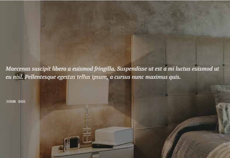
The HTML code for this section is taken from the Sixth Subpage of the Frontpage:
- Frontpage (header reservation form)
- First Subpage (header slideshow)
- Second Subpage ("Modern Accommodations" and hotel information text and image grid)
- Third Subpage ("Your satisfaction is our priority" text section)
- Fourth Subpage (bottom slideshow)
- Fifth Subpage (room showcase)
- Sixth Subpage (Testimonials)
- Seventh Subpage (Blog highlights)
And the basic HTML code used is:
		    <figure data-zindex="1">
		    <figcaption class="site mode-testimonial">
		    <div>
		    <blockquote>
		    Pellentesque egestas tellus ipsum, a cursus nunc maximus quis.
		    Maecenas suscipit libero a euismod fringilla. Suspendisse ut est a mi luctus euismod ut eu nisl.
		    <cite>Robert Gavick</strong></cite>
		    </div>
		    </figcaption >
		    </figure>

		    <figure data-zindex="2">
		    <figcaption class="site mode-testimonial">
		    <div>
		    <blockquote>
		    Maecenas suscipit libero a euismod fringilla. Suspendisse ut est a mi luctus euismod ut eu nisl. Pellentesque egestas tellus ipsum, a cursus nunc maximus quis.
		    <cite>John Doe</strong></cite>
		    <div>
		    </figcaption>
		    </figure>
HTML Breakdown
After some of the in-depth code and shortcodes of the past few sections, the code for the testimonials is much simpler! As always, we'll start by replacing the demo content with placeholder text:
			    <figure data-zindex="1">
			    <figcaption class="site mode-testimonial">
			    <div>
			    <blockquote>
			    First Quote Text
			    <cite>First Quote Citation</strong></cite>
			    </div>
			    </figcaption >
			    </figure>

			    <figure data-zindex="2">
			    <figcaption class="site mode-testimonial">
			    <div>
			    <blockquote>
			    Second Quote Text
			    <cite>Second Quote Citation</strong></cite>
			    <div>
			    </figcaption>
			    </figure>
As you can tell, the majority of the tags are for applying the CSS reveal effects; the actual text content is very simple to modify. Let's break it down:
First things first; the background image is taken from the Featured Image of the page, so the HTML deals only with the testimonials. However, since the testimonials rotate like slides, there's a bit more HTML structure than you'd find in a plain, non-rotating testimonial section. Each testimonial follows the same pattern; first, a <figure> tag is created that will contain all the required elements of the testimonial:
<figure data-zindex="1">
Notice that it has an attribute; data-zindex, which is set to one. This attribute defines the order of the testimonials in ascending order, so the testimonial with data-zindex of one is first, the testimonial with two is second etc...
Next is a <figcaption> tag that contains two classes used to style the testimonial, site and mode-testimonial:
<figcaption class="site mode-testimonial">
Then comes a opening <div> tag that will wrap the quote, followed by a <blockquote> tag that contains the quote text:
			    <div>
			    <blockquote>
			    Pellentesque egestas tellus ipsum, a cursus nunc maximus quis.
			    Maecenas suscipit libero a euismod fringilla. Suspendisse ut est a mi luctus euismod ut eu nisl.
And the citation name is added using a <cite> tag, before the testimonial is closed:
			    <cite>First Quote Citation</cite>
			    </div>
			    </figcaption>
			    </figure>
For the second testimonial, the same structure is repeated but the data-zindex attribute is set to two:
			    <figure data-zindex="2">
			    <figcaption class="site mode-testimonial">
			    <div>
			    <blockquote>
			    Maecenas suscipit libero a euismod fringilla. Suspendisse ut est a mi luctus euismod ut eu nisl. Pellentesque egestas tellus ipsum, a cursus nunc maximus quis.
			    <cite>John Doe</strong></cite>
			    <div>
			    </figcaption>
			    </figure>
Which ends the section.
Changing the Testimonial Text
Each testimonial's text is set after the <blockquote> tag in the fourth line of the code:
			    <figure data-zindex="1">
			    <figcaption class="site mode-testimonial">
			    <div>
			    <blockquote>
			    Pellentesque egestas tellus ipsum, a cursus nunc maximus quis.
			    Maecenas suscipit libero a euismod fringilla. Suspendisse ut est a mi luctus euismod ut eu nisl.
Simply replace this text with your own for each quote you wish to change:
			    <figure data-zindex="1">
			    <figcaption class="site mode-testimonial">
			    <div>
			    <blockquote>
			    Quote Text
Changing the Testimonial Citation
The citations (the name that appears under the quote to show who said it) is created in the <cite> tags immediately after the end of the quote text:
			    <blockquote>
			    Pellentesque egestas tellus ipsum, a cursus nunc maximus quis.
			    Maecenas suscipit libero a euismod fringilla. Suspendisse ut est a mi luctus euismod ut eu nisl.
			    <cite>Robert Gavick</strong></cite>
Replace the text between these tags as needed:
			    <blockquote>
    			First Quote Text
    			<cite>First Quote Citation</strong></cite>
Adding/Removing Testimonials
Each testimonial is contained in a <figure> tag, with all the elements between them:
			    <figure data-zindex="1">
			    <figcaption class="site mode-testimonial">
			    <div>
			    <blockquote>
			    First Quote Text
			    <cite>First Quote Citation</strong></cite>
			    </div>
			    </figcaption >
			    </figure>
So to add new testimonials, you need only recreate this structure (just copying and pasting it is fine), change the content, and add it to the end of the existing code. However, there is one additional step that you will need to take whenever adding a new testimonial; in the opening <figure> there is a data-zindex attribute; this attribute's value corresponds to the order that the testimonials appear, so the first testimonial is set to one, the second to two and so on. Because of this, when creating an additional testimonial it is necessary to change the data-zindex value to match the next available number i.e. if you have two testimonials:
			    <figure data-zindex="1">
			    <figcaption class="site mode-testimonial">
			    <div>
			    <blockquote>
			    First Quote Text
			    <cite>First Quote Citation</strong></cite>
			    </div>
			    </figcaption >
			    </figure>

			    <figure data-zindex="2">
			    <figcaption class="site mode-testimonial">
			    <div>
			    <blockquote>
			    Second Quote Text
			    <cite>Second Quote Citation</strong></cite>
			    <div>
			    </figcaption>
			    </figure>
When you add a third its data-zindex should be set to three:
			    <figure data-zindex="1">
			    <figcaption class="site mode-testimonial">
			    <div>
			    <blockquote>
			    First Quote Text
			    <cite>First Quote Citation</strong></cite>
			    </div>
			    </figcaption >
			    </figure>

			    <figure data-zindex="2">
			    <figcaption class="site mode-testimonial">
			    <div>
			    <blockquote>
			    Second Quote Text
			    <cite>Second Quote Citation</strong></cite>
			    <div>
			    </figcaption>
			    </figure>

			    <figure data-zindex="3">
			    <figcaption class="site mode-testimonial">
			    <div>
			    <blockquote>
			    Third Quote Text
			    <cite>Third Quote Citation</strong></cite>
			    </div>
			    </figcaption >
			    </figure>
There is no limit to the number of testimonials you may add to this section, so feel free to add as many as needed. To remove a testimonial, you need only delete the relevant block; though you must also remember to adjust the data-zindex attributes according. For example, if there are three quotes as in the above code, and the second testimonial is deleted, then the third testimonials data-zindex must be changed to two.
The Blog Highlights Section
This section provides showcases for your blog articles:
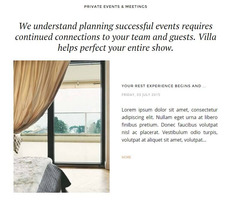
This section's HTML code is taken from the Seventh Subpage of the Frontpage:
- Frontpage (header reservation form)
- First Subpage (header slideshow)
- Second Subpage ("Modern Accommodations" and hotel information text and image grid)
- Third Subpage ("Your satisfaction is our priority" text section)
- Fourth Subpage (bottom slideshow)
- Fifth Subpage (room showcase)
- Sixth Subpage (Testimonials)
- Seventh Subpage (Blog highlights)
And the HTML code as used in the demo looks like this:
		    <div class="regular-space narrow title-centered">
		    <h3 class="widget-title"><span>Private Events & Meetings</span></h3>
		    <div class="content">
		    <h3>We understand planning successful events requires continued connections
		    to your team and guests. Villa helps perfect your entire show.</h3>

		    [gknsp use_css="off" cache_time="0" article_format="hotel-blog.format" widget_css_suffix="category-layout" article_cols="1" article_rows="2" article_block_padding="75px 0" article_title_len="32" article_title_len_type="chars" article_text_len="30" article_image_w="320" article_image_h="440" article_info_date_format="l, d F Y" orderby="date"]
		    </div>
		    </div>
HTML Breakdown
Just like the Rooms Showcase section, the code in this section can be split into two distinct parts; the normal HTML content that creates the small title and introductory text, and a shortcode that creates an instance of the News Show Pro widget. Let's remove the demo content and replace it with placeholder text to see how this is laid out:
			    <div class="regular-space narrow title-centered">
			    <h3 class="widget-title"><span>Small Title</span></h3>
			    <div class="content">
			    <h3>Introductory Text</h3>

			    [gknsp Shortcode Attributes Here]
			    </div>
			    </div>
The section starts with a <div> element that surrounds the entire section; it includes three classes that add some important styling and layout CSS to the section; regular-space, which controls the padding used throughout the section, narrow, which reduces the width of the section to create a narrower set of columns for the showcases, and title-centered, which centers the text for a symmetrical look.
<div class="regular-space narrow title-centered">
Then comes the small title; just like the small titles seen in the earlier frontpage sections this is created with a combination of an <h3> tag with the widget-title class to set the font-size, and a <span> tag that contains the small title text:
<h3 class="widget-title"><span>Private Events & Meetings</span></h3>
After this is another <div>that will wrap the introductory text and News Show Pro showcases, with a content class attached:
<div class="content">
Then the introductory text is added in a set of <h3> tags:
			    <h3>We understand planning successful events requires continued connections
    			to your team and guests. Villa helps perfect your entire show.</h3>
Now comes the News Show Pro shortcode; this is functionally the same as the shortcode used in the Rooms Showcase section, but there are several differences in terms of attributes to set the different layout. As before, the basic shortcode is as follows:
[gknsp]
And attributes are added before the closing brackets to change the default options. The attributes used in the demo content are:
- use_css - This option decides whether the default CSS for the widget is loaded. Villa Bellucci has its own CSS that's specific to the theme, so this option is set to Off in the demo content.
- cache_time - This option sets how long the widget settings should be stored in cache. In the demo this is set to 0 so users will always see the latest version of the widget every time they visit, including any new styling or articles.
- article_format - This option is used to specify the type of article being showcased; because this section is displaying showcases from the special Rooms plugin, this option is set to hotel-blog.format.
- widget_css_suffix - One of the most important options, this lets you define CSS suffixes specific to the widget so that you can target your CSS rules directly. The demo content specifies one suffix; category-layout, which provides most of the CSS styling of the section.
- article_cols & article_rows - Another two important options; these two attributes sets the number of columns and rows that NSP should create, which in turn defines the number of showcases. For example, in the demo content article_cols is set to 1 and article_rows is set to 2, so there's one column of two blog showcases.
- article_block_padding - This option lets you set the padding for the articles in pixels; up to four numbers can be entered to represent the padding for the top, right, bottom and left margins in turn. In the demo content this is set as 75px 0.
- article_title_len - Sets the length of the title (in characters or words) of the article showcase. Set to 32 in the demo.
- article_title_len_type - Defines whether the article_title_len attribute refers to total characters or total words; in the demo this is set to chars, or characters.
- article_text_len - This option sets the length of the preview text (in number of words) that each article showcase displays. Set to 30 in the demo.
- article_image_w - Defines the width of the article showcase image in pixels. In the demo content this is set to 320.
- article_image_h - Defines the height of the article showcase image in pixels. Set to 440 in the demo content.
- article_text_len - This option sets the length of the preview text (in number of words) that each article showcase displays. Set to 10 in the demo.
- article_info_date_format - Defines the format of the date that is listed under the title of the blog post in the showcase. In the demo content this is set to l, d F Y.
- orderby - Sets the ordering for the showcased posts. This can be set to sort items by ID, date etc...In the demo content, this option is set to date.
After all the attributes are added, the section is closed out with two closing </div> tags:
			    </div>
    			</div>
The attributes listed above are just a few of the available options; more details can be found in this News Show Pro-focused blog article.
Changing the Small Title
Like the other frontpage sections, the small title is contained in a <span> tag inside an <h3> tag that has the widget-title class attached:
<h3 class="widget-title"><span>Private Events & Meetings</span></h3>
Simply add your own text between these tags:
<h3 class="widget-title"><span>Small Title</span></h3>
Changing the Intro Text
The intro text is contained in a plain set of <h3> tags immediately after the small intro text:
			    <h3>We understand planning successful events requires continued connections
    			to your team and guests. Villa helps perfect your entire show.</h3>
So you may add your own text as needed:
<h3>Introductory Text</h3>
Adding More Article Showcases
In the default News Show Pro settings in Villa Belluci two articles are displayed over two rows, one for each row. To change the number of displayed articles we will need to change the number of rows to match our required layout; this is achieved by modifying the article_rows attribute (the narrow layout limits the number of columns to one, hence why we may only expand the rows). In the demo layout they are set to one column and two rows:
article_rows="2"
Which produces two article showcases. By changing the number of rows, you can add additional showcases. So if we wanted three showcases, we would change the attribute to three:
article_rows="3"
Bear in mind that the size of the previews means that each one added significantly increases the overall height of the section, so it is advisable to avoid adding too many rows.
Changing the Data Source
The standard settings used in the demo content does not specify data sources, so this leaves the options as default. The default behavior of News Show Pro is to display your latest WordPress posts from all categories. However, you may find that you'd prefer blog posts from a specific category are highlighted only, or that specific posts are highlighted for complete control of your frontpage. In these cases, we'll need to add some additional attributes to define the data source behavior.
First, we need to define the type of data source; we'll do this by adding a data_source_type attribute to the NSP shortcode using the following format:
data_source_type="wp-source"
Where source defines the type of source (category, tags etc...). There are several available options here, but we'll likely want to use one of the following:
- wp-latest - Set the source as the latest posts on all categories (default behavior).
- wp-category - Sets the source as one of your WordPress post categories.
- wp-post - Allows you to specify particular posts to be displayed.
After adding the data_source_type attribute, you'll need to define the category/tag/posts that you want NSP to pull from. To do this, we'll need to add a data_source attribute (for posts) or a wp_category_list attribute (for categories).
If you're using the data_source attribute to define specific posts to display, you will need to add either the slugs of the chosen posts, or the ID number. To find the slug of a particular post, click on Posts → All Posts in your WordPress backend. In the list of posts, hover your cursor over the post you want to find the slug for to see a set of options. Click on the Quick Edit option to open a new set of fields; the second field contains the slug, so you can copy and paste this into the value:
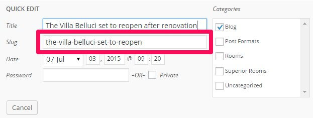
For example, in the demo content there is a post called "The Villa Belluci set to reopen after renovation", and the slug for this post is "the-villa-belluci-set-to-reopen". If we wanted NSP to show only that post, we would use the following shortcode:
[gknsp data_source_type="wp-post" data_source="the-villa-belluci-set-to-reopen"]
If you're using the wp_category_list attribute to define a category that articles should be pulled from, then you'll need to find the ID of the category you wish to use. To do so, click on Posts → Categories to see a list of categories, and click on the category you wish to use to be taken to the Edit Category screen. Now check the URL of the page; you'll notice that towards the end of the URL there's a section that looks like this:
&tag_ID=x
Where "x" is a number.

This is the category ID; add this number as the value of the wp_category_list attribute and save changes; NSP will now automatically display the latest posts from this category as you add them. For example, in the demo content the blog category has an ID of 3; to display this category's posts only in NSP, the shortcode would look like this:
[gknsp data_source="wp-category" wp_category_list="3"]
Note: You can add multiple category IDs or post slugs to these attributes as needed; just separate each ID or slug with a comma.
Changing Preview Text Lengths
If you modify the number of showcases via the row changes described above, you may find that your titles or preview texts are too long, and wrap in a way that does not look attractive, or take up too many lines on the page. In this case, you can modify the length of these elements to fit their space better. To do this, you will need to modify the article_title_len attribute (for the title), and the article_text_len attribute (for the preview text). In the demo content, the title length is defined by number of characters, and the text length is defined in number of words. Simply modify their respective values in the attributes. For example, if you wanted the title to be a maximum of 30 characters long, and the preview text to be 7 words, the shortcode would look like this:
[gknsp article_text_len="7" article_title_len="30"]
Theme Features
Villa Belluci includes additional featured to help you build your hotel website, including a dedicated Rooms plugin that creates uniquely-styled pages to highlight your available rooms types, Advanced Typography that expands your writing toolset, and a gallery page layout for users to get previews of your amenities and local attractions. In this section we'll look at how each of these additional features can be used.
The Rooms Plugin
The Rooms plugin is an exclusive addition to Villa Belluci for WordPress that creates a Custom Post Type specifically for your rooms, with a unique layout separate from the standard blog style:
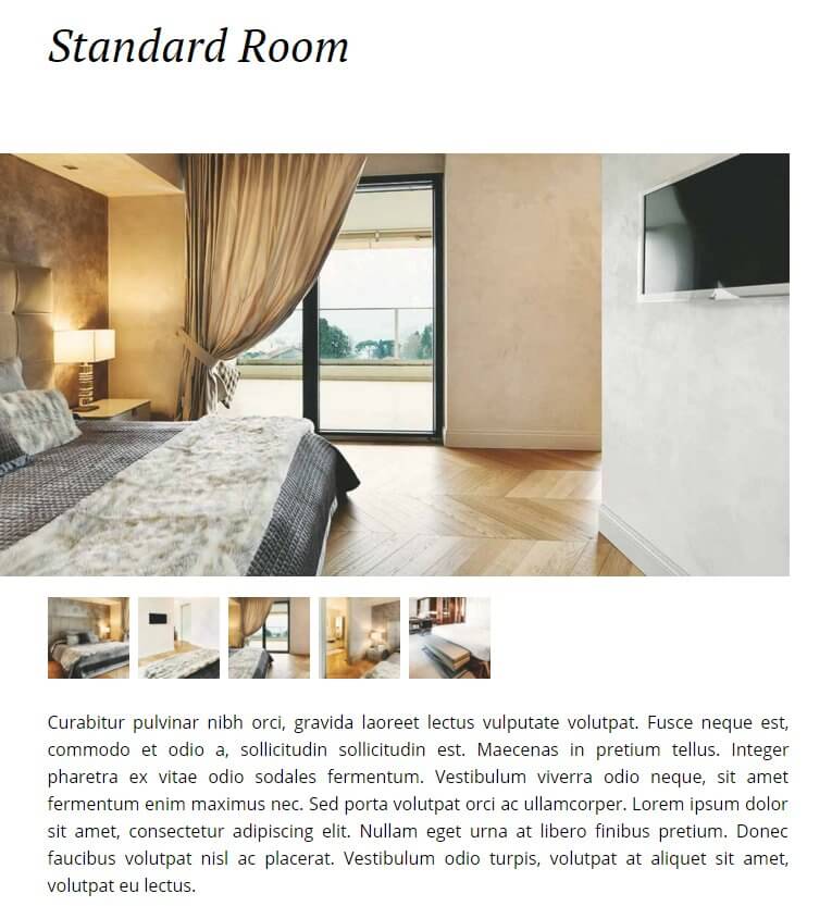
Here we'll cover all the steps you need to create your own room category and pages, as well as how to modify some of the basic settings. If you previously imported the demo content when installing the theme then you will already have an existing category and demo room pages already prepared, ready for modification.
The Rooms Category
The category you use to store your room pages is the same as creating a standard category; no additional options will need to be set. However, because there are some options behind the scenes that need to be created, it is important to make sure that any rooms categories you create are created in the Rooms plugin, and not via the standard Posts → Categories section. In the demo content a Rooms category is already created, so this step can be skipped. To create a category, click on Rooms → Categories in your WordPress dashboard's main menu to open the Categories page.

Here, add your new category's name to the Name field under the Add New Category heading on the left, and add a description of the category in the Description box. Both of these elements are important as they will be displayed at the top of the room listing page:

Now add an identifying name in the Slug field; this may be used in URLs so it should be lowercase and contain no spaces. Instead, hyphens or underscores should be used, such as:
hotel-rooms
In the demo content the category name is set to Rooms, and the slug is the same but lowercase, rooms. Once these fields are complete click the Add New Category button at the bottom of the column and the category will be added to the list of existing categories in the right column. Your category is now ready to have some room types assigned to it.
Rooms Pages
With a category prepared for your rooms, the next step is to create your room pages. This will be functionally similar to creating standard posts, except created via the Rooms plugin and using a special HTML layout and custom post fields to add room-specific information to the page, such as room amenities. If you've installed the quickstart or demo content then you'll already have three example rooms ready to go that you can modify, or you can create a new room from scratch.
Creating a New Room Page
To create a new room page, click on Rooms → Add New in the WordPress dashboard; you will be taken to the Add New Room page, which will look exactly the same as a standard Add New Post page so it's easy to follow.
The first thing to do is add a title; this should be the name of the room type such as Superior Non-Smoking Room. The title will be displayed in the room highlights on the front page as well as the rooms category list, so make sure the name is distinct. Then, you should assign a Featured Image to the page by clicking the Add Featured Image text at the bottom of the right sidebar; this will open the media library and allow you to select an image to add to the page. This image will then be displayed at the very top of the room page, just below the title.
The last step is to create the page content; this covers everything that appears under the featured image. It's advisable to switch the editor to Text mode since we'll be copying and pasting HTML code directly into the editor. As an example, the HTML for the Standard Room in the demo content looks like this:
				    [gallery columns="8" link="file" ids="102,99,96,94,105"]
				    <p class="room-intro-text">Curabitur pulvinar nibh orci, gravida laoreet lectus vulputate volutpat. Fusce neque est, commodo et odio a, sollicitudin sollicitudin est. Maecenas in pretium tellus. Integer pharetra ex vitae odio sodales fermentum. Vestibulum viverra odio neque, sit amet fermentum enim maximus nec. Sed porta volutpat orci ac ullamcorper. Lorem ipsum dolor sit amet, consectetur adipiscing elit. Nullam eget urna at libero finibus pretium. Donec faucibus volutpat nisl ac placerat. Vestibulum odio turpis, volutpat at aliquet sit amet, volutpat eu lectus.</p>

				    <div class="tariff-box">
				    <div class="span5">
				    <strong>Summer Holiday</strong><p>Enjoy your summer holiday at our hotel!</p></div>
				    <div class="room-price align-right ">
				    <span class="starting_from">Starting from</span><span class="min_tariff">EUR99.00</span><span class="tariff_suffix">/ room / 1 night</span>                                             </div>
				    </div>

				    <div class="info">
				    <h3>Facilities</h3>

				    <div class="row-fluid custom-field-row">
				    <div class="span2 info-heading">General</div>
				    <div class="span10">Family Rooms, Heating, Ironing facilities </div>
				    </div>

				    <div class="row-fluid custom-field-row">
				    <div class="span2 info-heading">Activities</div>
				    <div class="span10">Tennis Court, Fitness Center, Spa, Massage </div>
				    </div>

				    <div class="row-fluid custom-field-row">
				    <div class="span2 info-heading">Services</div>
				    <div class="span10">Airport Shuttle, Shuttle Service (Surcharge), Ironing Service</div>
				    </div>

				    <div class="row-fluid custom-field-row">
				    <div class="span2 info-heading">Internet</div>
				    <div class="span10">Wi-Fi is available in the hotel rooms and costs EUR 5 per 24 hours.</div>
				    </div>

				    <div class="row-fluid custom-field-row">
				    <div class="span2 info-heading">Parking</div>
				    <div class="span10">No parking available.</div>
				    </div>

				    <h3>Policies</h3>

				    <div class="row-fluid custom-field-row">
				    <div class="span2 info-heading">Checkin</div>
				    <div class="span10">3:00 am - 9.00 pm</div>
				    </div>

				    <div class="row-fluid custom-field-row">
				    <div class="span2 info-heading">Checkout</div>
				    <div class="span10">7.00 am - 9.00 pm</div>
				    </div>

				    <div class="row-fluid custom-field-row">
				    <div class="span2 info-heading">Cancellation / Prepayment</div>
				    <div class="span10">Cancellation and prepayment policies vary according to apartment type. Please check the Apartment Conditions when selecting your apartment above. </div>
				    </div>

				    <div class="row-fluid custom-field-row">
				    <div class="span2 info-heading">Children and extra beds</div>
				    <div class="span10">Free! One child under 4 years stays free of charge when using existing beds. One child under 3 years is charged EUR 20 per night in a crib. One older child or adult is charged EUR 20 per night in an extra bed. The maximum number of extra beds/cribs in a room is 1. Any type of extra bed or crib is upon request and needs to be confirmed by management. Additional fees are not calculated automatically in the total cost and will have to be paid for separately during your stay.</div>
				    </div>

				    <div class="row-fluid custom-field-row">
				    <div class="span2 info-heading">Pets</div>
				    <div class="span10">Pets are not allowed.</div>
				    </div>

				    <div class="row-fluid custom-field-row">
				    <div class="span2 info-heading"> Accepted credit cards</div>
				    <div class="span10">American Express, Visa, Euro/Mastercard, Diners Club, Maestro. The hotel reserves the right to pre-authorise credit cards prior to arrival.. </div>
				    </div>
				    </div>
HTML Breakdown
The page code above may look rather complex and imtimidating, but this is only due to the number of amenities and information sections being added; once we understand the formatting it becomes a lot easier to follow. First off, let's replace the example text in the HTML with placeholders:
				    [gallery columns="8" link="file" ids="102,99,96,94,105"]
    				<p class="room-intro-text">Intro Text Here</p>

				    <div class="tariff-box">
				    <div class="span5">
				    <strong>Offer Name</strong><p>Offer Text</p></div>
				    <div class="room-price align-right ">
				    <span class="starting_from">Text Above Price</span><span class="min_tariff">Price</span><span class="tariff_suffix">Text Under Price</span>
				    </div>
				    </div>

				    <div class="info">
				    <h3>Amenity Category</h3>

				    <div class="row-fluid custom-field-row">
				    <div class="span2 info-heading">First Amenity Title</div>
				    <div class="span10">First Amenity Content</div>
				    </div>

				    <div class="row-fluid custom-field-row">
				    <div class="span2 info-heading">Second Amenity Title</div>
				    <div class="span10">Second Amenity Content</div>
				    </div>

				    <div class="row-fluid custom-field-row">
				    <div class="span2 info-heading">Third Amenity Title</div>
				    <div class="span10">Third Amenity Content</div>
				    </div>

				    <div class="row-fluid custom-field-row">
				    <div class="span2 info-heading">Fourth Amenity Title</div>
				    <div class="span10">Fourth Amenity Content</div>
				    </div>

				    <div class="row-fluid custom-field-row">
				    <div class="span2 info-heading">Fifth Amenity Title</div>
				    <div class="span10">Fifth Amenity Content</div>
				    </div>

				    <h3>Policy Category</h3>

				    <div class="row-fluid custom-field-row">
				    <div class="span2 info-heading">First Policy Title</div>
				    <div class="span10">First Policy Content</div>
				    </div>

				    <div class="row-fluid custom-field-row">
				    <div class="span2 info-heading">Second Policy Title</div>
				    <div class="span10">Second Policy Content</div>
				    </div>

				    <div class="row-fluid custom-field-row">
				    <div class="span2 info-heading">Third Policy Title</div>
				    <div class="span10">Third Policy Content</div>
				    </div>

				    <div class="row-fluid custom-field-row">
				    <div class="span2 info-heading">Fourth Policy Title</div>
				    <div class="span10">Fourth Policy Content</div>
				    </div>

				    <div class="row-fluid custom-field-row">
				    <div class="span2 info-heading">Fifth Policy Title</div>
				    <div class="span10">Fifth Policy Content</div>
				    </div>

				    <div class="row-fluid custom-field-row">
				    <div class="span2 info-heading">Sixth Policy Title</div>
				    <div class="span10">Sixth Policy Content</div>
				    </div>
				    </div>
Now if we look at the page layout we can easily match up each piece of HTML to its equivalent space on the page. The first element is of course the title; this is taken from the page title and is not part of the HTML content. This is also true of the large image that appears underneath the title, which is taken from the Featured Image of the page. After this comes the start of the content created from the HTML, starting with a gallery shortcode:
[gallery columns="8" link="file" ids="102,99,96,94,105"]
The gallery shortcode is a core feature built into WordPress that allows you to create in-article galleries using your media library; we'll look at how to use this later in this guide. This particular example creates eight images in the gallery, which has been styled to match the Villa Belluci aesthetic. Following this is a <p> tag with a intro-text class attached; this class restyles the text to make it slightly larger and distinct from the rest of the page. Inside the tag is the introductory text which appears immediately after the gallery but before the pricing boxout:
<p class="room-intro-text">Curabitur pulvinar nibh orci, gravida laoreet lectus vulputate volutpat. Fusce neque est, commodo et odio a, sollicitudin sollicitudin est. Maecenas in pretium tellus. Integer pharetra ex vitae odio sodales fermentum. Vestibulum viverra odio neque, sit amet fermentum enim maximus nec. Sed porta volutpat orci ac ullamcorper. Lorem ipsum dolor sit amet, consectetur adipiscing elit. Nullam eget urna at libero finibus pretium. Donec faucibus volutpat nisl ac placerat. Vestibulum odio turpis, volutpat at aliquet sit amet, volutpat eu lectus.</p>
After this is the price, or tariff, box, which includes some text regarding special offers and a price with text above and below to provide additional clarification on how the pricing works (such as per room per night etc...). Each element in this box is separated via <div> elements that contain different classes to style each piece of text differently. First, the tariff box area is created using a <div> element with a tariff-box class:
<div class="tariff-box">
Next comes the text content to the left of the tariff box; this is created using a <div> with a span5 class (this is a Bootstrap class that defines the size of the area). Within this <div> is a pair of <strong> tags for the name of the offer, and a pair of <p> tags for the text underneath the title:
					<div class="span5">
					<strong>Summer Holiday</strong><p>Enjoy your summer holiday at our hotel!</p>
					</div>
Now comes the text on the right of the box. Another <div> is added with two classes attached; room-price, which assists with styling the pricing text, and align-right, which shifts the text to the right side of of the box for aesthetic reasons.
<div class="room-price align-right ">
The text is then added; each line of text is added using a set of <span> tags with different classes; the text above the price uses a starting_from class, the price itself uses a min_tariff class, and the text under the price uses a tariff_suffix class, before this section is closed out with two closing </div> tags, one for the right-hand block, and the other for the entire tariff box:
					<span class="starting_from">Starting from</span><span class="min_tariff">EUR99.00</span><span class="tariff_suffix">/ room / 1 night</span>
					</div>
					</div>
After this is the HTML code that adds the various information listings to the bottom of the page, such as the room amenities, policies and so on. The section opens with a <div> element containing an info class:
<div class="info">
This <div> wraps the rest of the content of the page. Inside it, each section of the amenities and features is created using a standardized format. Beginning with a plain set of <h3> tags that create the title for each section:
<h3>Facilities</h3>
Under each title is a set of amenities, with each amenity listing created using a <div> with a row-fluid and custom-field-row classes that wraps around the amenity's code, then a second <div> with info-heading and span2 classes for the amenity title, and a final <div> with the span10 class containing the description text for the amenity:
					<div class="row-fluid custom-field-row">
					<div class="span2 info-heading">General</div>
					<div class="span10">Family Rooms, Heating, Ironing facilities </div>
					</div>
This formatting is then repeated to add additional entries to the amenity list's category:
					<div class="row-fluid custom-field-row">
					<div class="span2 info-heading">Activities</div>
					<div class="span10">Tennis Court, Fitness Center, Spa, Massage </div>
					</div>

					<div class="row-fluid custom-field-row">
					<div class="span2 info-heading">Services</div>
					<div class="span10">Airport Shuttle, Shuttle Service (Surcharge), Ironing Service</div>
					</div>

					<div class="row-fluid custom-field-row">
					<div class="span2 info-heading">Internet</div>
					<div class="span10">Wi-Fi is available in the hotel rooms and costs EUR 5 per 24 hours.</div>
					</div>

					<div class="row-fluid custom-field-row">
					<div class="span2 info-heading">Parking</div>
					<div class="span10">No parking available.</div>
					</div>
Then the next category is added, with <h3> tags at the start and the same format for the amenities used as above before ending with an additional closing </div> tag to close out the section and end the page content:
				    <h3>Policies</h3>

				    <div class="row-fluid custom-field-row">
				    <div class="span2 info-heading">Checkin</div>
				    <div class="span10">3:00 am - 9.00 pm</div>
				    </div>

				    <div class="row-fluid custom-field-row">
				    <div class="span2 info-heading">Checkout</div>
				    <div class="span10">7.00 am - 9.00 pm</div>
				    </div>

				    <div class="row-fluid custom-field-row">
				    <div class="span2 info-heading">Cancellation / Prepayment</div>
				    <div class="span10">Cancellation and prepayment policies vary according to apartment type. Please check the Apartment Conditions when selecting your apartment above. </div>
				    </div>

				    <div class="row-fluid custom-field-row">
				    <div class="span2 info-heading">Children and extra beds</div>
				    <div class="span10">Free! One child under 4 years stays free of charge when using existing beds. One child under 3 years is charged EUR 20 per night in a crib. One older child or adult is charged EUR 20 per night in an extra bed. The maximum number of extra beds/cribs in a room is 1. Any type of extra bed or crib is upon request and needs to be confirmed by management. Additional fees are not calculated automatically in the total cost and will have to be paid for separately during your stay.</div>
				    </div>

				    <div class="row-fluid custom-field-row">
				    <div class="span2 info-heading">Pets</div>
				    <div class="span10">Pets are not allowed.</div>
				    </div>

				    <div class="row-fluid custom-field-row">
				    <div class="span2 info-heading"> Accepted credit cards</div>
				    <div class="span10">American Express, Visa, Euro/Mastercard, Diners Club, Maestro. The hotel reserves the right to pre-authorise credit cards prior to arrival.. </div>
				    </div>

				    </div>
Adding the Main Image
The main image appears at the top of the room page; this is taken from the Featured Image of the page rather than from the HTML content. To add an image, open the Edit Page screen and click on the Set Featured Image text in the right-sidebar; you will be taken to your media library where you can upload a new image or select an existing one from your library. Click on the image you wish to use, then click the Set Featured Image button in the bottom-right to add the image to your room page.
Adding a Gallery
The gallery that appears under the main image of the page is created using the built-in WordPress gallery functionality. In the content you will see that the gallery is inserted via a shortcode:
[gallery]
With various attributes added to define which images are displayed, the number of columns and more:
[gallery columns="8" link="file" ids="102,99,96,94,105"]
Creating and inserting this shortcode is extremely easy; instead of manually adding the shortcode to the content, we can instead use the Add Media function to prepare the shortcode. On the Edit Page screen, click in the body content where you want to add the gallery; if you're following the layout as used in the demo content this should be right at the top of the content. Then click the Add Media button to open the Insert Media screen. Here, you will usually click on an image you wish to insert, but this time instead click on the Create Gallery text in the right-sidebar:
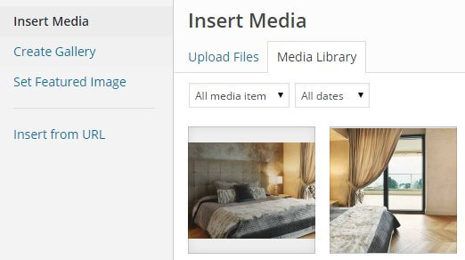
You will still see the available images from your media library, with just a change of text at the top. The functionality has changed though; now you can click on multiple images one after the other to create your gallery. Click once on every image you wish to add, then click the Create a New Gallery button in the bottom right. You will be taken to the Edit Gallery page, where you can drag and drop the images in your new gallery to set the order. There are also a set of options in the right-sidebar under Gallery Settings that allows you to set some of the main options:
- Link To - This option defines where the images in the gallery should link to when clicked; this option should be set to Media File as the functionality included with Villa Belucci will display the image in a lightbox when clicked.
- Columns - Sets the number of columns in the gallery, and thus the number of visible images. This number should be set to match the total number of images.
- Random Order - Randomizes the order of images, ignoring any order previously set.
- Size - Sets the size of the images. Since Villa Belucci includes a lightbox functionality for viewing enlarged images it's best to leave this as Thumbnail, otherwise the images will take up too much space. Users can click any image they want to see full-size.
Once all your options have been set, click on the Insert Gallery button in the bottom-right and the shortcode will be inserted into your page content.
Changing the Intro Text
The intro text is contained in the first set of <p> tags after the gallery shortcode, with a room-intro-text class attached:
<p class="room-intro-text">Curabitur pulvinar nibh orci, gravida laoreet lectus vulputate volutpat. Fusce neque est, commodo et odio a, sollicitudin sollicitudin est. Maecenas in pretium tellus. Integer pharetra ex vitae odio sodales fermentum. Vestibulum viverra odio neque, sit amet fermentum enim maximus nec. Sed porta volutpat orci ac ullamcorper. Lorem ipsum dolor sit amet, consectetur adipiscing elit. Nullam eget urna at libero finibus pretium. Donec faucibus volutpat nisl ac placerat. Vestibulum odio turpis, volutpat at aliquet sit amet, volutpat eu lectus.</p>
Simply replace this text with your own:
<p class="room-intro-text">Intro Text Here</p>
Changing the Tariff Box Text
The tariff box is made up of multiple elements since there are several types of text used. The entire section is contained within the <div> element with the tariff-box class, and consists of an offer name (large text on the left) contained in a set of <strong> tags, a subtitle to this large text which is in a set of <p> tags, and a price on the right created with three <span> elements; the text above the price uses a starting_from class, the price itself uses a min_tariff class, and the text under the price uses a tariff_suffix class:
					<div class="tariff-box">
					<div class="span5">
					<strong>Summer Holiday</strong><p>Enjoy your summer holiday at our hotel!</p></div>
					<div class="room-price align-right ">
					<span class="starting_from">Starting from</span><span class="min_tariff">EUR99.00</span><span class="tariff_suffix">/ room / 1 night</span>
					</div>
					</div>
Replace each of these elements with your own text, as shown below:
					<div class="tariff-box">
					<div class="span5">
					<strong>Offer Name</strong><p>Offer Text</p></div>
					<div class="room-price align-right ">
					<span class="starting_from">Text Above Price</span><span class="min_tariff">Price</span><span class="tariff_suffix">Text Under Price</span>
					</div>
					</div>
Changing/Adding Information Lists
The information lists use styled text to display important information that guests may want to know about your hotel, including things such as opening times, car parking charges, hotel policies and more. Though they cover a variety of information, they all use the same basic HTML layout. In the demo layout the information list section is wrapped in a <div> with an info class attached; find this in the demo content, and you'll know where the policy content is:
<div class="info">
Inside this <div> you can add as few or as many information lists as desired; simply add an <h3> tag for the section title:
<h3>Section Title (e.g. Policies, Amenities, General Information)</h3>
And then add each item underneath; because of the different placement and width for the item titles and text this section will use a combination of <div> elements with special classes, but the basic layout is always the same; a <div> with row-fluid and custom-field-row classes that wraps the title and text, a <div> with span2 and info-heading classes for the title text, and a <div> with a span10 class for the text:
					<div class="row-fluid custom-field-row">
					<div class="span2 info-heading">First Item Title</div>
					<div class="span10">First Item Content</div>
					</div>
You can add more items under each heading as you see fit; just continue adding them using the same HTML layout:
					<div class="row-fluid custom-field-row">
					<div class="span2 info-heading">Second Item Title</div>
					<div class="span10">Second Item Content</div>
					</div>

					<div class="row-fluid custom-field-row">
					<div class="span2 info-heading">Third Item Title</div>
					<div class="span10">Third Item Content</div>
					</div>

					<div class="row-fluid custom-field-row">
					<div class="span2 info-heading">Fourth Item Title</div>
					<div class="span10">Fourth Item Content</div>
					</div>
The GK Hotel Reservation Plugin
The Hotel Reservation plugin creates an easy-to-use contact form specifically designed for users to request accommodation dates, including specific fields for number of rooms, adults, children and stay dates.
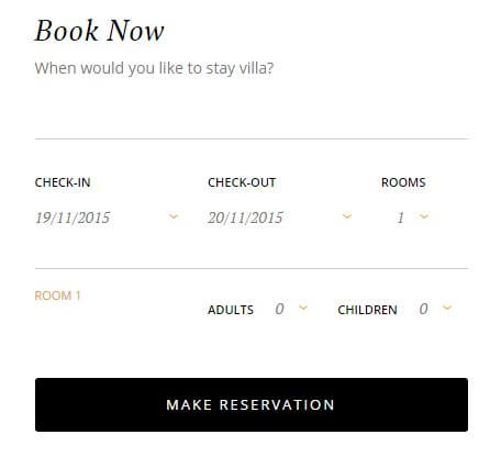
This form is created by inserting a shortcode into the page content wherever you want the form to appear; you'll see it used in the frontpage header as well as the individual room pages created with the Rooms plugin.
How it Works
As with other shortcodes, there are several attributes you may use to modify the available fields and settings, but the basic contact form is created using the plain shortcode:
[GK_Hotel_Reservation]
Inserting this basic shortcode into any of your content will create a contact form that uses the default attribute settings; these default settings are the same as those used in the demo layout.
To modify the default settings we'll need to add attributes within the square brackets after the shortcode title using the following syntax:
[GK_Hotel_Reservation Attribute_1="X" Attribute_2="X"]
Where "Attribute_1/2" is the name of the option you wish to change, and "X" is the value you want to change it to. The available attributes for this shortcode are:
- title - Sets the displayed title of the contact form; default is "Book Now".
- subtitle - Sets the subtitle that appears under the title of the contact form; the default is "When would you like to stay villa?".
- rooms_max - Sets the maximum number of rooms that may be requested via the Rooms drop-down list. The default is five.
- adult_max - Sets the maximum number of adults that may be selected per room; default is two.
- children_max - Sets the maximum number of children that may be selected per room; default is two.
- fields - Sets the fields that are displayed and must be filled out by the user when making a request. There are three fields to enable/disable; "name", "email" and "phone". Enter the fields you want to use separated by a comma as a delimiter i.e. to use name and email, attribute would be fields="name,email". Default uses all fields.
Advanced Typography
To provide options for enhancing your text content, Villa Belluci includes a multitude of advanced typography options that add flair, from highlights to warnings, floated blocks and more.
How It Works
The typography options in Villa Belluci may be applied in the Text mode of the TinyMCE editor, where you enter raw HTML code alongside basic text. Here, you can manually add the classes required to achieve each effect to the relevant HTML tags. To use the Text mode, click on the Text tab at the top-right of the editor window:
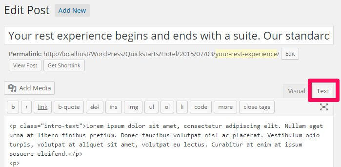
When writing in HTML code in the text editor, you will need to manually attach the classes to the HTML tag, so that the correct CSS rules are applied.
To attach a class to an HTML tag, a new attribute, "class", followed by an equals sign and the class name in quotes, must be added to the opening tag of the element after the tag but before the closing bracket. This assigns a class to that element. For example, to add a class called "special" to an HTML <p> tag, you would write:
<p class="special">Your Text</p>
The following sections will provide information on the classes available, and their functions.
Warnings
Warnings are highlighted text segments that are meant to draw attention to important information, such as rules, advice or guidelines. There are three types of warning available, each with a different purpose. To use them, simply add the class name to a <p> element:
<p class="classname">
- gk-info - This attribute adds a grey line above the text and prefaces it with a speech-bubble icon to highlight information.
- gk-success - This attribute adds a black line above the text and prefaces it with a lightbulb icon. It is useful for adding advice or hints to your content.
- gk-notice - This attribute adds an orange line above the text and prefaces it with an orange warning sign; it is used for warnings.
- gk-error - This attribute adds a red background and prefaces the text with a cross icon. It is used for negative statements.
Highlights
Highlights are a way to make a particular part of a paragraph stand out. Unlike the warnings, highlights can be applied in the middle of a paragraph without damaging the text layout.
To use highlights, you will need to add a set of <span> tags in your <p> tags to separate the phrase, and add the highlight class to the <span> element. For example, if you wish to add a highlight to the word "highlight" in the following <p> tag:
<p>This is a highlight phrase</p>
You would need to add the opening <span> tag with the highlight class before the word "highlight", and the closing </span> tag after, like this:
<p>This is a <span class="className">highlight</span> phrase</p>
In Villa Belluci there is one included highlight class, "gk-highlight", which will add a yellow background to the text.
Progress Bars
Progress bars display a progress bar that animates to a particular point defined by the user, with a label for the bar and a percentage point that appears at the termination point of the progress bar showing how far the bar is filled:
Progress bars are created using three elements. First is a <div> containing the bar and gk-loaded classes, as well as a style attribute containing a width property; this property accepts a percentage value which defines how far the bar should fill. After the opening <div> is a plain <p> tag, and inside this is a <span> tag; text is added between this tag to create the progress bar's label. Then, all elements are closed. For example, to create a progress bar with the label "Per cent complete" that fills to 90%, we'd use the following code:
				<div class="bar gk-loaded" style="width: 90%;">
				<p>
				<span>Label</span>
				</p>
				</div>
To add your own content, simply replace the text between the <span> tags to define the label, and change the percentage amount in the width property to whichever percentage you wish to use.
Code Listings
Code listings create blocks that separate code content away from the main content of your site, making it easy for users to spot and read your code:
Creating the code block is easy; simply surround the text/code you want to separate with a set of <pre> tags:
				<pre>
				#wrapper {
				float: left;
				display: block;
				}
				</pre>
Unordered Lists
Unordered lists are just that; lists with no particular ordering i.e. no numbered or otherwise ordered entries. This is a good way to list points or minutes in an easily-readable format.
The classes for styling the unordered lists should be added in the opening <ul> tag that begins with list, with the <li> list item tags left as they are:
				<ul class="className">
				<li>Item 1</li>
				<li>Item 2</li>
				<li>Item 3</li>
				</ul>
There are four available unordered list classes, as follows:
- gk-bullet1 - This class uses solid black dots as the delimiter between each point.
- gk-bullet2 - This class uses black blocks with a white checkmark inside as the delimiter to each point.
- gk-bullet3 - This classes uses black star outlines as the delimiter to each point.
- gk-bullet4 - This class uses black circles with a white arrow inside as the delimiter to each point.
Number Blocks
Number blocks create circles with character inside, such as a number, followed by a text. They are useful for highlighting larger points or available options.
The complexity of the number blocks means that they require some more complex HTML tags. Each block contains a <p> tag, which also has the class assigned to it, and a <span> tag that contains the character to appear in the block, with the text following this before the closing </p> tag. The basic structure looks like this:
				<p class="className">
				<span>Character (i.e. "1", "A")</span>
				Item Text
				</p>
The classes available are:
- numblocks num-1 - This creates a orange colored circle and character inside, with black text.
Blocks
Blocks are ways to frame text to draw attention to it, either by adding colored backgrounds or outlines.
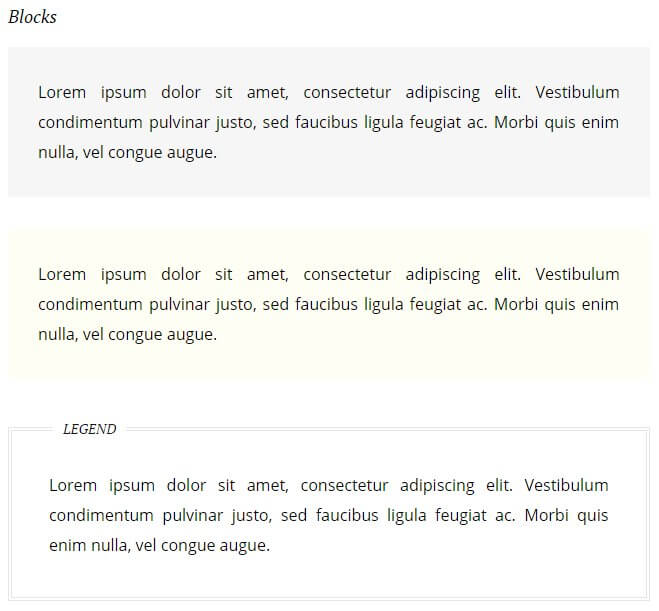
Creating blocks for your text is very easy; a basic <p> tag with a class added is all that's required:
<p class="className">
The available classes for blocks are:
- block-1 - This class adds a greyish-green background to the text.
- block-2 - Similar to the above class, but this time using a yellow background.
- legend - Creates a black outline around the text with a Legend label at the top-left of the block.
Blockquotes
Blockquotes allow you to elegantly highlight quotations in your article, to show that they are not from your pen, as it were.
The blockquotes format consists of a plain <blockquote> tag that contains the quoted text, which is then displayed offset from the rest of the content preceded a large quotation mark:
<blockquote>Your Quote Here</blockquote>
There is one blockquote style included with Villa Belluci:
- No Class - The basic blockquote layout; creates a block of text for the quote preceded by large quotation marks.
Floated Blocks
Floated blocks are some of the most visually-appealing typography options available in Villa Belluci. They allow you to highlight particular phrases or quotes from the text by adding them in colored text on the left, right, or centre of your main content, much like a newspaper.
The layout of the HTML tags for floated blocks depends on the type of floated block you are using, and where you want the block to appear. The text to appear in the floating block is defined in a <span> tag within your content. Content added before the <span> tag will appear above it, and content added after will be added alongside it. A standard piece of HTML using these blocks may look something like this:
				<p>Lorem ipsum dolor sit amet, consectetur adipiscing elit. Vestibulum condimentum pulvinar justo, sed faucibus ligula feugiat ac. Morbi quis enim nulla, vel congue augue. Duis quis quam sed purus porta eleifend.

				<span class="gk-block-text-left">Lorem ipsum dolor sit amet, consectetur adipiscing elit.</span>

				Donec eget dignissim augue. Donec ante felis, aliquam ut consequat eget, lobortis dapibus risus. Aliquam laoreet enim et lectus ornare hendrerit. Aliquam rhoncus enim libero. Morbi aliquam, nibh mattis feugiat dapibus, nisi massa adipiscing justo, sit amet condimentum urna ipsum et lacus. Nam fermentum, eros quis ullamcorper convallis, libero mauris lacinia eros, sed tempus leo lorem vitae purus.</p>
with the following result:
Something to note here is that there is no set position for the <span> tag to be added; it should be placed organically at the end of a paragraph or line in the text to highlight a particular phrase. Use the preview option in WordPress as you write the content to see how it looks and make your decision from there, and experiment with the <span> tag placement; you will get the feel for your preference very quickly!
There are a total of three classes for floated blocks:
- gk-block-text-left - This class aligns the text in the <span> tag to the left, with text following the tag appearing to the right.
- gk-block-text-right - The same as the above class, except this time the <span> tag text is on the right, and the main content after the closing tag floating left.
- gk-block-text-center - This tag creates a centrally-placed text block. Text before the <span> tag will appear above it, and text after the tag will appear below it.
Widget Settings
Villa Belluci, like all our modern themes, includes the GK Widget Rules plugin from GavickPro, which allows you to control exactly where a given widget will appear. Usually, you are limited to defining only the location where a widget appears, but with Widget Rules, you can set different widgets to appear on different pages, or limit particular widgets to a category etc...
It's a great way to diversify and target your widgets depending on the content.
Using Widget Rules
Once the plugin is activated, a Widget Rules button will appear at the bottom of every widget instance in the Widgets page, reachable by navigating to Appearance>Widgets in your WordPress dashboard. Clicking this button will expand the options accordingly, and you can start configuring where a widget appears.
The options available are:
- Visible At - This option is used to micro-manage a widgets appearance by exception or the rule. For example, you can use No Pages Except to p
- revent a widget from being displayed anywhere except areas you explicitly tell it to appear; great if you want the widget to appear on one or two static pages only. In contrast, the All Pages Except option applies the widget to the same place in all areas except the ones you tell it to avoid. Finally, All Pages simply displays the widget everywhere; this is the default behaviour.
-
Select Page to Add - After selecting whether you wish to automatically include or exclude pages, you need to add the content that should be ignored/included. With this option, you can select any particular page or post, all posts in a category, plus some additional pages such as 404 pages and the like.
When necessary, an additional box will appear to allow you to enter category or post slugs; we will cover this process in the next section.
- Selected Pages - This section shows any pages that have already been included/excluded.
- Custom CSS Class - This option allows you to add a special CSS class to the widget; great if you want to target it for additional CSS styling.
- Visible On - This option lets you decide which devices should see the widget in question. For example, you can set a widget to appear only on desktop browsers, or only on mobiles. This allows you to have a different instance of a widget depending on the device to ensure they get the best experience if a given widget isn't responsive.
- Visible For - This option allows you to hide a widget from particular users; useful if you only want registered users to access the resource, for example.
Adding a Page/Post to the Selected Pages List
This short guide will show you how to add a specific page or post to the selected pages list, so they can be included or excluded from displaying a widget depending on your Visible At settings.
- Set your preferred option in the Visible At section, depending on whether you want to exclude pages from displaying the widget (All Pages Except) or include them (No Pages Except).
- In the Select Page to Add drop-down list, select Page or Post, depending on which one you wish to add.
- A new field will appear called Page ID/Title/slug. Enter the slug for the post or page you wish to include/exclude in this field, then click Add Page to add the page to the Selected Pages list.
- Click Save to save changes.
You may also set a widget to appear on all pages or all posts; after selecting Page or Post in the Select Page to Add drop-down list, instead of entering a slug in the provided field, just click Add Page, and this will add all pages or posts to the include/exclude list.
To get the post slug for a particular post, navigate to the Post List in your WordPress backend by clicking Posts>All Posts in the dashboard, then highlight the post you wish to display to bring up the options related to that post and click on Quick Edit. This will open a new set of options, including a field that contains the current post's slug, and also allows you to change it if necessary.
The same steps may be used to find the page slug; simply open the Page List from your dashboard by clicking Pages>All Pages in the left menu of your dashboard, then highlight the page you wish to add and click Quick Edit to see the page slug; copy this into the appropriate field in the Widget Rules settings.
Font Awesome
Font Awesome is an incredibly useful font for delivering scalable icons to your site. With over 500 icons available covering a wide range of topics, from popular social media icons to transportation and payment icons, there's something for every type of site available.
How It Works
Font Awesome functionality is included as standard with our themes, so you can start using their icons immediately. Icons are added to content using an icon <i> tag with a particular class attached that corresponds to the icon you want to display.
Every icon in the Font Awesome set has a class name beginning with fa, such as fa-pinterest for the Pinterest icon. To use an icon, this class name must be inserted into the <i> tag using the following format:
<i class="fa fa-ClassName"></i>
Notice that fa appears twice in the class attribute; the first time to declare the use of Font Awesome, and the second time as part of the icon's class name. For example, to insert the Pinterest icon mentioned above, the code would be:
<i class="fa fa-pinterest"></i>
A full list of available icons and their respective class names may be found at the bottom of the Villa Belluci demo Typography Page.
The tags should always be left blank, with no text between the opening and closing tags. You may insert these tags anywhere you are entering standard HTML content, including any of our frontpage sections, or in your pages and posts.
The WYSIWYG (What You See Is What You Get) Editor that WordPress defaults to when editing posts and pages will usually clean up blank tags; that is, tags with no content between them. This will include <i> tags that create Font Awesome icons, since they do not have any text between the opening and closing tags. To counter this issue, make sure to only use the plain text editor when adding icons.
Reveal Animations
The reveal animations used in our themes are provided by the powerful ScrollReveal JavaScript Library. This library allows animations to be added to nearly every HTML element in your code via the use of a data-sr attribute; you may have noticed when modifying the code for the frontpage elements or additional pages that they often had this data-sr attribute attached to control the animation.
When this attribute is added to an HTML tag, that element will be animated into place using a default reveal animation:
<h2 data-sr>My Title</h2>
However, ScrollReveal also includes multiple keywords that you can use to define the reveal animation using simple, understandable language. For example, the keyword "over Xs", where "X" is a time in seconds, will control the speed of the animation so that it take the value of "x" to complete. So, a value of:
<h2 data-sr="over 2s">My Title</h2>
Will cause the default animation to take two seconds to complete. Similarly, there are many keywords for controlling the type of animation. using the enter keyword will let you define the direction from which the animation will start (top, left, right, and bottom), while move can define the distance (in pixels) the animated element should move. Combine them together with the over keyword, and you will have something like this:
<h2 data-sr="Enter left move 24px over 2s">My Title</h2>
So with this setting, the title will appear 24px to the left of its final position, and will move right 24px to the final position over two seconds.
There are many more keywords that let you delay the animation, flip, spin, rotate and scale the element, and control attributes like starting opacity. A full list of the available keywords and their respective functions may be found on the ScrollReveal GitHub page.
The Contact Page
The Villa Belluci Contact page displays a controllable Google map with your location highlighted, a simple contact form and useful contact details such as phone and fax numbers as well as the street address.
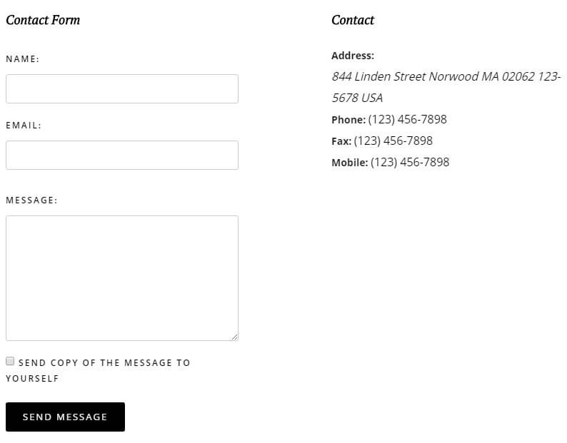
Creating a Contact Page
The demo content for Villa Belluci includes an example contact page ready to be modified, but if you're looking to create a new one from scratch it's a fairly standard process. As with the other pages, click on Pages → Add New in your admin area to add a new page. On the edit screen, add the page title to help you identify the page (the title won't be displayed on the live site) to the Title field.
Now copy the following HTML content into the mainbody of the page; this will get your contact page extra information matching our demo layout, ready for you to customize: :
			    <h3>Contact</h3>
			    <div class="contact-address"><span class="jicons-text">Address:</span><address><span class="contact-street">844 Linden Street Norwood MA 02062 123-5678 USA
			    </span></address></div>
			    <div class="contact-contactinfo">
			    <div><span class="jicons-text"> Phone: </span> <span class="contact-telephone"> (123) 456-7898 </span></div>
			    <div><span class="jicons-text"> Fax: </span> <span class="contact-fax"> (123) 456-7898 </span></div>
			    <div><span class="jicons-text"> Mobile: </span> <span class="contact-telephone"> (123) 456-7898 </span></div>
			    </div>
Now have a look at the Page Attributes section in the right sidebar; find the option called Template, click on the drop-down list for this option and select the Contact Page template; this will ensure the right formatting and CSS rules are applied to the page, and will also allow you to change several contact-page related options when viewing the page in the Theme Customizer. Finally, click on Publish at the top of the right sidebar to publish the page and your contact form is ready.
Changing the Map Location and Target
The map section of the contact page is setup via the Theme Customizer, with specific options dedicated to the contact page. More details may be found in the Theme Options section of this guide.
Changing the Contact Mainbody Content
The mainbody content is created via simple HTML code added to the page mainbody field. The basic code looks like this:
			    <h3>Contact</h3>
			    <div class="contact-address"><span class="jicons-text">Address:</span><address><span class="contact-street">844 Linden Street Norwood MA 02062 123-5678 USA
			    </span></address></div>
			    <div class="contact-contactinfo">
			    <div><span class="jicons-text"> Phone: </span> <span class="contact-telephone"> (123) 456-7898 </span></div>
			    <div><span class="jicons-text"> Fax: </span> <span class="contact-fax"> (123) 456-7898 </span></div>
			    <div><span class="jicons-text"> Mobile: </span> <span class="contact-telephone"> (123) 456-7898 </span></div>
			    </div>
This section's HTML is fairly straightforward, but it may seem more complex because of the use of <div> and <span> elements to frame the content. If we split the content up things become a lot clearer; first, the title for the right column of the contact page is added via an <h3> tag:
<h3>Contact</h3>
Then, the address is added. The address is contained in its own <div> with the contact-address class, with the title "Address:" text wrapped in <span> tags and the address text itself wrapped in <address> and <span> tags:
			    <div class="contact-address">
			    <span class="jicons-text">Address:</span>
			    <address><span class="contact-street">
			    844 Linden Street Norwood MA 02062 123-5678 USA
			    </span></address></div>
For the three contact numbers for fax, phone and mobile, a standardized layout is used. An opening <div> with a contact-contactinfo class is used that wraps all these elements. Next, each number is added, with a <div> tag, a <span> tag with a jicons-text class, and then another <span> tag with either a contact-telephone or contact-fax class, depending on what kind of number is displayed in the section:
			    <div class="contact-contactinfo">

			    <div><span class="jicons-text"> Phone: </span> <span class="contact-telephone"> (123) 456-7898 </span></div>

			    <div><span class="jicons-text"> Fax: </span> <span class="contact-fax"> (123) 456-7898 </span></div>

			    <div><span class="jicons-text"> Mobile: </span> <span class="contact-telephone"> (123) 456-7898 </span></div>

			    </div>
Changing each of these elements is easy; you may simply replace the existing text between each tag with your own. You may also add or remove more phone/fax numbers by copying/deleting the tag layout above.
- Details
- Written by Robert Gavick
- Category: Hotel
- Hits: 29450
Introduction
Villa Belluci is the first hotel and booking portal-focused Joomla template from GavickPro, boasting elegant design aesthetics that place focus on rooms, amenities and other hotel-specific features with multiple image slideshows and image blocks to highlight the quality of service and experience on offer.
This guide covers the installation and configuration of the template to match our demo layout, whether you are starting a new website or updating an existing Joomla! website to use the new template and layout.
Select Your Preferred Installation Method
The most important decision to make before proceeding is whether you need to install the template manually, or if you can use the Quickstart package, which will install everything for you.
Which installation method you should use depends on the current status of your site. The Quickstart is a full installation of Joomla! that installs Joomla itself, the template, modules, demo content and database data to match our demo layout. However, as this is a full Joomla! installation it may only be used on a clean server; the package cannot be installed in an existing Joomla installation.
Manual installation is still simple, but it is time-consuming if you wish to match the demo layout completely, since not only must you manually install the template and modules/plugins, but you must also create each module instance and assign the content accordingly to match the demo. It takes time, but if you've got a lot of content that will take you a long time to backup, or if backing up and restoring your content is not an option, then the manual installation is the way to go.
Generally we recommend the quickstart installation whenever possible; this install method provides you with the exact settings and layout needed to match the demo so you can start customizing your site right away. You should use this method if you are starting a new website, or if your existing website/Joomla! installation lacks any unique content you wish to preserve. For example, if your host installed Joomla for you, then it's advisable to remove this installation and reinstall using the quickstart, as it is much faster than manual installation.
If you have a lot of existing articles or other content that you do not wish to lose and do not have access to a backup extension to help you move these items to a new Joomla! instance, then the manual installation is the only way to install the template and match the demo settings without losing this content. However, with manual installation you will be able to take care of some customization as you go; when copying HTML content to a module you can replace it with your own, or when using the News Show Pro module you can define your own data source instead of relying on sample data.
Both installation methods will be covered in the following sections, with step-by-step guides to getting everything up and running.
Quickstart Installation
The quickstart installation requires very little input save for your admin and database details, and once the quickstart is uploaded to your server the entire install process takes just a few minutes. In order to complete this install method you will need FTP access to your server and a database name, username and password. A complete step-by-step guide with further information on the requirements may be found in our documentation:
Manual Installation
Manual installation requires that the template and plugins/modules are manually installed, and then other elements such as menus, module instances and content are manually placed. As such, it will take a bit of time to complete, though it must be stressed that this is not a difficult process at any point; placing modules and adding content is very simple thanks to Joomla's functionality.
Broadly-speaking, manual installation can be split into several steps, some very short, some rather long:
- Download and install the template.
- Download and install additional modules and plugins.
- Import template settings.
- Upload demo images (optional).
- Place and configure modules and create page content.
- Setup menus and additional pages.
Let's look more closely at each step in turn; once done, you will have a nice layout that matches the demo, ready for your own content!
Preparing Your Site for Manual Install
In order to ensure that your installation runs smoothly you will need to deactivate any existing modules as the install process for Hotel will involve placing several modules in module positions that are only used in this template; if you do not deactivate your existing modules beforehand there can be some conflict or overlap that will prevent the site from matching the demo. Once installation is complete you can of course republish the modules as needed; just be sure to double-check that they do not affect the template aesthetic or you may need to make some adjustments to the styling.
Deactivating the modules is very easy; simply log-in to your Joomla! backend, then click on Extensions → Module Manager in the top menu. You will now see a list of active modules.
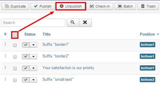
To deactivate modules en masse, click on the tickbox at the top of the second column in the module list to select every module, then click on the Unpublish button at the top of the screen to deactivate. Once done, do the same for any other pages should there be more modules. We can now start installing the template.
Download and Install the Template
Now that you're ready to install, the first thing to do is download and install the template's zip package. Click on the following link to go to the Villa Belluci Download Page (you must be logged-in to do so!). You'll see that there are three different files available:
- gk_hotel_J!3.zip - This package contains the basic template files; you should download this package for manual installation.
- gk_hotel_quickstart_J!3.zip - This contains the quickstart files for a new installation of Joomla that matches the demo layout exactly; this can be ignored if you are installing manually.
- gk_hotel_rest_files_J!3.zip - This package contains the source PSD files for the template as well as additional plugins required to expand the template functionality. Make sure to download this package too if you are installing manually.
Grab the basic template package and the rest files package; both will be needed during this install. You might also want to download the quickstart package if you want to use the demo images as placeholders before you add your own content; we'll discuss how to do this later. Once downloaded, we can install the template package:
- Login to your Joomla! backend and click on Extensions → Extension Manager, the manager's screen will open; now click on the Upload Package File tab at the top of the screen.
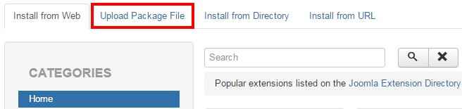
- Click on Choose File to open your file browser; select the recently-downloaded gk_hotel_J!3.zip file, then click the Upload & Install button.
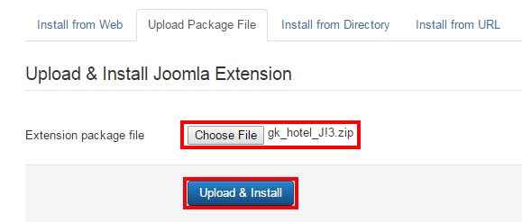
- Once installation is complete, click on Extensions → Template Manager to open the list of available templates; you should now see gk_hotel in the list.
- Click on the star next to gk_hotel in the Default column to set it as the default template.
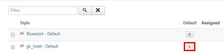
The template is now installed and ready to go; now we need to take care of the plugins and modules.
Installing Extras (Plugins & Modules)
Villa Belluci uses a number of modules and extensions to provide its varied range of options and features. These will need to be installed individually if you want to match the demo layout exactly; however if there are any features you do not require do feel free to skip the installation. As well as the selection of our own open-source modules and plugins there are also three third-party extensions used in the template; K2, which provides the base for the blog section of the theme and the blog post showcase on the frontpage (via our News Show Pro module), AcyMailing, which takes care of the newsletter functionality, and SolidRes, which provides the hotel booking and reservation options for your site, and also combines with our News Show Pro module to create the room showcases on the frontpage.
Installing the Plugins
The plugins in Villa Belluci are core elements of our Gavern Framework that powers our Joomla templates. This framework is designed to be modular, with plugins providing additional functions that can be optionally removed if no longer needed, including support for advanced typography, social media functionality and more. These elements are all included in the gk_hotel_rest_files package that you downloaded earlier.
To install the plugins, extract the gk_hotel_rest_files package on your local computer. You will see that it contains three folders; Modules, Plugins and Source. Log-in to your Joomla! backend and navigate to Extensions → Extension Manager → Upload Package File as you did with the template install.
Now click on the Choose File button to open the file explorer, and navigate to your extracted gk_hotel_rest_files → plugins folder; you will see a set of zip packages that each contain a plugin.
These are all the plugins that are recommended for the template; double-click on the first plugin in the folder to select it, then click the Upload & Install button. The install process will run. Once finished, repeat this install process for all the plugins in the folder in whichever order you prefer. Once all the plugins are installed you will need to activate them; navigate to Extensions → Plugin Manager in the top menu to see a list of installed plugins.
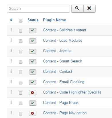
Find the plugins you have just installed; they will have a red X next to them to show they are not activated. Activate them by either clicking the X, or bulk-activate by adding a check to the tickbox next to each plugin to activate, then click the Enable button at the top of the page.
Installing the Modules
If you want your frontpage to have the same impact as the demo layout there are a few modules you will need to have installed that provide extra features, such as the slideshow or room and blog highlights. For these purposes we use our own open-source modules; Image Show GK4, which creates the slideshow on the frontpage, and News Show Pro GK5, our most powerful module that is used to display the room and blog showcases.
To download these modules navigate to our Joomla! modules' download section; you'll see a list of the various open-source modules GavickPro has created; there's quite a few! To start with we'll get the News Show Pro module, so click on the News Show Pro GK5 link to be taken to the download page for the module, and get the Joomla 3 version of NSP, called mod_news_pro_gk5_J!3.zip.
Now do the same for Image Show; unlike with NSP there are only two files available for this module, so download the Joomla 3-specific version; mod_image_show_gk4_J!3.zip. With both of the modules we need downloaded we can start installing; this is functionally the same install process as with the plugins, but without the need to extract first.
Login to your Joomla! backend and open the Extension Manager and click on the Upload Package File tab. Click Choose file and find your downloaded News Show Pro package and double-click it, then click the Upload & Install button to begin installation. Repeat this install process for the Image Show zip package too.
Once the modules are installed we can start installing the third-party extensions needed in this template.
Installing Third-Party Extensions
Villa Belluci makes use of three third-party extensions to provide additional features, all of which are available free to download. K2, which is an alternative article manager for more diverse content, is a completely free module, whereas AcyMailing, that is used for the Newsletter functionality, and SolidRes, which is used to create the reservation system in Villa Belluci, are both free to download but have additional features and support available for users who purchase a premium version of the plugin.
Note: If you are interested in purchasing the full version of SolidRes or AcyMailing, don't forget that you can get an amazing discount on both extensions via our Customer Discounts Page.
Installing K2
K2 offers complex article management options that far surpass those included in the core Joomla article manager; additional styling to K2 items has been added in Hotel so that your K2 category listing pages as well as K2 articles all match the template aesthetic.
To install this component, open the K2 site and click on the green Download K2 button in the header area to be taken to the download screen to start the download. Once done, login to your Joomla backend and open the Extension Manager via the top menu, then click on the Upload Package File tab.
Now click Choose File and select your recently downloaded K2 package and then click Upload & Install. After a few moments K2 will be installed and you'll be ready to go!
Installing SolidRes
SolidRes provides the booking system and hotel-specific pages such as room types etc...Extremely powerful, the basic free version of SolidRes provides a solid grounding for small hotels, with paid options available if you wish to provide a more complete service with multiple payment options and extra features such as search; great if you're running a cluster hotel website.
Installing SolidRes is the same as getting any other extension in Joomla. First, you'll need to get the file, so head to the SolidRes Download Page and click on the latest stable release to go to the download page; at the time of writing the current latest package is version 0.8.1 but of course that can change very quickly! After clicking on the chosen package you'll be taken to the details page where you can click on the Download Now button to get the package; make sure you are downloading the file with Full_Package in the title, as this includes everything you'll need to get started.
Once downloaded, log-in to your Joomla backend and open the Extension Manager. Click on the Upload Package tab, then click on the Choose File button and select your newly-downloaded file. Finally, click the Upload & Install button to start the install process. This will take a short while and several packages will be installed.
Installing SolidRes Sample Data (Optional)
If you do not have any existing SolidRes content, such as hotel locations, room types etc...it is highly recommended that you configure this content first as many of the frontpage modules will reference SolidRes for their content. Alternatively, the SolidRes install includes sample data that you can activate; this will provide some placeholder examples that you can use as references for your frontpage modules if necessary, and modify the content later.
Installing the content takes just a couple of clicks. First up, open SolidRes by clicking on Components → SolidRes in your Joomla backend's main menu to be taken to the SolidRes config screen.
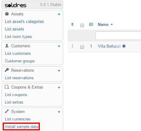
In the left sidebar is an option called Install Sample Content. Click on this; you will be asked to confirm that you wish to install the data. Accept this confirmation and the sample content will be installed, ready for you to use.
Installing SolidRes Demo Media (Optional)
If you've installed the sample data for Solidres, then it's a really good idea to also install the example images that SolidRes makes available to download on their site, as this will ensure your sample content has example images that will help when creating the frontpage and reservation page layouts.
To install this media, you'll first need to head over to the SolidRes Download Page. Click on the View Files button for the latest stable version of SolidRes; you will be taken to a page with a list of different files:
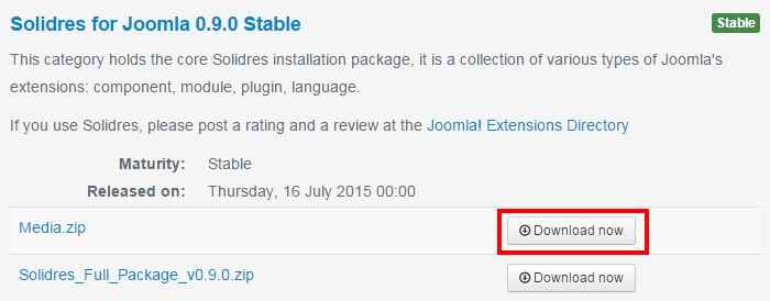
Click on the Download Now button to the right of the Media.zip file. Once download completes, extract the folder locally. Inside the folder will be two folders (com_solidres and language) and one file (solidres_media.xml). Using the FTP program of your choice, upload these files to the media folder in your Joomla root:
Once upload is complete the images will appear automatically in the sample content.
Installing AcyMailing
AcyMailing is a complete newsletter solution, and its functionality is used to setup the actions of the newsletter pop-up as well as provide some additional pages for newsletter subscription management and archives.
As ever, the first thing you'll need to do is get the package. If you haven't yet purchased AcyMailing a free version is available that takes care of the core newsletter functions, but if you want more extensive control and automated options then you'll need to upgrade. Don't worry though; you can start with the free version to see if it works for you, or if you'd prefer to use an alternative, then upgrade later if needed. To install the free version, point your browser towards the AcyMailing Starter Download Page and click on the Free Download button.
Once the file finishes downloading, open up the Extension Manager in your Joomla admin area and, like before, click Upload Package → Choose File and double-click on the downloaded file to start the install. After the package is uploaded and installed the extension will run a second brief install to load the modules and plugins it needs to provide its full set of options; just let it run; you'll get a message if any of the package don't install correctly.
Importing Template Settings
The template settings cover a wide range of options, including layouts, fonts, and other special features that allow users to add their own touch to their website. By importing settings, you can achieve the recommended style based on our demo example without manually configuring each setting.
To import these settings, we first need to get the json file that stores them; this may be found at this download link.
If you just click on the link you'll probably run into a little issue; instead of downloading the file your browser will instead try to open and display the file contents in the viewport. It won't break anything, but you don't want to waste time copying and pasting the data into a new file, right? So to get around this, we'll need to tell the browser that we want to download, rather than display the file. The process is essentially the same for every browser, but for some reason each of them decide to name the command you need to use differently:
- In Safari - Right or control-click on the link and select ‘Download linked file’. This will download a file called Hotel_config.json.
- In Chrome - Right-click on the link and select ‘Download link as…’. A dialogue box will open to specify where the download should be saved. The name will default to Hotel_config.json, so just leave this as default and save the file.
- In Firefox - Right-click on the link and select ‘Save link as…’. A dialogue box will open where you can specify the save location; as with the other browsers the name will default to Hotel_config.json so leave this as it is.
- In Internet Explorer - Right-click on the link and choose 'Save Target as'. A dialogue box will open so you can decide where to download the file to. The file name will default to Hotel_config.json, so leave this as it is.
Once downloaded, you need to import the settings into your Joomla installation. Connect to your server via FTP and navigate to the templates → gk_hotel → config folder; here is where the json configuration files are stored. Upload your recently-downloaded Hotel_config.json to this folder so that it can be found by Joomla. Now you can close your FTP program and login to your Joomla! backend as normal.
Click on Extensions → Template Manager to open the list of installed templates, and find the gk_hotel template in the list; click on it to open the template options panel. At the top of the screen is a set of tabs for each section of the settings:
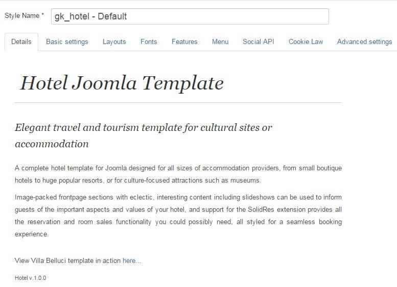
Open the Basic Settings tab; you'll notice that there is a Load configuration setting as the top option. At this point you'll only have the default.json configuration loaded, but if you click on the drop-down list under Load configuration you'll see the Hotel_config.json file you uploaded before select this from the list and then click on Load to apply the settings from the file.
Assigning the Frontpage ID
By default they certain page IDs will be assigned as the frontpage and additional pages; this controls which CSS rules are applied. However, depending on your configuration it is likely that your frontpage will have a different ID to that which is automatically stored in the imported settings. As such, we will also need to specify the frontpage ID. To do so, click on Menus → Main Menu in the top menu of your Joomla backend to see a list of assigned menu items. Make a note of the ID for your Home menu item; this number is located in the last column of attributes as in the screenshot below:
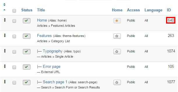
Click on Extensions → Template Manager → gk_hotel → Features tab to see the list of special features options included in the Hotel template. We're interested in the Suffixes for pages option at the bottom. In the ItemID/Option field, enter the ID number for your Home menu item, then in the Suffix field, type frontpage, then click the Add Rule button.
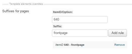
The frontpage suffix will be added to your Homepage, and the correct CSS rules will be applied.
Now we can start creating the content for the site; at this point you may choose to upload the placeholder demo images if you do not have any of your own ready on your site, or jump straight to installing the modules for the frontpage.
Upload the Demo Images (Optional)
The modules that we will setup in this tutorial will include references to images that are part of the demo content in the quickstart package, but are not included in the base template package that is used for manual install. This means that any image references will not be accurate, and the frontpage and other areas may not display properly until you assign your own images to each section, which you can do as we create each module.
However, if you haven't prepared your own frontpage images yet then you might want to consider uploading the demo images; this way you can just follow the basic module setup and any images referenced in the modules will be available, so you can see the layout on your site and replace the images with your own later. Uploading the demo images is very easy; we can simply take the folder from the quickstart package and upload it to our site via FTP.
The module placement guide assumes that you have uploaded the demo images to your server in certain situations, such as when images are defined in the HTML code; if you have your own images, simply replace the src attribute accordingly as you reach each section of the guide.
To upload the folder, firs you'll need to get the quickstart package from the Villa Belluci download page; click on the gk_hotel_quickstart_J!3.zip package. Once the download finishes, then extract the package on your local machine.
When the extraction is complete open the extracted quickstart folder; inside you'll find an Images folder, and inside that will be a Demo folder; this contains the demo-specific images for Hotel. Connect to your server using the FTP program of your choice and upload the Demo folder to the Images folder of your Joomla installation (this is in the root of your Joomla install).
With this folder uploaded the references included in the custom HTML of the frontpage modules will point to the demo images, and you'll also find the demo slides and the like so you can use them as placeholders for your Image Show slides until your images are ready.
Module Placement
Modules are the major part of Villa Belluci's frontpage, creating slideshows, room previews, blog highlights or just blocks of HTML content that can be styled separately with CSS, so it's very important that the modules are assigned and configured correctly to ensure that your site gives the perfect first impression. In each module you will find some standard options that appear in every module regardless of type, and module-specific options that are unique, such as adding slides to the Image Show slideshow module.
The basic steps for placing a module are:
- Login to your Joomla! backend and click on Extensions → Module Manager in the top menu to open the Module Manager, where you can see a list of modules currently assigned to your site (as per our preparation any existing modules in your installation should be disabled, indicated by a red X under the Status column, or deleted if unnecessary to avoid confusion).
- Click on New at the top of the screen to open a list of available Module Types.
- Select the required Module Type from the list; you will be taken to the settings screen for the module.
- In the Module tab (the first options tab you see when creating a new module of any type), add a title to the Title field; this is required before the module can be saved.
- Set the Show Title option to Show or Hide, depending on the required module settings; some modules use the title text, while others will not.
- In the Position field, set the module position. This tells Joomla where the module should be displayed on your site. You may either select the required position from the drop-down list, or manually type the (case-sensitive) module position into the position field.
- Open the Menu Assignment tab. Here, there is a Module Assignment drop-down list where you can define on what pages/menu items a module should appear on. In Villa Belluci there are two settings used here; either the module is left at the default On All Pages, so it will appear everywhere on your site (such as with the newsletter popup) or the option is set to Only on the pages selected. When this option is set, a list of available pages/menu items will appear, and you can add a checkmark next to the relevant item. Usually, this option is used to display a module on the frontpage only.
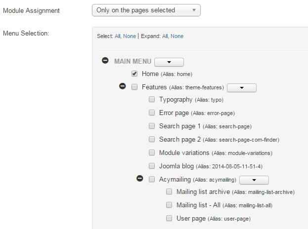
- Configure the module-specific settings. Each module will have its unique settings, some more than others. For example, our robust News Show Pro module has multiple tabs of options, whereas a Custom HTML module will just have a space for adding HTML content.
- Save changes to place the module.
These basic steps will be the same for every module placement; it's a good idea to familiarize yourself with this process if you are new to Joomla!, as it is one of the best ways to make your site your own.
Now let's configure the modules for our frontpage.
Frontpage Modules
The frontpage modules provide the core functionality that your frontpage offers, highlighting your room types, hotel features and amenities etc...so you'll want to ensure that will provide the first impression for your site, so it is imperative that they are placed and configured correctly. We will cover each module position of the frontpage in turn until the frontpage layout is complete.
Before starting module placement it is advisable that you disable the TinyMCE or other WYSIWYG editors. This is because these editors automatically cleans up empty HTML tags, but sometimes the modules used in our templates include custom HTML modules that use blank tags to create icons or for additional CSS purposes, so these empty tags shouldn't be removed. Since the clean-up cannot be disabled it is instead necessary to disable the editors.
In order to disable the WYSIWYG editor:
- Click on Users → User Manager in the top menu of your Joomla backend to be taken to a list of your registered users.
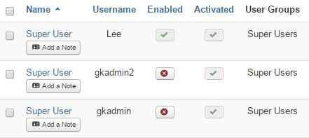
- Click on the username you will be logged in as when placing the modules to be taken to the Edit Profile screen.
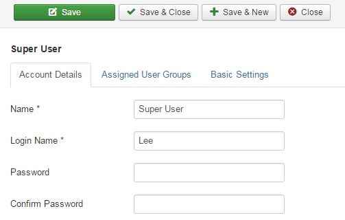
- Click on the Basic Settings tab and change the Editor option from Use Default to Editor - None.

- Click on Save & Close at the top of the screen to save changes.
Now when you open the editor in an article or Custom HTML module you will see just the plain text editor, and empty tags will not be automatically removed. Once you have finished module placement you may wish to reactivate the editor for the user should you intend to use it to write articles.
Though each type of module will offer a range of differing options, there are two basic but important options tabs to be found in every module; Module and Menu Assignment, which offer four core options; title, show/hide title, position, and menu assignment. The basic options for each frontpage module will be provided at the beginning of each module's relevant section, with the more complex module-specific settings following.
Each module covered in this section will include the following information:
- Module Desciption - A short description of the the module and how it is used on the frontpage, along with a link to a screenshot of the complete module settings should you prefer to match the configuration by sight rather than by following the guide. Note that in the case of custom HTML modules the HTML code that needs to be added to the module will be included in the Main Configuration section described below.
- Basic Settings - Provides the basic configuration details, including the module type that should be selected from the list of available modules when creating a new module, and the title, show/hide title, position and menu assignment settings as used in the demo.
- Main Configuration - Covers the module-specific settings, such as adding slides to our Image Show module, or providing the code to be added to a Custom HTML module.
With these sections you will be able to accurately match the demo layout. Now on to the modules!
The Top Information Block
The top information block appears to the right of the site's title, displaying contact and address info at a glance.

If needed, click on the following link for this module's Configuration Screenshot.
Basic Settings
- Module Type: Custom HTML module.
- Module Title: Top Information Block
- Show/Hide Title: Show
- Module Position: topinfo
- Module Assignment: On All Pages.
Main Configuration
The best thing about custom HTML modules is there isn't much that needs to be done in order to match the demo layout. Simply copy the following HTML code and paste it into the editor of your module; if preferred you can replace the text with your own:
                         <p><i class="gk-icon-headset"></i> <a href="tel:1-123-456-789">1-123-456-789</a></p>
                         <p><i class="gk-icon-marker"></i> 789 Linden Street New Lenox, MA 012345</p>
Remember to disable the editor beforehand, otherwise the icons will be removed during HTML cleanup when you save the module. No other options need to be changed, so you can click Save & Close at the top of the screen to save the changes.
The Header
The frontpage header in this case refers to the slideshow background that appears in the header area; the reservation form that appears on the right of the header is contained in a separate module we'll cover later.

If needed, click on the following link for this module's Configuration Screenshot.
Basic Settings
- Module Type: Image Show module.
- Module Title: Header Slideshow
- Show/Hide Title: Show
- Module Position: header
- Module Assignment: Only on the pages selected.
- Selected Pages: Homepage only.
Main Configuration
Image Show is a bit more complex than a custom HTML module, so as you'd expect there's quite a few options to play with. First off, in the Basic tab, click on the Module Style drop-down list and select gk_hotel_tabs. The next tab is Your Slides, where you can add your own slides to the module. Click on the Add New Slide button to open the slide options. In the Image field, click the Select button and choose a slide from your media; if you've uploaded the demo images then you'll find an image called Slide1 ready to use as a placeholder.
Next comes the content; text entered in the Title field will be used as the large overlay text in the slide, and text in the Content field will be used as the smaller text that appears above the title text as seen in the image above. The text and link of the Read More button is defined in the Url field, using the following format:
[Button Text Here]Link URL Here
As you can see, the square brackets contain the text you want to display on the button, and the URL you want the button to link to is added after the brackets. So to recap, each part of the slide's information is set as follows:
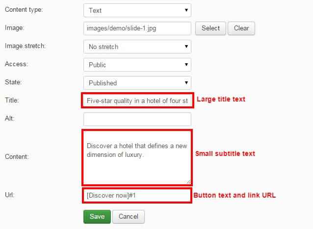
You may add your own content in these fields as you see fit, but if you want to match the demo exactly then you can use the following text settings:
Five-start quality in a hotel of four stars
...for the title, and:
Discover a hotel that defines a new dimension of luxury
...for the subtitle, and:
[Discover Now]#1
For the button and link. Once done, click on Save to save the slide. Repeat this process again to add additional slides as needed; in the demo content we have two slides, with the second one using the Slide2 demo image and the following for the content:
- Title: "Catchy Joomla theme for hotels, museums"
- Subtitle: "Built-in support for SolidRes - an effective booking solution"
- Button/Link URL: "[Read More]#2"
Note: Don't forget that the subtitle appears above the title in the slide!
We've still got some configuration to finish with the module. Click on the Interface tab; here is where image sizes and other aesthetic options are set. You will need to change the following settings:
- Tablet Image Height - Change to 542
- Mobile Image Height - Change to 334
Leave all other options as default. Now for the last change; click on the Advanced tab and change the Generate Thumbnails option to Disabled. Now you can click Save & Close at the top of the screen to save the module and your header is good to go!
The Header Availability Form
The availability form allows users to instantly check if rooms are available for their required dates of stay via the useful functionality provided by SolidRes.
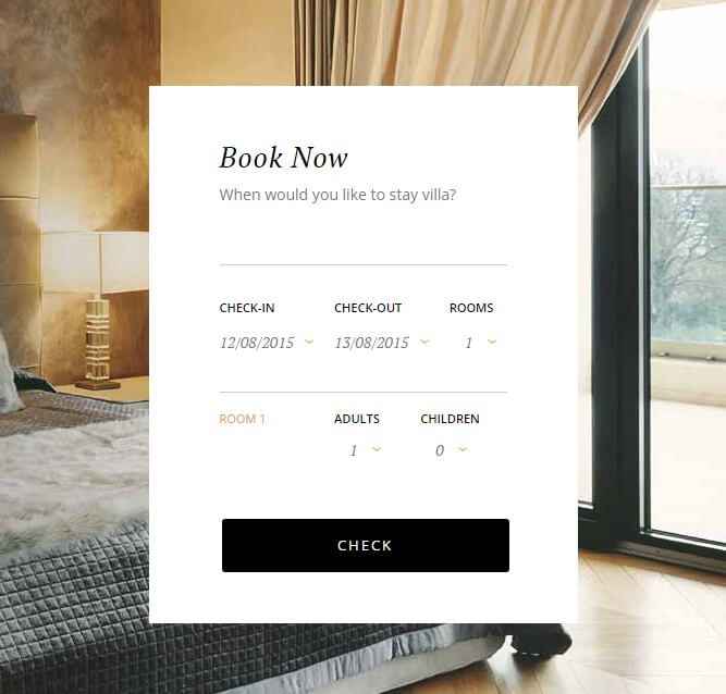
If needed, click on the following link for this module's Configuration Screenshot.
Basic Settings
- Module Type: SolidRes Check Availability module.
- Module Title: Book Now__When would you like to stay villa?__
- Show/Hide Title: Show
- Module Position: header_sidebar
- Module Assignment: Only on the pages selected.
- Selected Pages: Homepage only.
Main Configuration
Note: It's possible to add a title and subtitle by adding a double-underscore around the subtitle text after the title:
Title__Subtitle__
For example, in the demo content the title is "Book Now" and the subtitle is "When would you like to stay villa?", so the text in the title field would be:
Book Now__When would you like to stay villa?__
With the basic settings ready, now in the Module tab where you set the position and title you will also need to add a value to the Target itemid area for the hotel location you wish to allow availability checks for (SolidRes supports multiple hotel locations for larger franchises or clusters). You can find the ID of a particular location by clicking on Components → SolidRes in your Joomla admin area; this will take you to the Reservation Asset Manager section of SolidRes, where you can note down the ID from the second column to use in the availability module:
Once you've added ID to the Target itemid field, you'll need to change some of the other options on this page. Set the Enable Room Quantity option to Yes, the Max Room Number to 5, Max Adult Number to 2, and Max Child Number to 1.
If preferred you can set the Max Number options as per your hotel's limits, rather than relying on the demo setup. Once done, click on the Save & Close button to save changes.
The Modern Accommodations Section
Underneath the header slideshow is an introduction to your accommodation, made of a two-column text block with attribution:
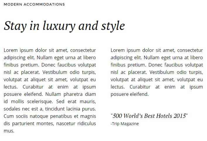
...and a photo grid that's amazing for highlighting some of the key draws of your hotel:
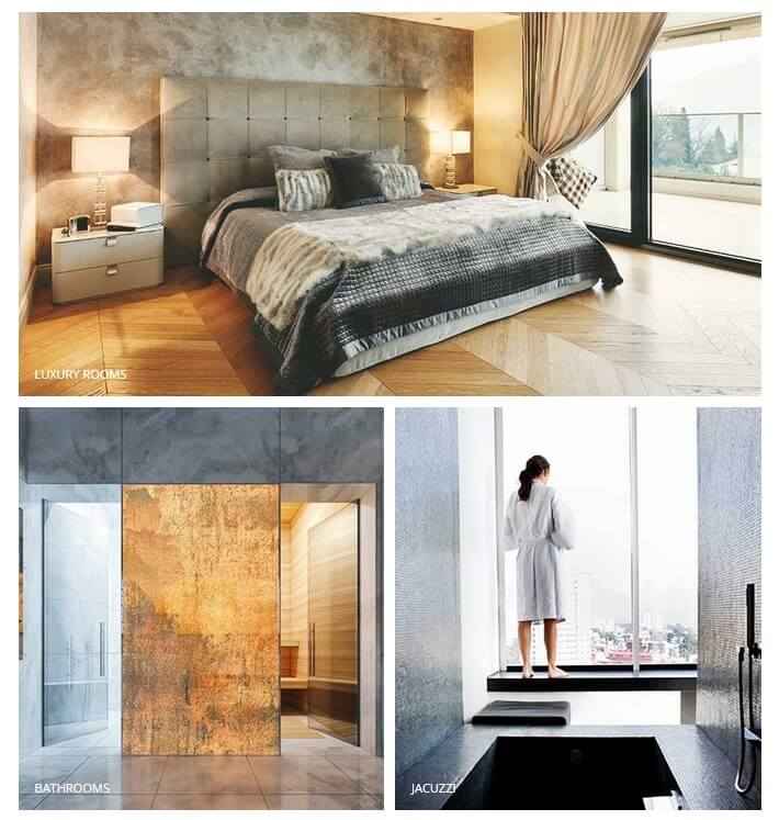
If needed, click on the following link for this module's Configuration Screenshot.
Basic Settings
- Module Type: Custom HTML module.
- Module Title: Modern Accommodations
- Show/Hide Title: Show
- Module Position: mainbody
- Module Assignment: Only on the pages selected.
- Selected Pages: Homepage only.
Main Configuration
Since Custom HTML modules are very simple, you need only set the opy the following HTML content into the editor area:
                         <h2>Stay in luxury and style</h2>
                         <div class="gk-cols" data-cols="2">
                         <div class="gk-text-justified"><p>Lorem ipsum dolor sit amet, consectetur adipiscing elit. Nullam eget urna at libero finibus pretium. Donec faucibus volutpat nisl ac placerat. Vestibulum odio turpis, volutpat at aliquet sit amet, volutpat eu lectus. Curabitur at enim at ipsum posuere eleifend. Nullam pharetra diam id mollis scelerisque. Sed erat mauris, sodales nec est a, tincidunt lacinia purus. Cum sociis natoque penatibus et magnis dis parturient montes, nascetur ridiculus mus.</p></div>
                         <div class="gk-text-justified"><p>Lorem ipsum dolor sit amet, consectetur adipiscing elit. Nullam eget urna at libero finibus pretium. Donec faucibus volutpat nisl ac placerat. Vestibulum odio turpis, volutpat at aliquet sit amet, volutpat eu lectus. Curabitur at enim at ipsum posuere eleifend.<cite>"500 World’s Best Hotels 2015"<small>-Trip Magazine</small></cite></p></div>
                         </div>

                         <div class="gk-photo-grid offset-left">
                         <figure class="gk-grid-1" data-sr="scale up 10%">
                         <img src="images/demo/hotel3.jpg" alt="" />
                         <figcaption>Luxury rooms</figcaption>
                         </figure>

                         <figure class="gk-grid-2" data-sr="scale up 10% and wait .15s">
                         <img src="images/demo/hotel5.jpg" alt="" />
                         <figcaption>Bathrooms</figcaption>
                         </figure>

                         <figure class="gk-grid-2" data-sr="scale up 10% and wait .3s">
                         <img src="images/demo/hotel4.jpg" alt="" />
                         <figcaption>Jacuzzi</figcaption>
                         </figure>
                         </div>
Now you can click Save & Close to save the module and you're ready to go. If you check the frontpage now you'll notice that this section looks too wide compared to the demo layout; this is because some modules need to be added to the sidebar area, which we'll do now.
Sidebar Modules
There are two modules placed in the sidebar area; one to create two images in a column, and another for additional hotel information. Let's look at adding each one in turn.
The Image Column
The first item in the sidebar creates a single column of photos that blend well with the photoset in the mainbody position.
If needed, click on the following link for this module's Configuration Screenshot.
Basic Settings
- Module Type: Custom HTML module.
- Module Title: Hotel Information
- Show/Hide Title: Show
- Module Position: sidebar
- Module Assignment: Only on the pages selected.
- Selected Pages: Homepage only.
Main Configuration
Just like the other custom HTML modules, we'll just need to copy the following HTML code into the editor:
                              <div class="gk-photo-grid no-margin">
                              <figure class="gk-grid-1" data-sr="scale up 10%">
                              <img src="images/demo/hotel1.jpg" alt="" />
                              </figure>
                              <figure class="gk-grid-1" data-sr="scale up 10% and wait 0.15s">
                              <img src="images/demo/hotel2.jpg" alt="" />
                              </figure>
                              </div>
All other options stay as default, so click on Save & Close at the top of the screen to save the module.
The Information Column
The general information area provides some additional information about your location, such as check-in or checkout time, parking charges and so on.
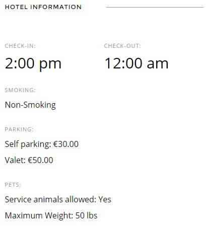
If needed, click on the following link for this module's Configuration Screenshot.
Basic Settings
- Module Type: Custom HTML module.
- Module Title: Hotel Information
- Show/Hide Title: Show
- Module Position: sidebar
- Module Assignment: Only on the pages selected.
- Selected Pages: Homepage only.
Main Configuration
No complex configuration here; all you need to do is copy and paste the following HTML code into the editor:
                             <ul class="gk-info">
                              <li class="gk-info-col-2">
                              <dl>
                              <dt>Check-in:</dt>
                              <dd><strong>2:00 pm</strong></dd>
                              </dl>
                              </li>
                              <li>
                              <dl class="gk-info-col-2">
                              <dt>Check-out:</dt>
                              <dd><strong>12:00 am</strong></dd>
                              </dl>
                              </li>
                              <li>
                              <dl>
                              <dt>Smoking:</dt>
                              <dd>Non-Smoking</dd>
                              </dl>
                              </li>
                              <li>
                              <dl>
                              <dt>Parking:</dt>
                              <dd>Self parking: €30.00</dd>
                              <dd>Valet: €50.00</dd>
                             </dl>
                              </li>
                              <li>
                              <dl>
                              <dt>Pets:</dt>
                              <dd>Service animals allowed: Yes</dd>
                             <dd>Maximum Weight: 50 lbs</dd>
                              </dl>
                              </li>
                              </ul>
Click on Save & Close to save your changes and the sidebar is ready!
The Your Satisfaction is our Priority Section
This frontpage section is a simple text block to help you get some more informative, diverse content on your frontpage, providing more ways to promote what makes your hotel special.
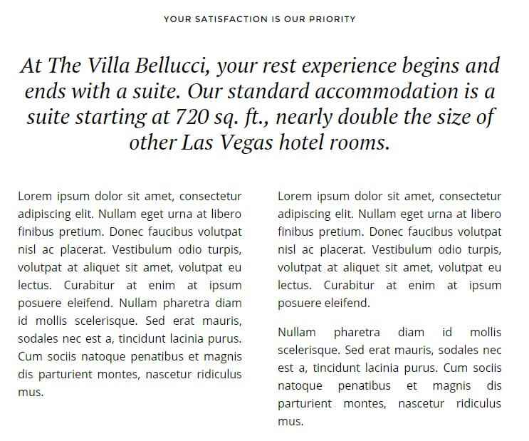
If needed, click on the following link for this module's Configuration Screenshot.
Basic Settings
- Module Type: Custom HTML module.
- Module Title: Your satisfaction is our priority
- Show/Hide Title: Show
- Module Position: bottom1
- Module Assignment: Only on the pages selected.
- Selected Pages: Homepage only.
Main Configuration
Another easy configuration; just copy this short HTML code into the module's editor:
                              <h3>At The Villa Belluci, your rest experience begins and ends with a suite. Our standard accommodation is a suite starting at 720 sq. ft., nearly double the size of other Las Vegas hotel rooms.</h3>

                              <div class="gk-cols" data-cols="2">
                              <div class="gk-text-justified"><p>Lorem ipsum dolor sit amet, consectetur adipiscing elit. Nullam eget urna at libero finibus pretium. Donec faucibus volutpat nisl ac placerat. Vestibulum odio turpis, volutpat at aliquet sit amet, volutpat eu lectus. Curabitur at enim at ipsum posuere eleifend. Nullam pharetra diam id mollis scelerisque. Sed erat mauris, sodales nec est a, tincidunt lacinia purus. Cum sociis natoque penatibus et magnis dis parturient montes, nascetur ridiculus mus.</p></div>
                              <div class="gk-text-justified"><p>Lorem ipsum dolor sit amet, consectetur adipiscing elit. Nullam eget urna at libero finibus pretium. Donec faucibus volutpat nisl ac placerat. Vestibulum odio turpis, volutpat at aliquet sit amet, volutpat eu lectus. Curabitur at enim at ipsum posuere eleifend.</p><p>Nullam pharetra diam id mollis scelerisque. Sed erat mauris, sodales nec est a, tincidunt lacinia purus. Cum sociis natoque penatibus et magnis dis parturient montes, nascetur ridiculus mus. </p>
                              </div>
                              </div>
There's one little addition to be added beyond the basics; we need to assign some special CSS suffixes to the module so it can be styled correctly, so open the Advanced tab and add the following text to the Module Class Suffix field:
narrow title-centered
Then click Save & Close to save your changes.
The Room Slideshow
This slideshow is designed to be focused on images of your room amenities and layout before the room showcase section that follows:
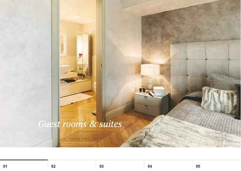
If needed, click on the following link for this module's Configuration Screenshot.
Basic Settings
- Module Type: Image Show module.
- Module Title: Frontpage Slideshow Bottom
- Show/Hide Title: Hide
- Module Position: bottom2
- Module Assignment: Only on the pages selected.
- Selected Pages: Homepage only.
Main Configuration
Image Show offers a more diverse option set than most modules, so there's a bit more configuration needed. Once your basic settings are sorted, open the Basic tab and change the Module Style option to gkhoteltabs, which will ensure the correct CSS layout is applied.
Now you can start adding slides in the Your Slides tab. Click on the Add New Slide button to open the slide options; most of the options here can be left as the default. Only two need to be changed; first, you should click on the Select button next to the Image field and pick an image from your media library to use as a slide; if you don't have a slide ready and you've uploaded the demo images you'll find five images labelled s1 to s5 that you can use as placeholders. The second option you must change is the Title field; text entered here will be added as an overlay on the slide. You might also want to add a URL for the slide to link to when clicked; this can be done by adding the desired address into the Url field.
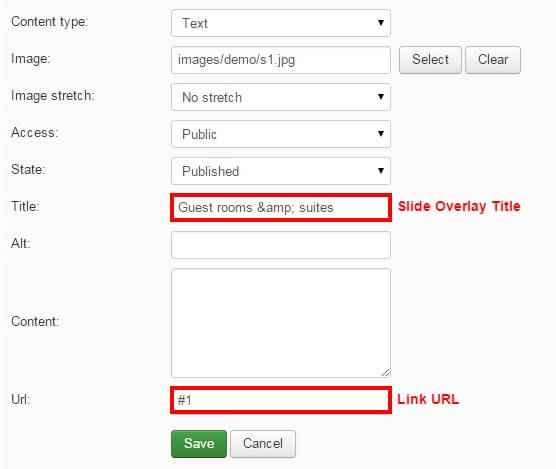
Once these options have been changed click the Save button at the bottom of the slide options to save the slide. Add more slides if necessary using the same method; the demo content uses five slides.
Now some of the sizing and layout options need to be changed. Open the Interface tab to see a range of options. The following ones should be changed from their default settings:
- Image width - Change to 1240.
- Image height - Change to 580.
- Tablet image height - Change to 480.
- Mobile image height - Change to 334.
- Module Mode - Change to Showcase.
- Pagination - Change to Bottom Pagination.
Leave all the other options as default. Next, open the Advanced tab and change the Generate Thumbnails option to Disabled. All changes are now complete, so click on Save & Close to save your slideshow module.
The Room Showcase
This section provides at-a-glance showcases of your room types, so you can encourage users to book with clear pricing and a description:
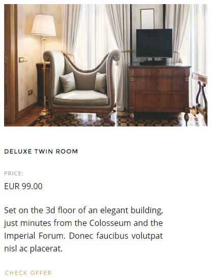
If needed, click on the following link for this module's Configuration Screenshot.
Basic Settings
- Module Type: News Show Pro GK5 module.
- Module Title: Modern accommodations
- Show/Hide Title: Show
- Module Position: bottom3
- Module Assignment: Only on the pages selected.
- Selected Pages: Homepage only.
Main Configuration
News Show Pro GK5 is a powerful tool, so there's a lot of tabs each containing several options for this module. To make configuration easier, we'll also go through them one-by-one here. Don't worry though; a lot of the options will be left at their default values, which will save a bit of time. Don't forget that you can also use the screenshot above for a visual way to check your settings. You should have already configured your basic settings as per the above, so we'll jump straight to the Module Tab:
Module Tab
Now we move on the the main options; click on the Basic Settings tab. In the Module Suffix field, add the following text:
offers
This is used to ensure the CSS is targeted correctly. Next, in the Pre-Text field, add some HTML to define the large text that appears above the room showcases:
<h3>Villa Bellucci has 264 elegantly furnished and air conditioned classic rooms, ideal for business and leisure travellers.</h3>
You can of course add your own content here; we recommend that you still use <h3> tags as this is styled to fit the layout more effectively.
Data Source Tab
Now we move onto the Data Source tab. Only one thing needs to be changed from the default on this tab, but it's the most important option; Source of Articles. This defines where News Show Pro should pull its preview data from; in this case, we'll want it to display the rooms from SolidRes, so change this setting to All SolidRes rooms.
Article Layout Tab
The next tab we need to modify is the Article Layout tab, where the number of rooms to be displayed is set, as well as the layout of each showcase. There's a number of options under different subheadings in this section, but we only need to change a few of them. Let's look at each section of this tab's changes:
Under the Article Pagination section:
- Amount of pages with arts - Change to 1.
- Amount of columns - Change to 3.
Under the Text section:
- Text position - Change to text-align:justify.
- Read more text - Change to Check Offer, or your own text.
Under the Information Block section:
-
Info format - Change to the following text:
<small>Price:</small> %PRICE
Under the Article Layout section:
-
Article block padding - Change to the following:
60px 5px 20px 5px -
Header order - Change to 2.
- Image order - Change to 1.
- Information order - Change to 3.
- Second info enabled - Change to Off.
- Read more position - Change to float:left.
The Article Layout section is finished, so we can move on to the Links Layout tab.
Links Layout Tab
In this section there's only one change; the Amount of pages with links option should be set to 0.
Thumbnails Tab
Click on the Thumbnails tab; there's two options that need to be modified in this section. First, set the Thumbnail dimensions option to 400 x 240px. Second, change the Image Margin option to:
0 0 32px 0
And that's all of the options configured! Click on Save & Close to save your changes.
The Testimonials Section
This section provides a new spin on the standard slideshow using a static background image with rotating testimonial text rather than images:

If needed, click on the following link for this module's Configuration Screenshot.
Basic Settings
- Module Type: Image Show module.
- Module Title: Testimonials
- Show/Hide Title: Hide
- Module Position: bottom4
- Module Assignment: Only on the pages selected.
- Selected Pages: Homepage only.
Main Configuration
Configuration will be similar to the earlier slideshow, with a few differences in terms of the slideshow and how it is Open the Basics tab; only two things need to be changed here. Change the Module Style option to gkhoteltabs, and add the following text to the Module Suffix field:
wide
Now it's time to create the slides, so click on the Your Slides tab, then on the Add New Slide button in the top-right to create a new slide.
In the slide's options, leave the Content Type as Text. In the Image field, click on the Select button next to it to open your media library and choose an image; this will be used as the background. For the testimonial, enter the text of the testimonial into the Content field, and the name of the attribution into the Title field. Leave the URL field blank; in this mode the testimonials will not be clickable so any URL will not be used. Click on the Save button under the slide options to save the changes; you can now repeat the slide creation process to add more testimonials as needed.
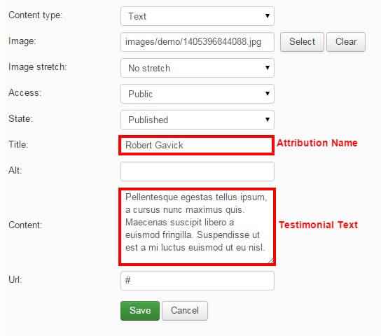
The image that you set for the first slide will be used as the background for all the other slides, regardless if a different image is chosen in another slide's options.
Once you've finished adding testimonial slides, move on to the Interface tab. There are just a few changes to be made in this tab:
- Tablet Image Height - Change to 542.
- Mobile Image Height - Change to 334.
- Module Mode - Change to Testimonials
- Slide Links - Change to Disabled
Now click on the Advanced tab; only one option needs to be changed here. Set the Generate Thumbnails option to Disabled.
The testimonial slideshow is now ready, so click on Save & Close to save the changes.
The Private Meetings & Events Section
This section displays showcases of your site's articles using structured image and text layouts:
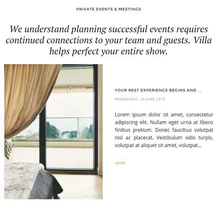
If needed, click on the following link for this module's Configuration Screenshot.
Basic Settings
- Module Type: News Show Pro GK5 module.
- Module Title: Private Events & Meetings
- Show/Hide Title: Show
- Module Position: bottom5
- Module Assignment: Only on the pages selected.
- Selected Pages: Homepage only.
Main Configuration
Since this section is created with News Show Pro there'll be quite a few options that need to be switched around from the default, but it won't take long to get things as they should be! You can use the screenshot link above to view the configuration, and step-by-step info on which options need to be changed is below, starting from the Basic Settings tab since there's an additional option to be set in addition to the settings covered above.
Basic Settings Tab
Add the following text to the Module Suffix field:
narrow title-centered category-layout
Data Source Tab
Change the Source of Articles setting to All K2 Articles; with this setting News Show Pro will automatically showcase your newest articles. Feel free to change this setting if you'd prefer to have the module showcase articles in a different order; you can specify that it should pull articles by category, tag or author, change the sort order, or define specific articles you want showcased.
Article Layout Tab
This tab sets up the overall look of the article showcase block, with separate sections specifically for deciding the number of showcases and their layouts. There are several options that need to be changed from the default:
In the Article Pagination section:
- Amount of pages with arts - Change to 1.
- Amount of rows - Change to 2.
In the Header section:
- Title Limit Value - Change to 32.
In the Image section:
- No changes required.
In the Text section:
- Text Position - Change to text-align:justify.
-
Read more text - Add this text to the field:
More
In the Information block section:
-
Info format - Change the text in this section to:
%DATE -
Date format - Change the text in this section to:
l, d F Y
In the Article Layout section:
-
Article block padding - Change the text in this field to:
75px 0 -
Header order - Change to 2.
- Image order - Change to 1.
- Information order - Change to 3.
- Second info enabled - Change to Off.
- Read more position - Change to float:left.
Links Layout Tab
- Amount of pages with links - Change to 0.
Thumbnails Tab
- Responsive images - Set to On.
- Wrap Content - Set to On.
- Create thumbnails - Set to On.
- Thumbnail dimensions - Set to 320 x 440px
-
Image margin - Change the text in this field to:
-70px 0 0 0
That's the last of the options for News Show Pro, so click on the Save & Close button to save the module.
The Footer Modules
At the bottom of every page in Hotel is a footer area containing quick links, contact information and social icons. This section is made up of two Custom HTML modules; one for the links and contact details, and another for the social icons. Let's look at how to setup each one:
Links & Contact Information
This first footer module creates the footer quick links and contact info.

If needed, click on the following link for this module's Configuration Screenshot.
Basic Settings
- Module Type: Custom HTML module.
- Module Title: Footer - Links
- Show/Hide Title: Show
- Module Position: footer_nav
- Module Assignment: On all pages.
Main Configuration
It's a custom HTML module, so as well as the basic settings you'll also need to copy and paste the following HTML content into the editor:
<div class="gk-cols" data-cols="3">
<div>
<h3>Quick Links</h3>
<div class="gk-cols" data-cols="2">
<div>
<ul>
<li><a href="#">Our Hotels</a></li>
<li><a href="#">About</a></li>
<li><a href="#">Press</a></li>
<li><a href="#">Fact Sheet</a></li>
</ul>
</div>
<div>
<ul>
<li><a href="#">Contact</a></li>
<li><a href="#">Careers</a></li>
<li><a href="#">Terms of Use</a></li>
<li><a href="#">Privacy Policy</a></li>
<li><a href="#">Our Best Rate Promise</a></li>
</ul>
</div>
</div>
</div>
<div>
<h3>Contact</h3>
<div class="gk-cols" data-cols="2">
<div>
<p>Phone:</p>
<p>Fax:</p>
<p>Reservations:</p>
</div>
<div>
<p>(123) 456-7898</p>
<p>(123) 456-7898</p>
<p>(123) 456-7898</p>
</div>
</div>
</div>
<div>
<h3>Villa Belluci</h3>
<p>844 Linden Street Norwood, MA 02062</p>
<p>Template Design © by <a href="https://www.gavick.com/" title="GavickPro" rel="nofollow">GavickPro</a>. All rights reserved.</p>
</div>
</div>
Since this module will appear on all pages no further changes need to be made, so click the Save & Close button to save changes.
The Social Icons
This module prepares the social icons and links in the footer.
If needed, click on the following link for this module's Configuration Screenshot.
Basic Settings
- Module Type: Custom HTML module.
- Module Title: Footer - social icons
- Show/Hide Title: Show
- Module Position: footer_nav
- Module Assignment: On all pages.
Main Configuration
As always, you'll need to copy and paste this HTML code into the editor:
                              <ul class="gk-social-links">
                              <li><a href="#"><i class="gk-icon-twitter"></i></a></li>
                              <li><a href="#"><i class="gk-icon-fb"></i></a></li>
                              <li><a href="#"><i class="gk-icon-gplus"></i></a></li>
                              <li><a href="#"><i class="gk-icon-linkedin"></i></a></li>
                              <li><a href="#"><i class="gk-icon-pinterest"></i></a></li>
                              </ul>
Remember to disable the editor (a tutorial on how to do this is found just before the **Frontpage Modules** section of this guide), otherwise the icons' tags will be removed during HTML cleanup when saving the module and no icons will be displayed.
Click the Save & Close button to save the module, and the footer section is now ready.
Newsletter Popup
The newsletter popup is a great way to encourage more sign-ups for your newsletter, with an automatic popup with sign-up field on every page:

If needed, click on the following link for this module's Configuration Screenshot.
Basic Settings
- Module Type: Custom HTML module.
- Module Title: Newsletter popup
- Show/Hide Title: Show
- Module Position: newsletter
- Module Assignment: On all pages.
Main Configuration
It's a custom HTML module, so you can guess what the next step is! That's right; copy this HTML content into the editor:
<h3>
Sign up to keep in touch!
</h3>
<p>
Be the first to hear about special offers and exclusive deals from Villa Belluci and our partners.
</p>
<form action="index.php?option=com_acymailing&ctrl=sub" method="post">
<input type="email" required id="user_email" name="user[email]" placeholder="enter email address">
<input type="submit" value="Submit" id="gk-newsletter-submit">
<input type="hidden" name="acyformname" value="formAcymailing1" />
<input type="hidden" name="ctrl" value="sub"/>
<input type="hidden" name="task" value="optin"/>
<input type="hidden" name="option" value="com_acymailing"/>
<input type="hidden" name="visiblelists" value=""/>
<input type="hidden" name="hiddenlists" value="1"/>
<input type="hidden" name="user[html]" value="1"/>
</form>
<!-- Configuration details: https://www.acyba.com/acymailing/248-acymailing-external-subscription-form.html -->
<small> Check out our <a href="#">Privacy Policy</a> & <a href="#">Terms of use</a><br />
You can unsubscribe from email list at any time </small>
No more changes are needed, so click on the Save & Close button to save.
Additional Modules & Pages
In addition to the modules created on the frontpage, there are also some additional modules that are only displayed on certain areas of your site. For example, on SolidRes' hotel or room pages the sidebar includes modules that appear exclusively on those pages. Villa Belluci also includes useful additional pages, such as a gallery and contact page, which require some additional configuration to use properly. In this section we'll cover the configuration for these extra modules and pages.
SolidRes Modules
There are two sidebar modules set to appear on SolidRes pages; an availability check form like that on the frontpage header, and a currency switcher. If you haven't already created pages for Solidres that you can assign these modules to, remember that Solidres includes an option to install sample data that will provide some example pages you can use (details may be found in the Installing Solidres section of this guide).
The Availability Check
The availability check is exactly the same module as seen on the frontpage header that lets users request a reservation at a given location.
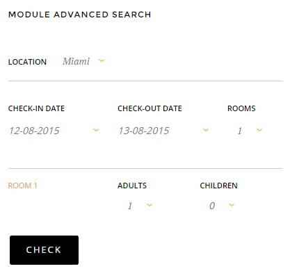
If needed, click on the following link for this module's Configuration Screenshot.
Basic Settings
- Module Type: Solidres - module check availability.
- Module Title: Check availability
- Show/Hide Title: Show
- Module Position: sidebar
- Module Assignment: Only on pages selected.
- Selected Pages: Solidres pages.
Main Configuration
The availability check module doesn't require much in the way of additional configuration beyond the basics. First up, in the Module tab, set the Enable room quantity option to Yes. Next, you'll need to add the itemid for your location into the Target itemid field; this should be the same setting as in the header availability check so just copy the ID from there. Once done, click on the Save & Close button to save the module, and you're done!
The Currency Switcher
The currency switcher allows users to swap between multiple currencies when booking rooms, with the available currencies taken from those set-up in Solidres. This module is very simple, and as such you will only need to setup the basic settings; there is no advanced configuration.
If needed, click on the following link for this module's Configuration Screenshot.
Basic Settings
- Module Type: Solidres - module currency.
- Module Title: Solidres - Module currency
- Show/Hide Title: Show
- Module Position: sidebar
- Module Assignment: Only on pages selected.
- Selected Pages: Solidres pages.
Login Popup
The login popup is a simple, effective way to allow users to access the Joomla login without loading a new page:
If needed, click on the following link for this module's Configuration Screenshot.
Basic Settings
- Module Type: Login module.
- Module Title: Log In
- Show/Hide Title: Hide
- Module Position: login
- Module Assignment: On all pages.
Main Configuration
After following the basic settings there are no other options to be configured in the module, so you can click Save & Close to save the module. However, you will need to add the login as a menu item for it to work correctly. Click on Menus → Main Menu → Add New Menu Item in your Joomla backend's main menu to be taken to the New Menu Item screen.
First, add a title for the menu item; this defines the text displayed in the main menu; in the demo content we use Log In with an alias of login-page, but you are free to use whatever you wish. Click on the Select button next to the Menu Item Type field to see a list of possible menu items; click on Users Manager → Login Form. Now click on the Page Display options tab and add the following text into the Browser Page Title field:
Registration
...and change the Show Page Heading option to Yes. Next, click on the Menu Params (GavickPro) tab.
Note: If you do not see the the Menu Params tab then it means that the GavickPro plugin that provides this functionality is either not installed or not activated; check the Installing the Modules & Plugins section of this guide for further assistance.
In the Additional Class field of the Menu Params tab, add the following text:
gk-login-popup
This will change the login form into a login popup. Now click the Save & Close button to save your changes and the login popup is ready.
The Gallery Page
The gallery page offers a touch-friendly image gallery for users to easily browse your selection of hotel photos.
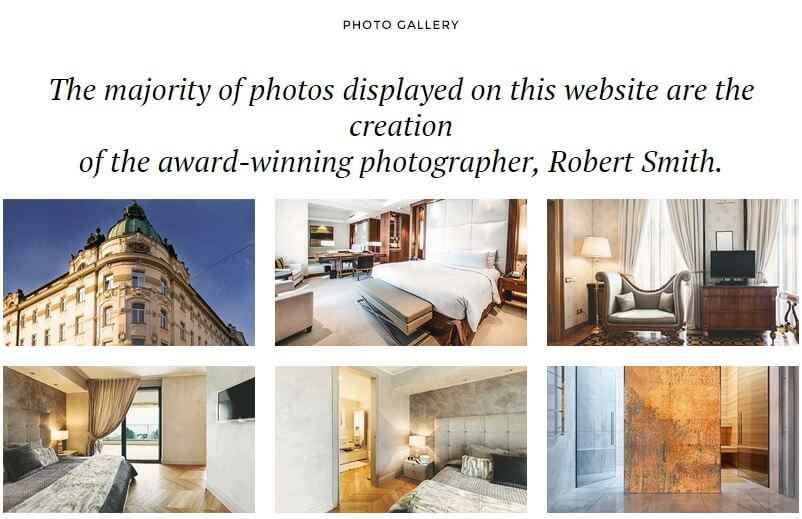
To create the basic layout as seen in our demo site, you'll need to perform three steps; create a blank page with just a title, create a menu item pointing to that page (so that modules can be assigned to it), and finally, creating a Custom HTML module to provide the gallery content and assigning it to the new page. To create the base page, simply click on Content → Article Manager → Add New Article in your Joomla admin area to go to the Add New Article screen. Add a title to your page, assign it to a category, and then save.
To assign it to the main menu, click on Menus → Main Menu → Add New Menu Item in your Joomla backend's main menu. Once on the Add Menu Item screen, add a title that will be displayed in the menu. Click on the Select button next to the Menu Item Type field and click on Articles → Single Article in the list of available types. A Select Article option will appear; click on the Select button next to it and choose your just-added gallery article. Now open the Page Display tab and change the Show Page Heading option to No.
Finally, for the gallery content we'll use a Custom HTML module.
If needed, click on the following link for this module's Configuration Screenshot.
Basic Settings
- Module Type: Custom HTML module.
- Module Title: Photo Gallery
- Show/Hide Title: Show
- Module Position: mainbody
- Module Assignment: Only on pages selected.
- Selected Pages: Gallery page only.
Main Configuration
As always with the custom HTML module the next step is to copy and paste the following HTML code into the editor; this will match the demo example with placeholder images if you've uploaded the demo image folder as discussed at the start of this tutorial:
                    <h3> The majority of photos displayed on this website are the creation<br />   of the award-winning photographer, Robert Smith. </h3>
                    <div class="gkPage">
                    <div class="gk-cols gk-gallery" data-cols="3">
                    <div>

                    <a data-order="1" href="images/demo/gallery/image1.jpg" data-size="1101x671" data-title="Room" data-desc=" Proin consectetur dui at tempor elementum. "><img src="images/demo/gallery/thumb1.jpg" height="234" width="400" alt="Thumbnail I" /></a>
                    <a data-order="4" href="images/demo/gallery/image2.jpg" data-size="1240x580" data-title="Room" data-desc=" Proin consectetur dui at tempor elementum. "><img src="images/demo/gallery/thumb2.jpg" height="234" width="400" alt="Thumbnail II" /></a>
                    <a data-order="7" href="images/demo/gallery/image3.jpg" data-size="1240x580" data-title="Room" data-desc=" Proin consectetur dui at tempor elementum. "><img src="images/demo/gallery/thumb3.jpg" height="234" width="400" alt="Thumbnail III" /></a>

                    </div>
                    <div>

                    <a data-order="2" href="images/demo/gallery/image4.jpg" data-size="1240x742" data-title="Room" data-desc=" Proin consectetur dui at tempor elementum. "><img src="images/demo/gallery/thumb4.jpg" height="234" width="400" alt="Thumbnail IV" /></a>
                    <a data-order="5" href="images/demo/gallery/image5.jpg" data-size="1240x580" data-title="Room" data-desc=" Proin consectetur dui at tempor elementum. "><img src="images/demo/gallery/thumb5.jpg" height="234" width="400" alt="Thumbnail V" /></a>
                    <a data-order="8" href="images/demo/gallery/image6.jpg" data-size="1240x580" data-title="Room" data-desc=" Proin consectetur dui at tempor elementum. "><img src="images/demo/gallery/thumb6.jpg" height="234" width="400" alt="Thumbnail VI" /></a>

                    </div>
                    <div>

                    <a data-order="3" href="images/demo/gallery/image7.jpg" data-size="1240x580" data-title="Room" data-desc=" Proin consectetur dui at tempor elementum. "><img src="images/demo/gallery/thumb7.jpg" height="234" width="400" alt="Thumbnail VII" /></a>
                    <a data-order="6" href="images/demo/gallery/image8.jpg" data-size="971x980" data-title="Room" data-desc=" Proin consectetur dui at tempor elementum. "><img src="images/demo/gallery/thumb8.jpg" height="234" width="400" alt="Thumbnail VIII" /></a>
                    <a data-order="9" href="images/demo/gallery/image9.jpg" data-size="1240x706" data-title="Room" data-desc=" Proin consectetur dui at tempor elementum. "><img src="images/demo/gallery/thumb9.jpg" height="234" width="400" alt="Thumbnail IX" /></a>

                    </div>
                    </div>
                    </div>
Now open the Advanced tab and add the following text to the Module Class Suffix field:
title-centered
Then click Save & Close to save changes. You can now modify the image links and text in the HTML content of the gallery as needed.
The Contact Page
The contact page in Hotel includes all the elements you need to make it a breeze for guests to find your location or contact your team should they have any questions, with a map, contact form and other contact details all in one place:
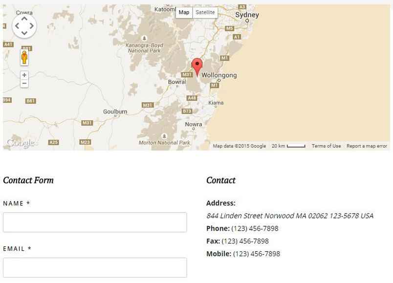
This section is created using the standard Joomla contact functionality. To create a new contact, open your Joomla admin area and click on Components → Contacts → Contacts to open the list of contacts, then click on the New button at the top of the screen to create a new contact.
Once on the contact options screen, add a title to the Name field (in the demo content we use Contact Us) and click on the icon next to the Linked User to open the list of users. Click on your admin account as the linked user. Now add your address details as per the available fields in the options; add your main street address to the Address field, city or suburb name to the City or Suburb field, postal or zip code to the Postal/Zip Code field, telephone number to the Telephone field etc...Now assign the contact to a category and change the Featured option to Yes.
Now click on the Miscellaneous Information tab and copy and paste the following HTML code into the editor:
<div class="gk-map static" data-latitude="-34.397" data-longitude="150.644" data-ui="yes" data-zoom="8"></div>
You can modify the data-latitude and data-longitude attributes to your own values to define where the map should point, and set the data-ui attribute to no if you do not want the map controls to be displayed on your contact page.
Next, open the Display tab and change the Show Category, Show Contact List and Name options to Hide. No other changes are required, so click the Save & Close button to save changes.
Now all that's left is to assign the contact to the menu. Click on Menus → Main Menu → Add New Menu Item in your Joomla main menu and add a title to the Menu Title field. In the Menu Item Type field, click on Select and click on Contacts → Single Contact.
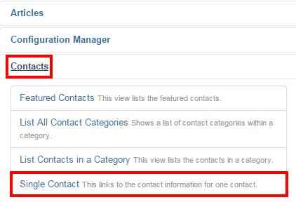
A new option will appear; Select Contact. Click on the Select button next to this field and choose your new contact from the list. In the Page Display tab, change the Show Page Heading option to No and add the following text to the Page Heading field:
Contact Us
In the Menu Params (GavickPro) tab, change the Show Title option to No. All changes are now complete, so click the Save & Close button to save your new menu item.
The Blog Section
The blog section as seen in the live demo is very simple to create, and relies on articles written in the K2 extension as its base. To utilize the layout you will need to take a few minor steps:
- Create a category in which to store your blog articles in K2.
- Create a Menu Item for the category.
Then each article added to this K2 category will appear in the blog section automatically. Let's look at each step in more detail:
Create a Category
You should create at least one category for your blog section, as the layout relies on pulling new articles from a selected category to function. Alternatively, you may prefer to have a main Blog category with several sub-categories covering different blogging areas, like News, Latest Offers etc...
To create a new category:
Click on Components → K2 → Categories in the Joomla backend menu to open the category list; this will be blank unless you have pre-existing categories in your content. Click on the green New button at the top of the screen to create a new category. Enter a Title for your blog at a minimum; if you wish you may add additional content to be displayed in the header area of the blog page, but this is not necessary. Click Save & Close to save changes.
Now we can create the menu item for this category.
Creating the Menu Item
Click on Menus → Main Menu → Add New Menu Item in your Joomla backend, and add a name for your menu item to the Menu Title field. Now click on the Select button in the Menu Item Type field, and select K2 → Categories. Finally, click on the Options tab, then click on the Select Categories field to see a drop-down list of your K2 categories; pick your blog category and click on Save & Close to save changes.
Your menu item is ready to go; now anyone clicking on that item will be taken to your list of blog articles, with the latest ones showing first.
User Menu
As well as the main menu in Hotel, there is also a user menu for logged-in users to manage their accounts. This isn't necessary if you're not allowing logins on your site, but if you are then you'll need this basic functionality since the user menu provides all the options for users to manage their profile when logged-in. To create this menu:
In your Joomla backend, click on Menus → Menu Manager → Add New Menu to be taken to the Menu Details screen. Enter a title and menu type in the respective fields; in the demo content we use User Menu as the title, and mainmemu as the Menu Type. Then click on Save & Close to save the changes. You will be taken back to Menu list where you'll need to add some items.
Click on Menus → User menu → Add New Menu Item to go to the Edit Menu Item screen; in the Title field, type Your Profile. Click on the Select button in the Menu Item Type field and select Users Manager → User Profile. Change the Access option on the right-hand side to Registered, then click Save & Close to save changes.
Repeat this process of adding a new menu item, but this time name the menu item Edit Profile, and in the Menu Item Type field select Users Manager → Edit User Profile. Add yet another new menu item, then type Create Article in the title field and select the Articles → Create Article menu item type before saving.
One more time; go through the steps to create a new item; type Submit a Web Link in the title field and select the Weblinks → Submit a Web Link menu item type before saving. Make sure that each of these menu items are limited to access from registered users only to prevent issues. The User menu is now ready, and we can assign it to its position.
Assigning the Menu
Since the menu is added as a module, if needed you may click the following link for a Configuration Screenshot.
This is very simple; just open your Module Manager, click on the green New button, and in the list of available modules click on the Menu option. Add a title to the title field; in the demo we use User area. Select the usermenu position in the Position field's drop-down list, or write the position into the field manually. Now, in the Select Menu field, select your new User Menu. Leave all other options as default and click on the Save & Close button to save changes. Your menu is now set-up.