- Details
- Written by Robert Gavick
- Category: Technews
- Hits: 7019
Introduction
TechNews is a extensive, professional-grade WordPress theme that offers a complete magazine portal website, with extra features such as animated review scores and in-article slideshows as well a Google Material Design-inspired layouts that highlight a range of articles and post types.
In this guide we'll cover several areas to help you make the most of the theme, with details on the available theme options and features, as well as some simple customization tips.

Guide Structure
This guide is split into three sections:
- Theme Options - Covers the options included in theme that are accessible via the WordPress Customizer.
- Theme Features - Explores the core features of the theme more in-depth, including the multiple header options, typography, review scores and more.
- Frontpage Elements - Details the frontpage elements and how they are created, and provides simple tutorials to help you get started with customizing them for your own content.
Theme Options
TechNews is designed to be flexible and easy to customize. For this reason, you'll find a wealth of options built into the WordPress Customizer, which offers a real-time preview of changes for comfortable, intuitive customization. To access the customizer, log-in to your WordPress backend and click on Appearance → Customize in the dashboard main menu. The customizer's main page consists of a viewport on the right that displays the live preview of your website (it will show the frontpage by default), with a list of option areas on the left. Clicking on one of these areas will expand the available options for that particular area e.g. clicking on the Fonts area will expand a list of options for changing your site's fonts. In this section of the Customization Guide, we'll look at each option area and their respective settings.
Site Identity
This section provides options for the core branding of the theme and your website, such as names, logos etc...This section includes the following options:
- Site Title - The site title is created when you first install WordPress; it sets what name visitors will see in the browser tab when browsing your site and will be used as the logo content when the Logo Type option is set to Text.
- Tagline - The tagline appears next the title in the browser's tab, to the right of the divider symbol (|.
- Site Icon - This options lets you set a favicon for your site, which is displayed in browser tabs & shortcuts or as app icons on mobile phones.
- Show Tagline - When the Logo Type option is set to Text, the tagline will be displayed underneath the logo of the site.
- Logo Type - Selects the type of logo that will be displayed at the top of the site; the example logo is created via CSS which you can of course modify, or you can define a simple text or image logo, or have no logo at all.
- Select Image - This option appears if you have set the Logo Type to Image, allowing you to upload a new logo to use on your site.
Colors
This section allows for customization of the main colors of the theme via a color picker, which makes it easy to find the color you wish to use instead of modifying the theme's CSS. The available options are:
- Primary Color - This option sets the color of the main color elements of the theme, including menu highlights and on-hover colors, such as the gradient seen in the first header variation, or link text.
- Secondary Color - This option covers secondary items such as link buttons and other minor elements.
Menus
This tab contains options for creating and setting menus, with the same functionality as the menu page. There are two main options in this section:
- Menu Locations - This option lets you assign available menus to the available locations in the theme.
- Add a Menu - Lets you create new menus and assign items to them.
Any menus you have created will also appear in this section where you can modify there available links and options.
Widgets
This section allows you to add, remove or edit widgets in the widget positions available in the TechNews theme, similar to the functionality you would find in the Appearance → Widgets section of the dashboard, but with the benefit of the preview window to see the effects of the widget as they are created (with some exceptions; some third-party widget's can be updated in this section, but won't live preview due to the way that they work behind the scenes).
Static Front Page
This section deals with how your frontpage content is laid out, with options for displaying static pages or latest posts. The available options are:
- Front page displays - Choose whether you want your frontpage to display a list of your latest posts, or a styled static page. TechNews uses a static front page to create the majority of its homepage content, so it's advisable to leave this setting as A Static Page.
- Front Page - Sets the static front page; in TechNews if you've used the quickstart or manual install guide then you should already have a page with the Frontpage template set as your frontpage, and this should not be changed as it is relied upon to create the frontpage layout.
- Posts Page - Sets a separate page where you will display your posts if you are using a static frontpage. This option should not be needed, as TechNews includes category layouts for displaying your latest posts.
Font Options
TechNews has support for multiple fonts, from standard web fonts to more complex offerings from Google Fonts, and you can target each individual element of the page to use a particular font, though the standard installation already has all relevant elements targeted if you're not interested in getting that deep into customizing the fonts! The available options are:
- Define Size of the Fonts - This option sets the base size of the font, from which all other text sizes are taken. Essentially, the base size is the size standard text will use, with CSS-styled text being larger or smaller relative to this base size.
- Body Font - Sets the font used in the Body elements of the theme (such as blog post text etc...). This can be a standard web font such as Verdana or Arial, or a Google Font.
- Google Font URL for the Body - This option only appears when the Body Font option is set to Google Font. Here, you can add the URL for the Google Font you wish to use (more information is available in the Using a Google Font section of this guide that follows this one).
- Selectors for the Body font - This field contains all the CSS classes or elements that should be changed to the selected Body Font. These elements are already preset in the theme, but you may add/remove your own elements if desired.
- Header Font - Sets the font used in the Header elements of the theme (e.g. headings, logos etc...); choose from standard web font or Google Font.
- Google Font URL for the Header - Appears if the Header Font option is set to Google Font. The Google Font's URL can be added here.
- Selectors for the Header font - Defines the CSS elements that should use the selected Header Font. Can be customized if desired.
- Other Elements Font - Defines the font used in the Other Elements of the theme (such as the author info section, comments etc...); choose from standard web font or Google Font.
- Google Font URL for the other elements - Appears if the Other Elements Font option is set to Google Font. The URL for the chosen Google Font should be added here.
- Selectors for the Other Elements font - Defines the CSS classes that should use the Other Elements font. Users may add/remove their own classes as needed.
In each of the Font options there is a choice between using a standard web font or a Google Font; follow these steps to apply a new font to each section as needed:
Using a Google Font
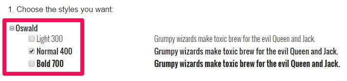
Setting up a Google Font in the theme requires some very simple steps:
- Navigate to to Google Fonts website .
-
From the list of fonts, select the one you wish to use and click the Quick Use icon.
-
Select the styles and character sets you wish to use for the font by clicking the tickboxes next to each.
-
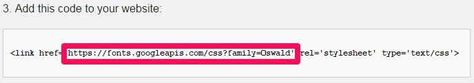
In the Add this code to your website section, copy only the font URL from the link element.
-
In the Appearance>Customize>Font options section of your WordPress backend, select Google Font in the drop-down list for the section you wish to use.
-
Paste the copied URL into the Google Font URL for Header/Body/Other Elements field; after a moment the live preview will update to show you how your site looks with the new font.
- Click the Save & Publish button to save changes.
The font has now been set as needed, and you will see the changes in the live preview window.
Using a Standard Font
The standard fonts available may be seen and selected in the Header Font, Body Font or Other Elements Font drop-down list; under the initial Google Font option are a list of standard fonts, so if you wish to use one of these fonts you may simply select it from the list, and the live preview will updated accordingly.
Default Font Configuration
The default font configuration covers the settings used in the demo layout of TechNews, including the fonts used and the selectors specified for each font.
Body Font
This option uses a standard Arial font, selectable from the Body Font drop-down list. It also uses the following selectors in the Selectors for the Body Font field:
                         body,
                         button,
                         .button,
                         input[type="submit"],
                         input[type="button"],
                         select,
                         textarea,
                         input[type="text"],
                         input[type="password"],
                         input[type="url"],
                         input[type="email"],
                         .widget.advertisement .widget-title,
                         .error404 .content-wrapper h2,
                         .nav-menu  li .sub-menu li a
Header Font
This option uses a Google Font with the following Google Font URL for Header:
//fonts.googleapis.com/css?family=Roboto:300,400,500,600,700
The following selectors are defined in the Selectors for the Header Font field:
                         h1,h2,h3,h4,h5,h6,
                         #gk-header-nav,
                         .btn,
                         button,
                         .button,
                         select,
                         textarea,
                         input[type="submit"],
                         input[type="button"],
                         input[type="text"],
                         input[type="password"],
                         input[type="url"],
                         input[type="email"],
                         .gk-tab,
                         th,
                         .gk-nsp,
                         .none .gk-tabs-wrap  ol li,
                         .entry-tags a
Layout
This section is concerned with the width of the theme, specifically in regards to the sidebar and the responsive width on each screen size, such as for tablets and mobile phones (which dictates which media elements are loaded etc...). The available options are as follows:
- Theme Width - Sets the max width (in pixels) of the theme; this is the largest that it will stretch to given a screen with a high-enough resolution; the default is 1240px.
- Tablet Width - Sets the max width for the tablet layout; screens larger than this set width will use the desktop site-layout. The default setting for this options is 1040px.
- Small Tablet Width - Sets the max width for the small tablet layout. Default setting is 840px.
- Mobile Width - Sets the max width for the mobile layout; default is 640px.
- Sidebar Width - Sets the total width of the sidebar; the width is set as a percentage of the total available width to ensure that the sidebar remains uniform across all screen sizes. For example, if your theme width is set at 1000px and the sidebar widget is set at 30%, then the sidebar will be 300px wide. You can experiment with this setting by going to a page that uses the sidebar such as the room preview pages; the live preview will update the sidebar as you change the options.
- Sidebar Position - Sets whether the sidebar should appear on the left or right of the theme on the pages that have a sidebar.
Features
This section includes any special features that do not fit with the other option categories, as well as toggles for JavaScript libraries included with the theme. The available options are:
- Enable Classic Menu - When enabled, the main menu of the theme will appear at the top of the screen in the usual position. When this option is disabled, the classic menu is replaced with menu button and icon that opens an Aside menu when clicked.
- Enable Fixed Classic Menu - When both this option and the Enable Classic Menu option are enabled, the main menu is accessible at any point on the page when the user scrolls up. If this option is disabled or if the aside menu is selected then the user must scroll to the top of the page to access the menu.
- Display Details on Pages - When enabled pages will display the author, creation date and other pertinent information, similarly to what is displayed on the blog posts.
- Enable Word-break - This option may be useful when using elements with a dynamic width or a non-romanized language such as Japanese or Korean that may not word-wrap correctly otherwise.
- Use Scroll-Reveal - When enabled, animations created using the Scroll Reveal library, which produces reveal animations for HTML elements, will be displayed. More information on Scroll Reveal may be found in the Theme Features section of this guide.
- Use Progressbar Script - Progressbar provides a framework for creating animated elements such as tabs, or drag and drop functionality. In TechNews it is used to create the tabbed section containing a link to the latest reviews; disabling this option removes this feature.
- Use Photo Swipe - Sets whether to use the Photo Swipe script. This script can provide touch gallery functions if you wish to create them; there are no pre-prepared gallery pages included with TechNews.
- Display Related Posts - When enabled, a related-posts section is added at the bottom of each post, with images and links to other posts.
- Display Latest Posts Under Single Posts - If this option is enabled then links will be included on single-post pages that highlight the post author's latest posts.
- Read More Button on Categories - This option toggles whether a "More" text link should appear on post category listing pages under each listed post.
- Use Page Preloader - When the page preloader is enabled, each page load is accompanied with a animated loading screen so users only see the page once the major elements have been loaded.
- Enable Popup Login - When disabled, clicking on a login link will take the user to a separate login page. When this option is enabled, clicking the login link will open a login overlay without navigating away from the current page.
- Date Format - Defines the formatting for the dates in post previews and at the top of posts.
- Copyright Text - Here you can add HTML that will be displayed in the footer of the theme.
Social API
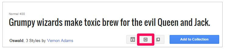
The Social API area provides options related to the addition of share buttons and social network icons in the theme. In TechNews, the social network sharing options are accessed by clicking the Share button at the bottom-right of the header image on post pages; this will expand a radial menu where you can select which social network to share to.
- Post Social Icons - Toggles whether post pages will include Facebook, Twitter, Google+ etc...share buttonsat the bottom of each post page.
- Page Social Icons - Provides the same functionality as the above option, but this time toggles whether the icons appear on pages rather than posts.
-
Enable Popup for Social Icons - When enabled, the social icon links are all contained in a separate radial share button, that provides a list of social networks to share to.
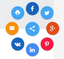
If disabled, the icons will appear separately at the bottom of the post's page.
Note: If this option is disabled only the buttons for Facebook, Google+ and Twitter will be available.
- Enable FB Icon - Set whether a Facebook share button is included in the social area or radial button.
- Enable Twitter Icon - Toggles whether a Twitter share button is added to the social icons area or radial button.
- Enable Google Icon - Adds a Google+ share button to the social area or radial button.
- Enable Pinterest Icon (Only available when Icon Popup is enabled) - Adds a Pinterest link to the share radial button for sharing.
- Enable LinkIn Icon (Only available when Icon Popup is enabled) - Adds a LinkedIn link to the share radial button for sharing.
- Enable VK Icon (Only available when Icon Popup is enabled) - Adds a VK link to the share radial button for sharing.
- Enable Print Icon - Adds a print icon for users to print out articles to the radial button.
- Enable Mail Icon - Adds an email link to the radial button so the article link can be emailed.
Cookie Law
This Customizer panel is dedicated to configuring a cookie banner in accordance with EU law.
- Use Cookie Consent Plugin - Enables or Disables the Cookie Law plugin.
- Consent Mode - Defines the type of cookie consent your site uses; choose from Explicit, where no cookies are set until the visitor consents, and Implied, which sets cookies but offers users the option to opt-out.
- Use SSL - Sets whether the Cookie Banner uses Secure Socket Layer (SSL) to protect any data it receives.
- Banner Placement - Choose where the Cookie Banner appears on your site.
- Tag Placement - Selects where the Privacy Settings tag appears on your page, that opens the Cookie Consent overlay when clicked.
- Refresh after gaining consent - Toggles whether the page should refresh after cookie consent is given.
There are some advanced configuration options available with this plugin; more information may be found on our blog in this Features article .
Frontpage
This panel in the WordPress Customizer controls some key features on the frontpage. The available options are:
- Tag Name - The frontpage header automatically pulls your latest posts that have the same tag as what is entered in this field; by default this is set to featured, but you can use any tag you like.
- Header Image Height - Sets the height in pixels of the header images.
- Header Image Width - Sets the width in pixels of the header images.
- Enable Header Grid Layout - When this option is enabled the header layout is changed from the default accordion style to a grid layout consisting of a single large post preview and two columns of two smaller previews.
- Amount of Header Columns - Sets the number of post previews that are displayed in the header; the default is 3, but you can have up to 5 previews in the accordion layout.
- Grid Layout - This option is only available when the Grid Header Layout is enabled, and it allows you to decide the order of the photo and two columns; choose whether to have the large photo in the center, left or right column, with the two smaller columns taking up the leftover spots.
- Filter Frontpage Categories - Underneath the header is a grid layout of your latest posts; when this option is enabled you can specify which categories these posts should be taken from via a Select Categories checkbox.
Newsletter
This section controls the newsletter popup's options.
- Newsletter Display - Sets the trigger for the newsletter popup appearing; it can be set to Display Directly, so it appears immediately when the page loads, Display After Time, so it appears after a time delay, and Display After Scrolling, so it appears when the user scrolls.
- Time Delay (Seconds) - When the Newsletter Display option is set to Display After Time, this option sets the delay between the page loading and the popup appearing.
- Scroll Delay (px) - When the Newsletter Display option is set to Display After Scrolling, this option sets the number of pixels the user must scroll down the page before the newsletter popup appears.
Contact Page
This section is only available when the Customizer preview viewport is on the contact page i.e. when the frontpage preview loads in the demo layout, clicking on the Contact link in the main menu will take you to the contact page, and this section will appear. This section includes options specific to the contact page.
- Enable reCaptcha - When enabled users must complete a reCaptcha before they can send an email via the contact form.
- Display Address Block - When enabled the contact page area that shows the address, phone, fax and mobile fields will be displayed on the page.
- Phone - Characters entered in this field will be displayed in the address block next to the Phone text.
- Fax - Characters entered in this field will be displayed in the address block next to the Fax text.
- Mobile - Characters entered in this field will be displayed in the address block next to the Mobile text.
Theme Features
TechNews boasts multiple special features, layouts and other customization options that make it stand out from the crowd. In this section we'll cover how to take advantage of the included features, such as review scores, typography and Font Awesome icons, as well as show how to create and modify any additional pages or content such as the contact page.
Review Scores
Review scores are an important metric for many readers; they want to be able to see at a glance if a product meets their needs. TechNews includes a specially-designed review score layout that lets you assess multiple areas of a product, as well as provide an overall score.
These scores are inserted into your content via a shortcode and can be placed at any point in a page or post, though you'll probably want to put them at the beginning or end of the review depending on your particular style.
The Review Scores Shortcode
The basic shortcode for adding a review score section to your content is:
[gkreview]
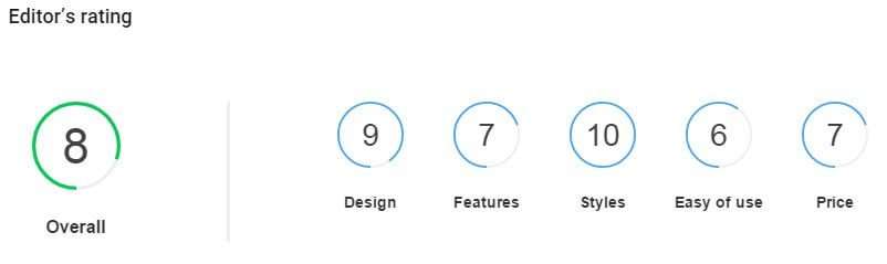
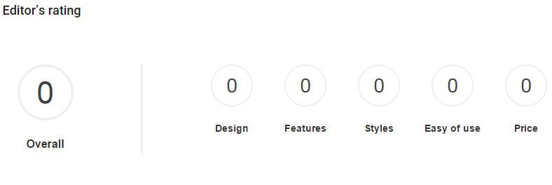
However, without any attributes set the shortcode will just display the default layout, which consists of five sub-categories and an overall score, each set to zero:
So we'll need to add attributes. There are four available attributes in the shortcode:
- Fields - Specifies the name and score of a subcategory using the following syntax: fieldName="Score" (quotes included), with additional fields separated by a comma.
- Max - Defines the maximum score that any of the fields can be set to. This setting is used for the animation that surrounds the review scores; if a field is set to "10" and the Max is also set to "10", then the animated circle will fill completely, while if the Max is "20" then the circle will fill halfway etc...
- Label - Sets the label of the Overall score on the left of the review score section.
- Decimal - Sets the number of decimal places the review scores should take into account i.e. if set to 1 then you can set the individual scores to include a decimal, such as 4.2 or 5.9. This decimal place will also be taken into account when calculating the overall score.
These attributes should be added within the square brackets of the shortcode after the "gkreviews" text, with a space between each attribute. For example, if we wanted to have five "areas" to score in with a maximum score of five for each area, an overall score labelled as "Total" and with the scores rounded to one decimal place, the shortcode would look like this:
[gkreviews label="Total" decimal="1" fields="Accessibility=5.1,Design=4.5,Reliability=4.4,Battery Life=3.1,Storage=4.4" max="5"]
The overall score that appears on the left of the review block is created automatically, with the score set to the average (rounded) score of the sub-sections and rounded to the specified number of decimal places from the decimal attribute.
How many sub-section scores can be added?
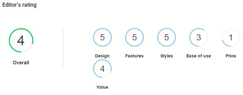
Technically you may add as many as you want; simply specify additional fields in the Fields attribute. However, bear in mind that if there are more than five sub-section scores then the sixth field and beyond will be displayed on a second line:
Keep this in mind when planning your layout to ensure that it fits your site.
The Header
Our recent themes have created the header area using a page-based frontpage, where the majority of options could be set within the page elements. However, in TechNews the header is automatically created, with additional functionality controlled by the WordPress Customizer. There are two distinct header types in TechNews, with the second type including three variations for a total of four different headers.
Changing the Previewed Articles
Which articles are displayed in the frontpage header is decided by tag; a particular tag is specified in the header-related options (in the default layout this is set as featured), and any post with that tag attached will be included in the list of articles to be displayed on the frontpage header. These posts are then displayed in date order; that is, if you have three preview articles in the header, then it will pull the three latest posts that have the specified tag.
Changing the Specified Tag
By default articles that have featured added as a tag will be displayed on the frontpage as long as they are one of the latest posts. However, you may specify any tag you prefer to use. To do so, open the WordPress Customizer by clicking on Appearance → Customize in your WordPress Dashboard. Once it's open you'll see a list of option areas, so click on the Frontpage area to expand the options. The first option in this section is Tag Name; simply delete the existing featured tag and replace it with your own. Remember that this option is case-sensitive, so enter the tag exactly as you would in the post.
Adding Tags to Posts
Once you've decided which tag to use to specify the header posts, you'll need to add the tag to the posts you want to display. To do so, click on Posts → All Posts in the WordPress Dashboard to see a list of your posts. Click on the one you want to add to the header area to open the Edit Post screen. You'll see a Tags option in the right-sidebar; simply enter your preferred tag into this field and click the Add button. Once the changes are saved the post will automatically be displayed in the header area as long as it is one of the first 3-5 latest posts.
The Default Header Variation (Accordion Style)
The default layout for the header, as seen when first loading up our demo, installing the quickstart package or following the manual install guide, displays a set of 3-5 article previews in an accordion-style layout, with focus changing to each article preview on hover:
Activating the Accordion Style Header
This layout is the default style, but if your installation did not display this layout by default, or you want to change back, then it's very easy to do. Simply open your WordPress Customizer by clicking on Appearance → Customize in the WordPress Dashboard. You'll see a list of available option areas; click on the Frontpage section to expand the options. Now uncheck the Enable Header Grid Layout option; this will revert the header back to the default layout.
Changing the Number of Article Previews
By default there are three article previews in this section, but you can also change this to display four or five previews. To do so, still in the Frontpage section of the WordPress Customizer, make sure that the Enable Header Grid Layout option is unchecked; if it is, then the option underneath will be Amount of Header Columns. In this drop-down list you can choose between having three, four or five article previews. Note that this option only affects the default header layout.
The Second Header Variation (Grid Layout)
The second major header layout in TechNews, this layout displays a total of five article previews in a grid, consisting of a large preview photo that takes up half of the header space, and four smaller grid items that are split in equal squares in the remaining half:
Activating the Grid Header
To switch to the grid layout, click on Appearance → Customize in your WordPress backend to open the WordPress Customizer, then expand the options in the Frontpage options panel. Now add a check to the Enable Header Grid Layout checkbox; it's immediately under the Header Image Width field. When you do this, you'll see the live preview switch to the grid layout straight away.
Changing the Grid Layout
The grid layout offers three variations, which decides the order of the three columns. You can have the main large photo first followed by two columns of two smaller article previews, have the large preview in the center with the two smaller columns on either side, or have the large preview at the end of the grid with the smaller columns first. To switch between these layouts, in the Frontpage section of the WordPress Customizer, look for the Grid Layout option (this option is only visible if you have enabled the header grid layout). In this drop-down list you'll see the three variations; Photo - Column - Column, Column - Photo - Column, Column - Column - Photo. Just pick the one you need from the list and click the Save & Publish button at the top of the page to save changes.
Slideshows in Articles
A new feature built for TechNews which allows for simple slideshows to be created and inserted into article content:
Like the review scores, slideshows are added using a shortcode, but the first thing you'll need to do before creating the slideshow is prepare the images and upload them to your WordPress installation:
- First, you should create the images that will be used in the slideshow. The shortcode will not resize these images, so make sure that they each have the same dimensions for smooth transitions.
- Once all your images are prepared, connect to your WordPress server via FTP and navigate to the uploads folder of your WordPress installation; the path for this should be wp-content/uploads. Create a new folder in the uploads folder and give it a name of your choice e.g. wp-content/uploads/review.
- upload your slideshow images into your newly-created folder.
Now when we create the slideshow using the shortcode we can specify the location for the slide images. To insert a slideshow into your page or post content, we'll need to use this basic shortcode:
[gkslideshow]
This shortcode will insert a slideshow, but it won't have any images loaded into it; we'll have to define some attributes so the shortcode knows where to find our slide images, and what to do with them. The available attributes are:
- directory - This option tells the shortcode where to look for our images; by default the shortcode will look in the wp-content/uploads folder of the WordPress installation, so if you've already uploaded your images into a new folder in the uploads folder you can add the new folder's name as the value e.g. if you've uploaded your slides into a folder called "Review" in the upload folder, then the directory attribute will look like directory="Review".
- slides - The directory attribute tells the slideshow where to look for the slides, and the slides attribute tells the shortcode which images to use, in which order to use them, and the captions for each image, using this format: slides="FirstSlideImage.jpg=first image caption,SecondSlideImage.jpg=second image caption". This format continues until you've finished adding images and captions.
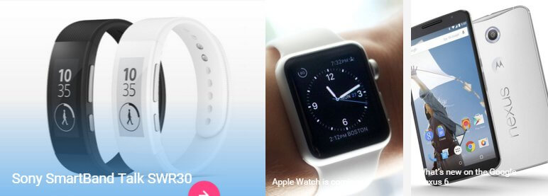
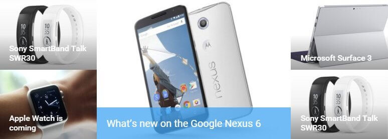
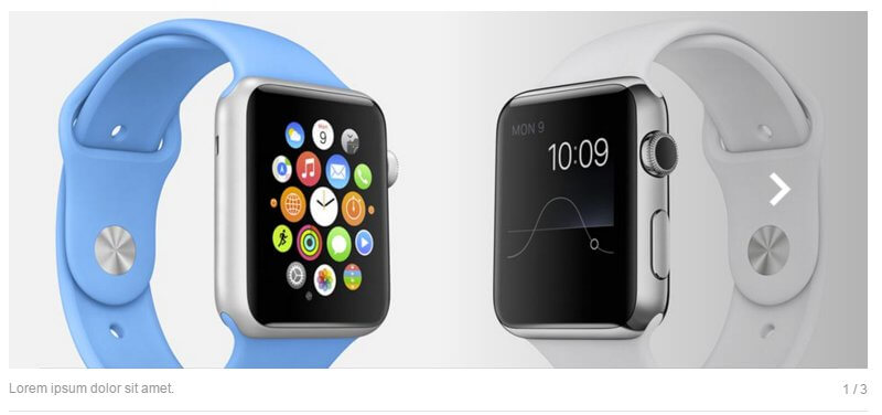
As an example; in the demo layout the slide images for the Nexus 6 article are placed in a folder called art1, which contains three slides called slide1.jpg, slide2.jpg, and slide3.jpg. To create a slideshow in the article that uses these three images and adds captions, we'll use the directory attribute to point to the wp-content/uploads/art1 folder, and then use the slides attribute to define the slide images to use and their captions, like so:
[gkslideshow directory="demo/art1/" slides="slide1.jpg=Lorem ipsum dolor sit amet.,slide2.jpg=Maecenas malesuada elit lectus felis.,slide3.jpg=Dolor malesuada ultricies."]
It doesn't technically matter which order the attributes go in, so place them in whatever order makes the most sense to you! Alternatively, you can forego the directory attribute altogether if preferred, and instead use the image path in the slides attribute i.e. in the above shortcode, instead of including a directory attribute I can just include the full path to the selected slide, starting from the uploads folder. That is, if the slides I want are in the wp-content/uploads/art1 folder, then I can rewrite the shortcode like this:
[gkslideshow slides="art1/slide1.jpg=Lorem ipsum dolor sit amet.,art1/slide2.jpg=Maecenas malesuada elit lectus felis.,art1/slide3.jpg=Dolor malesuada ultricies."]
Notice that there is no directory attribute in the above shortcode, and instead each slide includes the path to the image.
Note: The shortcode will always look in the wp-content/uploads folder by default, so the image path can only be below this folder in the hierarchy. It is possible to change the target folder completely, but this will require some code changes.
Author Twitter Profile Links
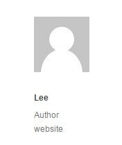
Each single post page in TechNews includes an author section on the left-hand side of the article that displays the author's avatar and provides a link to their website:
Since it's likely that you will be writing for your own website this functionality seems superfluous, so we've included an option to replace the author's website link with a link to their Twitter profile instead. To do so you will need to change your user settings. In the WordPress dashboard, click on Users → Your Profile to open your personal options screen. In the Contact Info section's Website field, write your twitter handle in the following format:
http://@TwitterHandle
So if your twitter handle is something like "WPUser", you write "http://@WPUser" in the Website field. This will automatically replace the website link with a link to your Twitter profile.
Widget Rules
TechNews includes the GK Widget Rules plugin from GavickPro, which allows you to control exactly where a given widget will appear. Usually, you are limited to defining only the location where a widget appears, but with Widget Rules, you can set different widgets to appear on different pages, or limit particular widgets to a category etc...
It's a great way to diversify and target your widgets depending on the content.
Using Widget Rules
Once the plugin is activated, a Widget Rules button will appear at the bottom of every widget instance in the Widgets page, reachable by navigating to Appearance>Widgets in your WordPress dashboard. Clicking this button will expand the options accordingly, and you can start configuring where a widget appears.
The options available are:
- Visible At - This option is used to micro-manage a widgets appearance by exception or the rule. For example, you can use No Pages Except to prevent a widget from being displayed anywhere except areas you explicitly tell it to appear; great if you want the widget to appear on one or two static pages only. In contrast, the All Pages Except option applies the widget to the same place in all areas except the ones you tell it to avoid. Finally, All Pages simply displays the widget everywhere; this is the default behaviour.
- Select Page to Add - After selecting whether you wish to automatically include or exclude pages, you need to add the content that should be ignored/included. With this option, you can select any particular page or post, all posts in a category, plus some additional pages such as 404 pages and the like. When necessary, an additional box will appear to allow you to enter category or post slugs; we will cover this process in the next section.
- Selected Pages - This section shows any pages that have already been Included/excluded.
- Custom CSS Class - This option allows you to add a special CSS class to the widget; great if you want to target it for additional CSS styling.
- Visible On - This option lets you decide which devices should see the widget in question. For example, you can set a widget to appear only on desktop browsers, or only on mobiles. This allows you to have a different instance of a widget depending on the device to ensure they get the best experience if a given widget isn't responsive.
- Visible For - This option allows you to hide a widget from particular users; useful if you only want registered users to access the resource, for example.
Adding a Page/Post to the Selected Pages List
This short guide will show you how to add a specific page or post to the selected pages list, so they can be included or excluded from displaying a widget depending on your Visible At settings.
- Set your preferred option in the Visible At section, depending on whether you want to exclude pages from displaying the widget (All Pages Except) or include them (No Pages Except).
- In the Select Page to Add drop-down list, select Page or Post, depending on which one you wish to add.
- A new field will appear called Page ID/Title/slug. Enter the slug for the post or page you wish to include/exclude in this field, then click Add Page to add the page to the Selected Pages list.
- Click Save to save changes.
You may also set a widget to appear on all pages or all posts; after selecting Page or Post in the Select Page to Add drop-down list, instead of entering a slug in the provided field, just click Add Page, and this will add all pages or posts to the include/exclude list.
To get the post slug for a particular post, navigate to the Post List in your WordPress backend by clicking Posts>All Posts in the dashboard, then highlight the post you wish to display to bring up the options related to that post and click on Quick Edit. This will open a new set of options, including a field that contains the current post's slug, and also allows you to change it if necessary.
The same steps may be used to find the page slug; simply open the Page List from your dashboard by clicking Pages>All Pages in the left menu of your dashboard, then highlight the page you wish to add and click Quick Edit to see the page slug; copy this into the appropriate field in the Widget Rules settings.
Advanced Typography
TechNews includes some advanced typographical elements for styling your text content
How It Works
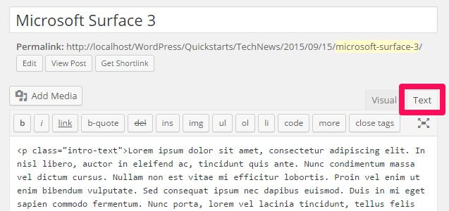
The typography options in TechNews may be applied in the Text mode of the TinyMCE editor, where you enter raw HTML code alongside basic text. Here, you can manually add the classes required to achieve each effect to the relevant HTML tags. To use the Text mode, click on the Text tab at the top-right of the editor window:
When writing in HTML code in the text editor, you will need to manually attach the classes to the HTML tag, so that the correct CSS rules are applied.
To attach a class to an HTML tag, a new attribute, "class", followed by an equals sign and the class name in quotes, must be added to the opening tag of the element after the tag but before the closing bracket. This assigns a class to that element. For example, to add a class called "special" to an HTML <p> tag, you would write:
<p class="special">Your Text</p>
The following sections will provide information on the classes available, and their functions.
Warnings
Warnings are highlighted text segments that are meant to draw attention to important information, such as rules, advice or guidelines. There are four types of warning available, each with a different purpose. To use them, simply add the class name to a <p> element:
<p class="classname">
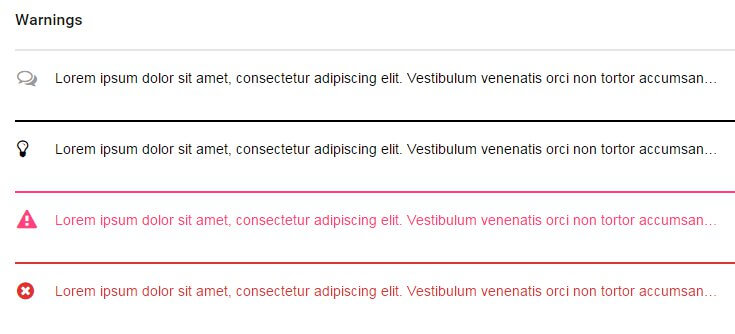
- gk-info - This attribute adds a grey line above the warning text and prefaces it with a speech-bubble icon to highlight information.
- gk-success - This attribute adds a black line above the warning text and prefaces it with a lightbulb icon. It is useful for adding advice or hints to your content.
- gk-notice - This attribute adds a pink line above the warning text and prefaces the text with an exclamation mark icon in a warning triangle. It is used for warnings or important notices.
- gk-error - This attribute adds a red line above the warning text and prefaces it with a red cross icon; useful for negative messages or warnings.
Highlights
Highlights are a way to make a particular part of a paragraph stand out. Unlike the warnings, highlights can be applied in the middle of a paragraph without damaging the text layout.
To use highlights, you will need to add a set of <span> tags in your <p> tags to separate the phrase, and add the highlight class to the <span> element. For example, if you wish to add a highlight to the word "highlight" in the following <p> tag:
<p>This is a highlight phrase</p>
You would need to add the opening <span> tag with the highlight class before the word "highlight", and the closing </span> tag after, like this:
<p>This is a <span class="className">highlight</span> phrase</p>
The available highlight classes are:
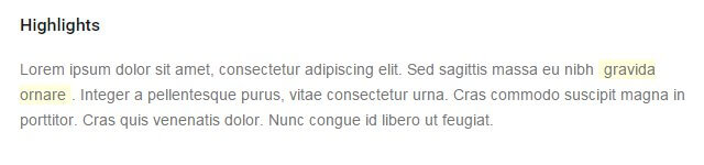
- gk-highlight - This highlight adds a yellow background to the text.
Progress Bars
Progress bars display a progress bar that animates to a particular point defined by the user, with a label for the bar and a percentage point that appears at the termination point of the progress bar showing how far the bar is filled:
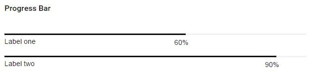
Progress bars are created using three elements. First is a <div> containing the bar and gk-loaded classes, as well as a style attribute containing a width property; this property accepts a percentage value which defines how far the bar should fill. After the opening <div> is a plain <p> tag, and inside this is a <span> tag; text is added between this tag to create the progress bar's label. Then, all elements are closed. For example, to create a progress bar with the label "Per cent complete" that fills to 90%, we'd use the following code:
                    <div class="bar gk-loaded" style="width: 90%;">
                    <p>
                    <span>Label</span>
                    </p>
                    </div>
To add your own content, simply replace the text between the <span> tags to define the label, and change the percentage amount in the width property to whichever percentage you wish to use.
Code Listings
Code listings create blocks that separate code content away from the main content of your site, making it easy for users to spot and read your code:
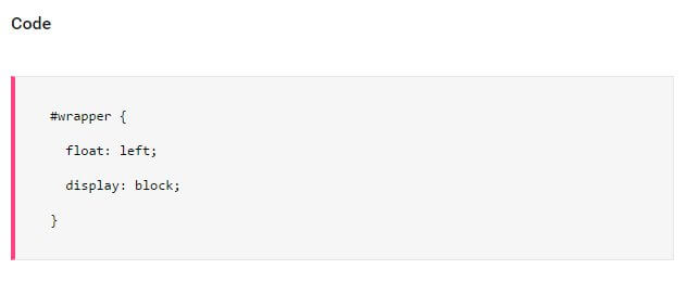
Creating the code block is easy; simply surround the text/code you want to separate with a set of <pre> tags:
                    <pre>
                    #wrapper {
                         float: left;
                         display: block;
                         }
                    </pre>
Unordered Lists
Unordered lists are just that; lists with no particular ordering i.e. no numbered or otherwise ordered entries. This is a good way to list points or minutes in an easily-readable format.
The classes for styling the unordered lists should be added in the opening <ul> tag that begins with list, with the <li> list item tags left as they are:
                    <ul class="className">
                    <li>Item 1</li>
                    <li>Item 2</li>
                    <li>Item 3</li>
                    </ul>
There are four available unordered list classes, as follows:
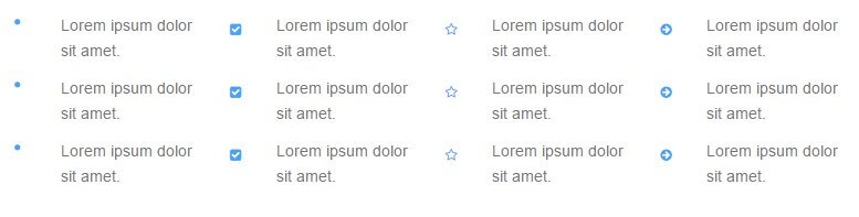
- gk-bullet1 - This class uses solid blue dots as the delimiter between each point.
- gk-bullet2 - This class uses blue tickboxes as the delimiter to each point.
- gk-bullet3 - This class uses blue star outline icons as the delimiter to each point.
- gk-bullet4 - This class uses blue right-arrow icons as the delimiter to each point.
Number Blocks
Number blocks create circles with character inside, such as a number, followed by a text. They are useful for highlighting larger points or available options.
The complexity of the number blocks means that they require some more complex HTML tags. Each block contains a <p> tag, which also has the class assigned to it, and a <span> tag that contains the character to appear in the block, with the text following this before the closing </p> tag. The basic structure looks like this:
                    <p class="className">
                    <span>Character (i.e. "1", "A")</span>
                    Item Text
                    </p>
The classes available are:
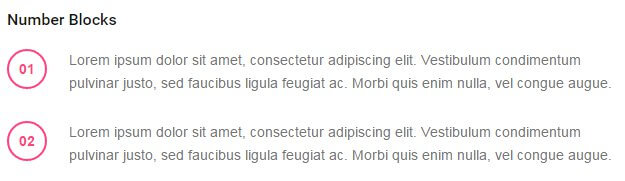
- numblocks num-1 - This creates a red-colored colored circle and character inside, with black text.
Blocks
Blocks are ways to frame text to draw attention to it, either by adding colored backgrounds or outlines.
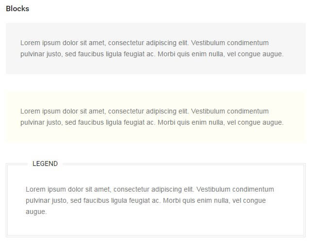
Creating blocks for your text is very easy; a basic <p> tag with a class added is all that's required:
<p class="className">
The available classes for blocks are:
- block-1 - This class adds a greyish-green background to the text.
- block-2 - Similar to the above class, but this time using a yellow background.
- legend - Creates a black outline around the text with a Legend label at the top-left of the block.
Blockquotes
Blockquotes allow you to elegantly highlight quotations in your article, to show that they are not from your pen, as it were.
The blockquotes format consists of a <blockquote> tag containing a <p> tag that in turn contains the quoted text.
                    <blockquote;>
                    <p>Your Quote Here</p>
                    </blockquote>
There is one blockquote type included in TechNews:
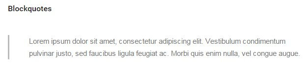
- No Class - The basic blockquote layout; indents text with a grey margin.
Floated Blocks
Floated blocks are some of the most visually-appealing typography options available in Ecommerce. They allow you to highlight particular phrases or quotes from the text by adding them in colored text on the left, right, or centre of your main content, much like a newspaper.
The layout of the HTML tags for floated blocks depends on the type of floated block you are using, and where you want the block to appear. The text to appear in the floating block is defined in a <span> tag within your content. Content added before the <span> tag will appear above it, and content added after will be added alongside it. A standard piece of HTML using these blocks may look something like this:
                    <p>Lorem ipsum dolor sit amet, consectetur adipiscing elit. Vestibulum condimentum pulvinar justo, sed faucibus ligula feugiat ac. Morbi quis enim nulla, vel congue augue. Duis quis quam sed purus porta eleifend.

                    <span class="gk-block-text-left">Lorem ipsum dolor sit amet, consectetur adipiscing elit.</span>

                    Donec eget dignissim augue. Donec ante felis, aliquam ut consequat eget, lobortis dapibus risus. Aliquam laoreet enim et lectus ornare hendrerit. Aliquam rhoncus enim libero. Morbi aliquam, nibh mattis feugiat dapibus, nisi massa adipiscing justo, sit amet condimentum urna ipsum et lacus. Nam fermentum, eros quis ullamcorper convallis, libero mauris lacinia eros, sed tempus leo lorem vitae purus.</p>
with the following result:
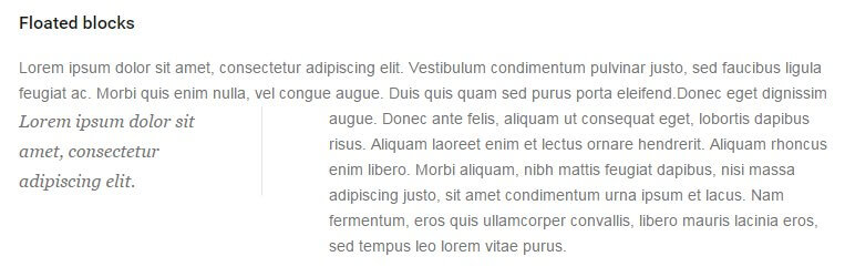
Something to note here is that there is no set position for the <span> tag to be added; it should be placed organically at the end of a paragraph or line in the text to highlight a particular phrase. Use the preview option in WordPress as you write the content to see how it looks and make your decision from there, and experiment with the <span> tag placement; you will get the feel for your preference very quickly!
There are a total of two classes for floated blocks:
- gk-block-text-left - This class aligns the text in the <span> tag to the left, with text following the tag appearing to the right.
- gk-block-text-right - The same as the above class, except this time the <span> tag text is on the right, and the main content after the closing tag floating left.
Font Awesome
Font Awesome is an incredibly useful font for delivering scalable icons to your site. With over 500 icons available covering a wide range of topics, from popular social media icons to transportation and payment icons, there's something for every type of site available.
How It Works
Font Awesome functionality is included as standard with TechNews, so you can start using their icons immediately. Icons are added to content using an icon <i> tag with a particular class attached that corresponds to the icon you want to display.
Every icon in the Font Awesome set has a class name beginning with fa, such as fa-pinterest for the Pinterest icon. To use an icon, this class name must be inserted into the <i> tag using the following format:
<i class="fa fa-ClassName"></i>
Notice that fa appears twice in the class attribute; the first time to declare the use of Font Awesome, and the second time as part of the icon's class name. For example, to insert the Pinterest icon mentioned above, the code would be:
<i class="fa fa-pinterest"></i>
A full list of available icons and their respective class names may be found at the bottom of our TechNews demo's Typography Page .
The tags should always be left blank, with no text between the opening and closing tags. You may insert these tags anywhere you are entering standard HTML content, including any of our frontpage sections, or in your pages and posts.
The WYSIWYG (What You See Is What You Get) Editor that WordPress defaults to when editing posts and pages will usually clean up blank tags; that is, tags with no content between them. This will include <i> tags that create Font Awesome icons, since they do not have any text between the opening and closing tags. To counter this issue, make sure to only use the plain text editor when adding icons.
Material Icons
Regular users of our WordPress themes will be familiar with Font Awesome, which provides a multitude of scaleable icons that can be placed in your site content. In TechNews we've added support for another set of icons, Material Icons, which were created by Google to expand on the style guide offered by their Material Design concept.
These icons may be inserted anywhere in your content just like Font Awesome, using the following syntax:
<i class="micon">name</i>
Where "name" is the name of the icon. Please be aware that if the icon's name has two or more words, such as "help outline" or "highlight off", then the individual words will need to be separated by an underscore ("_") rather than a blank space e.g. to use the "help outline" icon, the syntax would be:
<i class="micon">help_outline</i>
A full list of available icons and their respective names may be found on the Material Icons site ; simply select your icon from the list, and change the "name" text in the above example to match the icon's name.
Using Material Icons in the Menu
TechNews supports the use of Material Icons in your menus as well as your other content; with it, you can attach icons to appear next to your menu items, which can be a great way to make your navigation clearer and more intuitive; simply add the following text to the menu item's Navigation Label field:
__iconName__
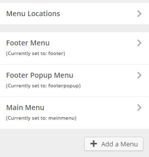
Where "iconName" is the icon class taken from the Material Icons documentation . Don't forget that if the icon's name has two words or more the individual words in the name must be separated by an underscore rather than a blank space. As an example, if we wanted to change the Home menu option in the main menu, we'd open the WordPress Customizer by clicking on Appearance → Themes in the WordPress dashboard, then open the Menus panel of the customizer options. Here, we can see the list of menus in the theme:
Click on the Main Menu to expand its options, and you'll be able to see the list of different menu items. Click on the down arrow on the right of the Home item to open the options, then add the following text to the Navigation Label section before the label name itself:
__home__
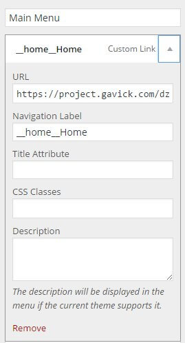
Save your changes, and you'll see that a house icon has been added to the left of the Home menu item:
Reveal Animations
The reveal animations that are often used in TechNews are provided by the powerful ScrollReveal JavaScript Library . This library allows animations to be added to nearly every HTML element in your code via the use of a data-sr attribute; you may have noticed when modifying the code for the frontpage elements or additional pages that they often had this data-sr attribute attached to control the animation.
When this attribute is added to an HTML tag, that element will be animated into place using a default reveal animation:
<h2 data-sr>My Title</h2>
However, ScrollReveal also includes multiple keywords that you can use to define the reveal animation using simple, understandable language. For example, the keyword "over Xs", where "X" is a time in seconds, will control the speed of the animation so that it take the value of "x" to complete. So, a value of:
<h2 data-sr="over 2s">My Title</h2>
Will cause the default animation to take two seconds to complete. Similarly, there are many keywords for controlling the type of animation. using the enter keyword will let you define the direction from which the animation will start (top, left, right, and bottom), while move can define the distance (in pixels) the animated element should move. Combine them together with the over keyword, and you will have something like this:
<h2 data-sr="Enter left move 24px over 2s">My Title</h2>
So with this setting, the title will appear 24px to the left of its final position, and will move right 24px to the final position over two seconds.
There are many more keywords that let you delay the animation, flip, spin, rotate and scale the element, and control attributes like starting opacity. A full list of the available keywords and their respective functions may be found on the ScrollReveal GitHub page .
Page-Load Animations
TechNews includes the ability to display animations as pages load, to avoid users from seeing the page before it is ready to view.
This animation is provided via a gif file called default.gif stored in the wp-content/themes/TechNews/images/preloaders folder of your WordPress installation. This default animation is designed to suit the aesthetics of the theme, but if you're interested using your own animation it's very easy to replace.
- First, create your animation and save as a gif file; there are many programs online to help you with this.
- Name your new file default.gif, as this is the name used by TechNews to target the preloader file.
- Connect to your server via FTP (more details on how to do this may be found in this blog article on the basics of FTP , and navigate to the wp-content/themes/TechNews/images/preloaders folder.
- Once at this folder, upload your new default.gif file and overwrite the existing file. Once done, your new page preloader animation will automatically be used.
GK News Show Pro
News Show Pro is the flagship open-source widget created by GavickPro, with complex functionality that allows it to display article previews in a range of styles and layouts from your chosen sources. In TechNews it provides the core of the functionality of the frontpage, being deployed as both a shortcode and a widget in various sections of the frontpage to create the varied article previews. In this section we'll look at the core functionality of the widget in both widget and shortcode form; this is meant as an introduction to how it works, so if you requrie specific details of how to change specific options relating to each frontpage section please visit the Frontpage Elements section of this guide, where we provide details on modifying the existing content.
What is News Show Pro?
News Show Pro is a WordPress plugin that can create article previews. It includes a range of layouts to choose from, each offering a different look for the previews and often slightly different functionality. For TechNews there have been multiple new modes created to take advantage of the review scores feature, creating new ways to highlight your posts, as well as video functionality that displays videos from articles in a pop-up lightbox. Despite the complexity of this tool, the options are clearly labelled and easy to modify to your liking.
How is News Show Pro used?
News Show Pro can be inserted into your content in two different ways; either as a widget that is placed in an available widget area and configured via the Widgets page, or directly into your post or page content via a shortcode that accepts various attributes to change the default settings. Let's start by looking at the widget version and the available options therein.
News Show Pro as a widget
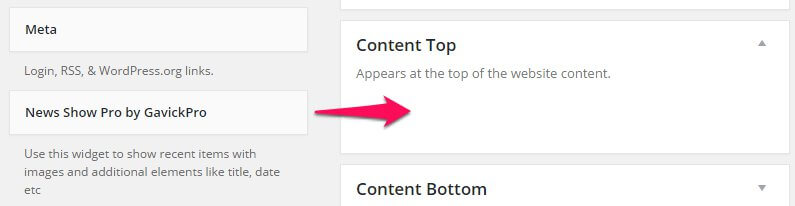
Like other widgets, News Show Pro can be added to any widget area on your site either via the WordPress Customizer, or on the Widgets page of your WordPress Dashboard, reached by clicking on Appearance → Widgets in the main menu. Simply drag a widget from the left side of the screen to the chosen widget area:
in the demo layout widgets are used in the Bottom V widget section to create the Most Rated article listing, in the Sidebar widget are to create the Popular article list, and in the Tabs widget area to create the Most Commented and Trending article lists.
News Show Pro Widget Options
Once the widget has been placed a group of option tabs will be expanded for you to control the look, layout and sources for the article previews. The available options are:
Basic Settings
This tab covers the basic options, including data sources, CSS suffixes and order. The following options are included:
- Title - Sets the title for the widget.
- CSS Suffix - Adding a CSS Suffix to this field allows for targeting particular CSS rules to particular NSP instances. For example, the vertical lists in the tab of the frontpage use a vertical-list CSS suffix, which is used to style the list to fit more comfortably in the tab area.
-
Data Source - One of the most important options; this option allows you to specify which articles are displayed by NSP. It can be pulled with the following filters:
- Latest Posts - NSP will display the latest articles from all categories, with the newest articles displayed first.
- Categories - Allows you to specify a particular category/group of categories; NSP will then display the latest posts only from the specified categories.
- Sticky Posts - Will display sticky posts only, from newest to oldest.
- Tags - Allows you specify a particular tag(s); NSP will then display the latest posts that include the chosen tags.
- Post Slugs - Allows for specific post slugs to be entered for NSP to display; great if you have particular popular posts you always want users to be able to find.
- Custom Post Types - Allows for a specific post type to be selected; NSP will then only display the latest posts to use the custom post type.
- JSON File - Specify a JSON file containing the post information you want to display.
- RSS Feed - Displays posts that have been added to your selected RSS Feed from newest to oldest.
- Latest WooCommerce Products - Instead of displaying posts, NSP will display previews of your latest WooCommerce products.
- WooCommerce Categories - Like the standard category option, but using WooCommerce categories as sources instead.
- WooCommerce Product SKUs - Allows you to specify particular products to be displayed, much like the Post Slug option for posts.
- XML File - Specify an XML file containing the post information.
- One Per Category - When this option is enabled NSP will only display one article from any given category; very useful if your site includes a lot of categories and you want to display diverse content in the widget.
- Order By - Articles are sorted by newest to oldest by default; this option allows you to change the order to alphabetical order, by date, ID, modified date or random, and set it to ascending or descending (that is, from newest to oldest or newest to oldest etc...).
- Offset - This option allows you to tell NSP to skip a certain number of articles i.e. if you have six new articles and you want NSP to skip the first and display the second to fifth, you'd set the offset to 1.
- Use Default CSS - NSP includes a default CSS profile for the widget; unchecking this option prevents it from using the default CSS. Instead, it will use CSS specified in the theme.
Widget Layout
This section covers the overall layout of the widget; number of previews, pagination etc...The options in this section are:
- Article Wrapper - This option allows for a specific functionality to be selected for the current instance of News Show Pro; each of these wrappers were usually specifically designed for a particular theme, but can be applied elsewhere. In TechNews there are three new wrappers; technews_rating, technews_reviews, and technews_videos. These are discussed in the Frontpage Elements section of this guide.
- Pages (article block) - Sets the number of "pages" of articles to be displayed. This refers to paginated groups of previews; for example, if you have a display of five articles in a vertical list, setting this option to 2 would add pagination options to the list, allowing users to browse to a second set of five articles for a total of ten in the preview.
- Columns (article block) - Sets the number of columns of previews NSP should display. When combined with the Rows option, it allows for complete control of the number of previews.
- Rows (article block) - Sets the number of rows of previews NSP should display. Combined with the Columns option, these options define the total number of article previews. For example, the vertical lists in the tabs on the TechNews frontpage display five rows in one column, for a total of five articles, whereas the videos section displays one row of four columns, for a total of four articles.
- Pages (link block) - So of the article wrappers for NSP include two sets of previews; one set that display an large image with text, and a secondary set that use smaller images or plain text; these secondary previews are called Links. This option sets the number of pages for the links, if applicable.
- Rows (link block) - Sets the number of rows of article links. Both this and the Pages option above are not used in the default TechNews layout, which relies on standard article previews only.
- Article Pagination - Defines the method available for users to move between different pages of articles if the Pages (article block) option is higher than one. Choose between Pagination, which adds a circular button for each page to the link list, or Arrows, which adds left and right arrows, or both.
- Links Pagination - The same option as above, but for the link group rather than article group.
Autoanimation Settings
These options control whether and how often the article or link lists should scroll between different pages.
- Auto-animation - When enabled, NSP will automatically switch between the available pages of articles or links.
- Interval - Sets the time in milliseconds between each autoanimation cycle.
- Auto-animation stops on hover - When enabled the automanimation cycle will pause when a user hovers over a preview.
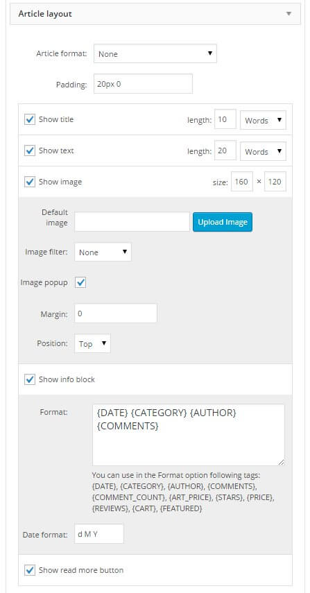
Article Layout
One of the most complex option tabs, this section covers whether each element of an article should be displayed or not, and the order they are displayed in. The available general options are:
- Article Format - Sets the layout of the individual article using pre-prepared CSS. Whereas the Article Wrapper option defines the overall layout of the widget, this option defines the layout of each article within that layout in terms of image size, text placement, and additional buttons or links if appropriate.
- Padding - Defines the padding for each individual article using the format 10px 10px 10px 10px, with the first number defining the padding at the top of the article, the second defining the right padding, third defining bottom padding, and fourth defining left padding (in pixels)
- Show Image - Sets whether an image is displayed in the article preview or not.
After the general options is the main part of the section, which allow you to control the layout intuitively via the Show X options, such as Show Title, Show Image etc...each of which can all be dragged & dropped into the order you wish to use and enabled or disabled as needed. Each item may include one or two additional options (or more, in the case of images) to give you further control of the layout. Let's look at the available items that can be dragged & dropped, their respective options, and then look at how it may be used.
The Show Title and Show Text block include one option; Length, where you can set the maximum length of the title or preview text in words or characters. By setting a word or character limit you can prevent posts with long titles wrapping to a new line, breaking the preview layout. The Show Text option refers to the preview text; the first few words from an article that can be used in the preview.
The Show Image options are a bit more complex, since there are several image-specific options:
- Size - Sets the size of the image in the article preview (in pixels)
- Default Image - Sets an image to use in the preview when the article being previewed has no featured image to display.
- Image Filter - Add a filter to any images in the preview such as sepia or grayscale.
- Image Popup -
- Margin - Sets the margin size of the image in the preview (in pixels)
- Position - Sets the position of the image in the preview; on the top or the left.
The next section, Info Block, also includes some additional options:
- Format - Sets the format for the article information; here you can decide which information elements to include and which order they will be displayed, including elements such as category, author, comments etc...
- Date Format - Defines how the date should be displayed in the article preview; can be set to display the day, month and year in any order, or omit particular elements as needed.
There's only one more option in this section, Show Read More, which sets whether a Read More button will be displayed in the previews.
To see how drag & drop of these elements work, lets use the default layout as an example:
The default layout is Title, Text, Image, Info Block, Read More. First, we can decide which elements to include in this section by adding or removing checkmarks to each of the Show X options. Once done, we can then shift the order. Hover your mouse over the center of the option block; that is, if you want to drag the Show Title section, hover your mouse in the block between the Show Title checkbox and the Length option; you'll see the mouse icon change to an arrow cross. Click and hold the left mouse button and you can now drag the entire Show Title box; move it under another element and you'll see a dash-outlined box appear to show you where you can drop it. Release the button, and your new order will be set. Repeat this with each element to achieve the exact order of elements needed.
Note: Some modes and layouts available in NSP have specific requirements; in these cases the Article Layout options will be overridden so your changes aren't registered.
Links Layout
This section offers similar functionality to the Article Layout tab, but this time the ordering and options are specific for the links that accompany the main previews. As you'd expect, these options only apply if your chosen layout uses additional links. The available options are functionally the same as the Article Layout tab, with a title, text, image and read more block where you can set whether each element is visible or not and change their order. However, there is one new set of options here that do not appear in the Article tab; a Show Read More Button Under Links setting. This decides if a read more button is added underneath the links block to encourage users to explore a category of articles further. There are also three additional options related to this block:
- Link Text - Sets the text for the link; that is, the text that appears on the button under the list of links.
- Link URL - Sets the target URL for the link button; this can be a category list, external URL; whatever you require.
- Use This Link Also in the Widget Title - When enabled, if the widget title is set as Visible and a user clicks it they will be taken to the link specified in the Link URL option.
Advanced Settings
The options in this tab are very specific, so it's likely you won't need to make any changes here. There are three options available:
- Cache Time - Sets the cache time for the instance of NSP. This is the length of time that a visitor's browser should store the widget in page cache. The advantage of a longer time setting is that users that come back to the page where the widget is will not have to redownload the information, making for a faster page load. The negative of this is that until the cache expires users will not see any changes in the widget; if you're regularly posting new content you might want a shorter cache time so users coming back to the frontpage after reading an article can see any new posts.
- Parse Shortcode in the Article Text - If you use shortcodes to produce any of your content, enabling this option will cause NSP to parse them accordingly if they are used in the content it delivers, such as titles or page text previews.
- Load Font Awesome - When enabled, Font Awesome is loaded by the widget and any Font Awesome codes used in the text or title shown by the widget will be parsed into their respective icon.
This covers all of the options available by default in the widget; note that some other option tabs may appear in particular layouts, and other options may disappear entirely when certain layouts are used since that option becomes redundant. To really get a feel for this widget though, we encourage you to play around with the options using the information above as a guideline; change layouts, data sources and more and you'll see the effect the options have. Soon you'll be able to create flexible, dynamic preview widgets to show off your full range of posts.
News Show Pro as a Shortcode
As well as a widget, it's also possible to create instances of NSP within your site content, whether it's a page, post or text widget. This allows for flexibility of placement while still retaining all the usual sets of options available in the widget version. NSP as a shortcode is used to create both the Reviews and Videos section of the frontpage, with the shortcode added to the respective section's pages.
How the Shortcode Works
If you've used any kind of shortcode in WordPress then you already have a good idea of how inserting NSP as a shortcode to your content will work; however, unlike many shortcodes, NSP includes a huge amount of attributes to allow for each of the options to be defined. To insert an instance of NSP into your content, we'll need to start with the basic shortcode:
[gknsp]
This shortcode will create an instance of News Show Pro in your content. However, the basic shortcode will create NSP with all options set to the default. Usually we can just make any changes in the widget options, but in this case we'll need to add attributes to the shortcode to define the options as needed, using the following format:
[gknsp Option_name="New_Option_Value"]
With a space separating each attribute if more than one is to be added. So if we want to set the cache time to "0", meaning users will always download the latest instance whenever they open the page, we'll use the following shortcode:
[gknsp cache_time="0"]
More options can be added so that there is functionally no difference between the the widget and shortcode version in terms of content. However, since attributes must be manually added it may take slightly longer to configure than the widget version. In the default TechNews layout you're likely to see the following attributes:
- before_title - Allows for HTML tag(s) to be defined that will be added before the title. Usually used to change the title to a particular header type for CSS targeting.
- after_title - Same as above, but defines HTML to be added after the widget title; will usually be the closing tags from the before_title option.
- title - Sets the widget title.
- data_source_type - This option is used to specify the data source, or where the widget should look for articles to display. This can be set to pull from particular categories ("wp-category"), specific posts ("wp-post") and more.
- data_source - Defines the particular posts to be displayed when the data_source_type attribute is set to wp-post. Accepts post slugs as values.
- wp_category_list - Defines which categories the widget should pull articles from when the data_source_type is set to wp-category. Accepts category IDs as values.
- article_wrapper - Defines the type of article wrapper used, which changes the layout and other features. Values for this attribute are the same as they appear in the widget version's article wrapper list, such as technews_revews.
- use_css - This option decides whether the default CSS for the widget is loaded.
- cache_time - This option sets how long the widget settings should be stored in cache. In the demo this is set to 0 so users will always see the latest version of the widget every time they visit, including any new styling or articles.
- article_format - This option is used to specify a particular article preview layout from those available.
- widget_css_suffix - One of the most important options, this lets you define CSS suffixes specific to the widget so that you can target your CSS rules directly.
- article_cols & article_rows - Another two important options; these two attributes sets the number of columns and rows that NSP should create, which in turn defines the number of showcases.
- article_block_padding - This option lets you set the padding for the articles in pixels; up to four numbers can be entered to represent the padding for the top, right, bottom and left margins in turn.
- article_image_w - Defines the width of the article showcase image in pixels.
- article_image_h - Defines the height of the article showcase image in pixels.
- orderby - Sets the ordering for the showcased posts. This can be set to sort items by ID, date etc...
- order - Sets whether the ordering defined in the orderby attribute is ascending or descending.
- article_text_len - This option sets the length of the preview text (in number of words) that each article showcase displays.
There are many more attributes available covering all of the available widget options; you can find a breakdown of the most commonly-used ones in this blog article ; for now, we'll cover the most important things you'll want to do; setting the data source.
Displaying Specific Posts
The default behavior of NSP as a shortcode is to look for the latest posts from all categories, displaying them in date order from newest to oldest. However, it's easy to change this so that you can specify which posts are previewed in the widget. We'll need to use two attributes to achieve this; data_source_type, which should be set to wp-post, and data_source, which should include the slugs of the posts you want to display separated by a comma:
[gknsp data_source_type="wp-post" data_source="first-post-slug,second-post-slug,third-post-slug"]
Finding the Post Slug
To find a post's slug, click on Posts → All Posts in the WordPress Dashboard to open the list of posts. Find the post you wish add to the reviews section and click the Quick Edit option that appears when you hover over the post in the post list:
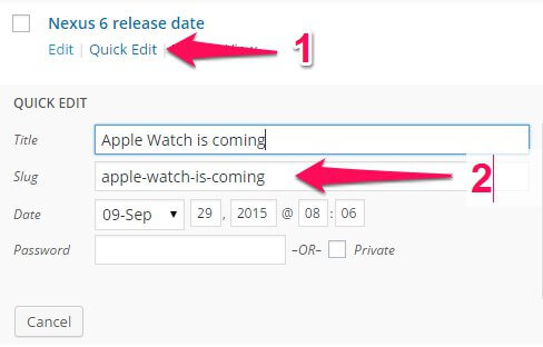
This will open a quick edit area where you can change various options in the post; the post slug is defined in the second field, Slug; copy the text from this field and paste it into the data_source attribute. Repeat this process to add more posts, separating each slug with a comma as in the examples above.
Displaying Latest Posts From Category
As an alternative to pulling all your latest posts from all categories, you might want to set NSP to pull the latest posts only from specific categories. Thankfully, this is very easy to do. To change News Show Pro's behavior to pull from categories instead of latest posts we'll need to use two shortcode attributes; data_source_type, which should be set to wp-category, and wp_category_list, which allows us to define which categories to display using the category ID:
[gknsp data_source_type="wp-category" wp_category_list="first-category-ID,second-category-id"]
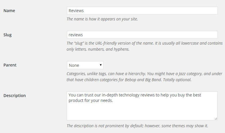
To get the ID of a particular category we'll need to jump through some hoops, since WordPress doesn't include an ID section in its default layout. To find the category ID, click on Posts → Categories in the WordPress dashboard to open the Categories page, then click on the category you wish to use in the list of categories to be taken to the Edit Category page:
The category page does not include any ID field, but you can find the ID in the URL for the current page. In your browser, check the address bar. In the URL you should find a sequence like tag_ID=X where "X" is a number; this number is the category ID:

As you can see in the above image, the URL includes a section that says tag_ID=3; by adding 3 as the value of the wp_category_list attribute we can have NSP pull the latest posts from this category automatically:
[gknsp data_source_type="wp-category" wp_category_list="3"]
If you have multiple review categories you can add all of their IDs to the wp_category_list attribute; just add a comma between each ID.
GK Tabs
GK Tabs is the second major plugin used in TechNews, alongside News Show Pro. With it, you can create multiple types of tabs that can display content from any widget; the frontpage of TechNews take advantage of this to display two instances of News Show Pro that provide listings of popular articles.
How GK Tabs Works
GK Tabs is a widget, which means it can be deployed in any available widget position on your WordPress site. With the power of the Widget Rules plugin (detailed later in the Theme Features section) you can also limit which pages the widget appears on for total control of your layout.
The basic premise behind GK Tabs is very simple; once the GK Tabs plugin has been installed and activated, a new set of three widget positions are automatically created, called GK Tabs I, II, and III. These widget positions are where you can place and configure the widget content you want to be displayed in a tab; technically you can use any widget area as the source for tabs, but these separate widget areas are safer since they do not have a specific area where they are displayed in the theme. GK Tabs can display all types of widgets, from basic text widgets to complex items such as comment lists, but in TechNews it's used to display News Show Pro's article preview lists.
Once the content for the tabs has been added to the GK Tabs widget areas, the Tabs widget itself is placed in the selected widget area; in the demo content you'll see that it is posted in the Bottom V widget area. Then, options set the tab layout and which widget area of the available GK Tabs areas to use as a source. The widget will then automatically sort each widget in the selected source widget area into its own tab.
The GK Tabs Options
The options in GK Tabs are not as extensive or complex as News Show Pro, but there are enough that it is worth familiarizing yourself with what's available so that you can easily adjust the content to your needs. The available options are:
- Title - Sets the title of the widget.
- Style - This option is used to select the tab's style; note that this does not affect the overall look of the section as that depends on the widget content being displayed. This option only changes the style of the tab names/selectors.
- Tabs Source - The most important option! Here you can select the widget area that the Tabs widget should use as the source for its tabs. The number of tabs created is directly taken from the number of widgets in the specified area i.e. if you have three text widgets in the selected widget area, then GK Tabs will create three separate tabs.
- First Tab - Tells the widget which tab to display by default; the widgets are sorted into numerical order according to the order they are in in the widget area, with position 1 being the first widget in a given area, 2 the one underneath it and so on.
- Tabs Activator Event - This option sets what action causes a tab to activate; if set to Click the tabs won't change until one is clicked. If set to Hover, the tab will change as soon as the user hovers over a tab.
- Swipe Gesture - Sets whether touchscreen users can swipe the widget to switch between tabs.
- Navigation Buttons - When enabled, pagination arrows are added to the middle area of the widget, allowing users to click the tab name or on the left or right arrows to change the active tab.
- Tabs Position - Sets the position for the tab names, where users can see which tabs are available and swap between them. Can be set to top or bottom.
- Auto-Animation - When enabled, GK Tabs will automatically scroll through the available tabs at a defined interval.
- Stop On Hover - When this option is enabled auto-animation will pause if a user hovers their cursor on a tab.
- Animation Speed - Sets the speed (in milliseconds) of the transition animation between tabs; that is, when a user clicks on a tab or the autoanimation forces movement to a new tab an animation is played; this option sets how long the animation takes.
- Animation Interval - Sets the wait time in milliseconds between each auto-animation rotation. Obviously ignored if auto-animation is disabled.
- Animation Type - Offers multiple ways for transitions between tabs to be animated, including rotations, fade in/out, and scaling. Test out the different animations to find one you like!
- Amount of Sidebars - This option defines the number of tab widget areas are created by the plugin. The default is three (GK Tabs I, II and II); increasing this number adds more widget areas for you to use, perfect if you have many instance of the Tab widget.
- Cache - Sets options related to the widget's cache. The first field sets the cache store time; that is, how long the widget contents should be stored by the user's browser. The second field lets you control what the cache affects; either the content of the tabs only, the entire widget (tabs and tabs content), or disable the cache entirely.
These options are fairly simple, but provide many ways to change the look of your tabs to suit your needs. Make sure to test the different options to find a layout that suits you.
Adding a Tab
The Tabs Source option in the GK Tabs widget options is where you define the widget area that should be used as the source for tabs content. As an example, let's look at the Most Commented and Trending tabs from the demo frontpage layout for TechNews:
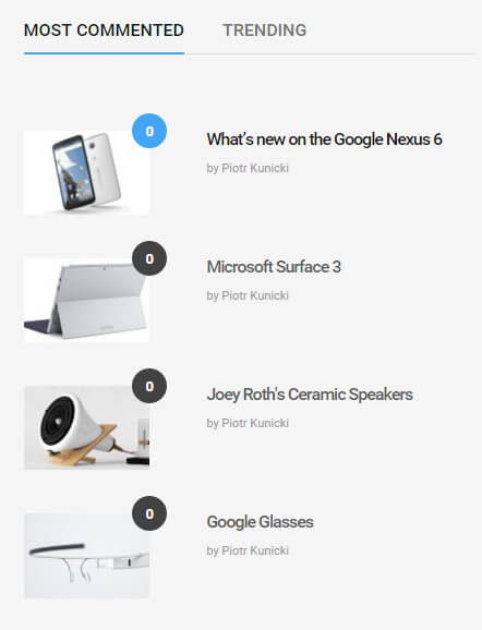
If you installed the quickstart package, then you'll find the two instances of News Show Pro that create these listings in the GK Tabs III widget area:
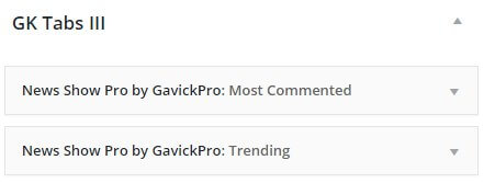
Notice that the two instances of NSP are the only widgets in this section. In the Tabs widget, when the source is defined as the GK Tabs III widget area, it will look in the specified widget area and automatically convert each individual widget in that area into a tab. So, in the case of the GK Tabs III area, there are two NSP widgets, so the Tabs widget creates two tabs. To add a new tab to this section, all you need to do is create a new widget and place it in the selected source widget area; the Tabs widget will do all the hard work of creating a new tab automatically.
Bear in mind that though there are technically no limits to the number of tabs or the type of content that can be displayed in the tabs, realistically there will be widgets that create too much content for it to be elegantly displayed in a tab. Make sure the widgets you wish to place in tabs have options for controlling how much data is displayed to avoid damaging the theme aesthetics, or that you have sufficient CSS knowledge to style the output accordingly.
Frontpage Elements
The frontpage of TechNews uses a mixture of page-based content and widgets. The header and What's New sections are built use pages as their base, but all the hard work is taken care of via the theme's code and these elements are modifiable via the WordPress customizer, whereas the reviews and video sections are both provided by shortcodes inserted into the frontpage pages. Finally, the advertisement blocks and tabbed article listings such as the Most Commented and Most Rated lists are created using widgets, allowing for a flexible approach to the frontpage. In this section we'll look at each frontpage section and how it can be customized to your liking, and we'll finish with some basic layout customization for the entire frontpage, such as removing particular elements.
The Frontpage Header
The frontpage header is created via a page that uses the Frontpage template that is then assigned as the Static Front Page:
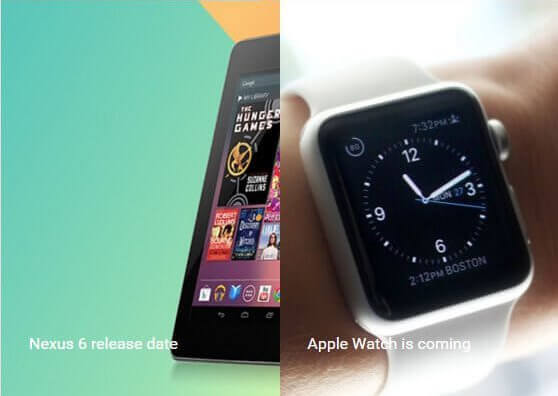
However, unlike our more recent releases none of the header content is taken from this base frontpage; instead, the page is used as a target for the theme's code to create the header. As such, the modifications for the frontpage are controlled entirely via the WordPress Customizer.
Changing the Header Layout
TechNews includes a total of four different header layouts; an accordion-style article preview that can display between 3 and 5 previews, and a grid-style layout that displays one large preview image and two columns of two smaller previews. To modify the layout, open the WordPress Customizer by clicking on Appearance → Customize in your WordPress dashboard, then open the Frontpage options panel in the list of areas to access the header options. More details on these options and what header variants are available is covered in the Theme Settings section of this guide.
The "What's New" section
This section appears directly under the header, providing previews of your latest posts to encourage users to explore your site.
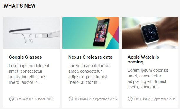
Like the header, this section is automatically created one a page using the Frontpage template is assigned as the Static Front Page for your site, and also like the header, all options related to this section are controlled via the WordPress Customizer. The layout is automatically created, but you can define filters for which posts should be included in this section via the Frontpage section of the customizer; more information is available in the Theme Options section of this guide.
The Reviews Section
The reviews section creates a list of article links with a large image preview that highlights the rating from the post; users can click on each link in the list to open it in the large preview, and then click on the large preview to link to the post itself:
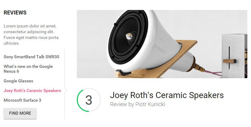
The reviews section is created using a shortcode in the first subpage of the Frontpage that creates an instance of NSP; the shortcode as used in the demo content looks like this:
[gknsp before_title="<h3>" after_title="</h3>>" title="Reviews" data_source_type="wp-post" data_source="sony-smartband,whats-new-on-the-google-nexus-6,glasses,joey-roths-ceramic-speakers,microsoft-surface-3" article_wrapper="technews_reviews" technews_reviews_button_label="Find more" technews_reviews_button_url="#" technews_reviews_articles="5" technews_reviews_widget_intro="Lorem ipsum dolor sit amet, consectetur adipiscing elit. Fusce eget mattis risus porta ultricies." technews_reviews_animation_interval="8000" technews_reviews_animation_autoanim="1" cache_time="0" article_image_w="900" article_image_h="360" use_css="off"]
Shortcode Breakdown
Note: For more information on how the News Show Pro widget works as a shortcode, check-out the Theme Features → News Show Pro section of this guide for a full breakdown.
The version of the NSP shortcode may look rather long in the demo content, but there are actually very few attributes required in this section; most of the space is taken up by added text or post specifics. Some of these attributes are general ones covered in the Theme Features section on News Show Pro, but for TechNews some special new portal modes were created to allow for additional features such as the listing layout and review scores to be displayed; we'll cover those (and some of the general options that are important for customization purposes) next.
- before_title - This option allows HTML elements to be added before the title of the widget as it apppears on the frontpage; in the demo content this is set to <h3> so the title uses a particular header size and styling.
- after_title - This sets the HTML elements that are to be added after the title of the widget; since the before_title option is an opening <h3> tag, as you can probably guess the after_title setting is the closing </h3> tag.
- Title - Sets the title that will be displayed at the top of the left column of the reviews block. In the demo this text is simply "Reviews", with the above attributes adding the <h3> tags around it.
- data_source_type - This option lets us specify what type of data source the widget should use; in the demo this is set to wp-post, which allows us to specify specific posts that should be displayed in the widget.
- data_source - With the data_source_type set to wp-post, this attribute lets us specify particular post slugs; the selected articles will then be displayed in this section.
- article_wrapper - Sets the layout type for the widget; NSP includes many prepared layouts. In this case the default is set to technews_reviews, which is a special TechNews-exclusive layout that creates the large preview with rating.
- technews_reviews_button_label - At the bottom of the first column that lists the various review articles is a button; this option defines the button's label. In the demo this is set to Find More.
- technews_reviews_button_url - Sets the URL that the button described above will link to when clicked. This isn't set to anything in the demo content, with just a hash placeholder instead.
- technews_reviews-articles - Sets the number of articles that should be displayed in the list of reviews. In the demo this is set to five.
- technews_reviews_widget_intro - Defines the text that appears under the widget title but before the reviews listing in the first column of the widget. in the demo this uses some placeholder Lorem Ipsum text.
- technews_reviews_animation_interval - Sets the time delay in milliseconds before the widget automatically scrolls to the next preview. In the demo this is set to 8000.
- technews_reviews_animation_autoanim - Sets whether the widget should auto-animate between review previews or not. Note that this option uses binary; a setting of 1 turns the option on, and 0 turns it off.
Changing the Section Title
The title in this section is set in the title attribute of the NSP shortcode; to add your own, just change the text in this attribute accordingly:
[gknsp title="Title Here"]
Changing the Intro Text
Underneath the title of the reviews section is a short piece of text that can be used to introduce the section; this text is defined in the technews_reviews_widget_intro attribute; simply add your text into this attribute as needed:
[gknsp technews_reviews_widget_intro="Your Intro Text Here"]
Changing the Button Text and Link
Underneath the list of reviews in the left column is a button that, in the demo content, is used to link users to a reviews category so that they can check out all of the reviews your site has to offer. These elements are controlled by two attributes; the technews_reviews_button_label attribute defines the button's text, and the technews_reviews_button_url defines the URL the button should redirect to when clicked; just change these to your preferred text:
[gknsp technews_reviews_button_label="Button Text Here" technews_reviews_button_url="Link URL Here"]
Remember that the button does not necessarily need to be used to link to your reviews category; feel free to use it as you see fit.
Changing the Displayed Posts
In the default settings the posts to display are set via the post slugs specified in the data_source attribute; replace the demo content slugs with your own to change the specified posts. Note that the data_source_type attribute must be set to wp-post also, so make sure this attribute isn't changed:
[gknsp data_source_type="wp-post" data_source="first-post-slug,second-post-slug,third-post-slug"]
Finding the Post Slug
To find a post's slug, click on Posts → All Posts in the WordPress Dashboard to open the list of posts. Find the post you wish add to the reviews section and click the Quick Edit option that appears when you hover over the post in the post list:
This will open a quick edit area where you can change various options in the post; the post slug is defined in the second field, Slug; copy the text from this field and paste it into the data_source attribute. Repeat this process to add more posts, separating each slug with a comma as in the examples above.
Note: The large previews in this section place a lot of emphasis on the review score, which is added automatically underneath the preview image. For this reason you should ensure that any posts you add to this section have the review shortcode added; it does not matter where in the content the shortcode is as NSP will pull the data automatically, but it is a required element for the layout to work correctly.
Displaying Latest Posts From Category
The default layout requires that each new post is manually added to the shortcode so that it is displayed on the frontpage, however if you have a specific reviews category then it might be useful to set this instance of NSP to pull your latest posts from this category; as long as the posts in the category always have the review score shortcode included in their content they will be displayed effectively in the review layout.
To change News Show Pro's behavior to pull from categories instead of specified posts we'll need to make a few changes to the shortcode; first, we need to remove the data_source attribute, since this only applies when we are setting specific posts to be displayed. Instead, we'll need to add a new attribute, wp_category_list, which allows us to define which categories to display using the category ID. Finally, the data_source_type attribute should be changed from the default wp-post to wp-category:
[gknsp data_source_type="wp-category" wp_category_list="first-category-ID,second-category-id"]
To get the ID of a particular category we'll need to jump through some hoops, since WordPress doesn't include an ID section in its default layout. To find the category ID, click on Posts → Categories in the WordPress dashboard to open the Categories page, then click on the category you wish to use in the list of categories to be taken to the Edit Category page:
The category page does not include any ID field, but you can find the ID in the URL for the current page. In your browser, check the address bar. In the URL you should find a sequence like tag_ID=X where "X" is a number; this number is the category ID:
As you can see in the above image, the URL includes a section that says tag_ID=3; by adding 3 as the value of the wp_category_list attribute we can have NSP pull the latest posts from this category automatically:
[gknsp data_source_type="wp-category" wp_category_list="3"]
If you have multiple review categories you can add all of their IDs to the wp_category_list attribute; just add a comma between each ID.
Changing the Number of Previewed Reviews
The demo layout of the reviews section displays five review post titles in the left column, which users can click on to view a particular preview and the respective score; the widget also auto-animates through the various posts automatically. However, you can easily change the number of previewed reviews by changing one attribute, technews_reviews_articles, which is a specific option for the TechNews layout. Simply change the value of this attribute, so if you want to have six reviews the shortcode would look like:
[gknsp technews_reviews_articles="6"]
There's no technical limit to the number of previews you can add to the left column, but bear in mind that the more you add, the longer the left column will become; if it's too long it will not match up nicely with the preview in the right column. Play with the settings to find what works for you though!
The Videos Section
This section provides a horizontal listing of articles that contain a video; users have the choice of clicking on the preview title text to be taken to the post itself, or clicking on the image to open the video from the article in a pop-up lightbox:
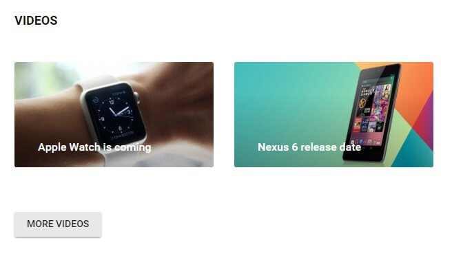
Like the reviews section, this section is created using the News Show Pro shortcode placed in the Second Subpage of the Frontpage; the shortcode as used in the demo content looks like this:
[gknsp before_title="<h3>" after_title="</h3>>" title="Videos" data_source_type="wp-post" data_source="apple-watch-is-coming,nexus-6-release-date,sony-experia-z3-released,google-glasses" article_wrapper="technews_videos" technews_videos_pages="1" technews_videos_cols="4" technews_videos_popup_switcher="1" technews_videos_popup_w="640" technews_videos_popup_h="480" technews_videos_title_len="40" technews_videos_button_label="More Videos" technews_videos_button_url="#" cache_time="0" article_image_w="340" article_image_h="180"]
Shortcode Breakdown
Like the reviews section, the video area's shortcode uses a special portal mode created specifically for TechNews, which means that there are some attributes in the shortcode that you won't find elsewhere. For details on the general attributes in News Show Pro check out the Theme Features → News Show Pro section of this guide. The additional elements specific to this layout are:
- technews_videos_pages - Sets the number of pages (that is, groups of previews) that appear in the widget. When the number is set to two or more pagination options will appear underneath the preview area so users can click to move between pages; very useful if you post a lot of videos and want users to be able to access them all.
- technews_videos_cols - Sets the number of preview columns, which directly controls the number of previews per 'page'. The default is four; if this number is changed the size of the previews will be automatically modified accordingly to fit the available space.
- technews_videos_popup_switcher - Enables or disables the video popup that appears when the preview image is clicked. Set to 1 (enabled) in the demo; set it to 0 to have the preview link to the post only.
- technews_videos_popup_w - Sets the width in pixels of the video popup that appears when the image is clicked.
- technews_videos_popup_h - Sets the height in pixels of the video popup that appears when the preview image is clicked.
- technews_videos_title_len - Sets the maximum length in characters of the video preview's title text that is taken from the post title. Set to 40 by default.
- technews_video_button_label - Defines the text that appears in the button underneath the video previews.
- technews_video_button_url - Defines the URL the button will redirect to when clicked.
Changing the Title
The title appears at the top-left of the section and is set via the title attribute; just change this to your preferred title:
[gknsp title="Your Title Here"]
Changing the Displayed Posts
As in the reviews layout, the demo version of the video section the posts to display are set via the post slugs specified in the data_source attribute; replace the demo content slugs with your own to change the specified posts. Note that the data_source_type attribute must be set to wp-post also, so make sure this attribute isn't changed:
[gknsp data_source_type="wp-post" data_source="first-post-slug,second-post-slug,third-post-slug"]
Finding the Post Slug
To find a post's slug, click on Posts → All Posts in the WordPress Dashboard to open the list of posts. Find the post you wish add and click the Quick Edit option that appears when you hover over the post in the post list:
This will open a quick edit area where you can change various options in the post; the post slug is defined in the second field, Slug; copy the text from this field and paste it into the data_source attribute. Repeat this process to add more posts, separating each slug with a comma as in the examples above.
Note: It's possible to add posts that don't have videos embedded in the post content to this section; NSP will check the post for the video when the image is clicked and if it doesn't find one it will simply link to the post. However, given the specific functionality for this section it's recommended that you stick to video posts here if possible.
Displaying Latest Posts From Category
If you have a specific category where you add any posts that have videos then you might prefer to set the video to The default layout requires that each new post is manually added to the shortcode so that it is displayed on the frontpage, however if you have a specific reviews category then it might be useful to set this instance of NSP to pull your latest posts from this category; as long as the posts in the category always have the review score shortcode included in their content they will be displayed effectively in the review layout.
To change News Show Pro's behavior to pull from categories instead of specified posts we'll need to make a few changes to the shortcode; first, we need to remove the data_source attribute, since this only applies when we are setting specific posts to be displayed. Instead, we'll need to add a new attribute, wp_category_list, which allows us to define which categories to display using the category ID. Finally, the data_source_type attribute should be changed from the default wp-post to wp-category:
[gknsp data_source_type="wp-category" wp_category_list="first-category-ID,second-category-id"]
To get the ID of a particular category we'll need to jump through some hoops, since WordPress doesn't include an ID section in its default layout. To find the category ID, click on Posts → Categories in the WordPress dashboard to open the Categories page, then click on the category you wish to use in the list of categories to be taken to the Edit Category page:
The category page does not include any ID field, but you can find the ID in the URL for the current page. In your browser, check the address bar. In the URL you should find a sequence like tag_ID=X where "X" is a number; this number is the category ID:
As you can see in the above image, the URL includes a section that says tag_ID=3; by adding 3 as the value of the wp_category_list attribute we can have NSP pull the latest posts from this category automatically:
[gknsp data_source_type="wp-category" wp_category_list="3"]
If you have multiple review categories you can add all of their IDs to the wp_category_list attribute; just add a comma between each ID.
Changing the Size of the Video Popup
The video popup's size is defined by two attributes; technews_videos_popup_h for the height, and technews_videos_popup_w for the width. Set these attributes to your chosen size (in pixels) to change the size of the popup:
[gknsp technews_videos_popup_h="Height In Pixels" technews_videos_popup_w="Width In Pixels"]
Changing the Number of Previews
There are two ways to change the number of previews in the videos section. The first method is to change the number of columns for the section; each preview occupies a single column so if you increase or reduce the number of columns the number of previews will be affected according. To do this, you should modify the technews_videos_cols attribute:
[gknsp technews_videos_cols="Number of Columns Here"]
The previews will be scaled to fit the available space, so if you set the column count to 3 (the default is 4) then the previews will be larger as there is more space available per preview. Of course, the downside to this is that if you want to have several previews, such as 10, then the available space will be too small and the previews will be crammed in and ugly. To get around this there's a second method to add previews; increasing the number of 'pages'. In this context 'pages' refers to groups of article previews. For example, in the demo content there are four video articles previewed in the video section; this group of four articles is called a page. By adding another page you can have a second set of four article previews accessible via pagination.
The number of pages of articles is controlled by the technews_videos_pages attributes; just enter the number of pages of articles you want to include; pagination options will automatically be added when the number of pages is above one:
[gknsp technews_videos_pages="Number of Pages Here"]
If preferred you can combine both of the above methods i.e. use the technews_videos_cols attribute to create three larger previews, and the technews_videos_pages attribute to add more pages so all your videos are included.
[gknsp technews_videos_cols="Number of Columns" technews_videos_pages="Number of Pages"]
The Most Commented/Trending Tabs
This section is a tabbed area with two separate article listings:
Both of these layouts are created using a combination of the Tabs and News Show Pro widgets; the individual lists are created using News Show Pro in one of the Tabs widget areas, whilst the Tabs widget is placed in the Bottom V position on the frontpage and set to display the News Show Pro widgets in its tabs. Unlike the reviews and videos sections of the frontpage the instances of News Show Pro do not include any TechNews-specific options; as such for further information on modifying the core options refer to the Theme Features → News Show Pro section of this guide. For adding/removing tabs or changing the layout of the tabs themselves, refer to the Theme Features → GK Tabs section for more information on the available options and customization.
The Most Rated Section
The Most Rated section displays a list of popular reviews, with review scores included in the preview:
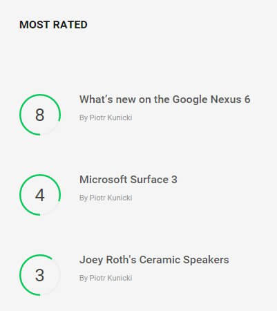
This section is created using an instance of News Show Pro in the Bottom V widget area, rather than a shortcode. As such, you may modify the options using the widget backend rather than adding attributes to a shortcode; refer to the Theme Features → News Show Pro section of this guide for more information on configuring and modifying the widget version of NSP and the available options.
Changing the Number of Previews
The Most Rated section uses a special portal mode built specifically for TechNews to create its unique listing layout; for this reason the number of previews is not controlled via the Widget Layout option tab as is normally the case for NSP, as the portal mode is designed only for vertical layouts; the widget layout options include settings for adding more columns as well as rows that would not apply in this case. Instead, setting the number of previews is defined in a options tab that is only visible when the Article Wrapper option is set to technews_rating, which will automatically provide the layout. When this wrapper is selected, a TechNews Reviews Options tab will appear in the NSP settings which contains one option; Number of Rows. Change this option to your desired number of previews and save changes.
The Newsletter Popup
The newsletter popup is a timed newsletter call-to-action that encourages users to sign-up for your newsletter:
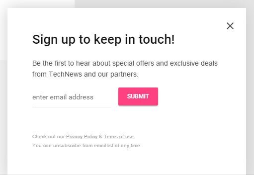
This popup is created using a MailPoet Subscription Form widget and a form provided by MailPoet also.
How It Works
This section consists of two parts; a subscription form, which is created in the visual editor of MailPoet's options, and a widget that creates the title and displays the subscription form. This widget is also provided by MailPoet, and is called a MailPoet Subscription Form widget.
The subscription form's look is defined in the visual editor of MailPoet (MailPoet → Settings → Forms tab → Edit Form in the WordPress menu):
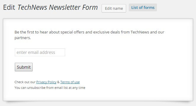
In this section you can highlight each block and edit the content by clicking the Edit Display button that appears when each section of the form is hovered over in the editor, or drag new fields from the list of available elements on the right and drop them into the visual editor, which will realign them accordingly. The form as used in the demo is made up of four parts; the first is a Random Text or HTML field with the following content:
<p>Be the first to hear about special offers and exclusive deals from TechNews and our partners.</p>
That appears at the top of the form, under the title. This is very simple HTML consisting of a plain <p> tag with text content. Next is the Email field, which has the following label attached:
enter email address
And the option to display the label within the field activated.
The third block is the Submit button, which has the plain "Submit" label. Finally, the last block is another Random Text or HTML block with the following HTML code:
<small>
Check out our <a href="#">Privacy Policy</a> & <a href="#">Terms of use</a><br>
You can unsubscribe from email list at any time
</small>
This HTML is a little more complex; a <small> tag wraps all the text, but there are also two <a> tags used to provide links to privacy policies and terms of use, along with a <br> tag for line breaks. This completes the form.
To add the form to the newsletter popup, a MailPoet Subscription Form widget is added to the Newsletter widget position. This widget has only two options; a Title field, which defines the title that is displayed at the top of the block, and a Select a form drop-down list where you can pick from the available forms from your MailPoet installation.
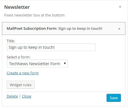
Changing the Popup Title
The title for the popup is defined in the Title field of the MailPoet Subscription Form widget. To change this, click on Appearance → Widgets in your WordPress backend to go to the Widgets screen. Click on the Newsletter position on the right to expand it, and then click on the MailPoet Subscription Form widget to expand the options.
The first option in this section will be the widget's Title field; modify the text in this field to redefine the title of the popup.
Changing the Text Above the Email Field
Above the email field is a short bit of text promoting the benefits of signing up to the newsletter. This is part of the MailPoet newsletter form. To modify it, Click on MailPoet → Settings in your WordPress backend to open the MailPoet option area, then click on the Forms tab to see a list of available forms.
In this list, highlight the newsletter's name and click the Edit button that appears to taken to the Edit Newsletter page. You will see the visual editor for the form on the left:
Use your mouse cursor to highlight the text block above the email field, and click the Edit display button that appears on hover to open a popup with options for editing the HTML content in this section. Change the text between the <p> tags to your own content.
Changing the Email Field Label
To change the email field's label, open the MailPoet form editor page, highlight the email address field in the visual editor on the left of the screen, and click the Edit display button that appears. A popup will open with two options; modify the text in the Label field to whatever you wish to display in this field.
Changing the Submit Button Label
To change the label of the button, open the MailPoet form editor page as in the above examples, then highlight the button in the visual editor and click the Edit Display button. A field will popup with a Label area where you can add your own button label.
Changing the Bottom Text Block
To change the text under the email form, open the MailPoet form editor, highlight the text block and click the Edit display button. A popup will open with the HTML text of this block added; you can modify this text using the following placeholder guide:
                         <small>
                         Text before first link <a href="First Link URL">First Linked Text</a> Text between links <a href="Second Link URL">Text after second link</a><br>
                         Second line of text.
                         </small>
Don't forget to add your link URLs to the href attribute in the link <a> tags. Alternatively, if you only want a text message without any links you can remove the <a> tags completely:
                         <small>
                         First line of text<br>
                         Second line of text.
                         </small>
- Details
- Written by Robert Gavick
- Category: Technews
- Hits: 15201
Introduction
TechNews provides a modern, professional magazine portal site that takes advantage of GavickPro's core News Show Pro and Tabs GK5 modules, combining them with stylish CSS animations to create dynamic frontpage article showcases and animated ratings on review pages.
This guide covers the special template-specific features, as well as quickstart and manual installation of the template for new and existing Joomla! installations.
Template Features
TechNews doesn't just look impressive; it also includes some helpful functionalities that will help make your site unique. Let's look at how to use these elements.
News Show Pro GK5
News Show Pro GK5 is our flagship Joomla module that creates stunning article showcases in a variety of layouts; in TechNews, the bulk of the frontpage with its various styles and post highlights are created using this module. In this section, we'll cover some of the additional functionalities included with News Show Pro GK5 specifically for this template, such as multiple header layouts and additional suffixes.
Changing the Header Layout (two available)
For TechNews, two variations on the header portal mode have been created to provide you with up to four different header layout options:
Header I
The first header variation displays 3-5 previews in an accordion-style image gallery, with each preview expanding to take up nearly half of the available header width on hover:
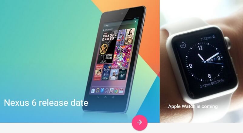
If you have installed the template via the quickstart package then the first header variation is enabled by default; details for setting up this module if you have deleted the module from your quickstart installation or you are installing the template manually may be found in the Frontpage Modules section of this guide.
There is only one layout-specific option for the first header layout; Number of Columns, which defines the number of articles previewed in the header (you may select between 3-5 previews). This option is found on the TechNews Header I - Portal Mode Settings tab of the module options.
Header II
The second header variation creates a grid made up of five article previews; one large preview that uses the full height and 50% of the width of the header, and two columns of two smaller previews, each one quarter the size of the main preview image.
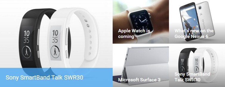
If you installed the template with the quickstart package then switching to the second header is very simple, as the module variation is already available as an unpublished module in the module manager. To enable it, navigate to your Module Manager (Extensions → Module Manager). In the list of modules, unpublish the Header I module by clicking on the green tick in the Status column to the left of the module title, and then publish the Header II module by clicking on the red cross in the Status column. If you have manually installed the template, then you will need to create a new instance of News Show Pro GK5 with the appropriate settings for the second header layout; details of this may be found in the Frontpage Modules section of this guide.
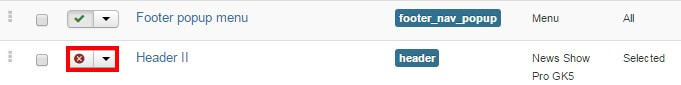
There is only one option specific to the second header layout, Columns Layout. The header is made up of three columns; the large column contains a single large image and article preview, and the two smaller columns contain two smaller images and previews. With this option you can customize the order that these three columns appear in the header, with three variations; Photo - Column - Column, Column - Photo - Column, and Column - Column - Photo. This option may be found in the TechNews Header II - Portal Mode Settings tab of the module options.
Review Scores
Review scores appear at the end of an article, providing an at-a-glance way of seeing a product rating in multiple areas as well as an overall score:
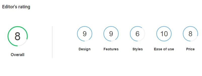
The review scores block can be added into any part of your Joomla! or K2 article content, though you'll usually want to place them at the end of the review rather than in the middle! To create the review block a shortcode must be added to your article content:
               {REVIEW}
               {/REVIEW}
...and inside this content will be the following attributes (in a "label=value" syntax) that define the settings and scores:
- label - This attribute defines the text that appears under the overall score.
- decimal - Sets the number of decimal places displayed in the overall score.
- max - Sets the maximum value of each rating so you can define your scale (this will also ensure that the score animations fill to the correct point)
And the name and scores for the various areas, which like the attributes above are added in a "label=score" syntax. So, for example, in the demo content the total score has an "Overall" label, there are no decimal places in the total score, the max score is ten, and there are five sections with different scores. With these elements added, the shortcode looks like this:
               {REVIEW}
               label=Overall
               decimal=0
               max=10
               Design=9
               Features=9
               Styles=6
               Ease of use=10
               Price=8
               {/REVIEW}
The overall score's value is taken from the average of the subscores, in the above example the overall score would be eight (42/5=8.4, rounded-down to eight since no decimal places are included). Each attribute must be added on a new line, or alternatively, you may list them on one line using a semi-colon as a delimiter:
{REVIEW}label=Overall;decimal=0;max=10;Design=9;Features=9;Styles=6;Ease of use=10;Price=8{/REVIEW}
Previewing the Review Score on the Frontpage Previews
Several of the frontpage article previews provided by the News Show Pro GK5 module includes a functionality for displaying the review score from an article, such as in the reviews section or the "Most Rated" listings at the bottom of the page. The portal modes used in these sections will automatically search for and display the overall score automatically, so as long as the article is eligible to be displayed (the module can be set to pull articles by date, category etc...). For instances of News Show Pro GK5 that do not use one of these new portal modes the review score will not be displayed.
Note: On occasion you may find that an article does not have its review score displayed in the "Reviews" or "Most Rated" sections. In these cases it may usually be fixed by opening the settings for the News Show Pro instance that creates the review previews, clicking on the K2/com_content additional settings tab and changing the "Text Type" setting to "fulltext" to ensure that the entire article content is evaluated by the module.
Article Slideshows
As well as review scores, TechNews also allows for simple slideshows to be added into article content, providing an easy way for users to explore images in your post.
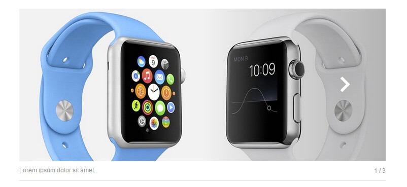
Like the review scores, slideshows are added using a shortcode, but some preparation is required:
- First, you should create the images that will be used in the slideshow. The shortcode will not resize these images, so make sure that they each have the same dimensions for smooth transitions.
- Once all your images are prepared, connect to your Joomla server via FTP and navigate to the images folder in your Joomla! installation's root directory. Create a new folder, and give it a name of your choice e.g. images/review1.
- upload your slideshow images into your newly-created folder.
Now that you have the images prepared and uploaded, you can add the slideshow to your article content. The basic shortcode is:
               {SLIDESHOW}
               {/SLIDESHOW}
...and like the review scores, there are some attributes in a "label=value" syntax to be added:
- directory - This attribute defines the directory in the images folder that contains the images for the slideshow. This attribute can be ignored if you wish to use images from multiple sources.
- interval - Sets the interval between the slideshow moving between slides in milliseconds. If preferred this can be set to "0" to disable the autoanimation.
With the core settings defined, you can now start adding images to the slideshow. The syntax for this is "filename=description", with the filename being the name of the image (including the extension), and the description being the text you want to appear underneath the slide. Zs an example, if we've created four jpg files called "slide1-slide4" and uploaded them to a directory called "review1", the slideshow shortcode would look like this:
               {SLIDESHOW}
               directory=review1/
               interval=5000
               slide1.jpg=First Slide description
               slide2.jpg=Second Slide description
               slide3.jpg=Third Slide description
               slide4.jpg=Fourth Slide description
               {/SLIDESHOW}
There is no limit to the number of slides you may add to the slideshow, but bear in mind that having too many slides will severely increase the weight of the page, so it's advisable to keep it down to three or four slides unless absolutely necessary. Each attribute needs to be added to a new line to work correctly, or alternatively you may add all the attributes of the shortcode in one line using a semi-colon as a delimiter:
               {SLIDESHOW}
               directory=review1/;interval=5000;slide1.jpg=First Slide description;slide2.jpg=Second Slide description;slide3.jpg=Third Slide description;slide4.jpg=Fourth Slide description
               {/SLIDESHOW}
Using Images from Multiple Sources
The directory attribute defines the source folder where the images are stored; you can then add images simply by adding their filenames to the shortcode as above. However, it's possible to use images from multiple folders if needed by writing the full path to the image rather than just the image name.
Material Icons
Regular users of our Joomla templates will be familiar with Font Awesome, which provides a multitude of scaleable icons that can be placed in your site content. In TechNews we've added support for another set of icons, Material Icons, which were created by Google to expand on the style guide offered by their Material Design concept.
These icons may be inserted anywhere in your content just like Font Awesome, using the following syntax:
<i class="micon">name</i>
Where "name" is the name of the icon. Please be aware that if the icon's name has two or more words, such as "help outline" or "highlight off", then the individual words will need to be separated by an underscore ("_") rather than a blank space e.g. to use the "help outline" icon, the syntax would be:
<i class="micon">help_outline</i>
A full list of available icons and their respective names may be found on the Material Icons site; simply select your icon from the list, and change the "name" text in the above example to match the icon's name.
Using Material Icons in the Menu
TechNews supports the use of Material Icons in menu items, which can be a great way to make your navigation clearer and more intuitive. To add an icon to a menu item, simply add the following text to the menu item's Title field:
{{iconName}}
Where "iconName" is the icon class taken from the Material Icons documentation. Don't forget that if the icon's name has two words or more the individual words in the name must be separated by an underscore rather than a blank space. For example, by changing the "Home" menu item's title to:
{{home}}
...we can replace the plain text menu item with a house icon. Alternatively, you may use a combination of text and an icon by adding plain text before or after the shortcode that adds the icon:
Home {{home}}
Installing the TechNews Template
The most important decision to make before proceeding with your installation is whether you need to install the template manually, or if you can use the Quickstart package, which will install everything for you.
Which installation method you should use depends on the current status of your site. The Quickstart is a full installation of Joomla! that installs Joomla itself, the template, modules, demo content and database data to match our demo layout. However, as this is a full Joomla! installation it may only be used on a clean server; the package cannot be installed in an existing Joomla installation.
Manual installation is still simple, but it is time-consuming if you wish to match the demo layout completely, since not only must you manually install the template and modules/plugins, but you must also create each module instance and assign the content accordingly to match the demo. It takes time, but if you've got a lot of content that will take you a long time to backup, or if backing up and restoring your content is not an option, then the manual installation is the way to go.
Generally we recommend the quickstart installation whenever possible; this install method provides you with the exact settings and layout needed to match the demo so you can start customizing your site right away. You should use this method if you are starting a new website, or if your existing website/Joomla! installation lacks any unique content you wish to preserve. For example, if your host installed Joomla for you, then it's advisable to remove this installation and reinstall using the quickstart, as it is much faster than manual installation.
If you have a lot of existing articles or other content that you do not wish to lose and do not have access to a backup extension to help you move these items to a new Joomla! instance, then the manual installation is the only way to install the template and match the demo settings without losing this content. However, with manual installation you will be able to take care of some customization as you go; when copying HTML content to a module you can replace it with your own, or when using the News Show Pro module you can define your own data source instead of relying on sample data.
Both installation methods will be covered in the following sections, with step-by-step guides to getting everything up and running.
Quickstart Installation
The quickstart installation requires very little input save for your admin and database details, and once the quickstart is uploaded to your server the entire install process takes just a few minutes. In order to complete this install method you will need FTP access to your server and a database name, username and password. A complete step-by-step guide with further information on the requirements may be found in our documentation:
Manual Installation
Manual installation requires that the template and plugins/modules are manually installed, and then other elements such as menus, module instances and content are manually placed. As such, it will take a bit of time to complete, though it must be stressed that this is not a difficult process at any point; placing modules and adding content is very simple thanks to Joomla's functionality.
Broadly-speaking, manual installation can be split into several steps, some very short, some rather long:
- Download and install the template.
- Download and install additional modules and plugins.
- Import template settings.
- Upload demo images (optional).
- Place and configure modules and create page content.
- Setup menus and additional pages.
Let's look more closely at each step in turn; once done, you will have a nice layout that matches the demo, ready for your own content!
Preparing Your Site for Manual Install
In order to ensure that your installation runs smoothly you will need to deactivate any existing modules as the install process for TechNews will involve placing several modules in module positions that are only used in this template; if you do not deactivate your existing modules beforehand there can be some conflict or overlap that will prevent the site from matching the demo. Once installation is complete you can of course republish the modules as needed; just be sure to double-check that they do not affect the template aesthetic or you may need to make some adjustments to the styling.
Deactivating the modules is very easy; simply log-in to your Joomla! backend, then click on Extensions → Module Manager in the top menu. You will now see a list of active modules.
To deactivate modules en masse, click on the tickbox at the top of the second column in the module list to select every module, then click on the Unpublish button at the top of the screen to deactivate. Once done, do the same for any other pages should there be more modules. We can now start installing the template.
Download and Install the Template
Now that you're ready to install, the first thing to do is download and install the template's zip package. Click on the following link to go to the TechNews Download Page (you must be logged-in to do so!). You'll see that there are three different files available:
- gk_technews_J!3.zip - This package contains the basic template files; you should download this package for manual installation.
- gk_technews_quickstart_J!3.zip - This contains the quickstart files for a new installation of Joomla that matches the demo layout exactly; this can be ignored if you are installing manually.
- gk_technews_rest_files_J!3.zip - This package contains the source PSD files for the template as well as additional plugins required to expand the template functionality. Make sure to download this package too if you are installing manually.
Grab the basic template package and the rest files package; both will be needed during this install. You might also want to download the quickstart package if you want to use the demo images as placeholders before you add your own content; we'll discuss how to do this later. Once downloaded, we can install the template package:
- Login to your Joomla! backend and click on Extensions → Extension Manager, the manager's screen will open; now click on the Upload Package File tab at the top of the screen.
- Click on Choose File to open your file browser; select the recently-downloaded gk_technews_J!3.zip file, then click the Upload & Install button.
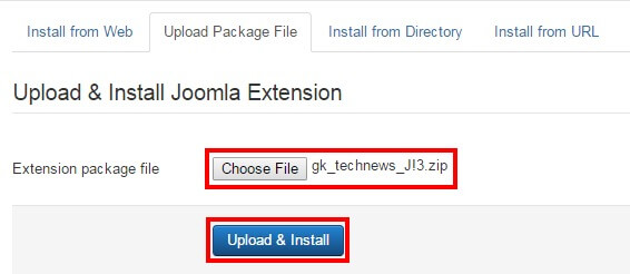
- Once installation is complete, click on Extensions → Template Manager to open the list of available templates; you should now see gk_technews in the list.
- Click on the star next to gk_technews in the Default column to set it as the default template.
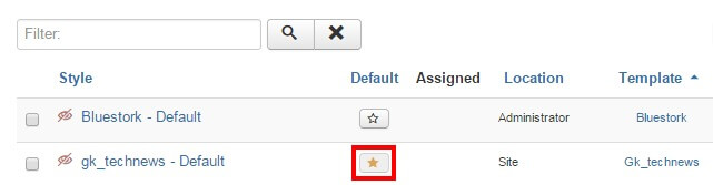
The template is now installed and ready to go; next we need to take care of the plugins and modules.
Installing Extras (Plugins & Modules)
TechNews' informative frontpage layout and score functions are provided by a combination of free, open-source modules and plugins, both our own and those provided by trusted third-party developers. To match the demo layout we will need to install these plugins and modules, then manually place and/or configure them as needed. These will need to be installed individually if you want to match the demo layout exactly; this is especially true of the News Show Pro module as this is the basis of all of the frontpage elements in the template. As well as the selection of our own open-source modules and plugins there is one third-party extension used in the template; K2, an alternative article manager which offers more complex layouts and settings compared to the standard Joomla! content manager, which you may use if preferred.
Installing the Plugins
The plugins in TechNews are core elements of our Gavern Framework that powers our Joomla templates. This framework is designed to be modular, with plugins providing additional functions that can be optionally removed if no longer needed, including support for advanced typography, social media functionality and more. These elements are all included in the gk_technews_rest_files package that you downloaded earlier. To install the plugins, extract the gk_technews_rest_files package on your local computer. You will see that it contains three folders; Modules, Plugins and Source. Log-in to your Joomla! backend and navigate to Extensions → Extension Manager → Upload Package File as you did with the template install.
Now click on the Choose File button to open the file explorer, and navigate to your extracted gk_technews_rest_files → plugins folder; you will see a set of zip packages that each contain a plugin. These are all the plugins that are recommended for the template; double-click on the first plugin in the folder to select it, then click the Upload & Install button. The install process will run. Once finished, repeat this install process for all the plugins in the folder in whichever order you prefer. Once all the plugins are installed you will need to activate them; navigate to Extensions → Plugin Manager in the top menu to see a list of installed plugins.
Find the plugins you have just installed; they will have a red X next to them to show they are not activated. Activate them by either clicking the X, or bulk-activate by adding a check to the tickbox next to each plugin to activate, then click the Enable button at the top of the page.
Installing the Modules
There are two very important modules that must be installed if you are to use the full potential of TechNews; News Show Pro GK5 and Tabs GK5, which together create the frontpage and sidebar content seen in the demo layout. To download these modules navigate to our Joomla! modules' download section; you'll see a list of the various open-source modules GavickPro has created; there's quite a few! To start with we'll get the News Show Pro module, so click on the News Show Pro GK5 link to be taken to the download page for the module, and get the Joomla 3 version of NSP, called mod_news_pro_gk5_J!3.zip.
Now do the same for Tabs GK5; again there'll be three files available, two of which are for Joomla! 2.5, so download the Joomla 3-specific version; mod_tabs_gk5_J!3.zip. With both of the modules we need downloaded we can start installing; this is functionally the same install process as with the plugins, but without the need to extract first. Login to your Joomla! backend and open the Extension Manager and click on the Upload Package File tab. Click Choose file and find your downloaded News Show Pro package and double-click it, then click the Upload & Install button to begin installation. Repeat this install process for the Tabs zip package too.
Once the modules are installed we can install the one third-party extension used in the demo; K2.
Installing K2
K2 offers complex article management options that far surpass those included in the core Joomla article manager, so it's a useful alternative if producing unique written content is a core part of your online product. To install this component, open the K2 site and click on the green Download K2 button in the header area to be taken to the download screen to start the download. Once done, login to your Joomla backend and open the Extension Manager via the top menu, then click on the Upload Package File tab. Now click Choose File and select your recently downloaded K2 package and then click Upload & Install. After a few moments K2 will be installed and you'll be ready to go!
Importing Template Settings
The template settings cover a wide range of options, including layouts, fonts, and other special features that allow users to add their own touch to their website. By importing settings, you can achieve the recommended style based on our demo example without manually configuring each setting.
To import these settings, we first need to get the json file that stores them; this may be found at this download link.
If you just click on the link you'll probably run into a little issue; instead of downloading the file your browser will instead try to open and display the file contents in the viewport. It won't break anything, but you don't want to waste time copying and pasting the data into a new file, right? So to get around this, we'll need to tell the browser that we want to download, rather than display the file. The process is essentially the same for every browser, but for some reason each of them decide to name the command you need to use differently:
- In Safari - Right or control-click on the link and select ‘Download linked file’. This will download a file called Technews_config.json.
- In Chrome - Right-click on the link and select ‘Download link as…’. A dialogue box will open to specify where the download should be saved. The name will default to Technews_config.json, so just leave this as default and save the file.
- In Firefox - Right-click on the link and select ‘Save link as…’. A dialogue box will open where you can specify the save location; as with the other browsers the name will default to Technews_config.json so leave this as it is.
- In Internet Explorer - Right-click on the link and choose 'Save Target as'. A dialogue box will open so you can decide where to download the file to. The file name will default to Technews_config.json, so leave this as it is.
Once downloaded, you need to import the settings into your Joomla installation. Connect to your server via FTP and navigate to the templates → gk_technews → config folder; here is where the json configuration files are stored. Upload your recently-downloaded Technews_config.json to this folder so that it can be found by Joomla. Now you can close your FTP program and login to your Joomla! backend as normal.
Click on Extensions → Template Manager to open the list of installed templates, and find the gk_technews template in the list; click on it to open the template options panel. At the top of the screen is a set of tabs for each section of the settings. Open the Basic Settings tab; you'll notice that there is a Load configuration setting as the top option. At this point you'll only have the default.json configuration loaded, but if you click on the drop-down list under Load configuration you'll see the Technews_config.json file you uploaded before select this from the list and then click on Load to apply the settings from the file.
Assigning the Frontpage ID
By default they certain page IDs will be assigned as the frontpage and additional pages; this controls which CSS rules are applied. However, depending on your configuration it is likely that your frontpage will have a different ID to that which is automatically stored in the imported settings. As such, we will also need to specify the frontpage ID. To do so, click on Menus → Main Menu in the top menu of your Joomla backend to see a list of assigned menu items. Make a note of the ID for your Home menu item; this number is located in the last column of attributes as in the screenshot below:
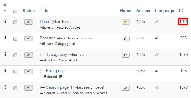
Click on Extensions → Template Manager → gk_technews → Features tab to see the list of special features options included in the TechNews template. We're interested in the Suffixes for pages option at the bottom. In the ItemID/Option field, enter the ID number for your Home menu item, then in the Suffix field, type frontpage, then click the Add Rule button.
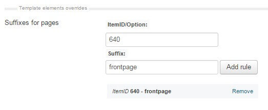
The frontpage suffix will be added to your Homepage, and the correct CSS rules will be applied.
Now we can start creating the content for the site; at this point you may choose to upload the placeholder demo images if you do not have any of your own ready on your site, or jump straight to installing the modules for the frontpage.
Upload the Demo Images (Optional)
The modules that we will setup in this tutorial will include references to images that are part of the demo content in the quickstart package, but are not included in the base template package that is used for manual install. This means that any image references will not be accurate, and the frontpage and other areas may not display properly until you assign your own images to each section, which you can do as we create each module.
However, if you haven't prepared your own frontpage images yet then you might want to consider uploading the demo images; this way you can just follow the basic module setup and any images referenced in the modules will be available, so you can see the layout on your site and replace the images with your own later. Uploading the demo images is very easy; we can simply take the folder from the quickstart package and upload it to our site via FTP.
The module placement guide assumes that you have uploaded the demo images to your server in certain situations, such as when images are defined in the HTML code; if you have your own images, simply replace the src attribute accordingly as you reach each section of the guide.
To upload the folder, firs you'll need to get the quickstart package from the TechNews download page; click on the gk_technews_quickstart_J!3.zip package. Once the download finishes, then extract the package on your local machine.
When the extraction is complete open the extracted quickstart folder; inside you'll find an Images folder, and inside that will be a Demo folder; this contains the demo-specific images for TechNews. Connect to your server using the FTP program of your choice and upload the Demo folder to the Images folder of your Joomla installation (this is in the root of your Joomla install).
With this folder uploaded the references included in the custom HTML of the frontpage modules (such as the advertisement banners) will point to the demo images as placeholders until you're ready to add your own content.
Module Placement
Modules are the key to TechNews' dynamic frontpage, utilizing the various portal modes included in News Show Pro to craft unique layouts that stand out from the crowd, so it's very important that the modules are assigned and configured correctly to ensure that your site gives the perfect first impression. In each module you will find some standard options that appear in every module regardless of type, and module-specific options that control the finer details.
The basic steps for placing a module are:
- Login to your Joomla! backend and click on Extensions → Module Manager in the top menu to open the Module Manager, where you can see a list of modules currently assigned to your site (as per our preparation any existing modules in your installation should be disabled, indicated by a red X under the Status column, or deleted if unnecessary to avoid confusion).
- Click on New at the top of the screen to open a list of available Module Types.
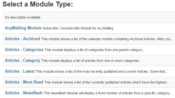
- Select the required Module Type from the list; you will be taken to the settings screen for the module.
- In the Module tab (the first options tab you see when creating a new module of any type), add a title to the Title field; this is required before the module can be saved.
- Set the Show Title option to Show or Hide, depending on the required module settings; some modules use the title text, while others will not.
- In the Position field, set the module position. This tells Joomla where the module should be displayed on your site. You may either select the required position from the drop-down list, or manually type the (case-sensitive) module position into the position field.
- Open the Menu Assignment tab. Here, there is a Module Assignment drop-down list where you can define on what pages/menu items a module should appear on. In TechNews there are two settings used here; either the module is left at the default On All Pages, so it will appear everywhere on your site (such as with the newsletter popup) or the option is set to Only on the pages selected. When this option is set, a list of available pages/menu items will appear, and you can add a checkmark next to the relevant item. Usually, this option is used to display a module on the frontpage only.
- Configure the module-specific settings. Each module will have its unique settings, some more than others. For example, our robust News Show Pro module has multiple tabs of options, whereas a Custom HTML module will just have a space for adding HTML content.
- Save changes to place the module.
These basic steps will be the same for every module placement; it's a good idea to familiarize yourself with this process if you are new to Joomla!, as it is one of the best ways to make your site your own.
Now let's configure the modules for our frontpage.
Frontpage Modules
The frontpage modules provide the core functionality that your frontpage offers, with article highlights, video links, review slides and more that make your content easy to find for your visitors, so it's important that they are configured correctly. We will cover each module position of the frontpage in turn until the frontpage layout is complete.
Before starting module placement it is advisable that you disable the TinyMCE or other WYSIWYG editors. This is because these editors automatically cleans up empty HTML tags, but sometimes the modules used in our templates include custom HTML modules that use blank tags to create icons or for additional CSS purposes, so these empty tags shouldn't be removed. Since the clean-up cannot be disabled it is instead necessary to disable the editors.
In order to disable the WYSIWYG editor:
- Click on Users → User Manager in the top menu of your Joomla backend to be taken to a list of your registered users.
- Click on the username you will be logged in as when placing the modules to be taken to the Edit Profile screen.
- Click on the Basic Settings tab and change the Editor option from Use Default to Editor - None.

- Click on Save & Close at the top of the screen to save changes.
Now when you open the editor in an article or Custom HTML module you will see just the plain text editor, and empty tags will not be automatically removed. Once you have finished module placement you may wish to reactivate the editor for the user should you intend to use it to write articles.
Though each type of module will offer a range of differing options, there are two basic but important options tabs to be found in every module; Module and Menu Assignment, which offer four core options; title, show/hide title, position, and menu assignment. The basic options for each frontpage module will be provided at the beginning of each module's relevant section, with the more complex module-specific settings following.
Each module covered in this section will include the following information:
- Module Desciption - A short description of the the module and how it is used on the frontpage, along with a link to a screenshot of the complete module settings should you prefer to match the configuration by sight rather than by following the guide. Note that in the case of custom HTML modules the HTML code that needs to be added to the module will be included in the Main Configuration section described below.
- Basic Settings - Provides the basic configuration details, including the module type that should be selected from the list of available modules when creating a new module, and the title, show/hide title, position and menu assignment settings as used in the demo.
- Main Configuration - Covers the module-specific settings, such as configuring the News Show Pro layouts, or providing the code to be added to a Custom HTML module.
With these sections you will be able to accurately match the demo layout. Now on to the modules!
The Header
The header is the first impression of your site, and TechNews offers two major variations; an accordion-style header that can display 3-5 article showcases, or a three-column layout that highlights five different articles in a grid of previews. Since each of these variations requires a separate configuration we will look at them individually, and you may decide which variation you wish to use in your installation.
First Header Variation
The first header variation is an accordion layout that can display between 3-5 article showcases that expand on hover:
If needed, click on the following link for this module's Configuration Screenshot.
Basic Settings
- Module Type: News Show Pro GK5 module.
- Module Title: Header I
- Show/Hide Title?:> Hide
- Module Position: header
- Module Assignment: Only on the pages selected.
- Selected Pages: Homepage only.
Main Configuration
News Show Pro GK5 is a powerful tool, so there's a lot of tabs each containing several options for this module. Usually this means that there are several options to be configured, but in the case of the TechNews headers they utilize some brand-new portal modes that ignore the core settings, so in fact there are very few changes to be made. We'll look at each option tab that requires changes from the default for easy setup:
Basic Settings Tab
Only one option needs to be changed here; the Module mode option should be set to TechNews - Header 1.
Data Source Tab
Only one thing needs to be changed from the default on this tab, but it's the most important option; Source of Articles. This defines where News Show Pro should pull its preview data from, so exactly where this is depends on which article manager you are using for your content, and how you have it laid out. By default, the Source of Articles option is set to pull from all Joomla! articles, but you can change this to only pull specific articles, or to pull latest articles from a particular category/categories only. You may also use these same filters with K2 items rather than the Joomla! article manager, so it's entirely up to you which settings to use for this section. As an example, in the demo layout provided in the quickstart package the Source of Articles option is set to K2 Items, and three specific articles are defined in the K2 Items field.
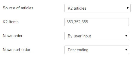
TechNews Header I - Portal Mode Settings
This tab contains only one option, Number of Columns, which defines the number of columns and thus the number of article previews should appear in the accordion layout (each column corresponds to one article preview). In the demo content this is set to 3, but you can choose between 3-5 columns; this choice is entirely up to you.
Thumbnails Tab
Again, only one option to change in this section; set the Thumbnail dimensions option to 800 x 560px.
And that's the header configured; you can now move on to the What's New section, ignoring the Second Header Variation section below.
Second Header Variation
The second header variation is a grid layout that displays five article previews in three differents layouts. The section is made up of three columns, with one larger column displaying a single preview, and two smaller columns of two previews each:
Basic Settings
- Module Type: News Show Pro GK5 module.
- Module Title: Header II
- Show/Hide Title?:> Show
- Module Position: header
- Module Assignment: Only on the pages selected.
- Selected Pages: Homepage only.
Main Configuration
News Show Pro GK5 is a powerful tool, so there's a lot of tabs each containing several options for this module. Usually this means that there are several options to be configured, but in the case of the TechNews headers they utilize some brand-new portal modes that ignore the core settings, so in fact there are very few changes to be made. We'll look at each option tab that requires changes from the default for easy setup:
Basic Settings Tab
Only one option needs to be changed here; the Module mode option should be set to TechNews - Header II.
Data Source Tab
Only one thing needs to be changed from the default on this tab, but it's the most important option; Source of Articles. This defines where News Show Pro should pull its preview data from, so exactly where this is depends on which article manager you are using for your content, and how you have it laid out. By default, the Source of Articles option is set to pull from all Joomla! articles, but you can change this to only pull specific articles, or to pull latest articles from a particular category/categories only. You may also use these same filters with K2 items rather than the Joomla! article manager, so it's entirely up to you which settings to use for this section. As an example, in the demo layout provided in the quickstart package the Source of Articles option is set to All K2 Articles.
TechNews Header II - Portal Mode Settings
This tab contains only one option, Columns Layout, which sets the order of the large and small columns. The header is made up of three columns; the large column contains a single large image and article preview, and the two smaller columns contain two smaller images and previews. With this option you can customize the order that these three columns appear in the header, with three variations; Photo - Column - Column, Column - Photo - Column, and Column - Column - Photo.
And that's the header configured; you can now move on to the What's New section.
The What's New Section
This section provides the meat of your latest articles, with the ability for users to switch between a polaroid-style four-column layout or a two-column layout with wider previews:
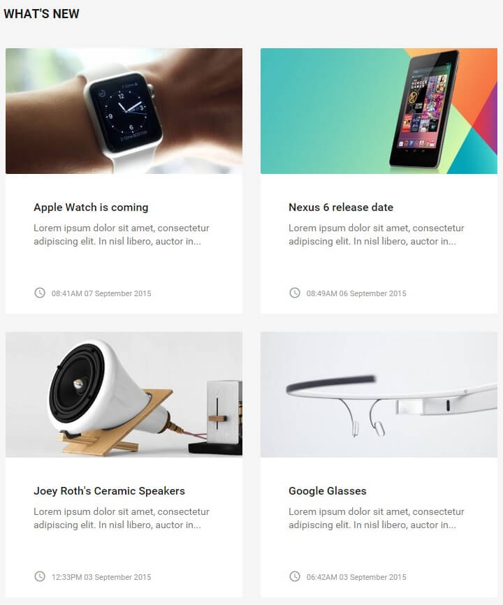
If needed, click on the following link for this module's Configuration Screenshot.
Basic Settings
- Module Type: News Show Pro GK5
- Module Title: What's New
- Show/Hide Title?:> Show
- Module Position: mainbody
- Module Assignment: Only on the pages selected.
- Selected Pages: Homepage only.
Main Configuration
This section takes full advantage of the complex options available in News Show Pro, so as before we will move through each option tab step-by-step covering which options should be changed from the default.
Basic Settings Tab
In the Module Suffix field, add the following text:
nsp-switch
Now in the Pre-text field, add the following HTML code:
                              <div class="nsp-switch-ui">
                              <i class="micon" data-cols="4">view_module</i>
                              <i class="micon" data-cols="2">reorder</i>
                              </div>
These two elements provide the layout switch for visitors on the frontpage.
Data Source
As with the header elements it is your choice where News Show Pro should pull the articles to display in this section from via the Source of Articles option. In the demo content, this option is set to All K2 Articles.
Article Layout
There's a number of options under different subheadings in this section, but we only need to change a few of them. Let's look at each section of this tab's changes:
Under the Article Pagination section:
- Amount of pages with arts - Change to 1.
- Amount of columns - Change to 4.
- Amount of rows - Change to 2.
- Pagination - Change to "none".
Under the Text section:
- Text limit value - Change to 13.
Under the Information Block section:
-
Info format - Change to the following text:
<i class="micon">access_time</i> %DATE -
Date format - Change to the following text:
h:iA d F Y
Under the Article Layout section:
- Article block padding - Change to 13px.
- Header order - Change to 2.
- Image order - Change to 1.
- Text order - Change to 3.
- Information order - Change to 4.
- Second info enabled - Change to Off.
- Read more enabled - Change to Off.
The Article Layout section is finished, so we can move on to the Links Layout tab.
Links Layout
Change the Amount of pages with links, Amount of links and Amount of links columns options to 0.
Thumbnails
Change the Wrap content and Create thumbnails options to On.
Set the Thumbnail dimensions option to 340px by 180px, and set the Image margin option to 0>
The section is now configured, so you can save the changes and move on to the next section.
The Reviews Section
This section displays showcases of your latest reviews and their respective scores:
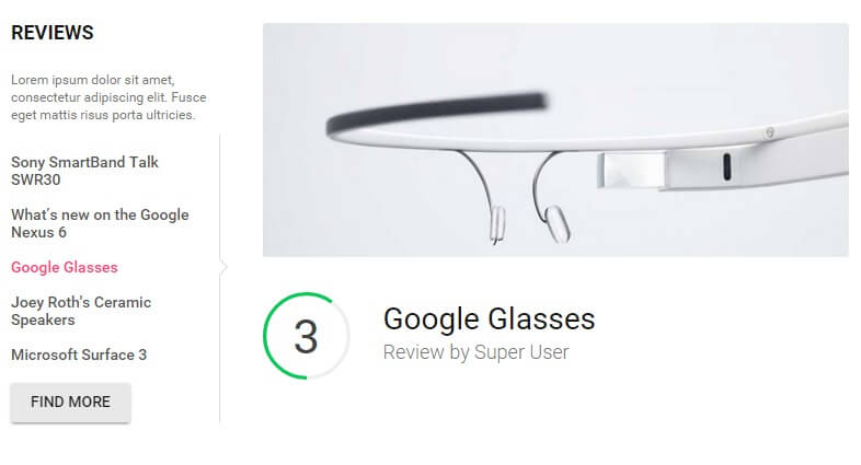
If needed, click on the following link for this module's Configuration Screenshot.
Basic Settings
- Module Type: News Show Pro GK5 module.
- Module Title: Reviews
- Show/Hide Title?:> Show
- Module Position: bottom1
- Module Assignment: Only on the pages selected.
- Selected Pages: Homepage only.
Main Configuration
Since this section is created with News Show Pro there'll be some options that need to be switched around from the default, but it's not as many as the What's New section due to the reviews showcase using one of the TechNews-specific portal modes, just like the header.
Basic Settings Tab
Change the Module mode to TechNews - Reviews
Data Source Tab
As always, the Source of Articles option may be set as you require. It's recommended that you create a separate category specifically for review articles that will include the review scores, and set the option to K2 Categories and set your review category as the only source; this way all your new reviews will automatically be displayed in this section.
TechNews Reviews - Portal Mode Settings
This tab contains the specific options for the portal mode. Add this text to the Intro text field:
Lorem ipsum dolor sit amet, consectetur adipiscing elit. Fusce eget mattis risus porta ultricies.
You may also add a link to your reviews category in the Button URL field if needed.
Thumbnails Tab
- Create thumbnails - Set to On.
- Thumbnail dimensions - Set to 900 x 360px
- Thumbnail quality - Change to 60%.
That's the last of the options for News Show Pro, so click on the Save & Close button to save the module.
The Videos Section
The videos section provides a preview of articles just like the other News Show Pro-powered sections, but with an additional twist; if an article previewed in this section has a video displayed anywhere in its content, then users will have the option of clicking the title of the post to go to the article, or clicking on the image to open a lightbox that plays the video independently without opening the article.
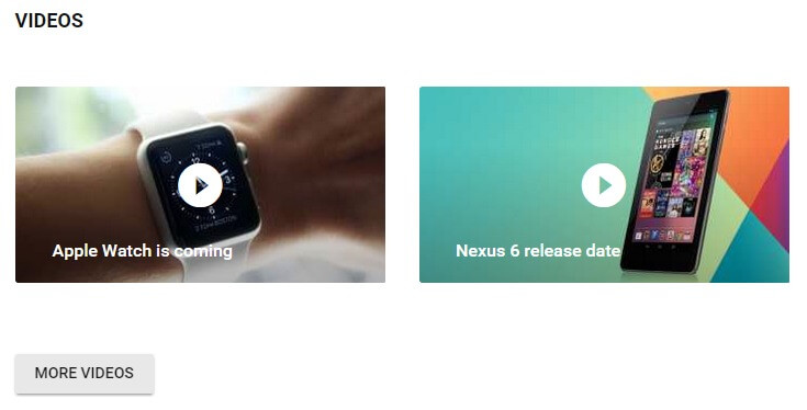
If needed, click on the following link for this module's Configuration Screenshot.
Basic Settings
- Module Type: News Show Pro GK5 module.
- Module Title: Videos
- Show/Hide Title?:> Show
- Module Position: bottom2
- Module Assignment: Only on the pages selected.
- Selected Pages: Homepage only.
Main Configuration
As with the other sections, there are several tabs where the NSP options will need to be changed from the default for this layout to work; we'll look at each option tab that has changes in order.
Basic Settings Tab
Set the Module mode option to Video List, and add the following text to the Post Text field:
<a href="#" class="btn btn-gray">More videos</a>
Data Source
You may set the data source as you see fit, but it is advisable to create a new category specifically for videos; then any new articles you create with video can be attached to their main category (such as Reviews) and the video category also, ensuring that users interested in video content will be able to see it on the frontpage without it being removed from rotation in the other showcase areas.
K2 Additional Settings
Set the Text type option to Fulltext; this will ensure the entire article being previewed is evaluated to find any videos in the content.
Video List - Portal Mode Settings
This section contains options specific to the video list portal mode. Change the Number of pages option to 1, and the Articles per page option to 4. Finally, change the Show date option to Off.
Thumbnails Tab
Only three changes need to be made in this section; change the Create thumbnails option to On, set the Thumbnail dimensions to 340 x 180px, and set the Image margin to 0.
External Files Tab
Only one option to change here; set the Use default CSS option to Off.
Now the videos section is configured, so you can save the module and move on to the next section.
The Most Commented Section
The most commented section is the first of two tabs that display listing-style NSP instances that appear at the bottom of the page. The tabs are created by our Tabs GK5 module, and the tab content is provided by News Show Pro. In this instance, NSP displays a list of popular articles, ordered by the total number of comments with a small circle overlay displaying the total number of comments.
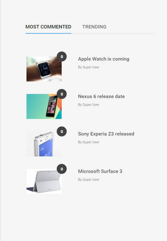
In this section we will be configuring the content for the list and adding it to a tab module position; later, we will configure the Tabs GK5 module to display this content in a tabbed area like in the demo layout.
If needed, click on the following link for this module's Configuration Screenshot.
Basic Settings
- Module Type: News Show Pro GK5 module.
- Module Title: Most commented
- Show/Hide Title?:> Show
- Module Position: tab1
- Module Assignment: On all pages.
Main Configuration
This instance of News Show doesn't use any special portal mode, so this means that there are several options that must be changed from the default. As always, we'll look at each option tab that requires changes from the default one-by-one.
Basic Settings Tab
Only one thing to change here; in the Module Suffix field, add the following text:
vertical-list
Data Source
The data source tab may be set up as you see fit, to point to your preferred data source, such as K2 or Joomla articles. In the demo content this is set to point to All K2 articles.
Article Layout
There's a number of options under different subheadings in this section, but we only need to change a few of them. Let's look at each section of this tab's changes:
Under the Article Pagination section:
- Amount of pages with arts - Change to 1.
- Amount of columns - Change to 1.
- Amount of rows - Change to 4.
Under the Information Block section:
-
Info format - Change to the following text:
<sup>%COMMENTS_SHORT</sup> -
Second info format - Change to the following text:
By %AUTHOR_NAME
Under the Article Layout section:
- Article block padding - Change to 20px 0.
- Header order - Change to 2.
- Image order - Change to 1.
- Text order - Change to 3.
- Text enabled - Change to Off.
- Information order - Change to 4.
- Read more enabled - Change to Off.
The Article Layout section is finished, so we can move on to the Links Layout tab.
Links Layout Tab
Only one change; change the Amount of pages with links option to 0.
Thumbnails Tab
Four changes are needed in this tab; change the Wrap content and Create thumbnails options to On. Now set the Thumbnail dimensions option to 120 x 80px, and set the Image margin option to 0.
External Files
Change the Use default CSS option to Off
This section is now configured; next, we'll configure the content for the second tab, which creates the Trending listing.
The Trending Section
This is the second of two tabs that display listing-style NSP instances that appear at the bottom of the page. The tabs are created by our Tabs GK5 module, and the tab content is provided by News Show Pro. In this instance, NSP displays a list of popular articles.
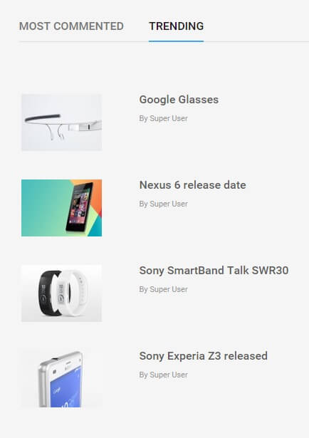
In this section we will be configuring the content for the list and adding it to a tab module position; later, we will configure the Tabs GK5 module to display this content in a tabbed area like in the demo layout.
If needed, click on the following link for this module's Configuration Screenshot.
Basic Settings
- Module Type: News Show Pro GK5 module.
- Module Title: Trending
- Show/Hide Title?:> Show
- Module Position: tab2
- Module Assignment: On all pages.
Main Configuration
This instance of News Show doesn't use any special portal mode, so this means that there are several options that must be changed from the default. As always, we'll look at each option tab that requires changes from the default one-by-one.
Basic Settings Tab
Only one thing to change here; in the Module Suffix field, add the following text:
vertical-list
Data Source
The data source tab may be set up as you see fit, to point to your preferred data source, such as K2 or Joomla articles. In the demo content this is set to point to All K2 articles in a random order.
Article Layout
There's a number of options under different subheadings in this section, but we only need to change a few of them. Let's look at each section of this tab's changes:
Under the Article Pagination section:
- Amount of pages with arts - Change to 1.
- Amount of columns - Change to 1.
- Amount of rows - Change to 4.
Under the Information Block section:
-
Second info format - Change to the following text:
By %AUTHOR_NAME
Under the Article Layout section:
- Article block padding - Change to 20px 0.
- Header order - Change to 2.
- Image order - Change to 1.
- Text order - Change to 3.
- Text enabled - Change to Off.
- Information order - Change to 4.
- Info enabled - Change to Off.
- Read more enabled - Change to Off.
The Article Layout section is finished, so we can move on to the Links Layout tab.
Links Layout Tab
Only one change; change the Amount of pages with links option to 0.
Thumbnails Tab
Four changes are needed in this tab; change the Wrap content and Create thumbnails options to On. Now set the Thumbnail dimensions option to 120 x 80px, and set the Image margin option to 0.
External Files
Change the Use default CSS option to Off
This section is now configured; now we'll create the tabs module that will display the content for the two NSP instance we just created.
The Tabs Section
We've now added content to two tab module positions, but they aren't yet being displayed on the frontpage; to do that, we'll need to add an instance of the Tabs GK5 module, which can be set to display content from these module positions.
If needed, click on the following link for this module's Configuration Screenshot.
Basic Settings
- Module Type: Tabs GK5 module.
- Module Title: Tabs
- Show/Hide Title?:> Hide
- Module Position: bottom3
- Module Assignment: Only on the pages selected.
- Selected Pages: Homepage only.
Main Configuration
Like News Show Pro, Tabs includes multiple options, but they are easily configurable. First we'll look at how to add the tab content to the module, and then we'll cover the additional options that need to be changed from the default.
Adding the Content Tabs
The content for our tabs has already been created, so all we need to do is tell the Tabs module to display them. To do this, click on the Tabs options panel to see a list of the currently assigned tabs, which will be blank since we haven't added anything yet! Click on the Add new tab button; a new set of options will appear for your new tab, ready to configure:
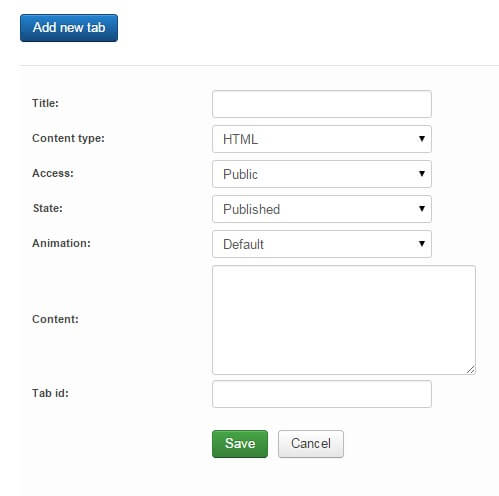
We'll add the Most commented tab first, so type "Most commented" in the title field. Change the Content type to Module, and change the Content option to tab1 (this tells Tabs GK5 to display the module from the tab1 module position). Now click on the Save button to save changes and your first tab is ready!
Now repeat the process; click on Add new tab, set the title to "Trending" and the Content type to Module, but this time set the Content option to tab2, which contains the instance of NSP that creates the trending list. Click the Save button and all your tabs are ready.
Additional Options
Your tab content is complete, but there are a few additional options in Tabs GK5 that need to be set to ensure the display on the frontpage matches the demo.
First, open the Animation tab and change the Auto animation option to Disabled. Next, in the Advanced settings tab, change the Used JavaScript framework option to jQuery. That's all the options sorted, so save the module and your tabs are all done!
The Most Rated Section
This section provides another list-style instance of News Show Pro as seen in the tabs section, but this time showcasing items with review scores:
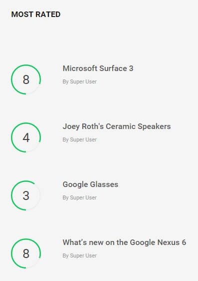
If needed, click on the following link for this module's Configuration Screenshot.
Basic Settings
- Module Type: News Show Pro GK5 module.
- Module Title: Most Rated
- Show/Hide Title?:> Show
- Module Position: bottom3
- Module Assignment: Only on the pages selected.
- Selected Pages: Homepage only.
Main Configuration
This instance of News Show Pro uses a special portal mode to deliver its content, so there are fewer options that need changing from the default. Let's go through each option tab in turn.
Basic Settings Tab
Only one thing to change here; change the Module mode option to TechNews - Rating.
Data Source
The data source tab may be set up as you see fit, to point to your preferred data source, such as K2 or Joomla articles. In the demo content this is set to point to K2 categories, with the reviews category being the target.
K2/Joomla! Content Additional Settings
Whether you are using K2 or Joomla! items for your reviews, in this tab the Text type option should be set to Fulltext.
TechNews Rating - Portal Mode Settings
This section contains a single option, Number of rows, which defines the number of items in the listing. In the demo content this is set to 4.
That covers all of the options for this section, so you can save the module.
The Advertisement Banners
There are two advertising banners that are used on the frontpage; one that appears to the right of the Most Rated listing and one that appears under it. These elements are just placeholders ready for you to add your own advertising solutions, but you may want to add them purely for aesthetics as you prepare your site for launch. We'll look at each one individually.
The Large Advertising Banner
This banner is placed to the right of the Most Rated list that we created in the previous section, and offers a large rectangular banner space:

If needed, click on the following link for this module's Configuration Screenshot.
Basic Settings
- Module Type: Custom HTML
- Module Title: Banner
- Show/Hide Title?:> Hide
- Module Position: bottom3
- Module Assignment: Only on the pages selected.
- Selected Pages: Homepage only.
Main Configuration
The best thing about custom HTML modules is there isn't much that needs to be done in order to match the demo layout. Simply copy the following HTML code and paste it into the editor of your module; if preferred you can replace the image with your own:
<p><img class="pull-right" src="/images/demo/banner-2.jpg" alt="" /></p>
One other option needs to be changed; click on the Advanced options tab, and in the Module class suffix field add the following text:
clear gray-bg
No other options need to be changed, so you can save the module.
The Standard Advertising Banner
This banner is placed under the Most Rated list, above the footer menu:

If needed, click on the following link for this module's Configuration Screenshot.
Basic Settings
- Module Type: Custom HTML
- Module Title: Banner bottom
- Show/Hide Title?:> Hide
- Module Position: bottom4
- Module Assignment: Only on the pages selected.
- Selected Pages: Homepage only.
Main Configuration
It's another Custom HTML module, so super-easy to configure. Simply copy the following HTML code and paste it into the editor of your module; if preferred you can replace the image with your own:
<p><a href="#"><img src="/images/demo/banner.jpg" alt="" /></a></p>
One other option needs to be changed; click on the Advanced options tab, and in the Module class suffix field add the following text:
banner
No other options need to be changed, so you can save the module.
And that's your frontpage configured! Now there are a few additional modules to configure that provide extras like the newsletter popup and sidebar items on category and article pages, which we'll cover now.
Additional Modules
In addition to the frontpage modules there are some additional modules that provide extra functionality, such as the newsletter popup or sidebar modules on post pages. We'll cover the configuration of these modules here. These modules are not necessarily required for your site, but they can add some extra flair and functionality. We encourage you to examine each additional module and decide which ones you would like to use on your site as needed.
Newsletter Popup
The newsletter popup is a great way to encourage more sign-ups for your newsletter, with an automatic popup with sign-up field on every page:
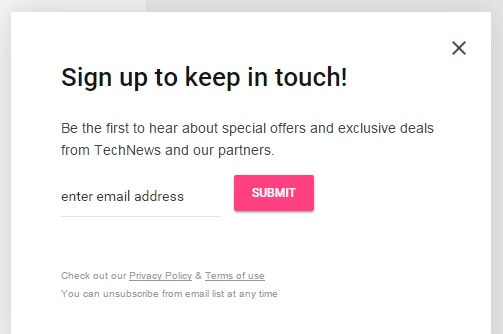
If needed, click on the following link for this module's Configuration Screenshot.
Basic Settings
- Module Type: Custom HTML module.
- Module Title: Newsletter popup
- Show/Hide Title?:> Show
- Module Position: newsletter
- Module Assignment: On all pages.
Main Configuration
It's a custom HTML module, so you can guess what the next step is! That's right; copy this HTML content into the editor:
<h3>
Sign up to keep in touch!
</h3>
<p>
Be the first to hear about special offers and exclusive deals from TechNews and our partners.
</p>
<form action="index.php?option=com_acymailing&ctrl=sub" method="post">
<input type="email" required id="user_email" name="user[email]" placeholder="enter email address">
<input type="submit" value="Submit" id="gk-newsletter-submit">
<input type="hidden" name="acyformname" value="formAcymailing1" />
<input type="hidden" name="ctrl" value="sub"/>
<input type="hidden" name="task" value="optin"/>
<input type="hidden" name="option" value="com_acymailing"/>
<input type="hidden" name="visiblelists" value=""/>
<input type="hidden" name="hiddenlists" value="1"/>
<input type="hidden" name="user[html]" value="1"/>
</form>
<!-- Configuration details: https://www.acyba.com/acymailing/248-acymailing-external-subscription-form.html -->
<small> Check out our <a href="#">Privacy Policy</a> & <a href="#">Terms of use</a><br />
You can unsubscribe from email list at any time </small>
No more changes are needed, so click on the Save & Close button to save.
The Popular Section
This section is a listing of popular articles much like what you can see in the bottom area of the frontpage:
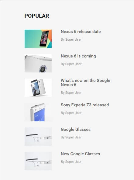
If needed, click on the following link for this module's Configuration Screenshot.
Basic Settings
- Module Type: News Show Pro GK5 module.
- Module Title: Popular
- Show/Hide Title?:> Show
- Module Position: sidebar
- Module Assignment: Only on pages selected.
- Menu Selection: Joomla blog (this should be attached to your own blog section if used).
Main Configuration
This instance of News Show doesn't use any special portal mode, so this means that there are several options that must be changed from the default. As always, we'll look at each option tab that requires changes from the default one-by-one.
Basic Settings Tab
Only one thing to change here; in the Module Suffix field, add the following text:
vertical-list
Data Source
The data source tab may be set up as you see fit, to point to your preferred data source, such as K2 or Joomla articles. In the demo content this is set to point to All K2 articles in a random order.
Article Layout
There's a number of options under different subheadings in this section, but we only need to change a few of them. Let's look at each section of this tab's changes:
Under the Article Pagination section:
- Amount of pages with arts - Change to 1.
- Amount of columns - Change to 1.
- Amount of rows - Change to 6.
Under the Information Block section:
-
Second info format - Change to the following text:
By %AUTHOR_NAME
Under the Article Layout section:
- Article block padding - Change to 20px 0 0 0.
- Header order - Change to 2.
- Image order - Change to 1.
- Text order - Change to 3.
- Text enabled - Change to Off.
- Information order - Change to 4.
- Info enabled - Change to Off.
- Read more enabled - Change to Off.
The Article Layout section is finished, so we can move on to the Links Layout tab.
Links Layout Tab
Only one change; change the Amount of pages with links option to 0.
Thumbnails Tab
Four changes are needed in this tab; change the Wrap content and Create thumbnails options to On. Now set the Thumbnail dimensions option to 90 x 60px, and set the Image margin option to 0.
External Files
Change the Use default CSS option to Off
This section is now configured so you can save the module.
The You May Also Like Section
This section provides a different style layout for highlighting articles in the sidebar:
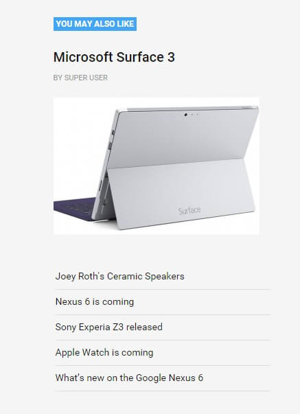
If needed, click on the following link for this module's Configuration Screenshot.
Basic Settings
- Module Type: News Show Pro GK5 module.
- Module Title: You may also like
- Show/Hide Title?:> Show
- Module Position: sidebar
- Module Assignment: Only on pages selected.
- Menu Selection: Joomla blog (this should be attached to your own blog section if used).
Main Configuration
This instance of News Show doesn't use any special portal mode, so this means that there are several options that must be changed from the default. As always, we'll look at each option tab that requires changes from the default one-by-one.
Basic Settings Tab
Only one thing to change here; in the Module Suffix field, add the following text:
nsp-links
Data Source
The data source tab may be set up as you see fit, to point to your preferred data source, such as K2 or Joomla articles. In the demo content this is set to point to All K2 articles in a random order.
Article Layout
There's a number of options under different subheadings in this section, but we only need to change a few of them. Let's look at each section of this tab's changes:
Under the Article Pagination section:
- Amount of pages with arts - Change to 1.
- Article pagination - Change to "None".
Under the Header section:
- Header floating: - Change to "No use float".
Under the Image section:
- Image position: - Change to "text-align:left".
- Image floating: - Change to "No use float".
Under the Text section:
- Text floating: - Change to "No use float".
Under the Information Block section:
- Information floating: - Change to "No use float".
- Second information floating: - Change to "No use float".
-
Second info format - Change to the following text:
By %AUTHOR_NAME
Under the Article Layout section:
- Article block padding - Change to 0.
- Image order - Change to 4.
- Text order - Change to 3.
- Text enabled - Change to Off.
- Information order - Change to 5.
- Info enabled - Change to Off.
- Second information order - Change to 2.
- Read more enabled - Change to Off.
The Article Layout section is finished, so we can move on to the Links Layout tab.
Links Layout Tab
A few changes to be made in this tab:
- Amount of pages with links - Change to 1.
- Amount of links - Change to 5.
- Pagination - Change to "None".
- Links block margin - Change to 40px 0 0.
- List text limit value - Change to 0.
Thumbnails Tab
Four changes are needed in this tab; change the Wrap content and Create thumbnails options to On. Now set the Thumbnail dimensions option to 300 x 200px, and set the Image margin option to 0.
External Files
Change the Use default CSS option to Off
This section is now configured so you can save the module.
Topbar Modules
The topbar contains two useful modules; a login module so users can login to your site, and a search module for hunting down those hard-to-find articles!
The Login Module
The login module is represented by a simple icon, and when clicked the username and password fields will appear without the need to load a new page:
If needed, click on the following link for this module's Configuration Screenshot.
Basic Settings
- Module Type: Login module.
- Module Title: Log In
- Show/Hide Title?:> Hide
- Module Position: login
- Module Assignment: On all pages.
Main Configuration
Once you've set the basic settings no further configuration is required, so you can save the module and move on!
The Search Module
The search module adds a search bar to the menu area that expand when clicked for users to search.
If needed, click on the following link for this module's Configuration Screenshot.
Basic Settings
- Module Type: Search module.
- Module Title: Search
- Show/Hide Title?:> Show
- Module Position: search
- Module Assignment: On all pages.
Main Configuration
Like the login module once the basic settings are sorted there's no other changes needed, so just save the module and you're good to go!
User Menu
Ghere is a user menu in TechNews for logged-in users to manage their accounts. This isn't necessary if you're not allowing logins on your site, but if you are then you'll need this basic functionality since the user menu provides all the options for users to manage their profile when logged-in. To create this menu:
In your Joomla backend, click on Menus → Menu Manager → Add New Menu to be taken to the Menu Details screen. Enter a title and menu type in the respective fields; in the demo content we use User Menu as the title, and mainmemu as the Menu Type. Then click on Save & Close to save the changes. You will be taken back to Menu list where you'll need to add some items.
Click on Menus → User menu → Add New Menu Item to go to the Edit Menu Item screen; in the Title field, type Your Profile. Click on the Select button in the Menu Item Type field and select Users Manager → User Profile. Change the Access option on the right-hand side to Registered, then click Save & Close to save changes.
Repeat this process of adding a new menu item, but this time name the menu item Edit Profile, and in the Menu Item Type field select Users Manager → Edit User Profile. Add yet another new menu item, then type Create Article in the title field and select the Articles → Create Article menu item type before saving.
One more time; go through the steps to create a new item; type Submit a Web Link in the title field and select the Weblinks → Submit a Web Link menu item type before saving. Make sure that each of these menu items are limited to access from registered users only to prevent issues. The User menu is now ready, and we can assign it to its position.
Assigning the Menu
This is very simple; just open your Module Manager, click on the green New button, and in the list of available modules click on the Menu option. Add a title to the title field; in the demo we use User area. Select the usermenu position in the Position field's drop-down list, or write the position into the field manually. Now, in the Select Menu field, select your new User Menu. Leave all other options as default and click on the Save & Close button to save changes. Your menu is now set-up.
Footer Menu
As well as the main menu area, there is also a footer menu area prepared in the demo layout. This is used just as a placeholder ready for your links to be added, but you may wish to create it before beginning customization just so you can see the full frontpage layout.
Click on Menus → Menu Manager → Add New Menu to go to the Menu Details screen. Enter a title and menu type in the respective fields; in the demo content we use Footer Menu as the title, and footermenu as the Menu Type. Then click on Save & Close to save the changes. You will be taken back to Menu list where you'll need to add some items.
Click on Menus → User menu → Add New Menu Item to go to the Edit Menu Item screen; in the Title field, type Subscribe. Click on the Select button in the Menu Item Type field and select System Links → External URL, then click Save & Close to save changes. Repeat this process to add eight more links, as follows:
- Advertise
- Site Map
- Press Center
- FAQ
- Contact Us
- Newsletter
- Jobs
- RSS
Once done, open your Module Manager, click on the green New button, and in the list of available modules click on the Menu option. Add a title to the title field; in the demo we use Footer menu. Select the footer_nav position in the Position field's drop-down list, or write the position into the field manually. Now, in the Select Menu field, select your new Footer Menu. Leave all other options as default and click on the Save & Close button to save changes, and the placeholder footer menu is ready!