Installation Default Restaurant Ecommerce
Introduction
The basic style included with Quark is an impressive, feature-rich yet clean design perfect for business landing pages, whether you're promoting an app, service or physical product. Additional pages and HTML constructs like price tables make selling and promotion that much easier, and with new styles released regularly you'll be able to redesign your site easily with minimal effort.
In this guide we'll cover how to get started with making your site unique; Quark comes with a lot of demo content and layouts to get you started, but it really comes into its own once you repurpose everything to your needs. The customization guide assumes that you have installed the theme as per our quickstart or manual installation guides, and thus have the demo content and other areas already prepared.

Guide Structure
The customization guide for Quark can be split into multiple sections:
- Theme Options - Discusses the available options included with Quark, their effects, and how to modify them.
- Frontpage Elements - Covers how the frontpage elements are created with page-based content, the structure of the HTML in any custom HTML elements of the frontpage, and how to insert your own content into these sections.
- Theme Features - Covers all Quark-specific features such as additional pages like the Our Team and Contact pages, and other additional features like page-load graphics, typography and reveal animations.
Theme Options
The WordPress Theme Customizer includes a wealth of options for modifying the theme, from colors to fonts and other special features unique to Quark. To see these options, login to your WordPress backend and click on Appearance → Customize in the left menu. In this section we'll detail the available theme options.
Colors
The Colors section lets you modify the main colors used in the theme. There are two sections that can be modified in this theme:
- Primary Color - This option sets the color of major elements, such as the header background color (displayed if no background image is selected for parallax effects), and some additional elements such as the slideshow slider buttons.
- Secondary Color - This option sets the color for the footer and menu area, including the menu background when it is expanded and the background assigned to the dark-bg CSS suffix, used most prominently in the background of the newsletter area in the footer of the frontpage and other pages. It is also used for secondary text in some sections, such as the Testimonials slider.
Cookie Law
The Cookie Law section includes options to aid websites in adhering to the EU regulations on cookies; it requires that users are told if the website uses cookies, and must opt-in before cookies may be permitted.
Quark includes a specially-prepared banner that will ensure that your site is compatible with this law. This section includes the following options:
- Use Cookie Consent plugin - When enabled, the cookie consent banner and options will be displayed to users visiting your site.
- Consent Mode - Defines the type of cookie consent your site uses; choose from Explicit, where no cookies are set until the visitor consents, and Implied, which sets cookies but offers users the option to opt-out.
- Use SSL - Sets whether the cookie banner and options uses Secure Sockets Layer (SSL) to encrypt any data it receives.
- Banner Placement - Defines where the banner appears on your site, such as at the bottom or top of the viewport.
- Tag Placement - Sets the position of the Privacy Policy tag.
- Refresh after gaining consent - When enabled, the page will be refreshed automatically once the user consents to cookies.
There are some advanced configuration options available with this plugin; more information may be found on our blog in this Quark Features article.
Header Image
The Header Image section lets you control the background image for the frontpage, which will automatically display the HTML content from the Frontpage page and apply a parallax effect to the image. There are two main options in this area:
- Add New Image - This button will allow you to upload a header image from your computer, or choose an existing image from your Media collection.
- Hide Image - Removes the currently-set background image, ready for a new one to be uploaded or selected.
There are also two secondary options:
- Randomize uploaded headers - Previous headers you've uploaded are displayed in the Previously uploaded section, so that you may roll back changes with ease. This option allows you have WordPress rotate through your previously uploaded headers automatically each time a user visits your site.
- Randomize suggested headers - The Suggested section of this option area includes suggestions on which header image to select, based on previous activity. By clicking this option you may have WordPress randomly assign the header from the suggested headers.
Navigation
This section provides options for assigning menus to the available menu areas of the theme.
Widgets
Here you may remove, modify or add widgets to the available widget areas, much like you can on the standard Widgets screen of your WordPress backend, but with the live-preview to see changes at a glance.
Static Front Page
This section allows you to select whether your front page is based on your latest posts, or displays a static page. Remember that the frontpage of the Quark theme relies on the Frontpage template page being set as the static front page.
Font Options
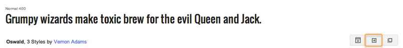
Here you may set the fonts used in the theme; either a standard font or a Google font. There are two font areas to be chosen; one for the headers and titles of the theme and another for the body, or content of the page.
Using a Google Font
Using a Google font in Photo requires some very simple steps:
- Navigate to to Google Fonts website.
- From the list of fonts, select the one you wish to use and click the Quick Use icon.
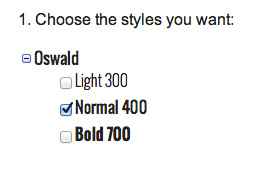
- Select the styles and character sets you wish to use for the font by clicking the tickboxes next to each.
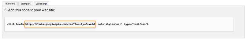
- In the Add this code to your website section, copy only the font URL from the link element.
- In the Appearance → Customize → Font options section of your WordPress backend, select Google Font in the drop-down list for the section you wish to use.
- Paste the copied URL into the Google Font URL for Header/Body/Other Elements field; after a moment the live preview will update to show you how your site looks with the new font.
- Click the Save & Publish button to save changes.
The font has now been set as needed, and you will see the changes in the live preview window.
Using a Standard Font
The standard fonts available may be seen and selected in the Header Font, Body Font or Other Elements Font drop-down list; under the initial Google Font option are a list of standard fonts, so if you wish to use one of these fonts you may simply select it from the list, and the live preview will updated accordingly.
Default font configuration
Body font
Google Font
//fonts.googleapis.com/css?family=Open+Sans:300,400,500,700
Selectors:
body,
button,
.button,
input[type="submit"],
input[type="button"],
select,
textarea,
input[type="text"],
input[type="password"],
input[type="url"],
input[type="email"],
article header h1,
article header h2
Using a Standard Font
The standard fonts available may be seen and selected in the Header Font, Body Font or Other Elements Font drop-down list; under the initial Google Font option are a list of standard fonts, so if you wish to use one of these fonts you may simply select it from the list, and the live preview will updated accordingly.
Layout
The layout options allow you to control the theme width across all display sizes. Each width setting for responsive displays, which includes the Theme Width, Tablet Width, Small Tablet Width and Mobile Width options, all define their sizes in pixels (px). The theme has our recommended widths already set, but you are free to modify these should you have a preferred width in mind for your site.
Features
This section includes toggles to modify a selection of special features included with the theme, as well as additional copyright information controls.
The available toggle controls, which you may choose to enable or disable by adding a tick to the relevant clickbox, are as follows:
- Enable Word-Break - This option may be useful when using elements with a dynamic width or a non-romanized language such as Japanese or Korean that may not word-wrap correctly otherwise.
- Use Scroll Reveal - Sets whether scroll reveal animations (discussed in the Extra Features section of this guide) are enabled or not.
- Display Related Posts - Each post's page in the Events theme includes an area above the comments where posts related to the post currently being read are displayed as thumbnails with titles.
If you do not want this area to appear on your site, untick this option.
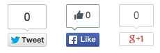
- Post Social Icons - Sets whether Facebook, Twitter and Google+ Share and Like buttons appear at the top of each post's page under the title.
- Page Social Icons - Similar to the above, this option decides if the share buttons appear on pages, rather than posts.
-
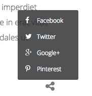
Enable Pop-Up for Social Icons - When enabled, social icons for sharing or liking posts or pages on your site are contained in clickable share icon that displays the available social networks when clicked:
If disabled the Like/Share buttons will appear underneath the post:
-
Display Mouse Icon in Header - Decides whether the animated mouse icon in the header is displayed on the currently shown page.
- Dark Image Background - When enabled menu and logo text is displayed as white text in order to better show up on dark backgrounds. When disabled, the text will be black to better show up on light backgrounds.
- Dark Image Background on Frontpage - The same control as above, but specific only to the frontpage.
Additional options beyond the toggles are as follows:
Date Format - This option sets whether dates are displayed in the theme-specific way, or in the standard WordPress way. In Quark, the theme date format reads "Sunday, 5 October 2014", whereas the standard WordPress version would use "October 5, 2014" without the day or shortened month name.
Copyright Text - Decides what copyright text should appear at the bottom of all pages. You can replace the existing text with your own, or remove it entirely by leaving the field blank.
Upload Author Page Background - This area allows you to upload a background image to be used in the header of author information pages that list an author's contributions to the site. This area may be found by clicking on the author's name in the post list or blog post.
Upload Error Page Background - Similar functionality to the above option, but this time the background image is used exclusively on the error page of the theme.
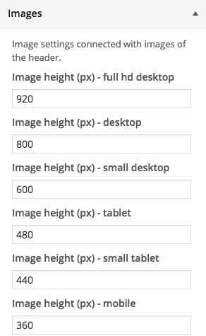
Images
The images options deal with the sizing of your images for each screen size. There are a set of 5 image height options that may be used to decide the overall height of the images used the header area of each page. There are specific settings for each screen size, so you can use smaller images for smaller screens to improve the browsing experience. Width for the images is based on the layout settings defined earlier.
Frontpage Elements
The Frontpage options are only visible when your customizer viewport is displaying the frontpage:
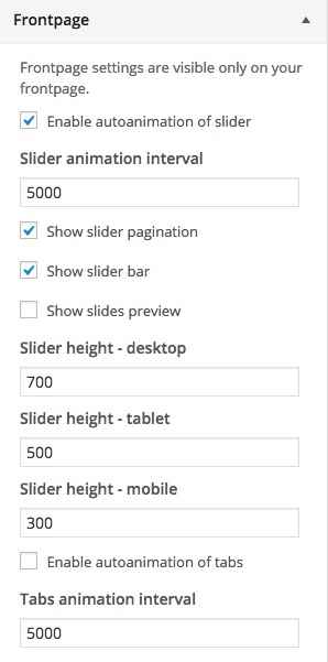
The available options are:
- Enable autoanimation of slider - When enabled the slideshow section of the frontpage will automatically animate between slides without user input.
- Slide animation interval - Defines the time in milliseconds that the slider should wait between slides when autoanimation is enabled.
- Show Slider Pagination - When enabled, controls that allow users to switch between slides manually are visible in the slideshow section to the right of the slide.

- Show slider bar - When enabled an animated bar under the slideshow appears, allowing users to scroll between slides and highlighting which slide is currently displayed.
- Show slides preview - When enabled, both previous and next slides in the sequence are displayed as smaller transparent images to the left and right of the main slide.

-
Slider height options - This set of three height options let you define the maximum height of the slide section in pixels for each screen type: desktop, tablet and mobile.
- Enable autoanimation of tabs - When enabled, the tabbed section of the frontpage will automatically switch between tabs without user input.
- Tabs animation interval - Defines the wait time in milliseconds between tab switches when the previous option is enabled.
Contact Page
The Contact Page options are only visible when your Theme Customizer screen viewport is displaying a contact page; that is, a page using the Contact Page template. More details may be found in the Features → Additional Pages → Contact Page section of this guide. The available options are:
- Enable reCaptcha - When enabled users sending a message via the contact form will be required to complete a reCaptcha to prevent spam.
- Email Source - the email address entered in this field will be the recipient of any messages sent via the contact form; if left blank, the default administrator email is used.
- Email header text - Text entered in this field will be displayed beneath the title in the contact page header.

- Social Icon/Map URLS - The contact page's header can include icons that link to your social media pages for Facebook, Twitter and Google+, with an additional text link to Google Maps should you wish to display your location. Simply enter the URL you want users to be redirected to into the appropriate field. Fields left blank will not be displayed, so if you do not have a Facebook page, for example, delete the content in the Facebook URL field and save to remove the icon from the header.
Frontpage Elements
The frontpage of Quark is visually interesting, utilizing multi-functional areas that can be used to display a range of content. In this section we'll discuss how each section is created, and how to modify the basic elements to suit your needs.
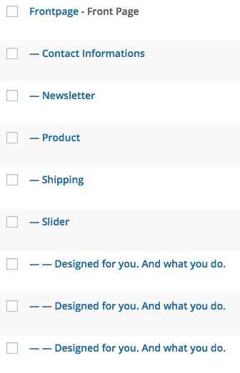
Quark uses a page-based system to create its frontpage content and the more complex additional pages, such as Contact or Our Team pages. This system uses a base page with a special template assigned as a starting point, and then subpages are added, with each subpage creating a new section below the next.
For example, in the demo layout for Quark, the parallax image header's HTML code is added into a base page using the Frontpage template:
And then further subpages are added to create the information blocks, tabs, slideshow and more. for the tabs and slideshows, each slide or tab is created by adding further subpages to the existing subpage. The basic frontpage page structure looks like this:
We will look through the creation and modification of each frontpage element in more depth over the coming sections to take you through adding your own content by modifying the existing HTML content and adding your own subpages.
Much of the HTML tags you will see in these sections will include **data-sr** attributes; these attributes refer directly to the ScrollReveal JavaScript library, which is included in Quark and makes creating scroll reveal animations easy. More information on how these attributes may be modified is covered in the **Features** section of this guide, but when first making changes these attributes should be left untouched to preserve the aesthetic in the theme.
The Frontpage Header
Quark utilizes multiple headers for different areas of the theme that all use the same basic functionality, but some will use slightly different HTML tags and styling. In this section we will focus only on the frontpage header:

This header uses a background image with parallax-scrolling effect, with a simple overlaid title and subtitle text and a "Learn More" button underneath, with an animated mouse image at the bottom.
Creating the Frontpage Page
If you follow our installation guide and imported the demo content or installed the quickstart package, then you should already have the required frontpage page, simply called Frontpage, and you can ignore this section and move straight to the next. If you haven't, it only takes a moment to create it.
- In your WordPress backend, click on Pages → Add New in the left menu to open the Add New Page screen.
- Enter a page title in the title field; this will not be shown on your website, so call it something that is easy for you to recognize. We simply use Frontpage.
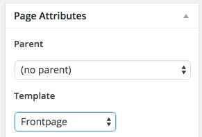
- In the Page Attributes section on the right-hand side of the screen, click on the drop-down box under the Template option and select Frontpage.
- Now click on Publish to make the page available.
- Now we must assign your new frontpage; click on Appearance → Customize in the left menu of your WordPress backend.
- In the Theme Customizer, click on the Static Front Page section to expand the options.
- Click on the drop-down box under the Front page heading, and select your newly-created page, then click Save at the top of the sidebar.
Your frontpage has now been set, and any HTML code added to this page will be displayed in the header of your frontpage.
The Header HTML Code
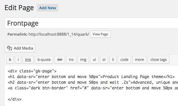
The basic HTML code used to create the header in the demo content looks like this:
    <div class="gk-page">
    <h1 data-sr="enter bottom and move 50px">Product Landing Page theme</h1>
    <h2 data-sr="enter bottom and move 50px and wait .2s">Advanced, unique and powerful premium theme</h2>
    <a class="dark btn-border" href="#" data-sr="enter bottom and move 50px and wait .3s">Learn more</a>
    </div>
This code creates the Title and Subtitle text, along with the Learn More button; the background parallax image in this section and the animated mouse icon are set, enabled and disabled in the Theme Customization screen (see the Theme Options section for more).
Let's make it clearer as to which text goes where in this code by changing the existing text to placeholder name text:
<div class="gk-page">
<h1 data-sr="enter bottom and move 50px">Title Text Here</h1>
<h2 data-sr="enter bottom and move 50px and wait .2s">Subtitle Text Here</h2>
<a class="dark btn-border" href="#" data-sr="enter bottom and move 50px and wait .3s">Button Text Here</a>
</div>
Changing the Title and Subtitle
The title and subtitle are contained in the <h1> and <h2> tags in the second and third line of the HTML code. To modify them, simply add your own text between these tags, whilst leaving the preceding opening <div> tag on the first line untouched:
<div class="gk-page">
<h1 data-sr="enter bottom and move 50px">Title Text Here</h1>
<h2 data-sr="enter bottom and move 50px and wait .2s">Subtitle Text Here</h2>
If desired you may add multiple subtitles by duplicating the <h2> tag:
<div class="gk-page">
<h1 data-sr="enter bottom and move 50px">Title Text Here</h1>
<h2 data-sr="enter bottom and move 50px and wait .2s">Subtitle Text Here</h2>
<h2 data-sr="enter bottom and move 50px and wait .2s">Second Subtitle Text Here</h2>
Which will look like this:

You may do this several times if necessary. You can also duplicate the title by creating a second <h1> tag, but generally it's advisable to stick to using just the one title to keep things clean.
Changing the Button Text and Link
The button text is contained between the <a> link tag in the fourth line of the HTML code. To modify the button text, change the placeholder text to your own without modifying the class or other attributes in the tag, nor the closing </div> tag that follows on line 5, as these are required for the styling:
<a class="dark btn-border" href="#" data-sr="enter bottom and move 50px and wait .3s">Button Text Here</a>
</div>
By default the button does not actually link anywhere, instead redirecting to a blank # link. To replace the link with your own, change the value of the href attribute to your chosen URL, without removing the quotation marks:
<a class="dark btn-border" href="/Your Link URL Here" data-sr="enter bottom and move 50px and wait .3s">Button Text Here</a>
The Frontpage Product Block
The frontpage product block displays an image with a longer title and text underneath; great for adding a bit more detail to your products or services after the initial introduction in the header.

Creating the Product Block Page
The product block is included in our demo content as the earliest-created subpage of the Frontpage page, and is called Product.
If you are creating this page manually, then you will need to create and assign a subpage to your existing Frontpage:
- In your WordPress backend, click on Pages → Add New in the left menu to open the Add New Page screen.
- Enter a page title in the title field; this will not be shown on your website, so call it something that is easy for you to recognize. We simply use Product.
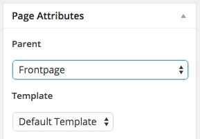
- In the Page Attributes section on the right-hand side of the screen, click on the drop-down box under the Parent option and select your Frontpage.
- Now click on Publish to make the page available.
The page will now be added as a subpage, and it's content will automatically be displayed under the frontpage header.
The Product Block HTML Code
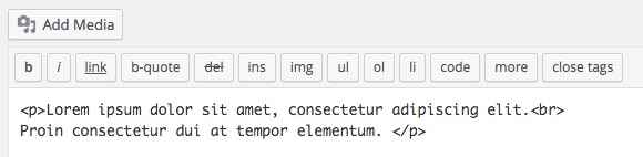
The demo HTML code for this page looks like this:
<div class="gk-desc">
<img src="http://localhost/quark/wp-content/uploads/2015/02/product_bg.jpg" alt="product_bg" data-sr="enter bottom and scale up 50% over .8s" />
<h2>Duis scelerisque consequat magna eget euismod.<br />
Sed vel odio nunc nulla facilisi</h2>
<p>Lorem ipsum dolor sit amet, consectetur adipiscing elit. Proin consectetur dui at tempor elementum. Aenean convallis metus nec nibh varius hendrerit. Ut varius purus lectus, a pharetra mi blandit at. Integer ante leo, iaculis ut odio sit amet, dignissim pretium quam. Ut ac diam egestas, bibendum ex et, pharetra tellus. Proin sagittis est sit amet ipsum aliquam, non dapibus sapien congue. Donec lobortis sed lacus at consectetur. Ut aliquet sapien eget dolor sollicitudin interdum. Duis scelerisque consequat magna eget euismod. Sed vel odio nunc. Nulla facilisi. Aenean a tincidunt leo. Praesent dapibus nibh id mauris sollicitudin, ut auctor lacus interdum. Phasellus volutpat magna a purus elementum, eget gravida tellus feugiat. In id lorem sapien.</p>
<a href="#" class="btn-border">Learn more</a>
</div>
This code creates all the elements of the block, starting with the Image, then the Title and Description text, and finally the Learn More button. If we simplify the demo content with placeholder text, the code would look like this:
<div class="gk-desc">
<img src="/Image Link Here" alt="product_bg" data-sr="enter bottom and scale up 50% over .8s" />
<h2>Title Text Here</h2>
<p>Description Text Here</p>
<a href="/Button Link Here" class="btn-border">Button Text Here</a>
</div>
Changing the Image
The image is added in the <img> tag that immediately follows the opening <div> tag (the <div> tag creates the block and assigns a class for CSS stylization, so this should not be changed or modified):
<img src="/Image Link Here" alt="product_bg" data-sr="enter bottom and scale up 50% over .8s" />
The important part here is the src attribute; this attribute contains the link to your image, usually from your Media Library. To change the image, you need to add your own image link into this attribute.
If the image you wish to use in this section is in your WordPress media library then we will need to find the image URL so that it may be added to the src attribute. To do so:
- In your WordPress backend, navigate to your media library.
- Once on the media library screen, click on the image that you wish to use; you will be taken to the Edit Image screen.
- In the top-right corner of the screen is an Attributes section, with a field called Image URL. Copy the entire URL from this field.
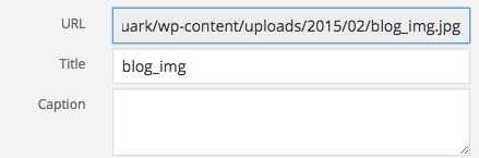
- Navigate back to your Product page, and paste the copied URL into the src attribute of the IMG tag and save changes. The image has now been updated.
Changing the Title and Description Text
The title and description text for this block are created in the <h2> and <p> tags that appear after the opening <div> and <img> tags of the HTML code:
<h2>Title Text Here</h2>
<p>Description Text Here</p>
To change them, simply replace the existing placeholder text within each tag with your own, taking care to leave the tags intact. Title text goes in the <h2> tag, and description text in the <p> tags. As you might have noticed in the demo content, you may also use </br> tags to force line breaks to better control the layout of this section:
<h2>Duis scelerisque consequat magna eget euismod.<br />
Sed vel odio nunc nulla facilisi</h2>
Changing the Button Text and Link
The button text, like with the header, is in the <a> link tag towards the end of the HTML code. To modify the button text, change the placeholder text to your own without modifying the class of the tag:
<a href="#" class="btn-border">Your Button Text Here</a>
Again, the demo content doesn't actually link anywhere, so be sure to add your own link URL into the href attribute without removing the quotation marks:
<a href="/Your Link URL Here" class="btn-border">Your Button Text Here</a>
The Frontpage Tabs
The Tabs on the frontpage of Quark offer multiple ways to showcase your content in full-width tabbed areas, which can be used to display styled text, other HTML elements like price tables, or mock-ups and text descriptions:

This section is the first to use additional subpages to create it's content. The initial subpage is used as a base for the tabs, and is left blank with no content. Then, additional subpages are added to the base tab subpage, with each subpages' content being displayed in its own tab, and the title used to add a tab button in the section on the frontpage.
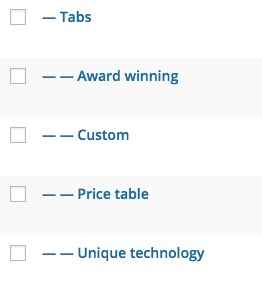
In the demo content the base page is already created under the name Tabs, and four subpage tabs are already assigned. Three of these tabs, Award Winning, Unique Technology, Price Table, are used to display the core stylizations you may apply to your tabs, and one, Custom, is a placeholder ready for your own content.
The basic structure of these subpages look like this:
Creating the Base Tabs Page
In the demo content the base Tabs page for your tabs is also configured, along with the subpages that create the tabs content. If you are creating this section from scratch you should perform the following steps:
- In your WordPress backend, click on Pages → Add New in the left menu to open the Add New Page screen.
- Enter a page title in the title field; this will not be shown on your website, so call it something that is easy for you to recognize. We simply use Tabs.
- In the Page Attributes section on the right-hand side of the screen, click on the drop-down box under the Parent option and select your Frontpage.
- Now click on Publish to make the page available.
Adding Tabs
You now have a blank page that is ready to use, but before it will apply the tabs functionality you must add subpages to this subpages to create the tab content. To do so, follow these steps:
- In your WordPress backend, click on Pages → Add New in the left menu to open the Add New Page screen.
- Enter a page title in the title field; this title will be used to create the name of the tab button that appears on the left of the section, so make it something snappy to draw customer attention.
- In the Page Attributes section on the right-hand side of the screen, click on the drop-down box under the Parent option and select your Tabs page.
- Click on Publish to add the page to your site.
Now any content that you add to the page mainbody will be used as the content for the tab, with the title as the button text. Repeat this process multiple times to add further tabs; there is no hard limit on how many tabs may be added, but it will damage the site aesthetic and overwhelm any readers if you add too many, so we advise keeping it down to four or so.
The Tab Content
Each tab in the demo content highlights a different feature that you may use when creating or modifying tabs to your liking, such as parallax background images, price tables, and stylized text. Let's look at each tab in turn and see how their content is created, and how you can modify it.
The First Tab
The first tab displays two interesting elements; a stylized piece of title text that includes a alpha-numeric character within the centre of an O character, and a parallax background. There is also a piece of descriptive text underneath the title:

The basic HTML code for this section looks like this:
<div class="very-big-spaces parallax-bg"><h2 class="gk-big-heading"><span>N</span><span class="gk-number-block">1</span></h2>
<p>Multi award winning ski goggles with <br>the multi lens technology</p>
</div>
The opening <div> element contains two important classes; very-big-spaces, which adds large padding to the top and bottom of the text; without this class the section would look very cramped.
And the second class, parallax-bg, sets all the CSS to achieve the parallax effect on your image. If you want to use a parallax effect in one of your tabs, this class is essential.
After the opening <div> we have the actual content; if we switch out the text with simple placeholders it would look like this:
<div class="very-big-spaces parallax-bg"><h2 class="gk-big-heading"><span>Characters before the special "O" character go here</span><span class="gk-number-block">Character to be within the "O" goes here</span></h2>
<p>Description Text Here</p>
</div>
The parallax background image is taken from the Featured Image of the first tab's corresponding page.
Changing the Title
The title area in the first tab requires some slightly more complex HTML than the other sections due to its special styling. Whereas in previous sections the title was contained in a single <h2>, here we have additional <span> tags that are used to separate the standard title text and the stylized O character with another character inside it so that the CSS rules can be applied correctly.
<h2 class="gk-big-heading"><span>N</span><span class="gk-number-block">1</span></h2>
So to change the title, we must make sure to place the correct characters in the correct place. The main part of your title text should be in the first <span> tag; note that text here will be very big and should be limited in scope. The character you wish to be encircled should be placed in the second <span> tag that uses the gk-number-block class, which will automatically place the character in the circle.
<h2 class="gk-big-heading"><span>Title Text Here</span><span class="gk-number-block">Encircled character here</span></h2>
You may add multiple encircled characters if preferred; simply repeat the <span> tag and include the gk-number-block class. For example:
<h2 class="gk-big-heading"><span class="gk-number-block">N</span><span class="gk-number-block">1</span></h2>
Will create two encircled characters like this:

Repeat this tag and class as needed. If you want to use the title's style on a second line, simply repeat the <h2> tag and add the <span> tags as before:
<h2 class="gk-big-heading"><span>Title Text Here</span><span class="gk-number-block">Encircled character here</span></h2>

<h2 class="gk-big-heading"><span>Second Title Text Here</span><span class="gk-number-block">Second encircled character here</span></h2>
Changing the Subtitle Text
The subtitle text is much simpler than the title, being contained in a standard <p> tag under the <h2> tag:
<p>Multi award winning ski goggles with <br>the multi lens technology</p>
To change this, just add your own text between the tags, but make sure to leave the closing </div> tag underneath untouched, otherwise the CSS will not be applied correctly.
Changing the Background Image
The background image is not included in the HTML code of the page like the Product section, nor is it set in the Theme Customizer like the Header section. Instead, the background image for the tab is taken from the Featured Image section of the tab's page.
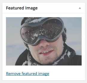
To set the background image:
- Login to your WordPress backend and click on Pages → All Pages to open the list of pages, and click on the page you created for your first tab to open the edit screen.
- On the Edit Page screen, click on Set Featured Image text on the right of the screen to open your media library; if you already have an image for the page that you wish to replace, click on the Remove Featured Image button first to remove it, then click the Set Featured Image button.
- You may now select an existing image or upload a new image, just as with the header image. Once selected, click on the Set Featured Image button to confirm selection.
- Save the changes to the page.
The image is now set, and will be automatically used as a background.
If you wish the image to have a parallax effect you will also need the **parallax-bg** class in your HTML code for the page, as with the first tab above.
The Second Tab
The second tab in this section displays a mobile-phone mock-up with image in the left column, with a list of features on the right; just the thing for going into a bit more detail about what you offer.
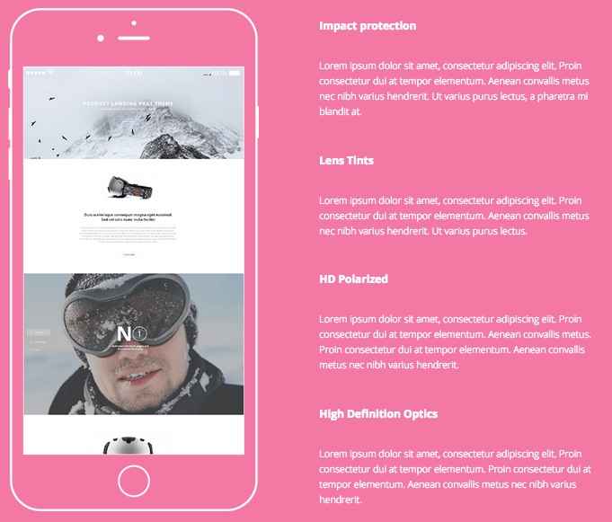
This tab uses what may seem at first glance to be a complex bit of HTML code, but it is very simple. The basic code looks like this:
<div class="site">
<div class="gk-cols gk-features bigger-spaces color-bg" data-cols="2">
<div><img src="http://localhost/quark/wp-content/uploads/2015/02/app_features-1.png" alt="App Features" /></div>
<div>
<dl>
<dt>Impact protection</dt>
<dd>Lorem ipsum dolor sit amet, consectetur adipiscing elit. Proin consectetur dui at tempor elementum. Aenean convallis metus nec nibh varius hendrerit. Ut varius purus lectus, a pharetra mi blandit at.</dd>
<dt>Lens Tints</dt>
<dd>Lorem ipsum dolor sit amet, consectetur adipiscing elit. Proin consectetur dui at tempor elementum. Aenean convallis metus nec nibh varius hendrerit. Ut varius purus lectus.</dd>
<dt>HD Polarized</dt>
<dd>Lorem ipsum dolor sit amet, consectetur adipiscing elit. Proin consectetur dui at tempor elementum. Aenean convallis metus. Proin consectetur dui at tempor elementum. Aenean convallis metus nec nibh varius hendrerit.</dd>
<dt>High Definition Optics</dt>
<dd>Lorem ipsum dolor sit amet, consectetur adipiscing elit. Proin consectetur dui at tempor elementum. Proin consectetur dui at tempor elementum. Aenean convallis metus nec nibh varius hendrerit.</dd>
</dl>
</div>
</div>
</div>
The opening two <div> tags provide the frame and classes for the layout; the site class in the first tag provides the padding for the columns. In the second tag, the gk-cols class and data-cols attribute declare the columns and set how many there will be, the bigger-spaces class adds padding to the top and bottom of the section to keep the size uniform with the other tabs, the color-bg class changes the background color from the standard white to the color selected in the theme settings, and the gk-features class provides the text style in the second column.
After these class declarations we have the two columns content; the first column is created with just a <div> containing an <img> tag that defines the image on the mock-up's screen:
<div><img src="http://localhost/quark/wp-content/uploads/2015/02/app_features-1.png" alt="App Features" /></div>
And the second column's code contains a <dl> description list with <dt> tags for the titles and <dd> tags for the descriptions.
<div>
<dl>
<dt>Impact protection</dt>
<dd>Lorem ipsum dolor sit amet, consectetur adipiscing elit. Proin consectetur dui at tempor elementum. Aenean convallis metus nec nibh varius hendrerit. Ut varius purus lectus, a pharetra mi blandit at.</dd>
<dt>Lens Tints</dt>
<dd>Lorem ipsum dolor sit amet, consectetur adipiscing elit. Proin consectetur dui at tempor elementum. Aenean convallis metus nec nibh varius hendrerit. Ut varius purus lectus.</dd>
<dt>HD Polarized</dt>
<dd>Lorem ipsum dolor sit amet, consectetur adipiscing elit. Proin consectetur dui at tempor elementum. Aenean convallis metus. Proin consectetur dui at tempor elementum. Aenean convallis metus nec nibh varius hendrerit.</dd>
<dt>High Definition Optics</dt>
<dd>Lorem ipsum dolor sit amet, consectetur adipiscing elit. Proin consectetur dui at tempor elementum. Proin consectetur dui at tempor elementum. Aenean convallis metus nec nibh varius hendrerit.</dd>
</dl>
</div>
With a final two closing </div> tags ending the section. If we switch out the complex text for simple placeholders and separate the two columns' content after the opening <div> tags, the code is much clearer to understand:
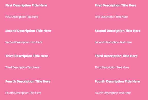
<div class="site">
<div class="gk-cols gk-features bigger-spaces color-bg" data-cols="2">

<div><img src="/Image URL Here" alt="App Features" /></div>

<div>
<dl>
<dt>First Description Title Here</dt>
<dd>First Description Text Here</dd>
<dt>Second Description Title Here</dt>
<dd>Second Description Text Here</dd>
<dt>Third Description Title Here</dt>
<dd>Third Description Text Here</dd>
<dt>Fourth Description Title Here</dt>
<dd>Fourth Description Text Here</dd>
</dl>
</div>
</div>
</div>
So the first column is just one line of code, with the second column made up of four titles and descriptions. Let's look at modifying them.
Changing the Screen Image
The screen image is defined in the first column's HTML code, specifically in the src attribute of the <img> tag. To add your own, just place the URL to your chosen image in this attribute:
<div><img src="/Image URL Here" alt="App Features" /></div>
<div>
If you're unfamiliar with how to get an image's URL from your Media Library, follow these steps:
- In your WordPress backend, navigate to your media library.
- Once on the media library screen, click on the image that you wish to use; you will be taken to the Edit Image screen.
- In the top-right corner of the screen is an Attributes section, with a field called Image URL. Copy the entire URL from this field and paste it into the src attribute of the above HTML code.
Changing the Title and Descriptions
The second column's combination of titles and descriptions for the feature is very easy to understand. Just like when creating an unordered list, you have an opening <dl> tag that creates the list, followed by a <dt> tag, that is used for the title, and a <dd> tag that contains the description:
<dl>
<dt>First Description Title Here</dt>
<dd>First Description Text Here</dd>
The <dt> and <dd> tags are then repeated for each title and description that needs to be added, and the list is ended with a closing </dl> tag:
<dt>Second Description Title Here</dt>
<dd>Second Description Text Here</dd>
<dt>Third Description Title Here</dt>
<dd>Third Description Text Here</dd>
<dt>Fourth Description Title Here</dt>
<dd>Fourth Description Text Here</dd>
</dl>
So, to change the description title, modify the text between the <dt> tag of choice. For the description, modify the text between the <dd> text. If required, you can add additional features by replicating the two tags and adding them to the end of the existing list; that is, before the closing <dl> tag.
Two Columns of Features
If you do not wish to utilize the phone mockup for your content and would instead prefer to create a second set of features, you may do so by replacing the <div> and <img> tags that make up the first column and replacing them with the same content as the right column, as in the following example code:
<div class="site">
<div class="gk-cols gk-features bigger-spaces color-bg" data-cols="2">

<div>
<dl>
<dt>First Description Title Here</dt>
<dd>First Description Text Here</dd>
<dt>Second Description Title Here</dt>
<dd>Second Description Text Here</dd>
<dt>Third Description Title Here</dt>
<dd>Third Description Text Here</dd>
<dt>Fourth Description Title Here</dt>
<dd>Fourth Description Text Here</dd>
</dl>
</div>
</div>
</div>
Which produces two columns of features:
The Third Tab
The third tab in this section includes a plain gray background with a price table for highlighting your package deals or other offers, with a dark background highlight for your most popular or best value deal:
This section uses a large amount of HTML code and classes to separate each portion of the price table into its own section. The basic HTML code as used in the demo layout looks like this:
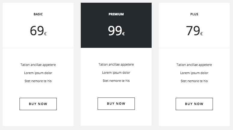
<div class="site">
<div class="gk-price-table gray-bg bigger-spaces" data-cols="3">
<dl>
<dt><strong>Basic</strong><span>69<sub>€</sub></span></dt>
<dd>
<ul>
<li>Tation ancillae appetere</li>
<li>Lorem ipsum dolor</li>
<li>Stet nemore te his</li>
</ul>
</dd>
<dd><a href="#">Buy now</a></dd>
</dl>
<dl class="gk-premium">
<dt><strong>Premium</strong><span>99<sub>€</sub></span></dt>
<dd>
<ul>
<li>Tation ancillae appetere</li>
<li>Lorem ipsum dolor</li>
<li>Stet nemore te his</li>
</ul>
</dd>
<dd><a href="#">Buy now</a></dd>
</dl>
<dl>
<dt><strong>Plus</strong><span>79<sub>€</sub></span></dt>
<dd>
<ul>
<li>Tation ancillae appetere</li>
<li>Lorem ipsum dolor</li>
<li>Stet nemore te his</li>
</ul>
</dd>
<dd><a href="#">Buy now</a></dd>
</dl>
</div>
</div>
Like the features section of the previous tab, this lengthy code can be easily broken down into blocks. The opening two <div> tags, like with the previous tab, provide the site and gk-price-table class for CSS targeting, along with a data-cols attribute for defining the number of columns. There's also a gray-bg class for changing the background color, and a bigger-spaces class for adding padding to the top and bottom of the tab.
<div class="site">
<div class="gk-price-table gray-bg bigger-spaces" data-cols="3">
After this is the code for the price table. The code can be split into three separate blocks, each representing one column of the price table. Each of the columns uses a standard code layout that looks like this:
<dl>
<dt><strong>Basic</strong><span>69<sub>€</sub></span></dt>
<dd>
<ul>
<li>Tation ancillae appetere</li>
<li>Lorem ipsum dolor</li>
<li>Stet nemore te his</li>
</ul>
</dd>
<dd><a href="#">Buy now</a></dd>
</dl>
Like with the second tab, a description list is created with a <dl> tag; this frames the entire column. Then, the title and price that appear at the top of the column are added into a <dt> title tag:
<dl>
<dt><strong>Basic</strong><span>69<sub>€</sub></span></dt>
Then the three lines of features are created with a <dd> tag that then contains an unordered list <ul> tag with three list item <li> tags:
<dd>
<ul>
<li>Tation ancillae appetere</li>
<li>Lorem ipsum dolor</li>
<li>Stet nemore te his</li>
</ul>
</dd>
Finally, another <dd> tag contains a link <a> tag which is used to create the button that can be used to link to payment or more information pages:
<dd><a href="#">Buy now</a></dd>
</dl>
This block is repeated two more times to create the next two columns of the price table, with the second column also using a gk-premium class in the opening <dl> tag to change it to a dark background:
<dl class="gk-premium">
<dt><strong>Premium</strong><span>99<sub>€</sub></span></dt>
<dd>
<ul>
<li>Tation ancillae appetere</li>
<li>Lorem ipsum dolor</li>
<li>Stet nemore te his</li>
</ul>
</dd>
<dd><a href="#">Buy now</a></dd>
</dl>
<dl>
<dt><strong>Plus</strong><span>79<sub>€</sub></span></dt>
<dd>
<ul>
<li>Tation ancillae appetere</li>
<li>Lorem ipsum dolor</li>
<li>Stet nemore te his</li>
</ul>
</dd>
<dd><a href="#">Buy now</a></dd>
</dl>
</div>
</div>
Now let's look at modifying a price table column.
Changing the Price Table Title and Price
The price table title and price that appears at the top of the column is one of the more complex pieces of HTML code in Quark, since it uses several different fonts and styles that require some specific tags to allow the CSS code to separate them. The whole block is contained in the <dt> tag, but then <span>, <strong> and <sub> elements are used to separate each part of the text:
<dt><strong>Premium</strong><span>99<sub>€</sub></span></dt>
As you can see in the above example code, the actual title of the of the price table is contained in the <strong> tags of the <dt> tag, so to change the title, modify the text between these tags:
<dt><strong>Price Table Title Here</strong>
The price is a bit more complex. The whole of the price, including the currency symbol, is contained in a <span> tag inside the <dt> tag, but within the <span> tag is a <sub> tag which is exclusively for the currency symbol as this is stylized as a much smaller font than the actual price:
<span>99<sub>€</sub></span></dt>
To modify the price, place the numbers of the price immediately after the opening <span> tag. For the currency symbol, modify the character between the <sub> tags:
<dt><strong>Price Table Title Here</strong><span>Price Here<sub>Currency Symbol Here</sub></span></dt>
The second price table column in the demo content offers a highlighted title and price using a dark background:
If you wish to highlight one of your price tables, all you need to do is add the gk-premium class to your price table column's opening <dl> tag:
<dl class="gk-premium">
Changing the Feature List
The feature list is much simpler than the title and price, as it is just a standard HTML unordered list wrapped in a <dd> tag. As such, to change the features, you need to only change the text contained within the <li> list items, leaving the <dd> and <ul> tags untouched:
<dd>
<ul>
<li>First Feature Here</li>
<li>Second Feature Here</li>
<li>Third Feature Here</li>
</ul>
</dd>
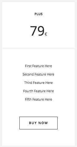
If desired you may add more features to the list by adding an additional set of <li> tags; the price table will increase height automatically to accommodate so there is no hard limit on the number of features, but we recommend keeping things light to avoid overcomplicating your offers and putting potential customers off. The code for set of five features would look like this:
<dd>
<ul>
<li>First Feature Here</li>
<li>Second Feature Here</li>
<li>Third Feature Here</li>
<li>Fourth Feature Here</li>
<li>Fifth Feature Here</li>
</ul>
</dd>
And would produce this result:
Changing the Button Text and Link
As with the previous sections of the frontpage the button is made with a plain <a> tag, though in this case it is wrapped in <dd> tags to separate it from the other blocks of the price table column:
<dd><a href="#">Buy now</a></dd>
To change the button text, change the text after the opening <a> tag:
<dd><a href="#">Button Text Here</a></dd>
To set the URL where the button will link to when clicked, add your chosen URL into the href attribute of the opening <a> tag:
<dd><a href="/Link URL Here">Button Text Here</a></dd>
The Fourth Tab
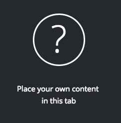
The fourth tab is set as a placeholder for you to add your own text, utilizing the stylization options from previous tabs to create a circled question mark and subtitle:
The basic code for this section looks like this:
<div class="very-big-spaces dark-bg"><h2 class="gk-big-heading"><span class="gk-number-block">?</span></h2>
<p>Place your own content <br />in this tab</p></div>
As you can see this uses the very-big-spaces class to add additional padding to the top and bottom of the content to keep the tab uniform in size with the other tabs, and uses the gk-big-heading and gk-number-block classes in the <h2> and <span> tags to create the circled character, just like in the first tab.
There is one new class to be aware of here; dark-bg, added to the opening <div> tag, causes the background to use a black background rather than the standard white background, just like the gray-bg class adds a gray background, the color-bg adds a colored background, or the Featured Image option adds an image background.
The Frontpage Slideshow
The frontpage slideshow takes the basic idea of a slideshow and improves it with slick animated transitions, slider bars for manual pagination and titles and subtitles underneath the image for more effective selling.

The frontpage slideshow is the second of our sections that uses subpages to provide its content. In this case, instead of each sub-subpage creating a tab they create a new slide with the accompanying text. The slide image is taken from the Featured Image of the frontpage, with the Title and Mainbody of the page providing the title and subtitle text for that slide.
Creating the Base Page
In the demo content the base page is already created under the title Slider. If you are adding the page yourself, follows these steps:
- In your WordPress backend, click on Pages → Add New in the left menu to open the Add New Page screen.
- Enter a page title in the title field; this will not be shown on your website so it is for your benefit only. In the demo content it is called Slider.
- In the Page Attributes section on the right-hand side of the screen, click on the drop-down box under the Parent option and select your Frontpage.
- Now click on Publish to make the page available.
Adding a New Slide
To add a slide you will need to create a new subpage and assign your Slider page as the parent. In your WordPress backend add a new page and instead of choosing the Frontpage as the parent in the sidebar option, choose your Slider page.
Now you need to add the content for your slide; the image, title and subtitle. The image for the slide is taken from the Featured Image section. To add an image, click on the Set Featured Image text on the right sidebar:
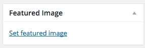
This will open your media library, where you can upload a new image or select an existing one from your library. Click on the image you wish to use, then click on the Set Featured Image button in the bottom right of the screen.
The slide image is now set.
For the title text that appears under the slide, add your text to the Title field on the Edit Page screen, and for the subtitle text, add the text to the mainbody of the page in plain <p> tags:
The title and subtitle text will automatically be displayed under the featured image in the slide. You may continue adding more subpages to create more slides; there are no hard limits on how many you may have, but do bear in mind that each additional slide will increase the page weight so it's advisable to stick to three or four slides if possible.
Removing a Slide
Since the slide uses pages to create each slide, to remove one from your list you need only delete or unpublish the page in question for the section to be removed.
The Frontpage Video Block
This section offers a parallax background image with overlaid text and an animated Play button that will load a full-width embedded video from a site of your choice when clicked:

You might think that such a complex layout would need a lot of HTML code to get working, but the base code used in this page is very simple:
<div class="very-big-spaces parallax-bg"> <a class="gk-video-link gk-add-rotate-animation" href="#" data-url="//player.vimeo.com/video/88558878?color=ffffff&title=0&byline=0&portrait=0" data-width="1920" data-height="1080" data-sr="enter bottom and move 50px">Product landing page theme <i class="fa fa-play"></i> Play</a> </div>
The opening <div> element includes two special classes that we've used previously; very-big-spaces adds padding to the block, as without it the block would be much thinner than other blocks on the page unless a lot more content was added. The second class, parallax-bg, is responsible for the clever CSS tricks that create the parallax effect on the background image.
Following this is a link <a> tag with two new classes, gk-video-link, which is used to take care of the video embed effects and transition, and gk-add-rotate-animation, which adds a smart little rotate animation to the play button when it loads. The text in this <a> tag provides the overlaid text to the parallax background, with an <i> icon tag providing the Font Awesome play button icon in the middle of the text.
The parallax background image is taken from the Featured Image of the video block's page, which helps reduce the amount of required HTML code.
Creating the Video Page
In the demo content the page that creates the video block is already available, with the name Video in the background, ready for you to modify with your own content. If you need to create the page manually, follow these steps:
- In your WordPress backend, click on Pages → Add New in the left menu to open the Add New Page screen.
- Enter a page title in the title field; this will not be shown on your website so it is for your benefit only. In the demo content it is called Video in the background.
- In the Page Attributes section on the right-hand side of the screen, click on the drop-down box under the Parent option and select your Frontpage.
- Now click on Publish to make the page available.
Changing the Background Image
Since the parallax background image is provided from the Featured Image of the page it is easy to modify. Navigate to your Video in the background back in your WordPress backend, and once on the Edit Page screen click on the Set Featured Image text on the right of the screen:
If a featured image is already assigned that you wish to replace, then first click on Remove featured image to delete the image, and then you can click on the Set featured image text.
After clicking you will see your media library; select your preferred background image here and click on the Set Featured Image button in the bottom-right of the screen.
Click on Update to save changes to your page, and your background image is ready.
Changing the Overlaid Text
The overlaid text on the parallax background is created inside the <a> tag after the opening <div> tag in the page's HTML code:
<a class="gk-video-link gk-add-rotate-animation" href="#" data-url="//player.vimeo.com/video/88558878?color=ffffff&title=0&byline=0&portrait=0" data-width="1920" data-height="1080" data-sr="enter bottom and move 50px">Product landing page theme <i class="fa fa-play"></i> Play</a>
There's a lot of information there, but this is all related to the video settings. What we need to focus on when changing the overlaid text is the short piece of text following the end of the opening <a> tag:
Product landing page theme <i class="fa fa-play"></i> Play
This text is used for the overlay and includes a play button icon that is created by the empty <i> tag:
<i class="fa fa-play"></i>
Bear in mind that all of the text here will link to the player, so it is not necessary for a user to click the icon to open the video; clicking on any of the text will achieve the same result.
To change the text then, we should modify the text before and after the <i> tag:
<a class="gk-video-link gk-add-rotate-animation" href="#" data-url="//player.vimeo.com/video/88558878?color=ffffff&title=0&byline=0&portrait=0" data-width="1920" data-height="1080" data-sr="enter bottom and move 50px">Text on the left of the icon here <i class="fa fa-play"></i> Text on the right of the icon here</a>
Make sure that the tags for the icon and link are not changed, as this could cause display issues.
Changing the Icon
The icon used in the text is taken from the extensive, flexible Font Awesome set. The <i> icon tag used to create the icon is actually blank; no text is added between the opening and closing tag. Instead, the class of the tag defines which icon should be displayed:
<i class="fa fa-play"></i>
So to change the icon, we need to change the class of the tag. Font Awesome includes hundreds of different icons, and you may view a full list of those available in Quark on our Quark Typography Page.
Notice that each of the icons has a particular class that looks like this:
fa-icon-name
An anchor icon, for example, will have the class:
fa-anchor
To add your chosen icon into this section, select your chosen icon and note down the class name. Then, modify the class in the <i> tag accordingly. The format here is:
fa icon-class-name
So if you wanted to add the anchor icon you would change the class to:
fa fa-anchor
Notice that "fa" must be typed twice; once to declare a Font Awesome icon, and again in the class name. When added to the tag, it would look like this:
<i class="fa fa-anchor"></i>
You may also add Font Awesome icons anywhere else in the text of your site using the above tag; more information may be found in the Features → Font Awesome section of this guide.
Changing the Linked Video
Naturally you'll want to link to your own video in this section, and this is very easy to do. The URL for the video is declared in the opening <a> tag's data-url attribute; the embed URL for your chosen video should be placed in this attribute, and the video will appear in the block when the overlaid text and icon from the section are clicked:
<a class="gk-video-link gk-add-rotate-animation" href="#" data-url="Video Embed URL goes here" data-width="1920" data-height="1080" data-sr="enter bottom and move 50px">
The other attributes in the opening tag should remain untouched, as they declare the CSS classes needed to style the section, provide the max video size and define the reveal animation for the overlaid text.
Getting the Embed URL: Dailymotion
- Open your browser and navigate to the Dailymotion website and find the video you want to embed.
- Under the video below the username of the video creator are three tabs; About Export and Add To.
- Click on the Export option; you'll see a new set of fields and options load, including a Get Embed Code field containing the HTML required to embed the video directly into your webpage. However, we don't actually need to full code; only the URL contained in the src attribute of the code.
-
Before we take this URL, we should first set the player options that way we want them. Click on the More Options and Preview button underneath the Get Embed Code option; you'll see a range of new options that will let you customize how the player looks on your site; including:
- Hide on-page video info -
- Hide in-player video info - Checking this option will remove extra information from the video preview, like title, uploader name and length.
- Player Colors - These three options let you change the coloring of elements like the play button, title bar and highlights.
- Autoplay Mode - Sets the video to automatically play when loaded; this will be after the user clicks the link text in the video block in Quark.
- Start at - Lets you set the time that the video should start when loaded if you wish to skip intros or other sections.
- Notice that as you change these options the URL contained in the src attribute will change to reflect your changes. Once the options are set, copy the complete URL between the two quotation marks of the attribute, and paste it into the data-url attribute of your page's HTML.
-
Save the changes to your page by clicking the Update button; your chosen video will now load when the overlay text is clicked.
Getting the Embed URL: Youtube
To get the embed URL for a video on Youtube, follow these steps:
- Open your browser and navigate to the video on Youtube that you wish to use.
- Under the video below the username of the video creator is a Share tab; click on this to open another set of three tabs; Share, Embed and Email.
- Click on the Embed option; a new field will appear with a lengthy bit of HTML code used to embed the video directly into your webpage, but we don't need the full code; all that's required is the URL contained in the src attribute of the code.
- Before we copy the URL however, we can change several options to control how the player will look on our site. Click on the Show More button underneath the field containing the HTML code; you'll see a range of new options that will let you customize how the player looks on your site; including:
- Show suggested videos when the video finishes - Unchecking this option prevents suggested video blocks being shown when the video ends.
- Show player controls - Unchecking this option will remove the player controls like the play, settings and closed caption buttons, keeping the video clear.
- Show video title and player actions - Unchecking this option removes the title bar and share button from the top of the player.
- Enable privacy-enhanced mode - Using this mode prevents the player from collecting information from your user's browser unless they play the video.
- Notice the URL in the src attribute of the embed code changes as options are changed. Once your options are set, copy the entire URL from this attribute and paste it into the data-url attribute of your video page's HTML code.
- Save the changes to your page by clicking the Update button; your chosen video will now load when the overlay text is clicked.
Getting the Embed URL: Vimeo
To get the embed URL for a video on Vimeo, follow these steps:
- Open your browser and navigate to the video on Vimeo that you wish to use.
- In the video player on the right-hand side is a paper-aeroplane icon; click on this to open the sharing options.
- A popup will appear with Link, Social, Email and Embed sharing options. The Embed field includes a lengthy bit of HTML code used to embed the video directly into your webpage, but we don't need the full code; all that's required is the URL contained in the src attribute of the code.
- Before we copy the URL however, we can change several options to control how the player will look on our site. Click on the Show Options button opposite the title to see a range of options for setting the video's look, including:
- Color - Sets the color of the text and other highlights in the title and toolbar of the video.
- Intro - In this section there are three options; Portrait, Title and Byline. Unchecking any of these options will remove that element from the video preview image.
- Loop this video - Causes the video to restart automatically when finished.
- Show text link underneath this video - Enabling this option will show a link to the video on Vimeo underneath the player. This option will have no effect on Quark, since it does not use the full embed HTML.
- Show video description underneath this video - Enabling this option will show a description on the video underneath the player. This option will have no effect in Quark, since it does not use the full embed HTML.
- Notice the URL in the src attribute of the embed code changes as options are changed. Once your options are set, copy the entire URL from this attribute and paste it into the data-url attribute of your video page's HTML code.
- Save the changes to your page by clicking the Update button; your chosen video will now load when the overlay text is clicked.
The Frontpage Testimonials
This section is a slideshow-esque block that, instead of displaying full-size slides with text, instead displays avatar images with quotations underneath. It's a unique way to show visitors comments from your satisfied customers.
Rather than using multiple pages to create the testimonials as with the slideshow, instead this section uses custom HTML to achieve its styling. The base code of this section from the demo page looks like this:
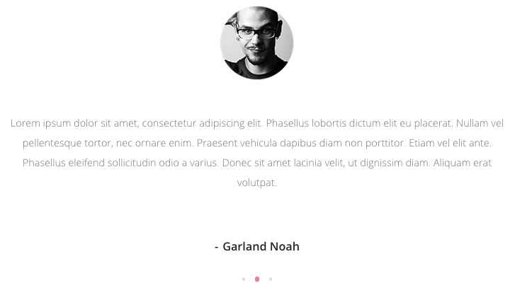
<div class="gk-testimonials site" data-sr="scale up 50%" data-amount="3">
<div>
<div>
<blockquote><img src="http://localhost/quark/wp-content/uploads/2015/02/testimonials_avatar.png" alt="testimonials_avatar" />
<p>Lorem ipsum dolor sit amet, consectetur adipiscing elit. Phasellus lobortis dictum elit eu placerat. Nullam vel pellentesque tortor, nec ornare enim. Praesent vehicula dapibus diam non porttitor. Etiam vel elit ante. Phasellus eleifend sollicitudin odio a varius. Donec sit amet lacinia velit, ut dignissim diam. Aliquam erat volutpat.</p>
<strong>Garland Noah</strong></blockquote>
</div>
</div>
</div>
As with many of the other custom-HTML-based sections, the first few lines of the code are basic <div> elements that are used for CSS targeting; the opening element utilizes special classes for styling purposes; gk-testimonials and site. There are also two attributes used to set the number of testimonial blocks (data-amount) and a styling attribute that should be used, but not changed (data-sr).
After this is the real meat; the testimonial content. There are three example testimonials in the demo example, each consisting of an <img> tag for the avatar, a <p> tag for the description, and a <strong> tag for the name of the person quoted, all wrapped up in a <blockquote>. So each individual testimonial is contained within a single set of <blockquote> tags.
Changing the Testimonial Content
The individual testimonials are contained within the <blockquote> tags; if you check the code above you'll notice that there are three sets of <blockquote> tags, each containing an <img>, <p> and <strong> tag:
<blockquote><img src="http://localhost/quark/wp-content/uploads/2015/02/testimonials_avatar.png" alt="testimonials_avatar" />
<p>Lorem ipsum dolor sit amet, consectetur adipiscing elit. Phasellus lobortis dictum elit eu placerat. Nullam vel pellentesque tortor, nec ornare enim. Praesent vehicula dapibus diam non porttitor. Etiam vel elit ante. Phasellus eleifend sollicitudin odio a varius. Donec sit amet lacinia velit, ut dignissim diam. Aliquam erat volutpat.</p>
<strong>Garland Noah</strong></blockquote>
Let's break this code down into a single testimonial and simplify the placeholder code to make it easy to see how each section is created:
<blockquote><img src="/Testimonial Image Link Here" alt="Alt Name Here" />
<p>Testimonial Quote Here</p>
<strong>Testimonial Name Here</strong></blockquote>
As you can see, the code is not complex once you break it down to its core parts. From here, we can easily modify each section of the testimonial.
Changing the Image
The image is set in the src attribute of the <img> tag; simply copy and paste the link to your chosen image into this attribute between the quotation marks. Images may be from your Media Library or external sources.
<img src="/Testimonial Image Link Here" alt="Alt Name Here" />
To get the link for an image in your Media Library, follow these steps:
- In your WordPress backend, navigate to your media library.
- Once on the media library screen, click on the image that you wish to use; you will be taken to the Edit Image screen.
- In the top-right corner of the screen is an Attributes section, with a field called Image URL. Copy the entire URL from this field and paste it into the src attribute of the above HTML code.
Changing the Quote Text
Under the image is the quotation text, which in the code is contained in the <p> tag under the <img> tag. All you need to do is add your own text between the tags.
<p>Testimonial Quote Here</p>
Changing the Atrribution Text
At the bottom of the testimonial is an attribution showing the name of the person or company that provided the quotation. This section is contained in the <strong> tags that appear just before the closing </blockquote> tags. Modify the text between these tags to create your attribution name.
<strong>Testimonial Name Here</strong>
Adding Additional Testimonials
There is no limit on the number of testimonials you may add to this section, though it's prudent to avoid overloading this section as too many large files like images can slow down the initial load-time for your site.
To add new testimonials, you must do two things. First, you must change the data-amount attribute in the opening <div> tag of the HTML code used on this page to match the number of testimonials you wish to display:
<div class="gk-testimonials site" data-sr="scale up 50%" data-amount="Number of Testimonials Here">
So if you have 5 testimonials, add that into your code:
<div class="gk-testimonials site" data-sr="scale up 50%" data-amount="5">
Next, you'll need to add the additional testimonial content to your HTML code. As we've already covered, each testimonial is made up of a <blockquote> tag containing an <img> tag, a <p> tag and a <strong> tag. So, we should recreate the code between the blockquote tags (including the tags themselves) and add it to the end of the existing HTML code before the closing <div> tags.
The basic code with three testimonials might look like this:
<div class="gk-testimonials site" data-sr="scale up 50%" data-amount="3">
<div>
<div>
<blockquote><img src="/First Image URL" alt="First Alt Title" />
<p>First Testimonial Text</p>
<strong>First Testimonial Attribution</strong></blockquote>
<blockquote><img src="/Second Image URL" alt="Second Alt Title" />
<p>Second Testimonial Text</p>
<strong>Second Testimonial Attribution</strong></blockquote>
<blockquote><img src="/Third Image URL" alt="Third Alt Title" />
<p>Third Testimonial Text</p>
<strong>Third Testimonial Attribution</strong></blockquote>
</div>
</div>
</div>
And when changed to include 5 testimonials, the code might look like this:
<div class="gk-testimonials site" data-sr="scale up 50%" data-amount="5">
<div>
<div>
<blockquote><img src="/First Image URL" alt="First Alt Title" />
<p>First Testimonial Text</p>
<strong>First Testimonial Attribution</strong></blockquote>
<blockquote><img src="/Second Image URL" alt="Second Alt Title" />
<p>Second Testimonial Text</p>
<strong>Second Testimonial Attribution</strong></blockquote>
<blockquote><img src="/Third Image URL" alt="Third Alt Title" />
<p>Third Testimonial Text</p>
<strong>Third Testimonial Attribution</strong></blockquote>
<blockquote><img src="/Fourth Image URL" alt="Fourth Alt Title" />
<p>Fourth Testimonial Text</p>
<strong>Fourth Testimonial Attribution</strong></blockquote>
<blockquote><img src="/Fifth Image URL" alt="Fifth Alt Title" />
<p>Fifth Testimonial Text</p>
<strong>Fifth Testimonial Attribution</strong></blockquote>
</div>
</div>
</div>
Experiment with varying amounts of testimonials to find the amount that's right for your site.
The Frontpage Shipping Section
The Shipping section is a simple two-column section that displays useful information on the left and an image on the right. In the demo content this is used to highlight promotional shipping options, but any kind of content can be placed here:

To make this page some fairly basic HTML code is employed, with the basic code from the demo content using the following format:
<div class="gk-cols vertical-center gray-bg" data-cols="2"> <div class="gk-text-center" data-sr="enter left and move 200px"><span class="big-text">Free Shipping on Orders over $25</span> <p>Buy everyday free shipping products with free shipping<br />on orders over $35, low prices & product reviews</p> </div> <div class="gk-text-center" data-sr="enter right and move 200px"><img src="http://localhost/quark/wp-content/uploads/2015/02/shipping_img.jpg" alt="shipping_img" /></div> </div>
This is all fairly straightforward to follow; the opening <div> tag wraps the entire content and includes three special classes; gk-cols, which creates the column-style layout, vertical-center, which places the text in the center of the block (in the y-axis only), and gray-bg, which adds a simple gray background to the block. There's also a data-cols attribute, which is used to define the number of content columns in the block.
Then, another <div> tag is created to contain the left-column content, with a text-alignment gk-text-center class that keeps the text centered in the block; in this element is a <span> tag with a big-text class that creates the bolded text of the section, and a plain <p> tag that contains the standard text underneath.
For the second block, another <div> element is created with the gk-text-center class, and an <img> tag is added that creates the right column's image.
Changing the Left Column's Text
To change the left column's text we must look at the content between the second <div> element. If we swap out the demo text for simply placeholder code, it looks like this:
<div class="gk-text-center" data-sr="enter left and move 200px">
<span class="big-text">Bold Text Here</span>
<p>Standard Text Here</p>
</div>
So, if you want to change the bold text of the section, simply add it between the <span> tags. For the standard text underneath, modify the text between the plain <p> tags.
Note that you don't necessarily need to have both text examples in this column; if you'd prefer to only have the bold text, for example, then you can remove the <p> tags and the content within entirely, and leave only the text between the <span> tags:
<div class="gk-text-center" data-sr="enter left and move 200px">
<span class="big-text">Bold Text Here</span>
</div>
The block will restyle itself accordingly to ensure the text is still centered as needed.
Changing the Right Column's Image
The right column image is contained within the third set of <div> tags, using only a plain <img> tag:
<div class="gk-text-center" data-sr="enter right and move 200px">
<img src="/Image URL Here" alt="Alt Name Here" />
</div>
To change the image, simply add the link URL to your preferred image into the src attribute of the <img> tag. The image may be external or from your media library. To find the URL for an image in your media library, follow these steps:
- In your WordPress backend, navigate to your media library.
- Once on the media library screen, click on the image that you wish to use; you will be taken to the Edit Image screen.
- In the top-right corner of the screen is an Attributes section, with a field called Image URL. Copy the entire URL from this field and paste it into the src attribute of the above HTML code.
The Frontpage Social Counters
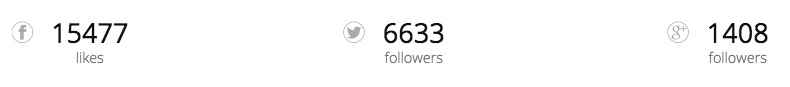
This section displays animated counters that show your Facebook likes along with Twitter and Google+ followers, and link to your social media profiles when clicked.
The counters here are manually updated rather than automatically pulling numbers to ease modification. As with the other areas of this page, simple custom HTML code is used to create this section. The base code used in the demo content looks like this:
<div class="gk-cols small-spaces" data-cols="3">
<div class="gk-text-center gk-social-counter">
<a href="#" class="inverse"><i class="gkicon-fb"></i><strong><span data-sr="enter bottom" data-count="15477">0</span><span>likes</span></strong></a>
</div>
<div class="gk-text-center gk-social-counter">
<a href="#" class="inverse"><i class="gkicon-twitter"></i><strong><span data-sr="enter bottom" data-count="6633">0</span><span>followers</span></strong></a>
</div>
<div class="gk-text-center gk-social-counter">
<a href="#" class="inverse"><i class="gkicon-gplus"></i><strong><span data-sr="enter bottom" data-count="1408">0</span><span>followers</span></strong></a>
</div>
</div>
The layout of this code is very similar conceptually to the previous Shipping section, but instead of creating two columns with text on the left and an image on the right, we're instead creating three columns of text only.
The opening <div> tag is the container for all of the content in this section, and includes two classes, gk-cols, which declares that the section will be split into columns (the data-cols attribute in this tag defines the number of columns), and small-spaces, which reduces the padding around each element to improve the aesthetics.
Following this are three more <div> containers which contain the code for the counters; two more classes are used in these containers. gk-text-center keeps the text in the center of the block so it looks clean and symmetrical, and gk-social-counter links the important CSS needed for the counters to work.
Within each counter's <div> container are four more tags; an <a> tag that makes the counter content clickable to link to social media profiles (with a special inverse class that changes the rollover color), an <i> class that specifies the social network icon to be displayed, and 2 plain <span> tags enclosed by <strong> tags that specifies both the starting number and the final number for the count animation (ending number is defined in the data-count attribute, while the starting number is specified between the opening and closing <span> tag), with the second <span> tag providing the text underneath the counter.
Changing the Counter Content
Let's break down the code into simple parts with placeholder text to help us see clearly where each element of the counter appears. We'll start by focusing only on a single counter's code, which consists of the all the tags within the <div> element that uses the gk-text-center and gk-social-counter classes:
<div class="gk-text-center gk-social-counter">
<a href="#" class="inverse"><i class="gkicon-fb"></i><strong><span data-sr="enter bottom" data-count="15477">0</span><span>likes</span></strong></a>
</div>
This format is repeated three times to create three separate counters. If we replace the demo content with placeholder text, it becomes even easier to understand:
<div class="gk-text-center gk-social-counter">
<a href="/Link URL Here" class="inverse"><i class="Icon Class Here"></i><strong><span data-sr="enter bottom" data-count="Ending Count Number Here">Starting Counter Number Here</span><span>Text Under the Counter Here</span></strong></a>
</div>
Now we can examine each tag in the block individually to see how we can add our own content.
Adding a Link
Clicking on the counter text in the demo doesn't actually link anywhere, but you can set it to link to your social media profiles, or any link you want to highlight. To do so, you must add your link URL into the href attribute of the <a> tag, that appears immediately after the opening <div> tag of the counter:
<a href="/Link URL Here" class="inverse">
Make sure to leave the inverse class as it is, as this is required for the CSS effects to work correctly.
Changing the Icon
The social media icon is created using a blank <i> tag, with the class it is assigned deciding which icon will be displayed.
<i class="Icon Class Here"></i>
Quark includes several pre-prepared social icons that match the aesthetic style used in the demo version of this section; their class names are as follows:
- gkicon-fb - Facebook
- gkicon-twitter - Twitter
- gkicon-gplus - Google+
- gkicon-pinterest - Pinterest
- gkicon-behance - Behance
- gkicon-dribbble - Dribbble
- gkicon-instagram - Instagram
- gkicon-rss - RSS Feed Icon
- gkicon-youtube - Youtube
- gkicon-vimeo - Vimeo
- gkicon-linkedin - LinkedIn
Simply select your icon and place the classname in the class attribute of the <i> tag; for example, if you wanted to use a LinkedIn icon, you would use the following code:
<i class="gkicon-linkedin"></i>
If preferred, you may also use any Font Awesome icon; details of adding Font Awesome icons to your content are covered in the Features → Font Awesome section of this guide.
Changing the Count Numbers
The count numbers can be separated into two separate numbers; one is the starting amount, which will usually be set to zero. This number is what users will see when they first scroll down the page, before the animation starts. The other number is the end point of the count, where the counter stops. The HTML tag for this element is the first <span> tag that follows the <strong> tag after the icon code:
<strong><span data-sr="enter bottom" data-count="Ending Count Number Here">Starting Counter Number Here</span>
As you can see, the end count number for the counter should be placed in the data-count attribute that is within the opening <span> tag, while the starting number should go between the opening and closing tag like standard text. For example, if you wanted the counter to start at 10 and finish at 1000, the code would look like this:
<span data-sr="enter bottom" data-count="1000">10</span>
Changing the Text Under the Counter
The text under the counter is used to add context to the counter, highlighting that the numbers are for likes or followers, but you can adjust the text to whatever you wish to highlight; combined with the manually-set counters it can just as easily point to the number of projects worked on or other figures. The short text here is taken from the second <span> tag contained in the <strong> tags before the closing </a> tag:
<span>Text Under the Counter Here</span></strong></a>
To change the text, simply add your own between the opening and closing <span> tags. Remember that space is limited, so try to keep it down to one or two words for aesthetic purposes.
Adding More Counters
If required you can easily add additional counters to this section if you have more social media numbers to highlight or other figures to promote. To do so, you need to make two amendments to the code.
First, you need to change the data-cols attribute in the first <div> element of the code to match the number of counters you wish to use:
<div class="gk-cols small-spaces" data-cols="Number of Counters Here">
Second, you need to add the code for any additional counters before the closing <div> at the end of the code:
    <div class="gk-text-center gk-social-counter">
<a href="#" class="inverse"><i class="gkicon-gplus"></i><strong><span data-sr="enter bottom" data-count="1408">0</span><span>followers</span></strong></a>
</div>
Additional Counter Code Here
</div>
Remember that each counter is a <div> containing an <a>, <i>, <strong> and <span> tag:
<div class="gk-text-center gk-social-counter">
<a href="/Link URL Here" class="inverse"><i class="Icon Class Here"></i><strong><span data-sr="enter bottom" data-count="Ending Count Number Here">Starting Counter Number Here</span><span>Text Under the Counter Here</span></strong></a>
</div>
So, if we wanted to have four counters in this section, with the new fourth counter highlighting 5000 Instagram followers, the code would look like this:
<div class="gk-cols small-spaces" data-cols="4">
<div class="gk-text-center gk-social-counter">
<a href="#" class="inverse"><i class="gkicon-fb"></i><strong><span data-sr="enter bottom" data-count="15477">0</span><span>likes</span></strong></a>
</div>
<div class="gk-text-center gk-social-counter">
<a href="#" class="inverse"><i class="gkicon-twitter"></i><strong><span data-sr="enter bottom" data-count="6633">0</span><span>followers</span></strong></a>
</div>
<div class="gk-text-center gk-social-counter">
<a href="#" class="inverse"><i class="gkicon-gplus"></i><strong><span data-sr="enter bottom" data-count="1408">0</span><span>followers</span></strong></a>
</div>
<div class="gk-text-center gk-social-counter">
<a href="#" class="inverse"><i class="gkicon-instagram"></i><strong><span data-sr="enter bottom" data-count="5000">0</span><span>followers</span></strong></a>
</div>
</div>
Notice the changed data-cols attribute at the start of the code and the new <div> block at the end of the code containing the Instagram logo and count.
These counters will automatically realign themselves to fit smaller screens so you may add several new counters if you wish, but do remember to avoid information overload!
The Newsletter Section
This section provides a quick and easy way for users to sign-up instantly for your newsletter, with simple call-to-action and email-address-only form for more conversions:

However, the code that creates this section does not yet have a newsletter plugin attached to it; this is so that you may choose whichever solution works for you, such as MailChimp, MailPoet et al. The basic code in this section looks like this:
<form class="newsletter-gk dark-bg" action="#"><small>Stay up-to-date with latest product</small><input name="email" required="required" type="email" placeholder="Enter your e-mail..." /><input class="dark btn-border" type="submit" value="Subscribe" /></form>
This is a standard <form> tag (which is used to control the form and its function) that uses a newsletter-gk and dark-bg class to control the styling of the block, with a <small> tag inside that provides the call-to-action text, an <input> tag that creates the input field and the "Enter your e-mail..." text, and a second <input> tag that creates the button (using a dark and btn-border class to frame the button with a light border and dark background) and takes form-submission duties.
Modifying the Call To Action
The call-to-action text that appears to the left of the email field and can be used to encourage users to sign-up for the newsletter, is contained in the <small> tag that appears immediately after the opening <form> tag. Simply add your own text between these tags:
<small>Your call to action text here</small>
Modifying the Email Field Text
The field where users input their email has a small piece of text that informs users what to do to subscribe; in the demo content this text is "Enter your e-mail...", but you can add whatever text you feel is appropriate. To do so, you will need to modify the text in the placeholder attribute of the first <input> tag in the above code:
<input name="email" required="required" type="email" placeholder="Email Field Text Goes Here" />
Modifying the Button Text
The text for the submit button, which in the demo says "Subscribe", is set in the value attribute of the second <input> tag of the code; just change this attribute to your own text to change the button accordingly:
<input class="dark btn-border" type="submit" value="Button Text Goes Here" />
Applying a Form Action
By default the form has no action set to it; this means that when a user enters an email address and clicks the subscribe button nothing will happen. This has been designed in this way because there are many different newsletter clients and plugins that a site owner might wish to use, so the base form needed to be ready for adjustment to suit. In the following sections we'll look at applying a form action for two of the most popular newsletter solutions; MailChimp and MailPoet.
MailChimp Form Action
If you prefer to use MailChimp as your newsletter solution, you will need to perform the following steps for the form in Quark to allow sign-ups:
- Ensure that you have already created a MailChimp account and started your first newsletter list. Log-in to the MailChimp site, and click on Lists on the top menu; you'll see your current subscriber lists.
- Click on the list that you wish visitors to your Quark-based website to be added to if they sign-up to be taken to the configuration screen for the list, then click on the Signup Forms tab.
- You'll see a list of different form types; click on Embedded forms to be taken to the form configuration screen.
- On this page you would usually configure how you want the form to look, what fields need to be completed, and many other elements. In this case, we already have a form ready to go in Quark, so we just need to take the important information from the Copy/Paste onto your site section on the right of the screen.
-
There's a lot of HTML code and inline CSS styling in this field, but we can ignore the majority of it. In the code, find the <form> tag; it should look something like this:
<form action="//test.us10.list-manage.com/subscribe/post?u=0a51e78c937188d221d463d11&id=c0ccacb0ae" method="post" id="mc-embedded-subscribe-form" name="mc-embedded-subscribe-form" class="validate" target="_blank" novalidate>
The validate class and id attribute in the above code are not needed for the form to function so can be removed:
<form action="//test.us10.list-manage.com/subscribe/post?u=0a51e78c937188d221d463d11&id=c0ccacb0ae" method="post" name="mc-embedded-subscribe-form" target="_blank" novalidate>
Now that's removed, copy the contents of the tag from "action" to "novalidate":
action="//test.us10.list-manage.com/subscribe/post?u=0a51e78c937188d221d463d11&id=c0ccacb0ae" method="post" id="mc-embedded-subscribe-form" name="mc-embedded-subscribe-form" class="validate" target="_blank" novalidate
And paste it into the <form> tag of your page content, leaving the classes untouched but replacing the blank action attribute. It should look something like this:
<form class="newsletter-gk dark-bg" action="//test.us10.list-manage.com/subscribe/post?u=0a51e78c937188d221d463d11&id=c0ccacb0ae" method="post" name="mc-embedded-subscribe-form" target="_blank" novalidate>
-
Next we need to configure the first <input> tag's name attribute to match what MailChimp expects; if you don't do this then MailChimp will ask for the email address again once they reach the subscription screen. In the embed code on the MailChimp screen you should find an <input> tag that looks something like this:
Notice the name attribute; in this example code it's value is "EMAIL". Copy this value and use it to replace the existing name attribute in the Quark newsletter code:
<input name="EMAIL" required="required" type="email" placeholder="Enter your e-mail..." />
The name attribute is case-sensitive, so make sure it matches exactly.
-
With both of these changes made, your code should now look something like this (though of course with a different action URL specific for your account):
Save changes by clicking the Update button on the right of the Edit Page screen, and you're done!
The Frontpage Contact Info Block
The final section of the frontpage before the footer menu is a simple, unobtrusive 3-column section that includes basic contact information for your business, including email, telephone, fax and street address details.

The code for this section is very basic and easy to modify:
<div class="gk-cols small-spaces small-text" data-cols="3">
<div>email: This email address is being protected from spambots. You need JavaScript enabled to view it.</div>
<div class="gk-text-center">tel. 123.456.7890<br />fax: 098.654,3211</div>
<div class="gk-text-right">Quaking Row, Kensington,<br />IN, 47699-9366, US</div>
</div>
The opening <div> encircles the entire code and includes three important classes, all of which we've seen previously; gk-cols for splitting the content into columns with the number defined in the data-cols attribute, small-spaces that reduces padding and spacing to a minimum for smaller, compact text, and small-text, which lowers the overall font size for a clean text layout.
This is followed by the actual content of the section; a plain <div> contains the email details with no other tags. This is followed by another <div> that uses the gk-text-center class to center the text block, with a telephone and fax number separated by a line break <br> tag. Finally, a third <div> with the gk-text-right class to float the text to the right of the block contains the address information, again with <br> line breaks to spread the text over multiple lines.
Changing the Contact Information
The simplicity of this section makes it easy to modify with your own content. If we replace the demo content with placeholder text, you can clearly see where each bit of text information should go:
<div class="gk-cols small-spaces small-text" data-cols="3">
<div>Email Info Here</div>
<div class="gk-text-center">Telephone Number Here<br />Fax Number Here</div>
<div class="gk-text-right">Address Line 1 Here<br />Address Line 2 Here</div>
</div>
So, email info is usually added between the second set of <div> tags, telephone and fax numbers in the third set of <div> tags with a line break <br /> tag separating each number, and address details in the fourth set of <div> tags, again with the <br /> line break between lines one and two of the address.
Bear in mind that the classes set in the <div> elements of this code are used only to align the text, so you may add whatever information you wish into each block, or swap information between them. If you feel that your email and telephone number should go together in the center block, then you can simply add the appropriate text to the third <div>:
<div class="gk-text-center">Telephone Number Here<br />Email Here</div>
Remember that new lines should be created by using a <br /> rather than opening a new set of tags, as this can potentially cause CSS issues.
Adding Additional Columns
It many be that you have several addresses or emails, or additional ways for users to contact you. In this case, you can add more columns with two easy steps:
- Change the data-cols attribute in the opening <div> element to match your chosen number of columns.
- Create a new <div> within opening <div> element and add your content between the tags.
For example, if I wanted to have four columns, I would change the data-cols attribute to "4" and add a new <div> with my content:
<div class="gk-cols small-spaces small-text" data-cols="4">
<div>New Content Here</div>
<div>Email Info Here</div>
<div class="gk-text-center">Telephone Number Here<br />Fax Number Here</div>
<div class="gk-text-right">Address Line 1 Here<br />Address Line 2 Here</div>
</div>
One thing to remember is that each of the blocks has its text aligned to the left, center or right depending on its location. So the left block has no class in the <div> element since its text automatically will float left, but the center and right column content has the gk-text-center and gk-text-right columns to align the text to the center or right of the block.
It's a good idea to aim to keep this style with any new blocks, with the left-most block having no class attached, the end block aligned right, and the center blocks aligned to the center. In the above example the new <div> has been added as the left-most block, moving the original left block into the center. To fix the alignment, I will need to add a gk-text-center class to the new center <div>:
<div class="gk-cols small-spaces small-text" data-cols="4">
<div>New Content Here</div>
<div class="gk-text-center">Email Info Here</div>
<div class="gk-text-center">Telephone Number Here<br />Fax Number Here</div>
<div class="gk-text-right">Address Line 1 Here<br />Address Line 2 Here</div>
</div>
Remember to use these classes when adding any new columns so that the first content <div> has no class attached, the middle column <div>s have gk-text-center class attached, and the final <div> has the gk-text-right class.
Theme Features
Designed to provide a multipurpose base for a variety of websites, Quark offers a range of great features to help round out your content and functionality. In this section we'll examine the various extras available with Quark, including additional pages, typography and unique plugins, and how you can use and customize them for your own needs.
Additional Pages
Quark is designed to be a great starting point for any business, so it includes several expertly-designed additional pages that cover some of the common requirements a business site needs to offer, including Contact, Error, Gallery and Under Construction pages.
Some of these pages, such as the error page, follow a standard template and do not need to be customized. However, others like the Contact page are very complex, with almost as much content as the frontpage, and they require special attention to get the most from them. We'll examine each page in turn and cover how you can customize them to match your requirements.
The Contact Page
The Contact page included with Quark combines a parallax background header with social media and Google Maps links, with a simple contact form and other contact information. It also includes the Newsletter and Contact Information blocks above the footer menu just like the frontpage to provide a uniform look across multiple pages.
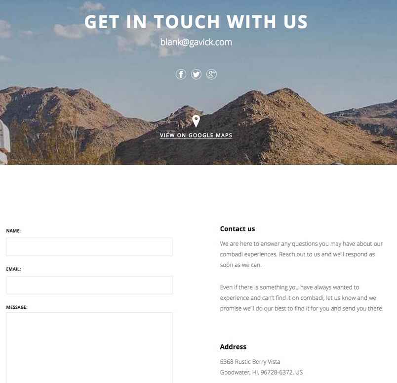
Creating a Contact Page
The demo content of Quark already includes an example contact page ready to be modified, but if you did not install the demo content or wish to create a new contact page, follow these steps:
- In your WordPress backend, click on Pages → Add New to open the Add New Page screen.
- Add the page title that you want to be displayed in the header to the Title field; text entered here will appear in large print in the header, like this:

- Copy the following HTML content into the mainbody of the page; this is just placeholder text that matches the demo content, but we will discuss how to modify it to your own needs in the next few sections:
<h3>Contact us</h3>
<p>We are here to answer any questions you may have about our combadi experiences. Reach out to us and we'll respond as soon as we can.</p>
<p>Even if there is something you have always wanted to experience and can't find it on combadi, let us know and we promise we'll do our best to find it for you and send you there.</p>


<h3>Address</h3>


<p>6368 Rustic Berry Vista<br />
Goodwater, HI, 96728-6372, US</p>


<big>+1 808 132 05 80</big><small>Open Monday to Saturday, 9.15am - 5.15pm</small>
- In the Page Attributes section in the right sidebar, click on the drop-down list under the Template section and select Contact Page.
- Click on the Set Featured Image text in the right sidebar and select an image from your media library; this image will be used as the parallax background image.
- Click on Publish at the top of the right sidebar to publish the page.
The basic contact page is now set, but the Newsletter and Contact information blocks at the bottom of the page are both set via widgets, so you'll need to set those up too.
Adding Existing Widgets to the Contact Page
The newsletter and contact information section at the bottom of the contact page are similar to those found on the frontpage, but since the contact page does not use a page-based layout these sections are instead created with text widgets with the same code as the frontpage sections.
If you installed Quark via the quickstart package or followed the installation guide you will already have these widgets ready to go, but you will need to assign them to your new contact page via the Widget Rules. More information on the Widget Rules plugin and how to use it to display widgets on specified pages only may be found in the Features → Widget Settings section of this guide.
Creating a New Newsletter Widget
If you did not install the quickstart or follow the installation guide and need to create the Newsletter section for your contact page, please check the installation guide and widget configuration here.
Creating a New Contact Information Widget
As with the Newsletter, if you do not already have a contact information widget created then you can do so very easily. Please follow the steps from Quark installation guide here.
Changing the Contact Page Header
The contact page's header is modified via a combination of page content and theme settings; specifically, the large title text is taken from the title of your contact page, whereas the subtitle text and social media/Google Map icons and links are controlled via the theme options.
Changing the Title Text
To change the title text, modify the text in the title field of your contact page; click on Pages → All Pages in the WordPress left menu and select your contact page, then make your changes. The title text will automatically be used as the large text on the header.
Changing the Background Image
The background image is taken from the Featured Image of your contact page. By changing the featured image you can set a new background. On the Edit Page screen click on the Set Featured Image text on the right of the screen.
If a featured image is already assigned that you wish to replace, then first click on Remove featured image to delete the image, and then you can click on the Set featured image text.
After clicking you will see your media library; select your preferred background image here and click on the Set Featured Image button in the bottom-right of the screen.
Click on Update to save changes to your page, and your background image is ready.
Changing the Social Media and Map Links
The social media icons and links, along with the Google Maps link at the bottom of the header, are all controlled with the Theme Customizer. In your WordPress backend, click on Appearance → Customise in the left menu to open the customizer. You will see a set of options on the left, and a view of the frontpage on the right.
In the frontpage preview, open your contact page via the menu. Once on a page with the Contact Page template assigned, a new set of options specifically for this page's social icons and links will appear.
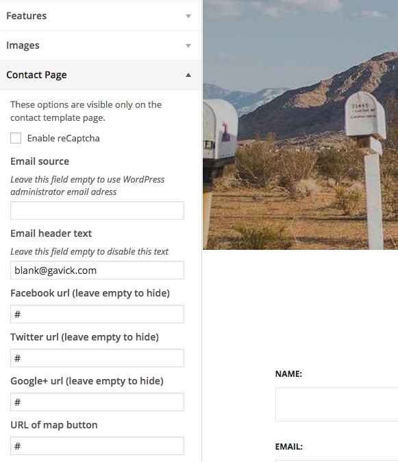
Click on the section to expand the options, and make your changes. More information on the settings and how to change them may be found in the Theme Settings section at the start of this guide.
Changing the Contact Mainbody Content
The mainbody content is created via simple HTML code added to the page mainbody field. The basic code looks like this:
    <h3>Contact us</h3>
    <p>We are here to answer any questions you may have about our combadi experiences. Reach out to us and we'll respond as soon as we can.</p>
    <p>Even if there is something you have always wanted to experience and can't find it on combadi, let us know and we promise we'll do our best to find it for you and send you there.</p>

    <h3>Address</h3>

    <p>6368 Rustic Berry Vista<br />
    Goodwater, HI, 96728-6372, US</p>

    <big>+1 808 132 05 80</big><small>Open Monday to Saturday, 9.15am - 5.15pm</small>
If we simplify the code by replacing the demo text with placeholder labels, you can see clearly where each piece of information should go:
    <h3>Right column title here</h3>
    <p>Right column first paragraph here</p>
    <p>Right column second paragraph here</p>

    <h3>Second right column title here</h3>

    <p>Address Line 1<br />
    Address line 2</p>

    <big>Phone Number Here</big><small>Opening days/times here</small>
The first <h3> tag creates the first title of the right-column's text, next to the contact form. This is followed by two plain text paragraphs in the two sets of <p> tags.
Next, a second <h3> heading highlights the second section, with a <p> tag containing address information; a <br /> line break separates the two lines of the address.
Finally, a <big> tag provides the large text for highlighting a phone number, and final <small> tag contains opening times and days.
Since none of these tags use any special classes or attributes, you may simply change the text between each tag to your liking. It does not necessarily need to list address and telephone numbers; you can add emails or alternative contact means as you see fit. If desired, you may also expand the content by adding more <h3>, <p>, <big> and <small> tags; the section will automatically expand to fit, but do bear in mind that the contact form is a set height, so it's recommended to keep the amount of content roughly similar to our demo to keep things in line. Also, you may remove any lines that you feel are unnecessary; this will not affect the aesthetics of the page as it will adjust itself to fit.
Modifying the Newsletter and Contact Info Sections
The two sections at the bottom provided by the widget are functionally similar to their frontpage counterparts, and the modifications and functionality covered in the frontpage section of this guide will apply to the widgets also. The code for both these widgets is the same as the frontpage versions with one minor difference; an opening <div> element with the site class has been added surrounding the entirety of the widget code. This should be ignored as it is essential to the widget displaying properly, but all other areas can be modified as per the frontpage guide.
The Our Team Page
The Our Team page is the most extensive and complex additional page included in Quark, and boasts a page-based layout similar to the frontpage:
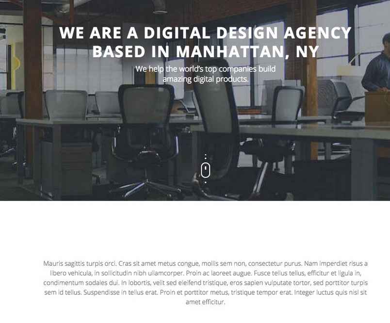
With sections covering introductions, press features, achievements and available positions, this page can be a great way to connect with your customers and add a human face to your company.
We will look at each section of the Our Team page in turn; as with the frontpage there is a base page, with sub-pages added to create the different sections in order.
Creating the Base Our Team Page
The basic Our Team page takes advantage of the One Page template included in Quark, that allows for longer, more content filled pages than ever before. The base page also includes the content for the page header:

The demo content includes the base page, called Our Team, but you can easily create your own base page if necessary. Simply click on Pages → Add New in the WordPress menu to open the Add New Page screen.
Next, give your page a title; this title won't be displayed so give it a name that makes it easy for you to identify. Next, copy the following HTML text into the mainbody:
<div class="gk-page">
<h1 data-sr="enter bottom and move 50px">We are a digital design agency based in Manhattan, NY</h1>
<h2 data-sr="enter bottom and move 50px and wait .2s">We help the world's top companies build<br>amazing digital products.</h2>
</div>
Now click on the Template drop-down list in the right-sidebar and select One-Page from the list. Finally, click on Set Featured Image and select an image to use as the header background from your Media Manager, and publish the page to save changes.
Your base page is now ready, and we can look at customizing the content.
Changing the Header Text
The header text is split into two; a large title and smaller subtitle text. The opening <div> element of the HTML code includes a gk-page class that is used to apply CSS rules, so it should be left unchanged. The text content is contained in the <h1> and <h2> tags that follow this <div> element, with the title text in the <h1> tag and the subtitle in the <h2> tag with a <br /> line break to move the subtitle to a new line for aesthetic reasons. If we swap out the demo text for simple placeholders, it looks like this:
<div class="gk-page">
<h1 data-sr="enter bottom and move 50px">Title Text Here</h1>
<h2 data-sr="enter bottom and move 50px and wait .2s">Subtitle Text Here</h2>
</div>
So, simply add your own title text between the <h1> tags, and subtitle text between the <h2> tags, using a <br /> tag to move to a new line if needed.
Changing the Background Image
The background image is pulled from the Featured Image of your base Our Team page and a parallax effect is applied via our CSS rules. By changing the featured image you can set a new background. On the Edit Page screen click on the Set Featured Image text on the right of the screen.
If a featured image is already assigned that you wish to replace, then first click on Remove featured image to delete the image, and then you can click on the Set featured image text.
After clicking you will see your media library; select your preferred background image here and click on the Set Featured Image button in the bottom-right of the screen.
Click on Update to save changes to your page, and your background image is ready.
The About Us Section
The second section of the Our Team page is a simple text block that uses a mixture of large and small text with an attribution at the end that's a great way to provide a personal face to your company:
This section is created from the first subpage of base Our Team page (that is, the page with the One Page template assigned as in the previous section). It uses some simple HTML code with classes to deliver its content. The base code from the demo looks like this:
<div class="gk-desc">
<p><span class="big-text">Mauris sagittis turpis orci. Cras sit amet metus congue, mollis sem non, consectetur purus. Nam imperdiet risus a libero vehicula, in sollicitudin nibh ullamcorper. Proin ac laoreet augue. Fusce tellus tellus, efficitur et ligula in, condimentum sodales dui. In lobortis, velit sed eleifend tristique, eros sapien vulputate tortor, sed porttitor turpis sem id tellus. Suspendisse in tellus erat. Proin et porttitor metus, tristique tempor erat. Integer luctus quis nisl sit amet efficitur.</span></p>
<p>Mauris sagittis turpis orci. Cras sit amet metus congue, mollis sem non, consectetur purus. Nam imperdiet risus a libero vehicula, in sollicitudin nibh ullamcorper. Proin ac laoreet augue. Fusce tellus tellus, efficitur et ligula in, condimentum sodales dui. In lobortis, velit sed eleifend tristique, eros sapien vulputate tortor, sed porttitor turpis sem id tellus. Suspendisse in tellus erat. Proin et porttitor metus, tristique tempor erat. Integer luctus quis nisl sit amet efficitur.</p>
<p>Sed eget tortor neque. Quisque viverra, justo sed aliquam mollis, odio tellus sollicitudin justo, sagittis dapibus sem orci in elit. Nullam sed consectetur nisl. Nam condimentum leo ac metus laoreet, in tincidunt lacus imperdiet. Integer at tempor sem. Donec dapibus dui nec lacus sollicitudin, eget facilisis justo elementum. Aenean bibendum nec velit sed condimentum.</p>
<p class="gk-signature">John Mahito, founder/ceo</p>
</div>
An opening <div> element with the gk-desc class attached provides the frame for the rest of this sections content. Then, a combination of a plain <p> tag and a <span> tag with a big-text class attached provides the large opening paragraph's text, and a second and third plain <p> tag contains the text for the second and third paragraphs with smaller text. Finally, another <p> tag with the special gk-signature class is used for the attribution at the end of the section.
Changing the About Us Content
The paragraph content is very simple to change; if we swap out the demo text with placeholders you can easily see where your own content should be placed:
<div class="gk-desc">
<p><span class="big-text">Large paragraph text here</span></p>
<p>First small paragraph text here</p>
<p>Second small paragraph text here</p>
<p class="gk-signature">Attribution text here</p>
</div>
You are not limited to using three paragraphs; you may add multiple <p> tags for more small text content, or recreate the <p> and <span> tags with the big-text class for more large-text paragraphs, and the height of the block will adjust automatically.
The Our Work In Numbers Section
This section creates counters much like the social counters of the frontpage, but with larger elements and extra overlaid title and subtitle texts as well as a parallax background effect:
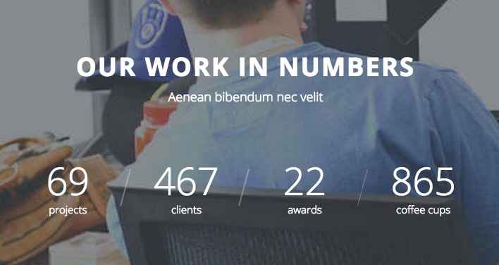
This section is created in the second subpage of the base Our Team page, and uses the following HTML code:
<div class="gk-big-text bigger-spaces parallax-bg">
<h2>Our work in numbers</h2>
<small>Aenean bibendum nec velit </small></div>
<div class="gk-counters">
<div class="gk-counter"><span data-sr="enter bottom" data-count="69">0</span><small>projects</small></div>
<div class="gk-counter"><span data-sr="enter bottom" data-count="467">0</span><small>clients</small></div>
<div class="gk-counter"><span data-sr="enter bottom" data-count="22">0</span><small>awards</small></div>
<div class="gk-counter"><span data-sr="enter bottom" data-count="865">0</span><small>coffee cups</small></div>
</div>
The opening <div> element creates the block the section's title and subtitle will go in, and applies the important styling using three classes that we've seen used on the frontpage; gk-big-text, which creates a larger font for the text, bigger-spaces, which increases the padding above and below the text to bring its size in line with other blocks on the page, and parallax-bg, which applies the parallax effect to the background image.
Following this are the title and subtitle text, created in the <h2> and <small> tags that follow the opening <div>. Then, the block for the counters is created with another <div> using the gk-counters class.
Next, the code for the counters are added. Each one follows the same pattern as we saw on the frontpage; a <div> with a gk-counter class is created, then a <span> tag is used to define the starting and ending number that the counter should use, with the ending number appearing in the data-count attribute in the opening <span> tag and the starting number (which will usually be zero) placed between the tags. Finally, a set of <small> tags contain the text that appears directly under the counter to tell people what the counter represents, like "clients" or "awards".
The parallax background image is automatically taken from the featured image for this subpage.
Changing the Title and Subtitle
The title and subtitle are very simple to modify; just add your own text between the <h2> tags for the title, and between the <small> tags for the subtitle:
<div class="gk-big-text bigger-spaces parallax-bg">
<h2>Title Text Here</h2>
<small>Subtitle Text Here</small></div>
Changing the Counter Numbers and Text
The counter numbers and text are formed within the individual <div> tags that use the gk-counter class:
<div class="gk-counter"><span data-sr="enter bottom" data-count="69">0</span><small>projects</small></div>
If we simplify the placeholder text in the code, you can see clearly where each piece of information should go:
<div class="gk-counter"><span data-sr="enter bottom" data-count="Counter Ending Number Here">Counter Starting Number Here</span><small>Text Under Counter Here</small></div>
As you can see, the ending number for the counter will go in the data-count attribute; this should be the total amount you want the counter to display. The starting number is entered between the opening and closing <span> tags, where text would usually be.
<span data-sr="enter bottom" data-count="Counter Ending Number Here">Counter Starting Number Here</span>
For the small text underneath the counter number, you should modify the content between the <small> tags before the closing </div> tag:
<small>Text Under Counter Here</small></div>
Adding Additional Counters
Should you wish to add additional counters to this section, you may do so by copying the full code for an individual counter from the opening to closing <div>:
<div class="gk-counter"><span data-sr="enter bottom" data-count="12">0</span><small>New counter</small></div>
and inserting it into the code before the final closing <div>:
<div class="gk-big-text bigger-spaces parallax-bg">
<h2>Our work in numbers</h2>
<small>Aenean bibendum nec velit </small></div>
<div class="gk-counters">
<div class="gk-counter"><span data-sr="enter bottom" data-count="69">0</span><small>projects</small></div>
<div class="gk-counter"><span data-sr="enter bottom" data-count="467">0</span><small>clients</small></div>
<div class="gk-counter"><span data-sr="enter bottom" data-count="22">0</span><small>awards</small></div>
<div class="gk-counter"><span data-sr="enter bottom" data-count="865">0</span><small>coffee cups</small></div>
<div class="gk-counter"><span data-sr="enter bottom" data-count="12">0</span><small>New counter</small></div>
</div>
Bear in mind that any new counters will be added to a new line, so it's a good idea to add at least two extra so that the two lines align.
Changing the Parallax Background Image
The background image is pulled from the Featured Image of your subpage and a parallax effect is applied via our CSS rules. By changing the featured image you can set a new background. On the Edit Page screen click on the Set Featured Image text on the right of the screen.
If a featured image is already assigned that you wish to replace, then first click on Remove featured image to delete the image, and then you can click on the Set featured image text.
After clicking you will see your media library; select your preferred background image here and click on the Set Featured Image button in the bottom-right of the screen.
Click on Update to save changes to your page, and your background image is ready.
The We Are Hiring Section
This section displays recruitment information for your company, highlighting any positions you currently have available in an elegant list:
This section is created in the third subpage of the Our Team page, using the following HTML code:
<div class="gk-desc bigger-spaces">
<h2>We are hiring</h2>
<dl>
<dt data-sr="enter bottom and move 50px">Project Manager</dt>
<dd data-sr="enter bottom and move 50px wait .2s">
<p>Lorem ipsum dolor sit amet, consectetur adipiscing elit. Proin consectetur dui at tempor elementum. Aenean convallis metus nec nibh varius hendrerit. Ut varius purus lectus, a pharetra mi blandit at. Integer ante leo, iaculis ut odio sit amet, dignissim pretium quam.</p>
<a href="#">Apply</a></dd>
<dt data-sr="enter bottom and move 50px wait .5s">Support Engineer</dt>
<dd data-sr="enter bottom and move 50px wait .7s">
<p>Lorem ipsum dolor sit amet, consectetur adipiscing elit. Proin consectetur dui at tempor elementum. Aenean convallis metus nec nibh varius hendrerit. Ut varius purus lectus, a pharetra mi blandit at. Integer ante leo, iaculis ut odio sit amet, dignissim pretium quam.</p>
<a href="#">Apply</a></dd>
</dl>
</div>
The opening <div> creates the block that all of this section's content will go into, with the gk-desc class assigned to target certain section-specific CSS rules, and a bigger-spaces class to increase the height of the block.
Next, the title is placed in an <h2> tag, followed by a description list <dl> tag that will create the listing. Then, each job entry is created using a <dt> tag for the job title, and a <dd> containing a <p> tag for the job description and an <a> link tag to create the "Apply" text and link. This format is then repeated, before the closing </dl> and </div> tags that end the block.
Changing the Section Title
The main title for the "We are hiring" section is created in the first <h2> tag straight after the opening <div>, so simply modify the text between these tags to change the title:
<div class="gk-desc bigger-spaces">
<h2>Title Text Here</h2>
Changing the Job Listing
The entire set of job listings are created using a description list <dl>, which is functionally similar to an ordered or unordered list, except that it includes specific tags for title <dt> and descriptions <dd>. The job listing consists of three parts; a title, a job description, and a link for further information or to apply. The text in the description is provided by two different tags; a <p> tag for the description itself, and an <a> tag for the link:
<dl>
<dt data-sr="enter bottom and move 50px">Job Title Here</dt>
<dd data-sr="enter bottom and move 50px wait .2s">
<p>Job Description Here</p>
<a href="/Link URL Here">Link Text Here</a></dd>
To change the job title of the listing, modify the text between the opening and closing <dt> tag:
<dt data-sr="enter bottom and move 50px">Job Title Here</dt>
For the description, modify the text between the <p> tags in the <dd>:
<dd data-sr="enter bottom and move 50px wait .2s">
<p>Job Description Here</p>
For the link, change the text between the <a> tags to modify the link text, and add a URL to the href attribute in the opening tag to define where the link text will lead when clicked.
Adding More Job Listings
There is no hard limit on the number of job listings you may add; each new listing will add an extra numbered job detail block, and the section will automatically increase its vertical size to accommodate. To add a new listing, duplicate the code from the <dt> tag, that creates the title, to the closing </dd> tag, where the description ends:
<dt data-sr="enter bottom and move 50px">Job Title Here</dt>
<dd data-sr="enter bottom and move 50px wait .2s">
<p>Job Description Here</p>
<a href="/Link URL Here">Link Text Here</a></dd>
Add this block of code to the end of the full code, before the closing </dl> tag. For example, the base code looks like this:
<div class="gk-desc bigger-spaces">
<h2>Title Text Here</h2>
<dl>
<dt data-sr="enter bottom and move 50px">Job Title Here</dt>
<dd data-sr="enter bottom and move 50px wait .2s">
<p>Job Description Here</p>
<a href="/Link URL Here">Link Text Here</a></dd>
<dt data-sr="enter bottom and move 50px">Job Title Here</dt>
<dd data-sr="enter bottom and move 50px wait .2s">
<p>Job Description Here</p>
<a href="/Link URL Here">Link Text Here</a></dd>
</dl>
</div>
With two job listings. By adding two more of the listing code blocks, we can have four listings:
<div class="gk-desc bigger-spaces">
<h2>First Title Text Here</h2>
<dl>
<dt data-sr="enter bottom and move 50px">Job Title Here</dt>
<dd data-sr="enter bottom and move 50px wait .2s">
<p>First Job Description Here</p>
<a href="/Link URL Here">First Link Text Here</a></dd>
<dt data-sr="enter bottom and move 50px">Second Job Title Here</dt>
<dd data-sr="enter bottom and move 50px wait .2s">
<p>Second Job Description Here</p>
<a href="/Link URL Here">Second Link Text Here</a></dd>
<dt data-sr="enter bottom and move 50px">Third Job Title Here</dt>
<dd data-sr="enter bottom and move 50px wait .2s">
<p>Third Job Description Here</p>
<a href="/Link URL Here">Third Link Text Here</a></dd>
<dt data-sr="enter bottom and move 50px">Fourth Job Title Here</dt>
<dd data-sr="enter bottom and move 50px wait .2s">
<p>Fourth Job Description Here</p>
<a href="/Link URL Here">Fourth Link Text Here</a></dd>
</dl>
</div>
Repeat this process to add additional listings as desired.
The Everything is Designed Section
This section is basic parallax background with overlaid title and subtitle:

This section is created in the fourth subpage the base Our Team page, and uses the following HTML code:
<div class="gk-big-text bigger-spaces">
<h2 data-sr="enter top and move 50px">Everything is designed <br />Few things are designed well</h2>
<small data-sr="enter bottom and move 50px">Our philosophy</small></div>
The first <div> contain creates the block and add the gk-big-text class, that sets larger font sizes, and the bigger-spaces class, that increases the padding at the top and bottom of the block to increase the overall size in line with the other blocks.
This is followed by the title text in the <h2> tags, with a <br /> tag used to start a new line. Finally, the subtitle text is added in a pair of <small> tags.
For the parallax background image, the Featured Image of the subpage is automatically taken.
Changing the Section Content
The content here is very easy to change; simply change the text between the <h2> tags to modify the title; it's not necessary to use a line break <br /> tag in your text, but it's a good way of ensuring a particular text layout as the page responds to screen size. For the subtitle, change the content between the <small> tags. Make sure to leave the opening and closing <div> tags untouched, as they help target the CSS correctly.
The simplified code for this section, with placeholders marking what goes where, looks like this:
<div class="gk-big-text bigger-spaces">
<h2 data-sr="enter top and move 50px">Title Text Here</h2>
<small data-sr="enter bottom and move 50px">Subtitle Text Here</small></div>
Changing the Background Image
The background image is pulled from the Featured Image of the subpage and a parallax effect is applied via our CSS rules. By changing the featured image you can set a new background. On the Edit Page screen click on the Set Featured Image text on the right of the screen.
If a featured image is already assigned that you wish to replace, then first click on Remove featured image to delete the image, and then you can click on the Set featured image text.
After clicking you will see your media library; select your preferred background image here and click on the Set Featured Image button in the bottom-right of the screen.
Click on Update to save changes to your page, and your background image is ready.
The Press Section
The press section highlights logos of media sites or companies that have featured your work:

Comprising of an intro sentence and logo images, the basic code from the demo is from the fifth subpage of the Our Team base page, and it looks like this:
<div class="gk-desc small-spaces">
<p><em>We've been featured in the press by these great websites</em></p>
<p>
<img src="http://localhost/quark/wp-content/uploads/2015/02/logo1.jpg" alt="logo1" data-sr="enter bottom and move 50px wait .2s" />
<img src="http://localhost/quark/wp-content/uploads/2015/02/logo2.jpg" alt="Logo II" data-sr="enter bottom and move 50px wait .3s" /> <img src="http://localhost/quark/wp-content/uploads/2015/02/logo3.jpg" alt="Logo III" data-sr="enter bottom and move 50px wait .4s" /> <img src="http://localhost/quark/wp-content/uploads/2015/02/logo4.jpg" alt="Logo IV" data-sr="enter bottom and move 50px wait .5s" /> <img src="http://localhost/quark/wp-content/uploads/2015/02/logo5.jpg" alt="Logo V" data-sr="enter bottom and move 50px wait .6s" /></p>
</div>
Although it seems a bit complex, it is in fact very simple; a <div> tag is opened with the gk-desc class, that centralizes the text, and the small-spaces class, which add small padding to the top and bottom of the block, attached to the tag.
Then, the intro sentence is created with a combination <p> and <em> tag to create the italic text.
Next, another <p> tag is opened, and inside this are <img> tags that are used to display each of the images with their own reveal animation, before the code is closed with a closing </div>.
Changing the Italic Sentence
The italic sentence is created in the combined <p> and <em> tags right after the opening <div>:
<div class="gk-desc small-spaces">
<p><em>Your Intro Text Here</em></p>
Just enter your intro sentence text between these two tags. Alternatively, if you don't want to use italics, you can remove the <em> tags and just use the plain <p> tags:
<div class="gk-desc small-spaces">
<p>Your Intro Text Here</p>
Changing the Images
Each image is contained in a single <img> tag. This tag contains a src attribute, which in turn contains the link to the image you want to display, either from your media library or an external source:
<img src="/Image URL Here" alt="Logo II" data-sr="enter bottom and move 50px wait .3s" />
To change each image, you will need to modify the src attribute to point to your chosen image.
To get the link for an image in your Media Library, follow these steps:
- In your WordPress backend, navigate to your media library.
- Once on the media library screen, click on the image that you wish to use; you will be taken to the Edit Image screen.
- In the top-right corner of the screen is an Attributes section, with a field called Image URL. Copy the entire URL from this field and paste it into the src attribute of the above HTML code.
There are a total of five <img> tags in the demo content, but you may add more if necessary; additional logos beyond the initial five will be added to a new line from the center, keeping them in balance with the line above. To add new images, simply add another <img> tag as needed; it's recommended to also copy the data-sr attribute from another existing <img> as this creates the reveal animation:
<img src="/Image URL Here" alt="You Alt Name Here" data-sr="enter bottom and move 50px wait .3s" />
Make sure that any images are added before the closing </p> tag of the code.
The Testimonials Section
The testimonials section is created from the sixth subpage of the base Our Team page, and like the frontpage version, can display an image with quote and attribution underneath. The difference here is that the section can be used to introduce your team's avatars and provide introductory information about them, rather than pure testimonials:
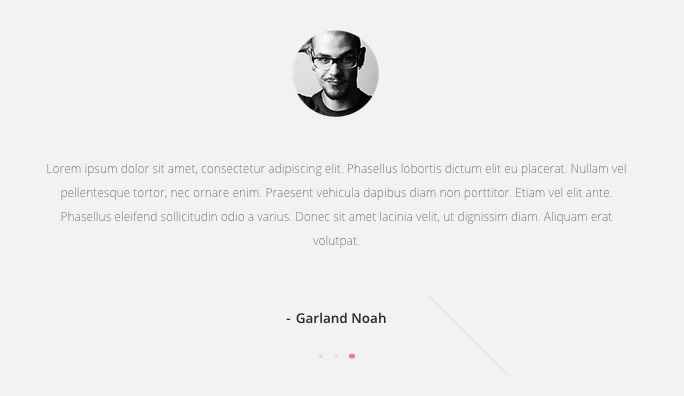
The HTML code used for this section looks like this:
<div class="gk-testimonials gray-bg site" data-sr="scale up 50%" data-amount="3">
<div>
<div>
<blockquote><img src="http://localhost/quark/wp-content/uploads/2015/02/testimonials_avatar.png" alt="testimonials_avatar" />
<p>Lorem ipsum dolor sit amet, consectetur adipiscing elit. Phasellus lobortis dictum elit eu placerat. Nullam vel pellentesque tortor, nec ornare enim. Praesent vehicula dapibus diam non porttitor. Etiam vel elit ante. Phasellus eleifend sollicitudin odio a varius. Donec sit amet lacinia velit, ut dignissim diam. Aliquam erat volutpat.</p>
<strong>Garland Noah</strong></blockquote>
</div>
</div>
</div>
This code is almost exactly the same as the testimonials section on the frontpage, except for the addition of a gray-bg class to the opening <div> to change the background color for this section. The opening <div> element utilizes two special classes for styling purposes; gk-testimonials and site. There are also two attributes used to set the number of testimonial blocks (data-amount) and a styling attribute that should be used, but not changed (data-sr).
After this is the testimonial content, which consists of three testimonials just like the frontpage, each consisting of an <img> tag for the avatar, a <p> tag for the description, and a <strong> tag for the name of the person quoted, all wrapped up in a <blockquote>. So each individual testimonial is contained within a single set of <blockquote> tags.
Changing the Testimonial Content
The individual testimonials are contained within the <blockquote> tags; if you check the code above you'll notice that there are three sets of <blockquote> tags, each containing an <img>, <p> and <strong> tag:
<blockquote><img src="http://localhost/quark/wp-content/uploads/2015/02/testimonials_avatar.png" alt="testimonials_avatar" />
<p>Lorem ipsum dolor sit amet, consectetur adipiscing elit. Phasellus lobortis dictum elit eu placerat. Nullam vel pellentesque tortor, nec ornare enim. Praesent vehicula dapibus diam non porttitor. Etiam vel elit ante. Phasellus eleifend sollicitudin odio a varius. Donec sit amet lacinia velit, ut dignissim diam. Aliquam erat volutpat.</p>
<strong>Garland Noah</strong></blockquote>
<blockquote><img src="http://localhost/quark/wp-content/uploads/2015/02/testimonials_avatar.png" alt="testimonials_avatar" />
<p>Lorem ipsum dolor sit amet, consectetur adipiscing elit. Phasellus lobortis dictum elit eu placerat. Nullam vel pellentesque tortor, nec ornare enim. Praesent vehicula dapibus diam non porttitor. Etiam vel elit ante. Phasellus eleifend sollicitudin odio a varius. Donec sit amet lacinia velit, ut dignissim diam. Aliquam erat volutpat.</p>
<strong>Garland Noah</strong></blockquote>
<blockquote><img src="http://localhost/quark/wp-content/uploads/2015/02/testimonials_avatar.png" alt="testimonials_avatar" />
<p>Lorem ipsum dolor sit amet, consectetur adipiscing elit. Phasellus lobortis dictum elit eu placerat. Nullam vel pellentesque tortor, nec ornare enim. Praesent vehicula dapibus diam non porttitor. Etiam vel elit ante. Phasellus eleifend sollicitudin odio a varius. Donec sit amet lacinia velit, ut dignissim diam. Aliquam erat volutpat.</p>
<strong>Garland Noah</strong></blockquote>
Let's look at a single testimonial's code and add simple placeholder text to make it easy to see how each section is created:
<blockquote><img src="/Testimonial Image Link Here" alt="Alt Name Here" />
<p>Testimonial Quote Here</p>
<strong>Testimonial Name Here</strong></blockquote>
As you can see, the code is not complex once you break it down to its core parts. From here, we can easily modify each section of the testimonial.
Changing the Image
The image is set in the src attribute of the <img> tag; simply copy and paste the link to your chosen image into this attribute between the quotation marks. Images may be from your Media Library or external sources.
<img src="/Testimonial Image Link Here" alt="Alt Name Here" />
To get the link for an image in your Media Library, follow these steps:
- In your WordPress backend, navigate to your media library.
- Once on the media library screen, click on the image that you wish to use; you will be taken to the Edit Image screen.
- In the top-right corner of the screen is an Attributes section, with a field called Image URL. Copy the entire URL from this field and paste it into the src attribute of the above HTML code.
Changing the Quote Text
Under the image is the quotation text, which in the code is contained in the <p> tag under the <img> tag. All you need to do is add your own text between the tags.
<p>Testimonial Quote Here</p>
Changing the Atrribution Text
At the bottom of the testimonial is an attribution showing the name of the person or company that provided the quotation. This section is contained in the <strong> tags that appear just before the closing </blockquote> tags. Modify the text between these tags to create your attribution name.
<strong>Testimonial Name Here</strong>
Adding Additional Testimonials
There is no limit on the number of testimonials you may add to this section, though it's prudent to avoid overloading this section as too many large files like images can slow down the load-time for your site.
To add new testimonials, you must do two things. First, you must change the data-amount attribute in the opening <div> tag of the HTML code used on this page to match the number of testimonials you wish to display:
<div class="gk-testimonials site" data-sr="scale up 50%" data-amount="Number of Testimonials Here">
So if you have 5 testimonials, add that into your code:
<div class="gk-testimonials site" data-sr="scale up 50%" data-amount="5">
Next, you'll need to add the additional testimonial content to your HTML code. As we've already covered, each testimonial is made up of a <blockquote> tag containing an <img> tag, a <p> tag and a <strong> tag. So, we should recreate the code between the blockquote tags (including the tags themselves) and add it to the end of the existing HTML code before the closing <div> tags.
The basic code with three testimonials might look like this:
<div class="gk-testimonials gray-bg site" data-sr="scale up 50%" data-amount="3">
<div>
<div>
<blockquote><img src="/First Image URL" alt="First Alt Title" />
<p>First Testimonial Text</p>
<strong>First Testimonial Attribution</strong></blockquote>
<blockquote><img src="/Second Image URL" alt="Second Alt Title" />
<p>Second Testimonial Text</p>
<strong>Second Testimonial Attribution</strong></blockquote>
<blockquote><img src="/Third Image URL" alt="Third Alt Title" />
<p>Third Testimonial Text</p>
<strong>Third Testimonial Attribution</strong></blockquote>
</div>
</div>
</div>
And when changed to include 5 testimonials, the code might look like this:
<div class="gk-testimonials gray-bg site" data-sr="scale up 50%" data-amount="5">
<div>
<div>
<blockquote><img src="/First Image URL" alt="First Alt Title" />
<p>First Testimonial Text</p>
<strong>First Testimonial Attribution</strong></blockquote>
<blockquote><img src="/Second Image URL" alt="Second Alt Title" />
<p>Second Testimonial Text</p>
<strong>Second Testimonial Attribution</strong></blockquote>
<blockquote><img src="/Third Image URL" alt="Third Alt Title" />
<p>Third Testimonial Text</p>
<strong>Third Testimonial Attribution</strong></blockquote>
<blockquote><img src="/Fourth Image URL" alt="Fourth Alt Title" />
<p>Fourth Testimonial Text</p>
<strong>Fourth Testimonial Attribution</strong></blockquote>
<blockquote><img src="/Fifth Image URL" alt="Fifth Alt Title" />
<p>Fifth Testimonial Text</p>
<strong>Fifth Testimonial Attribution</strong></blockquote>
</div>
</div>
</div>
The Social Counters, Newsletter and Contact Details Sections
These three sections are taken from the sixth, seventh and eighth subpage of the base Our Team page, and utilize exactly the same code as the same sections on the frontpage. For more information on modifying these sections to suit your needs, please check the Frontpage Elements section of this guide.
The Gallery Page
The Gallery page allows the creation of touch-friendly image galleries that are a great way to show off your Quarks or portfolio:

Images are displayed in a masonry-style layout; click or touching an image will zoom in. Users can then zoom further, share or view images in fullscreen, and swipe to move between each image in sequence.
Gallery Page Structure
The Gallery page is the same as any other page with no special template added; just a specific HTML structure. The page can be split into two sections; the header, and the image gallery itself.
Like with the other basic pages, the header title text is taken from the title field of the page, with the date of publication automatically added underneath.
For the gallery content, HTML code is used. The base code used in the demo is as follows:
<div class="site">
<div class="gk-cols gk-gallery" data-cols="3">
<div>
<a href="http://localhost/quark/wp-content/themes/Quark/images/gallery/image1.jpg" data-size="1280x1280" data-title="Modern clock" data-desc="Lorem ipsum dolor sit amet, consectetur adipiscing elit. Proin consectetur dui at tempor elementum. Aenean convallis metus nec nibh varius hendrerit."><img src="http://localhost/quark/wp-content/themes/Quark/images/gallery/thumb1.jpg" height="334" width="334" alt="Thumbnail I" /></a>
<a href="http://localhost/quark/wp-content/themes/Quark/images/gallery/image2.jpg" data-size="1280x853" data-title="Painting love" data-desc="Lorem ipsum dolor sit amet, consectetur adipiscing elit. Proin consectetur dui at tempor elementum. Aenean convallis metus nec nibh varius hendrerit."><img src="http://localhost/quark/wp-content/themes/Quark/images/gallery/thumb2.jpg" height="224" width="335" alt="Thumbnail II" /></a>
<a href="http://localhost/quark/wp-content/themes/Quark/images/gallery/image3.jpg" data-size="1164x872" data-title="Green Barrel" data-desc="Lorem ipsum dolor sit amet, consectetur adipiscing elit. Proin consectetur dui at tempor elementum. Aenean convallis metus nec nibh varius hendrerit."><img src="http://localhost/quark/wp-content/themes/Quark/images/gallery/thumb3.jpg" height="251" width="335" alt="Thumbnail III" /></a>
<a href="http://localhost/quark/wp-content/themes/Quark/images/gallery/image4.jpg" data-size="1280x853" data-title="Wooden doors" data-desc="Lorem ipsum dolor sit amet, consectetur adipiscing elit. Proin consectetur dui at tempor elementum. Aenean convallis metus nec nibh varius hendrerit."><img src="http://localhost/quark/wp-content/themes/Quark/images/gallery/thumb4.jpg" height="224" width="335" alt="Thumbnail IV" /></a>
<a href="http://localhost/quark/wp-content/themes/Quark/images/gallery/image5.jpg" data-size="852x1280" data-title="Japanese dinner" data-desc="Lorem ipsum dolor sit amet, consectetur adipiscing elit. Proin consectetur dui at tempor elementum. Aenean convallis metus nec nibh varius hendrerit."><img src="http://localhost/quark/wp-content/themes/Quark/images/gallery/thumb5.jpg" height="504" width="335" alt="Thumbnail V" /></a>
</div>
<div>
<a href="http://localhost/quark/wp-content/themes/Quark/images/gallery/image6.jpg" data-size="853x1280" data-title="Quarkgraphy art" data-desc="Lorem ipsum dolor sit amet, consectetur adipiscing elit. Proin consectetur dui at tempor elementum. Aenean convallis metus nec nibh varius hendrerit."><img src="http://localhost/quark/wp-content/themes/Quark/images/gallery/thumb6.jpg" height="457" width="305" alt="Thumbnail VI" /></a>
<a href="http://localhost/quark/wp-content/themes/Quark/images/gallery/image7.jpg" data-size="1280x853" data-title="Sailing in the fog" data-desc="Lorem ipsum dolor sit amet, consectetur adipiscing elit. Proin consectetur dui at tempor elementum. Aenean convallis metus nec nibh varius hendrerit."><img src="http://localhost/quark/wp-content/themes/Quark/images/gallery/thumb7.jpg" height="203" width="305" alt="Thumbnail VII" /></a>
<a href="http://localhost/quark/wp-content/themes/Quark/images/gallery/image8.jpg" data-size="1280x853" data-title="Travel time" data-desc="Lorem ipsum dolor sit amet, consectetur adipiscing elit. Proin consectetur dui at tempor elementum. Aenean convallis metus nec nibh varius hendrerit."><img src="http://localhost/quark/wp-content/themes/Quark/images/gallery/thumb8.jpg" height="204" width="305" alt="Thumbnail VIII" /></a>
<a href="http://localhost/quark/wp-content/themes/Quark/images/gallery/image9.jpg" data-size="960x1280" data-title="For ged" data-desc="Lorem ipsum dolor sit amet, consectetur adipiscing elit. Proin consectetur dui at tempor elementum. Aenean convallis metus nec nibh varius hendrerit."><img src="http://localhost/quark/wp-content/themes/Quark/images/gallery/thumb9.jpg" height="406" width="305" alt="Thumbnail IX" /></a>
<a href="http://localhost/quark/wp-content/themes/Quark/images/gallery/image10.jpg" data-size="1280x853" data-title="Summer time" data-desc="Lorem ipsum dolor sit amet, consectetur adipiscing elit. Proin consectetur dui at tempor elementum. Aenean convallis metus nec nibh varius hendrerit."><img src="http://localhost/quark/wp-content/themes/Quark/images/gallery/thumb10.jpg" height="203" width="305" alt="Thumbnail X" /></a>
</div>
<div>
<a href="http://localhost/quark/wp-content/themes/Quark/images/gallery/image11.jpg" data-size="1280x853" data-title="Mobile music" data-desc="Lorem ipsum dolor sit amet, consectetur adipiscing elit. Proin consectetur dui at tempor elementum. Aenean convallis metus nec nibh varius hendrerit."><img src="http://localhost/quark/wp-content/themes/Quark/images/gallery/thumb11.jpg" height="198" width="297" alt="Thumbnail XI" /></a>
<a href="http://localhost/quark/wp-content/themes/Quark/images/gallery/image12.jpg" data-size="1155x1280" data-title="Guitar artist" data-desc="Lorem ipsum dolor sit amet, consectetur adipiscing elit. Proin consectetur dui at tempor elementum. Aenean convallis metus nec nibh varius hendrerit."><img src="http://localhost/quark/wp-content/themes/Quark/images/gallery/thumb12.jpg" height="329" width="297" alt="Thumbnail XII" /></a>
<a href="http://localhost/quark/wp-content/themes/Quark/images/gallery/image13.jpg" data-size="873x1280" data-title="Typewriter" data-desc="Lorem ipsum dolor sit amet, consectetur adipiscing elit. Proin consectetur dui at tempor elementum. Aenean convallis metus nec nibh varius hendrerit."><img src="http://localhost/quark/wp-content/themes/Quark/images/gallery/thumb13.jpg" height="436" width="297" alt="Thumbnail XIII" /></a>
<a href="http://localhost/quark/wp-content/themes/Quark/images/gallery/image14.jpg" data-size="1280x853" data-title="Morning coffee" data-desc="Lorem ipsum dolor sit amet, consectetur adipiscing elit. Proin consectetur dui at tempor elementum. Aenean convallis metus nec nibh varius hendrerit."><img src="http://localhost/quark/wp-content/themes/Quark/images/gallery/thumb14.jpg" height="199" width="297" alt="Thumbnail XIV" /></a>
<a href="http://localhost/quark/wp-content/themes/Quark/images/gallery/image15.jpg" data-size="1280x848" data-title="Fitness time" data-desc="Lorem ipsum dolor sit amet, consectetur adipiscing elit. Proin consectetur dui at tempor elementum. Aenean convallis metus nec nibh varius hendrerit."><img src="http://localhost/quark/wp-content/themes/Quark/images/gallery/thumb15.jpg" height="196" width="297" alt="Thumbnail XV" /></a>
</div>
</div>
</div>
The first two <div> elements of this code are essential, as they define that the gallery style and effects are to be used, and also define the number of columns for the content.
<div class="site">
<div class="gk-cols gk-gallery" data-cols="3">
The site class is used for CSS targeting, while the gk-cols class in the second <div> declares that the section will be split into columns. The gk-gallery class sets that the page will be displaying a gallery, and ensure the correct CSS style and effects are added. Finally, the data-cols attribute declares the number of columns that will be used and adjusts the block layout accordingly.
Following this is the gallery content. A new <div> element is added, which will contain a single column's images. Inside this <div> are the images; each image is made up of an <a> tag that includes a link to the image in the href attribute (the gallery code will use this to provide the zoom) and three additional attributes; data-size, which sets the size of the image when zoomed, data-title, which sets the title displayed when the image is zoomed, and data-desc, which provides the description that appears to the right of the title in the zoomed image:

Following the opening <a> tag is an <img> tag, which will provide the image details. The src attribute includes the link URL to the image in your media library (this will be the same as it was in the href attribute of the <a> tag), and the other two attributes, height and width, define the size of the image when it is displayed in the plain gallery page without zoom:

The full code for a single image in the gallery looks like this:
<a href="/Image URL Here" data-size="Zoomed Image Size Here" data-title="Zoomed Image Title Here" data-desc="Zoom Image Description Here"><img src="/Image URL Here" height="Height on Gallery Page here" width="Width on Gallery Page here" alt="Alt Image Title Here" /></a>
This layout is then repeated for however many images are in the column; in the demo content there are five. Then, the <div> for the column is closed, and a new <div> created to contain the second column's images, and so on until the set number of columns and images is complete.
Let's look at building an Gallery Page from scratch to better understand how it works.
Creating a Gallery Page
To create a gallery page requires only some specific HTML code to be added to a page; no special templates or other elements need to be taken. To create a Gallery page ready for you to add images to, navigate to your WordPress backend and click on Pages → Add New to open the Add New Page screen. Enter your page title in the Title field; this title will be displayed automatically in the header with the date of publication added underneath.
Now we can start creating the gallery. Start by adding the first <div> element with the site class attached:
<div class="site">
Next, you'll need to decide how many columns of images you want to use. In the demo there are 3 columns, but you can use more or less as you see fit. Just remember that the images will be shifted underneath each other on a smaller screen, so try to avoid overloading.
Let's say we want to use three columns of images, just like in the demo. We will need to add a second <div> element with the gk-gallery and gk-cols classes attached, to declare that the page is for a gallery and will split the page into columns. Then, we can add the data-cols attribute and set its value to the number of columns we want:
<div class="site">
<div class="gk-cols gk-gallery" data-cols="3">
Better add the closing </div> tags too, to be safe:
<div class="site">
<div class="gk-cols gk-gallery" data-cols="3">

</div>
</div>
Now we have the basic structure for the gallery page ready. Next, we will need to define the columns, and then add the images as necessary. In this example we're going to have three columns of content. Each column will be contained in a separate <div>, so let's add three sets of opening and closing <div> tags to our existing code:
<div class="site">
<div class="gk-cols gk-gallery" data-cols="3">

<div>
First Column Content Here
</div>
<div>
Second Column Content Here
</div>
<div>
Third Column Content Here
</div>

</div>
</div>
Now all that's left is for us to add each column's images, using <a> and <img> tags, to their respective <div> blocks.
Adding Images to a Column
So we have the basic HTML structure; the opening <div> elements define the number of columns and type of content, and then three sets of <div> tags define the three columns. Let's look at how to add an image to a column next.
Usually, adding an image consists of just using an <img> tag with a link to the image you wish to use from your media library, but since this gallery page includes special options, including zoom, swipe and sharing functionality, the image code is a little more complex.
First, we need to know the URL for the image we wish to use. This can be found by clicking on the image in your media library (Media → Library in your WordPress backend) and copying the URL from the URL field in the top-right of the screen:
Once you have the image URL, we need to define two different properties of the image; how it will look on the base gallery page, and how it will look when zoomed in (i.e. when a user clicks or taps on the image).
The code for how the image looks when zoomed in is contained in an <a> tag. When adding this tag, you'll need to define an href attribute, which will be the image URL we just grabbed:
<div>
<a href="/Image URL Here"></a>
</div>
Then we'll need to add three very important attributes that will define the title displayed on the left under the zoomed image, the description that will appear on the right under the zoomed image, and the total size of the zoomed image. The attributes used for this are:
- data-size - Defines the size of the zoomed image in pixels using the format WidthxHeight (e.g. 800x600), just like when defining screen resolution.
- data-title - Sets the title text.
- data-desc - Sets the description text.
Once we've added these elements to our code it should look something like this:
<div class="site">
<div class="gk-cols gk-gallery" data-cols="3">

<div>
<a href="/Image URL Here" data-size="800x600" data-title="My First Image" data-desc="An image taken with my camera"></a>
</div>
<div>
Second Column Content Here
</div>
<div>
Third Column Content Here
</div>

</div>
</div>
Now we've got the code for our first image's looks when zoomed, we also need to define how it looks on the basic page. To do this, we'll use an <img> tag with the standard attributes; that is, src with the image URL, and Alt for the alternate title. This should be added between the opening and closing <a> tag:
<div>
<a href="/Image URL Here" data-size="800x600" data-title="My First Image" data-desc="An image taken with my camera"><img src="/Image URL Here" Alt="Alt Title Here" /></a>
</div>
When this is added to the code, we'll have the first image in the first column ready. Now we can repeat the process of adding <a> and <img> tags to the <div> to define the other images in the column; for this example let's add four images. Once done, the code should look like this:
<div class="site">
<div class="gk-cols gk-gallery" data-cols="3">

<div>
<a href="/Image URL Here" data-size="800x600" data-title="My First Image" data-desc="First Image Desc"><img src="/Image URL Here" Alt="Alt Title Here" /></a>
<a href="/Image URL Here" data-size="800x600" data-title="My Second Image" data-desc="Second Image Desc"><img src="/Image URL Here" Alt="Alt Title Here" /></a>
<a href="/Image URL Here" data-size="800x600" data-title="My Third Image" data-desc="Third Image Desc"><img src="/Image URL Here" Alt="Alt Title Here" /></a>
<a href="/Image URL Here" data-size="800x600" data-title="My Fourth Image" data-desc="Fourth Image Desc"><img src="/Image URL Here" Alt="Alt Title Here" /></a>
</div>
<div>
Second Column Content Here
</div>
<div>
Third Column Content Here
</div>

</div>
</div>
So now we have one full column of four images. We can now repeat the image-adding process to create the next two columns of content, with four images each:
<div class="site">
<div class="gk-cols gk-gallery" data-cols="3">

<div>
<a href="/Image URL Here" data-size="800x600" data-title="My First Image" data-desc="First Image Desc"><img src="/Image URL Here" Alt="Alt Title Here" /></a>
<a href="/Image URL Here" data-size="800x600" data-title="My Second Image" data-desc="Second Image Desc"><img src="/Image URL Here" Alt="Alt Title Here" /></a>
<a href="/Image URL Here" data-size="800x600" data-title="My Third Image" data-desc="Third Image Desc"><img src="/Image URL Here" Alt="Alt Title Here" /></a>
<a href="/Image URL Here" data-size="800x600" data-title="My Fourth Image" data-desc="Fourth Image Desc"><img src="/Image URL Here" Alt="Alt Title Here" /></a>
</div>

</div>
</div>
And this is how the complete code should look, with two opening <div> elements to set the classes, then each column contained within a <div>, and each image made up of an <a> and <img> tag.
Your gallery page is now ready, so play around and see how things work for you!
Font Awesome
Font Awesome is an incredibly useful font for delivering scalable icons to your site. With over 500 icons available covering a wide range of topics, from popular social media icons to transportation and payment icons, there's something for every type of site available.
How It Works
Font Awesome functionality is included as standard with Quark, so you can start using their icons immediately. Icons are added to content using an icon <i> tag with a particular class attached that corresponds to the icon you want to display.
Every icon in the Font Awesome set has a class name beginning with fa, such as fa-pinterest for the Pinterest icon. To use an icon, this class name must be inserted into the <i> tag using the following format:
<i class="fa fa-ClassName"></i>
Notice that fa appears twice in the class attribute; the first time to declare the use of Font Awesome, and the second time as part of the icon's class name. For example, to insert the Pinterest icon mentioned above, the code would be:
<i class="fa fa-pinterest"></i>
A full list of available icons and their respective class names may be found at the bottom of our Quark demo's Typography Page.
The tags should always be left blank, with no text between the opening and closing tags. You may insert these tags anywhere you are entering standard HTML content, including any of our frontpage sections, or in your pages and posts.
The WYSIWYG (What You See Is What You Get) Editor that WordPress defaults to when editing posts and pages will usually clean up blank tags; that is, tags with no content between them. This will include <i> tags that create Font Awesome icons, since they do not have any text between the opening and closing tags. To counter this issue, make sure to only use the plain text editor when adding icons.
Reveal Animations
The reveal animations that are often used in Quark are provided by the powerful ScrollReveal JavaScript Library. This library allows animations to be added to nearly every HTML element in your code via the use of a data-sr attribute; you may have noticed when modifying the code for the frontpage elements or additional pages that they often had this data-sr attribute attached to control the animation.
When this attribute is added to an HTML tag, that element will be animated into place using a default reveal animation:
<h2 data-sr>My Title</h2>
However, ScrollReveal also includes multiple keywords that you can use to define the reveal animation using simple, understandable language. For example, the keyword "over Xs", where "X" is a time in seconds, will control the speed of the animation so that it take the value of "x" to complete. So, a value of:
<h2 data-sr="over 2s">My Title</h2>
Will cause the default animation to take two seconds to complete. Similarly, there are many keywords for controlling the type of animation. using the enter keyword will let you define the direction from which the animation will start (top, left, right, and bottom), while move can define the distance (in pixels) the animated element should move. Combine them together with the over keyword, and you will have something like this:
<h2 data-sr="Enter left move 24px over 2s">My Title</h2>
So with this setting, the title will appear 24px to the left of its final position, and will move right 24px to the final position over two seconds.
There are many more keywords that let you delay the animation, flip, spin, rotate and scale the element, and control attributes like starting opacity. A full list of the available keywords and their respective functions may be found on the ScrollReveal GitHub page.
Page-Load Animations
Quark includes the ability to display animations as pages load, to avoid users from seeing the page before it is ready to view.

This animation is provided via a gif file called default.gif stored in the wp-content/Quark/images/preloaders folder of your WordPress installation. This default animation is designed to suit the aesthetics of the theme, but if you're interested using your own animation it's very easy to replace.
- First, create your animation and save as a gif file; there are many programs online to help you with this.
- Name your new file default.gif, as this is the name used by Quark to target the preloader file.
- Connect to your server via FTP (more details on how to do this may be found in this blog article on the basics of FTP, and navigate to the wp-content/Quark/images/preloaders folder.
- Once at this folder, upload your new default.gif file and overwrite the existing file. Once done, your new page preloader animation will automatically be used.
Login Popup
The login popup is an elegant way to allow users to log-in without loading an additional page; this is very useful if your site requires users to log-in in order to receive the complete set of site features:
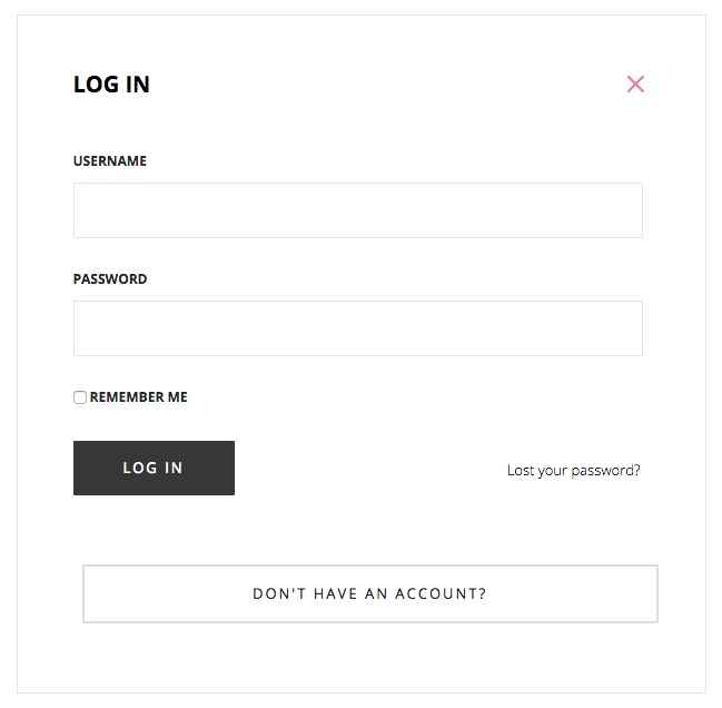
To create this popup, you will need to first create a Login/Register page, and then a menu item that links to the page; this page and menu item are already present in our demo content, but it is easy to create new ones if needed.
To create the page:
- In your WordPress backend, click on Pages → Add New to open the Add New Page screen.
- Add a title such as Login/Register to the title field, and in the Template drop-down list in the Page Attributes section of the sidebar, select the Login Page template.
- Click on Publish to save and publish the page; the login form will be displayed automatically.
To create the menu item:
- In your WordPress backend, click on Appearance → Menus to open the Edit Menus screen.
- In the Select a menu to edit drop-down lists, choose the menu you wish to add the login to.
- In the section on the left of the screen where you can choose which menu items to add, click on Pages to expand the section, then add a check to your Login/Register page and click the Add to Menu button.
- The menu item will be added to the list under the Menu Structure heading. Now click on the new menu item to expand the options; you should see a CSS Classes field; if not, click on the Screen Options box at the very top of the page and add a check to the CSS Classes option:
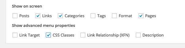
-
In the CSS Classes field, add the following class:
gk-login-popup
- Click on Save Menu in the bottom-right to save the changes. Your popup login will now work as needed.
Menu Widgets
Quark offers two menu types, definable in the Theme Customizer. The classic menu works as you would expect; each main menu item appears at the top of the page, and highlighting an option reveals its submenus if applicable:

However, the second menu type is off-canvas; that is, it scrolls into view from the right of the screen when a menu button is clicked.
Because this menu type offers a large amount of space, we have included widget areas in the off-canvas menu to help you to diversify your content. There are two widget areas available; one above the menu, and one below. You may attach any widgets you like to these areas, but in this section we will discuss the example used in the demo content; displaying social media icons and links.
The Menu Social Media Icons
In the demo layout, the Menu Bottom widget area features a Text widget with the following code to produce the social icon links:
<div class="gk-social-icons">
<a href="#"><i class="gkicon-fb"></i></a>
<a href="#"><i class="gkicon-twitter"></i></a>
<a href="#"><i class="gkicon-gplus"></i></a>
<a href="#"><i class="gkicon-pinterest"></i></a>
<a href="#"><i class="gkicon-behance"></i></a>
<a href="#"><i class="gkicon-dribbble"></i></a>
<a href="#"><i class="gkicon-instagram"></i></a>
<a href="#"><i class="gkicon-rss"></i></a>
<a href="#"><i class="gkicon-youtube"></i></a>
<a href="#"><i class="gkicon-vimeo"></i></a>
<a href="#"><i class="gkicon-linkedin"></i></a>
</div>
The code here is very easy to understand; a <div> element is created with the gk-social-icons class attached to take care of styling. Then, each social icon is created using a mixture of an <a> tag, for the link, and a set of <i> tags for the icon:
<a href="#"><i class="gkicon-fb"></i></a>
Just like when adding Font Awesome icons, the class of the opening <i> tag defines which icon is displayed. You can pick from the following selection of classes/icons:
- gkicon-fb - Facebook
- gkicon-twitter - Twitter
- gkicon-gplus - Google+
- gkicon-pinterest - Pinterest
- gkicon-behance - Behance
- gkicon-dribbble - Dribbble
- gkicon-instagram - Instagram
- gkicon-rss - RSS Feed Icon
- gkicon-youtube - Youtube
- gkicon-vimeo - Vimeo
- gkicon-linkedin - LinkedIn
Changing an Icon
To change the icon of a given entry, you will need to modify the class attribute of the <i> tag in question. For example, to change the first icon from a Facebook icon to a Twitter icon, you would change the second line of the code from:
<a href="#"><i class="gkicon-fb"></i></a>
To:
<a href="#"><i class="gkicon-twitter"></i></a>
If you do not need a particular icon, simply delete its code starting from the opening <a> tag and finishing at the closing </a> tag (delete the <a> tags too!).
Adding a Link
By default these icons do not link anywhere, so you will need to add a link to your corresponding social media profile into the href attribute of the opening <a> tag:
<a href="/Link URL Goes Here!"><i class="gkicon-fb"></i></a>
Repeat this step for each icon so that they all link to their appropriate social media profiles.
Advanced Typography
Quark includes some complex typography options to help style your post content the way you want it; in this section, we'll cover how to use these special options.
How It Works
The typography options in Quark may be applied in the Text mode of the TinyMCE editor, where you enter raw HTML code alongside basic text. Here, you can manually add the classes required to achieve each effect to the relevant HTML tags. To use the Text mode, click on the Text tab at the top-right of the editor window:
When writing in HTML code in the text editor, you will need to manually attach the classes to the HTML tag, so that the correct CSS rules are applied.
To attach a class to an HTML tag, a new attribute, "class", followed by an equals sign and the class name in quotes, must be added to the opening tag of the element after the tag but before the closing bracket. This assigns a class to that element. For example, to add a class called "special" to an HTML <p> tag, you would write:
<p class="special">Your Text</p>
The following sections will provide information on the classes available, and their functions.
Warnings
Warnings are highlighted text segments that are meant to draw attention to important information, such as rules, advice or guidelines. There are three types of warning available, each with a different purpose. To use them, simply add the class name to a <p> element:
<p class="classname">
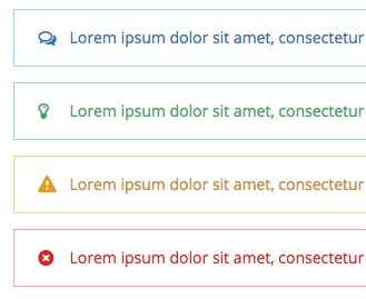
- gk-info - This attribute adds a blue border to the text and prefaces it with a chat icon to highlight information.
- gk-success - This attribute adds a green border to the text and prefaces it with a lightbulb icon. It is useful for adding advice or hints to your content.
- gk-notice - This attribute adds a yellow border and prefaces the text with a exclamation mark. It is used for warnings.
- gk-error - This attribute adds a red border and prefaces the text with a cross icon. It is used for errors and negative statements.
Highlights
Highlights are a way to make a particular part of a paragraph stand out. Unlike the warnings, highlights can be applied in the middle of a paragraph without damaging the text layout.
To use highlights, you will need to add a set of <span> tags in your <p> tags to separate the phrase, and add the highlight class to the <span> element. For example, if you wish to add a highlight to the word "highlight" in the following <p> tag:
<p>This is a highlight phrase</p>
You would need to add the opening <span> tag with the highlight class before the word "highlight", and the closing </span> tag after, like this:
<p>This is a <span class="className">highlight</span> phrase</p>
There is one available highlight class in Quark, which is:
- gk-highlight - This highlight adds a yellow background to the text.
Progress Bar
The progress bar is a white bar with a label underneath that can be set to fill with black to a certain point (represented by a percentage) on reveal, with a text percentage amount appearing at the point where the bar is filled to.
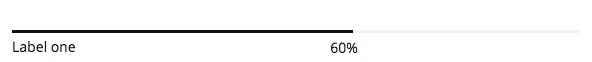
This is probably the most complex typography element to create in Quark, requiring multiple tags and classes to get the full functionality. First, a <div> class is created with a progress class attached. Then, a second <div> is added with a bar gk-loaded class and a style attribute that defines the length that the bar should fill to as a percentage using the following format: "width: XX%; visibility: visible;". Following this is a set of plain <span> tags that contain the label that should appear at the end of the progress bar. At this point the second <div> is closed, and a new paragraph <p> tag is opened containing a <span> tag, which in turn contains the label of the progress bar (that is, the label that appears on the left underneath the bar itself). Let's look at this code in action:
<div class="progress">
<div class="bar gk-loaded" style="width: 60%; visibility: visible; "><span>60%</span></div>
<p><span>Label one</span></p></div>
You can repeat this layout multiple times to stack a group of progress bars together; great for highlighting progress towards set goals or other measurable targets.
Code
The code typography element seperates text into an indented color block with a dark margin, great for separating code to make it easier for users to read and copy & paste.
Creating code is easy; you only need to wrap your code in <pre> tags. For example:
<p>This is plain text.</p>
<pre>This is code.</pre>
Unordered Lists
Unordered lists are just that; lists with no particular ordering i.e. no numbered or otherwise ordered entries. This is a good way to list points or minutes in an easily-readable format.
The classes for styling the unordered lists should be added in the opening <ul> tag that begins with list, with the <li> list item tags left as they are:
<ul class="className">
<li>Item 1</li>
<li>Item 2</li>
<li>Item 3</li>
</ul>
There are four available unordered list classes, as follows:
- gk-bullet1 - This class uses solid black blocks as the delimiter between each point.
- gk-bullet2 - This class uses black outline blocks as the delimiter to each point.
- gk-bullet3 - This class uses solid orange blocks as the delimiter to each point.
- gk-bullet4 - This class uses orange outline blocks as the delimiter to each point.
Number Blocks
Number blocks create large blocks that contain a block with a character inside, such as a number, followed by a two-line item. They are useful for highlighting larger points or available options.
The complexity of the number blocks means that they require some more complex HTML tags. Each block contains a <p> tag, which also has the class assigned to it, a <span> tag that contains the character to appear in the block, an <em> tag for the first line of the item, and plain text for the second line. The basic structure looks like this:
<p class="className">
<span>Character (i.e. "1", "A")</span>
<em>First Line</em>
Second Line
</p>
There is one available number block class in Quark, which is:
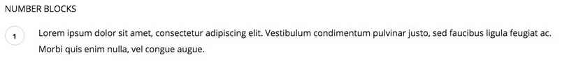
- numblocks num-1 - This creates a black colored block and text.
Blocks
Blocks are boxes that surround a paragraph of text, whether with solid color backgrounds or outlines.
Blocks are created by adding a particular class to the <p> tag that you wish to apply the block to. The basic format is very simple:
<p class="Classname">Paragraph text here.</p>
There are two simple blocks to choose from in Quark:
- block-1 - This class adds a green background block to your paragraph.
- block-2 - This class adds a yellow background block to your paragraph.
There's also a third block type that's a little more complex. Instead of adding a color background to a paragraph block, this third block type adds a black outline around the paragraph, with a title in the top-left of the outline:
This third type is created with three elements; an opening <div> tag with the special legend class applied, containing an <h4> tag that contains the title, and a <p> tag containing the paragraph text. The basic code looks like this:
<div class="legend">
<h4>Block Title Here</h4>
<p>Paragraph Text Here</p>
</div>
Blockquotes
Blockquotes allow you to elegantly highlight quotations in your article, to show that they are not from your pen, as it were.
The blockquotes format consists of a <blockquote> tag with class attached that contains the quoted text, and a <strong> tag before the closing </blockquote> that provides the attribution.
<blockquote class="className">Your Quote Here
<strong>Attribution Name</strong>
</blockquote>

This will separate the text in the blockquote tags from your other content with a grey margin on the left side.
Floated Blocks
Floated blocks are some of the most visually-appealing typography options available in Quark. They allow you to highlight particular phrases or quotes from the text by adding them in colored text on the left, right, or centre of your main content, much like a newspaper.
The layout of the HTML tags for floated blocks depends on the type of floated block you are using, and where you want the block to appear. The text to appear in the floating block is defined in a <span> tag within your content. Content added before the <span> tag will appear above it, and content added after will be added alongside it. A standard piece of HTML using these blocks may look something like this:
<p>Lorem ipsum dolor sit amet, consectetur adipiscing elit. Vestibulum condimentum pulvinar justo, sed faucibus ligula feugiat ac. Morbi quis enim nulla, vel congue augue. Duis quis quam sed purus porta eleifend.

<span class="gk-block-text-left">Lorem ipsum dolor sit amet, consectetur adipiscing elit.</span>

Donec eget dignissim augue. Donec ante felis, aliquam ut consequat eget, lobortis dapibus risus. Aliquam laoreet enim et lectus ornare hendrerit. Aliquam rhoncus enim libero. Morbi aliquam, nibh mattis feugiat dapibus, nisi massa adipiscing justo, sit amet condimentum urna ipsum et lacus. Nam fermentum, eros quis ullamcorper convallis, libero mauris lacinia eros, sed tempus leo lorem vitae purus.</p>
with the following result:
Something to note here is that there is no set position for the <span> tag to be added; it should be placed organically at the end of a paragraph or line in the text to highlight a particular phrase. Use the preview option in WordPress as you write the content to see how it looks and make your decision from there, and experiment with the <span> tag placement; you will get the feel for your preference very quickly!
There are a total of three classes for floated blocks:
- gk-block-text-left - This class aligns the text in the <span> tag to the left, with text following the tag appearing to the right.
- gk-block-text-right - The same as the above class, except this time the <span> tag text is on the right, and the main content after the closing tag floating left.
- gk-block-text-center - This tag creates a centrally-placed text block. Text before the <span> tag will appear above it, and text after the tag will appear below it.
Widget Settings
Quark includes the GK Widget Rules plugin from GavickPro, which allows you to control exactly where a given widget will appear. Usually, you are limited to defining only the location where a widget appears, but with Widget Rules, you can set different widgets to appear on different pages, or limit particular widgets to a category etc...
It's a great way to diversify and target your widgets depending on the content.
Using Widget Rules
Once the plugin is activated, a Widget Rules button will appear at the bottom of every widget instance in the Widgets page, reachable by navigating to Appearance>Widgets in your WordPress dashboard. Clicking this button will expand the options accordingly, and you can start configuring where a widget appears.
The options available are:
- Visible At - This option is used to micro-manage a widgets appearance by exception or the rule. For example, you can use No Pages Except to p
- revent a widget from being displayed anywhere except areas you explicitly tell it to appear; great if you want the widget to appear on one or two static pages only. In contrast, the All Pages Except option applies the widget to the same place in all areas except the ones you tell it to avoid. Finally, All Pages simply displays the widget everywhere; this is the default behaviour.
-
Select Page to Add - After selecting whether you wish to automatically include or exclude pages, you need to add the content that should be ignored/included. With this option, you can select any particular page or post, all posts in a category, plus some additional pages such as 404 pages and the like.
When necessary, an additional box will appear to allow you to enter category or post slugs; we will cover this process in the next section.
- Selected Pages - This section shows any pages that have already been included/excluded.
- Custom CSS Class - This option allows you to add a special CSS class to the widget; great if you want to target it for additional CSS styling.
- Visible On - This option lets you decide which devices should see the widget in question. For example, you can set a widget to appear only on desktop browsers, or only on mobiles. This allows you to have a different instance of a widget depending on the device to ensure they get the best experience if a given widget isn't responsive.
- Visible For - This option allows you to hide a widget from particular users; useful if you only want registered users to access the resource, for example.
Adding a Page/Post to the Selected Pages List
This short guide will show you how to add a specific page or post to the selected pages list, so they can be included or excluded from displaying a widget depending on your Visible At settings.
- Set your preferred option in the Visible At section, depending on whether you want to exclude pages from displaying the widget (All Pages Except) or include them (No Pages Except).
- In the Select Page to Add drop-down list, select Page or Post, depending on which one you wish to add.
- A new field will appear called Page ID/Title/slug. Enter the slug for the post or page you wish to include/exclude in this field, then click Add Page to add the page to the Selected Pages list.
- Click Save to save changes.
You may also set a widget to appear on all pages or all posts; after selecting Page or Post in the Select Page to Add drop-down list, instead of entering a slug in the provided field, just click Add Page, and this will add all pages or posts to the include/exclude list.
To get the post slug for a particular post, navigate to the Post List in your WordPress backend by clicking Posts>All Posts in the dashboard, then highlight the post you wish to display to bring up the options related to that post and click on Quick Edit. This will open a new set of options, including a field that contains the current post's slug, and also allows you to change it if necessary.
The same steps may be used to find the page slug; simply open the Page List from your dashboard by clicking Pages>All Pages in the left menu of your dashboard, then highlight the page you wish to add and click Quick Edit to see the page slug; copy this into the appropriate field in the Widget Rules settings.