Installation Default Restaurant Ecommerce
Introduction
Ecommerce for Quark delivers a media-packed sales platform designed not just to push sales, but to develop a strong brand image. Bring a new focus to your marketing; develop unique, high-quality product lines and promote their use as part of a lifestyle, not just one more product in a crowd. Each section of this style is built to highlight the various aspects of a your products and help you drive interest and connect with your consumer base.
Careful design avoids information overload, but there's still plenty of ways that you can make your mark in this layout. In this guide we'll look at how each section is created and how you can modify the core elements to suit your requirements. The steps included here work from our demo layout as a base, so each customization explanation will assume that you have installed the quickstart package or followed the manual installation guide to match our demo layout.

Guide Structure
The Ecommerce Customization Guide has three different sections:
- Theme Options - Provides details on the options available in the Theme Customizer, with additional details on how to use these options where necessary.
- Frontpage Elements - Examines how to modify the core frontpage elements of Ecommerce, so you can refocus its layout onto your products and features. This covers all the frontpage elements created via the page-based layout.
- Theme Features - Explains the core features included in Quark, as well as Ecommerce-specific features. This section includes information on included plugins, typography, Scroll Reveal and other useful features.
Theme Options
Basic customization of Ecommerce is made easier thanks to integration of the theme-related options in the WordPress Customizer. With this tool you can modify multiple visual elements and features of the theme and examine their effects in real-time thanks to a preview window. This section will cover the available options and their effects.
Colors
The Colors options provide an instant way to modify the main colors of the theme layout to match your product or branding using a color picker, without the need to add your own custom CSS rules:
- Primary Color - This option sets the color for some primary elements, such as button hover highlight colors (titles when highlighting products, or highlight color when hovering over buttons etc...), frontpage blog post links, Cookie Law banner buttons and blog post header colors.
- Secondary Color - This option sets the color for secondary elements like the button frame in the parallax scrolling blocks.
- Tertiary Color - Like the secondary color, this option sets the color of button or picture frame elements, but instead of modifying the blocks with parallax images this options sets the color for text blocks. The options are separated so that dark-colored images can have a light button frame or text, whilst elements on a white background can have a darker coloring, improving readability.
- Dark Color - Changes the color for elements using the dark CSS suffix; in the demo content this would include WooCommerce product and category pages, or any area where the suffix is used.
Header Image
The Header Image section lets you control the background image for the frontpage, which displays the HTML content from the default frontpage that's using the Frontpage template as an overlay, and adds a parallax effect to the image. There are two main options in this area:
- Add New Image - This button will allow you to upload a new header image, or choose an existing image from your WordPress Media collection.
- Hide Image - Removes the currently-set background image, ready for a new one to be uploaded or selected.
There are also two secondary options:
- Randomize uploaded headers - Previous headers you've uploaded are displayed in the Previously uploaded section to let you rollback image changes quickly if necessary. This option allows you have WordPress rotate through your previously uploaded headers automatically each time a user visits your site.
- Randomize suggested headers - The Suggested section of this option area includes suggestions on which header image to select, based on previous activity. By clicking this option you may have WordPress randomly assign the header from the suggested headers.
Navigation
This section provides options for assigning menus to the available menu areas of the theme just like you'd find in the Appearance → Menus section of your WordPress backend, though with no options for modifying the menu content; you may only assign menus in this section. There is also one additional checkbox that's very important:
- Enable Classic Menu - Ecommerce uses the Classic menu by default, but if you'd prefer to use the modern Off-Canvas menu you can do so by unticking this option.
- Enable Fixed Classic Menu - When enabled the classic menu will appear in a separate topbar when the user scrolls up anywhere on the page.
Widgets
Here you may remove, modify or add widgets to the available widget areas just like in the Appearance → Widgets section of your WordPress backend.
Static Front Page
This section allows you to select whether your front page is based on your latest posts, or displays a static page. Ecommerce's frontpage is created from a core Frontpage page, with subpages of this frontpage creating the site content, it's likely that you will not need to modify this option.
Font Options
Here you may set the fonts used in the theme; either a standard font or a Google font. There are two font areas to be chosen; one for the headers and titles of the theme and another for the body, or content of the page.
Using a Google Font
Setting up a Google Font in the theme requires some very simple steps:
- Navigate to to Google Fonts website.
- From the list of fonts, select the one you wish to use and click the Quick Use icon.
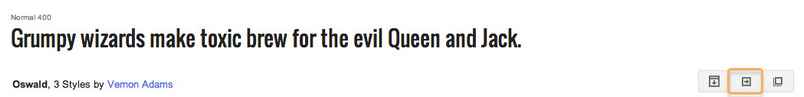
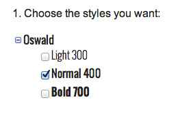
- Select the styles and character sets you wish to use for the font by clicking the tickboxes next to each.
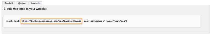
- In the Add this code to your website section, copy only the font URL from the link element.
- In the Appearance → Customize → Font options section of your WordPress backend, select Google Font in the drop-down list for the section you wish to use.
- Paste the copied URL into the Google Font URL for Header/Body/Other Elements field; after a moment the live preview will update to show you how your site looks with the new font.
- Click the Save & Publish button to save changes.
The font has now been set as needed, and you will see the changes in the live preview window.
Using a Standard Font
The standard fonts available may be seen and selected in the Header Font, Body Font or Other Elements Font drop-down list; under the initial Google Font option are a list of standard fonts, so if you wish to use one of these fonts you may simply select it from the list, and the live preview will updated accordingly.
Default font configuration
Body font
Google Font
//fonts.googleapis.com/css?family=Open+Sans:300,400,500,700
Selectors:
body,
button,
.button,
input[type="submit"],
input[type="button"],
select,
textarea,
input[type="text"],
input[type="password"],
input[type="url"],
input[type="email"],
article header h1,
article header h2
Using a Standard Font
The standard fonts available may be seen and selected in the Header Font, Body Font or Other Elements Font drop-down list; under the initial Google Font option are a list of standard fonts, so if you wish to use one of these fonts you may simply select it from the list, and the live preview will updated accordingly.
Layout
The layout options allow you to control the theme width across all display sizes. Each width setting for responsive displays, which includes the Theme Width, Tablet Width, Small Tablet Width and Mobile Width options, all define their sizes in pixels (px). The theme has our recommended widths already set, but you are free to modify these should you have a preferred width in mind for your site.
There are also two options related to the sidebar layout; Restaurant doesn't use a sidebar by default, but if you should add widgets to the sidebar you can define whether the sidebar appears on the left or right of the page with the Sidebar Position option, and set the percentage of the total page width that the sidebar should take up with the Sidebar width (%) option.
Features
This section provides multiple toggles for enabling/disabling core theme features, and provides additional controls for extras such as search page header images and copyright information.
The available toggle controls, which you may choose to enable or disable by adding a tick to the relevant clickbox, are as follows:
- Enable Word-Break - This option may be useful when using elements with a dynamic width or a non-romanized language such as Japanese or Korean that may not word-wrap correctly otherwise.
- Use Scroll Reveal - Sets whether scroll reveal animations (discussed in the Theme Features section of this guide) are enabled or not.
- Use Photo Swipe - When enabled, images added to a Gallery page (discussed in the Theme Features section) will be browsable via a touch interface that uses swipes to move between zoomed-in images.
- Use Kalendae Script - When enabled, users entering a date in the Reservation page will see a calendar pop-up so a date may be selected from the list. If disabled, the date must be entered manually.
- Display Related Posts - When enabled your blog posts will include an area above the comments where posts related to the post currently being read are displayed as thumbnails with titles. If you do not want this area to appear on your site, untick this option.
- Display Mouse Icon in Header - Decides whether an animated mouse icon in the header like that used in the default layout of Quark is displayed on the currently shown page.
- Fullscreen Frontpage Header - When enabled the header area of the frontpage will be expanded in height to fill the entire browser viewport, with the other sections below. If disabled, the header will be around half the size, and rely on the amount of content to set its overall height.
- Dark Image Background - When enabled, the theme logo and menu buttons will be set to a light color instead of dark (or light image logo if you've defined one) so it is easier to see if the header images are dark-colored. This option can be toggled on each individual page, whether for posts, pages or categories.
- Dark Image Background in Header - The same functionality as the Dark Image Background option above, but specific to the frontpage of the theme.
- Use Page Preloader - Sets whether the preload animation is displayed when the pages of the theme are loading or not.
- Enable Popup Login - When enabled users clicking the Login/Register link will open a popup overlay containing the the login fields without leaving the current page; if disabled then the link will lead to a separate login page.
- Date Format - This option sets whether dates are displayed in the theme-specific way, or in the standard WordPress way. In Quark, the theme date format reads "Sunday, 5 October 2014", whereas the standard WordPress version would use "October 5, 2014" without the day or shortened month name.
- Upload Author Page Background - Like the frontpage header options, this setting lets you assign an image to be used as the parallax background header on author pages (what users see when they click an author's name in a blog post).
- Upload Error Page Background - Sets the header background image for the 404 error page.
- Upload Search Page Background - Sets the header background for the search page.
- Copyright Text - Decides what copyright text should appear at the bottom of all pages. You can replace the existing text with your own, or remove it entirely by leaving the field blank.
Images
The images options let you set the exact image height for each screen size to provide more effective site experiences for users on a range of devices. There are five image height options that provide the ability to height of images used the header area of each page. There are specific settings for each screen size, so you can use smaller images for smaller screens to improve the browsing experience. Width for the images is based on the layout settings defined earlier.
Social API
The social API included with Quark Restaurant provides options for including sharing, liking and other useful social media sharing buttons along with icons for several other media networks. The settings in this section provide toggle controls so you can decide which elements should be shown or hidden. The available options are:
- Post Social Icons - When enabled your chosen social media share buttons, including Facebook, Twitter, Google+, Pinterest, LinkedIn and VK, will be displayed on all your WordPress posts.
- Page Social Icons - When this option is active your chosen social media share buttons will appear on all your WordPress pages.
- Enable Popup for Social Icons - If enabled the social media share buttons will be hidden, with a Share icon taking their place. When clicked, the available sharing options will be displayed in a separate popup overlay for instant sharing and clean post/page layouts.
- Enable Facebook/Twitter/Google etc... Icon - This set of 6 toggles lets you decide which social media icons should be displayed on your posts/pages; simply add a check to all icons you want to be available on your site.
Cookie Law
The Cookie Law section includes options to aid websites in adhering to the EU regulations on cookies; it requires that users are told if the website uses cookies, and must opt-in before cookies may be permitted.
Restaurant has its own cookie banner prepared that matches the theme aesthetic to help your site be compatible with this law without damaging the site's looks. This section includes the following options:
- Use Cookie Consent plugin - When enabled, the cookie consent banner and options will be displayed to users visiting your site.
- Consent Mode - Defines the type of cookie consent your site uses; choose from Explicit, where no cookies are set until the visitor consents, and Implied, which sets cookies but offers users the option to opt-out.
- Use SSL - Sets whether the cookie banner and options uses Secure Sockets Layer (SSL) to encrypt any data it receives.
- Banner Placement - Defines where the banner appears on your site, such as at the bottom or top of the viewport.
- Tag Placement - Sets the position of the Privacy Policy tag.
- Refresh after gaining consent - When enabled, the page will be refreshed automatically once the user consents to cookies.
There are some advanced configuration options available with this plugin; more information may be found on our blog in this Quark Features article.
Frontpage
The frontpage settings are used to control sliders added to the frontpage, as in the default Quark style. Since Ecommerce does not include any such slideshows these options can be ignored.
WooCommerce
This section contains some specific options for your WooCommerce product layout.
- Enable cart next to Main Menu - When enabled the shopping cart icon will be displayed to the right of the main menu.
Note: A WooCommerce Cart widget must be added to the **Cart** widget area for this option to function; doing so is covered in the Quark install guide.
- Enable Rating on Archive Pages - If your products have been reviewed by some of your customers, enabling this option will allow users to see the rating on WooCommerce archive pages. Note that this option is not available for live preview; after enabling this option you will need to close the customizer and reopen/visit your site to see the results.
Newsletter
The options in this section provide some extra control for the newsletter call-to-action that appears in bottom-right of the frontpage.
- Newsletter Display - Allows you to decide when the newsletter pop-up should appear; after a time delay, the instant the page loads, or when the user scrolls down.
- Time Delay (seconds) - This option is only available when Newsletter Display is set to Display after time. Here you can set amount of time in seconds must pass after the page is loaded before the pop-up appears.
Contact Page
The contact page settings appear only when the Theme Customizer preview window is display your contact page; in the demo content the contact page is reachable via the main menu, so after opening the Theme Customizer simply click on the menu button in the viewport and click the Contact link.
Once on the page, the Contact Page options tab will appear at the bottom of the list of theme options. The following settings are available:
- Enable reCaptcha - When enabled users will need to verify they are a real person and not a spambot by filling out a reCaptcha.
- Email Source - The email address entered in this section will be the target email for any messages sent via the contact form; if left blank the site administrator email address is used by default.
- Email header text - This option sets the subtitle text that appears directly under the main title of the page in the header:

- Facebook, Twitter and Google+ URLs - These three fields set the link URLs for the three social icons that are displayed in the header under the subtitle; usually they will be set to point to your equivalent social media profile. If any of these fields are left blank then the icon will not be displayed.
- URL of map button - Sets the link URL for the View on Google Maps link button at the bottom of the contact page header. Leave this field blank if you want to remove this text.
Frontpage Elements
You've got your theme options set, but if your product is going to be a big success you'll need to add your own personal touch to the frontpage to make your offerings stand out. In this section we'll look at each part of the frontpage in turn and look at how it is created, and how it may be modified & customized.
Frontpage Layout
Like our other modern themes, the Ecommerce frontpage utilizes a page-based layout. This means that a base page with the Frontpage template assigned is used to create the header, with each subpage of this base frontpage creating the next section down. Depending on the type of content several areas might be customizable, but the core content is always taken from the mainbody text of the page; for example, the base frontpage includes the HTML content that creates the header's text and buttons. The layout of the various subpages' content is automatically taken care of by the theme; all we need to learn is how the HTML content is structured so that we can add our own spin on it!
This guide assumes that you have already installed the quickstart or followed the manual installation guide, and so already have the demo frontpage and its subpages ready to be modified.
Many of the HTML tags in the demo content include **data-sr** attributes; these attributes refer to the ScrollReveal JavaScript library which is included in Quark and allows users to add reveal animations to their HTML elements. More information on how these attributes may be modified is covered in the **Theme Features** section of this guide if you are interested in changing the animations, or you can leave them as they are to use the default for the theme.
The Frontpage Header
The frontpage header of Ecommerce provides two useful functions; a large image background with overlaid title and text establishes your brand and product focus in an instant, and a button and call-to-action encourages users to begin exploring your site:
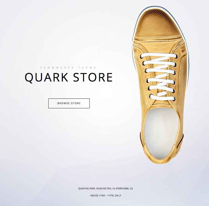
The HTML code for the header is taken from the base page that has the Frontpage template assigned to it, while the background image is controlled and set via the Theme Customizer as discussed in the Theme Options section of this guide. The basic HTML code for the header is as follows:
<div class="gk-store-info image-horizontal">
<div class="gk-store-header"><small data-sr="enter top and move 50px and wait .25s">Ecommerce theme</small>
<h1 data-sr="enter top and move 50px and wait 0s">Quark store</h1>
<a class="dark btn-border" href="#" data-sr="enter bottom and wait .5s">Browse store</a>

</div>
<div class="gk-store-image" data-sr="enter top and move 50px scale up 20% and wait .25s"><img src="http://localhost/WordPress/Quickstarts/Quark/Ecommerce/wp-content/uploads/2015/05/header_img.png" alt="" /></div>
</div>
<div class="gk-store-info-additional">Quaking Row, Kensington, IN, 47699-9366, US
Hours 11am – 11pm, daily</div>
HTML Breakdown
The HTML Breakdown sections for each frontpage block will explain what each tag and class of the HTML used in this section actually does; read this section if you want to understand how the HTML is structured. If you want to focus on making changes to the code to add your own content you can skip this section.
First, let's simplify the text so that instead of the example content from the demo, there are instead just placeholder text so you can see which content goes where in the code:
<div class="gk-store-info">
<div class="gk-store-header"><small data-sr="enter top and move 50px and wait .25s">Small Title Text</small>
<h1 data-sr="enter top and move 50px and wait 0s">Main Title Text</h1>
<a class="dark btn-border" href="/Button Link URL" data-sr="enter bottom and wait .5s">Button Text</a>

</div>
<div class="gk-store-image" data-sr="enter top and move 50px scale up 20% and wait .25s"><img src="/Image URL Here" alt="" /></div>
</div>

<div class="gk-store-info-additional">Quaking Row, Kensington, IN, 47699-9366, US
Hours 11am – 11pm, daily</div>
This HTML code can be split into three parts; the text and button content on the left of the center of the header, the image that appears to the right of the center, and small text at the bottom of the header. Each of these elements are contained in their own <div> element, as we shall see.
The opening <div> element creates the block for the center content; that is, the text on the left and the image on the right. It contains one class, gk-store-info, which targets the CSS for the centralize the content and style it so that the image fits the layout.
<div class="gk-store-info">
After this comes the text content, which consists of a new <div> with a gk-store-header class that centers the text on the vertical plane and also sets the appropriate fonts for this section.
<div class="gk-store-header">
Inside this element is a <small> tag, which creates the small text above the main title, and an <h1> tag that creates the main title text:
<small data-sr="enter top and move 50px and wait .25s">Ecommerce theme</small>
<h1 data-sr="enter top and move 50px and wait 0s">Quark store</h1>
Then comes the last part of the left-centered text block; a button that is created with an <a> link tag that uses the btn-border (for the button border) and dark (for the dark font coloring) to create the button, with the text between the tags creating the button text, followed by a closing </div>:
<a class="dark btn-border" href="#" data-sr="enter bottom and wait .5s">Browse store</a>
</div>
Now the code moves onto the image on the right; a new <div> is created with the gk-store-image class added to resize and center the image correctly in the block. Then, the image itself is added via a standard <img> tag before the <div> for the image and the <div> for the center block in general are closed:
<div class="gk-store-image" data-sr="enter top and move 50px scale up 20% and wait .25s"><img src="http://localhost/WordPress/Quickstarts/Quark/Ecommerce/wp-content/uploads/2015/05/header_img.png" alt="" /></div>
</div>
All that's left now is the small text at the bottom of the header block; this is created with another new <div> with a gk-store-info-additional class to position the block and set the appropriate font sizes. Then, the address, and opening hours text is simply added between the opening and closing <div> tags, rather than using any other HTML tags:
<div class="gk-store-info-additional">Quaking Row, Kensington, IN, 47699-9366, US
Hours 11am – 11pm, daily</div>
That completes the overlay text content; the background image is set separately via the theme customizer options, so now information for the image is added to the page content.
Modifying the Title Text
The title and the small text above it are contained in the <small> text after the two opening <div> tags (for the small text above the title) and the <h1> tag after the <small> tag (for the large title text):
<small data-sr="enter top and move 50px and wait .25s">Small Title Text</small>
<h1 data-sr="enter top and move 50px and wait 0s">Main Title Text</h1>
By modifying the text between these tags you can add your own small text and title as needed. If preferred, you may also remove either of these text blocks by deleting the tag; so a section with a title but no small text above will just have the <h1> tag after the <div> tags like in the below code:
<div class="gk-store-info image-horizontal">
<div class="gk-store-header">
<h1 data-sr="enter top and move 50px and wait 0s">Main Title Text</h1>
Modifying the Button Text and Link
The button is created in the <h1> tag following the title's <h1> tag. The link URL (where you want the button to link to when clicked) should be entered into the href attribute of the opening tag, and the text for the button goes between the opening and closing tag:
<a class="dark btn-border" href="/Button Link URL" data-sr="enter bottom and wait .5s">Button Text</a>
Modify these texts as needed, but ensure not to change the classes in the opening tag as these are needed to animated and style the button appropriately. If you don't want to have a button in this section you can of course remove the <a> tag completely; the other text elements will automatically center themselves in the block to preserve the aesthetics.
If desired you may also add extra buttons to this section by copying the <a> tag layout and changing the link and button text again:
<a class="dark btn-border" href="/Button Link URL" data-sr="enter bottom and wait .5s">First Button Text</a>
<a class="dark btn-border" href="/Button Link URL" data-sr="enter bottom and wait .5s">Second Button Text</a>
Again, the section's text will automatically align itself correctly.
Changing the Image
The image is added via a plain <img> tag after the third opening <div> tag; to change the image all you need to do is change the src attribute so that it points to your image's URL:
<div class="gk-store-image" data-sr="enter top and move 50px scale up 20% and wait .25s"><img src="/Image URL Here" alt="" /></div>
If you want to use an image from your Media Library you will need to get its URL. This easy to do; just open your Media Library by clicking on Media in your WordPress admin menu. Then, click on the image in your library you want to use to open the Attachment Details overlay:
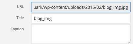
In the top-right of this screen is a URL field; simply copy the URL from this field and paste it into the src attribute as needed.
Changing the Small Text
The small text at the bottom of the header comes from the final set of <div> tags in the page's HTML code; no additional tags are needed as the <div> classes take care of the styling and placement:
<div class="gk-store-info-additional">Small Text Here</div>
You can add your own text between these <div> tags as needed.
The Motion is Life Section
This section offers a way to highlight your latest product line with a simple title and paragraph text and a large image with New Model badge in the top-right:
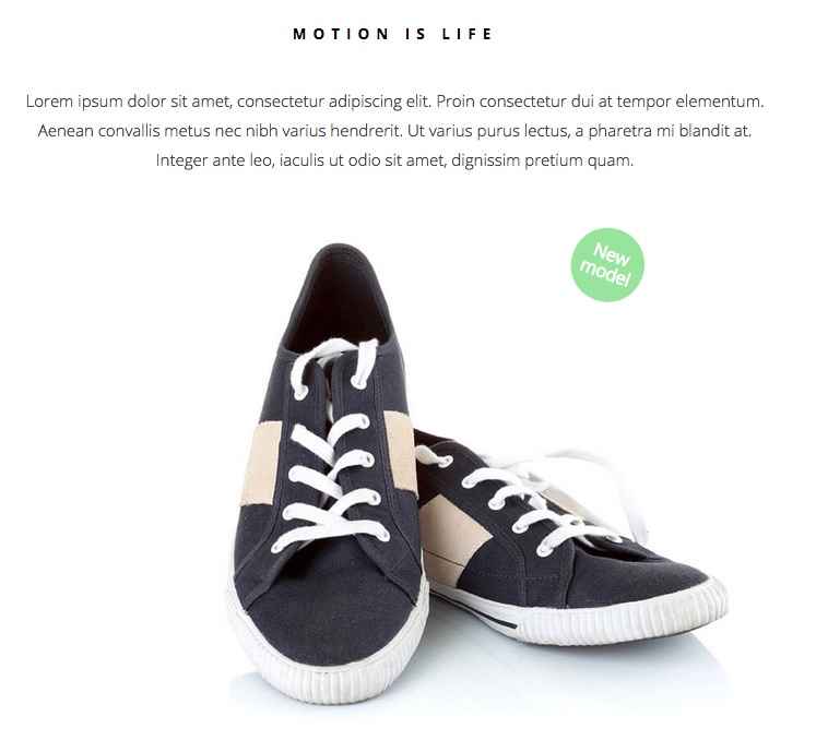
This section's HTML comes from the mainbody of the first subpage of your Frontpage page; all the elements of this section come from the HTML code, which looks like this in the demo:
<div class="gk-desc site">
<h2>Motion is life</h2>
<p>
     Lorem ipsum dolor sit amet, consectetur adipiscing elit. Proin consectetur dui at tempor elementum. Aenean convallis metus nec nibh varius hendrerit. Ut varius purus lectus, a pharetra mi blandit at. Integer ante leo, iaculis ut odio sit amet, dignissim pretium quam.
</p>

<div class="gk-image-badge" data-sr="enter bottom and scale up 50% over .8s">
<span class="gk-image-badge-green">New model</span>
<img src="http://localhost/WordPress/Quickstarts/Quark/Ecommerce/wp-content/uploads/2015/05/life_is_motion.jpg" alt="" />
</div>
</div>
HTML Breakdown
The code for this section is very simple, since the main content comprises a simple title and paragraph text with image; perfect for introducing the company, your product philosophy etc...without the complex flair that comes with later sections. The section's code can be split into two sections; the first containing the title and text, and the second containing the image and badge. If we break down the code into simple placeholder texts instead of demo content, it looks like this:
<div class="gk-desc site">
<h2>Title Text</h2>
<p>
     Description Text
</p>

<div class="gk-image-badge" data-sr="enter bottom and scale up 50% over .8s">
<span class="gk-image-badge-green">Badge Text</span>
<img src="/Image URL" alt="" />
</div>
</div>
The code opens with a <div> tag that uses two classes for its styling; gk-desc and site. This creates the block where the title and description will appear:
<div class="gk-desc site">
Then comes the title text between <h2> tags, and the description which is contained in <p> tags. Both of these are plain, with no special classes needed for the styling:
 <h2>Motion is life</h2>
<p>
     Lorem ipsum dolor sit amet, consectetur adipiscing elit. Proin consectetur dui at tempor elementum. Aenean convallis metus nec nibh varius hendrerit. Ut varius purus lectus, a pharetra mi blandit at. Integer ante leo, iaculis ut odio sit amet, dignissim pretium quam.
</p>
Now comes the second section of the code that contains the image. A new <div> is added using a new class, gk-image-badge, which is needed to ensure proper badge placement on the image:
<div class="gk-image-badge" data-sr="enter bottom and scale up 50% over .8s">
After this, the badge is created before the image using a <span> tag with a gk-image-badge-green class added to style the badge. The text for the badge goes between the opening and closing tag:
<span class="gk-image-badge-green">New model</span>
Next up is the image itself; this is another plain <img> tag with the image URL in the src attribute:
<img src="http://localhost/WordPress/Quickstarts/Quark/Ecommerce/wp-content/uploads/2015/05/life_is_motion.jpg" alt="" />
Then comes the closing </div> tags; two of them to close out both blocks:
</div>
</div>
Changing the Title and Description
The title and description are created using the <h2> tags (for the title) and <p> tags (for the description) that appear immediately after the opening <div> tag in the page HTML code:
<h2>Title Text</h2>
<p>
Description Text
</p>
Simply add your own text between these tags as needed, making sure to leave the other elements untouched as they are required for styling and reveal animations.
Changing the Badge Text
The green badge that appears at the top-right of the image can be modified to display any text as needed; this text is contained in the <span> tag that comes immediately after the second <div> element:
<span class="gk-image-badge-green">Badge Text</span>
Just add your own badge text between the opening and closing <span> tag. Here it's very important that the class in the <span> tag and the <div> element before it are untouched as they are required for the correct styling and placement of the badge on your image.
If you should not want to use the badge at all, you can delete the <span> tags and the content between them entirely; this will remove the badge from the image.
Changing the Image
The image is in the plain <img> tag that comes after the <span> tag from the previous section:
<img src="/Image URL" alt="" />
No special classes are added, so to use your own image all you need to do is replace the URL in the src attribute to your own image's URL. Remember that you can easily find the URL of any image in your media library by navigating to the library in your WordPress backend, clicking on the image you want to use and then copying and pasting the text from the URL field at the top-right of the overlay:
The Intelligent Shoe Section
This section of the frontpage is where you provide the big features of your product, with an image and description making up the bulk of the section, but this time with additional clickable buttons that open feature popups for more in-depth information:
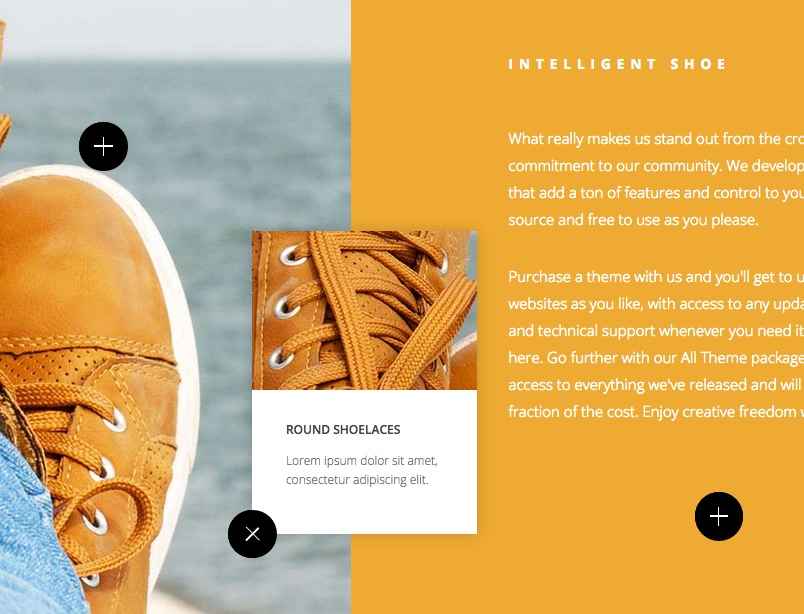
This section is created using HTML code added to the second subpage of the Frontpage page, and like the last section all the elements in this section are created using HTML & CSS only. However, the HTML code as used in the demo is more complex than the previous few sections:
<div class="big-photo box-clear">
<div class="big-photo-img">
<img src="http://localhost/WordPress/Quickstarts/Quark/Ecommerce/wp-content/uploads/2015/05/shoes_bg.jpg" alt="" />

<span class="big-photo-button gk-overlay-button" style="top: 20%; right: 30%" data-sr="scale up 30% over .75s and wait .5s">
<span class="big-photo-button-preloader"></span>
<span class="big-photo-button-popup">
<img src="http://localhost/WordPress/Quickstarts/Quark/Ecommerce/wp-content/uploads/2015/05/popup_img1.jpg" alt="">

<strong>Free Powerliners</strong>
<small>Lorem ipsum dolor sit amet, consectetur adipiscing elit. </small>
</span>
</span>

<span class="big-photo-button gk-overlay-button" style="top: 70%; right: 10%" data-sr="scale up 30% over .75s and wait .8s">
<span class="big-photo-button-preloader"></span>
<span class="big-photo-button-popup">
<img src="http://localhost/WordPress/Quickstarts/Quark/Ecommerce/wp-content/uploads/2015/05/popup_img2.jpg" alt="">
<strong>Round Shoelaces</strong>
<small>Lorem ipsum dolor sit amet, consectetur adipiscing elit. </small>
</span>
</span>

</div>
<div class="big-photo-desc">
<h2>Intelligent Shoe</h2>
<p>What really makes us stand out from the crowd is our commitment to our community. We develop powerful plugins that add a ton of features and control to your site, all open-source and free to use as you please.</p>
<p>Purchase a theme with us and you'll get to use it on as many websites as you like, with access to any updates we release and technical support whenever you need it; no artificial limits here. Go further with our All Theme package, which get you access to everything we've released and will ever release for a fraction of the cost. Enjoy creative freedom with GavickPro!</p>
<span>

<span class="big-photo-button" data-sr="scale up 30% over .75s and wait 1.1s">
<span class="big-photo-button-preloader"></span>
<span class="big-photo-button-popup">
<img src="http://localhost/WordPress/Quickstarts/Quark/Ecommerce/wp-content/uploads/2015/05/popup_img3.jpg" alt="">
<strong>Eco Cowhide</strong>
<small>Lorem ipsum dolor sit amet, consectetur adipiscing elit. </small>
</span>
</span>
</span>
</div>
</div>
HTML Breakdown
Now this section's a little bit more complex HTML-wise than the last few sections! But once you break things down it's easy to see what each block of HTML code does so you can add your own content. Just bear in mind that a lot of the code for this section is for creating the buttons and effects for the pop-ups; the content of these blocks is easy to locate and change.
First off, here's what the code looks like if we get rid of all the demo content and just leave simple text placeholders that highlight where each piece of content should go:
<div class="big-photo box-clear">
<div class="big-photo-img">
<img src="/Background Image URL (For left side of block)" alt="" />

<span class="big-photo-button gk-overlay-button" style="top: 20%; right: 30%" data-sr="scale up 30% over .75s and wait .5s">
<span class="big-photo-button-preloader"></span>
<span class="big-photo-button-popup">
<img src="/First Pop-up Image (top left button)" alt="">

<strong>First Pop-up Title</strong>
<small>First Pop-up Text</small>
</span>
</span>

<span class="big-photo-button gk-overlay-button" style="top: 70%; right: 10%" data-sr="scale up 30% over .75s and wait .8s">
<span class="big-photo-button-preloader"></span>
<span class="big-photo-button-popup">
<img src="/Second Pop-up Image (bottom-left button)" alt="">
<strong>Second Pop-up Title</strong>
<small>Second Pop-up Text</small>
</span>
</span>
</div>

<div class="big-photo-desc">
<h2>Main Title (right section)</h2>
<p>First Paragraph</p>
<p>Second Paragraph</p>
<span>

<span class="big-photo-button" data-sr="scale up 30% over .75s and wait 1.1s">
<span class="big-photo-button-preloader"></span>
<span class="big-photo-button-popup">
<img src="/Third Pop-up Image (bottom-right)" alt="">
<strong>Third Pop-up Title</strong>
<small>Third Pop-up Text</small>
</span>
</span>
</span>
</div>
</div>
Now let's look at how all this code creates the nice image and text block with pop-up feature highlights. First comes a <div> element with two classes; big-photo and box-clear:
<div class="big-photo box-clear">
This element creates the entire block for this section, where all the contenct including the image on the left, text column on the right, and feature pop-ups will all be added.
Following this is another <div> tag with another class, big-photo-img. Inside this <div> will be any element that appears in the left half of the block, which includes the background image and two feature buttons:
<div class="big-photo-img">
The first actual visible element added to this code comes next, and it's a plain <img> tag that will set the background image for the left block, with the image URL in the src attribute:
<img src="http://localhost/WordPress/Quickstarts/Quark/Ecommerce/wp-content/uploads/2015/05/shoes_bg.jpg" alt="" />
After this image comes the first of the two pop-up feature blocks in the left side of the section. These parts look complex, but the concept is very simple. Three <span> tags are used; the first, which includes the big-photo-button and gk-overlay-button classes, is the frame that creates the button (the big-photo-button class in particular creates the button; the gk-overlay-button adds additional styling to place the button over the background image). This tag also includes a style attribute, which defines the position of the element in relation to the <div> it's in i.e. top: 20% in the attribute will place the button 20% of the way down the block's height, while right: 30% moves the button 30% of the total block width away from the right margin:
<span class="big-photo-button gk-overlay-button" style="top: 20%; right: 30%" data-sr="scale up 30% over .75s and wait .5s">
The second <span> is just opening and closing tags, but the opening tag has the big-photo-button-preloader class which takes care of the preloader animation that plays when the button is clicked:
<span class="big-photo-button-preloader"></span>
And then the third <span> creates the pop-up itself using the big-photo-button-popup class:
<span class="big-photo-button-popup">
Now that the button, the preload animation and the pop-up are created, the content for the pop-up is added using an <img> tag for the top image, a <strong> tag for the title, and <small> tag for the paragraph text before the pop-up section is closed with two closing </span> tags:
<img src="http://localhost/WordPress/Quickstarts/Quark/Ecommerce/wp-content/uploads/2015/05/popup_img2.jpg" alt="">
<strong>Round Shoelaces</strong>
<small>Lorem ipsum dolor sit amet, consectetur adipiscing elit. </small>
</span>
</span>
This same format is repeated again for the second button that appears on the left side of the block:
<span class="big-photo-button gk-overlay-button" style="top: 70%; right: 10%" data-sr="scale up 30% over .75s and wait .8s">
<span class="big-photo-button-preloader"></span>
<span class="big-photo-button-popup">
<img src="http://localhost/WordPress/Quickstarts/Quark/Ecommerce/wp-content/uploads/2015/05/popup_img2.jpg" alt="">
<strong>Round Shoelaces</strong>
<small>Lorem ipsum dolor sit amet, consectetur adipiscing elit. </small>
</span>
</span>
And then there's a closing </div> that ends the left section of the block:
</div>
Now comes the content for the right side of the block; starting with a new <div> using the big-photo-desc class to style the description text:
<div class="big-photo-desc">
Then the content is added, using an <h2> tag to create the title of the block, and two <p> tags to create the two paragraphs of standard text:
<h2>Intelligent Shoe</h2>
<p>What really makes us stand out from the crowd is our commitment to our community. We develop powerful plugins that add a ton of features and control to your site, all open-source and free to use as you please.</p>
<p>Purchase a theme with us and you'll get to use it on as many websites as you like, with access to any updates we release and technical support whenever you need it; no artificial limits here. Go further with our All Theme package, which get you access to everything we've released and will ever release for a fraction of the cost. Enjoy creative freedom with GavickPro!</p>
Now the final button and pop-up has to be added; this follows the same layout as the previous buttons but with some slight differences; instead of using the gk-overlay-button class in the first <span> to style the button separately from the other content in the block, instead an additional plain <span> tag is added, so there are four <span> tags creating the button instead of three:
<span>
<span class="big-photo-button" data-sr="scale up 30% over .75s and wait 1.1s">
<span class="big-photo-button-preloader"></span>
<span class="big-photo-button-popup">
Also, notice that there is no style attribute in this tag; this is because the placement of this element is applied in CSS since it doesn't need to be moved to fit over the image. The rest of the content stays the same, with <img>, <strong> and <small> tags creating the pop-up image, title and text respectively, before the right block and then the entire section is closed out with two closing </div> tags:
<img src="http://localhost/WordPress/Quickstarts/Quark/Ecommerce/wp-content/uploads/2015/05/popup_img3.jpg" alt="">
<strong>Eco Cowhide</strong>
<small>Lorem ipsum dolor sit amet, consectetur adipiscing elit. </small>
</span>
</span>
</span>
</div>
</div>
Changing the Background Image (Left Column)
The left side of the block contains a background image that the feature buttons are overlaid on. This is added via the first <img> tag that appears in the third line of the code:
<img src="/Background Image URL (For left side of block)" alt="" />
Change the src attribute to a URL pointing to your preferred image. If you need the URL for an image in your WordPress installation, open the Media Library and click on the image you wish to use; in the overlay that opens the URL can be found in the URL field in the top-right of the screen, just copy and paste this into the src attribute.
Modifying the Feature Pop-Ups
The image, title and text of the feature pop-ups are contained in groups of three <span> elements that apply the classes needed to create the button, animation and pop-up block:
<span class="big-photo-button" data-sr="scale up 30% over .75s and wait 1.1s">
<span class="big-photo-button-preloader"></span>
<span class="big-photo-button-popup">
So anywhere in the HTML code where you see three <span> tags like above, the content for the pop-up block will follow. There are three such sections in the HTML code; two near the start that create the buttons on the left of the section, and one at the end that creates the button on the right of the section. The actual content for each button is contained in three more tags; an <img> tag for the image, <strong> tag for the title, and <small> tags for the paragraph under the title:
<img src="/Pop-up Image" alt="">
<strong>Pop-up Title</strong>
<small>Pop-up Text</small>
To change the image, add your selected image's URL (you can get this from the overlay that opens when you click the image in your WordPress Media Manager) to the src attribute of the <img> tag.
For the title, add your own text between the <strong> tags, and add your text paragraph between the <small> tags.
Changing the Button Position
The two buttons over the image are used to highlight features that your product offers. For an intuitive design, it's a good idea to have the buttons appearing over the feature or element they describe i.e. if your product is a phone and you want to highlight the keypad features you should have the button appearing over or next to the keypad so users can instantly tell what the feature addresses before clicking on it.
The location of the buttons on the image is controlled in the opening <span> tag of the button's code; look at this example from the demo content:
<span class="big-photo-button gk-overlay-button" style="top: 20%; right: 30%" data-sr="scale up 30% over .75s and wait .5s">
<span class="big-photo-button-preloader"></span>
<span class="big-photo-button-popup">
<img src="/First Pop-up Image (top left button)" alt="">
<strong>First Pop-up Title</strong>
<small>First Pop-up Text</small>
</span>
</span>
Notice that the first <span> tag of this code includes a style attribute to add CSS code to? The code added in this attribute controls where the button appears on the image using two values; top and right. Percentages are assigned to these two values that define where the button should appear in relation to the top and bottom of the image.
In the example code above, the top value is set at 20%, and the right value is set at 30%. The browser interprets this setting to mean that in the image block, the button should be placed 20% of the total height of the image from the top of the block, and 30% of the total width from the right of the block.
Note: Percentages are used so that the effect is applied to all screen sizes; if the placement was defined in pure pixels then the layout simply wouldn't work on small screens. With percentages, you can be sure the buttons will always appear in the correct places no matter the screen size.
To change the position of the button, we simply need to modify the top and right values. If you want the button to be higher on the image, reduce the percentage amount of the top value, and if you want it to be lower, increase the top value.
For the horizontal layout, decrease the right value's percentage to move the button to the right, or increase it to move it to the left.
<span class="big-photo-button gk-overlay-button" style="top: Enter percentage value for vertical position here; right: Enter percentage value for horizontal position here" data-sr="scale up 30% over .75s and wait .5s">
You may notice that the third feature button on the right does not have a style attribute; this is because it is centered with the text above it so does not need to be repositioned, though it can be removed if so desired.
Adding Extra Pop-up Content
You may find that you want to have more information added to your pop-up content; perhaps adding two titles and paragraphs for example. The pop-up block will adjust its height automatically to fit additional content so you can add longer text than that used in the demo to the <small> tags, but remember that the pop-ups are designed for quick feature highlights, so it's best not to go crazy!
If you'd like to have additional titles and text combinations you can add a second set of <strong> and <small> tags to the content. However, the padding for the top of the title text is non-existent so it's a good idea to add a line break <br> tag to the second title tag to create a margin between the text. For example, this code:
<strong>Round Shoelaces</strong>
<small>Lorem ipsum dolor sit amet, consectetur adipiscing elit.</small>
<strong>Round Shoelaces</strong>
<small>Lorem ipsum dolor sit amet, consectetur adipiscing elit. </small>
Will create two titles and text sections in the pop-up, but the second title will sit very close to the previous text. So, adding a <br> tag to the start of the second title will add some spacing:
<strong>Round Shoelaces</strong>
<small>Lorem ipsum dolor sit amet, consectetur adipiscing elit.</small>
<strong><br>Round Shoelaces</strong>
<small>Lorem ipsum dolor sit amet, consectetur adipiscing elit. </small>
As ever, try to exercise restraint with the content; too much will be hard for readers to digest at a glance.
Removing Pop-ups
If you need to remove one or all of the features, you will need to delete the opening three <span> tags for the button, and everything in between. For example, if you delete the below content from the demo page it will remove the first button from the left block:
<span class="big-photo-button gk-overlay-button" style="top: 20%; right: 30%" data-sr="scale up 30% over .75s and wait .5s">
<span class="big-photo-button-preloader"></span>
<span class="big-photo-button-popup">
<img src="/First Pop-up Image (top left button)" alt="">
<strong>First Pop-up Title</strong>
<small>First Pop-up Text</small>
</span>
</span>
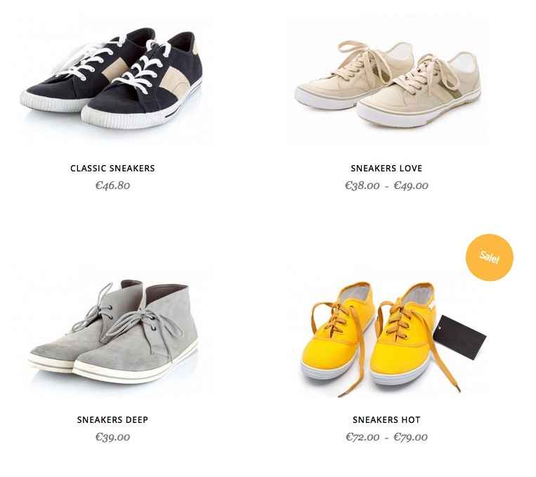
The Featured Products Section
The featured products highlights the important products you have available; with Quark Ecommerce's focus on singular or limited product lines the two column layout provides an effective way to display multiple product iterations or SKUs:
This section's content is taken from the third subpage of the Frontpage page, but unlike the others it does not use custom HTML to create its elements; instead, a shortcode displaying WooCommerce's recent products is used, but with custom CSS code to style it to match the theme aesthetic. The shortcode used in the demo content looks like this:
<div class="site bigger-spaces">[recent_products per_page="8" columns="2"]</div>
How It Works
There's only one piece of HTML code here, and that's the <div> that surrounds the shortcode and uses the site and bigger-spaces classes to expand the height of the block and target additional CSS to style the widget.
The shortcode itself has a very easy to understand layout. The basic shortcode is:
[recent_products]
Which creates the instance of the widget in the page content. However, this defaults to displaying all products, no matter how many you have. To limit the number of products displayed on the page, the per_page attribute is added:
[recent_products per_page="6"]
Which limits the number of products displayed to the amount set in the attribute. Next, the columns attribute is used to limit the section to two columns. In fact, the maximum number of columns for this section is two due to the layout being taken from product archive pages, but you can change it to 3 or 4 columns with some minor CSS changes; these are discussed in the next sections.
And that's it! The hard work of pulling your latest products is taken care of via WooCommerce, so no further action is required.
Changing the Number of Displayed Products
The shortcode used to create the recent products widget includes a per_page attribute which defines the number of product previews that appear on the page:
[recent_products per_page="number of displayed products" columns="2"]
Just set this attribute to your chosen number of items and the widget will ensure the correct amount are displayed.
Adding a "Sale!" Badge
The sale badge is part of the standard WooCommerce functionality and is automatically added to the preview images when the product has been given a discount; that is, if you've set a sale price in the Sale Price field of the product's edit page.
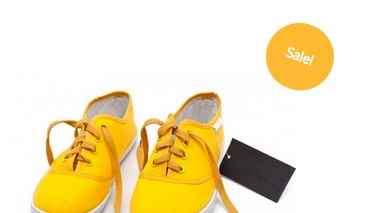
Once done the sale badge will appear on this product's preview.
Removing the "Sale!" Badge
If you don't want the badge to appear on your sale products, then you will need to add some custom CSS to your site to remove it. One of the most basic ways to do this is to use the override.css file to add your own CSS code without touching the core files (our documentation includes a Custom CSS Guide for this purpose), and add the following line:
 .onsale {
display: none!important;
}
There are several other ways to remove the badge that avoid using the !important attribute, but this is the quickest and easiest way for beginners to get the same effect!
Changing the Number of Columns
To add additional columns beyond the default two, you will need to perform two steps; first, change the columns attribute in the shortcode to your required number of columns; we recommend a maximum of 3 or 4:
[recent_products per_page="number of displayed products" columns="Enter Number of Columns"]
Second, you will need to add some custom CSS code to your site; check the Removing the "Sale!" Badge" section above for more details on adding custom CSS to the theme via the override.css file. Once you've got access to this file, add the following code to it:
If number of columns is set to 3:
.frontpage ul.products li.product {
width: 33.3%;
}
If number of columns is set to 4:
.frontpage ul.products li.product {
width: 25.0%;
}
Remember that each added column reduces the amount of available space for each column; this isn't a problem on large desktop screens, but users on mobile devices may find browsing so many stacked columns rather uncomfortable, so it's a good idea to test each option to find the best fit for your site.
The Video Teaser Section
The video teaser is a simple background image with a Play Video button and text that when clicked shift the block into a large video player that autoplays a video from a upload site such as Vimeo.

This section's HTML code is taken from the fourth subpage of the Frontpage page, with the custom HTML in the mainbody of the page creating the play icon and text, as well as the video embed. The background image that is shown before the user clicks play is taken from the Featured Image of the subpage. The basic HTML code used in this section is as follows:
<div class="very-big-spaces"><a href="#" class="gk-video-link gk-add-rotate-animation" data-url="//player.vimeo.com/video/8432525?color=ffffff&title=0&byline=0&portrait=0" data-width="1280" data-height="720" data-sr="enter bottom and move 50px">Play <i class="fa fa-play"></i> video</a></div>
HTML Breakdown
The code for this section is really very basic, with most of the heavy lifting with regards to embedding the video and styling it appropriately going into the CSS code. Here's a quick breakdown with placeholder text to show you where each element is created:
<div class="very-big-spaces"><a href="#" class="gk-video-link gk-add-rotate-animation" data-url="Video URL" data-width="1280" data-height="720" data-sr="enter bottom and move 50px">Text Left of Icon <i class="Icon Class"></i> Text Right of Icon</a></div>
The code starts, as do most such sections, with a <div> tag. This one has only one class added; very-big-spaces, which adds a lot of padding for the top and bottom of the text:
<div class="very-big-spaces">
This is a vitally-important class; without it, the block will only be as tall as the text and icon with minor padding, essentially leaving a thin line to display your video in. With this class added, the block is extended so you can get a nice fullscreen effect on the video.
The next bit of code is an <a> tag; this tag is where all the interesting actions are added. The special gk-video-link class styles the font and icon, and the gk-add-rotate-animation class adds a nice rotation animation to the icon on reveal. Then comes the attributes; the href attribute that usually sets the link URL is worthless here, since the item never links anywhere. Thus, it is left blank. The important attributes are the data-url attribute which defines which video should be played, and the data-width and data-height attributes which set the dimensions of the video.
<a href="#" class="gk-video-link gk-add-rotate-animation" data-url="Video URL" data-width="1280" data-height="720" data-sr="enter bottom and move 50px">
After this opening tag is the text that will be overlaid on the background image. This consists of some plain text, an <i> tag that creates the icon, and then some more plain text that appears after the icon:
Play <i class="fa fa-play"></i> video
The icon displayed is decided by the class of the <i> tag; in this case the play button is taken from the Font Awesome set.
Finally, the <a> tag and <div> are closed, ending the block:
</a></div>
That takes care of the overlay and video, but before the video is opened an image is displayed rather than the video thumbnail to preserve the site aesthetics. The image in the background is automatically pulled from the Featured Image of the page.
Changing the Background Image
The background image that is shown before the user clicks the play button is the easiest thing to change since it is taken from the Featured Image of the page.
To change it, first click on the Remove featured image text that appears under the image in the right sidebar of the Edit Page screen; this will remove the existing image. Now click on the Set featured image text that has appeared and select your new background image from your WordPress media library, then click Update in the top-right of the Edit Page screen to save your changes.
Changing the Overlaid Text
The overlaid text over the background image is taken from between the <a> tags of the HTML code:
Text Left of Icon <i class="Icon Class"></i> Text Right of Icon</a>
There's an <i> tag that appears in the middle of the text that creates the play button in the demo layout; simply change the content before this tag to add text to the left of the icon, and change the content after the <i> tag to add text to the right of the icon.
Changing the Icon
The icon that appears in this section is provided by the useful Font Awesome set, which is supported in our theme. The <i> tag that creates the icon is left blank, but the class of the tag is what defines the icon; like how the Play button icon is added in the demo content:
<i class="fa fa-play"></i>
So to change the icon the <i> tag's class needs to be changed accordingly. You can see the full list of available icons provided by Font Awesome and their classes on our Ecommerce Typography Page.
Have a look at the different icons on the typography page and you'll notice that each of the icons has a particular class that looks like this:
fa-icon-name
So, for example, an anchor icon will have the following class:
fa-anchor
To add your chosen icon into the <i> tag, pick an icon from those available and remember the class name. Then, modify the class in the <i> tag accordingly. The format here is:
fa icon-class-name
So if you wanted to add the anchor icon you would change the class to:
fa fa-anchor
Notice that "fa" must be typed twice; once to declare a Font Awesome icon, and again in the class name. When added to the tag, it would look like this:
<i class="fa fa-anchor"></i>
Changing the Linked Video
The linked video in this section is the most complex to change, but it is still made quite easy thanks to the extensive options most of the video-sharing sites offer to help you embed and control the video and player. The URL for the video is set in the data-url attribute of the opening <a> tag in the code:
<a href="#" class="gk-video-link gk-add-rotate-animation" data-url="Video URL" data-width="1280" data-height="720" data-sr="enter bottom and move 50px">
So to change the video you'll need to find the embed code for your chosen video, make sure the options for it are set correctly, then copy and paste the embed code into the data-url attribute. In practice it's a little bit more complex than that because of how the video sites tend to expect videos to be embedded, but it's nothing too challenging.
Getting the Embed URL: Dailymotion
- Open your browser and navigate to the Dailymotion website and find the video you want to embed.
- Under the video below the username of the video creator are three tabs; About Export and Add To.
- Click on the Export option; you'll see a new set of fields and options load, including a Get Embed Code field containing the HTML required to embed the video directly into your webpage. However, we don't actually need to full code; only the URL contained in the src attribute of the code.
- Before we take this URL, we should first set the player options that way we want them. Click on the More Options and Preview button underneath the Get Embed Code option; you'll see a range of new options that will let you customize how the player looks on your site; including:
- Hide on-page video info -
- Hide in-player video info - Checking this option will remove extra information from the video preview, like title, uploader name and length.
- Player Colors - These three options let you change the coloring of elements like the play button, title bar and highlights.
- Autoplay Mode - Sets the video to automatically play when loaded; this will be after the user clicks the link text in the video block in Quark.
- Start at - Lets you set the time that the video should start when loaded if you wish to skip intros or other sections.
- Notice that as you change these options the URL contained in the src attribute will change to reflect your changes. Once the options are set, copy the complete URL between the two quotation marks of the attribute, and paste it into the data-url attribute of your page's HTML.
-
Save the changes to your page by clicking the Update button; your chosen video will now load when the overlay text is clicked.
Getting the Embed URL: Youtube
To get the embed URL for a video on Youtube, follow these steps:
- Open your browser and navigate to the video on Youtube that you wish to use.
- Under the video below the username of the video creator is a Share tab; click on this to open another set of three tabs; Share, Embed and Email.
- Click on the Embed option; a new field will appear with a lengthy bit of HTML code used to embed the video directly into your webpage, but we don't need the full code; all that's required is the URL contained in the src attribute of the code.
- Before we copy the URL however, we can change several options to control how the player will look on our site. Click on the Show More button underneath the field containing the HTML code; you'll see a range of new options that will let you customize how the player looks on your site; including:
- Show suggested videos when the video finishes - Unchecking this option prevents suggested video blocks being shown when the video ends.
- Show player controls - Unchecking this option will remove the player controls like the play, settings and closed caption buttons, keeping the video clear.
- Show video title and player actions - Unchecking this option removes the title bar and share button from the top of the player.
- Enable privacy-enhanced mode - Using this mode prevents the player from collecting information from your user's browser unless they play the video.
- Notice the URL in the src attribute of the embed code changes as options are changed. Once your options are set, copy the entire URL from this attribute and paste it into the data-url attribute of your video page's HTML code.
- Save the changes to your page by clicking the Update button; your chosen video will now load when the overlay text is clicked.
Getting the Embed URL: Vimeo
To get the embed URL for a video on Vimeo, follow these steps:
- Open your browser and navigate to the video on Vimeo that you wish to use.
- In the video player on the right-hand side is a paper-aeroplane icon; click on this to open the sharing options.
- A popup will appear with Link, Social, Email and Embed sharing options. The Embed field includes a lengthy bit of HTML code used to embed the video directly into your webpage, but we don't need the full code; all that's required is the URL contained in the src attribute of the code.
- Before we copy the URL however, we can change several options to control how the player will look on our site. Click on the Show Options button opposite the title to see a range of options for setting the video's look, including:
- Color - Sets the color of the text and other highlights in the title and toolbar of the video.
- Intro - In this section there are three options; Portrait, Title and Byline. Unchecking any of these options will remove that element from the video preview image.
- Loop this video - Causes the video to restart automatically when finished.
- Show text link underneath this video - Enabling this option will show a link to the video on Vimeo underneath the player. This option will have no effect on Quark, since it does not use the full embed HTML.
- Show video description underneath this video - Enabling this option will show a description on the video underneath the player. This option will have no effect in Quark, since it does not use the full embed HTML.
- Notice the URL in the src attribute of the embed code changes as options are changed. Once your options are set, copy the entire URL from this attribute and paste it into the data-url attribute of your video page's HTML code.
- Save the changes to your page by clicking the Update button; your chosen video will now load when the overlay text is clicked.
The Blog Section
The blog section lets you connect with your visitors with regular news updates, blog articles or special offers in a simple block layout:
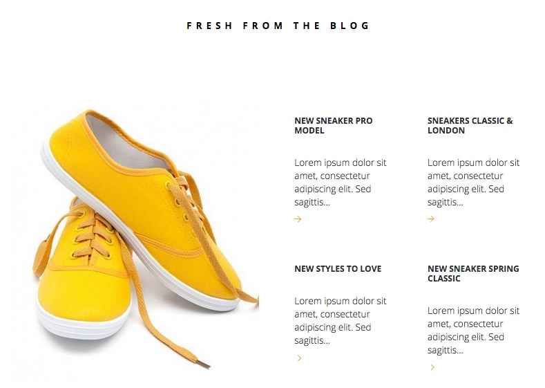
This section's code is taken from the fifth subpage of the Frontpage page. Like the Featured Products section, the content here is not created with HTML code, but with a shortcode, in this case a shortcode that creates an instance of our powerful News Show Pro widget, which can create showcases for articles, products and more. The code used in the demo layout looks like this:
<div class="quark-gallery bigger-spaces">
[gknsp use_css="off" title="Fresh from the blog" before_title="<h3>" after_title="</h3>" cache_time="0" widget_css_suffix="big-spaces quark-gallery site" article_cols="2" article_rows="2" article_block_padding="26px" article_image_w="480" article_image_h="540" article_info_state="off" article_text_len="10" article_title_len="40" article_title_len_type="chars"]
</div>
How It Works
As with the Featured Products section, the shortcode is wrapped in a <div> tag to provide additional styling of the News Show Pro widget within the block. This <div> has two classes attached; bigger-spaces, which adds extra padding to the top & bottom of the block to keep it in line with the other sections of the frontpage, and quark-gallery, which is used for font styling and padding around the widget title:
<div class="quark-gallery bigger-spaces">
If you were to remove this <div> element the title would be unstyled and would sit very close to the widget content, and there would be minimal padding above and below the widget content which damages the aesthetic. As such, it's important that this element and class are left in place.
Inside the <div> is the shortcode, which is much longer than the recent_products shortcode we saw earlier because NSP includes a huge amount of options.
[gknsp use_css="off" title="Fresh from the blog" before_title="<h3>" after_title="</h3>" cache_time="0" widget_css_suffix="big-spaces quark-gallery site" article_cols="2" article_rows="2" article_block_padding="26px" article_image_w="480" article_image_h="540" article_info_state="off" article_text_len="10" article_title_len="40" article_title_len_type="chars"]
We can break it down quite easily though. The basic shortcode is simply:
[gknsp]
This creates an instance of the News Show Pro widget with the default options. However, the default options are vastly different from the options used in the demo, so the blog section will break completely and look absolutely awful. Let's look at each attribute that is used in the shortcode from the demo content to see how it brings everything together:
- use_css - This option decides whether the default CSS for the widget is loaded. Since Ecommerce has its own theme-specific CSS for this widget this option is set to Off in the demo content.
- title - Fairly self-explanatory; this sets the title for the widget, which will appear above the widget content on the frontpage. In the demo this is set to Fresh From the Blog.
- before_title & after_title - These two options allow you to define HTML code that should be added before and after the title text defined in the last attribute; very useful for styling. In the demo the title is wrapped in <h3> tags, so the before_title attribute is set to "<h3>" and the after_title attribute is set to "</h3>".
- cache_time - This option sets how long the widget settings should be stored in cache. In the demo this is set to 0 so users will always see the latest version of the widget every time they visit, including any new styling or articles.
- widget_css_suffix - One of the most important options, this lets you define CSS suffixes specific to the widget so that you can target your CSS rules directly. The demo content specifies three suffixes; big-spaces, quark-gallery, and site. Between them these suffixes provide most of the CSS styling of this section; try adding this attribute to the plain shortcode and see the difference in layout it makes!
- article_cols & article_rows - Another two important options; these two attributes sets the number of columns and rows that NSP should create, which in turn defines the number of showcases. For example, in the demo content article_cols and article_rows are both set to 2, so there's two rows of two columns of article showcases, for four total. By modifying this setting you can change the number of showcases.
- article_block_padding - This option lets you set the padding for the articles in pixels; up to four numbers can be entered to represent the padding for the top, right, bottom and left margins in turn. In the demo content this is set as 26px, which adds 26 pixels of padding to the top of the article showcases.
- article_image_w - Defines the width of the article showcase image in pixels. In the demo content this is set to 480.
- article_image_h - Defines the height of the article showcase image in pixels. Set to 540 in the demo content.
- article_info_state - Sets whether extra article information is displayed, such as author, post date and comment count. In the demo this is set to Off.
- article_text_len - This option sets the length of the preview text (in number of words) that each article showcase displays. Set to 10 in the demo.
- article_title_len - Sets the length of the title (in characters or words) of the article showcase. Set to 40 in the demo.
- article_title_len_type - Defines whether the article_title_len attribute refers to total characters or total words; in the demo this is set to chars, or characters.
Once all of these attributes are added to the shortcode the blog section will look like the demo, but there are a huge amount of extra options available; more details can be found in this News Show Pro-focused blog article. Now let's look at some of the basic customization available.
Adding More Article Showcases
In the default News Show Pro settings in Eccommerce four articles are displayed in two rows of two columns.
To change the number of displayed articles we will need to change the number of rows and columns to match our required layout; this is achieved by modifying the article_cols (for columns) and article_rows (for rows) attribute. In the demo layout they are both set to two:
article_cols="2" article_rows="2"
For a total of four articles. Depending on your requirements, you can choose to expand your number of articles by adding extra rows, or extra columns. For example, let's say we wanted six articles displayed in two rows; then we'd leave the number of rows at two, but change the number of columns to three:
article_cols="3" article_rows="2"
Whereas if we wanted six articles on three rows, we would change the number of rows to three but leave the number of columns untouched:
article_cols="2" article_rows="3"
Something that is important to note is that the height of block that contains the showcases is fluid, while the width is not. This means that if you add more columns, then there will be less total space for each showcase i.e. if you have two columns then both columns are set at 50% of the available width. By adding a third column, each column will be reduced to 33% of the available width. This means that when adding more columns you'll likely need to reduce the length of the title and text previews to ensure it remains visually-appealing.
For this reason we recommend that if you want to add more articles you do so by adding more rows, as the block will simply increase in size to fit the additional showcases without damaging the aesthetics of the site.
Changing the Data Source
The standard settings used in the demo content does not specify data sources, so this leaves the options as default. The default behavior of News Show Pro is to display your latest WordPress posts from all categories. However, you may find that you'd prefer blog posts from a specific category are highlighted only, or that specific posts are highlighted for complete control of your frontpage. In these cases, we'll need to add some additional attributes to define the data source behavior.
First, we need to define the type of data source; we'll do this by adding a data_source_type attribute to the NSP shortcode using the following format:
data_source_type="wp-source"
Where source defines the type of source (category, tags etc...). There are several available options here, but we'll likely want to use one of the following:
- wp-latest - Set the source as the latest posts on all categories (default behavior).
- wp-category - Sets the source as one of your WordPress post categories.
- wp-post - Allows you to specify particular posts to be displayed.
After adding the data_source_type attribute, you'll need to define the category/tag/posts that you want NSP to pull from. To do this, we'll need to add a data_source attribute (for posts) or a wp_category_list attribute (for categories).
If you're using the data_source attribute to define specific posts to display, you will need to add either the slugs of the chosen posts, or the ID number. To find the slug of a particular post, click on Posts → All Posts in your WordPress backend. In the list of posts, hover your cursor over the post you want to find the slug for to see a set of options. Click on the Quick Edit option to open a new set of fields; the second field contains the slug, so you can copy and paste this into the value:
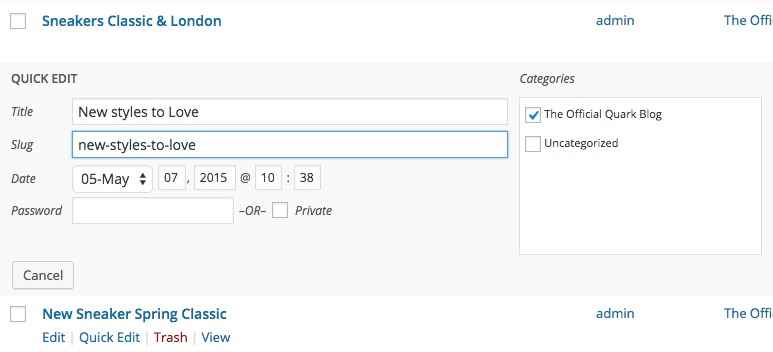
For example, in the demo content there is a post called "New styles to Love", and the slug for this post is "new-styles-to-love". If we wanted NSP to show only that post, we would use the following shortcode:
[gknsp data_source_type="wp-post" data_source="new-styles-to-love"]
If you're using the wp_category_list attribute to define a category that articles should be pulled from, then you'll need to find the ID of the category you wish to use. To do so, click on Posts → Categories to see a list of categories, and click on the category you wish to use to be taken to the Edit Category screen. Now check the URL of the page; you'll notice that towards the end of the URL there's a section that looks like this:
&tag_ID=x
Where "x" is a number.
This is the category ID; add this number as the value of the wp_category_list attribute and save changes; NSP will now automatically display the latest posts from this category as you add them. For example, in the demo content the sole category has an ID of 2; to display this category's posts only in NSP, the shortcode would look like this:
[gknsp data_source="wp-category" wp_category_list="2"]
Note: You can add multiple category IDs or post slugs to these attributes as needed; just separate each ID or slug with a comma
Changing the Title Text
The title appears above the showcases and is defined in the shortcode via the title attribute; simply change this value to your own title:
title="Your Title Here"
Changing Preview Text Lengths
If you modify the number of showcases via the column and row changes described above, you may find that your titles or preview texts are too long, and wrap in a way that does not look attractive, or take up too many lines on the page. In this case, you can modify the length of these elements to fit their space better. To do this, you will need to modify the article_title_len attribute (for the title), and the article_text_len attribute (for the preview text). In the demo content, the title length is defined by number of characters, and the text length is defined in number of words. Simply modify their respective values in the attributes. For example, if you wanted the title to be a maximum of 30 characters long, and the preview text to be 7 words, the shortcode would look like this:
[gknsp article_text_len="7" article_title_len="30"]
More Information
If you're interested in modifying News Show Pro even further, take a look at this GavickPro blog post which covers the available attributes and their respective functions and values.
The Newsletter Popup
The newsletter popup is a timed newsletter call-to-action that encourages users to sign-up for your newsletter:
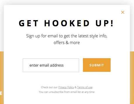
This popup is created using a MailPoet Subscription Form widget and a form provided by MailPoet also.
How It Works
This section consists of two parts; a subscription form, which is created in the visual editor of MailPoet's options, and a widget that creates the title and displays the subscription form. This widget is also provided by MailPoet, and is called a MailPoet Subscription Form widget.
The subscription form's look is defined in the visual editor of MailPoet (MailPoet → Settings → Forms tab → Edit Form in the WordPress menu):
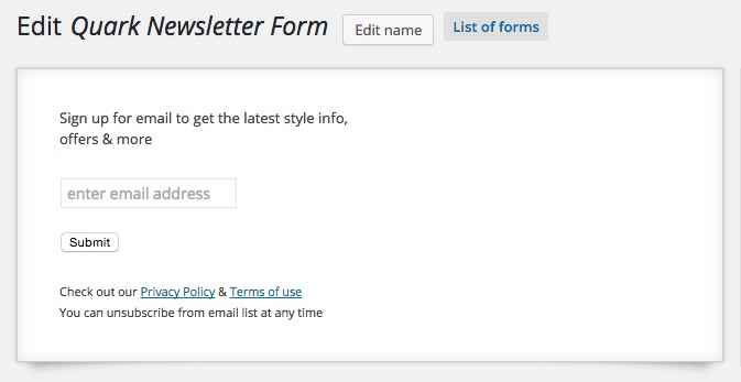
In this section you can highlight each block and edit the content by clicking the Edit Display button that appears when each section of the form is hovered over in the editor, or drag new fields from the list of available elements on the right and drop them into the visual editor, which will realign them accordingly. The form as used in the demo is made up of four parts; the first is a Random Text or HTML field with the following content:
<p>Sign up for email to get the latest style info,<br> offers & more</p>
That appears at the top of the form, under the title. This is very simple HTML consisting of a plain <p> tag with a <br> tag creating a line break in the middle of the content. Next is the Email field, which has the following label attached:
enter email address
And the option to display the label within the field activated.
The third block is the Submit button, which has the plain "Submit" label. Finally, the last block is another Random Text or HTML block with the following HTML code:
<small> Check out our <a href="#">Privacy Policy</a> & <a href="#">Terms of use</a><br> You can unsubscribe from email list at any time </small>
This HTML is a little more complex; a <small> tag wraps all the text, but there are also two <a> tags used to provide links to privacy policies and terms of use, along with a <br> tag for line breaks. This completes the form.
To add the form to the newsletter popup, a MailPoet Subscription Form widget is added to the Newsletter widget position. This widget has only two options; a Title field, which defines the title that is displayed at the top of the block, and a Select a form drop-down list where you can pick from the available forms from your MailPoet installation.
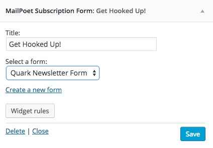
Changing the Popup Title
The title for the popup is defined in the Title field of the MailPoet Subscription Form widget. To change this, click on Appearance → Widgets in your WordPress backend to go to the Widgets screen. Click on the Newsletter position on the right to expand it, and then click on the MailPoet Subscription Form widget to expand the options.
The first option in this section will be the widget's Title field; modify the text in this field to redefine the title of the popup.
Changing the Text Above the Email Field
Above the email field is a short bit of text promoting the benefits of signing up to the newsletter. This is part of the MailPoet newsletter form. To modify it, Click on MailPoet → Settings in your WordPress backend to open the MailPoet option area, then click on the Forms tab to see a list of available forms.
In this list, highlight the newsletter's name and click the Edit button that appears to taken to the Edit Newsletter page. You will see the visual editor for the form on the left:
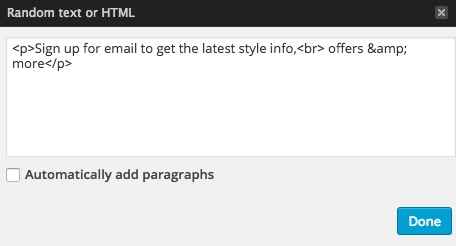
Use your mouse cursor to highlight the text block above the email field, and click the Edit display button that appears on hover to open a popup with options for editing the HTML content in this section. Change the text between the <p> tags to your own content as per the below layout:
<p>First line of text<br>Second line of text</p>
Changing the Email Field Label
To change the email field's label, open the MailPoet form editor page, highlight the email address field in the visual editor on the left of the screen, and click the Edit display button that appears. A popup will open with two options; modify the text in the Label field to whatever you wish to display in this field.
Changing the Submit Button Label
To change the label of the button, open the MailPoet form editor page as in the above examples, then highlight the button in the visual editor and click the Edit Display button. A field will popup with a Label area where you can add your own button label.
Changing the Bottom Text Block
To change the text under the email form, open the MailPoet form editor, highlight the text block and click the Edit display button. A popup will open with the HTML text of this block added; you can modify this text using the following placeholder guide:
<small>
Text before first link <a href="/First Link URL">First Linked Text</a> Text between links <a href="/Second Link URL">Text after second link</a><br>
Second line of text.
</small>
Don't forget to add your link URLs to the href attribute in the link <a> tags. Alternatively, if you only want a text message without any links you can remove the <a> tags completely:
<small>
First line of text<br>
Second line of text.
</small>
Theme Features
Eccommerce includes additional features and pages to help improve your site that are not specific to the frontpage, such as typography, reveal animations, and more. This section will look at each of these features in-depth.
The Contact Page
The Quark Contact page uses a parallax header background with overlaid text, social media icons and links and a Google Maps link to help customers locate your establishment. In the mainbody of the page is an easy-to-use contact form along with other contact information.
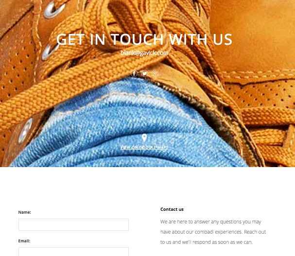
Creating a Contact Page
The Ecommerce demo content includes an example contact page ready to be modified, but if you're looking to create a new one from scratch it's a fairly standard process. As with the other pages, click on Pages → Add New in your admin area to add a new page. On the edit screen, add the page title that you want to be displayed in the header to the Title field; text entered here will appear as the title in the header.
Now copy the following HTML content into the mainbody of the page; this will get your contact page extra information matching our demo layout, ready for you to customize: :
    <h3>Contact us</h3>
    <p>We are here to answer any questions you may have about our combadi experiences. Reach out to us and we'll respond as soon as we can.</p>
    <p>Even if there is something you have always wanted to experience and can't find it on combadi, let us know and we promise we'll do our best to find it for you and send you there.</p>

    <h3>Address</h3>

    <p>6368 Rustic Berry Vista<br />
    Goodwater, HI, 96728-6372, US</p>

    <big>+1 808 132 05 80</big><small>Open Monday to Saturday, 9.15am - 5.15pm</small>
Now have a look at the Page Attributes section in the right sidebar; find the option called Template, click on the drop-down list for this option and select the Contact Page template; this will ensure the right formatting and CSS rules are applied to the page, and will also allow you to change several contact-page related options when viewing the page in the Theme Customizer.
Next up is the parallax background image; Click on the Set Featured Image text in the right sidebar and select an image from your media library; this image will be used as the parallax background image. Finally, click on Publish at the top of the right sidebar to publish the page and your contact form is ready.
Changing the Contact Page Header
The contact page's header is modified via a combination of page content and theme settings; specifically, the large title text is taken from the title of your contact page, whereas the subtitle text and social media/Google Map icons and links are controlled via the theme options.
Changing the Title Text
To change the title text, modify the text in the title field of your contact page; click on Pages → All Pages in the WordPress left menu and select your contact page, then make your changes. The title text will automatically be used as the large text on the Contact Page:

Changing the Background Image
The background image is taken from the Featured Image of your contact page. By changing the featured image you can set a new background. On the Edit Page screen click on the Set Featured Image text on the right of the screen.
If a featured image is already assigned that you wish to replace, then first click on Remove featured image to delete the image, and then you can click on the Set featured image text.
After clicking you will see your media library; select your preferred background image here and click on the Set Featured Image button in the bottom-right of the screen to set the image, then click on Update to save changes to your page, and your background image is ready.
Changing the Social Media and Map Links
The social media icons and links, along with the Google Maps link at the bottom of the header, are all controlled with the Theme Customizer. In your WordPress backend, click on Appearance → Customise in the left menu to open the customizer. You will see a set of options on the left, and a view of the frontpage on the right.
In the frontpage preview, open your contact page via the menu. Once on a page with the Contact Page template assigned, a new set of options specifically for this page's social icons and links will appear.
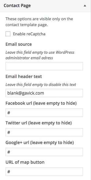
Click on the section to expand the options, and make your changes. More information on the settings and how to change them may be found in the Theme Settings section at the start of this guide.
Changing the Contact Mainbody Content
The mainbody content is created via simple HTML code added to the page mainbody field. The basic code looks like this:
    <h3>Contact us</h3>
    <p>We are here to answer any questions you may have about our combadi experiences. Reach out to us and we'll respond as soon as we can.</p>
    <p>Even if there is something you have always wanted to experience and can't find it on combadi, let us know and we promise we'll do our best to find it for you and send you there.</p>

    <h3>Address</h3>

    <p>6368 Rustic Berry Vista<br />
    Goodwater, HI, 96728-6372, US</p>

    <big>+1 808 132 05 80</big><small>Open Monday to Saturday, 9.15am - 5.15pm</small>
If we simplify the code by replacing the demo text with placeholder labels, you can see clearly where each piece of information should go:
    <h3>Right column title here</h3>
    <p>Right column first paragraph here</p>
    <p>Right column second paragraph here</p>

    <h3>Second right column title here</h3>

    <p>Address Line 1<br />
    Address line 2</p>

    <big>Phone Number Here</big><small>Opening days/times here</small>
The first <h3> tag creates the first title of the right-column's text, next to the contact form. This is followed by two plain text paragraphs in the two sets of <p> tags.
Next, a second <h3> heading highlights the second section, with a <p> tag containing address information; a <br /> line break separates the two lines of the address.
Finally, a <big> tag provides the large text for highlighting a phone number, and final <small> tag contains opening times and days.
Since none of these tags use any special classes or attributes, you may simply change the text between each tag to your liking. It does not necessarily need to list address and telephone numbers; you can add emails or alternative contact means as you see fit. If desired, you may also expand the content by adding more <h3>, <p>, <big> and <small> tags; the section will automatically expand to fit, but do bear in mind that the contact form is a set height, so it's recommended to keep the amount of content roughly similar to our demo to keep things in line. Also, you may remove any lines that you feel are unnecessary; this will not affect the aesthetics of the page as it will adjust itself to fit.
Font Awesome
Font Awesome is an incredibly useful font for delivering scalable icons to your site. With over 500 icons available covering a wide range of topics, from popular social media icons to transportation and payment icons, there's something for every type of site available.
How It Works
Font Awesome functionality is included as standard with Quark, so you can start using their icons immediately. Icons are added to content using an icon <i> tag with a particular class attached that corresponds to the icon you want to display.
Every icon in the Font Awesome set has a class name beginning with fa, such as fa-pinterest for the Pinterest icon. To use an icon, this class name must be inserted into the <i> tag using the following format:
<i class="fa fa-ClassName"></i>
Notice that fa appears twice in the class attribute; the first time to declare the use of Font Awesome, and the second time as part of the icon's class name. For example, to insert the Pinterest icon mentioned above, the code would be:
<i class="fa fa-pinterest"></i>
A full list of available icons and their respective class names may be found at the bottom of our Quark demo's Typography Page.
The tags should always be left blank, with no text between the opening and closing tags. You may insert these tags anywhere you are entering standard HTML content, including any of our frontpage sections, or in your pages and posts.
The WYSIWYG (What You See Is What You Get) Editor that WordPress defaults to when editing posts and pages will usually clean up blank tags; that is, tags with no content between them. This will include <i> tags that create Font Awesome icons, since they do not have any text between the opening and closing tags. To counter this issue, make sure to only use the plain text editor when adding icons.
Reveal Animations
The reveal animations that are often used in Quark are provided by the powerful ScrollReveal JavaScript Library. This library allows animations to be added to nearly every HTML element in your code via the use of a data-sr attribute; you may have noticed when modifying the code for the frontpage elements or additional pages that they often had this data-sr attribute attached to control the animation.
When this attribute is added to an HTML tag, that element will be animated into place using a default reveal animation:
<h2 data-sr>My Title</h2>
However, ScrollReveal also includes multiple keywords that you can use to define the reveal animation using simple, understandable language. For example, the keyword "over Xs", where "X" is a time in seconds, will control the speed of the animation so that it take the value of "x" to complete. So, a value of:
<h2 data-sr="over 2s">My Title</h2>
Will cause the default animation to take two seconds to complete. Similarly, there are many keywords for controlling the type of animation. using the enter keyword will let you define the direction from which the animation will start (top, left, right, and bottom), while move can define the distance (in pixels) the animated element should move. Combine them together with the over keyword, and you will have something like this:
<h2 data-sr="Enter left move 24px over 2s">My Title</h2>
So with this setting, the title will appear 24px to the left of its final position, and will move right 24px to the final position over two seconds.
There are many more keywords that let you delay the animation, flip, spin, rotate and scale the element, and control attributes like starting opacity. A full list of the available keywords and their respective functions may be found on the ScrollReveal GitHub page.
Page-Load Animations
Quark includes the ability to display animations as pages load, to avoid users from seeing the page before it is ready to view.
This animation is provided via a gif file called default.gif stored in the wp-content/Quark/images/preloaders folder of your WordPress installation. This default animation is designed to suit the aesthetics of the theme, but if you're interested using your own animation it's very easy to replace.
- First, create your animation and save as a gif file; there are many programs online to help you with this.
- Name your new file default.gif, as this is the name used by Quark to target the preloader file.
- Connect to your server via FTP (more details on how to do this may be found in this blog article on the basics of FTP, and navigate to the wp-content/Quark/images/preloaders folder.
- Once at this folder, upload your new default.gif file and overwrite the existing file. Once done, your new page preloader animation will automatically be used.
Login Popup
The login popup is an elegant way to allow users to log-in without loading an additional page; this is very useful if your site requires users to log-in in order to receive the complete set of site features:
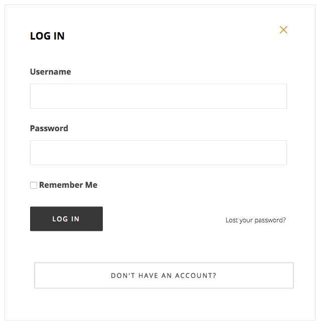
To create this popup, you will need to first create a Login/Register page, and then a menu item that links to the page; this page and menu item are already present in our demo content, but it is easy to create new ones if needed.
To create the page:
- In your WordPress backend, click on Pages → Add New to open the Add New Page screen.
- Add a title such as Login/Register to the title field, and in the Template drop-down list in the Page Attributes section of the sidebar, select the Login Page template.
- Click on Publish to save and publish the page; the login form will be displayed automatically.
To create the menu item:
- In your WordPress backend, click on Appearance → Menus to open the Edit Menus screen.
- In the Select a menu to edit drop-down lists, choose the menu you wish to add the login to.
- In the section on the left of the screen where you can choose which menu items to add, click on Pages to expand the section, then add a check to your Login/Register page and click the Add to Menu button.
- The menu item will be added to the list under the Menu Structure heading. Now click on the new menu item to expand the options; you should see a CSS Classes field; if not, click on the Screen Options box at the very top of the page and add a check to the CSS Classes option:
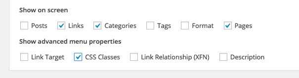
- In the CSS Classes field, add the following class:
gk-login-popup
- Click on Save Menu in the bottom-right to save the changes. Your popup login will now work as needed.
Menu Widgets
Ecommerce offers two menu types, definable in the Theme Customizer. The classic menu works as you would expect; each main menu item appears at the top of the page, and highlighting an option reveals its submenus if applicable:
However, the second menu type is off-canvas; that is, it scrolls into view from the right of the screen when a menu button is clicked.
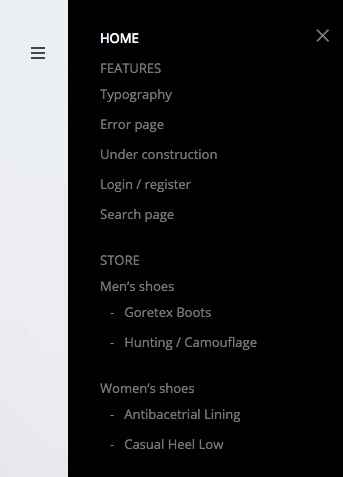
Because this menu type offers a large amount of space, we have included widget areas in the off-canvas menu to help you to diversify your content. There are two widget areas available; one above the menu, and one below. You may attach any widgets you like to these areas, but in this section we will discuss the example used in the demo content; displaying social media icons and links.
The Menu Social Media Icons
In the demo layout, the Menu Bottom widget area features a Text widget with the following code to produce the social icon links:
<div class="gk-social-icons">
<a href="#"><i class="gkicon-fb"></i></a>
<a href="#"><i class="gkicon-twitter"></i></a>
<a href="#"><i class="gkicon-gplus"></i></a>
<a href="#"><i class="gkicon-pinterest"></i></a>
<a href="#"><i class="gkicon-behance"></i></a>
<a href="#"><i class="gkicon-dribbble"></i></a>
<a href="#"><i class="gkicon-instagram"></i></a>
<a href="#"><i class="gkicon-rss"></i></a>
<a href="#"><i class="gkicon-youtube"></i></a>
<a href="#"><i class="gkicon-vimeo"></i></a>
<a href="#"><i class="gkicon-linkedin"></i></a>
</div>
The code here is very easy to understand; a <div> element is created with the gk-social-icons class attached to take care of styling. Then, each social icon is created using a mixture of an <a> tag, for the link, and a set of <i> tags for the icon:
<a href="#"><i class="gkicon-fb"></i></a>
Just like when adding Font Awesome icons, the class of the opening <i> tag defines which icon is displayed. You can pick from the following selection of classes/icons:
- gkicon-fb - Facebook
- gkicon-twitter - Twitter
- gkicon-gplus - Google+
- gkicon-pinterest - Pinterest
- gkicon-behance - Behance
- gkicon-dribbble - Dribbble
- gkicon-instagram - Instagram
- gkicon-rss - RSS Feed Icon
- gkicon-youtube - Youtube
- gkicon-vimeo - Vimeo
- gkicon-linkedin - LinkedIn
Changing an Icon
To change the icon of a given entry, you will need to modify the class attribute of the <i> tag in question. For example, to change the first icon from a Facebook icon to a Twitter icon, you would change the second line of the code from:
<a href="#"><i class="gkicon-fb"></i></a>
To:
<a href="#"><i class="gkicon-twitter"></i></a>
If you do not need a particular icon, simply delete its code starting from the opening <a> tag and finishing at the closing </a> tag (delete the <a> tags too!).
Adding a Link
By default these icons do not link anywhere, so you will need to add a link to your corresponding social media profile into the href attribute of the opening <a> tag:
<a href="/Link URL Goes Here!"><i class="gkicon-fb"></i></a>
Repeat this step for each icon so that they all link to their appropriate social media profiles.
Advanced Typography
Quark includes some complex typography options to help style your post content the way you want it; in this section, we'll cover how to use these special options.
How It Works
The typography options in Quark may be applied in the Text mode of the TinyMCE editor, where you enter raw HTML code alongside basic text. Here, you can manually add the classes required to achieve each effect to the relevant HTML tags. To use the Text mode, click on the Text tab at the top-right of the editor window:
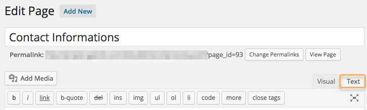
When writing in HTML code in the text editor, you will need to manually attach the classes to the HTML tag, so that the correct CSS rules are applied.
To attach a class to an HTML tag, a new attribute, "class", followed by an equals sign and the class name in quotes, must be added to the opening tag of the element after the tag but before the closing bracket. This assigns a class to that element. For example, to add a class called "special" to an HTML <p> tag, you would write:
<p class="special">Your Text</p>
The following sections will provide information on the classes available, and their functions.
Warnings
Warnings are highlighted text segments that are meant to draw attention to important information, such as rules, advice or guidelines. There are three types of warning available, each with a different purpose. To use them, simply add the class name to a <p> element:
<p class="classname">
- gk-info - This attribute adds a blue border to the text and prefaces it with a chat icon to highlight information.
- gk-success - This attribute adds a green border to the text and prefaces it with a lightbulb icon. It is useful for adding advice or hints to your content.
- gk-notice - This attribute adds a yellow border and prefaces the text with a exclamation mark. It is used for warnings.
- gk-error - This attribute adds a red border and prefaces the text with a cross icon. It is used for errors and negative statements.
Highlights
Highlights are a way to make a particular part of a paragraph stand out. Unlike the warnings, highlights can be applied in the middle of a paragraph without damaging the text layout.
To use highlights, you will need to add a set of <span> tags in your <p> tags to separate the phrase, and add the highlight class to the <span> element. For example, if you wish to add a highlight to the word "highlight" in the following <p> tag:
<p>This is a highlight phrase</p>
You would need to add the opening <span> tag with the highlight class before the word "highlight", and the closing </span> tag after, like this:
<p>This is a <span class="className">highlight</span> phrase</p>
There is one available highlight class in Quark, which is:
- gk-highlight - This highlight adds a yellow background to the text.
Progress Bar
The progress bar is a white bar with a label underneath that can be set to fill with black to a certain point (represented by a percentage) on reveal, with a text percentage amount appearing at the point where the bar is filled to.
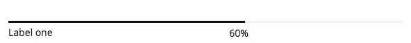
This is probably the most complex typography element to create in Quark, requiring multiple tags and classes to get the full functionality. First, a <div> class is created with a progress class attached. Then, a second <div> is added with a bar gk-loaded class and a style attribute that defines the length that the bar should fill to as a percentage using the following format: "width: XX%; visibility: visible;". Following this is a set of plain <span> tags that contain the label that should appear at the end of the progress bar. At this point the second <div> is closed, and a new paragraph <p> tag is opened containing a <span> tag, which in turn contains the label of the progress bar (that is, the label that appears on the left underneath the bar itself). Let's look at this code in action:
<div class="progress">
<div class="bar gk-loaded" style="width: 60%; visibility: visible; "><span>60%</span></div>
<p><span>Label one</span></p></div>
You can repeat this layout multiple times to stack a group of progress bars together; great for highlighting progress towards set goals or other measurable targets.
Code
The code typography element seperates text into an indented color block with a dark margin, great for separating code to make it easier for users to read and copy & paste.
Creating code is easy; you only need to wrap your code in <pre> tags. For example:
<p>This is plain text.</p>
<pre>This is code.</pre>
Unordered Lists
Unordered lists are just that; lists with no particular ordering i.e. no numbered or otherwise ordered entries. This is a good way to list points or minutes in an easily-readable format.
The classes for styling the unordered lists should be added in the opening <ul> tag that begins with list, with the <li> list item tags left as they are:
<ul class="className">
<li>Item 1</li>
<li>Item 2</li>
<li>Item 3</li>
</ul>
There are four available unordered list classes, as follows:
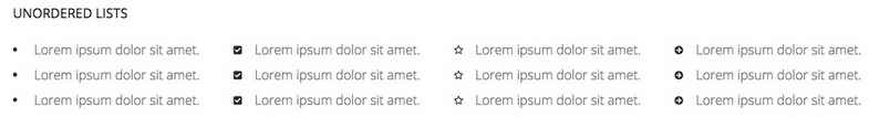
- gk-bullet1 - This class uses solid black blocks as the delimiter between each point.
- gk-bullet2 - This class uses black outline blocks as the delimiter to each point.
- gk-bullet3 - This class uses solid orange blocks as the delimiter to each point.
- gk-bullet4 - This class uses orange outline blocks as the delimiter to each point.
Number Blocks
Number blocks create large blocks that contain a block with a character inside, such as a number, followed by a two-line item. They are useful for highlighting larger points or available options.
The complexity of the number blocks means that they require some more complex HTML tags. Each block contains a <p> tag, which also has the class assigned to it, a <span> tag that contains the character to appear in the block, an <em> tag for the first line of the item, and plain text for the second line. The basic structure looks like this:
<p class="className">
<span>Character (i.e. "1", "A")</span>
<em>First Line</em>
Second Line
</p>
There is one available number block class in Quark, which is:
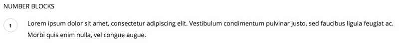
- numblocks num-1 - This creates a black colored block and text.
Blocks
Blocks are boxes that surround a paragraph of text, whether with solid color backgrounds or outlines.
Blocks are created by adding a particular class to the <p> tag that you wish to apply the block to. The basic format is very simple:
<p class="Classname">Paragraph text here.</p>
There are two simple blocks to choose from in Quark:
- block-1 - This class adds a green background block to your paragraph.
- block-2 - This class adds a yellow background block to your paragraph.
There's also a third block type that's a little more complex. Instead of adding a color background to a paragraph block, this third block type adds a black outline around the paragraph, with a title in the top-left of the outline:
This third type is created with three elements; an opening <div> tag with the special legend class applied, containing an <h4> tag that contains the title, and a <p> tag containing the paragraph text. The basic code looks like this:
<div class="legend">
<h4>Block Title Here</h4>
<p>Paragraph Text Here</p>
</div>
Blockquotes
Blockquotes allow you to elegantly highlight quotations in your article, to show that they are not from your pen, as it were.
The blockquotes format consists of a <blockquote> tag with class attached that contains the quoted text, and a <strong> tag before the closing </blockquote> that provides the attribution.
<blockquote class="className">Your Quote Here
<strong>Attribution Name</strong>
</blockquote>

This will separate the text in the blockquote tags from your other content with a grey margin on the left side.
Floated Blocks
Floated blocks are some of the most visually-appealing typography options available in Quark. They allow you to highlight particular phrases or quotes from the text by adding them in colored text on the left, right, or centre of your main content, much like a newspaper.
The layout of the HTML tags for floated blocks depends on the type of floated block you are using, and where you want the block to appear. The text to appear in the floating block is defined in a <span> tag within your content. Content added before the <span> tag will appear above it, and content added after will be added alongside it. A standard piece of HTML using these blocks may look something like this:
<p>Lorem ipsum dolor sit amet, consectetur adipiscing elit. Vestibulum condimentum pulvinar justo, sed faucibus ligula feugiat ac. Morbi quis enim nulla, vel congue augue. Duis quis quam sed purus porta eleifend.

<span class="gk-block-text-left">Lorem ipsum dolor sit amet, consectetur adipiscing elit.</span>

Donec eget dignissim augue. Donec ante felis, aliquam ut consequat eget, lobortis dapibus risus. Aliquam laoreet enim et lectus ornare hendrerit. Aliquam rhoncus enim libero. Morbi aliquam, nibh mattis feugiat dapibus, nisi massa adipiscing justo, sit amet condimentum urna ipsum et lacus. Nam fermentum, eros quis ullamcorper convallis, libero mauris lacinia eros, sed tempus leo lorem vitae purus.</p>
with the following result:
Something to note here is that there is no set position for the <span> tag to be added; it should be placed organically at the end of a paragraph or line in the text to highlight a particular phrase. Use the preview option in WordPress as you write the content to see how it looks and make your decision from there, and experiment with the <span> tag placement; you will get the feel for your preference very quickly!
There are a total of three classes for floated blocks:
- gk-block-text-left - This class aligns the text in the <span> tag to the left, with text following the tag appearing to the right.
- gk-block-text-right - The same as the above class, except this time the <span> tag text is on the right, and the main content after the closing tag floating left.
- gk-block-text-center - This tag creates a centrally-placed text block. Text before the <span> tag will appear above it, and text after the tag will appear below it.
Widget Settings
Quark Ecommerce includes the GK Widget Rules plugin from GavickPro, which allows you to control exactly where a given widget will appear. Usually, you are limited to defining only the location where a widget appears, but with Widget Rules, you can set different widgets to appear on different pages, or limit particular widgets to a category etc...
It's a great way to diversify and target your widgets depending on the content.
Using Widget Rules
Once the plugin is activated, a Widget Rules button will appear at the bottom of every widget instance in the Widgets page, reachable by navigating to Appearance>Widgets in your WordPress dashboard. Clicking this button will expand the options accordingly, and you can start configuring where a widget appears.
The options available are:
- Visible At - This option is used to micro-manage a widgets appearance by exception or the rule. For example, you can use No Pages Except to p
- revent a widget from being displayed anywhere except areas you explicitly tell it to appear; great if you want the widget to appear on one or two static pages only. In contrast, the All Pages Except option applies the widget to the same place in all areas except the ones you tell it to avoid. Finally, All Pages simply displays the widget everywhere; this is the default behaviour.
- Select Page to Add - After selecting whether you wish to automatically include or exclude pages, you need to add the content that should be ignored/included. With this option, you can select any particular page or post, all posts in a category, plus some additional pages such as 404 pages and the like.
When necessary, an additional box will appear to allow you to enter category or post slugs; we will cover this process in the next section.
- Selected Pages - This section shows any pages that have already been included/excluded.
- Custom CSS Class - This option allows you to add a special CSS class to the widget; great if you want to target it for additional CSS styling.
- Visible On - This option lets you decide which devices should see the widget in question. For example, you can set a widget to appear only on desktop browsers, or only on mobiles. This allows you to have a different instance of a widget depending on the device to ensure they get the best experience if a given widget isn't responsive.
- Visible For - This option allows you to hide a widget from particular users; useful if you only want registered users to access the resource, for example.
Adding a Page/Post to the Selected Pages List
This short guide will show you how to add a specific page or post to the selected pages list, so they can be included or excluded from displaying a widget depending on your Visible At settings.
- Set your preferred option in the Visible At section, depending on whether you want to exclude pages from displaying the widget (All Pages Except) or include them (No Pages Except).
- In the Select Page to Add drop-down list, select Page or Post, depending on which one you wish to add.
- A new field will appear called Page ID/Title/slug. Enter the slug for the post or page you wish to include/exclude in this field, then click Add Page to add the page to the Selected Pages list.
- Click Save to save changes.
You may also set a widget to appear on all pages or all posts; after selecting Page or Post in the Select Page to Add drop-down list, instead of entering a slug in the provided field, just click Add Page, and this will add all pages or posts to the include/exclude list.
To get the post slug for a particular post, navigate to the Post List in your WordPress backend by clicking Posts>All Posts in the dashboard, then highlight the post you wish to display to bring up the options related to that post and click on Quick Edit. This will open a new set of options, including a field that contains the current post's slug, and also allows you to change it if necessary.
The same steps may be used to find the page slug; simply open the Page List from your dashboard by clicking Pages>All Pages in the left menu of your dashboard, then highlight the page you wish to add and click Quick Edit to see the page slug; copy this into the appropriate field in the Widget Rules settings.