- Details
- Written by Robert Gavick
- Category: Box
- Hits: 5043
Introduction
Box comes equipped with all you'll need to run a successful store and create a recognizable, respectable brand image thanks to sublime modern design, extensive features and lightweight coding for the smoothest buying experience around.
In this guide we'll cover several areas to help you make the most of the theme, with details on the available theme options and features, as well as some simple customization tips.
Guide Structure
This guide is split into three sections:
- Theme Options - Covers the options included in theme that are accessible via the WordPress Customizer.
- Theme Features - Explores the features available in the theme, such as advanced typography and plugins such as News Show Pro and Tabs.
- Frontpage Elements - Details the frontpage elements and how they are created, and provides simple tutorials to help you get started with customizing them for your own content.
Theme Options
Box is packed with multiple options to make it flexible and easy to customize for your needs. You'll find a wealth of settings built into the WordPress Customizer, which offers a real-time preview of changes for comfortable, intuitive customization. To access the customizer, log-in to your WordPress backend and click on Appearance → Customize in the dashboard main menu. The customizer's main page consists of a viewport on the right that displays the live preview of your website (it will show the frontpage by default), with a list of option areas on the left. Clicking on one of these areas will expand the available options for that particular area e.g. clicking on the Fonts area will expand a list of options for changing your site's fonts. In this section of the Customization Guide, we'll look at each option area and their respective settings.
Site Identity
This section provides options for the core branding of the theme and your website, such as names, logos etc...This section includes the following options:
- Site Title - The site title is created when you first install WordPress; it sets what name visitors will see in the browser tab when browsing your site and will be used as the logo content when the Logo Type option is set to Text.
- Tagline - The tagline appears next the title in the browser's tab, to the right of the divider symbol (|.
- Site Icon - This options lets you set a favicon for your site, which is displayed in browser tabs & shortcuts or as app icons on mobile phones.
- Show Tagline - When the Logo Type option is set to Text, the tagline will be displayed underneath the logo of the site.
- Logo Type - Selects the type of logo that will be displayed at the top of the site; the example logo is created via CSS which you can of course modify, or you can define a simple text or image logo, or have no logo at all.
- Select Image - This option appears if you have set the Logo Type to Image, allowing you to upload a new logo to use on your site.
Colors
This section allows for customization of the main colors of the theme via a color picker, which makes it easy to find the color you wish to use instead of modifying the theme's CSS. The available options are:
- Background Color - This options sets the color of the background, which covers any area outside the theme's central width as well as the area behind the top menu.
- Primary Color - This option sets the color of the main color elements of the theme, including menu highlights and on-hover colors, buttons, and the background colors of the frontpage text blocks.
- Secondary Color - This option covers secondary items such as slide buttons and the background color of the image blocks (such as the frontpage "New Models" section).
Background Image
This section provides options for setting and manipulating a background image instead of a background color for your site. The available options are:
- Select Image - Clicking this button will open your media manager, where you can select or upload an image to be used as the background.
The following options are only visible once a background image has been set for your site:
- Remove - Removes the selected background image.
- Change Image - Opens the media manager to allow you to select an alternative background image.
- Background Repeat - Offers four options for controlling the 'tiling' effect of your background image; set the background to No Repeat to use the background image only once, to Tile to repeat the image until all the background area is covered, or to Tile Horizontally or Tile Vertically to repeat the image only horizontally or vertically across your background.
- Background Position - Sets the starting point for the tiled background image; choose from Left, Center or Right.
- Background Attachment - Sets whether the background should allow you to scroll down it like it was part of your site, or to fix the background image in its relative screen position no matter whether the user scrolls or not.
Menus
This tab contains options for creating and setting menus, with the same functionality as the menu page. There are two main options in this section:
- Menu Locations - This option lets you assign available menus to the available locations in the theme.
- Add a Menu - Lets you create new menus and assign items to them.
Any menus you have created will also appear in this section where you can modify their available links and options.
Widgets
This section allows you to add, remove or edit widgets in the widget positions available in the Box theme, similar to the functionality you would find in the Appearance → Widgets section of the dashboard, but with the benefit of the preview window to see the effects of the widget as they are created (with some exceptions; some third-party widgets can be updated in this section, but won't live preview due to the way that they work behind the scenes).
Static Front Page
This section deals with how your frontpage content is laid out, with options for displaying static pages or latest posts. The available options are:
- Front page displays - Choose whether you want your frontpage to display a list of your latest posts, or a styled static page. Box uses a static frontpage to create the majority of its homepage content, so it's advisable to leave this setting as A Static Page.
- Front Page - Sets the static front page; in Box if you've used the quickstart or manual install guide then you should already have a page with the Frontpage template set as your frontpage, and this should not be changed as it is relied upon to create the frontpage layout.
- Posts Page - Sets a separate page where you will display your posts if you are using a static frontpage. This option should not be needed, as Box includes category layouts for displaying your latest posts.
Font Options
Box has support for multiple fonts, from standard web fonts to more complex offerings from Google Fonts, and you can target each individual element of the page to use a particular font, though the standard installation already has all relevant elements targeted if you're not interested in getting that deep into customizing the fonts! The available options are:
- Define Size of the Fonts - This option sets the base size of the font, from which all other text sizes are taken. Essentially, the base size is the size standard text will use, with CSS-styled text being larger or smaller relative to this base size.
- Body Font - Sets the font used in the Body elements of the theme (such as blog post text etc...). This can be a standard web font such as Verdana or Arial, or a Google Font.
- Google Font URL for the Body - This option only appears when the Body Font option is set to Google Font. Here, you can add the URL for the Google Font you wish to use (more information is available in the Using a Google Font section of this guide that follows this one).
- Selectors for the Body font - This field contains all the CSS classes or elements that should be changed to the selected Body Font. These elements are already preset in the theme, but you may add/remove your own elements if desired.
- Header Font - Sets the font used in the Header elements of the theme (e.g. headings, logos etc...); choose from standard web font or Google Font.
- Google Font URL for the Header - Appears if the Header Font option is set to Google Font. The Google Font's URL can be added here.
- Selectors for the Header font - Defines the CSS elements that should use the selected Header Font. Can be customized if desired.
- Other Elements Font - Defines the font used in the Other Elements of the theme (such as the author info section, comments etc...); choose from standard web font or Google Font.
- Google Font URL for the other elements - Appears if the Other Elements Font option is set to Google Font. The URL for the chosen Google Font should be added here.
- Selectors for the Other Elements font - Defines the CSS classes that should use the Other Elements font. Users may add/remove their own classes as needed.
In each of the Font options there is a choice between using a standard web font or a Google Font; follow these steps to apply a new font to each section as needed:
Using a Google Font
Setting up a Google Font in the theme requires some very simple steps:
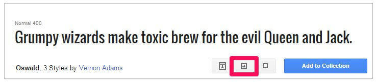
- Navigate to to Google Fonts website .
-
From the list of fonts, select the one you wish to use and click the Quick Use icon.
-
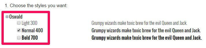
Select the styles and character sets you wish to use for the font by clicking the tickboxes next to each.
-
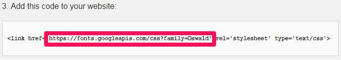
In the Add this code to your website section, copy only the font URL from the link element.
-
In the Appearance>Customize>Font options section of your WordPress backend, select Google Font in the drop-down list for the section you wish to use.
-
Paste the copied URL into the Google Font URL for Header/Body/Other Elements field; after a moment the live preview will update to show you how your site looks with the new font.
- Click the Save & Publish button to save changes.
The font has now been set as needed, and you will see the changes in the live preview window.
Using a Standard Font
The standard fonts available may be seen and selected in the Header Font, Body Font or Other Elements Font drop-down list; under the initial Google Font option are a list of standard fonts, so if you wish to use one of these fonts you may simply select it from the list, and the live preview will updated accordingly.
Default Font Configuration
The default font configuration covers the settings used in the demo layout of Box, including the fonts used and the selectors specified for each font.
Body Font
This option uses a Google Font with the following Google Font URL for the body:
//fonts.googleapis.com/css?family=Roboto:400,500,700
                         body,
                         .error404 .content-wrapper h2
Header Font
This option uses a Google Font with the following Google Font URL for Header:
//fonts.googleapis.com/css?family=Montserrat:400,700
The following selectors are defined in the Selectors for the Header Font field:
                         h1,h2,h3,h4,h5,h6,
                         .btn,
                         [type=button],
                         [type=submit],
                         button,
                         .article__date,
                         .widget.contact,
                         .bottom__box h3,
                         .post__tag,
                         .product-fields-title,
                         .bottom__links
Layout
This section is concerned with the width of the theme, specifically in regards to the sidebar and the responsive width on each screen size, such as for tablets and mobile phones (which dictates which media elements are loaded etc...). The available options are as follows:
- Theme Width - Sets the max width (in pixels) of the theme; this is the largest that it will stretch to given a screen with a high-enough resolution; the default is 1560px.
- Sidebar Width - Sets the total width of the sidebar; the width is set as a percentage of the total available width to ensure that the sidebar remains uniform across all screen sizes. For example, if your theme width is set at 1000px and the sidebar widget is set at 30%, then the sidebar will be 300px wide. The default setting for this options is 20%.
- Sidebar Position - Sets whether the sidebar should appear on the left or right of the theme on the pages that have a sidebar; the default is set to Left.
Features
This section includes any special features that do not fit with the other option categories. The available options are:
- Enable Classic Menu - When enabled, the main menu of the theme will appear at the top of the screen in the usual position. When this option is disabled, the classic menu is replaced with a 'hamburger' menu icon that opens an Aside menu when clicked.
- Display Details on Pages - When enabled pages will display the author, creation date and other pertinent information, similarly to what is displayed on blog posts.
- Read More Button on Categories - This option toggles whether a "More" text link should appear on post category listing pages under each listed post.
- Display Tags on Category Pages - This option sets whether a post's tags are displayed underneath the post preview in the category page, such as in the blog section of Box.
- Enable Popup Login - When disabled, clicking on a login link will take the user to a separate login page. When this option is enabled, clicking the login link will open a login overlay without navigating away from the current page.
- Date Format - Defines the formatting for the dates in post previews and at the top of posts.
- Copyright Text - Here you can add HTML that will be displayed in the footer of the theme.
Social API
The Social API area provides options related to the addition of share buttons and social network icons in the theme. In Box, the social network sharing options are displayed in a Share With section at the bottom of posts/pages, with individual icons for each social network.
- Post Social Icons - Toggles whether posts will include Facebook, Twitter, Google+ etc...share buttons at the bottom of each post.
- Page Social Icons - Provides the same functionality as the above option, but this time toggles whether the icons appear on pages rather than posts.
- Enable FB Icon - Set whether a Facebook share button is included in the social sharing area.
- Enable Twitter Icon - Toggles whether a Twitter share button is added to the social sharing area.
- Enable Google Icon - Adds a Google+ share button to the social sharing area.
- Enable Pinterest Icon - Adds a Pinterest link to the social sharing area.
- Enable LinkedIn Icon - Adds a LinkedIn link to the social sharing area.
- Enable VK Icon - Adds a VK link to the social sharing area.
- Enable Print Icon - Adds a print icon for users to print out articles to the social sharing area.
- Enable Mail Icon - Adds an email link to the social sharing area so the article link can be emailed.
Cookie Law
This Customizer panel is dedicated to configuring a cookie banner in accordance with EU law.
- Use Cookie Consent Plugin - Enables or Disables the Cookie Law plugin.
- Consent Mode - Defines the type of cookie consent your site uses; choose from Explicit, where no cookies are set until the visitor consents, and Implied, which sets cookies but offers users the option to opt-out.
- Use SSL - Sets whether the Cookie Banner uses Secure Socket Layer (SSL) to protect any data it receives.
- Banner Placement - Choose where the Cookie Banner appears on your site.
- Tag Placement - Selects where the Privacy Settings tag appears on your page, that opens the Cookie Consent overlay when clicked.
- Refresh after gaining consent - Toggles whether the page should refresh after cookie consent is given.
There are some advanced configuration options available with this plugin; more information may be found on our blog in this Features article .
Frontpage
This panel in the WordPress Customizer controls the slider features on the frontpage. In order to see this panel in the customizer the site preview must be displaying your site's homepage. The available options are:
- Tag Name - The frontpage header automatically pulls your latest posts that have the same tag as what is entered in this field; by default this is set to featured, but you can use any tag you like.
- Header Image Height - Sets the height in pixels of the header images.
- Header Image Width - Sets the width in pixels of the header images.
- Enable Header Grid Layout - When this option is enabled the header layout is changed from the default accordion style to a grid layout consisting of a single large post preview and two columns of two smaller previews.
- Amount of Header Columns - Sets the number of post previews that are displayed in the header; the default is 3, but you can have up to 5 previews in the accordion layout.
- Grid Layout - This option is only available when the Grid Header Layout is enabled, and it allows you to decide the order of the photo and two columns; choose whether to have the large photo in the center, left or right column, with the two smaller columns taking up the leftover spots.
- Filter Frontpage Categories - Underneath the header is a grid layout of your latest posts; when this option is enabled you can specify which categories these posts should be taken from via a Select Categories checkbox.
Contact Page
This section is only available when the Customizer preview viewport is on the contact page i.e. when the frontpage preview loads in the demo layout, clicking on the Contact link in the main menu will take you to the contact page, and this section will appear. This section includes options specific to the contact page.
- Enable reCaptcha - When enabled users must complete a reCaptcha before they can send an email via the contact form.
- Display Address Block - When enabled the contact page area that shows the address, phone, fax and mobile fields will be displayed on the page.
- Address - Text in this field will be displayed in the address block next to the Address text.
- Phone - Characters entered in this field will be displayed in the address block next to the Phone text.
- Fax - Characters entered in this field will be displayed in the address block next to the Fax text.
- Mobile - Characters entered in this field will be displayed in the address block next to the Mobile text.
Theme Features
The Box package includes several plugins and other additions that expand the core features of WordPress to give users total control of their content and overall look. In this section we'll examine these features and expand on how they can be used.
Widget Rules
Box includes the GK Widget Rules plugin from GavickPro, which allows you to control exactly where a given widget will appear. Usually, you are limited to defining only the location where a widget appears, but with Widget Rules, you can set different widgets to appear on different pages, or limit particular widgets to a category; there's a large number of options at your disposal, providing a great way to diversify and target your widgets depending on the content.
Using Widget Rules
Once the plugin is activated, a Widget Rules button will appear at the bottom of every widget instance in the Widgets page, reachable by navigating to Appearance>Widgets in your WordPress dashboard. Clicking this button will expand the options accordingly, and you can start configuring where a widget appears.
The options available are:
- Visible At - This option is used to micro-manage a widgets appearance by exception or the rule. For example, you can use No Pages Except to prevent a widget from being displayed anywhere except areas you explicitly tell it to appear; great if you want the widget to appear on one or two static pages only. In contrast, the All Pages Except option applies the widget to the same place in all areas except the ones you tell it to avoid. Finally, All Pages simply displays the widget everywhere; this is the default behaviour.
- Select Page to Add - After selecting whether you wish to automatically include or exclude pages, you need to add the content that should be ignored/included. With this option, you can select any particular page or post, all posts in a category, plus some additional pages such as 404 pages and the like. When necessary, an additional box will appear to allow you to enter category or post slugs; we will cover this process in the next section.
- Selected Pages - This section shows any pages that have already been Included/excluded.
- Custom CSS Class - This option allows you to add a special CSS class to the widget; great if you want to target it for additional CSS styling.
- Visible On - This option lets you decide which devices should see the widget in question. For example, you can set a widget to appear only on desktop browsers, or only on mobiles. This allows you to have a different instance of a widget depending on the device to ensure they get the best experience if a given widget isn't responsive.
- Visible For - This option allows you to hide a widget from particular users; useful if you only want registered users to access the resource, for example.
Adding a Page/Post to the Selected Pages List
This short guide will show you how to add a specific page or post to the selected pages list, so they can be included or excluded from displaying a widget depending on your Visible At settings.
- Set your preferred option in the Visible At section, depending on whether you want to exclude pages from displaying the widget (All Pages Except) or include them (No Pages Except).
- In the Select Page to Add drop-down list, select Page or Post, depending on which one you wish to add.
- A new field will appear called Page ID/Title/slug. Enter the slug for the post or page you wish to include/exclude in this field, then click Add Page to add the page to the Selected Pages list.
- Click Save to save changes.
You may also set a widget to appear on all pages or all posts; after selecting Page or Post in the Select Page to Add drop-down list, instead of entering a slug in the provided field, just click Add Page, and this will add all pages or posts to the include/exclude list.
To get the post slug for a particular post, navigate to the Post List in your WordPress backend by clicking Posts>All Posts in the dashboard, then highlight the post you wish to display to bring up the options related to that post and click on Quick Edit. This will open a new set of options, including a field that contains the current post's slug, and also allows you to change it if necessary.
The same steps may be used to find the page slug; simply open the Page List from your dashboard by clicking Pages>All Pages in the left menu of your dashboard, then highlight the page you wish to add and click Quick Edit to see the page slug; copy this into the appropriate field in the Widget Rules settings.
Advanced Typography
Box includes some advanced typographical elements for styling your text content beyond the standard HTML tags, such as special list layouts and text highlights.
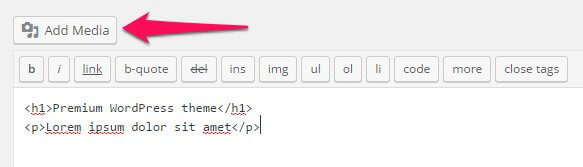
How It Works
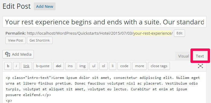
The typography options in Box may be applied in the Text mode of the TinyMCE editor, where you enter raw HTML code alongside basic text. Here, you can manually add the classes required to achieve each effect to the relevant HTML tags. To use the Text mode, click on the Text tab at the top-right of the editor window:
When writing in HTML code in the text editor, you will need to manually attach the classes to the HTML tag, so that the correct CSS rules are applied.
To attach a class to an HTML tag, a new attribute, "class", followed by an equals sign and the class name in quotes, must be added to the opening tag of the element after the tag but before the closing bracket. This assigns a class to that element. For example, to add a class called "special" to an HTML <p> tag, you would write:
<p class="special">Your Text</p>
The following sections will provide information on the classes available, and their functions.
Warnings
Warnings are highlighted text segments that are meant to draw attention to important information, such as rules, advice or guidelines. There are four types of warning available, each with a different purpose. To use them, simply add the class name to a <p> element:
<p class="classname">
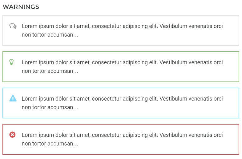
- gk-info - This attribute adds a grey border around the warning text and prefaces it with a speech-bubble icon to highlight information.
- gk-success - This attribute adds a green border around the warning text and prefaces it with a lightbulb icon. It is useful for adding advice or hints to your content.
- gk-notice - This attribute adds a blue border around the warning text and prefaces the text with an exclamation mark icon in a warning triangle. It is used for warnings or important notices.
- gk-error - This attribute adds a red border around the warning text and prefaces it with a red cross icon; useful for negative messages or warnings.
Highlights
Highlights are a way to make a particular part of a paragraph stand out. Unlike the warnings, highlights can be applied in the middle of a paragraph without damaging the text layout.
To use highlights, you will need to add a set of <span> tags in your <p> tags to separate the phrase, and add the highlight class to the <span> element. For example, if you wish to add a highlight to the word "highlight" in the following <p> tag:
<p>This is a highlight phrase</p>
You would need to add the opening <span> tag with the highlight class before the word "highlight", and the closing </span> tag after, like this:
<p>This is a <span class="className">highlight</span> phrase</p>
The available highlight classes are:
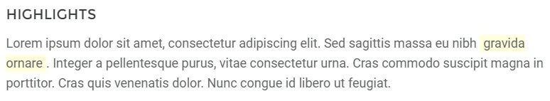
- gk-highlight - This highlight adds a yellow background to the text.
Code Listings
Code listings create blocks that separate code content away from the main content of your site, making it easy for users to spot and read your code:
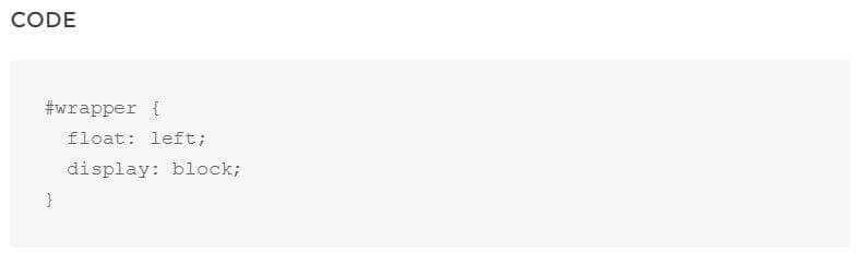
Creating the code block is easy; simply surround the text/code you want to separate with a set of <pre> tags:
                         <pre>
                         #wrapper {
                              float: left;
                              display: block;
                              }
                         </pre>
Unordered Lists
Unordered lists are just that; lists with no particular ordering i.e. no numbered or otherwise ordered entries. This is a good way to list points or minutes in an easily-readable format.
The classes for styling the unordered lists should be added in the opening <ul> tag that begins with list, with the <li> list item tags left as they are:
                    <ul class="className">
                    <li>Item 1</li>
                    <li>Item 2</li>
                    <li>Item 3</li>
                    </ul>
There are four available unordered list classes, as follows:
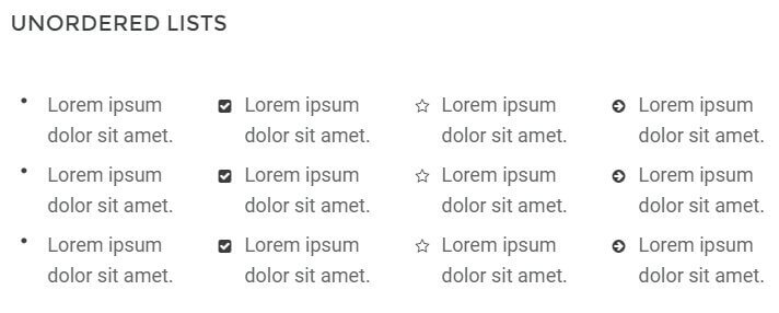
- gk-bullet1 - This class uses solid black dots as the delimiter between each point.
- gk-bullet2 - This class uses black tickboxes as the delimiter to each point.
- gk-bullet3 - This class uses black star outline icons as the delimiter to each point.
- gk-bullet4 - This class uses black right-arrow icons as the delimiter to each point.
Number Blocks
Number blocks create circles with character inside, such as a number, followed by a text. They are useful for highlighting larger points or available options.
The complexity of the number blocks means that they require some more complex HTML tags. Each block contains a <p> tag, which also has the class assigned to it, and a <span> tag that contains the character to appear in the block, with the text following this before the closing </p> tag. The basic structure looks like this:
                    <p class="className">
                    <span>Character (i.e. "1", "A")</span>
                    Item Text
                    </p>
The classes available are:
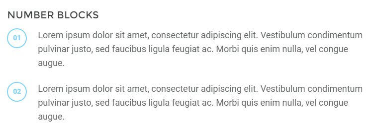
- numblocks num-1 - This creates a blue-colored colored circle and character inside, with black text.
Blocks
Blocks are ways to frame text to draw attention to it, either by adding colored backgrounds or outlines.
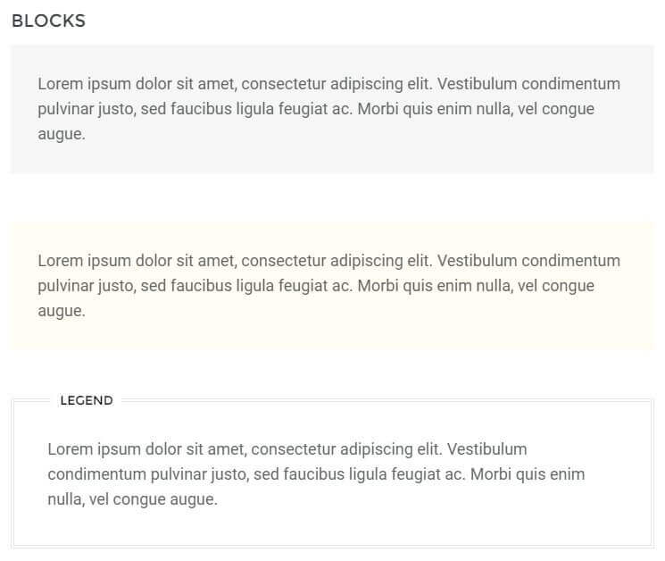
Creating blocks for your text is very easy; a basic <p> tag with a class added is all that's required:
<p class="className">
The available classes for blocks are:
- block-1 - This class adds a greyish-green background to the text.
- block-2 - Similar to the above class, but this time using a yellow background.
- legend - Creates a black outline around the text with a Legend label at the top-left of the block.
Blockquotes
Blockquotes allow you to elegantly highlight quotations in your article, to show that they are not from your pen, as it were.
The blockquotes format consists of a <blockquote> tag containing a <p> tag that in turn contains the quoted text.
                    <blockquote;>
                    <p>Your Quote Here</p>
                    </blockquote>
There is one blockquote type included in Box:
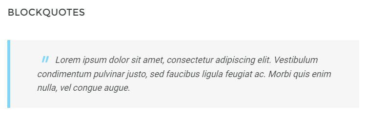
- No Class - The basic blockquote layout; adds a grey background with blue margin and quote marks to the text.
Floated Blocks
Floated blocks are some of the most visually-appealing typography options available in Box. They allow you to highlight particular phrases or quotes from the text by adding them on the left, right, or centre of your main content, much like a newspaper.
The layout of the HTML tags for floated blocks depends on the type of floated block you are using, and where you want the block to appear. The text to appear in the floating block is defined in a <span> tag within your content. Content added before the <span> tag will appear above it, and content added after will be added alongside it. A standard piece of HTML using these blocks may look something like this:
                    <p>Lorem ipsum dolor sit amet, consectetur adipiscing elit. Vestibulum condimentum pulvinar justo, sed faucibus ligula feugiat ac. Morbi quis enim nulla, vel congue augue. Duis quis quam sed purus porta eleifend.

                    <span class="gk-block-text-left">Lorem ipsum dolor sit amet, consectetur adipiscing elit.</span>

                    Donec eget dignissim augue. Donec ante felis, aliquam ut consequat eget, lobortis dapibus risus. Aliquam laoreet enim et lectus ornare hendrerit. Aliquam rhoncus enim libero. Morbi aliquam, nibh mattis feugiat dapibus, nisi massa adipiscing justo, sit amet condimentum urna ipsum et lacus. Nam fermentum, eros quis ullamcorper convallis, libero mauris lacinia eros, sed tempus leo lorem vitae purus.</p>
Something to note here is that there is no set position for the <span> tag to be added; it should be placed organically at the end of a paragraph or line in the text to highlight a particular phrase. Use the preview option in WordPress as you write the content to see how it looks and make your decision from there, and experiment with the <span> tag placement; you will get the feel for your preference very quickly!
There are a total of two classes for floated blocks:
- gk-block-text-left - This class aligns the text in the <span> tag to the left, with text following the tag appearing to the right.
- gk-block-text-right - The same as the above class, except this time the <span> tag text is on the right, and the main content after the closing tag floating left.
Two-Column Paragraphs
To help your blog look more visually interesting, Box includes a two-column paragraph layout for a newspaper-style look:
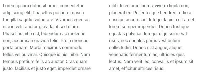
The format for this layout uses a <p> tag with a post__double class:
<p class="post__double" >Paragraph Text </p>
The paragraph text will be automatically split equally between the two columns, so no matter whether you write a short 10-word paragraph or a long-form text, the two-column layout will still work perfectly.
Large Post Images
Posts in Box include three image sizes; a full-width featured image in the header, a smaller size for standard images inserted into the content, and also an optional larger image that sits between the full-width header size and the smaller standard image size. To apply the larger image style, the <img> tag should be wrapped in a <p> tag with a post__oversize class:
<p class="post__oversize" ><img src="/img URL" /></p>
Font Awesome
Font Awesome is an incredibly useful font for delivering scalable icons to your site. With over 500 icons available covering a wide range of topics, from popular social media icons to transportation and payment icons, there's something for every type of site available.
How It Works
Font Awesome functionality is included as standard with Box, so you can start using their icons immediately. Icons are added to content using an icon <i> tag with a particular class attached that corresponds to the icon you want to display.
Every icon in the Font Awesome set has a class name beginning with fa, such as fa-pinterest for the Pinterest icon. To use an icon, this class name must be inserted into the <i> tag using the following format:
<i class="fa fa-ClassName"></i>
Notice that fa appears twice in the class attribute; the first time to declare the use of Font Awesome, and the second time as part of the icon's class name. For example, to insert the Pinterest icon mentioned above, the code would be:
<i class="fa fa-pinterest"></i>
A full list of available icons and their respective class names may be found at the bottom of our Box demo's Typography Page .
The tags should always be left blank, with no text between the opening and closing tags. You may insert these tags anywhere you are entering standard HTML content, including any of our frontpage sections, or in your pages and posts.
The WYSIWYG (What You See Is What You Get) Editor that WordPress defaults to when editing posts and pages will usually clean up blank tags; that is, tags with no content between them. This will include <i> tags that create Font Awesome icons, since they do not have any text between the opening and closing tags. To counter this issue, make sure to only use the plain text editor when adding icons.
GK News Show Pro
News Show Pro is the flagship open-source widget created by GavickPro, with complex functionality that allows it to display article previews in a range of styles and layouts from your chosen sources. In this section we'll look at the core functionality of the widget in both widget and shortcode form.
What is News Show Pro?
News Show Pro is a WordPress plugin that can create article previews. It includes a range of layouts to choose from, each offering a different look for the previews and often slightly different functionality. This plugin is not used on the Box frontpage, but can be applied to display products or articles anywhere on your site.
How is News Show Pro used?
News Show Pro can be inserted into your content in two different ways; either as a widget that is placed in an available widget area and configured via the Widgets page, or directly into your post or page content via a shortcode that accepts various attributes to change the default settings. Let's start by looking at the widget version and the available options therein.
News Show Pro as a widget
Like other widgets, News Show Pro can be added to any widget area on your site either via the WordPress Customizer, or on the Widgets page of your WordPress Dashboard, reached by clicking on Appearance → Widgets in the main menu. Simply drag a widget from the left side of the screen to the chosen widget area:
News Show Pro Widget Options
Once the widget has been placed a group of option tabs will be expanded for you to control the look, layout and sources for the previews. The available options are:
Basic Settings
This tab covers the basic options, including data sources, CSS suffixes and order. The following options are included:
- Title - Sets the title for the widget.
- CSS Suffix - Adding a CSS Suffix to this field allows for targeting particular CSS rules to particular NSP instances.
-
Data Source - One of the most important options; this option allows you to specify which articles are displayed by NSP. It can be pulled with the following filters:
- Latest Posts - NSP will display the latest articles from all categories, with the newest articles displayed first.
- Categories - Allows you to specify a particular category/group of categories; NSP will then display the latest posts only from the specified categories.
- Sticky Posts - Will display sticky posts only, from newest to oldest.
- Tags - Allows you specify a particular tag(s); NSP will then display the latest posts that include the chosen tags.
- Post Slugs - Allows for specific post slugs to be entered for NSP to display; great if you have particular popular posts you always want users to be able to find.
- Custom Post Types - Allows for a specific post type to be selected; NSP will then only display the latest posts to use the custom post type.
- JSON File - Specify a JSON file containing the post information you want to display.
- RSS Feed - Displays posts that have been added to your selected RSS Feed from newest to oldest.
- Latest WooCommerce Products - Instead of displaying posts, NSP will display previews of your latest WooCommerce products.
- WooCommerce Categories - Like the standard category option, but using WooCommerce categories as sources instead.
- WooCommerce Product SKUs - Allows you to specify particular products to be displayed, much like the Post Slug option for posts.
- XML File - Specify an XML file containing the post information.
- One Per Category - When this option is enabled NSP will only display one article or product from any given category; very useful if your site sells a wide range of products and you want visitors to get an immediate idea of what's available.
- Order By - Products or articles are sorted by newest to oldest by default; this option allows you to change the order to alphabetical order, by date, ID, modified date or random, and set it to ascending or descending (that is, from newest to oldest or newest to oldest etc...).
- Offset - This option allows you to tell NSP to skip a certain number of products or articles i.e. if you've created a showcase for your new product in the header of the frontpage and don't want it to be duplicated in the product preview section, then you can set this option to 1 and NSP will skip the newest product, displaying the second-newest onwards.
- Use Default CSS - NSP includes a default CSS profile for the widget; unchecking this option prevents it from using the default CSS. Instead, it will use CSS specified in the theme.
Widget Layout
This section covers the overall layout of the widget; number of previews, pagination etc...The options in this section are:
- Article Wrapper - This option allows for a specific functionality to be selected for the current instance of News Show Pro; each of these wrappers were usually specifically designed for a particular theme, but can be applied elsewhere.
- Pages (article block) - Sets the number of "pages" of articles or products to be displayed. This refers to paginated groups of previews; for example, if you have a display of five products on the frontpage, setting this option to 2 would add pagination options to the section, allowing users to browse to a second set of five products for a total of ten in the preview.
- Columns (article block) - Sets the number of columns of previews NSP should display. When combined with the Rows option, it allows for complete control of the number of previews.
- Rows (article block) - Sets the number of rows of previews NSP should display. Combined with the Columns option, these options define the total number of product or article previews.
- Pages (link block) - Some of the available article wrappers for NSP include two sets of previews; one set that display an large image with text, and a secondary set that use smaller images or plain text; these secondary previews are called Links. This option sets the number of pages for the links, if applicable.
- Rows (link block) - Sets the number of rows of article links.
- Article Pagination - Defines the method available for users to move between different pages of articles if the Pages (article block) option is higher than one. Choose between Pagination, which adds a circular button for each page to the link list, or Arrows, which adds left and right arrows, or both.
- Links Pagination - The same option as above, but for the link group rather than article group.
Autoanimation Settings
These options control whether and how often the article or link lists should scroll between different pages.
- Auto-animation - When enabled, NSP will automatically switch between the available pages of articles or links.
- Interval - Sets the time in milliseconds between each autoanimation cycle.
- Auto-animation stops on hover - When enabled the automanimation cycle will pause when a user hovers over a preview.
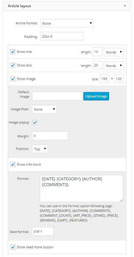
Article Layout
One of the most complex option tabs, this section covers whether each element of an article should be displayed or not, and the order they are displayed in. The available general options are:
- Article Format - Sets the layout of the individual article using pre-prepared CSS. Whereas the Article Wrapper option defines the overall layout of the widget, this option defines the layout of each article within that layout in terms of image size, text placement, and additional buttons or links if appropriate.
- Padding - Defines the padding for each individual article using the format 10px 10px 10px 10px, with the first number defining the padding at the top of the article, the second defining the right padding, third defining bottom padding, and fourth defining left padding (in pixels)
- Show Image - Sets whether an image is displayed in the article preview or not.
After the general options is the main part of the section, which allow you to control the layout intuitively via the Show X options, such as Show Title, Show Image etc...each of which can all be dragged & dropped into the order you wish to use and enabled or disabled as needed. Each item may include one or two additional options (or more, in the case of images) to give you further control of the layout. Let's look at the available items that can be dragged & dropped, their respective options, and then look at how it may be used.
The Show Title and Show Text block include one option; Length, where you can set the maximum length of the title or preview text in words or characters. By setting a word or character limit you can prevent posts with long titles wrapping to a new line, breaking the preview layout. The Show Text option refers to the preview text; the first few words from an article that can be used in the preview.
The Show Image options are a bit more complex, since there are several image-specific options:
- Size - Sets the size of the image in the article preview (in pixels)
- Default Image - Sets an image to use in the preview when the article being previewed has no featured image to display.
- Image Filter - Add a filter to any images in the preview such as sepia or grayscale.
- Image Popup -
- Margin - Sets the margin size of the image in the preview (in pixels)
- Position - Sets the position of the image in the preview; on the top or the left.
The next section, Info Block, also includes some additional options:
- Format - Sets the format for the article information; here you can decide which information elements to include and which order they will be displayed, including elements such as category, author, comments etc...
- Date Format - Defines how the date should be displayed in the article preview; can be set to display the day, month and year in any order, or omit particular elements as needed.
There's only one more option in this section, Show Read More, which sets whether a Read More button will be displayed in the previews.
To see how drag & drop of these elements work, lets use the default layout as an example:
The default layout is Title, Text, Image, Info Block, Read More. First, we can decide which elements to include in this section by adding or removing checkmarks to each of the Show X options. Once done, we can then shift the order. Hover your mouse over the center of the option block; that is, if you want to drag the Show Title section, hover your mouse in the block between the Show Title checkbox and the Length option; you'll see the mouse icon change to an arrow cross. Click and hold the left mouse button and you can now drag the entire Show Title box; move it under another element and you'll see a dash-outlined box appear to show you where you can drop it. Release the button, and your new order will be set. Repeat this with each element to achieve the exact order of elements needed.
Note: Some modes and layouts available in NSP have specific requirements; in these cases the Article Layout options will be overridden so your changes aren't registered.
Links Layout
This section offers similar functionality to the Article Layout tab, but this time the ordering and options are specific for the links that accompany the main previews. As you'd expect, these options only apply if your chosen layout uses additional links. The available options are functionally the same as the Article Layout tab, with a title, text, image and read more block where you can set whether each element is visible or not and change their order. However, there is one new set of options here that do not appear in the Article tab; a Show Read More Button Under Links setting. This decides if a read more button is added underneath the links block to encourage users to explore a category of articles further. There are also three additional options related to this block:
- Link Text - Sets the text for the link; that is, the text that appears on the button under the list of links.
- Link URL - Sets the target URL for the link button; this can be a category list, external URL; whatever you require.
- Use This Link Also in the Widget Title - When enabled, if the widget title is set as Visible and a user clicks it they will be taken to the link specified in the Link URL option.
Advanced Settings
The options in this tab are very specific, so it's likely you won't need to make any changes here. There are three options available:
- Cache Time - Sets the cache time for the instance of NSP. This is the length of time that a visitor's browser should store the widget in page cache. The advantage of a longer time setting is that users that come back to the page where the widget is will not have to redownload the information, making for a faster page load. The negative of this is that until the cache expires users will not see any changes in the widget; if you're regularly posting new content you might want a shorter cache time so users coming back to the frontpage after reading an article can see any new posts.
- Parse Shortcode in the Article Text - If you use shortcodes to produce any of your content, enabling this option will cause NSP to parse them accordingly if they are used in the content it delivers, such as titles or page text previews.
- Load Font Awesome - When enabled, Font Awesome is loaded by the widget and any Font Awesome codes used in the text or title shown by the widget will be parsed into their respective icon.
This covers all of the options available by default in the widget; note that some other option tabs may appear in particular layouts, and other options may disappear entirely when certain layouts are used since that option becomes redundant. To really get a feel for this widget though, we encourage you to play around with the options using the information above as a guideline; change layouts, data sources and more and you'll see the effect the options have. Soon you'll be able to create flexible, dynamic preview widgets to show off your full range of posts.
News Show Pro as a Shortcode
As well as a widget, it's also possible to create instances of NSP within your site content, whether it's a page, post or text widget. This allows for flexibility of placement while still retaining all the usual sets of options available in the widget version.
How the Shortcode Works
If you've used any kind of shortcode in WordPress then you already have a good idea of how inserting NSP as a shortcode to your content will work; however, unlike many shortcodes, NSP includes a huge amount of attributes to allow for each of the options to be defined. To insert an instance of NSP into your content, we'll need to start with the basic shortcode:
[gknsp]
This shortcode will create an instance of News Show Pro in your content. However, the basic shortcode will create NSP with all options set to the default. Usually we can just make any changes in the widget options, but in this case we'll need to add attributes to the shortcode to define the options as needed, using the following format:
[gknsp Option_name="New_Option_Value"]
With a space separating each attribute if more than one is to be added. So if we want to set the cache time to "0", meaning users will always download the latest instance whenever they open the page, we'll use the following shortcode:
[gknsp cache_time="0"]
More options can be added so that there is functionally no difference between the the widget and shortcode version in terms of content. However, since attributes must be manually added it may take slightly longer to configure than the widget version. Some of the available attributes are:
- before_title - Allows for HTML tag(s) to be defined that will be added before the title. Usually used to change the title to a particular header type for CSS targeting.
- after_title - Same as above, but defines HTML to be added after the widget title; will usually be the closing tags from the before_title option.
- title - Sets the widget title.
- data_source_type - This option is used to specify the data source, or where the widget should look for articles to display. This can be set to pull from particular categories ("wp-category"), specific posts ("wp-post") and more.
- data_source - Defines the particular posts to be displayed when the data_source_type attribute is set to wp-post. Accepts post slugs as values.
- wp_category_list - Defines which categories the widget should pull articles from when the data_source_type is set to wp-category. Accepts category IDs as values.
- article_wrapper - Defines the type of article wrapper used, which changes the layout and other features. Values for this attribute are the same as they appear in the widget version's article wrapper list, such as technews_reviews.
- use_css - This option decides whether the default CSS for the widget is loaded.
- cache_time - This option sets how long the widget settings should be stored in cache. In the demo this is set to 0 so users will always see the latest version of the widget every time they visit, including any new styling or articles.
- article_format - This option is used to specify a particular article preview layout from those available.
- widget_css_suffix - One of the most important options, this lets you define CSS suffixes specific to the widget so that you can target your CSS rules directly.
- article_cols & article_rows - Another two important options; these two attributes sets the number of columns and rows that NSP should create, which in turn defines the number of showcases.
- article_block_padding - This option lets you set the padding for the articles in pixels; up to four numbers can be entered to represent the padding for the top, right, bottom and left margins in turn.
- article_image_w - Defines the width of the article showcase image in pixels.
- article_image_h - Defines the height of the article showcase image in pixels.
- orderby - Sets the ordering for the showcased posts. This can be set to sort items by ID, date etc...
- order - Sets whether the ordering defined in the orderby attribute is ascending or descending.
- article_text_len - This option sets the length of the preview text (in number of words) that each article showcase displays.
There are many more attributes available covering all of the available widget options; you can find a breakdown of the most commonly-used ones in this blog article ; for now, we'll cover the most important things you'll want to do; setting the data source.
Displaying Specific Posts
The default behavior of NSP as a shortcode is to look for the latest posts from all categories, displaying them in date order from newest to oldest. However, it's easy to change this so that you can specify which posts are previewed in the widget. We'll need to use two attributes to achieve this; data_source_type, which should be set to wp-post, and data_source, which should include the slugs of the posts you want to display separated by a comma:
[gknsp data_source_type="wp-post" data_source="first-post-slug,second-post-slug,third-post-slug"]
Finding the Post Slug
To find a post's slug, click on Posts → All Posts in the WordPress Dashboard to open the list of posts. Find the post you wish to display in NSP and click the Quick Edit option that appears when you hover over the post in the post list:
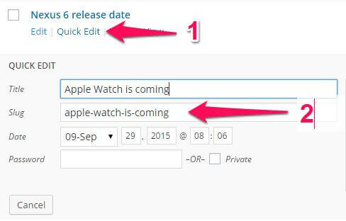
This will open a quick edit area where you can change various options in the post; the post slug is defined in the second field, Slug; copy the text from this field and paste it into the data_source attribute. Repeat this process to add more posts, separating each slug with a comma as in the examples above.
Displaying Latest Posts From Category
As an alternative to pulling all your latest posts from all categories, you might want to set NSP to pull the latest posts only from specific categories. Thankfully, this is very easy to do. To change News Show Pro's behavior to pull from categories instead of latest posts we'll need to use two shortcode attributes; data_source_type, which should be set to wp-category, and wp_category_list, which allows us to define which categories to display using the category ID:
[gknsp data_source_type="wp-category" wp_category_list="first-category-ID,second-category-id"]
To get the ID of a particular category we'll need to jump through some hoops, since WordPress doesn't include an ID section in its default layout. To find the category ID, click on Posts → Categories in the WordPress dashboard to open the Categories page, then click on the category you wish to use in the list of categories to be taken to the Edit Category page:
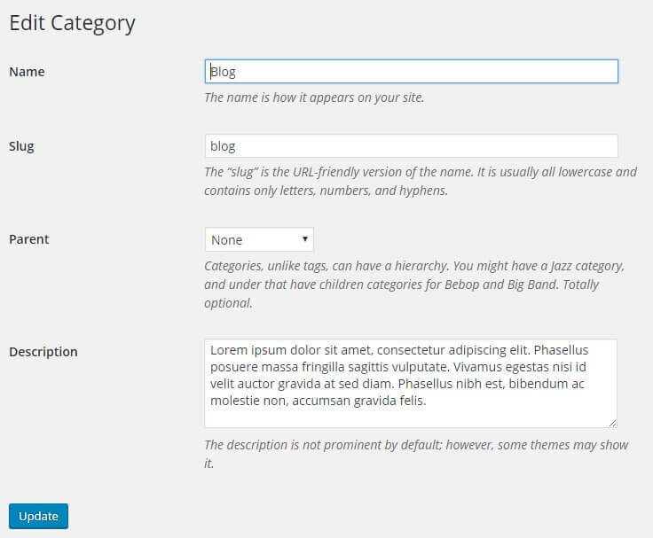
The category page does not include any ID field, but you can find the ID in the URL for the current page. In your browser, check the address bar. In the URL you should find a sequence like tag_ID=X where "X" is a number; this number is the category ID:

As you can see in the above image, the URL includes a section that says tag_ID=3; by adding 3 as the value of the wp_category_list attribute we can have NSP pull the latest posts from this category automatically:
[gknsp data_source_type="wp-category" wp_category_list="3"]
If you have multiple categories you want to pull from you can add all of their IDs to the wp_category_list attribute; just add a comma between each ID.
GK Tabs
GK Tabs is the second major plugin included with Box, alongside News Show Pro. With it, you can create multiple types of tabs that can display content from any widget; perfect for listing popular posts in the sidebar, for example.
How GK Tabs Works
GK Tabs is a widget, which means it can be deployed in any available widget position on your WordPress site. With the power of the Widget Rules plugin (detailed later in the Theme Features section) you can also limit which pages the widget appears on for total control of your layout.
The basic premise behind GK Tabs is very simple; once the GK Tabs plugin has been installed and activated, a new set of three widget positions are automatically created, called GK Tabs I, II, and III. These widget positions are where you can place and configure the widget content you want to be displayed in a tab; technically you can use any widget area as the source for tabs, but these separate widget areas are safer since they do not have a specific area where they are displayed in the theme. GK Tabs can display all types of widgets, from basic text widgets to complex items such as comment lists.
Once the content for the tabs has been added to the GK Tabs widget areas, the Tabs widget itself is placed in the selected widget area. Then, options set the tab layout and which widget area of the available GK Tabs areas to use as a source. The widget will then automatically sort each widget in the selected source widget area into its own tab.
The GK Tabs Options
The options in GK Tabs are not as extensive or complex as News Show Pro, but there are enough that it is worth familiarizing yourself with what's available so that you can easily adjust the content to your needs. The available options are:
- Title - Sets the title of the widget.
- Style - This option is used to select the tab's style; note that this does not affect the overall look of the section as that depends on the widget content being displayed. This option only changes the style of the tab names/selectors.
- Tabs Source - The most important option! Here you can select the widget area that the Tabs widget should use as the source for its tabs. The number of tabs created is directly taken from the number of widgets in the specified area i.e. if you have three text widgets in the selected widget area, then GK Tabs will create three separate tabs.
- First Tab - Tells the widget which tab to display by default; the widgets are sorted into numerical order according to the order they are in in the widget area, with position 1 being the first widget in a given area, 2 the one underneath it and so on.
- Tabs Activator Event - This option sets what action causes a tab to activate; if set to Click the tabs won't change until one is clicked. If set to Hover, the tab will change as soon as the user hovers over a tab.
- Swipe Gesture - Sets whether touchscreen users can swipe the widget to switch between tabs.
- Navigation Buttons - When enabled, pagination arrows are added to the middle area of the widget, allowing users to click the tab name or on the left or right arrows to change the active tab.
- Tabs Position - Sets the position for the tab names, where users can see which tabs are available and swap between them. Can be set to top or bottom.
- Auto-Animation - When enabled, GK Tabs will automatically scroll through the available tabs at a defined interval.
- Stop On Hover - When this option is enabled auto-animation will pause if a user hovers their cursor on a tab.
- Animation Speed - Sets the speed (in milliseconds) of the transition animation between tabs; that is, when a user clicks on a tab or the autoanimation forces movement to a new tab an animation is played; this option sets how long the animation takes.
- Animation Interval - Sets the wait time in milliseconds between each auto-animation rotation. Obviously ignored if auto-animation is disabled.
- Animation Type - Offers multiple ways for transitions between tabs to be animated, including rotations, fade in/out, and scaling. Test out the different animations to find one you like!
- Amount of Sidebars - This option defines the number of tab widget areas are created by the plugin. The default is three (GK Tabs I, II and II); increasing this number adds more widget areas for you to use, perfect if you have many instances of the Tab widget.
- Cache - Sets options related to the widget's cache. The first field sets the cache store time; that is, how long the widget contents should be stored by the user's browser. The second field lets you control what the cache affects; either the content of the tabs only, the entire widget (tabs and tabs content), or disable the cache entirely.
These options are fairly simple, but provide many ways to change the look of your tabs to suit your needs. Make sure to test the different options to find a layout that suits you.
Adding a Tab
The Tabs Source option in the GK Tabs widget options is where you define the widget area that should be used as the source for tabs content. As an example, let's look at the example tabs from the Widget Styles page in the Box demo:
In this layout, three instances of Text widgets are added to the GK Tabs I widget area. In the Tabs widget, when the source is defined as the GK Tabs I widget area, it will look in the specified widget area and automatically convert each individual widget in that area into a tab. So, in the case of the GK Tabs I area, there are three text widgets, so the Tabs widget creates three tabs. To add a new tab to this section, all you need to do is create a new widget and place it in the selected source widget area; the Tabs widget will do all the hard work of creating a new tab automatically.
If you're looking to add a new instance of the Tabs widget to your site, then you'll first need to decide which GK Tabs widget area to use as the source. Then, create the widgets you wish to display in the tabs, and add them to your chosen GK Tabs widget position. Finally, insert the instance of the GK Tabs widget to the widget position you wish to display the tabs in, and set the source to whichever GK Tabs X widget area contains your tab content. Bear in mind that though there are technically no limits to the number of tabs or the type of content that can be displayed in the tabs, realistically there will be widgets that create too much content for it to be elegantly displayed in a tab. Make sure the widgets you wish to place in tabs have options for controlling how much data is displayed to avoid damaging the theme aesthetics, or that you have sufficient CSS knowledge to style the output accordingly. Also, remember to consider page weight and how it will affect load times; too many tabs will result in a large amount of content being loaded, which can make users on slower connections suffer longer load times.
Frontpage Elements
The frontpage of Box is built almost entirely out of page-based content, with each page containing HTML code and shortcodes that make up the frontpage layout. There is also a single widget that creates the bottom menu, newsletter and social media profile links section at the bottom of the frontpage (and indeed, every page of the theme). In this section, we'll examine how each page's content is laid out, how it works, and how to customize it with your own text, image or product content.
The Frontpage Header
The frontpage header provides a simple introduction to your site with a large background image and overlaid text:
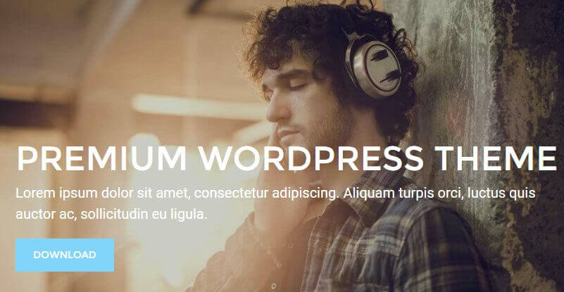
This section is created via the base frontpage page that uses the Frontpage template and assigned as the Static Front Page. The image for the section is taken from the Featured Image of the page, with the overlaid text content provided by the page's mainbody content. The HTML code included in the demo content looks like this:
                    <h1>Premium WordPress theme</h1>
                    <p>Lorem ipsum dolor sit amet, consectetur adipiscing. Aliquam turpis orci, luctus quis auctor ac, sollicitudin eu ligula.</p><a class="btn btn--rev" href="#!">Download</a>
HTML Breakdown
The HTML content here is very basic, so nothing too hard to grapple with when changing it to your own content. First, let's replace the example content with placeholder text that lets you know what each tag's content will provide:
                         <h1>Large Title Text</h1>
                         <p>Text Under Title</p>
                         <a class="btn btn--rev" href="/Button Link URL">Button Text</a>
The opening plain <h1> tag contains the large title text:
<h1>Large Title Text</h1>
Followed by the smaller subtitle text, which is created using plain <p> tags:
<p>Text Under Title</p>
Finally, the button is created using a plain <a> link tag, with the href attribute providing the link URL and the text between the tags providing the button text:
<a class="btn btn--rev" href="/Button Link URL">Button Text</a>
Changing the Title and Subtitle Text
The title and subtitle that are overlaid on the header background image are created in the opening <h1> and <p> tags of the HTML code:
                         <h1>Premium WordPress theme</h1>
                         <p>Lorem ipsum dolor sit amet, consectetur adipiscing. Aliquam turpis orci, luctus quis auctor ac, sollicitudin eu ligula.</p>
Simply replace the text between the <h1> tags to add your own title, and between the <p> tags for the subtitle:
                         <h1>Your Title Here</h1>
                         <p>Your Subtitle Here</p>
Changing the Button Link and Label
The button is created using the <a> link tag that immediately follows the title and subtitle text:
<a class="btn btn--rev" href="/Button Link URL">Button Text</a>
The link (that is, where the browser will be redirected to when the button is clicked) is defined in the href attribute; to change it, simply add your own URL between the quotation marks. To change the button's label, modify the text between the opening and closing link tag:
<a class="btn btn--rev" href="/Your Link URL Here">Your Button Label Here</a>
Changing the Header Image
The header image is automatically taken from the Featured Image of the frontpage page. To change it, click on the Set Featured Image option in the right-sidebar of the Edit Page screen (if you already have a featured image set then first you'll need to click the Remove Featured Image option). This will open the Media Library popup, where you can choose an image from your library, or, by clicking the tabs at the top of the section, choose to upload a new image. Click on the image you wish to use in the header, then click on the Set featured image button at the bottom-right of the screen. The new featured image is now set, so save changes and you're good to go!
The Headphones Wi-Fi Section
This section uses a simple text block with link button call-to-action, along with some animated lines in the background for extra style, with an image block underneath for displaying a photo:
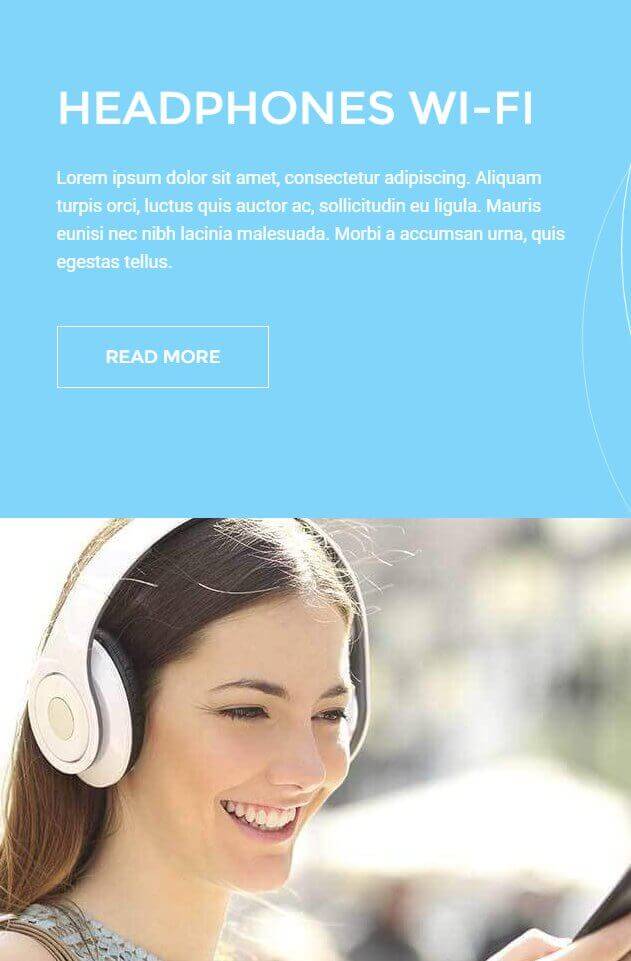
This section is created via HTML code added in the first subpage of the frontpage; the demo HTML code looks like this:
                    <div class="section__left">
                    <div class="section__left-box box--blue animated-color-bg">
                    <h2>Headphones Wi-Fi</h2>
                    <p>Lorem ipsum dolor sit amet, consectetur adipiscing. Aliquam turpis orci, luctus quis auctor ac, sollicitudin eu ligula. Mauris eunisi nec nibh lacinia malesuada. Morbi a accumsan urna, quis egestas tellus.</p>
                    <a class="btn btn--border btn--border--white" href="/">Read more</a>
                    </div>

                    <div class="picture_bottom">
                    <img src="http://localhost/WordPress/Quickstarts/Box/wp-content/uploads/2016/03/image-left.jpg" alt="image-left" width="780" height="600" class="alignnone size-full wp-image-47" />
                    </div>
                    </div>
HTML Breakdown
This section's HTML can be split into two sections, the first creating the text block and button, and the second covering the image. First, let's change the demo text to placeholders so it's easy to see what goes where:
                         <div class="section__left">
                         <div class="section__left-box box--blue animated-color-bg">
                         <h2>Text Block Title</h2>
                         <p>Text Block Subtitle</p>
                         <a class="btn btn--border btn--border--white" href="/Button Link URL">Button Label</a>
                         </div>

                         <div class="picture_bottom">
                         <img src="/Image Block Photo URL" alt="image-left" width="780" height="600" class="alignnone size-full wp-image-47" />
                         </div>
                         </div>
The code starts with a <div> element using the section_left class, that will wrap the rest of the code and provides the CSS target to align the content to the left of the theme:
<div class="section__left">
Then comes the code for the text block, starting with another <div> to separate the content from the image block, utilizing three classes; section__left-box, box--blue, and animated-color-bg. These classes align the block, set the background color (changeable in the WordPress customizer), and provides the CSS3-powered animated lines:
<div class="section__left-box box--blue animated-color-bg">
Following this is the text content for the block; the large title text is contained in a plain <h2> tag, and the smaller subtitle text that appears underneath it is contained in a plain <p> tag:
                         <h2>Text Block Title</h2>
                         <p>Text Block Subtitle</p>
Then the last part of the block, the button, is provided by a <a> link tag with the btn, btn--border and btn--border--white classes, which provide the styling and coloring for the button. The label for the button is added between the opening and closing link tags, with the href attribute providing the link URL:
<a class="btn btn--border btn--border--white" href="/Button Link URL">Button Label</a>
With the first block finished, the <div> element is closed:
</div>
The next part of the code creates the image block underneath the text block. As before, a <div> element is opened to separate the block's code from the rest, this time with the picture_bottom class to align the image correctly:
<div class="picture_bottom">
After this is the image itself, which is inserted using the standard WordPress Insert Media formatting:
<img src="/Image Block Photo URL" alt="image-left" width="780" height="600" class="alignnone size-full wp-image-47" />
To end this block, a closing </div> is added, and then a second is added to close out the entire section's code completely:
                         </div>
                         </div>
Changing the Text Block Title and Subtitle
The text block's title and subtitle are created in the <h2> and <p> tags that immediately follow the opening <div> tags:
                         <div class="section__left">
                         <div class="section__left-box box--blue animated-color-bg">
                         <h2>Headphones Wi-Fi</h2>
                         <p>Lorem ipsum dolor sit amet, consectetur adipiscing. Aliquam turpis orci, luctus quis auctor ac, sollicitudin eu ligula. Mauris eunisi nec nibh lacinia malesuada. Morbi a accumsan urna, quis egestas tellus.</p>
Simply replace the text between these tags with your own:
                         <div class="section__left">
                         <div class="section__left-box box--blue animated-color-bg">
                         <h2>Your Text Block Title Here</h2>
                         <p>Your Text Block Subtitle Here</p>
Changing the Background Color
The background color for the text block is defined in the WordPress Customizer in the Colors section; more information may be found in the Theme Options section at the start of this guide.
Changing the Button Link and Label
The button is created and its label defined in the <a> link tag following the title and subtitle tags:
<a class="btn btn--border btn--border--white" href="/">Read more</a>
The link that the button redirects to is defined in the href attribute, with the button label defined by the text between the opening and closing tags; add your own URL and label to these areas to set the button's label and link accordingly:
<a class="btn btn--border btn--border--white" href="/Button Link URL Here">Button Label Here</a>
Changing the Image Block Photo
The photo that creates the image block in the second is defined in the second block of the page's HTML code, in the <img> tag that follows the third opening <div> tag:
                         <div class="picture_bottom">
                         <img src="http://localhost/WordPress/Quickstarts/Box/wp-content/uploads/2016/03/image-left.jpg" alt="image-left" width="780" height="600" class="alignnone size-full wp-image-47" />
This tag is the standard format for inserted media in WordPress, so there are two options for changing the image; first, you can simply change the image defined in the src attribute:
<img src="/Image Block Photo URL Here" alt="image-left" width="780" height="600" class="alignnone size-full wp-image-47" />
However, a better option is to simply delete the entire <img> tag and its contents, then use the standard Add Media button at the top of the editor to insert an image from your library; this will automatically generate the tag as seen in the HTML code.
The image will automatically be sized to fit the section, but it is still a good idea to size the image accordingly so that it fits the aesthetic perfectly, and also so that you are not using unnecessarily weighty resources, which can potentially slow down the page load speed.
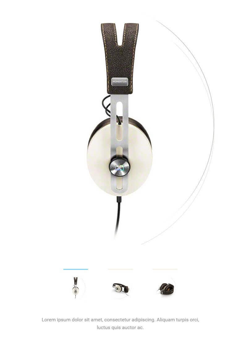
The Slideshow Section
The slideshow section is located to the right of the text and image blocks from the last section, filling up the other half of the page width, and providing a easily-explored set of slides for highlighting products:
This section is created from the second subpage of the base Frontpage; however, unlike the earlier sections this subpage contains very little HTML code apart from an opening and closing <div> tag that aligns the slideshow to the right:
                    <div class="section__right">

                    </div>
The actual content for the slideshow is provided by subpages that are added to the slideshow subpage, which we'll cover in the next section.
How It Works
Unlike the other frontpage areas which rely on shortcodes or HTML to create their content, the slideshows work in a similar way to the frontpage as a whole. That is, the subpage itself creates the slideshow automatically, and then any subpages added after that count as slides.
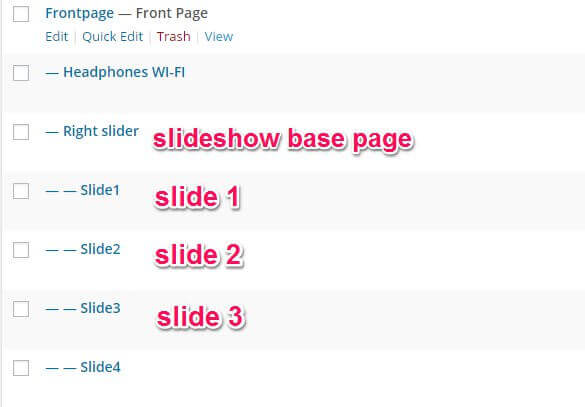
Let's visualize this hierarchy:
- Second Subpage (slideshow)
- First header slideshow slide
- Second header slideshow slide
So we have the base slideshow page, which is a subpage of the Frontpage. Then, further subpages are added to the slideshow page, with each subpage creating a slide.
The slideshow base page contains no information except a title for identification purposes, and a single <div> with the section__right class to align the section correctly on the frontpage. The actual meat of the slideshow, that is, the slides plus the descriptions, are all taken from the individual slide subpages.
In each slide subpage there are two elements that are defined; a Featured Image, which defines the slide image, a Title, which is only displayed on the backend to help the user track the slide, and plain text in the mainbody of the page that provides the description. So adding more slides is as simple as creating a new subpage of your header slideshow base page, and adding a title, description and featured image.
Changing a Slide's Image
Each slide in the header is created via a subpage of the slideshow page, with the Featured Image providing the slide. To change an existing slide's image, in your WordPress backend click on Pages → All Pages to see a list of your pages, and click on one of the subpages of your slideshow page (this will be the second subpage of your Frontpage).
Once on the Edit Page screen, you will see the current slide image in the Featured Image section in the right sidebar. To remove the existing slide, click on the Remove Featured Image text under the image.
Once the image is removed, you can specify your new slide image. To do so, click on the Set Featured Image text in the Featured Image section. Your media library will open, and you may upload your slide or select an existing image from your library to use. Once done, click on the Save button at the top of the screen to save changes, and your new slide is ready!
When selecting an image, bear in mind your current image width and height settings (these may be set in the WordPress Customizer). If the image does not match the slideshow's set dimensions it will be resized to fit if larger than the standard, or, if smaller than the demo content, the slideshow will adjust it's height to fit, which will affect the aesthetics of the frontpage. Make sure to standardize your image sizes if possible.
Changing a Slide's Description
Each slide has a description that appears at the bottom of the slideshow, underneath the pagination options. This description is pulled from the mainbody of the slide page; no HTML is required, you can simply type your text into the editor and it will automatically be displayed in the descripion area of the slideshow. To change an existing slide's description, just change the text and save; no other changes are required.
Adding a New Slide
Adding new slides to the slideshow is as simple as adding a new page to your site. First click on Pages → Add New in your WordPress dashboard. Once on the edit screen for your new page, look for the Page Attributes section in the right sidebar. Here, you will see there is a Parent option with a drop-down list of your pages; select your slideshow base page as your new page's parent; the theme will automatically use this new subpage as a slide.
Now we need to add the slide elements. First, set the slide image by clicking on the Set Featured Image button in the Featured Image section of the right sidebar, and uploading a slide image or selecting one from your Media Library.
Next, add a title to the Title field so you know which page is for which slide; as this text won't be displayed on the frontpage you can enter a name that's easier for you to recognize. Finally, add a description into the text editor and click on the Publish button to make the page public; the slide will be automatically displayed in the header slideshow.
Note: The order of the slides in the slideshow is defined by their date of creation, so if you wish to change the order you will need to delete the older slides and recreate them in a new slide page to move them to the end.
The New Models Section
This section combines some elements from previous sections to create an block with two images displayed plus a title and description, as well as animated curved lines as seen in the earlier text block:
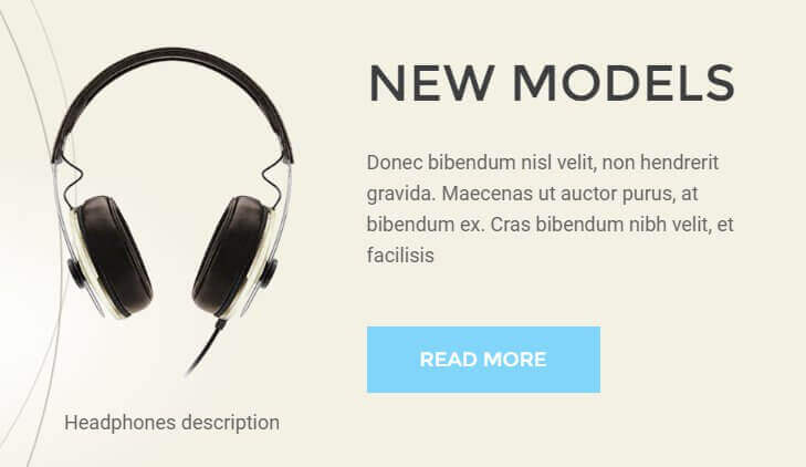
The content for this section is taken from the third subpage of the base frontpage, and the HTML code used in the demo uses the following format:
                    <div class="section-second__right animated-circles-left beige-bg">
                    <header>
                    <h2>New models</h2>
                    <p> Donec bibendum nisl velit, non hendrerit gravida. Maecenas ut auctor purus, at bibendum ex. Cras bibendum nibh velit, et facilisis</p>
                    <a class="btn" href="/">Read more</a>
                    </header>
                    </div>
                    <div class="section-second__left pictures ">
                    <div class="pictures__box">
                    <div class="pictures__item">
                    <img src="http://localhost/WordPress/Quickstarts/Box/wp-content/uploads/2016/03/section-second_pic_1_336.png" alt="section-second_pic_1_336" width="336" height="422" class="alignnone size-full wp-image-39" />
                    <span>Headphones description</span>
                    </div>
                    <div class="pictures__item">
                    <img src="http://localhost/WordPress/Quickstarts/Box/wp-content/uploads/2016/03/section-second_pic_2_336.png" alt="section-second_pic_2_336" width="336" height="422" class="alignnone size-full wp-image-40" />
                    <span>Headphones description</span>
                    </div>

                    </div>
                    </div>
HTML Breakdown
Like the earlier text and image block, this section's HTML can be broadly split into two parts, the first providing the title and text on the right side of the block, and the second providing the images. To start, let's look at the HTML with placeholders instead of the demo text:
                         <div class="section-second__right animated-circles-left beige-bg">
                         <header>
                         <h2>Title Text</h2>
                         <p> Subtitle Text</p>
                         <a class="btn" href="/">Button Label</a>
                         </header>
                         </div>
                         <div class="section-second__left pictures ">
                         <div class="pictures__box">
                         <div class="pictures__item">
                         <img src="/First Image URL" width="336" height="422" class="alignnone size-full wp-image-39" />
                         <span>First Image Description</span>
                         </div>
                         <div class="pictures__item">
                         <img src="/Second Image URL" alt="section-second_pic_2_336" width="336" height="422" class="alignnone size-full wp-image-40" />
                         <span>Second Image Description</span>
                         </div>

                         </div>
                         </div>
The first tag in this HTML code wraps the right-side content of the block and is used for alignment, coloring and the CSS animations, via a <div> tag with the section-second__right, animated-circles-left and beige-bg classes:
<div class="section-second__right animated-circles-left beige-bg">
Then comes the code for the title and subtitle on the right of the block; this starts with a plain <header> tag, followed by the title and subtitle text in plain <h2> and <p> tags, respectively:
                         <header>
                         <h2>New models</h2>
                         <p> Donec bibendum nisl velit, non hendrerit gravida. Maecenas ut auctor purus, at bibendum ex. Cras bibendum nibh velit, et facilisis</p>
Next is the code for the button at the bottom of the right column, which uses the same format as the other buttons on the frontpage; an <a> link tag with the href attribute providing the link URL and the text between the opening and closing tags providing the button label, before the section is closed with a closing </header> and </div> tag:
                         <a class="btn" href="/">Read more</a>
                         </header>
                         </div>
Then comes the second block of content containing the images; this begins with two <div> tags, the first using the section-second__left and pictures classes for alignment and styling of the larger block, and the second using the pictures__box class to set the size and shape of the smaller block that will contain the images:
                         <div class="section-second__left pictures ">
                         <div class="pictures__box">
Then comes the two images; each image is created using four tags. First, a <div> using the pictures__item class wraps the image and description. Then, the image is added via a standard <img> tag. Finally, the description for the image is added via a plain <span> tag, before the item is closed off with a closing </div>:
                         <div class="pictures__item">
                         <img src="http://localhost/WordPress/Quickstarts/Box/wp-content/uploads/2016/03/section-second_pic_1_336.png" alt="section-second_pic_1_336" width="336" height="422" class="alignnone size-full wp-image-39" />
                         <span>Headphones description</span>
                         </div>
This format is repeated again to create the second image of the block:
                         <div class="pictures__item">
                         <img src="http://localhost/WordPress/Quickstarts/Box/wp-content/uploads/2016/03/section-second_pic_2_336.png" alt="section-second_pic_2_336" width="336" height="422" class="alignnone size-full wp-image-40" />
                         <span>Headphones description</span>
                         </div>
And then the section ends with the closing </div> tags:
                         </div>
                         </div>
Changing the Title and Subtitle Text
The text block's title and subtitle are created in the <h2> and <p> tags that immediately follow the opening <div> and <header> tags:
                              <div class="section-second__right animated-circles-left beige-bg">
                              <header>
                              <h2>New models</h2>
                              <p> Donec bibendum nisl velit, non hendrerit gravida. Maecenas ut auctor purus, at bibendum ex. Cras bibendum nibh velit, et facilisis</p>
Simply replace the text between these tags with your own:
                              <div class="section-second__right animated-circles-left beige-bg">
                              <header>
                              <h2>Your Title Text Here</h2>
                              <p>Your Subtitle Text Here</p>
Changing the Button Link and Label
The button is created and its label defined in the <a> link tag following the title and subtitle tags:
<a class="btn" href="/">Read more</a>
The link that the button redirects to is defined in the href attribute, with the button label defined by the text between the opening and closing tags; add your own URL and label to these areas to set the button's label and link accordingly:
<a class="btn" href="/Your Link URL Here">Your Button Label Here</a>
Changing the Images and Descriptions
Each of the image blocks is made up of three tags; a <div> tag that creates the space for the image (this should be left unchanged), and the content for the block, consisting of an image provided by the <img> tag, and the description provided by a <span> tag:
                              <div class="pictures__item">
                              <img src="http://localhost/WordPress/Quickstarts/Box/wp-content/uploads/2016/03/section-second_pic_1_336.png" alt="section-second_pic_1_336" width="336" height="422" class="alignnone size-full wp-image-39" />
                              <span>Headphones description</span>
                              </div>
To change the image, you may either replace the href attribute with the URL to the image you wish to use from your server, or, more efficiently, delete the existing <img> tag entirely and use the standard Add Media button at the top of the editor to insert the image; there's no special modifiers added so the tag as generated by the Add Media button will work perfectly.
For the image descriptions, modify the text between the <span> tags directly underneath the <img> tag:
                              <div class="pictures__item">
                              <img src="/Image URL Here" width="336" height="422" class="alignnone size-full wp-image-39" />
                              <span>Image Description Here</span>
                              </div>
Repeat these steps to make changes to the second image also, as it uses exactly the same code layout.
The Headphones Section
This section offers a background image with an overlaid text block:
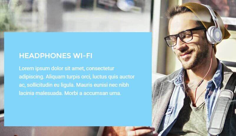
This section's HTML code is taken from the fourth subpage of the base Frontpage and exclusively uses HTML code; the code as used in the demo looks like this:
                         <div class="photo-overlay">
                         <img src="http://localhost/WordPress/Quickstarts/Box/wp-content/uploads/2016/03/headphones.jpg" alt="headphones" width="1560" height="780" class="alignnone size-full wp-image-44" />
                         <div class="box box--blue header">
                         <h2>Headphones Wi-Fi</h2>
                         <p>Lorem ipsum dolor sit amet, consectetur adipiscing. Aliquam turpis orci, luctus quis auctor ac, sollicitudin eu ligula. Mauris eunisi nec nibh lacinia malesuada. Morbi a accumsan urna.</p>

                         </div>
                         </div>
HTML Breakdown
Despite the elegant layout of this section the majority of the work is done via CSS, so the HTML code is very simple. As always, we'll start by replacing the demo content with placeholder text to make it easy to see what information goes where:
                              <div class="photo-overlay">
                              <img src="/Background Image URL" alt="headphones" width="1560" height="780" class="alignnone size-full wp-image-44" />
                              <div class="box box--blue header">
                              <h2>Title Text</h2>
                              <p>Subtitle Text</p>

                              </div>
                              </div>
As with the other sections, this page's code begins with a <div> tag that will wrap all of the content and provide the core CSS rules for alignment and layout via the photo-overlay class:
<div class="photo-overlay">
Then comes the background image code; as before this uses the standard <img> tag that you'd get if you use the Add Media button to insert an image:
<img src="/Background Image URL" alt="headphones" width="1560" height="780" class="alignnone size-full wp-image-44" />
Now for the title and subtitle text; as this appears in a separate box that is overlaid on the background image, a new <div> tag is added that uses the box, box--blue and header classes to create the container, the background color and the box layout:
<div class="box box--blue header">
Then the title and subtitle text are added using plain <h2> and <p> tags:
                              <h2>Headphones Wi-Fi</h2>
                              <p>Lorem ipsum dolor sit amet, consectetur adipiscing. Aliquam turpis orci, luctus quis auctor ac, sollicitudin eu ligula. Mauris eunisi nec nibh lacinia malesuada. Morbi a accumsan urna.</p>
And finally, the section closes out with the closing </div> tags for the overlaid box, and the entire section:
                              </div>
                              </div>
Changing the Background Image
The background image is set in the <img> tag after the opening <div> tag:
                         <div class="photo-overlay">
                         <img src="/Background Image URL" alt="headphones" width="1560" height="780" class="alignnone size-full wp-image-44" />
It's possible to modify the image by changing the URL in the src attribute to point to your desired image, however the easier option is to delete the existing tag completely and then use the Add Media button in the text editor to insert an image from your media library; this will create the necessary tag and the CSS code will take care of the alignment and other styling required.
Changing the Text Block Title and Subtitle
The title and subtitle of the text block are provided by the <h2> and <p> tags after the <div> tag that creates the text block container:
                              <div class="box box--blue header">
                              <h2>Headphones Wi-Fi</h2>
                              <p>Lorem ipsum dolor sit amet, consectetur adipiscing. Aliquam turpis orci, luctus quis auctor ac, sollicitudin eu ligula. Mauris eunisi nec nibh lacinia malesuada. Morbi a accumsan urna.</p>
Simply replace the content between these two tags with your own:
                              <div class="box box--blue header">
                              <h2>Title Text Here</h2>
                              <p>Subtitle Text Here</p>
The Visit Our Store Section
This section provides a clear yet attractive showcase of your latest products:
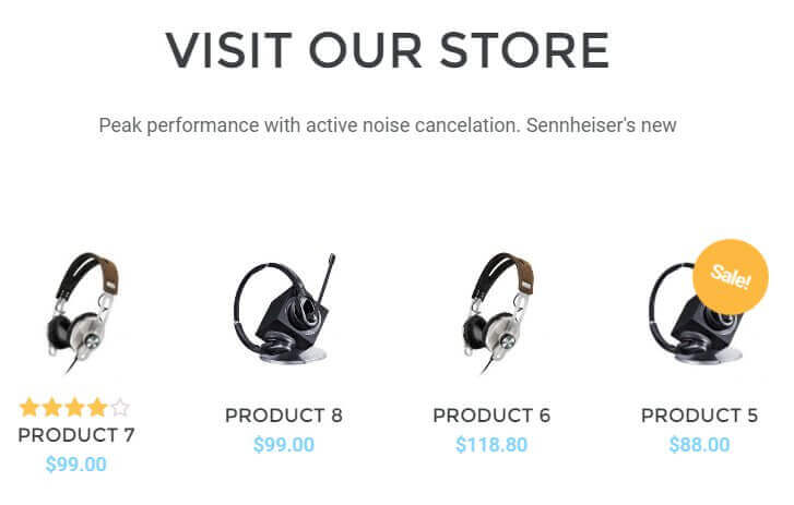
THis section's HTML code is taken from the fifth subpage of the base Frontpage; the demo HTML code looks like this:
                         <header>
                         <h2>Visit our Store</h2>
                         <p>Peak performance with active noise cancelation. Sennheiser's new</p>
                         </header>
                         <div class="store__box box--store box--bigtitle category">
                         [recent_products per_page="4" columns="4"]
                         </div>
HTML Breakdown
This section's HTML consists of two parts; standard HTML that creates the title and subtitle text for the section, and a shortcode that creates an instance of the WooCommerce Recent Products widget, that is used to display the latest products you have to offer. The HTML code with placeholder text replacing the demo content is:
                              <header>
                              <h2>Title Text</h2>
                              <p>Subtitle Text</p>
                              </header>
                              <div class="store__box box--store box--bigtitle category">
                              [Widget Shortcode and attributes]
                              </div>
The content starts with a <header> tag that will separate the title and subtitle from the widget, then creates the title and subtitle in a standard <h2> and <p> tag:
                              <header>
                              <h2>Visit our Store</h2>
                              <p>Peak performance with active noise cancelation. Sennheiser's new</p>
                              </header>
Following this is the shortcode section, which starts with a <div> tag that uses four classes; store__box, box--store, box--bigtitle and category to create the container and also to style the widget so that it fits the aesthetics of the theme rather than using the default layout:
<div class="store__box box--store box--bigtitle category">
Then comes the shortcode itself, which is added in square brackets with two attributes:
[recent_products per_page="4" columns="4"]
Finally, a closing <div> ends the section:
</div>
How the Shortcode Works
The shortcode for the recent products widget has a very simple layout. The basic shortcode is:
[recent_products]
Which creates the instance of the widget in the page content. However, this defaults to displaying all products, no matter how many you have. To limit the number of products displayed on the page, the per_page attribute is added:
[recent_products per_page="4"]
Which limits the number of products displayed to the amount set in the attribute. Next, the columns attribute is used to limit the section to a certain number of columns. That is, if you were to set the per_page option to 4 and the columns option to 4, then you will have four previews in a row in the widget. If you were to change the columns widget to just 3, then there will be a maximum of three previews on a row, with the fourth being moved down to a new row. The default in the demo content sets both attributes to 4.
Changing the Title and Subtitle Text
The title and subtitle text are set in the <h2> and <p> tags contained in the <header> tag at the start of the HTML content:
                              <header>
                              <h2>Visit our Store</h2>
                              <p>Peak performance with active noise cancelation. Sennheiser's new</p>
                              </header>
You can add your own title and subtitle by substituting the existing text with your own:
                              <header>
                              <h2>Title Text Here</h2>
                              <p>Subtitle Text Here</p>
                              </header>
Changing the Number of Displayed Products
The shortcode used to create the recent products widget includes a per_page attribute which defines the number of product previews that appear on the page:
[recent_products per_page="number of displayed products" columns="4"]
Just set this attribute to your chosen number of items and the widget will ensure the correct amount are displayed.
Adding a "Sale!" Badge
The sale badge is part of the standard WooCommerce functionality and is automatically added to the preview images when the product has been given a discount; that is, if you've set a sale price in the Sale Price field of the product's edit page.
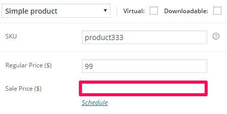
Once done the sale badge will appear on this product's preview.
Removing the "Sale!" Badge
If you don't want the badge to appear on your sale products, then you will need to add some custom CSS to your site to remove it. One of the most basic ways to do this is to use the override.css file to add your own CSS code without touching the core files (our documentation includes a <a href=" ">Custom CSS Guide for this purpose), and add the following line:
                              .onsale {
                              display: none!important;
                              }
There are several other ways to remove the badge that avoid using the !important attribute, but this is the quickest and easiest way for beginners to get the same effect!
Changing the Number of Columns
To add additional columns beyond the default four, you will need to change the columns attribute in the shortcode to your required number of columns; the number in this attribute will set how many products can appear on each row:
[recent_products per_page="number of displayed products" columns="Enter Number of Columns"]
The Footer Links
This section provides various links, a newsletter sign-up form, plus social media profile links for users:
Unlike the rest of the frontpage, this section is created using a Text Widget in the Bottom I widget area. The HTML used in this section looks like this:
               <div class="bottom__box">
               <ul class="bottom__links">
                    <li><a href="#">Contact</a></li>
                    <li><a href="#">Center </a></li>
                    <li><a href="#">Legal Notice</a></li>
                    <li><a href="#">Privacy </a></li>
                    <li><a href="#">Location</a></li>
               </ul>
               <ul class="bottom__links">
                    <li><a href="#">Contact </a></li>
                    <li><a href="#">Center </a></li>
                    <li><a href="#">Legal Notice</a></li>
                    <li><a href="#">Privacy </a></li>
                    <li><a href="#">Location</a></li>
               </ul>
               <h3>Subscribe to BOX</h3>
               [wysija_form id="1"]
               </div>

               <div class="bottom__contact">
               <div class="bottom__contact-address">Wj 34 Hamilton Road, Phillipsburg, NJ 012345
               <br /> +1 12 345 1234 5678
               </div>
               <div class="bottom__contact-socials">
               <a href="#" class="gk-social-icon">
               <i class="gk-social-icon-twitter"></i>
               </a>
               <a href="#" class="gk-social-icon">
               <i class="gk-social-icon-fb"></i>
               </a>
               <a href="#" class="gk-social-icon">
               <i class="gk-social-icon-gplus"></i>
               </a>
               <a href="#" class="gk-social-icon">
               <i class="gk-social-icon-vimeo"></i>
               </a>
               <a href="#" class="gk-social-icon">
               <i class="gk-social-icon-linkedin"></i>
               </a>
               <a href="#" class="gk-social-icon">
               <i class="gk-social-icon-instagram"></i>
               </a>
               <a href="#" class="gk-social-icon">
               <i class="gk-social-icon-pinterest"></i>
               </a>

               </div>
               </div>
HTML Breakdown
There's a lot of HTML code in this section, but there's nothing to complex with the layout so you'll find it easy to understand. First, let's look at the content with demo text removed and replaced with placeholders:
                    <div class="bottom__box">
                    <ul class="bottom__links">
                         <li><a href="/First Column Link URL 1">Link 1 Label</a></li>
                         <li><a href="/First Column Link URL 2">Link 2 Label</a></li>
                         <li><a href="/First Column Link URL 3">Link 3 Label</a></li>
                         <li><a href="/First Column Link URL 4">Link 4 Label</a></li>
                         <li><a href="/First Column Link URL 5">Link 5 Label</a></li>
                    </ul>
                    <ul class="bottom__links">
                         <li><a href="/Second Column Link URL 1">Link 1 Label</a></li>
                         <li><a href="/Second Column Link URL 2">Link 2 Label</a></li>
                         <li><a href="/Second Column Link URL 3">Link 3 Label</a></li>
                         <li><a href="/Second Column Link URL 4">Link 4 Label</a></li>
                         <li><a href="/Second Column Link URL 5">Link 5 Label</a></li>
                    </ul>
                    <ul class="bottom__links">
                         <li><a href="/Third Column Link URL 1">Link 1 Label</a></li>
                         <li><a href="/Third Column Link URL 2">Link 2 Label</a></li>
                         <li><a href="/Third Column Link URL 3">Link 3 Label</a></li>
                         <li><a href="/Third Column Link URL 4">Link 4 Label </a></li>
                         <li><a href="/Third Column Link URL 5">Link 5 Label</a></li>
                    </ul>
                    <ul class="bottom__links">
                         <li><a href="/Fourth Column Link URL 1">Link 1 Label</a></li>
                         <li><a href="/Fourth Column Link URL 2">Link 2 Label</a></li>
                         <li><a href="/Fourth Column Link URL 3">Link 3 Label</a></li>
                         <li><a href="/Fourth Column Link URL 4">Link 4 Label</a></li>
                         <li><a href="/Fourth Column Link URL 5">Link 5 Label</a></li>
                    </ul>
                    <h3>Newsletter Subscription Message</h3>
                    [wysija_form id="1"]
                    </div>

                    <div class="bottom__contact">
                    <div class="bottom__contact-address">Contact Address
                    <br /> Contact Phone Number
                    </div>
                    <div class="bottom__contact-socials">
                    <a href="/Twitter Profile URL" class="gk-social-icon">
                    <i class="gk-social-icon-twitter"></i>
                    </a>
                    <a href="/Facebook Page URL" class="gk-social-icon">
                    <i class="gk-social-icon-fb"></i>
                    </a>
                    <a href="/G+ Profile URL" class="gk-social-icon">
                    <i class="gk-social-icon-gplus"></i>
                    </a>
                    <a href="/Vimeo Channel URL" class="gk-social-icon">
                    <i class="gk-social-icon-vimeo"></i>
                    </a>
                    <a href="/LinkedIn Profile URL" class="gk-social-icon">
                    <i class="gk-social-icon-linkedin"></i>
                    </a>
                    <a href="/Instagram Profile URL" class="gk-social-icon">
                    <i class="gk-social-icon-instagram"></i>
                    </a>
                    <a href="/Pinterest Profile URL" class="gk-social-icon">
                    <i class="gk-social-icon-pinterest"></i>
                    </a>

                    </div>
                    </div>
We can split the content in this widget into two parts, the first containing the list links and newsletter sign-up field, and the second containing the address, phone info and social media icons. The entire section opens with a <div> tag using the bottom__box class, which will wrap the top part of the section containing the links and newsletter form:
<div class="bottom__box">
Then the content begins; each column of links is created with a <ul> unordered list tag using the bottom__links class for styling. Then, each individual link is added using a <li> list item tag containing an <a> link tag:
                    <ul class="bottom__links">
                    <li><a href="#">Contact</a></li>
The text for the link is added between the opening and closing <a> tag, and the URL that the text should link to when clicked is added to the href attribute. A total of five list items are added to the column, before it is ended with a closing </ul> tag:
                    <ul class="bottom__links">
                         <li><a href="#">Contact</a></li>
                         <li><a href="#">Center </a></li>
                         <li><a href="#">Legal Notice</a></li>
                         <li><a href="#">Privacy </a></li>

                         <li><a href="#">Location</a></li>
                    </ul>
This format is repeated three more times to create a total of four columns of links:
                    <ul class="bottom__links">
                         <li><a href="#">Contact </a></li>
                         <li><a href="#">Center </a></li>
                         <li><a href="#">Legal Notice</a></li>
                         <li><a href="#">Privacy </a></li>
                         <li><a href="#">Location</a></li>
                    </ul>
Then comes the content for the newsletter section, starting with an <h3> tag to create the title:
<h3>Subscribe to BOX</h3>
Then, the form is added via a shortcode that will insert a MailPoet form into the content; details on how to create this form are included in the installation guide:
[wysija_form id="1"]
And then the top section ends with a closing </div>:
</div>
Now comes the lower block of content containing the address, phone number and social media icons, starting with another <div> tag with the bottom__contact class that creates the container, and another <div> with the bottom__contact-address class that will be used to align the address and phone number information. After this, the address information is added as plain text with a <br /> line break separating the address from the phone number, before a closing </div> tag finishes this part of the content:
                    <div class="bottom__contact">
                    <div class="bottom__contact-address">Contact Address
                    <br /> Contact Phone Number
                    </div>
The social media icons section follows this, with another <div> tag with the bottom__contact-socials class starting the section:
<div class="bottom__contact-socials">
Each social icon consists of two tags; an <a> link tag that provides the URL for the linked social media profile, and an empty <i> tag with a special class to create the icon:
                    <a href="#" class="gk-social-icon">
                    <i class="gk-social-icon-twitter"></i>
                    </a>
In the first icon above, the href attribute will be used to point to the site's Twitter profile, while the icon is provided by the gk-social-icon-twitter class that is attached to the <i> tag. This format is repeated for the other social networks:
                    <a href="/Facebook Page URL" class="gk-social-icon">
                    <i class="gk-social-icon-fb"></i>
                    </a>
                    <a href="/G+ Profile URL" class="gk-social-icon">
                    <i class="gk-social-icon-gplus"></i>
                    </a>
                    <a href="/Vimeo Channel URL" class="gk-social-icon">
                    <i class="gk-social-icon-vimeo"></i>
                    </a>
                    <a href="/LinkedIn Profile URL" class="gk-social-icon">
                    <i class="gk-social-icon-linkedin"></i>
                    </a>
                    <a href="/Instagram Profile URL" class="gk-social-icon">
                    <i class="gk-social-icon-instagram"></i>
                    </a>
                    <a href="/Pinterest Profile URL" class="gk-social-icon">
                    <i class="gk-social-icon-pinterest"></i>
                    </a>
Before the code is ended with two closing </div> tags:
                    </div>
                    </div>
Changing the Link Text and URL
The four columns of links are each created with a unordered list <ul> tag, with each link in a column contained in a <li> link item tag with an <a> tag providing the link URL and label:
                    <ul class="bottom__links">
                         <li><a href="#">Contact</a></li>
                         <li><a href="#">Center </a></li>
                         <li><a href="#">Legal Notice</a></li>
                         <li><a href="#">Privacy </a></li>
                         <li><a href="#">Location</a></li>
                    </ul>
To change a link's URL, replace the contents of the href attribute in the link you want to change with your own link URL. For the label, adjust the text between the opening and closing <a> tags:
                    <ul class="bottom__links">
                         <li><a href="/First Link URL">First Label</a></li>
                         <li><a href="/Second Link URL">Second Label</a></li>
                         <li><a href="/Third Link URL">Third Label</a></li>
                         <li><a href="/Fourth Link URL">Fourth Label</a></li>
                         <li><a href="/Fifth Link URL">Fifth Label</a></li>
                    </ul>
Adding a Link
To add a link to a particular column you need only duplicate the existing <li>/<a> layout, adding it before the closing </ul> tag of the column you wish to add the new content to:
                     <ul class="bottom__links">
                         <li><a href="/First Link URL">First Label</a></li>
                         <li><a href="/Second Link URL">Second Label</a></li>
                         <li><a href="/Third Link URL">Third Label</a></li>
                         <li><a href="/Fourth Link URL">Fourth Label</a></li>
                         <li><a href="/Fifth Link URL">Fifth Label</a></li>
                         <li><a href="/New Link URL">New Label</a></li>
                    </ul>
Changing the Newsletter Call-To-Action
The call-to-action that appears above the newsletter subscription field is contained in the <h3> tags that follow the end of the link list section:
                    <h3>Subscribe to BOX</h3>
                    [wysija_form id="1"]
To change this message, modify the text between the opening a closing tags:
                    <h3>Your Call-To-Action Here</h3>
                    [wysija_form id="1"]
Changing the Address Information
The address information, consisting of a street address and phone number, are provided by the <div> element with the bottom__contact-address class:
                    <div class="bottom__contact-address">Wj 34 Hamilton Road, Phillipsburg, NJ 012345
                    <br /> +1 12 345 1234 5678
                    </div>
Notice that a line break <br /> tag is used to move the phone number to a separate line. Add your own text between the <div> tags to modify it::
                    <div class="bottom__contact-address">Street Address Here
                    <br /> Phone Number Here
                    </div>
Connecting Social Media Links
The social icons as used in the demo are not linked to any profiles; to change this you will need to add the links to your profiles into the href attribute of each icon's <a> link tag. For example, the Twitter icon's HTML looks like this in the demo code:
                    <a href="#" class="gk-social-icon">
                    <i class="gk-social-icon-twitter"></i>
To link the icon to a Twitter profile we'll need to remove the placeholder hash (#) and replace it with the URL for our Twitter profile:
                    <a href="/Twitter Profile URL Here" class="gk-social-icon">
                    <i class="gk-social-icon-twitter"></i>
Removing Unused Social Media Icons
Should you only need to utilize some, not all, of the available social media icons included with Box, then you'll need to remove any unused ones to prevent users from trying to use a link that doesn't exist. To remove an icon, simply delete the entire <a> tag containing the link and icon tag for the network you wish to remove. For example, if we have all of the social network icons as in the demo:
                    <a href="/Twitter Profile URL" class="gk-social-icon">
                    <i class="gk-social-icon-twitter"></i>
                    </a>
                    <a href="/Facebook Page URL" class="gk-social-icon">
                    <i class="gk-social-icon-fb"></i>
                    </a>
                    <a href="/G+ Profile URL" class="gk-social-icon">
                    <i class="gk-social-icon-gplus"></i>
                    </a>
                    <a href="/Vimeo Channel URL" class="gk-social-icon">
                    <i class="gk-social-icon-vimeo"></i>
                    </a>
                    <a href="/LinkedIn Profile URL" class="gk-social-icon">
                    <i class="gk-social-icon-linkedin"></i>
                    </a>
                    <a href="/Instagram Profile URL" class="gk-social-icon">
                    <i class="gk-social-icon-instagram"></i>
                    </a>
                    <a href="/Pinterest Profile URL" class="gk-social-icon">
                    <i class="gk-social-icon-pinterest"></i>
                    </a>
And we wanted to remove the Pinterest icon from the bottom, then we'd delete the last link tag and everything in it, so the amended code looks like this:
                    <a href="/Twitter Profile URL" class="gk-social-icon">
                    <i class="gk-social-icon-twitter"></i>
                    </a>
                    <a href="/Facebook Page URL" class="gk-social-icon">
                    <i class="gk-social-icon-fb"></i>
                    </a>
                    <a href="/G+ Profile URL" class="gk-social-icon">
                    <i class="gk-social-icon-gplus"></i>
                    </a>
                    <a href="/Vimeo Channel URL" class="gk-social-icon">
                    <i class="gk-social-icon-vimeo"></i>
                    </a>
                    <a href="/LinkedIn Profile URL" class="gk-social-icon">
                    <i class="gk-social-icon-linkedin"></i>
                    </a>
                    <a href="/Instagram Profile URL" class="gk-social-icon">
                    <i class="gk-social-icon-instagram"></i>
                    </a>
- Details
- Written by Robert Gavick
- Category: Box
- Hits: 5207
Introduction
Equipped with a modern, professional design and support for WooCommerce, Box is a superb package for users looking to expand their sales network online while maintaining a unique brand image that stands out from the crowd. A clean frontpage with multiple image and text sections draws the eye, while large fonts and buttons provide a strong call-to-action that's just as effective for touchscreens, that mobile and tablet users will be sure to appreciate. In this guide we'll cover installation of the theme, either via the automatic installation of the quickstart package, or manual installation in an existing WordPress installation so that your site will match the layout of our demo site.

Theme Structure
The Box frontpage is created using our page-based system; rather than each section being created using widgets, instead a base page is created that uses a special frontpage template. Each subpage added to this base page will have a different function, creating the core elements of the frontpage; for example, the frontpage header's content is taken from the base Frontpage, with the Featured Image providing the background image and the HTML content of the page providing the text and button overlay. For some subpages there will also be a sub-subpages used, such as with the frontpage slideshow. Here, a subpage creates the slideshow, and the subpages of the slideshow subpage create the individual slides. Though this may seem complex at first, once you've seen it in action you'll appreciate its simplicity, and thanks to this layout you'll be able to get a site that matches the demo perfectly in minutes, even on a pre-existing WordPress installation!
Installing the Box Template
The big question before you get started with your installation is whether you can use the Quickstart package to install the complete WordPress and theme package to match the demo, or if you'll need to install the theme manually in an existing WordPress instance, which will require a couple of additional steps compared to the quickstart.
Which installation method you should use depends on whether your site is already established, or if you're starting afresh. The Quickstart is a full installation of WordPress that installs WordPress itself, the theme, plugins, demo content and database data to match our demo layout. However, as this is a full WordPress installation it may only be used on a clean server; the package cannot be installed on an existing WordPress instance.
Manual installation is still very simple as WordPress includes the ability to import much of the content from the demo, and the page-based frontpage layout means that you can match the demo exactly in just a few steps. However, there are a few extra steps needed to set the frontpage template and configure the menus and additional widgets if you want to get your site looking exactly like our demo layout. If you've got a lot of content that will take you a long time to backup, or if backing up and restoring your content is not an option, then the manual installation is a great way to get an updated site without losing all your data.
Generally we recommend the quickstart installation whenever possible; this install method provides you with the exact settings and layout needed to match the demo so you can start customizing your site right away. You should use this method if you are starting a new website, or if your existing website/WordPress installation lacks any unique content you wish to preserve. For example, if your host installed WordPress for you, then it's advisable to remove this installation and reinstall using the quickstart, as it is much faster than manual installation.
If you have a lot of existing posts or other content that you do not wish to lose then the manual installation is the only way to install the theme and match the demo layout without losing this content. However, with manual installation you will be able to take care of some customization as you go; modifying shortcodes or widget settings to match your own content rather than the imported demo content.
Both installation methods will be covered in the following sections, with step-by-step guides to getting everything up and running.
Quickstart Installation
The quickstart installation requires very little input save for your admin and database details, and once the quickstart is uploaded to your server the entire install process takes just a few minutes. In order to complete this install method you will need FTP access to your server and a database name, username and password. A complete step-by-step guide with further information on the requirements may be found in our documentation:
Manual Installation
Manual installation requires that the theme and plugins are manually installed, then the demo content imported and frontpage template set; finally, additional elements such as menus and widgets need to be placed and configured according to our demo settings. Many of these steps are fairly automated, so a manual installation won't take much longer than the standard quickstart install, but there's still a couple more steps than if you were to use the quickstart.
Broadly-speaking, manual installation can be split into these steps:
- Download and install the theme.
- Download and install plugins.
- Import theme demo content.
- Assign Static Frontpage.
- Place and configure widgets.
- Setup menus and additional pages.
Let's look more closely at each step in turn; once done, you will have a nice layout that matches the demo, ready for your own content!
Preparing Your Site for Manual Installation
Before starting the installation, you'll want to ensure that the install process will complete without a hitch. For this reason, it's important to move any existing widgets you have previously placed in any widget position in your Appearance → Widgets section are moved to the Inactive Widgets section, or deleted entirely if you no longer wish to use them; this will leave you with no active widgets in any widget positions.
This step is necessary as, barring some common sections, the widget areas where your widgets are placed are exclusive to the theme; if you move from one theme to another the widgets will often be moved to a new widget area which can damage the overall theme aesthetic. For example, your current theme may only have a single widget position where all widgets are assigned, such as the sidebar. However, your new theme may have several widget positions depending on the complexity, such as header areas, banners, multiple sidebars and more. Once the theme is installed and activated, the widgets from your old theme may be inadvertently assigned to the first position of the new theme, which may not coincide with your older layout and will make your new theme look rather messy until the widgets are removed/reassigned.
Download and Install the Theme
Now that you're ready to install, the first thing to do is download and install the theme's zip package. Click on the following link to go to the Box Download Page (you must be logged-in to do so!). You'll see that there are three different files available:
- gk_box.zip - This package contains the basic theme files; this package is essential for manual installation, so make sure to download it.
- gk_box_quickstart.zip - This contains the quickstart files for a new installation of WordPress that matches the demo layout exactly; this can be ignored if you are installing manually.
- gk_box_rest_files.zip - This package contains the source PSD files for the theme; you shouldn't need these unless you intend to make some fundamental changes to the core design of the theme so this package can be ignored.
To keep things simple, download only the basic theme package. Once it's downloaded you can install the theme package by following these steps:
- Login to your WordPress backend and click on Appearance → Themes in the left menu to be taken to the Themes section of WordPress.
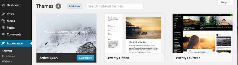
- Click on the blue Add New link at the top of the screen to open the Add Themes page.
- Click on the blue Upload Theme link, located at the top of the screen as with the previous step.
- A dialogue box will open to allow you to select the theme package for upload. Click on the Choose File button and select your just-downloaded gk_box.zip file. Then, click the Install Now button to start the installation process.
- Wait a few moments whilst WordPress installs the theme's files. Once the install is complete, you will be given three options; Live Preview, Activate, or Return to Themes Page.
Click on Activate.
The theme is now installed and ready to go; next we need to take care of installing the plugins.
Installing Plugins
Plugins are a great way to expand your WordPress installation's capabilities, and in Box we use a combination of our own custom open-source plugins alongside established, trustworthy solutions such as WooCommerce and MailPoet to provide ecommerce and newsletter-related functionalities. The required plugins are:
- News Show Pro - This plugin creates article previews and showcases. With full control over whether to show featured images, titles and text snippets with multiple display options and pagination. In Box, the main function of this widget is to work alongside WooCommerce to create product previews on the frontpage, helping you to advertise your latest products or popular offers. This functionality can be applied using a widget or, as is the case on Box's frontpage, by using a shortcode in your page content.
- Tabs - This widget creates tabbed areas that can then display other widgets; though it isn't required to match the demo layout, the functionality included in this plugin and its synergy with News Show Pro means that it is recommended that it is installed.
- Widget Rules gives you control over which pages and posts a widget should appear on, so you can create specific widget instances to match all types of content. This is used to limit widgets to particular pages or areas of your site.
- WooCommerce - The most popular ecommerce solution for WordPress, WooCommerce provides a huge amount of sales options, from product page creation, checkout processes, categories, discounts and more. This plugin is essential if you wish to complete sales via your website.
- MailPoet - Providing a flexible yet easy-to-understand newsletter functionality, MailPoet allows for the creation of sign-up forms, mailing lists and newsletter content all within your WordPress backend, providing a clear avenue for communicating directly with your customers.
Though these plugins are not included with the theme files, they may be installed with very little effort after theme installation by following these steps:
- After installing and activating the theme a message will appear at the top of the WordPress backend that tells you which recommended or required plugins the theme uses.
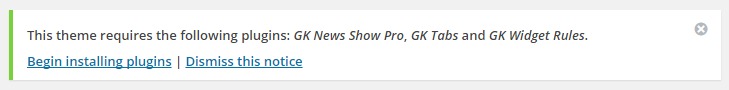
- Click on the Begin Installing Plugins text link that appears underneath the message; you will be taken to the Install Required Plugins screen.
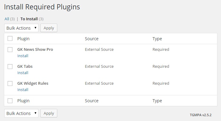
- On this screen there is a list of the recommended and/or required plugins; to the left of the Plugin title is a tickbox; click on this to add a tick to every plugin. Then, click on the Bulk Actions drop-down list and select Install, then click Apply.
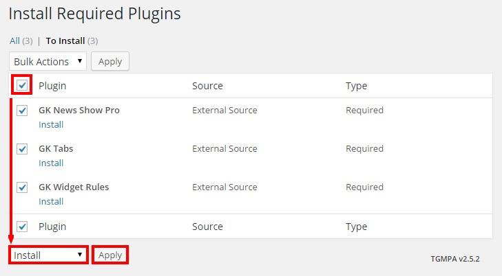
- Allow WordPress to run through the installation process for each plugin; you will see messages advising of each step of installation. Once it finishes, you will see a text link called Return to Required Plugins Installer; click on this link.
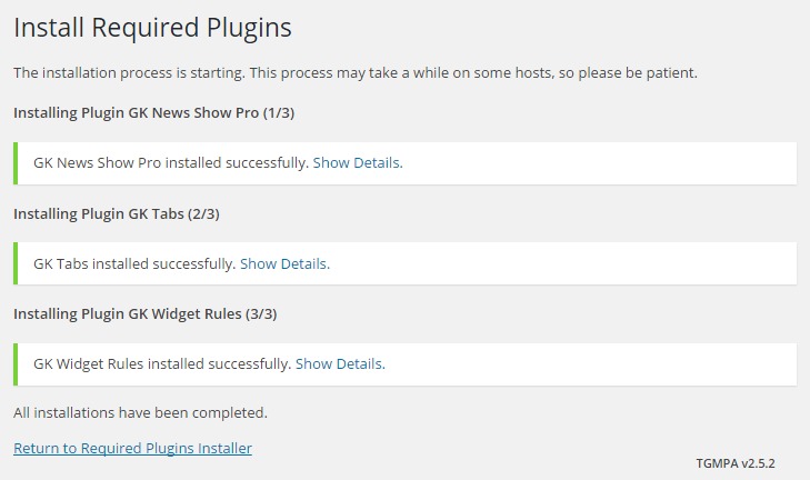
- Now that the plugins are installed, all that's left is to activate them. Like before, click on the tickbox next to the Plugin title to add a tick to every plugin, then select Activate in the Bulk Actions drop-down list and click Apply.
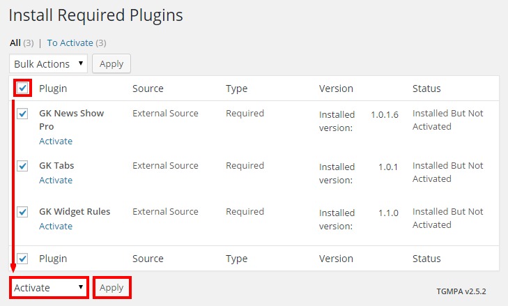
Once these steps are completed all of the plugins that you'll need to match the demo will be installed and ready to go, so we can now focus on importing the content from our demo so that you can match its layout.
Importing the Demo Content
This step will import all of the example products, articles, categories and menus from our demo layout, including the pages needed to create the frontpage. Importing requires two steps; first we need to install the tool that will let us import the demo content, the WordPress Importer. Then, we need to download the demo content and use the WordPress Importer to import it to our site.
Installing the WordPress Importer
The Import/Export option exists in the WordPress backend even in a new installation, but the core plugin that hands the process is not included with the WordPress core, so it must be installed if you haven't done this already. To do so, follow these steps:
- Log-in to your WordPress backend and click on Tools → Import in the left menu. A new screen will open with a list of options for systems that you can import posts into WordPress from, including Tumblr, LiveJournal and more.
- The demo content we will be importing comes from a WordPress installation, so click on WordPress in the list of systems. A pop-up will open with an option to install the WordPress Importer.
- If you want a bit more information on what can be imported, take a moment to read through the description. Once done, or if you don't fancy reading, you can click the Install Now button to start the installation process.
- WordPress will run through the download and install process automatically, so relax for a moment and let it do its thing. Once the install is complete you will see a message and two text options that let you activate and run the newly-installed plugin, or go back to the list of system importers. We'll be importing our WordPress content soon, so click on Activate Plugin & Run Importer.
After a moment you will be taken to the Importer's start screen, ready for a file to be uploaded. However, we don't yet have the file to upload; we'll take care of that now.
Downloading and Importing the Content
All the demo content data is contained in what WordPress calls a WXR file, though it is more commonly called an XML file. We'll need to download this file and use the WordPress Importer to install it on our site.
The list of available XML files for our themes may be found on this theme documentation page ; you will see a list of links, each pointing to a theme's XML file; simply find your chosen style in the list.
If you just click on the link for the Box WXR file you might encounter an issue; instead of downloading, your browser will instead open and display the file contents automatically. To get around this, we'll need to tell the browser that we want to download, rather than display the file:
- In Safari - Right or control-click on the link and select ‘Download linked file’. This will download a file called Box.xml.
- In Chrome - Right-click on the link and select ‘Download link as…’. A dialogue box will open to specify where the download should be saved. The name will default to ‘Box.xml’, so just leave this as default and save the file.
- In Firefox - Right-click on the link and select ‘Save link as…’. A dialogue box will open where you can specify the save location; as with the other browsers the name will default to 'Box.xml' so leave this as it is.
- In Internet Explorer - Right-click on the link and choose 'Save Target as'. A dialogue box will open so you can decide where to download the file to. The file name will default to 'Box.xml', so leave this as it is.
Now with the file downloaded we can import the content into WordPress:
- Navigate back to your WordPress backend and open the WordPress Importer by clicking on Tools → Import → WordPress; if the importer is still open after the install then you may obviously skip this step!
- Click on Choose File and select the 'Box.xml' file you just downloaded, then click on the Upload file and import button.
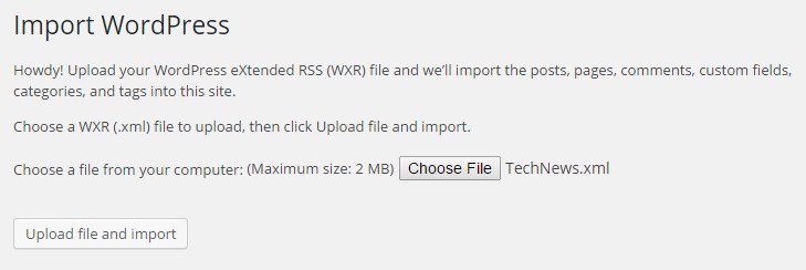
- After a few moments you will see the Assign Authors page. This area will let you decide who gets to be in charge of the content you are importing; you may import the original authors, create a new author, or assign the content to your existing users. There may only be one or two authors who may be imported, or there may be as many as ten, especially if the theme includes BuddyPress since each BuddyPress user in the demo content will be considered a separate author. One of the following options will need to be set for each author and their content that is to be imported:
- If the option is left blank - The original creator's username will be imported into your WordPress, and the imported content assigned to the imported username.
- If a name is entered in the 'Create new user with login name' field - The name you wrote in the field will be used as the username for a new user, and the imported content will be assigned to this new user.
- If a user is selected in the 'Assign posts to an existing user' drop-down list - Once the content is imported it will be assigned to the user that you selected in the drop-down box.
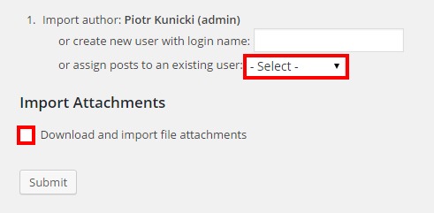
- Now click on the Download and import file attachments tick-box; if selected then the demo placeholder images and other media from the demo will be imported along with the posts.
- Finally, click on the Submit button to start the importing process. Wait for the process to complete; once done, you will see a confirmation message letting you know everything is finished.
The demo content is now ready to go; now it's time to start on preparing your frontpage. This will, for the most part, be an automatic process; we'll just need to assign the static frontpage template so that the theme knows where to look for its frontpage content and the homepage will be set up automatically.
Assigning the Static Frontpage
The entirety of the Box frontpage is created using pages; a core frontpage template is assigned, and subpages of the base page provide the HTML code, shortcodes or images that will then be displayed on the frontpage. Since we've imported the demo content in the last section, we now have a set of ready-prepared content for our frontpage that we can apply simply by assigning the imported frontpage as our static frontpage. To do so, first open the WordPress Customizer by clicking on Appearance → Customization in your WordPress backend.
Now click on the Static Front Page section to open its options. You'll see two radial buttons that let you use your Latest Posts as your frontpage, or a Static Front Page. Make sure the Static Front Page radial button is checked. Now, in the Front Page drop-down list, find the page called Frontpage and click on it.
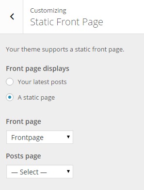
Once done, click on the blue Save button at the top of the customizer to save changes; the static frontpage is now set. And that's it! The imported demo content pages will automatically be used to create the frontpage sections, and your frontpage will now match the demo layout. We're not quite finished yet though; we still need to configure the theme's menus that were imported along with the demo content, and also create the additional widgets that will be used to provide the links, address and newsletter sign-up form that appear at the bottom of every page, the shopping cart functionality, and the search bar functionality. If you wish to use the newsletter field we'll also need to create a sign-up form template in MailPoet.
Configuring Additional Widgets
There are only three widgets that need to be created in addition to the existing page content; a search widget to enable easy searching on your site, the shopping cart so users can check what they've got in their cart on any page, and a set of footer links and newsletter sign-up form that you'll see on every page of the demo. Let's look at creating each of these in turn:
The Search Bar
As simple as a widget can be; the search bar appears at the top-right of each page of the theme:
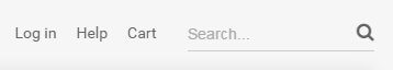
To add this widget we'll use the WordPress Customizer. In your WordPress backend, click on Appearance → Customize to open the Customizer; once it opens you'll see the various options available in the left sidebar, with a live preview of your site taking up the rest of the view area. In the list of options, click on Widgets; this will open a new list displaying all of the widget areas that are included in Box. In this list, click on the Search Widget Area section to load the widget list. Since there are no widgets in this section yet, all you'll see is a short description of the widget area and an Add a Widget button:
Click on the Add a Widget button to expand a second list displaying all the available widgets, and click on the Search option:
There's no options that need to be set for this simple widget, so just click the Save & Publish button at the top of the screen to save the changes and it's ready.
The Footer Links
This section contains the general site links, newsletter sign-up form and social media links for the site:

Since this section will display a newsletter sign-up form provided by MailPoet alongside the links, we'll first need to create the form to ensure it matches the demo layout.
Creating the MailPoet Newsletter Form
In your WordPress backend click on MailPoet → Settings to go to the options page, then click on the Forms tab; you'll see a list available forms, which since this is a new installation of the plugin will include one or two demo forms. It is highly recommended that you delete these example forms as each form generates an ID number that will be used in the HTML code to specify which form to display; by deleting the demo ones, you can ensure that your new form will have the ID "1", which makes it easier when creating the footer widget. To delete the forms, hover over the form's name in the list; the options available for the form will appear. Now click on the Delete button to remove it. Once all the demo forms are removed we can start afresh with a new form, so click on the Create a new form button at the top of the section.
In the Edit New Form page, you'll see the elements to create your own form. The main field on the left displays the form, and on the right is a set of different form elements that you can drag and drop onto the main field to create the form bit by bit.
The form has two elements already added; an Email field, and a Subscribe button. To match the demo layout we'll just need to modify one of these elements. Mouse over the email field in the main left area; an Edit Field button will appear. Click on this button to open a popup where you can modify the element.
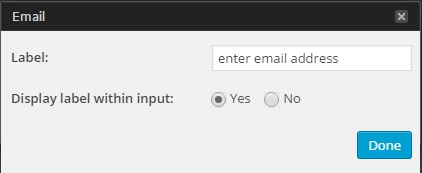
Change the Display Label in Input option to Yes, then click the Done button to save changes. Now add a name for your form in the Edit Name field at the top of the page (the demo uses "Subscribe to Box" and click the Save button at the bottom of the page to save the new form; it's now ready to be used in the widget.
Creating the Footer Widget
To create this section we'll need to use a Custom HTML widget along with some HTML code to create the links and forms. In your WordPress Customizer, click on Widgets and select the Bottom I widget area to expand the section. Again, this area should be clear of widgets, so click on the Add a Widget button and choose the Text widget from the list of available widgets:
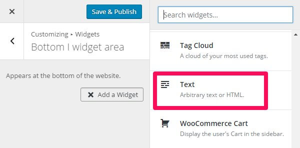
You'll see two main sections to this widget; the first is the Title field, which we can leave blank. The second is the Content field; here is where the HTML code you wish to use needs to be added. To match the demo, copy and paste the following HTML code into the content field:
                              <div class="bottom__box">
                              <ul class="bottom__links">
                                   <li><a href="#">Contact</a></li>
                                   <li><a href="#">Center </a></li>
                                   <li><a href="#">Legal Notice</a></li>
                                   <li><a href="#">Privacy </a></li>
                                   <li><a href="#">Location</a></li>
                              </ul>
                              <ul class="bottom__links">
                                   <li><a href="#">Contact </a></li>
                                   <li><a href="#">Center </a></li>
                                   <li><a href="#">Legal Notice</a></li>
                                   <li><a href="#">Privacy </a></li>
                                   <li><a href="#">Location</a></li>
                              </ul>

                              <h3>Subscribe to BOX</h3>
                              [wysija_form id="1"]
                              </div>

                              <div class="bottom__contact">
                              <div class="bottom__contact-address">Wj 34 Hamilton Road, Phillipsburg, NJ 012345
                              <br /> +1 12 345 1234 5678
                              </div>
                              <div class="bottom__contact-socials">
                              <a href="#" class="gk-social-icon">
                              <i class="gk-social-icon-twitter"></i>
                              </a>
                              <a href="#" class="gk-social-icon">
                              <i class="gk-social-icon-fb"></i>
                              </a>
                              <a href="#" class="gk-social-icon">
                              <i class="gk-social-icon-gplus"></i>
                              </a>
                              <a href="#" class="gk-social-icon">
                              <i class="gk-social-icon-vimeo"></i>
                              </a>
                              <a href="#" class="gk-social-icon">
                              <i class="gk-social-icon-linkedin"></i>
                              </a>
                              <a href="#" class="gk-social-icon">
                              <i class="gk-social-icon-instagram"></i>
                              </a>
                              <a href="#" class="gk-social-icon">
                              <i class="gk-social-icon-pinterest"></i>
                              </a>
                              </div>
                              </div>
Feel free to modify any of the data to match your own if preferred. Once done, there's one more option that needs to be set. Click on the Widget Rules button under the content section to expand its options; this is where we can set which pages the widget appears on and also add extra CSS styles. In the Custom CSS Class field, add the following text:
gray-bg animated-circles
The options are now set, so click the Save & Publish button to save changes.
The Shopping Cart
You won't be able to sell many products if visitors can't check what's in their shopping cart! This widget provides the functionality:
To set-up this widget, open the Widgets area of your WordPress Customizer and click on the Cart section at the bottom of the widget list to expand its options. Then, click on the Add a Widget button. In the list of available widgets, choose the WooCommerce Cart widget. The default options for this widget are fine, so now click Save and Publish to save changes.
That's all the widgets created, so we now just need to assign the menus and your site is ready!
Assigning the Menus
There are three menu positions in Box; the main menu, the footer menu, and the top menu that appears above the main menu. The demo content we imported included example menus that we can use, so you don't need to create new ones yet if you don't wish to, but we will need to assign the correct menus to their respective positions.
To do so, open your WordPress Customizer and click on the Menus option to see a list of menus; you should see a list of three available menus called Footer Menu, Main Menu and Top Menu, which makes it easy to guess which menu goes in which position! To assign these menus, click on the Menu Locations button above the menus; you will be taken to a list of the menu locations with drop-down lists where you can set which menu appears in each location.
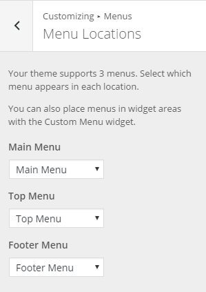
Simply assign each menu to their namesake menu position; the Footer Menu should be assigned to the Footer Menu position etc...
Once finished click the Save & Publish button to save the changes, and your menus are configured!
Your site should now match the layout as seen in our demo, so you can start repurposing the various elements and other content to meet your needs.
- Details
- Written by Robert Gavick
- Category: Box
- Hits: 15879
Introduction
The Box Joomla! 3.5 ecommerce template is designed to do more than facilitate sales; with a fresh touch-friendly layout that transfers effortlessly between desktop and mobile screens, readable fonts and typography and informative boxouts and images all wrapped up with Virtuemart support, it can help you sell a lifestyle; building a brand that matches your core product demographic.
This guide explains the key features included with the template, and provides an in-depth step-by-step process for installing the quickstart package for new sites, or manually configuring the template on an existing Joomla! installation.
Installing the Box Template
Before starting your installation the most important step is to decide whether you can install Quickstart package, which will automate the installation of the latest version of Joomla!, the template, modules, menus, demo content and database data to match the demo layout of the template, or if you should use the more time-consuming manual installation, which will allow you to update an existing website without removing any content. Which method you should use rests on the current status of your site; if you're starting a brand new website or your existing site is relatively new with little custom content, then the quickstart installation will get you up and running fast. However, since it is a full Joomla! installation this method may only be used on a clean server; it cannot be installed in an existing Joomla! installation.
If you have a mature site that has a lot of content that you'd rather not migrate to a new installation, or if there is custom content that cannot be backed up and restored, then the manual installation would be the preferred install solution. This method will allow you to keep the existing content, but develop the layout and features included with the Box template to frame them in a new and exciting way. This can be especially useful if you already have an extensive product catalogue in Virtuemart, for example. With the included modules you can simply assign your existing products to the frontpage product showcases. However, the major drawback of this installation method is that it is time-consuming; without an automated install it becomes necessary to manually place and configure each of the module used in the template in order to match the demo, though of course this does allow you to modify the content as you go rather than changing the demo content after install.
Generally we recommend the quickstart installation if possible, especially if you're fairly new to Joomla. Though configuring modules is not a particularly tough task, if you are not comfortable with the process then there will be a lot of double-checking needed to ensure you are getting the settings correct. Once you have decided on your preferred method, you can move on to the following sections which will provide you with step-by-step information on how to get things installed and ready to go.
Quickstart Installation
Installing the quickstart is a fast and easy process that runs just like a normal Joomla! installation, so you won't need much time for this save for the initial transferring of the files to your server. There are however some things you'll need to have handy during the install; first up is FTP access to your server so that you can upload the quickstart files, and then for the actual install you'll also need a database name, username and password. A full step-by-step guide to this process with further information on the server requirements may be found in our documentation:
Manual Installation
Manually installing the template is a simple process, but the configuration of the template settings and the placing of the modules is more time-consuming. However, though the manual install process requires many more steps that the quickstart install, it is still easy to do; Joomla's functionality makes placing and configuring modules, plugins and extra elements such as menus very intuitive once you get the hang of it. We can break down the complete process of installing the template and configuring it to match the demo layout into several steps, some more in-depth than others:
- Download and install the template.
- Download and install additional modules and plugins.
- Import template settings.
- Upload demo images (optional).
- Place and configure modules and create page content.
- Setup menus and additional pages.
We'll look at each of these steps more closely in the following sections; once done, you'll have a nice layout that matches the demo example, ready for your own content.
Preparing Your Site for Manual Install
Before getting started you'll need to take care of one minor requirement; to make sure that the layout matches the demo you should first deactivate any existing modules in your Joomla! backend, as the install process for Box will include placing and configuring several modules that make up the frontpage as well as additional content, and if the existing modules are not deactivated there may be some conflict or overlap with the Box-specific module positions that will cause visual or other usability issues. Once the installation is complete you can of course reactivate the pre-existing modules; just be sure to double-check that they do not affect the template's aesthetic or you may need to perform some additional CSS styling to blend them effectively.
Deactivating modules takes just a couple of very simple steps; just log-in to your Joomla! backend then click on Extensions → Module Manager in the top menu. You will now see a list of active modules.
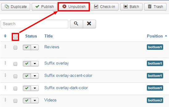
To deactivate all modules at once, click on the tickbox at the top of the second column in the module list to select every module, then click on the Unpublish button at the top of the screen to deactivate. Once done, do the same for any other pages should there be more modules. The existing modules are now deactivated and you can start with the template install.
Download and Install the Template
Now that you're ready to install, the first thing to do is download and install the template's zip package. Click on the following link to go to the Box Download Page (you must be logged-in to do so!). You'll see that there are three different files available:
- gk_box_J!3.zip - This package contains the basic template files; you should download this package for manual installation.
- gk_box_quickstart_J!3.zip - This contains the quickstart files for a new installation of Joomla that matches the demo layout exactly; this can be ignored if you are installing manually.
- gk_box_rest_files_J!3.zip - This package contains the source PSD files for the template as well as additional plugins required to expand the template functionality. Make sure to download this package too if you are installing manually.
Grab the basic template package and the rest files package; both will be needed during this install. You might also want to download the quickstart package if you want to use the demo images as placeholders before you add your own content; we'll discuss how to do this later. Once downloaded, we can install the template package:
- Login to your Joomla! backend and click on Extensions → Extension Manager, the manager's screen will open; now click on the Upload Package File tab at the top of the screen.
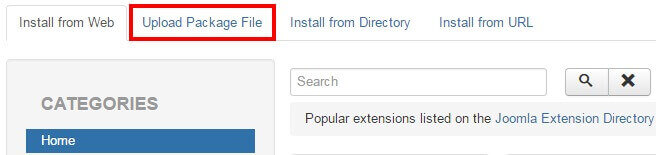
- Click on Choose File to open your file browser; select the recently-downloaded gk_box_J!3.zip file, then click the Upload & Install button.
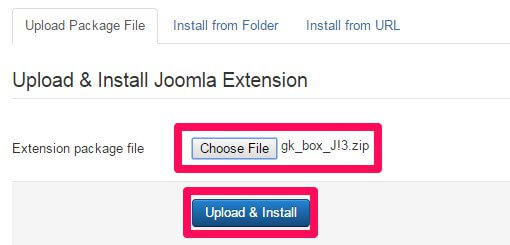
- Once installation is complete, click on Extensions → Template Manager to open the list of available templates; you should now see gk_box in the list.
- Click on the star next to gk_box in the Default column to set it as the default template.
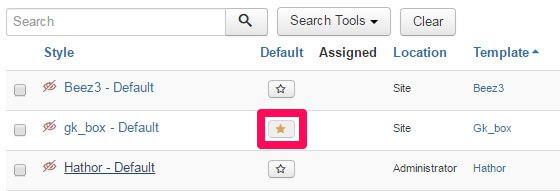
The template is now installed and ready to go; next we need to take care of the plugins and modules.
Installing Extras (Plugins & Modules)
The Box template's frontpage and other features are provided via a combination of custom HTML for the simpler content, and our own open-source modules for more complex features such as frontpage product displays, tabs and slideshows, so you'll need to install these additional free modules to ensure you are able to match the demo layout. Also, the Gavern Framework that underpins all our templates utilizes several unique plugins that provide additional features such as social media sharing functionality, which will also need to be installed. Finally, there are two free third-party extensions supported by Box which we recommend you install to access the full capabilities of the template; Virtuemart, which provides the ecommerce functions, and K2, which is a powerful alternative to the standard Joomla! Article Manager.
Installing the Plugins
The plugins in Box are core elements of our Gavern Framework that powers our Joomla templates. This framework is designed to be modular, with plugins providing additional functions that can be optionally removed if no longer needed, including support for advanced typography, social media functionality and more. These elements are all included in the gk_box_rest_files package that you downloaded earlier. To install the plugins, extract the gk_box_rest_files package on your local computer. You will see that it contains three folders; Modules, Plugins and Source. Log-in to your Joomla! backend and navigate to Extensions → Extension Manager → Upload Package File as you did with the template install.
Now click on the Choose File button to open the file explorer, and navigate to your extracted gk_box_rest_files → plugins folder; you will see a set of zip packages that each contain a plugin. These are all the plugins that are recommended for the template; double-click on the first plugin in the folder to select it, then click the Upload & Install button. The install process will run. Once finished, repeat this install process for all the plugins in the folder in whichever order you prefer. Once all the plugins are installed you will need to activate them; navigate to Extensions → Plugin Manager in the top menu to see a list of installed plugins.
Find the plugins you have just installed; they will have a red X next to them to show they are not activated. Activate them by either clicking the X, or bulk-activate by adding a check to the tickbox next to each plugin to activate, then click the Enable button at the top of the page.
Installing the Modules
There are three Gavick-designed modules that are essential for matching the frontpage demo layout; News Show Pro GK5, Image Show GK4 and Tabs GK5, which together create the frontpage product previews and tabbed slides seen on the demo frontpage. To download these modules navigate to our Joomla! modules' download section ; you'll see a list of the various open-source modules GavickPro has created; there's quite a few! To start with we'll get the News Show Pro module, so click on the News Show Pro GK5 link to be taken to the download page for the module, and get the Joomla 3 version of NSP, called mod_news_pro_gk5_J!3.zip.
Now do the same for Tabs GK5; again there'll be three files available, two of which are for Joomla! 2.5, so download the Joomla 3-specific version; mod_tabs_gk5_J!3.zip; next, repeat this process for Image Show GK4; there are only two files available for this module so download the mod_image_show_gk4_J!3.zip package, which contains the Joomla! 3.5-specific version of the module. With all three of the modules we need downloaded we can start installing; this is functionally the same install process as with the plugins, but without the need to extract first. Login to your Joomla! backend and open the Extension Manager and click on the Upload Package File tab. Click Choose file and find your downloaded News Show Pro package and double-click it, then click the Upload & Install button to begin installation. Repeat this install process for the Tabs and Image Show zip packages too.
Once the modules are installed we can install the third-party extensions that are used in the template; one of them, Virtuemart, is essential if you wish to access the product displays and sale functions of the template, whereas the other, K2, is non-essential but highly recommended.
Installing Virtuemart
Virtuemart is a mature, complete ecommerce solution for Joomla!, offering the full range of product management, pricing, sales and payment options that a modern shopping website needs to give a comfortable purchasing experience to their customers. To install it, visit the VirtueMart Download Page and click on the Download VM3 Now button; this will download a file called com_virtuemart.3.x.x_extract_first.zip. This package contains the core installation files required for an existing Joomla! site, so you can ignore the other downloads.
Once the file is downloaded, extract it locally as the individual components will need to be installed one by one. Once extracted you will be left with three separate zip files. Now log-in to your Joomla! administrator area and click on Extensions → Extension Manager in the top menu to open the Extension Manager: Install page. Click on the Upload Package File tab and then click the Choose File button to open the file explorer. Select the file you wish to install, then click on the Upload & Install button to install the package. The three files should be installed in the following order:
- com_virtuemart.3.x.x.zip - This is the core VirtueMart extension, and should be installed first.
- com_virtuemart.3.x.x_ext_aio.zip - This package contains the VirtueMart-specific modules and other components, and should be installed second.
- com_tcpdf_1.x.x.zip - This package contains the component needed to create PDF invoices that can be emailed or printed for your customers, and should be installed last. If you are an advanced user who does not require PDF invoices or if you have alternative invoicing methods ready then you can ignore this package, but all other users or those who are not sure of their requirements should install it as standard.
Once all of the packages have been installed in order VirtueMart will be ready to use, but there is one very important change that needs to be made in the VirtueMart configuration. Click on VirtueMart → Configuration in the Joomla! main menu to open the configuration screen for VirtueMart. There are a lot of options here, but we only need to change one for now; click on the Templates tab and, in the Activate CSS Styles & Javascripts section, disable the Using the VirtueMart CSS option and save changes. If you do not do this, then the template CSS will be overidden and will not match the demo. When this option is changed, we can move on to installing K2.
Installing K2
K2 offers complex article management options that far surpass those included in the core Joomla article manager, so it's a useful alternative if producing unique written content is a core part of your online product. To install this component, open the K2 site and click on the green Download K2 button in the header area to be taken to the download screen to start the download. Once done, login to your Joomla backend and open the Extension Manager via the top menu, then click on the Upload Package File tab. Now click Choose File and select your recently downloaded K2 package and then click Upload & Install. After a few moments K2 will be installed and you'll be ready to go!
Importing Template Settings
The template settings cover a wide range of options, including layouts, fonts, and other special features that allow users to add their own touch to their website. By importing settings, you can achieve the recommended style based on our demo example without manually configuring each setting.
To import these settings, we first need to get the json file that stores them; this may be found at this download link .
If you just click on the link you'll probably run into a little issue; instead of downloading the file your browser will instead try to open and display the file contents in the viewport. It won't break anything, but you don't want to waste time copying and pasting the data into a new file, right? So to get around this, we'll need to tell the browser that we want to download, rather than display the file. The process is essentially the same for every browser, but for some reason each of them decide to name the command you need to use differently:
- In Safari - Right or control-click on the link and select ‘Download linked file’. This will download a file called Box_config.json.
- In Chrome - Right-click on the link and select ‘Download link as…’. A dialogue box will open to specify where the download should be saved. The name will default to Box_config.json, so just leave this as default and save the file.
- In Firefox - Right-click on the link and select ‘Save link as…’. A dialogue box will open where you can specify the save location; as with the other browsers the name will default to Box_config.json so leave this as it is.
- In Internet Explorer - Right-click on the link and choose 'Save Target as'. A dialogue box will open so you can decide where to download the file to. The file name will default to Box_config.json, so leave this as it is.
Once downloaded, you need to import the settings into your Joomla installation. Connect to your server via FTP and navigate to the templates → gk_box → config folder; here is where the json configuration files are stored. Upload your recently-downloaded Box_config.json to this folder so that it can be found by Joomla. Now you can close your FTP program and login to your Joomla! backend as normal.
Click on Extensions → Template Manager to open the list of installed templates, and find the gk_box template in the list; click on it to open the template options panel. At the top of the screen is a set of tabs for each section of the settings. Open the Basic Settings tab; you'll notice that there is a Load configuration setting as the top option. At this point you'll only have the default.json configuration loaded, but if you click on the drop-down list under Load configuration you'll see the Box_config.json file you uploaded before select this from the list and then click on Load to apply the settings from the file.
Assigning the Frontpage ID
By default they certain page IDs will be assigned as the frontpage and additional pages; this controls which CSS rules are applied. However, depending on your configuration it is likely that your frontpage will have a different ID to that which is automatically stored in the imported settings. As such, we will also need to specify the frontpage ID. To do so, click on Menus → Main Menu in the top menu of your Joomla backend to see a list of assigned menu items. Make a note of the ID for your Home menu item; this number is located in the last column of attributes as in the screenshot below:
Click on Extensions → Template Manager → gk_box → Features tab to see the list of special features options included in the Box template. We're interested in the Suffixes for pages option at the bottom. In the ItemID/Option field, enter the ID number for your Home menu item, then in the Suffix field, type frontpage, then click the Add Rule button.
The frontpage suffix will be added to your Homepage, and the correct CSS rules will be applied. Now repeat this process twice to add two more CSS suffixes to the frontpage; nav-transparent and frontpage-grid.
As the Box template's frontpage also uses the sidebar to place several modules in, we must also make a change in the frontpage's sidebar width. To do this, click on the Layouts tab; the second to last option in this section is Custom Sidebar Width. In the ItemID/Option field, enter your frontpage ID. Next, in the Width field, set this to 50% and click the Add Rule button. The sidebar is now set to the correct width.
Now we can start creating the content for the site; at this point you may choose to upload the placeholder demo images if you do not have any of your own ready on your site, or jump straight to installing the modules for the frontpage.
Upload the Demo Images (Optional)
The modules that we will setup in this tutorial will include references to images that are part of the demo content in the quickstart package, but are not included in the base template package that is used for manual install. This means that any image references will not be accurate, and the frontpage and other areas may not display properly until you assign your own images to each section, which you can do as we create each module.
However, if you haven't prepared your own frontpage images yet then you might want to consider uploading the demo images; this way you can just follow the basic module setup and any images referenced in the modules will be available, so you can see the layout on your site and replace the images with your own later. Uploading the demo images is very easy; we can simply take the folder from the quickstart package and upload it to our site via FTP.
The module placement guide assumes that you have uploaded the demo images to your server in certain situations, such as when images are defined in the HTML code; if you have your own images, simply replace the src attribute accordingly as you reach each section of the guide.
To upload the folder, firs you'll need to get the quickstart package from the Box download page ; click on the gk_box_quickstart_J!3.zip package. Once the download finishes, then extract the package on your local machine.
When the extraction is complete open the extracted quickstart folder; inside you'll find an Images folder, and inside that will be a Demo folder; this contains the demo-specific images for Box. Connect to your server using the FTP program of your choice and upload the Demo folder to the Images folder of your Joomla installation (this is in the root of your Joomla install).
With this folder uploaded the references included in the custom HTML of the frontpage modules (such as the advertisement banners) will point to the demo images as placeholders until you're ready to add your own content.
Module Placement
The frontpage of the Box template is based on modules; from simple custom HTML modules to more complex modules such as our News Show Pro showcase module, that can be used to display articles or VirtueMart products in portal modes specially-designed for Box. If you're going to build a site that looks every bit as good as the demo layout then it's very important that the modules are assigned and configured correctly to ensure that your site gives the perfect first impression. In each module you will find some standard options that appear in every module regardless of type, and module-specific options that control the finer details.
The basic steps for placing a module are:
- Login to your Joomla! backend and click on Extensions → Module Manager in the top menu to open the Module Manager, where you can see a list of modules currently assigned to your site (as per our preparation any existing modules in your installation should be disabled, indicated by a red X under the Status column, or deleted if unnecessary to avoid confusion).
- Click on New at the top of the screen to open a list of available Module Types.
- Select the required Module Type from the list; you will be taken to the settings screen for the module.
- In the Module tab (the first options tab you see when creating a new module of any type), add a title to the Title field; this is required before the module can be saved.
- Set the Show Title option to Show or Hide, depending on the required module settings; some modules use the title text, while others will not.
- In the Position field, set the module position. This tells Joomla where the module should be displayed on your site. You may either select the required position from the drop-down list, or manually type the (case-sensitive) module position into the position field.
- Open the Menu Assignment tab. Here, there is a Module Assignment drop-down list where you can define on what pages/menu items a module should appear on. In Box there are two settings used here; either the module is left at the default On All Pages, so it will appear everywhere on your site (such as with the bottom menu) or the option is set to Only on the pages selected. When this option is set, a list of available pages/menu items will appear, and you can add a checkmark next to the relevant item. Usually, this option is used to display a module on the frontpage only.
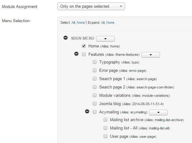
- Configure the module-specific settings. Each module will have its unique settings, some more than others. For example, our robust News Show Pro module has multiple tabs of options, whereas a Custom HTML module will just have a space for adding HTML content.
- Save changes to place the module.
These basic steps will be the same for every module placement; it's a good idea to familiarize yourself with this process if you are new to Joomla!, as it is one of the best ways to make your site your own.
Now let's configure the modules for our frontpage.
Frontpage Modules
The frontpage modules provide the core functionality that your frontpage offers, with product showcases, tabbed slides and carefully crafted image and text blocks that will help you build you company brand and maximize sales, so it's important that they are configured correctly. We will cover each module position of the frontpage in turn until the frontpage layout is complete.
Before starting module placement it is advisable that you disable the TinyMCE or other WYSIWYG editors. This is because these editors automatically cleans up empty HTML tags, but sometimes the modules used in our templates include custom HTML modules that use blank tags to create icons or for additional CSS purposes, so these empty tags shouldn't be removed. Since the clean-up cannot be disabled it is instead necessary to disable the editors.
In order to disable the WYSIWYG editor:
- Click on Users → User Manager in the top menu of your Joomla backend to be taken to a list of your registered users.
- Click on the username you will be logged in as when placing the modules to be taken to the Edit Profile screen.
- Click on the Basic Settings tab and change the Editor option from Use Default to Editor - None.
- Click on Save & Close at the top of the screen to save changes.
Now when you open the editor in an article or Custom HTML module you will see just the plain text editor, and empty tags will not be automatically removed. Once you have finished module placement you may wish to reactivate the editor for the user should you intend to use it to write articles.
Though each type of module will offer a range of differing options, there are two basic but important options tabs to be found in every module; Module and Menu Assignment, which offer four core options; title, show/hide title, position, and menu assignment. The basic options for each frontpage module will be provided at the beginning of each module's relevant section, with the more complex module-specific settings following.
Each module covered in this section will include the following information:
- Module Desciption - A short description of the the module and how it is used on the frontpage, along with a link to a screenshot of the complete module settings should you prefer to match the configuration by sight rather than by following the guide. Note that in the case of custom HTML modules the HTML code that needs to be added to the module will be included in the Main Configuration section described below.
- Basic Settings - Provides the basic configuration details, including the module type that should be selected from the list of available modules when creating a new module, and the title, show/hide title, position and menu assignment settings as used in the demo.
- Main Configuration - Covers the module-specific settings, such as configuring the News Show Pro layouts, or providing the code to be added to a Custom HTML module.
With these sections you will be able to accurately match the demo layout. Now on to the modules!
The Frontpage Header
The frontpage header is a simple introduction to your website, consisting of a large header image with overlaid text. :
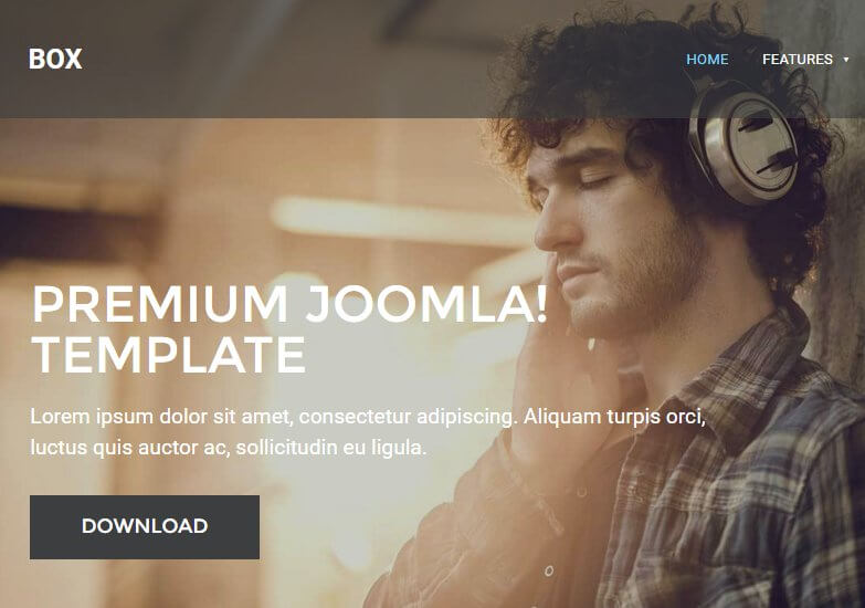
If needed, click on the following link for this module's Configuration Screenshot .
Basic Settings
- Module Type: Custom HTML
- Module Title: Header
- Show/Hide Title: Show
- Module Position: header
- Module Assignment: Only on the pages selected.
- Selected Pages: Homepage only.
Main Configuration
Since this section is created using custom HTML it is extremely easy to set up. Simple copy the following HTML code and paste it into the editor of your module; you may change the header image in the <img> tag and add your own text to the <h1> and <p> tags, but make sure to leave the core <div> structure as this is required for correct styling of the text:
                         <div class="gkHeaderBlock"><img src="/images/demo/header_bg.jpg" alt="" />
                         <div class="gkHeaderContent">
                         <h1>Premium Joomla! Template</h1>
                         <p>Lorem ipsum dolor sit amet, consectetur adipiscing. Aliquam turpis orci, luctus quis auctor ac, sollicitudin eu ligula.</p>
                         <a class="btn inverse" href="#">Download</a></div>
                         </div>
No other options need to be changed, so save the module and we can move on to the other sections.
The Text Block Sidebar
This section provides the bright background block with text and button link directly under the header:
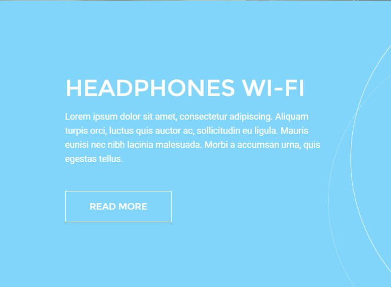
If needed, click on the following link for this module's Configuration Screenshot .
As the frontpage of Box is split into a grid-style layout, the first text block underneath the header is actually placed in the sidebar, though when placed it will appear in the left 50% of the site.
Basic Settings
- Module Type: Custom HTML
- Module Title: Headphones Wi-Fi - sidebar
- Show/Hide Title: Hide
- Module Position: sidebar
- Module Assignment: Only on the pages selected.
- Selected Pages: Homepage only.
Main Configuration
Again, this section is created using simple custom HTML, so configuration is very easy. Copy the following HTML code into the editor of your module; you may add your own text as needed, and don't forget to change the <href^> attribute in the link tag to configure where the user will be directed when clicking on the button, as this is not set to anything by default:
                         <h2>Headphones Wi-Fi</h2>
                         <p>Lorem ipsum dolor sit amet, consectetur adipiscing. Aliquam turpis orci, luctus quis auctor ac, sollicitudin eu ligula. Mauris eunisi nec nibh lacinia malesuada. Morbi a accumsan urna, quis egestas tellus.</p>
                         <p><a class="btn border" href="#">Read more</a></p>
Next open the Advanced tab and, in the Module Class Suffix field, add the following:
animated-color-bg
This will add the required styling to the section. This section is now configured so you can save and close the module.
The Frontpage Banner
This section displays a plain image aligned to fit with the text block above it in the sidebar area of the frontpage:

If needed, click on the following link for this module's Configuration Screenshot .
Basic Settings
- Module Type: Custom HTML
- Module Title: Frontpage banner
- Show/Hide Title: Hide
- Module Position: sidebar
- Module Assignment: Only on the pages selected.
- Selected Pages: Homepage only.
Main Configuration
Since this section only displays an image, you only need to add the following HTML code to the editor of your custom HTML module:
<p><img src="/images/demo/frontpage_img.jpg" alt="" /></p>
Now click on the Advanced tab and add the following text to the Module Class Suffix field:
clear
With that done the module is configured, so you can save the changes.
The Frontpage Slideshow
The Frontpage Slideshow displays a series of images controlled by a tabbed pagination bar, allowing users to rotate through the available slides:
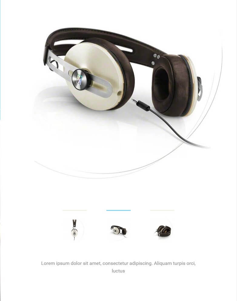
If needed, click on the following link for this module's Configuration Screenshot .
Basic Settings
- Module Type: Image Show module.
- Module Title: Image Show GK4
- Show/Hide Title: Hide
- Module Position: mainbody
- Module Assignment: Only on the pages selected.
- Selected Pages: Homepage only.
Main Configuration
Image Show is more complex than the custom HTML modules we've used so far, so there are several additional options that will need to be configured as well as the slides added to recreate the demo example. First, open the Basic option tab, then add the following text to the Module ID field:
gk-is-1
Next, click on the Module Style drop-down list and select gk_box style, which is the new portal mode created especially for this template. The next tab is Your Slides, where you can add your own slides to the module. Click on the Add New Slide button to open the slide options. In the Image field, click the Select button and choose a slide from your media; if you've uploaded the demo images then you'll find an image called slide-1 ready to use as a placeholder. The image you choose will be used both as the slide image and also as the thumbnail tab that appears at the bottom of the section.
Next comes the text content, which appears underneath the tab area at the bottom of the module. The text you wish to display here should be added to the Content field. You may add your own content in these fields as you see fit; the demo layout uses a basic Lorem Ipsum as placeholder text:
Lorem ipsum dolor sit amet, consectetur adipiscing. Aliquam turpis orci, luctus
You should also add a title into the Title field; this won't be displayed on the frontpage but it will help you to track your slides should you need to make changes. You can also add a link address to the URL field, which specifies where the slide should link to when clicked. Once done, click on Save button to save the slide. Repeat this process again to add additional slides as needed; in the demo content we have three slides, each using a Lorem Ipsum for the placeholder text and the demo slide-2 and slide-3 images, respectively.
No other options need to be changed here, so once you've finished adding your slides click the Save & Close button to save changes.
The New Models Section
This section displays a set of images with a text block and button on the right-hand side:
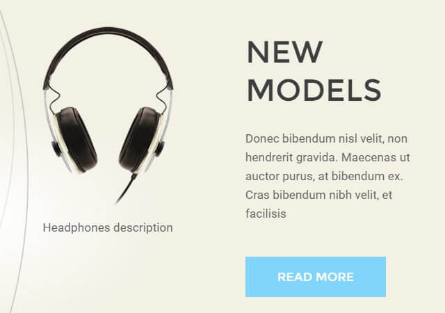
If needed, click on the following link for this module's Configuration Screenshot .
Basic Settings
- Module Type: Custom HTML
- Module Title: New models
- Show/Hide Title: Hide
- Module Position: bottom1
- Module Assignment: Only on the pages selected.
- Selected Pages: Homepage only.
Main Configuration
Another custom HTML module, so as you'd expect it's easy to replicate. First, add the following HTML code to your editor in the module:
                         <div class="showcase"><header class="showcase-header">
                         <h2>New models</h2>
                         <p>Donec bibendum nisl velit, non hendrerit gravida. Maecenas ut auctor purus, at bibendum ex. Cras bibendum nibh velit, et facilisis</p>
                         <a class="btn">Read more</a></header>
                         <div class="showcase-pictures">
                         <div class="showcase-item"><img src="/images/demo/new-models-1.png" alt="" />Headphones description</div>
                         <div class="showcase-item"><img src="/images/demo/new-models-2.png" alt="" />Headphones description</div>
                         </div>
                         </div>
The content of the text block can be modified in the first part of the HTML code above, with the <h2> tags containing the headline text, the <p> tags containing the text underneath the headline, and the <a> link tag defining the button link target and setting the text of the button. For the images, you'll need to amend the <img> tags that appears in lines 7 and 8 of the above code; the src attribute defines the image, and the text before the closing </div> tag defines the description text underneath the image, if required. Once your content is prepared, save the module.
The Headphones Wi-Fi Section
This section displays an image with a text block overlaid:
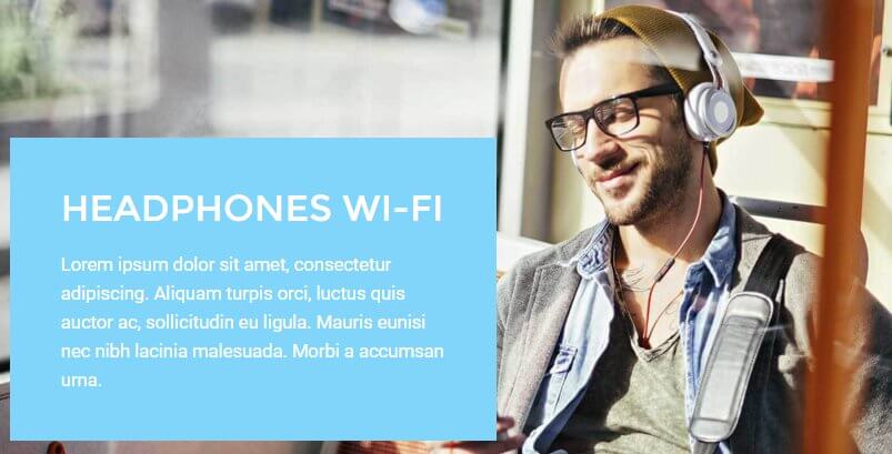
If needed, click on the following link for this module's Configuration Screenshot .
Basic Settings
- Module Type: Custom HTML
- Module Title: Headphones Wi-Fi
- Show/Hide Title: Hide
- Module Position: bottom2
- Module Assignment: Only on the pages selected.
- Selected Pages: Homepage only.
Main Configuration
As this is another custom HTML module, you will need to copy the following HTML into the editor screen of the module:
                         <div class="gkPhotoOverlay"><img src="/images/demo/bottom2-bg.jpg" alt="" />
                         <div class="gkPhotoOverlayContent">
                         <h2>Headphones Wi-Fi</h2>
                         <p>Lorem ipsum dolor sit amet, consectetur adipiscing. Aliquam turpis orci, luctus quis auctor ac, sollicitudin eu ligula. Mauris eunisi nec nibh lacinia malesuada. Morbi a accumsan urna.</p>
                         </div>
                         </div>
Remember that you may add your own text or image content to this section as you see fit. Once done, open the Advanced tab and enter the following text into the Module Class Suffix field:
overlay
The module is now ready, so you can save changes.
The Visit Our Store Section
This area utilizes our News Show Pro module to display a range of product previews pulled from Virtuemart:
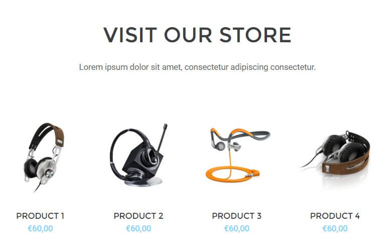
If needed, click on the following link for this module's Configuration Screenshot .
Basic Settings
- Module Type: News Show Pro GK5
- Module Title: Visit our store __Lorem ipsum dolor sit amet, consectetur adipiscing consectetur.__
- Show/Hide Title: Show
- Module Position: bottom3
- Module Assignment: Only on the pages selected.
- Selected Pages: Homepage only.
Main Configuration
This section takes full advantage of the complex options available in News Show Pro, so as before we will move through each option tab step-by-step covering which options should be changed from the default.
Basic Settings Tab
No changes required from default.
Data Source
This section allows you to define which products should be displayed on your frontpage; the Source of Articles option can be set to VirtueMart Products or VirtueMart Categories, and you can change the order using the News order and News sort order options to set whether products should be listed by newest first (either from all products or from specific categories as defined in the Source of Articles option), alphabetically, randomly and more. You can also specify exact products to be displayed if you'd prefer to have fine control over your frontpage showcases. In the demo layout, VirtueMart Categories are set as the data source, and one category, Headpiece, is used from the demo products as an example. Set the options here to your own products and preferences.
VirtueMart Additional Settings
This section is specific to VirtueMart data sources, and requires two changes from the default settings. First, change the Show Add to Cart Button option to On, and change the Display Type drop-down option to Price Only.
Article Layout
There's a number of options under different subheadings in this section, but we only need to change a few of them. Let's look at each section of this tab's changes:
Under the Article Pagination section:
- Amount of pages with arts - Change to 1.
- Amount of columns - Change to 4.
- Amount of rows - Change to 1.
Under the Header section:
- Header Position - Change to "text-align:center".
Under the Image section:
- Image Position - Change to "text-align:center".
- Image Floating - Change to "float:none".
- Image Link - Change to "Off".
Under the Text section:
- No changes required.
Under the Information Block section:
- Information Position - Change to "text-align:center".
-
Info format - Change to the following text:
%STORE
Under the Article Layout section:
- Article block padding - Change to 20px 40px 20px 0.
- Header order - Change to 2.
- Image order - Change to 1.
- Text order - Change to 4.
- Text Enabled - Change to Disabled.
- Information order - Change to 3.
- Info Enabled - Change to Off.
- Second info enabled - Change to Disabled.
- Read more enabled - Change to Disabled.
The Article Layout section is finished, so we can move on to the Links Layout tab.
Links Layout
Change the Amount of pages with links option to 0.
Thumbnails
Change the Wrap content and Create thumbnails options to On.
Set the Thumbnail dimensions option to 140px by 156px.
The section is now configured, so you can save the changes.
The Bottom Menu
This section appears at the bottom of every page on the site, and displays menu and social links along with a newsletter sign-up field:
If needed, click on the following link for this module's Configuration Screenshot .
Basic Settings
- Module Type: Custom HTML
- Module Title: Bottom
- Show/Hide Title: Hide
- Module Position: bottom4
- Module Assignment: On All Pages.
Main Configuration
We're back to the custom HTML modules, so copy the following code into the editor of your module; you may modify each link's URL and text as needed, and basic information for configuring the newsletter form is in the comments of the code:
                         <div class="gk-cols gk-bottom-links">
                         <ul class="col-width-20">
                         <li><a href="#">Contact</a></li>
                         <li><a href="#">Center </a></li>
                         <li><a href="#">Legal Notice</a></li>
                         <li><a href="#">Privacy </a></li>
                         <li><a href="#">Location</a></li>
                         </ul>
                         <ul class="col-width-20">
                         <li><a href="#">Contact </a></li>
                         <li><a href="#">Center </a></li>
                         <li><a href="#">Legal Notice</a></li>
                         <li><a href="#">Privacy </a></li>
                         <li><a href="#">Location</a></li>
                         </ul>
                         <!-- Begin MailChimp Signup Form --> <!-- put your url from MailChimp form into action="your link here" --><form class="col-width-20 gk-newsletter" action="#!" method="post" name="mc-embedded-subscribe-form" novalidate="" target="_blank">
                         <h3>Subscribe to BOX</h3>
                         <input id="mce-EMAIL" class="required email" name="EMAIL" type="email" value="" placeholder="email" /> <!-- real people should not fill this in and expect good things - do not remove this or risk form bot signups-->
                         <div style="position: absolute; left: -5000px;"><input tabindex="-1" name="b_6601f0307e28eefdfd842bbdd_2007e79bce" type="text" value="" /></div>
                         <div class="clear"><input id="mc-embedded-subscribe" class="button" name="subscribe" type="submit" value="Subscribe" /></div>
                         </form><!--End mc_embed_signup--></div>
                         <div class="gk-cols">
                         <div class="col-width-75 gk-contact-info">Your Postal Address here, NJ 0123456789<br /> +1 12 345 1234 5678</div>
                         <div class="col-width-25 gk-social-icons"> </div>
                         </div>
Now open the Advanced options tab and add the following suffixes to the Module Class Suffix field:
gray-bg animated-circles big-spaces
Once done, save the changes to the module.
The Shopping Cart
Shoppers won't get very far if there's no way to purchase anything; that's why it's essential to have the VirtueMart Shopping Cart module in place. In Box, only the default cart module is used, so configuration is virtually instant, but you will need to ensure it is assigned to the correct module position.
Basic Settings
- Module Type: VirtueMart Shopping Cart
- Module Title: VM - Shopping cart
- Show/Hide Title: Show
- Module Position: cart
- Module Assignment: On All Pages.
Main Configuration
Nothing more needs to be done for this module; the default settings are all you need, so you can save. Do remember that the install process of VirtueMart creates an instance of the shopping cart module by default, so if you've just installed the extension you can simply modify the existing instance of the cart to assign it to the cart module position instead of the default position-4.
The Search Bar
Adds a search bar to the top of all pages. This uses a standard search module with default options.
Basic Settings
- Module Type: Search
- Module Title: Search
- Show/Hide Title: Show
- Module Position: search
- Module Assignment: On All Pages.
Main Configuration
No changes are required from the default settings.
Menus
There are several menu positions available in Box, and here we will create some placeholder menus to complete the look of the frontpage and give you somewhere to work from as you add your own items.
User Menu
A user menu is included in Box to let users manage their profiles and other information. It isn't necessary to allow logins for your site, but if you're going to use the ecommerce features of Box then allowing logins will let users track and manage order history as well as give you insight into particular purchase habits which will help you plan your sales strategy. To create this menu:
In your Joomla backend, click on Menus → Menu Manager → Add New Menu to be taken to the Menu Details screen. Enter a title and menu type in the respective fields; in the demo content we use User Menu as the title, and mainemu as the Menu Type. Then click on Save & Close to save the changes. You will be taken back to Menu list where you'll need to add some items.
Click on Menus → User menu → Add New Menu Item to go to the Edit Menu Item screen; in the Title field, type Your Profile. Click on the Select button in the Menu Item Type field and select Users Manager → User Profile. Change the Access option on the right-hand side to Registered, then click Save & Close to save changes.
Repeat this process of adding a new menu item, but this time name the menu item Edit Profile, and in the Menu Item Type field select Users Manager → Edit User Profile. Add yet another new menu item, then type Create Article in the title field and select the Articles → Create Article menu item type before saving.
One more time; go through the steps to create a new item; type Create Article in the title field and select the Article → Create an Article menu item type before saving. Make sure that each of these menu items are limited to access from registered users only to prevent issues. The User menu is now ready, and we can assign it to its position.
Assigning the Menu
This is very simple; just open your Module Manager, click on the green New button, and in the list of available modules click on the Menu option. Add a title to the title field; in the demo we use User area. Select the usermenu position in the Position field's drop-down list, or write the position into the field manually. Now, in the Select Menu field, select your new User Menu. Leave all other options as default and click on the Save & Close button to save changes. Your menu is now set-up.
Top Menu
The top menu appears at the very top of every page, providing quick links to help pages and the shopping cart. To create this menu, click on Menus → Menu Manager → Add New Menu as before and enter a title and menu type; we use Top menu as the title and top-menu as the menu type. Now click on Save & Close to save the menu.
Click on Menus → Top Menu → Add New Menu Item in your Joomla! admin menu to go to the Edit Menu Item screen. Add Help as the title and select System Links → External URL as the Menu Item Type; you may add your help page link here, or just save the menu item if you will do this later. Repeat the process to add a second menu item, and set the title as Cart. This time for the Menu Item Type, click on the Select button and then choose VirtueMart → Shopping Cart, and save changes. Now you can assign the menu by opening your Module Manager and creating a new module. Set the title to Top menu and, in the Select Menu drop-down list, choose your new Top menu. Finally, set the module position to top_nav and save changes.
Footer Menu
As well as the main menu area, there is also a footer menu area prepared in the demo layout. This is used just as a placeholder ready for your links to be added, but you may wish to create it before beginning customization just so you can see the full frontpage layout.
Click on Menus → Menu Manager → Add New Menu to go to the Menu Details screen. Enter a title and menu type in the respective fields; in the demo content we use Footer Menu as the title, and footermenu as the Menu Type. Then click on Save & Close to save the changes. You will be taken back to Menu list where you'll need to add some items.
Click on Menus → User menu → Add New Menu Item to go to the Edit Menu Item screen; in the Title field, type Privacy Policy. Click on the Select button in the Menu Item Type field and select System Links → External URL, then click Save & Close to save changes. Repeat this process to add another external link, Cookies. The URLs can of course be modified to point to your own cookie/privacy policy as needed, or you can replace/add menu items as you see fit. Once done, open your Module Manager, click on the green New button, and in the list of available modules click on the Menu option. Add a title to the title field; in the demo we use Footer menu. Select the footer_nav position in the Position field's drop-down list, or write the position into the field manually. Now, in the Select Menu field, select your new Footer Menu. Leave all other options as default and click on the Save & Close button to save changes, and the placeholder footer menu is ready!
Additional VirtueMart Settings
We already covered the most important option earlier in this guide, but if you wish to match the VirtueMart store layout as seen in the demo exactly, then there are some additional settings you'll need to modify. In the Joomla! backend, click on VirtueMart → Configuration to open the settings panel, then click on the Shopfront tab. The following changes need to be made:
- Show the Print View link - Uncheck this option.
- Use ReCaptcha for recommendation and 'Ask a question' - Uncheck this option.
- Latest Products - Number of days to display - Set to 4.
- Auto-publish reviews - Uncheck this option.
- Show Review - Change to Don't Show.
- Enable Review System - Change to Disabled.
- Show Rating - Change to Don't Show.
- Enable Rating System - Change to Disabled.
Next, click on the Templates tab; we'll need to change a few settings here in addition to the CSS option from earlier, starting with the Shopfront settings section:
- Default number of categories in a row - Change to 4.
- Default number of products in a row - Change to 4.
- Default number of manufacturers in a row - Change to 4.
In the VirtueMart Home Page Settings section:
- Default number of categories in a row - Change to 4.
- Default number of products in a row - Change to 4.
In the Home Page Feed Settings section, disable the Enable Latest Product Feeds, Enable Top Ten Product Feeds and Enabled Featured Product Feeds options.
In the Media Files Settings section, change the Thumbnail Image Height to 340.
The settings are now configured, so save changes and you're ready to go.
Adding Features Lists to Product Pages
The demo layout for VirtueMart products includes fine product details, such as the microphone impedance. These are added via Editor custom field, with the following HTML layout:
                         <dl>
                              <dt>Feature Title:</dt>
                              <dd> Feature Value </dd>
                              <dt>Feature Title:</dt>
                              <dd> Feature Value</dd>
                         </dl>
Using this format you may add as many features as you want; to separate two sets of features, simply create a new Editor custom field and add a new description list to it; each list will be populated at the bottom of the product page after the description.
Box Advanced Typography
Box includes some useful typography features that will make your site more readable and visually interesting; in this section we'll cover what they are, and how to use them.
Using Advanced Typography
Inserting the advanced typography available in Box into your articles is possible via the Text mode of the TinyMCE editor, where you can enter raw HTML and add the necessary classes to the HTML tags. To switch to the Text version of the editor, click on the Toggle Editor button in the bottom-right of the editor window. To add a particular typography style to a supported HTML tag, you'll need to add the class attribute with the class of the styling you wish to use attached; for example, if we wanted to use the Information Alert box around our text, then we'll add a standard <p> tag and attach the alert-info class:
<p class="alert info">Text goes here</p>
In the following sections we'll cover the available styles and their required classes, so you'll be ready to go.
Warnings
Warnings are highlighted text segments that are meant to draw attention to important information, such as rules, advice or guidelines. There are four types of warning available, each with a different purpose. To use them, simply add the class name to a <p> element:
<p class="classname">
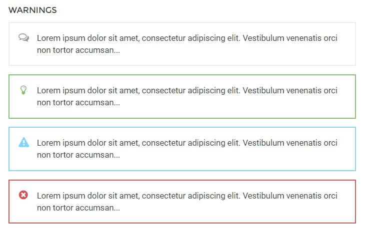
- alert info - This attribute adds a grey border around the the warning text and prefaces it with a speech-bubble icon to highlight information.
- alert success - This attribute adds a green border around the warning text and prefaces it with a lightbulb icon. It is useful for adding advice or hints to your content.
- alert notice - This attribute adds a blue border around the warning text and prefaces the text with an exclamation mark icon in a warning triangle. It is used for warnings or important notices.
- alert error - This attribute adds a red border around the warning text and prefaces it with a red cross icon; useful for negative messages or warnings.
Highlights
Highlights are a way to make a particular part of a paragraph stand out. Unlike the warnings, highlights can be applied in the middle of a paragraph without damaging the text layout.
To use highlights, you will need to add a set of <span> tags in your <p> tags to separate the phrase, and add the highlight class to the <span> element. For example, if you wish to add a highlight to the word "highlight" in the following <p> tag:
<p>This is a highlight phrase</p>
You would need to add the opening <span> tag with the highlight class before the word "highlight", and the closing </span> tag after, like this:
<p>This is a <span class="className">highlight</span> phrase</p>
The available highlight classes are:
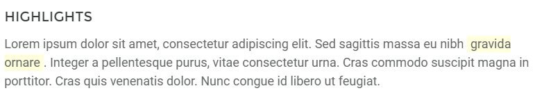
- highlight - This highlight adds a yellow background to the text.
Code Listings
Code listings create blocks that separate code content away from the main content of your site, making it easy for users to spot and read your code:
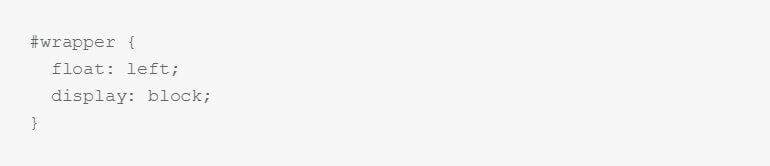
Creating the code block is easy; simply surround the text/code you want to separate with a set of <pre> tags:
                    <pre>
                    #wrapper {
                         float: left;
                         display: block;
                         }
                    </pre>
Unordered Lists
Unordered lists are just that; lists with no particular ordering i.e. no numbered or otherwise ordered entries. This is a good way to list points or minutes in an easily-readable format.
The classes for styling the unordered lists should be added in the opening <ul> tag that begins with list, with the <li> list item tags left as they are:
                    <ul class="className">
                    <li>Item 1</li>
                    <li>Item 2</li>
                    <li>Item 3</li>
                    </ul>
There are four available unordered list classes, as follows:
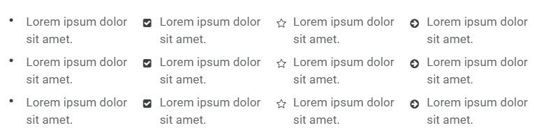
- no class - The standard unordered list uses solid black dots as the delimiter between each point.
- list-1 - This class uses black tickboxes as the delimiter to each point.
- list-2 - This class uses black star outline icons as the delimiter to each point.
- list-3 - This class uses black right-arrow icons as the delimiter to each point.
Number Blocks
Number blocks create circles with a character inside, such as a number, followed by a text. They are useful for highlighting larger points or available options.
The complexity of the number blocks means that they require some more complex HTML tags. Each block contains a <p> tag, which also has the class assigned to it, and a <span> tag that contains the character to appear in the block, with the text following this before the closing </p> tag. The basic structure looks like this:
                    <p class="className">
                    <span>Character (i.e. "1", "A")</span>
                    Item Text
                    </p>
The classes available are:
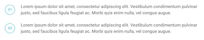
- numblock - This creates a blue-colored colored circle and character inside.
Blocks
Blocks are ways to frame text to draw attention to it, either by adding colored backgrounds or outlines.
Creating blocks for your text is very easy; a basic <p> tag with a class added is all that's required:
<p class="className">
...with one exception, the Legend block, which we'll look at in a moment.
The available classes for blocks are:
- block-1 - This class adds a greyish-green background to the text.
- block-2 - Similar to the above class, but this time using a yellow background.
- legend - Creates a black outline around the text with a Legend or user-defined label at the top-left of the block.
For the legend block a different format is used due to it requiring a title. For this, a <div> should be created with the class name attached, then <h4> should be used for the block title, and standard <p> tags for the text:
<div class="legend"><h4>Title Here</h4><p>Text here</p></div>
Blockquotes
Blockquotes allow you to elegantly highlight quotations in your article. The blockquotes format consists of a <blockquote> tag containing a <p> tag that in turn contains the quoted text.
                    <blockquote;>
                    <p>Your Quote Here</p>
                    </blockquote>
There is one blockquote type included in Box, that is used by default whenever the <blockquote> tag is used in your HTML code.
Floated Blocks
Floated blocks are some of the most visually-appealing typography options available in Ecommerce. They allow you to highlight particular phrases or quotes from the text by adding them in colored text on the left, right, or centre of your main content, much like a newspaper.
The layout of the HTML tags for floated blocks depends on the type of floated block you are using, and where you want the block to appear. The text to appear in the floating block is defined in a <span> tag within your content. Content added before the <span> tag will appear above it, and content added after will be added alongside it. A standard piece of HTML using these blocks may look something like this:
                    <p>Lorem ipsum dolor sit amet, consectetur adipiscing elit. Vestibulum condimentum pulvinar justo, sed faucibus ligula feugiat ac. Morbi quis enim nulla, vel congue augue. Duis quis quam sed purus porta eleifend.

                    <span class="gk-block-text-left">Lorem ipsum dolor sit amet, consectetur adipiscing elit.</span>

                    Donec eget dignissim augue. Donec ante felis, aliquam ut consequat eget, lobortis dapibus risus. Aliquam laoreet enim et lectus ornare hendrerit. Aliquam rhoncus enim libero. Morbi aliquam, nibh mattis feugiat dapibus, nisi massa adipiscing justo, sit amet condimentum urna ipsum et lacus. Nam fermentum, eros quis ullamcorper convallis, libero mauris lacinia eros, sed tempus leo lorem vitae purus.</p>
Something to note here is that there is no set position for the <span> tag to be added; it should be placed organically at the end of a paragraph or line in the text to highlight a particular phrase. Use the preview option in WordPress as you write the content to see how it looks and make your decision from there, and experiment with the <span> tag placement; you will get the feel for your preference very quickly!
There are a total of two classes for floated blocks:
- block-left - This class aligns the text in the <span> tag to the left, with text following the tag appearing to the right.
- block-right - The same as the above class, except this time the <span> tag text is on the right, and the main content after the closing tag floating left.
Large Images in Articles
The standard blog layout included in Box usually uses two image sizes; a large header image, a smaller images in the content. However, Box also includes a special class for inserting images that are smaller than the header, but larger than the standard image in articles. To utilize this feature, simply add the gk-big-image class to your <img> tag:
<img src="/X" class="gk-big-image" alt="test" />
Two-column paragraphs
To make your articles more readable, at times you may want to split a paragraph into two columns instead of the usual one, as seen in the demo blog posts. To do this, add a double class to the paragraph you wish to display in two columns, newspaper-style:
<p class="double">Text goes here and will wrap automatically</p>
Font Awesome
Font Awesome is an incredibly useful font for delivering scalable icons to your site. With over 500 icons available covering a wide range of topics, from popular social media icons to transportation and payment icons, there's something for every type of site available.
How It Works
Font Awesome functionality is included as standard in the Gavern Framework, so you can start using their icons immediately. Icons are added to content using an icon <i> tag with a particular class attached that corresponds to the icon you want to display.
Every icon in the Font Awesome set has a class name beginning with fa, such as fa-pinterest for the Pinterest icon. To use an icon, this class name must be inserted into the <i> tag using the following format:
<i class="fa fa-ClassName"></i>
Notice that fa appears twice in the class attribute; the first time to declare the use of Font Awesome, and the second time as part of the icon's class name. For example, to insert the Pinterest icon mentioned above, the code would be:
<i class="fa fa-pinterest"></i>
A full list of available icons and their respective class names may be found on the Box demo's Typography Page .
The tags should always be left blank, with no text between the opening and closing tags. You may insert these tags anywhere you are entering standard HTML content, including any of our frontpage sections, or in your pages and posts.
The WYSIWYG (What You See Is What You Get) Editor that is used by default in Joomla!will usually clean up blank tags in articles; that is, tags with no content between them. This will include <i> tags that create Font Awesome icons, since they do not have any text between the opening and closing tags. To counter this issue, make sure to only use the plain text editor when adding icons.