Since 19 August, 2015 we’ve been able to test the alpha version of the new Bootstrap 4 release. 4 years to the day of the original Bootstrap release the authors introduced a brand new generation of the most popular responsive framework around; so popular it’s even included in the Joomla! core! We’ve discussed Bootstrap often on our blog, and in particular I’ve been critical of its implementation in Joomla in my article from last year, Why mixing Joomla and Bootstrap may not be a great idea, which stimulated some interesting discussion and bought to light both the advantages and disadvantages of adopting the framework with Joomla!. Not much has changed since I wrote that post though; we’ve still got the old, update-lacking version of Bootstrap in Joomla!, while the bootstrap framework has continued to evolve over the past few years, as we can see in the latest v4 release.
TL;DR
There’s a long list of changes implemented in this latest Bootstrap release, but many of them are wordy and fairly dense for the average user, so to save you from skimming through every single change looking for things that interest you, we’ve done the boring bit and drawn up a short list of the main changes. We’ll get more in-depth about these changes below, but for those of you strapped (HA!) for time, here’s what you’ve got to look forward to:
- the base CSS code is no longer created with LESS; Sass is now the main CSS pre-processor – this means that there will be more variables that you can customize.
- No more wells, thumbnails, and panels – they’re all replaced by cards.
- All CSS reset rules are now in one file called Reboot.
- IE8 is not supported due to use of rem’s which will also significantly improve responsive typography.
- Flexbox grid is not enabled by default but it is available.
- Every JavaScript plugin has been rewritten in ES6 and tons of improvements were added!
Still here? then let’s have a closer look at these changes.
Time to switch to Sass

For non-developers this change is invisible, so don’t worry too much if you’re not familiar with some of the terms used here; your Bootstrap experience will be unchanged. For this change, the Bootstrap authors decided to switch the core CSS pre-processor in Bootstrap from LESS (which we use in our templates) to Sass. Both tools are very similar but it seems that Sass is the more popular of the two, and the Bootstrap authors have noted that the change makes sense due to Sass’ better compilation performance. For users who only include Bootstrap in their website and don’t get down to the nitty-gritty of coding then you’ll find nothing different in terms of usage, as both Less and Sass work from .less/.scss files which are used to prepare the final CSS file. Due to this migration process authors can now include more variables which you can customize, even including advanced animations.
No more wells, thumbnails, and panels…
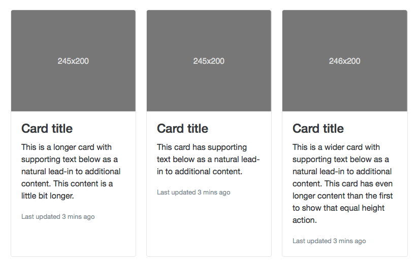
Now this one will make a difference to the user experience! Some of the most popular Bootstrap CSS/JS components like wells, thumbnails and panels have been replaced by the new, all-encompassing component called cards. With cards you can achieve the same layout as the old three components could, but this time using only one. Cards have separated options for headers and footers, along with multiple display options. The migration process from Bootstrap v3 components to cards should be simple enough as the authors have included some class modifiers which can transform a card into the desired well, thumbnail or panel. Cards may be easily utilized in a columns layout using cards with equal width and height inside a container called a…deck (really should have seen that one coming…). You can read more on Bootstrap cards and the new layouts that come with it in the Official Documentation.
Reboot.scss
By default Bootstrap uses Normalize.css as the CSS reset stylesheet. What is the purpose of using it? As the official Normalize.css website explains:
Normalize.css makes browsers render all elements more consistently and in line with modern standards. It precisely targets only the styles that need normalizing.
Reboot is an extended version of Normalize and includes global resets for properties like box-sizing and for common HTML elements like legend, caption or blockquote. You can preview the source of this file on its GitHub repository, and from what we’ve seen it may be a nice replacement for the commonly-used Normalize.css stylesheet.
IE8 – time to say goodbye

Finally, like so many other modern tools before it, Bootstrap is dropping support for IE8. We could go into detail about the frustrating difficulty it takes to support this horrendously old-fashioned browser with HTML5 and CSS3, but then we’d need to write another article; just rest assured that the Bootstrap developers have made the right decision! Code in general should be much cleaner when you don’t need to support this kind of creaky old browser, and you can use em’s and rem’s in your CSS code again (which we’ll look at in the next section). Just bear in mind that if your site needs to support IE8 then you’re limited to using v3 of Bootstrap at most.
Easier responsive typography with em’s and rem’s
em and rem are well-known CSS units. In brief, em is a unit of measurement relative to the font-size of a given element, particular elements like paragraphs (p) or headings (h1,h2,h3…). It’s very common to use this unit for properties like line-height in your CSS; for example:
.sample {
    font-size: 16px;
    line-height: 1.2em;
}
The line-height property will be computed automatically by your browser based on the font-size value, so in the above example it will be 16px*1.2 = 19.2px. As you may suspect the more parent elements the more calculations are required; here’s where Rem comes in. Rem means relative em and it works in much the same way as em, but with an important difference; instead of using the current element as the base from which to make the relative calculation, rem uses the root one (html). With this powerful CSS3 feature designers can easily create responsive typography that doesn’t require manual modification of every single font-size, padding, margin and line-height property; just overwrite the on the root or parent element instead.
Why didn’t Bootstrap implement this useful feature before? The blame for this lies with IE8, as it does not support rem attributes so you were stuck with default unit values (incidentally, you can find out what features a browser supports or doesn’t support on the Can I Use …? website). It’s not all happy days though, as even on the slightly more recent IE 9 & IE 10 the shorthand form of all font-related declarations isn’t supported:
body {
 font: font-style font-variant font-weight font-size/line-height font-family;
}
but at least rem values works properly; it’s a start!
Opt-in Flexbox
Flexbox, or Flexible Box Layout, is likely to be an important element of the future of CSS layouts. It redefines the way that column and row combinations are created in CSS; with flexbox you can arrange elements inside a flex container in a multitude of ways, and specify how the container (and the elements inside) will react under different screen sizes and resolutions, which is a huge improvement for responsive design. If you look at the flexbox structure it’s probably even easier to develop than the regular block model with float and position properties. With Bootstrap v4 flexbox-based grids are available but it not set as a default. To enable, you’ll need to add a declaration into the variables.scss file:
$enable-flex: false !default;
This means that you need to change this boolean variable in Sass file and recompile the entire CSS to get the flexbox layout.
JavaScript plugins refactored and ES6 support.
As the official release notes mention:
Every plugin has been rewritten in ES6 to take advantage of the newest JavaScript enhancements. They also now come with UMD support, generic teardown methods, option type checking, and tons more.
So this means that all Bootstrap v4 plugins support ECMAScript 6 with all the great features that come with it, like block-scoped variables without hoisting, function parameters default values, promises, improved class syntax and much more. There’s enough cool stuff here for a separate article about ES6, but if you’re interested in learning what kind of new features ECMASCript 6 has to offer check out this ECMAScript 6: New Features: Overview and Comparison article.
Better customization and tons more
The Variables.scss file which contains all the customization variables is much bigger in Bootstrap v4. Developers can include not only style variables like gradients, colors, margins etc…in the file, but can also easily modify transitions, shadows and many others. Another significant improvement (or rather, bug fix) is that the issue with auto-placement of tooltips and popovers has been resolved (anyone who’s used them with elements with the position: absolute attribute knows where they can appear). There’s also several cool little improvements; with the new Bootstrap we also get dedicated classes for margins and padding and a few custom form controls, and the grid system should behave much better on mobile devices. The Bootstrap documentation has also been completely rewritten in Markdown (a shorthand method of writing HTML; if you haven’t heard of it a quick Google search is worth it as it can be quite an efficient tool for writing site content) and an improved search is incoming which should make finding what you need less of a chore. Basically, it looks like it’s definitely worth waiting for the upcoming Bootstrap release because this will be huge improvement for all users.
Found out anything interesting in v4 of Bootstrap, or got a favourite new feature? Why not let us know in the comments!