Our Game Joomla! template has hit the shelves, as it were, and it’s designed to help you spread information about your chosen subject whilst looking rather classy at the same time. We’ve never cared for sitting back and taking it easy, and with Game we’ve incorporated several new features to give an eighth-generation sheen to your site; after all, no-one wants to be left behind in the technology race.
Knowledge is, so the saying goes, power. Not in a physical sense; being a information sponge isn’t going to increase your strength or speed, at least until the day that real-life gets a level-up plugin. What it does do, is assist in making the right decisions for ourselves, whether it be as complex as “What should I do with my life?” or as simple as “Is that game really worth $60, or should I wait for a sale?”. It is a noble pursuit indeed to spread information and knowledge, no matter how trivial it may seem to an outsider.
So what’s on offer? What new features does the Game template bring to the table? Well, that’s what I’m here for, isn’t it? So sit down, pour a cup of tea (or coffee, if you’re a heathen) and let’s delve a bit deeper.
Bigger is better

Upon loading up the template’s live demo, available here, perhaps the first thing that strikes me is the absolutely gigantic slider dominating the background. It’s an impressive opening that’s clearly meant to draw attention, even before getting to the ‘news’ part of this news-focused template. Like the opening of Killzone 2 or God of War III; it’s meant as eye-candy to demonstrate the power of the engine, while offering a bit less in terms of functionality compared to the other options seen throughout the live demo. In particular, the blurred images creates a faux depth-of-field effect, which provides a sense of dynamic perspective.
Something to note here is that the images are not blurred by the module itself; this effect was applied in PhotoShop before uploading, so if you would rather have a clean, focused image in your background slider then there’s nothing to stop you doing so. Personally, I think such a design choice would negatively impact the aesthetics; a dynamic background can be a great backdrop and should impress at first glance, but it isn’t the centerpiece; the depth-of-field effect lets the user read through the rest of the page without constantly being distracted by the slider so that the content can be the driver of long-term interest; the background slider creates the initial interest, but, as with the aforementioned games, it is the content that keeps someone ‘playing’, not the spectacle.
A wealth of information
Despite the impressiveness of the background slider, it’s still news that will make or break a news site. Certainly in my own experience I’ve abandoned a website because it insisted on being too ‘flashy’ with animations or overly-elaborate effects that slowdown the loading of the page, or overloaded its frontpage with unnecessary information that made finding what I’m interested in a chore. Though it’s nice when a website looks impressive, the thing that will keep me coming back is the content; if the news is interesting and the features well-written, and I can easily see when something new has been posted, then I’m going to frequent the site whenever I’m sneakily avoiding work (Hi Boss!).
My initial impression of Game was that it was densely-packed with information; this isn’t necessarily a bad thing in itself, but it’s important that I know what each section relates to, otherwise it just looks like a random collection of articles with no rhyme or reason to their layout. Thankfully, after taking a few moments to get my bearings, I notice that each section has a clear label at the top; this seems like a trivial detail, but you would be surprised how often something as simple as this is missed in site design. One of my old favorites changed their layout from a simple list view with slideshow at the top to a 3-section layout, with a slider at top of each section and articles underneath. At this time, 5 months after the change, I still have no idea why they are separated this way; there are no labels marking the 3 sections, and there is no consistency regarding where a new article is posted. After a while it becomes rather irritating scrolling through three layers of articles looking for new stuff, and I give up, leaving the website without delving deeper.
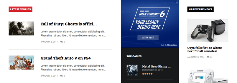
Mercifully, the developers here at GavickPro have seen fit to avoid attempting such post-modern design quirks; there are sections for new trailers, latest stories, coming soon, top games and hardware news. One of the great new features introduced in Game is the ability for the News Show Pro module, which provides most of the showcases on the game frontpage, to order the articles/games by user rating. When you’re working in what is often a niche market, it is essential to cultivate a community; by allowing your users to rate your articles and displaying them on the front page, they can feel that they are able to make a contribution to your site, and you can learn just which of your features draws the most interest and engagement from your visitors.
SpecTabular!

What really interests me though is the tabs section. Usually, if a website has tabs, it’s for displaying simple top 10 lists, such as one tab for the latest 10 reviews, another for the 10 latest previews, and another for the 10 most popular articles or something similar, and the whole thing is stuck on the sidebar or somewhere out of the way.
That’s not the case here; the tabs are actually the first piece of content beyond the background slider; it’s the first thing a user will see after drawing their eyes away. The difference compared to the tabs on other sites is instantly noticeable; there are images and article fragments in the tabs, rather than plain text. Aesthetically, it blends well with the overall look of the site, and clicking on different tabs causes the new articles to transition via fade in; the effect is less jarring than a straight instant-transition.
The most important feature is that it lets me, as the user, choose what articles I want to see. When I go to a news website, I don’t want to spend ages clicking through menus and subcategories looking for a scrap of news, and by putting the option right there at the start you can limit page loads and increase engagement; someone who can instantly find a category that suits them is far more likely to stick around.
It does look a bit sparse though; would it not be better to have multiple tabs covering all the major categories, rather than the 2 already in Game? Yes it would, and you can in fact add additional tabs really easily. How easily? Well, I managed to do it in a couple of minutes, and my first attempt at using Joomla! resulted in me crashing my test site so severely that my only solution was reinstalling! In other words; I’m an absolute beginner; if I can do it, so can you. So if you want, your site can have multiple tabs covering several of your categories or specific articles; there are quite a few options for specifying exactly where the showcases are pulled from.

Now your thinking with portals
Here’s another of my pet-peeves with game websites; they stuff their pages with endless YouTube/DailyMotion/Vimeo videos, then stick them all on top of each other either on the frontpage or in an article. Then, I click on one, get bored, move to the next one, and the previous video keeps on loading, slowing down the next video loading. In the event that the video is on its own in an article, I’m still expected to click through to the article to watch the video; sure, this contributes to page views, but it’s also irritating for users; stack up to many irritating elements and your audience will start to look for something better.
To soothe my frustrated heart, the developers here at GavickPro have seen fit to include what they call a new ‘portal mode’ in their News Show Pro module, which is used to display the articles. My technical knowledge regarding this is painfully limited, but the result is something that I would like to see more sites adopting; an overlay video player that appears when a video is clicked. There are two clear benefits for me in this case: firstly, even if there are multiple videos on the page I can close one as soon as I get bored without affecting the next, and secondly, the overlay can be implemented directly with videos on the frontpage. Since the video is not loaded until you click, this won’t affect page loading times.

There is perhaps an aesthetic appeal in this design for those of us with mild OCD tendencies too; since the video appears separately in an overlay, you can decide which image should be used on the frontpage itself, rather than the intro picture to the video being shown (and there are some truly terrible ones out there!), and once you’ve finished with the video it will be closed; no end-of-video static images or ‘more recommendations’ prompts spoiling the site’s tone.
Menus everywhere!
Next up is the menu design; usually there is nothing special to mention about menus; they point to categories or sections, and that’s it. Not that it’s a bad thing; this menu style has served us well over the years, and there’s no reason to change it just yet. Still, there are a few mighty nice changes to the Classic menu in this template that make finding the right section even easier. For one, the menus in Game can have multiple columns; on the demo page by highlighting the ‘Games’ menu item I’m given a choice of multiple categories in one go, rather than needing to highlight particular categories to reach the submenu.
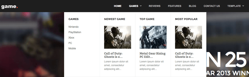
This isn’t a big change in itself; I’m not going to start shouting about this incredible development from the rooftops! But it’s a nice addition; I’m not the most accurate of mouse-users so I often find myself accidentally moving the cursor off of the menu, which in turn causes it to close and I need to start again. By having multiple columns the chances of my inaccurate, sweeping gestures missing my target is all the more diminished. Plus, you can add modules to the menus, so the latest article in each category can have a image and article fragment visible in the menu; it’s a great way to promote a particular article, and adds to the overall feel of quality that permeates this template.
…And the rest
Many of our customers have already called Game our best work yet; it certainly looks the part, but after digging a bit deeper it’s clear that the feature-list has been expanded quite substantially compared to our previous game-focused efforts. It sets a new precedent for quality, and should be the go-to template should you be looking at developing a gaming or other hobby website; it will likely be quite some time before we see improvements on this scale!