One of the greatest challenges while creating Gavern Framework was to prepare improved support for mobile devices. There are some positive changes on a few fields.
More options
Pages’ mobile versions are quite specific therefore we prepared some templates options dedicated especially to template mobile version:
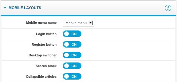
The most important change is a possibility to specify a separate menu for mobile version of a page in Mobile menu name option. Thanks to this, we can eliminate some subpages which, by the way, will not be displayed correctly on mobile devices.
Additionally, we can switch on/off a few elements of page mobile version which standard layout looks as follows:
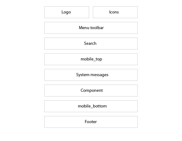
In page’s mobile version we have two module positions, namely: mobile_top and mobile_bottom and a standard place for component and system messages.
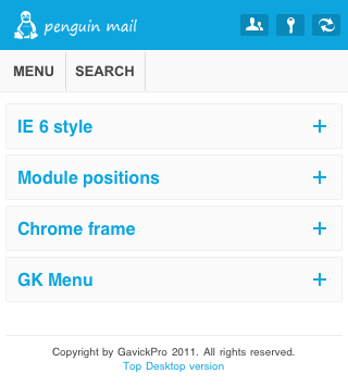
The most interesting is a possibility to switch on rolled up blocks with articles – this option works on mobiles with iOS and Android systems only:
Menu Improved
We have heard a lot about lack of support for submenu in templates mobile versions. Therefore, we are really happy to announce that we solved this problem; from now on, by clicking (or even touching)menu position including submenu:
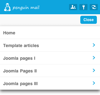
There will be submenu displayed, the same as, button returning to previous menu level:
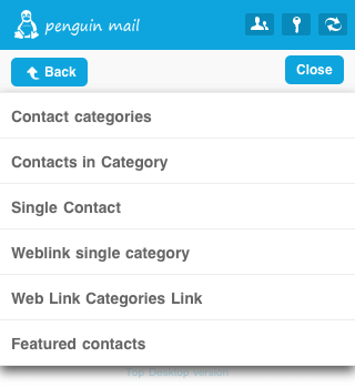
It’s worth mentioning here that such a menu is the next reason for which it is very useful to have a separate menu for mobile version of a page – we cannot get to menu position which includes submenu directly that’s why, the best idea is to create such submenu positions as separators.
CSS revolution
Create pages in mobile version is a very interesting experience but after some time it can become irritating. Thus, we paid a lot of attention to our templates mobile versions so as to create them in a possibly fast way.
Thanks to CSS files division into regular part and two which can be modified and creation a universal PSD file to create mobile versions of templates, whole work is focused on generating appropriate images , setting few values in pixels and specifying template colors. By the way, it is an ease while mobile version of templates updates.
Ease in creating views of mobile versions
Built in Gavern Framework system of creating easy plugins showed that it is extremely useful; if we want a view in overwritten component to have different structure in mobile version of a template and different in desktop version, it would be enough to use <gavern:desktop> and <gavern:mobile> tags. An example is presented below:
<gavern:desktop>
     <h1>It's a desktop browser!</h1>
</gavern:desktop>
<gavern:mobile>
     <h1>It's a mobile browser!</h1>
</gavern:mobile>
As you can see, it can be done without any combinations and using redundant plugins.
Lightweight is the key
Joomla! 1.6 did not want to exclude from head section MooTools framework but it was done successfully, thanks to which templates mobile versions are much lightweight (framework Zepto.js is much lighter than MooTools).
Let’s see the changes in penguinMail for Joomla! 1.5 and mobile version based on our new solutions:
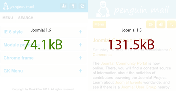
There is no need to describe the difference; I guess mobile devices users will be grateful for saving some seconds while waiting for site loading.
What’s next?
Changes mentioned are surely a great step in comparison with previous mobile templates. And that’s not the end, we are going to improve mobile versions of templates and thanks to ordered structure of CSS files, every customer will be able to incorporate all new functions and improvements.