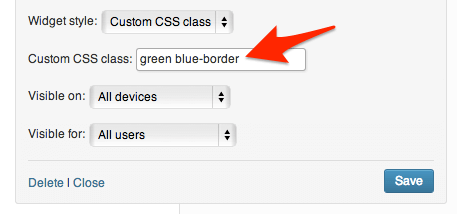
 But If you want to use more styles in the same widget, you should select “Custom CSS class” from the list and type the css classes of the styles you require separated by a space, as in the below image:
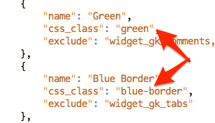
 Usually classes are lowercase words separated by a dash “-“. If you are not sure if the spelling is correct, you can check the CSS classes in Theme_directory/gavern/config/widgets.styles.json file.
 So, how do we use our own CSS class? With the GavernWP Framework this is easy to achieve; simply select “Custom CSS class” and enter your chosen class name e.g. “my-own-class”
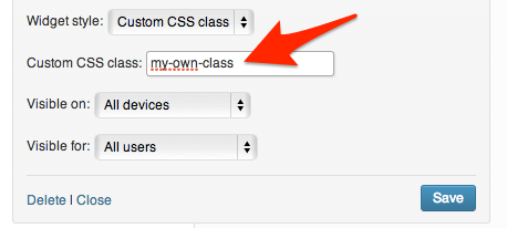 Then, when you click the save button, your widget will have a .my-own-class CSS class. Every element of your widget can by styled by your css class, of course you should have basic CSS knowledge before you do this. If you are not using the Child Theme Mechanism, then the best place for your new CSS class is Theme_directory/css/override.css file (Remember to enable this option first in the Template Options -> Advanced Tab).
e.g. use this CSS selector to style your widget links:
Then, when you click the save button, your widget will have a .my-own-class CSS class. Every element of your widget can by styled by your css class, of course you should have basic CSS knowledge before you do this. If you are not using the Child Theme Mechanism, then the best place for your new CSS class is Theme_directory/css/override.css file (Remember to enable this option first in the Template Options -> Advanced Tab).
e.g. use this CSS selector to style your widget links:
.box.my-own-class a {
 /* CSS properties */
}
Feel free to test out this quick tip using our Free WordPress Theme – Meet GavernWP.
This article was first published
November 19th, 2013