Recent changes from Google means that from now on support for mobile devices is officially taken into account when deciding the results of a Google search, so it’s now more important than ever to ensure your website is ready for small-screen users. As you would expect, it is essential that our products meet these standards; a few weeks ago we tested our currently-supported templates and all of them passed the Google test, both for the main pages and for important sub-pages such as categories, posts, products, etc…despite this, some users have reported that their webpages based on our templates are still not passing the test, so we’ll quickly examine the two most common reasons for this issue.
Default robots.txt file in Joomla!
When examining your site, the test from Google does not take into account any preview files that are blocked by the robots.txt file – this can lead to it seeing an inaccurate view of your website that includes issues that are corrected with the addition of the blocked files. This seemingly minor issue can cause our website to be considered incompatible with mobile devices.
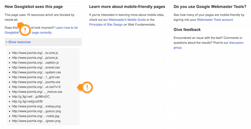
Unfortunately, the robots.txt file used in Joomla! blocks Google’s robots from accessing such directories as images or templates by default, preventing most of the resources from being loaded. To get around this issue should you encounter it, you’ll need to make a few minor changes to the file by deleting some lines:
Disallow: /images/
Disallow: /templates/
Additionally, if you’re using modules/plugins that use their own unique CSS styles then you might need to delete these lines:
Disallow: /modules/
Disallow: /plugins/
Finally, if you are using compressed CSS and JS files via the compress function in our templates you should also remove the line:
Disallow: /cache/
CSS/HTML changes made by user
The second major reason for a site failing a test is must harder to pin down, and requires careful examination of your site. Some users do not check how websites behave on mobile devices after implementing their own modifications, which leads to problems such as: elements that are too small, content that sticks out of the browser window etc…for many users such minor things may not be a huge problem, but Google’s test won’t see it that way and the page will be listed as incompatible with mobile devices.
Unfortunately, the solution here is not one that can be easily compressed into a step-by-step guide; each of these individual issues could be one of millions, with a million potential causes. In these cases the website creator will need to examine the changes they’ve implemented carefully, checking the effects on the website in mobile views, to diagnose the source. Frustrating though this may be, it is still a better option than losing out on a deserved strong Google placing that will encourage more visits and views.