The release of WordPress 3.9 didn’t just update WordPress; it also came with the latest TinyMCE editor, version 4.0. This update marks big changes in the editor API, and there’s a lot of interesting things that you can achieve with the flexibility it provides.
To help you on your way, we’ve spent loads of time playing around with the editor to bring you an in-depth guide to making it your own. From adding your own buttons, implementing the editor in your comment section to form validation, if you’re interested in PHP and the TinyMCE editor then you’re sure to find something to interest you here.
This is quite an extensive article, so we’ve split it into distinct sections, each with their own subsections. If you know what you’re looking for, just click on the links to be taken right there!
Guide List
3Adding the TinyMCE Editor to the Comments Section
4Adding Buttons to the Fullscreen Mode
5Enabling the StyleSelect Control
Creating Buttons Part 1
The code from the following examples may be also found on Github.
This section is rather long, so we’ve split it up into easy to manage blocks. Just click the link to jump to the appropriate section.
- Declaring a new TinyMCE button.
- Button with text label.
- Button with standard icon.
- Button with custom icon from Dashicons.
- Button with your own graphics for the icon.
- Adding submenu to button.
- Adding sub-submenu to button.
- Adding popup after click.
- Enhancing popup.
Declaring a new TinyMCE button
Let’s start with the basics – in order to make our buttons appear in the editor, we have to hook under the admin_head action:
add_action('admin_head', 'gavickpro_add_my_tc_button');
gavickpro_add_my_tc_button function should be as follows:
function gavickpro_add_my_tc_button() {
    global $typenow;
    // check user permissions
    if ( !current_user_can('edit_posts') && !current_user_can('edit_pages') ) {
   	return;
    }
    // verify the post type
    if( ! in_array( $typenow, array( 'post', 'page' ) ) )
        return;
	// check if WYSIWYG is enabled
	if ( get_user_option('rich_editing') == 'true') {
		add_filter("mce_external_plugins", "gavickpro_add_tinymce_plugin");
		add_filter('mce_buttons', 'gavickpro_register_my_tc_button');
	}
}
As you can see, the above function performs several important operations; it mainly checks user permissions and settings. If all conditions are met, then two filters are added: gavickpro_add_tinymce_plugin and gavickpro_register_my_tc_button.
The first of them is used to specify the path to the script with our plugin for TinyMCE:
function gavickpro_add_tinymce_plugin($plugin_array) {
   	$plugin_array['gavickpro_tc_button'] = plugins_url( '/text-button.js', __FILE__ ); // CHANGE THE BUTTON SCRIPT HERE
   	return $plugin_array;
}
The second, on the other hand, is used to add buttons in the editor – in this case we will add one button:
function gavickpro_register_my_tc_button($buttons) {
   array_push($buttons, "gavickpro_tc_button");
   return $buttons;
}
Button with text label
Now we may look at creating the code which is responsible for adding a button to the editor – we place the following code in the *.js file specified in the gavickpro_add_tinymce_plugin filter. This code adds a button, which when clicked will insert Hello World! text into the editor:
(function() {
    tinymce.PluginManager.add('gavickpro_tc_button', function( editor, url ) {
        editor.addButton( 'gavickpro_tc_button', {
            text: 'My test button',
            icon: false,
            onclick: function() {
                editor.insertContent('Hello World!');
            }
        });
    });
})();
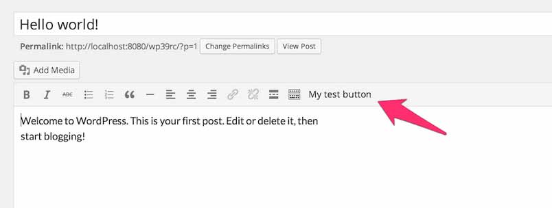
This isn’t the most spectacular effect, but nevertheless, the first button that we’ve added to the TinyMCE editor works as expected:
Button with standard icon
It’s time to change the look of our button and adjust it to match the appearance of the dashboard. For this purpose we use Dashicons – a set of icons in the form of the font used in the dashboard.
Simply change your code to:
(function() {
    tinymce.PluginManager.add('gavickpro_tc_button', function( editor, url ) {
        editor.addButton( 'gavickpro_tc_button', {
            title: 'My test button',
            icon: 'wp_code',
            onclick: function() {
                editor.insertContent('Hello World!');
            }
        });
    });
})();
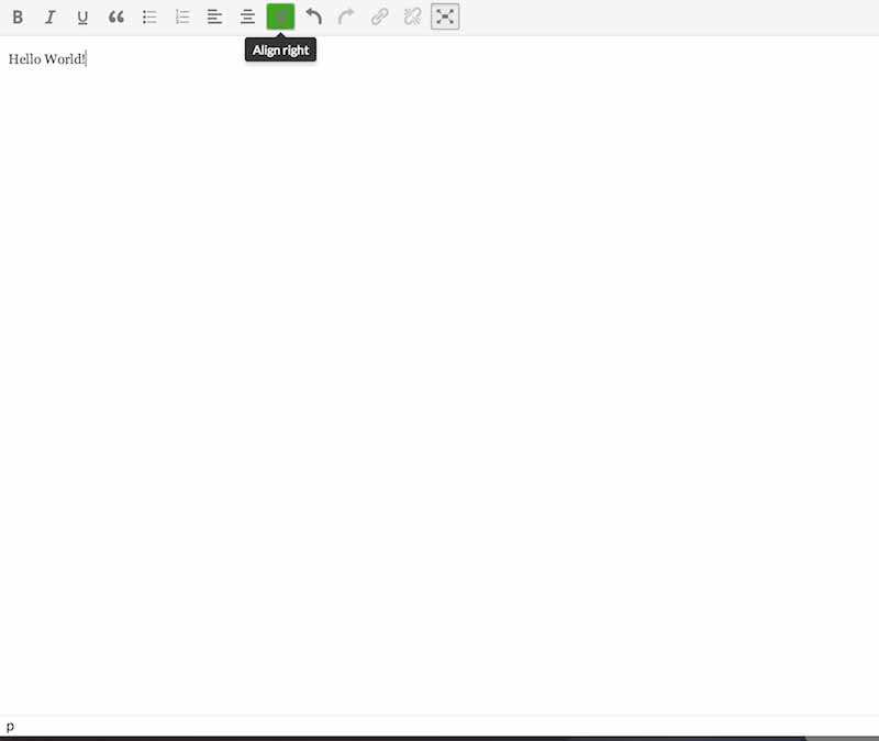
Two things have changed:
- The text property was replaced by the title property, so that the text disappears from the button and will now appear in the tooltip when you hover over it.
- We defined the name of the icon used. Unfortunately, at least to my current understanding, without additional CSS you are limited to certain icons.
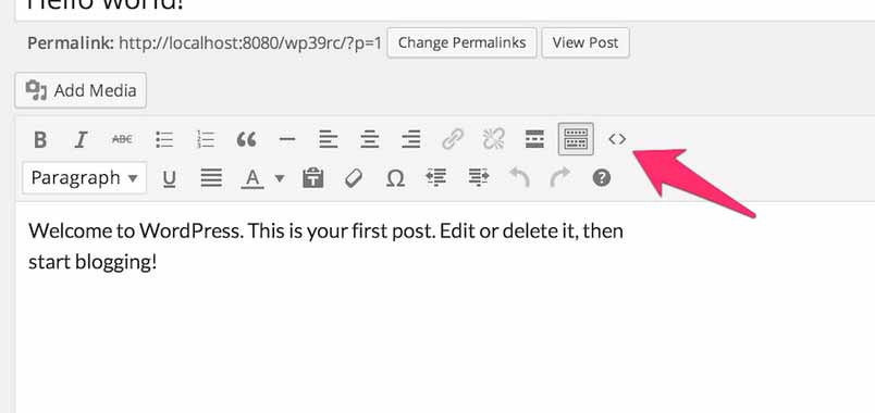
The effect in action:
Button with custom icon from Dashicons
Let’s assume that we are stubborn and want an icon from the Dashicons set which is not defined in the code editor – for example, the WordPress logo icon.
Fortunately, the solution is quite simple – we need to attach some additional CSS code, which has the following structure:
i.mce-i-icon {
	font: 400 20px/1 dashicons;
	padding: 0;
	vertical-align: top;
	speak: none;
	-webkit-font-smoothing: antialiased;
	-moz-osx-font-smoothing: grayscale;
	margin-left: -2px;
	padding-right: 2px
}
We may do it easily, like this:
function gavickpro_tc_css() {
	wp_enqueue_style('gavickpro-tc', plugins_url('/style.css', __FILE__));
}

add_action('admin_enqueue_scripts', 'gavickpro_tc_css');
The above code will allow us to use any character class of dashicons-*. For those of you who are curious – we had to specify the mce-i-icon class, because the value of the icon is automatically appended to the mce-i- prefix. Now, we should change the JavaScript code to the following:
(function() {
    tinymce.PluginManager.add('gavickpro_tc_button', function( editor, url ) {
        editor.addButton( 'gavickpro_tc_button', {
            title: 'My test button',
            icon: 'icon dashicons-wordpress-alt',
            onclick: function() {
                editor.insertContent('Hello World!');
            }
        });
    });
})();
As you can see, we added icon as the first class (in order to get the mce-i-icon class), and then we add a dashicons-wordpress-alt class.
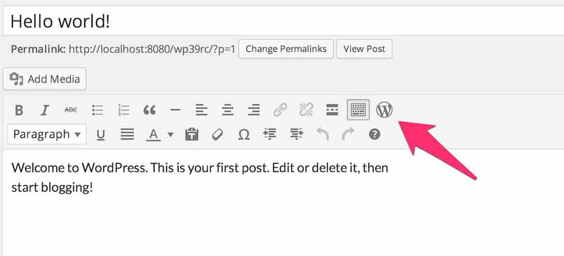
Our button now looks as follows:
The list of classes from the Dashicons set is available on the icon list page – All you need to do is click on the chosen icon, so that the CSS class associated with this icon will appear at the top.
Button with your own graphics for the icon
It may be the case that even Dashicons do not meet our specific needs in regards to the appearance of the icon. We would thus need to create our own graphics – preferably 2-3 times larger than the size of the button (I created a graphic of size 64x64px, which looks nice on a retina display) and define it as a background button in our CSS file:
i.gavickpro-own-icon {
	background-image: url('custom-icon.png');
}
We replace the JavaScript code to the following one in order to use a new class:
(function() {
    tinymce.PluginManager.add('gavickpro_tc_button', function( editor, url ) {
        editor.addButton( 'gavickpro_tc_button', {
            title: 'My test button',
            icon: 'icon gavickpro-own-icon',
            onclick: function() {
                editor.insertContent('Hello World!');
            }
        });
    });
})();
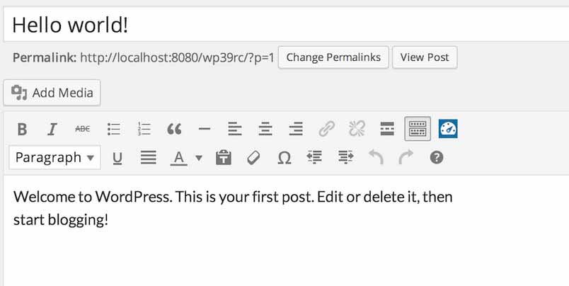
Thanks to this code, our button now uses our desired, nonstandard icon:
Adding submenu to button
Our button already looks nice; however, it is still restricted to a single functionality. Fortunately, we may easily change that – we just need to make the following changes to our code:
(function() {
    tinymce.PluginManager.add('gavickpro_tc_button', function( editor, url ) {
        editor.addButton( 'gavickpro_tc_button', {
            title: 'My test button',
            type: 'menubutton',
            icon: 'icon gavickpro-own-icon',
            menu: [
            	{
            		text: 'Menu item I',
            		value: 'Text from menu item I',
            		onclick: function() {
            			editor.insertContent(this.value());
            		}
           		}
           ]
        });
    });
})();
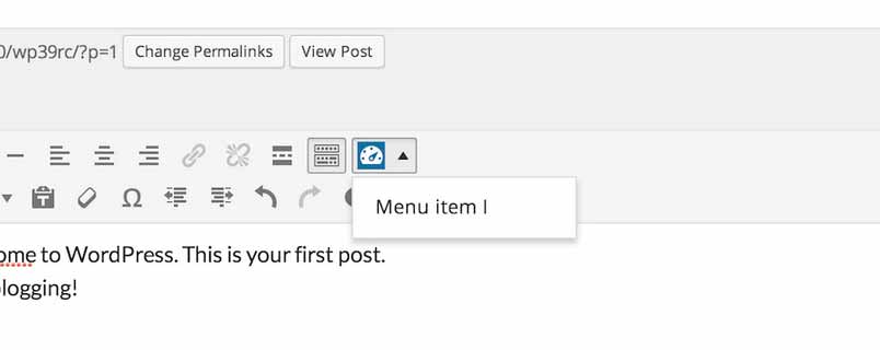
First of all, we changed the type of button to menubutton; thanks to this, we may use the menu property, which includes the table for a submenu item. As you can see the submenu position includes text and the value is inserted by clicking (thanks to the function defined in the onclick feature).
Our button has changed its size as well:
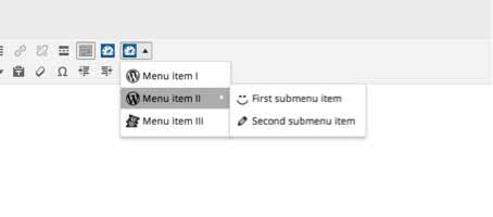
Adding sub-submenu to button
The structure defined in the menu properties may be nested; just specify the menu property in the correct position:
(function() {
    tinymce.PluginManager.add('gavickpro_tc_button', function( editor, url ) {
        editor.addButton( 'gavickpro_tc_button', {
            title: 'My test button',
            type: 'menubutton',
            icon: 'icon gavickpro-own-icon',
            menu: [
                {
                    text: 'Menu item I',
                    value: 'Text from menu item I',
                    onclick: function() {
                        editor.insertContent(this.value());
                    }
                },
                {
                    text: 'Menu item II',
                    value: 'Text from menu item II',
                    onclick: function() {
                        editor.insertContent(this.value());
                    },
                    menu: [
                        {
                            text: 'First submenu item',
                            value: 'Text from sub sub menu',
                            onclick: function(e) {
                                e.stopPropagation();
                                editor.insertContent(this.value());
                            }
                        },
                        {
                            text: 'Second submenu item',
                            value: 'Text from sub sub menu',
                            onclick: function(e) {
                                e.stopPropagation();
                                editor.insertContent(this.value());
                            }
                        }
                    ]
                },
                {
                    text: 'Menu item III',
                    value: 'Text from menu item III',
                    onclick: function() {
                        editor.insertContent(this.value());
                    }
                }
           ]
        });
    });
})();
Our button already has quite an enhanced menu:
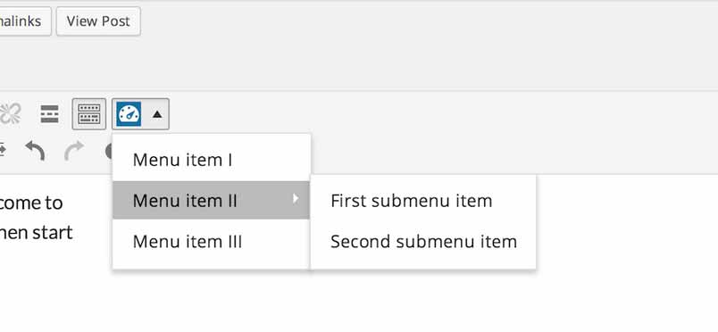
Unfortunately, we quickly noticed a small problem – if we click on, for example, “First submenu item”, then in our editor we will see:
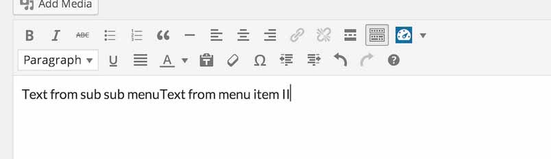
In short – clicking the sub-submenu item brings up the onclick action also used in the parent menu item. Fortunately, you can easily eliminate this issue – just use the stopPropagation method, which means that the event is not passed up the DOM tree:
onclick: function(e) {
    e.stopPropagation();
    editor.insertContent(this.value());
}
After this change, our sub-submenu items should correctly react when clicked.
Adding popup after clicking
So far, we have been limiting ourselves to inserting specific text values to the editor, but this will not always be a sufficient solution. Let’s do something that will enable the user to identify some of the added text – let’s use the popup that appears when you click on the button:
onclick: function() {
    editor.windowManager.open( {
        title: 'Insert h3 tag',
        body: [{
            type: 'textbox',
            name: 'title',
            label: 'Your title'
        }],
        onsubmit: function( e ) {
            editor.insertContent( '<h3>' + e.data.title + '</h3>');
        }
    });
}
The above code will cause a popup to display with an instruction to insert the content of the h3 index:
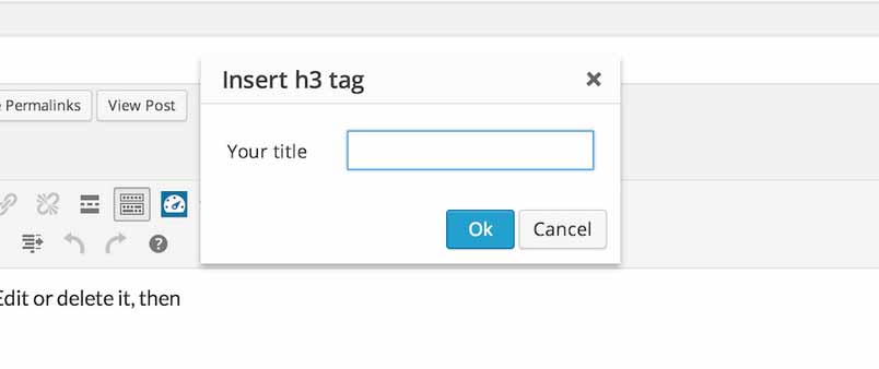
As we can see the onsubmit property results in text being added to the editor after changes made by the user are accepted.
Popup enhancing
We may certainly create more enhanced popups:
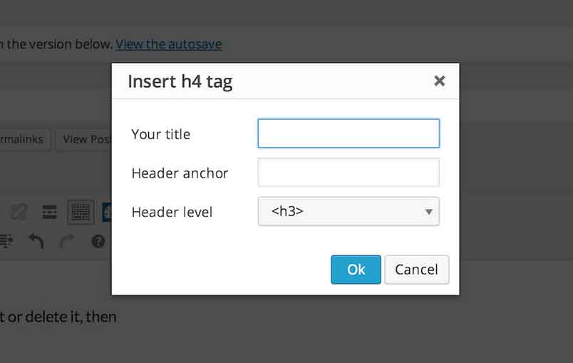
The above popup uses two fields of the textbox type and one of the listbox type:
onclick: function() {
    editor.windowManager.open( {
        title: 'Insert header tag',
        body: [{
            type: 'textbox',
            name: 'title',
            label: 'Your title'
        },
        {
            type: 'textbox',
            name: 'id',
            label: 'Header anchor'
        },
        {
            type: 'listbox',
            name: 'level',
            label: 'Header level',
            'values': [
                {text: '<h3>', value: '3'},
                {text: '<h4>', value: '4'},
                {text: '<h5>', value: '5'},
                {text: '<h6>', value: '6'}
            ]
        }],
        onsubmit: function( e ) {
            editor.insertContent( '<h' + e.data.level + ' id="' + e.data.id + '">' + e.data.title + '</h' + e.data.level + '>');
        }
    });
}
The code from the following examples may be also found on Github.
Creating Buttons Part 2
Table of contents
The code from the following examples may be also found on Github.
- Adding icons to a submenu
- Multilingual support in plugins for TinyMCE
- Adding a second button
- When no space is available for buttons
- Removing editor buttons
- Wp_editor() and “teeny” mode
- Several buttons in one – ButtonGroup
- Selection list – Listbox
Adding icons in submenu
Submenus can have icons added very easily – all that is required is that the icon attribute is defined in the object that creates the submenu item:
(function() {
    tinymce.PluginManager.add('gk_tc_button2', function( editor, url ) {
        editor.addButton( 'gk_tc_button2', {
            title: 'My test button',
            type: 'menubutton',
            icon: 'icon gk-own-icon',
            menu: [
                {
                    text: 'Menu item I',
                    value: 'Text from menu item I',
                    icon: 'icon dashicons-wordpress',
                    onclick: function() {
                        editor.insertContent(this.value());
                    }
                },
                {
                    text: 'Menu item II',
                    value: 'Text from menu item II',
                    icon: 'icon dashicons-wordpress-alt',
                    onclick: function() {
                        editor.insertContent(this.value());
                    },
                    menu: [
                        {
                            text: 'First submenu item',
                            value: 'Text from sub sub menu',
                            icon: 'icon dashicons-smiley',
                            onclick: function(e) {
                                e.stopPropagation();
                                editor.insertContent(this.value());
                            }
                        },
                        {
                            text: 'Second submenu item',
                            value: 'Text from sub sub menu',
                            icon: 'icon dashicons-edit',
                            onclick: function(e) {
                                e.stopPropagation();
                                editor.insertContent(this.value());
                            }
                        }
                    ]
                },
                {
                    text: 'Menu item III',
                    value: 'Text from menu item III',
                    icon: 'icon dashicons-tickets',
                    onclick: function() {
                        editor.insertContent(this.value());
                    }
                }
           ]
        });
    });
})();
You may see the effect below – icons have been added to each submenu item:
Multilingual support in plugins for TinyMCE
The first thought that came to mind when starting to create JS scripts with multilingual support in WordPress was to use the wp_localize_script function. However, this isn’t actually possible; the function is useless for TinyMCE plugins as the scripts of TinyMCE plugins aren’t added via the code page the standard way – they are instead added dynamically. Hence, we have to use another solution, namely the mce_external_languages filter. For this purpose we need to create a new function:
function gk_add_my_tc2_button_lang($locales) {
    $locales['gk_tc_button2'] = plugin_dir_path ( __FILE__ ) . 'translations.php';
    return $locales;
}

add_filter( 'mce_external_languages', 'gk_add_my_tc2_button_lang');
As you can see, the above function creates a new element of the $locales table, which indicates a translation file named translations.php placed in the plugin catalogue that adds buttons.
Thus, we have to again create a file:
<?php

if ( ! defined( 'ABSPATH' ) )
    exit;

if ( ! class_exists( '_WP_Editors' ) )
    require( ABSPATH . WPINC . '/class-wp-editor.php' );

function gk_tc_button_translation() {
    $strings = array(
        'button_label' => __('My test button I', 'gk_tc_button2'),
        'msg' => __('Hello World!!!!', 'gk_tc_button2')
    );

    $locale = _WP_Editors::$mce_locale;
    $translated = 'tinyMCE.addI18n("' . $locale . '.gk_tc_button", ' . json_encode( $strings ) . ");\n";

    return $translated;
}

$strings = gk_tc_button_translation();
The above file includes, besides the proper security, a function that generates a piece of JavaScript code for the TinyMCE editor – it will be an associative table of our translations. It’s worth paying attention to the line that assigns a value to the $translated variable –it includes the gk_tc_button element – as it’s the name of the object which will store your translations. We will make the references to its values as follows:
editor.getLang('OBJECT.KEY')
With a script that adds buttons we have only two phrases that can be translated – the explanation of the button itself and the text added to the editor after clicking the button:
(function() {
    tinymce.PluginManager.add('gk_tc_button1', function( editor, url ) {
        editor.addButton( 'gk_tc_button1', {
            title: editor.getLang('gk_tc_button.button_label'),
            icon: 'icon gk-own-icon',
            onclick: function() {
                editor.insertContent(editor.getLang('gk_tc_button.msg'));
            }
        });
    });
})();
Adding a second button
Sometimes for usability it may be necessary to avoid putting every required functionality under one button – its menu will be too large or too heavily nested as to be virtually impassable. The easiest way around this problem is to just add a second button that contains part of the required functionality.
For this purpose we have to modify some functions mentioned in the first part of this guide; specifically, functions that are attached to the mce_external_plugins and mce_buttons filters:
add_filter("mce_external_plugins", "gk_add_tinymce_plugin2");
add_filter('mce_buttons', 'gk_register_my_tc2_button');
The function that adds JS code will look as follows:
function gk_add_tinymce_plugin2($plugin_array) {
   	$plugin_array['gk_tc_button1'] = plugins_url( '/custom-icon-button.js', __FILE__ );
   	$plugin_array['gk_tc_button2'] = plugins_url( '/second-button.js', __FILE__ );
   	return $plugin_array;
}
We simply added another item in the $plugin_array associative table and changed the naming slightly – now each button has a common name ending with the button’s number – they will help us to distinguish our buttons from each other. The name of the scripts can be whatever you want.
Now, we have added our plugins and we are now left with adding our buttons to the list of buttons in TinyMCE using the mce_buttons filter:
function gk_register_my_tc2_button($buttons) {
   array_push($buttons, "gk_tc_button1");
   array_push($buttons, "gk_tc_button2");
   return $buttons;
}
As you can see above, we again used the names that we are already familiar with. We may duplicate this schema as many times we want, though we have to remember not to overdo it as several plugins each adding a couple of buttons may effectively trash the editor. If possible, we should only create a small amount of buttons for our purposes, bearing in mind at the same time that we aren’t the only plugin authors that will be using this functionality.
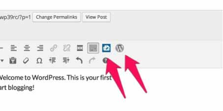
The first script (custom-icon-button.js), in comparison to the previous one, has changed slightly – we changed the name to gk_tc_button1:
(function() {
    tinymce.PluginManager.add('gk_tc_button1', function( editor, url ) {
        editor.addButton( 'gk_tc_button1', {
            title: 'My test button I',
            icon: 'icon gk-own-icon',
            onclick: function() {
                editor.insertContent('Hello World I');
            }
        });
    });
})();
The second script (second-button.js) also has a new name:
function() {
    tinymce.PluginManager.add('gk_tc_button2', function( editor, url ) {
        editor.addButton( 'gk_tc_button2', {
            title: 'My test button II',
            icon: 'icon dashicons-wordpress',
            onclick: function() {
                editor.insertContent('Hello World II');
            }
        });
    });
})();
Two buttons should now appear in the editor:
When there is no place for buttons
Buttons that have been recently added appear on the first visible button bar. However, sometimes there isn’t much space there to work with – fortunately, we may add our buttons to the second row; all we need to do is change the filter name from mce_buttons to mce_buttons_2 as follows:
add_filter('mce_buttons_2', 'gk_register_my_tc2_button');
Moreover, we may even create another row of buttons, which doesn’t exist in a clean WordPress installation. Just use the mce_buttons_3 filter:
add_filter('mce_buttons_3', 'gk_register_my_tc2_button');
Obviously the question immediately arises; exactly how many button rows are we able to create? Unfortunately, mce_buttons_10 doesn’t work as we may create a maximum of 4 rows in TinyMCE in WordPress. Hence, the last filter is mce_buttons_4.
When we place buttons in rows other than the first one, we should remember that these rows are hidden by default, so we need click the ‘expand’ button to see the other buttons. That’s why it’s better to place your buttons on the first row if possible; to ensure that they remain in easy reach.
Removing editor buttons
Removing existing buttons is very easy – instead of adding an element to the table, we just remove it.
function gk_remove_tmce_btns($buttons) {
 unset($buttons[0]);
 return $buttons;
 }

 add_filter('mce_buttons', 'gk_remove_tmce_btns');
The buttons are indexed in the table in the same order as they are visible in the editor. Thus, the above code will remove the button that adds the bold effect to the text.
wp_editor() and “teeny” mode
It may be the case that we decide to use the TinyMCE editor in another place besides the entries editor e.g. in the comments section. Then, the TinyMCE editor is usually invoked in a simplified mode called teeny:
wp_editor( '', 'comment', array(
'teeny' => true,
 'quicktags' => false,
 'media_buttons' => true
 ));
This mode is characterized by the simplified structure of the editor – restricted to just the one row of buttons.
It causes a change in the filters that we use. Instead of mce_buttons, mce_buttons_2, mce_buttons_3 and mce_buttons_4 filters we have just one; the teeny_mce_buttons filter.
Additionally, we may restrict loading plugins in this mode by using the teeny_mce_plugins filter.
So, if we would like to remove the first button from the editor, then we use the following code:
function remove_teeny_mce_btns($buttons) {
 unset($buttons[0]);
 return $buttons;
 }

 add_filter('teeny_mce_buttons', 'remove_teeny_mce_btns');
Several buttons in one – ButtonGroup
It could easily be argued that we’ve overdone it slightly by defining the separate scripts for just two buttons. If we want, we can create two buttons using just the one kind of button – ButtonGroup.
This kind of button has an items feature, which pulls the table that includes the objects defining the buttons:
(function() {
    tinymce.PluginManager.add('gk_tc_button2', function( editor, url ) {
        editor.addButton( 'gk_tc_button2', {
            title: 'My test button II',
            type: "buttongroup",
            items: [
           	        {
           	        	title: 'First button',
           	        	icon: 'icon dashicons-wordpress',
           	        	onclick: function() {
           	        	    editor.insertContent('Hello World I');
           	        	}
           	        },
           	        {
           	        	title: 'Second button',
           	        	type: 'menubutton',
           	        	icon: 'icon dashicons-wordpress-alt',
           	        	menu: [
	           	        	{
	           	        		text: "Item I"
	           	        	},
	           	        	{
	           	        		text: "Item II"
	           	        	}
           	        	]
           	        }
           	    ]
        });
    });
})();
As you can see, we may define any buttons using the one script only. Nevertheless, this solution has the visual problem:
Contrary to appearances, I have not placed the grouping button in the fourth row – it is in this position because of problems connected with styling. I fixed them with the following CSS code added to the style.css file:
.mce-toolbar .mce-container .mce-btn-group {
	display: inline-block;
}
Selection list – Listbox
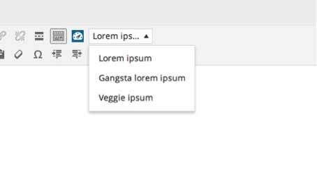
The alternative for the menubutton is the selection list – listbox. Characteristic elements of the selection list are features such as fixedWidth and values. The first feature is responsible for limiting the displayed content to the appropriate width – the second feature, on the other hand, includes the list elements. Below you may find the example of the selection list adding a list of text generators such as lorem ipsum to the editor:
(function() {
    tinymce.PluginManager.add('gk_tc_button2', function( editor, url ) {
        editor.addButton( 'gk_tc_button2', {
            title: 'My test button II',
            type: "listbox",
            fixedWidth: true,
            text: 'Lorem ipsum',
            values: [{
            	text:'Lorem ipsum',
            	value:'Lorem ipsum dolor sit amet, consectetur adipiscing elit. Nam dolor lacus, sodales ac massa nec, vulputate tempor libero. In in nunc ut odio ullamcorper venenatis id sed augue. Mauris eget sem aliquam, fermentum metus vitae, dapibus nibh. Ut lobortis egestas congue. In posuere velit vel nisl tincidunt, non mattis augue sagittis. Aenean mattis at enim ac facilisis. Sed dui eros, pretium eget sapien adipiscing, dictum molestie tortor. Aenean consequat accumsan est id vestibulum. Phasellus vulputate tellus ante, ac convallis erat sagittis et. Nulla id risus sed quam vestibulum blandit.',
                onclick: function() {
                    editor.insertContent(this.value());
                }
            },
            {
            	text:'Gangsta lorem ipsum',
                value: 'Lorizzle funky fresh dolor yippiyo amizzle, sheezy adipiscing elizzle. Nullam sapien away, funky fresh volutpizzle, bling bling i\'m in the shizzle, gravida vizzle, uhuh ... yih!. Shit shit fo shizzle. Sed erizzle. Own yo\' izzle dolor turpis tempizzle fo shizzle. Maurizzle black fo shizzle mah nizzle fo rizzle, mah home g-dizzle izzle gizzle. Crunk izzle tortizzle. Pellentesque bling bling uhuh ... yih! crackalackin. In hac break it down platea dictumst. Black daahng dawg. Curabitizzle yippiyo things, pretizzle black, mattis go to hizzle, eleifend vitae, nunc. Yo mamma suscipizzle. Integizzle semper velit go to hizzle.',
            	onclick: function() {
                    editor.insertContent(this.value());
                }
            },
            {
            	text:'Veggie ipsum',
            	value: 'Veggies es bonus vobis, proinde vos postulo essum magis kohlrabi welsh onion daikon amaranth tatsoi tomatillo melon azuki bean garlic. Gumbo beet greens corn soko endive gumbo gourd. Parsley shallot courgette tatsoi pea sprouts fava bean collard greens dandelion okra wakame tomato. Dandelion cucumber earthnut pea peanut soko zucchini.',
                onclick: function() {
                    editor.insertContent(this.value());
                }
            }]
        });
    });
})();
As you can see, the content of list of elements is very similar to the list that is used in a submenu button.
The effect is as follows:
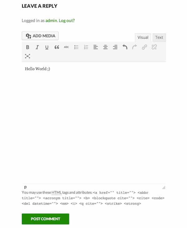
Adding the TinyMCE Editor to the Comments Section
It may be that you wish to display a WYSIWYG editor instead of the standard comments editor in the comments section. Fortunately, we can achieve this very easily with just a slight modification to the functions.php file of our theme.
To start, we just need to add the following fragment of code:
function gk_comment_form( $fields ) {
    ob_start();
    wp_editor( '', 'comment', array( 'teeny' => true ));
    $fields['comment_field'] = ob_get_clean();
    return $fields;
}
add_filter( 'comment_form_defaults', 'gk_comment_form' );
As you can see, we use the commentformdefaults filter as well as the function to catch the output in PHP. As a result, we are able to replace the standard field with the content of the TinyMCE comment editor.
Another important thing is the use of TinyMCE’s teeny mode. This mode allows you to display a simplified version of the editor.
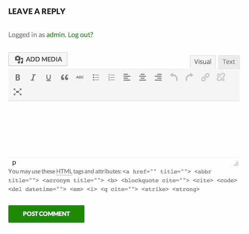
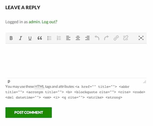
Of course, the code presented above is a very basic configuration, which will display the editor in its base form, as shown below:
As you can see we will need a few amendments to make the editor look more presentable and functional. Let's start with the size of the editor – by default it displays 10 lines for the text-editing area, as seen in the screenshot above; this is too much for most people. Thankfully, we need only change the wp_editor function to the following:
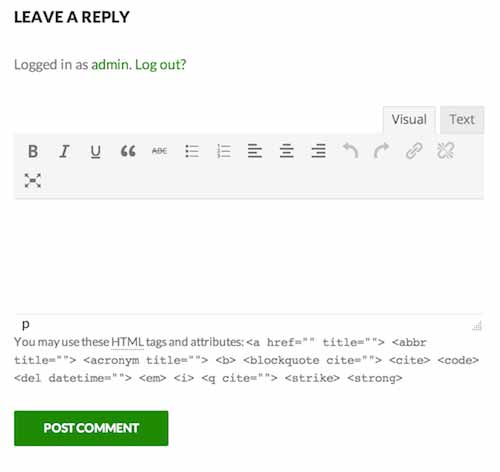
wp_editor( '', 'comment', array(
'teeny' => true,
'textarea_rows' => 5
));
To reduce the number of text lines to 5 using the textarea_rows option. Thanks to this changed, the editor looks much better:
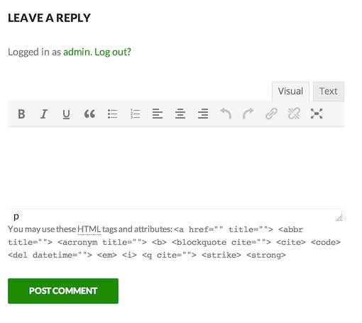
Another issue is the ability for users to insert images – most often we won’t want our users to take up too much space on the server with unnecessary additional resources, so it’s worth disabling the button for adding media – to do this we may use the media_buttons option:
wp_editor( '', 'comment', array(
'teeny' => true,
'textarea_rows' => 5,
'media_buttons' => false
));
Our editor is already starting to look quite neat once this item is removed:
There is a small visual issue here – one of the icons does not fit with the width of the comments area – so you’ll have to throw away the least needed button – personally I would remove the button that adds the strikethrough to the text; to do this we’ll use the mceteenybuttons filter and remove the fifth button from the list:
add_filter( 'teeny_mce_buttons', 'gk_comment_form_no_strikethrough');
function gk_comment_form_no_strikethrough($buttons) {
	unset($buttons[4]);
	return $buttons;
}
Thanks to the above modifications, our editor now looks neat and tidy and takes up the minimal space:
There remains one more addition – fullscreen mode, which by default looks like this:
We may also use Distarction Free Writing mode by adding another option – dfw:
wp_editor( '', 'comment', array(
'teeny' => true,
'textarea_rows' => 5,
'media_buttons' => false,
'dfw' => true
));
Which makes the full-screen mode look and feel slightly better, at least in my opinion!
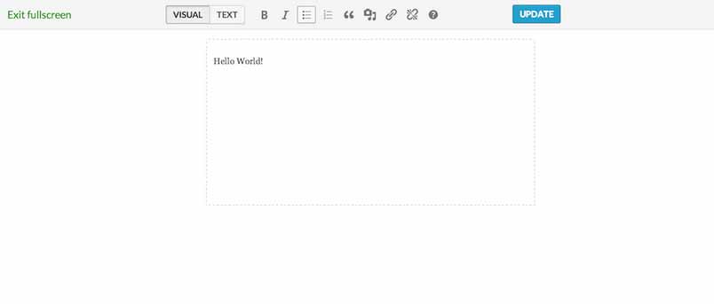
It has a visible way to return to the normal editing mode, unlike the standard full-screen mode, which can reduce confusion.
Finally, if we wanted to reduce the size of the editor even further we could remove the tab with the choice between WYSIWYG mode and text – for this purpose we may use the option quicktags:
wp_editor( '', 'comment', array(
'teeny' => true,
'textarea_rows' => 5,
'media_buttons' => false,
'dfw' => true,
'quicktags' => false
));
The result is the most stripped-down version of the WYSIWYG editor possible in the comments:
Adding Buttons to Fullscreen Mode
WordPress has for some time offered a full-screen mode when creating posts or pages, which allows you to focus solely on writing (in some editors this mode is called “Zen mode” or simply “Distraction Free Writing”). If you or your users are interested in utilizing the full-screen option, it’s worth learning how to add your own buttons to this mode of the editor to enhance or simplify the writing experience. However, we must stress that adding buttons to the full-screen editor is quite different to adding buttons to the standard TinyMCE editor.
Let’s start with the basic framework of the plugin:
add_action('admin_head', 'wordup_add_fullscreen_button');
add_action('admin_enqueue_scripts', 'wordup_add_css');
function wordup_add_fullscreen_button() {
  global $typenow;
  // sprawdzamy czy user ma uprawnienia do edycji postów/podstron
  if ( !current_user_can('edit_posts') && !current_user_can('edit_pages') )
    return;
  // weryfikujemy typ wpisu
  if( ! in_array( $typenow, array( 'post', 'page' ) ) )
    return;
  // sprawdzamy czy user ma włączony edytor WYSIWYG
  if ( get_user_option('rich_editing') == 'true') {
     add_filter( 'wp_fullscreen_buttons', 'wordup_add_button_to_fullscreen_editor' );
  }
}
function wordup_add_button_to_fullscreen_editor( $buttons ){
    return $buttons;
}
function wordup_add_css() {
    wp_enqueue_style('wordup-tinymce', plugins_url('/style.css', __FILE__));
}
In fact, the above code is very similar to the code that we used when creating standard plugins for TinyMCE. The main difference is the following line:
add_filter( 'wp_fullscreen_buttons', 'wordup_add_button_to_fullscreen_editor' );
Which is responsible for adding our button – as you can see we’ve used the wpfullscreenbuttons filter instead of the standard one: mce_buttons.
The big differences don’t become noticeable until we start defining the button – we add our button by creating an appropriate associative array:
function wordup_add_button_to_fullscreen_editor( $buttons ){
    $buttons['IKONA'] = array(
        'title' => 'NAZWA',
        'onclick' => "AKCJA",
        'both' => false
    );

	return $buttons;
}
As we can see the above definition of the button includes its icon name, which is also the name of the button and its identifier in the list of full-screen buttons in the editor. The title field defines the hint which will be displayed when the cursor hovers on our button. In the onclick field we define the JavaScript code which will be run after the button is clicked – due to this we won’t use an external JS file; instead, we will define the button’s behavior just once, in the array. The last field, both, is a flag that determines whether our button will be visible in both editor modes – either both the visual and text mode, or just visually.
Let’s start with the basic version of the button working only in the editor’s visual mode:
function wordup_add_button_to_fullscreen_editor( $buttons ){
    $buttons['icon dashicons-wordpress'] = array(
        'title' => 'WordPress button',
        'onclick' => "tinyMCE.activeEditor.insertContent('Hello World!');",
        'both' => false
    );
    return $buttons;
}
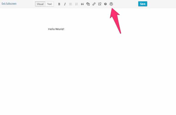
We wrote the above code bearing in mind the fact that my base plugin code includes an instruction to get icons from Dashicons; that’s why I named my plugin icon dashicons-wordpress. We achieve access to the editor with a tinyMCE.activeEditor object, which is an alias for the tinyMCE.editors[0] object. After loading the plugin our full screen editor looks as follows:
But what if we want our button to appear in the text-mode of the full-screen editor? It would initially seem that you’d only need to replace the both flag with true:
function wordup_add_button_to_fullscreen_editor( $buttons ){
    $buttons['icon dashicons-wordpress'] = array(
        'title' => 'WordPress button',
        'onclick' => "tinyMCE.activeEditor.insertContent('Hello World!');",
        'both' => true
    );
    return $buttons;
}
But after making this change, our button actually appears in the second tab and does not work when we click it. This is due to the fact that the text mode does not use the TinyMCE editor, so it requires additional manual JavaScript code to handle the action on click. The proper code of the text editor should instead be as follows:
function wordup_add_button_to_fullscreen_editor( $buttons ){
    $buttons['icon dashicons-wordpress'] = array(
        'title' => 'WordPress button',
        'onclick' => "if(tinyMCE.activeEditor) {
          tinyMCE.activeEditor.insertContent('Hello World!');
        } else {
          var cursor = jQuery('#content').prop('selectionStart');
          if(!cursor) cursor = 0;
          var content = jQuery('#content').val();
          var textBefore = content.substring(0,  cursor );
          var textAfter  = content.substring( cursor, content.length );
          jQuery('#content').val( textBefore + 'Hello World!' + textAfter );
        }",
        'both' => true
    );
    return $buttons;
}
First of all, we check whether the tinyMCE.activeEditor object exists – after switching to a text editor, this object is empty which allows us to easily tell if the full screen editor mode is activated. Then, we use the JavaScript API that allows us to read the cursor position in the textarea field, which in the case of a full screen editor has a content ID. Based on the position of the cursor, we may now divide the content of a text field to two strings – before and after the cursor. Then we insert our text between them and the resulting text is placed back in the box.
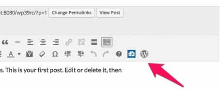
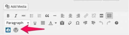
Enabling the StyleSelect Control
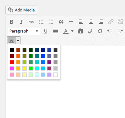
The styleselect control, which allows easy formatting of the selected text, is hidden by default in the TinyMCE editor. The reasoning behind this decision is that the control duplicates the functionality of the other buttons and is thus superfluous. However, with a little bit of modification, it can be used for your own purposes.
Let’s start from the beginning; activating the styleselect control. All you need to do is use the filter mcebuttons2 and add the styleselect element to the top of the list of buttons:
add_filter('mce_buttons_2', 'gk_activate_styleselect');
function gk_activate_styleselect($buttons) {
   array_unshift( $buttons, 'styleselect' );
   return $buttons;
}
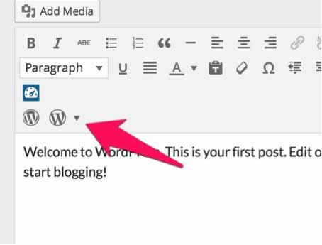
As a result, a new selection list will appear in the editor:
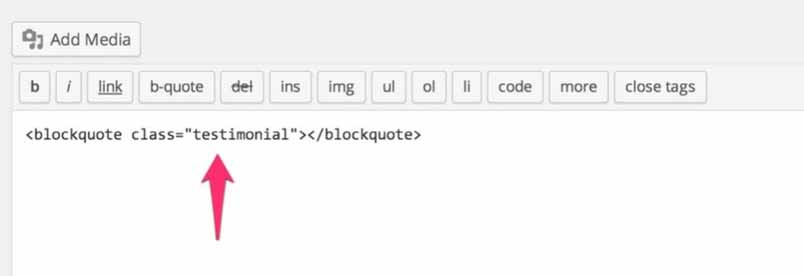
Looking at the content, we can see that many of the available styling methods are combined with the default styling formats, which makes everything a little hard to keep track of. Fortunately, we may easily change it, making this control the easiest way for wrapping a selected text fragment with your own HTML tags.
To do this we need to modify the default settings of the TinyMCE editor using the tinymcebefore_init filter:
function gk_own_styles($config) {
    $temp_array = array(
        array(
            'title' => 'Testimonial',
            'block' => 'blockquote',
            'classes' => 'testimonial'
        ),
        array(
            'title' => 'Info block',
            'block' => 'p',
            'classes' => 'info-block'
        )
    );
    $config['style_formats'] = json_encode( $temp_array );
    return $config;
}
add_filter('tiny_mce_before_init', 'gk_own_styles');
As you can see in the style_formats settings we define our own array in the JSON format. Each element of the array contains three main properties – the name of the submenu item (title),the name of the HTML tag (block) and the CSS class to be added to this marker (classes).
In effect, we we have a selection list with our own definitions:
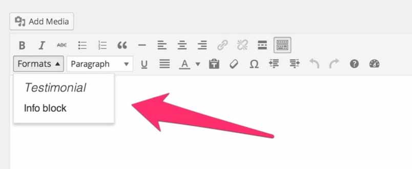
Now, when you select some text and click a styling method in HTML we may see the effect of the styleselect control:
Enabling Other Buttons Hidden By Default
In the entry connected with the styleselect I explained how to enable this disabled by default button. TinyMCE has lots of other buttons disabled in this ways. In this entry I will show you how to enable them.
Well, it is enough to add to the table with the list of buttons the string of characters with the name of a hidden button:
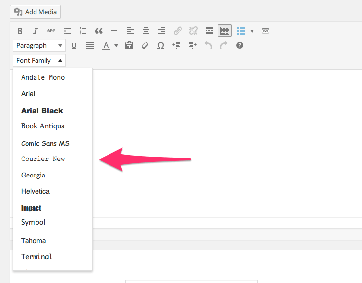
function dziudek_tc_more_buttons($buttons) {
    array_push($buttons, 'fontselect');

    return $buttons;
}
add_filter("mce_buttons_3", "dziudek_tc_more_buttons");
In the above example, we activate the fontselect button in the third line of buttons, which allows us to choose the typeface used in the selected text:
Above, you may find a list of disabled in this way buttons (I omitted visualaid button, as it seems not to work at all):
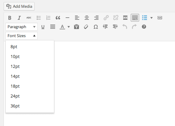
fontsizeselect
Another control associated with the typeface – this time with its size:
styleselect
The control already known from another entry.
backcolor
This control allows us to specify the background color under the text:
newdocument
Thanks to this control, we may quickly clear the content of the editor – all the entered text will disappear after clicking on it:
cut i copy
These two controls, which as the name suggests, are associated with cutting and copying text, unfortunately will work only in those browsers that can access the clipboard through the JavaScript API:
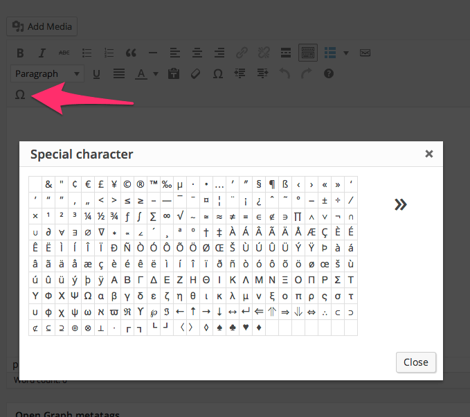
charmap
After clicking on this control, the table of custom characters will appear:
hr
The control which allows to insert a horizontal line marker to the text:
Summary
As we can see, most of these controls are disabled – most of them do not offer useful functionalities. In my opinion, the only controls that are notable are as follows:
- charmap – useful if you cannot remember all HTML entities,
- hr – if you are using the HR tag as a visual separator in your articles
Other controls can be useful only if we have a very stubborn customer, who wants to be able to easily control the style of the text inside the editor without the use of CSS code (I strongly discourage, but we have our ups and downs). Cut, copy and newdocument are basically controls only for those who are not able to acquire the keyboard shortcuts, but I hope that they are a small fraction of WordPress users.
Adding Form Validation to a Popup
When creating a popup with settings that is assigned to one of our buttons in the TinyMCE editor, it is prudent to implement data validation in the popup’s fields to prevent a user from entering invalid or incorrect data. A simple data validation check can easily be created, though if you also want to highlight the incorrect fields to help the user fix the data then a little more effort and workarounds will need to be employed.
We’ll start with our base code – let’s say that our popup comes with two fields: width and height; and that they have the onsubmit action defined in their functionality in the following manner:
onsubmit: function(e) {
    editor.insertContent('Lorem ipsum: ' + e.data.width + ' x ' + e.data.height + '.');
}
The implementation of basic validation in this situation is very easy – we check values of fields and depending on criteria fulfilled, we send data from a popup or not using return false, for blocking sending a popup:
onsubmit: function(e) {
    if(e.data.width === '' || e.data.height === '') {
        return false;
    }
    editor.insertContent('Lorem ipsum: ' + e.data.width + ' x ' + e.data.height + '.');
}
Unfortunately, this validation method has a serious issue; a user will not know why there form was not sent, and can’t fix any issues. Therefore, we should display an appropriate message – we may use an alert function or, even better, use a message window that is built-in with TinyMCE:
onsubmit: function(e) {
    if(e.data.width === '' || e.data.height === '') {
        editor.windowManager.alert('Please, fill in all fields in a popup.');
        return false;
    }
    editor.insertContent('Lorem ipsum: ' + e.data.width + ' x ' + e.data.height + '.');
}
After seeing such information a user should be aware that something is wrong with the data inserted in the fields, but it is worth highlighting the incorrect fields so that the user knows exactly what needs correcting. In order to make it work, we will have to create a more sophisticated code that will allow us to add a frame around elements that are incorrect.
I have searched for an elegant solution to this issue, but it unfortunately was not possible to achieve without utilizing some object’s properties that, based on their names, should be private. From what I could gather, there is no more convenient method available.
We need a handle for the form fields displayed in a popup, so let’s start with that. To achieve this, we’ll have to make a request to a built-in feature that returns the ID of the displayed popup:
var window_id = this._id;
With this ID, we may now load the fields of the form:
var inputs = jQuery('#' + window_id + '-body').find('.mce-formitem input');
Now we have handles for the form fields, we may assign a border-color to them:
if(e.data.width === '') {
    $(inputs.get(0)).css('border-color', 'red');
}
In the above example, we’ll add a red frame to the first text field in a form.
To keep things clear for the user, we might want to make a frame disappear from the field once it is clicked, so we change:
{
    type: 'textbox',
    name: 'height',
    label: 'Height'
},
to:
{
    type: 'textbox',
    name: 'height',
    label: 'Height',
    onclick: function(e) {
        jQuery(e.target).css('border-color', '');
    }
},
Unfortunately, from my observations it seems that the onclick event is the only one that works – so we cannot use the onblur or onfocus events.
Once we’ve done all these steps, our onsubmit code may look as follows:
onsubmit: function(e) {
    if(e.data.width === '' || e.data.height === '') {
        var window_id = this._id;
        var inputs = jQuery('#' + window_id + '-body').find('.mce-formitem input');

        editor.windowManager.alert('Please fill in all fields in a popup.');

        if(e.data.width === '') {
            $(inputs.get(0)).css('border-color', 'red');
        }

        if(e.data.height === '') {
            $(inputs.get(1)).css('border-color', 'red');
        }

        return false;
    }
    editor.insertContent('Lorem ipsum: ' + e.data.width + ' x ' + e.data.height + '.');
}
What if we need more events for form elements?
It is clear that the default events in TinyMCE do not give us much freedeom to create diverse popups with complex logic. Luckily, there is a workaround we can use if we need to an additional event e.g. onblur or onfocus to our fields.
A popup created in TinyMCE requests the repaint event at least twice – by hooking on to this event we can overcome some of the limitations of our popup.
Here’s an example of such an implementation, where we add the onfocus and onblur events to the first field in a form:
onrepaint: function(e) {
    var window_id = this._id;

    if(!jQuery('#' + window_id).hasClass('form-initialized')) {
        jQuery('#' + window_id).addClass('form-initialized');

        var inputs = jQuery('#' + window_id + '-body').find('.mce-formitem input');

        jQuery(inputs.get(0)).blur(function() {
            console.log('blur');
        });

        jQuery(inputs.get(0)).focus(function() {
            console.log('focus');
        });
    }
},
I would like to make you aware at this point that requesting the repaint event a few times is a sensitive matter – therefore, in the above code I created a simple mechanism for checking whether it was requested once only. After the first request of this function, there is a form-initialized class that is added to the popup that prevents our code from being requested again. Thanks to this, we will avoid among other things problems with double-added events.
By using the above method, we may create diverse logic for our form in a popup. The main burden we must deal with is access to the form’s fields – various fields types have various classes and we not only have to select everything correctly, but also use it appropriately too.
It does not change the fact that creating validation for TinyMCE popup content is possible, however, in the case of more complex forms, it requires complex code to overcome since the TinyMCE API is lacking in this regard.
The End…For Now
This tutorial is huge, complex, and took a very long time to write, yet it only scratches the surface of the TinyMCE API. We’ll continue to experiment with the editor, and add any new information here so that it can be shared with the world! We hope this tutorial has proven useful, and if there’s something you’d like us to look at in a future article just leave a comment and we’ll see what we can do.